Quantcast
Channel: Bint photoBooks on INTernet
Viewing all 931 articles
Browse latest View live

Rijksmuseum Amsterdam Buys first ever Photo book Photographs of British Algae Anna Atkins

$
0
0

Photographs of British Algae: Cyanotype Impressions

Artist:Anna Atkins (British, 1799–1871)
Date:1843–53
Medium:Cyanotypes
Dimensions:Image: 25.3 x 20 cm (9 15/16 x 7 7/8 in.) each

The first book to be photographically printed and illustrated, Photographs of British Algae was published in fascicles beginning in 1843 and is a landmark in the history of photography. Using specimens she collected herself or received from other amateur scientists, Atkins made the plates by placing wet algae directly on light-sensitized paper and exposing the paper to sunlight. In the 1840s, the study of algae was just beginning to be systematized in Britain, and Atkins based her nomenclature on William Harvey's unillustrated Manual of British Algae (1841), labeling each plate in her own hand.

Although artistic expression was not her primary goal, Atkins was sensitive to the visual appeal of these "flowers of the sea" and arranged her specimens on the page in imaginative and elegant compositions. Uniting rational science with art, Photographs of British Algae is an ambitious and effective book composed entirely of cyanotypes, a process invented in 1842 by Sir John Herschel and long used by architects to duplicate their line drawings as blueprints.

Rijksmuseum koopt allereerste fotoboek
Fotografie
Voor 450.000 euro heeft het Rijksmuseum een fotoboek uit 1843 gekocht van Anna Atkins, de eerste vrouwelijke fotografe.
Daan van Lent
18 mei 2017

Afbeeldingen van zeewier in Photographs of British Algae van Anna Atkins.
Beeld Rijksmuseum

Het allereerste fotoboek in de wereld. Vanaf 1843 in tien jaar tijd gemaakt door de eerste vrouwelijke fotograaf. Dat is de nieuwste aanwinst van het Rijksmuseum, dat deze donderdag de aankoop van Photographs of British Algae van Anna Atkins (1799-1871) bekendmaakt.

Atkins was een botanicus die besloot illustraties te maken bij een destijds net verschenen handboek van zeewieren. De auteur daarvan had uit tijdgebrek dat handboek niet geïllustreerd. Atkins besloot de eerste fotografische technieken aan te wenden om dat wel te doen.

Atkins gebruikte nog geen fotocamera, maar maakte zogeheten cynatopieën. Ze legde het gedroogde zeewier op in water ondergedompeld papier en liet het zonlicht er vijf tot vijftien minuten op inwerken. Door gebruik van twee ijzerzouten in het water kreeg het papier een ‘Pruisisch blauwe’ kleur, waarop het wier na het drogen een witte afdruk achterliet. Deze blauwdruktechniek, die later vooral door architecten zou worden gebruikt, was in de tijd van Atkins de enige simpele manier van contactafdrukken maken, uitgevonden door Sir John Herschel. Atkins en haar man waren bevriend met Herschel en met fotografiepionier William Henry Fox Talbot van wie zij technieken leerde.

Atkins liet haar blad voor blad gemaakte afdrukken binden in een oplage van tussen de twintig en dertig boeken en gaf deze cadeau aan andere botanici. Volgens conservator fotografie Hans Rooseboom van het Rijks zijn er nog ongeveer twaalf exemplaren in goede staat bekend, die in bezit zijn van onder meer de British Library en de Royal Society in Londen en het Metropolitan Museum en de New York Public Library.

Elk exemplaar is uniek. Op de helblauwe pagina’s staan 307 afbeeldingen van wieren in allerlei vormen: streepjes, draden, vlekken of wolkachtige vormen. Woensdag toonde het Rijksmuseum het boek aan een groep journalisten. Zonder de labels met Latijnse namen van de wieren, zouden het ook abstracte werken van een hedendaags kunstenaar kunnen zijn. Het werk ligt volgens het Rijksmuseum dan ook op de grens van wetenschap en kunst. „Atkins had een wetenschappelijke benadering, maar inmiddels zien we de fotografische, visuele en estethische kwaliteiten van haar werk. Er zijn verschillende kunstenaars die deze techniek nu gebruiken”, aldus Rooseboom.

Het Rijksmuseum kocht begin dit jaar het boek, waar het jarenlang naar had gezocht, van de New Yorkse kunstenaar Michele Oka Doner. Hoe zij aan het werk is gekomen, weet het Rijks „nog niet”. De aanschaf van Photographs of British Algae kostte 450.000 euro, waarmee het de duurste aankoop op het gebied van fotografie is die het Rijks ooit heeft gedaan. De BankGiro Loterij, de familie Cordia en het Paul Huf Fonds maakten het mogelijk. Op de tentoonstelling New Realities. Fotografie in de 19de eeuw, die op 17 juni wordt geopend, zal het Rijks een hele zaal wijden aan het boek.

Rijksmuseum krijgt fotografie-schenking: 35 zeegezichten
05-05-2017 AGENDA  NIEUWS  Door: Jasper van Bladel

Het Rijksmuseum heeft een genereuze schenking van ruim 35 fotografische zeegezichten ontvangen van een particuliere verzamelaar. Dit genre is voor de omvangrijke fotocollectie van het Rijksmuseum compleet nieuw. De schenking bevat verrassende werken van voornamelijk eigentijdse internationale fotografen als Viviane Sassen, Chip Hooper, Franco Fontana, Jo Ractliffe, Chris Mc Caw en van Simon van Til. Van 17 juni t/m 17 september 2017 is een selectie van dertien werken te zien in de presentatie 'Sea Views' in de Philipsvleugel van het Rijksmuseum.

De collectie zeegezichten is met veel zorg, aandacht en liefde over een periode van 10 jaar door een particuliere verzamelaar bij elkaar gebracht. Elk werk is een intensieve oefening: een spel met lucht, licht en getij. De foto’s tonen de hand van de fotograaf én de rijkdom van de fotografie. De resultaten zijn totaal verschillend: de zee in het zwart of azuurblauw. Sommige werken zijn monumentaal, andere klein en intiem. In Sea Views zijn dertien foto’s van zeegezichten te zien. In Sea Views wordt een begeleidende film van Jochem van Laarhoven getoond.


Seascape Mar Ligure, Franco Fontana, 2005

Het zeegezicht
Nederland en de zee is een geliefd thema in het Rijksmuseum. In de 17de eeuw tekende Willem van Velde de kust voor Kijkduin en Terheijden in reusachtige en minutieuze pentekeningen. Jan Toorop verloor zich in de late 19de eeuw in de golvende zee voor Katwijk. Door de genereuze schenking zijn nu ook hedendaagse zeegezichten aan de collectie toegevoegd.

New Realities. Fotografie in de 19de eeuw
Gelijktijdig met Sea Views is in de Philipsvleugel een grote overzichtstentoonstelling 19de-eeuwse fotografie te zien. Driehonderd foto’s uit eigen collectie geven een beeld van hoe gevarieerd de fotografie was direct na haar uitvinding in 1839. Topfotografen als William Henry Fox Talbot, George Hendrik Breitner, Willem Witsen en Gustave Le Gray verschijnen zij aan zij met anonieme verrassingen die nog niet eerder zijn getoond.


Every Photo by Stanley Greene was a Statement Photojournalism Photography

$
0
0

STANLEY GREENE
The death of a poet

BY OLIVIER LAURENT
Stanley Greene wasn’t just a war photographer—a label he both embraced and despised. He was also a poet who always searched for dignity, justice and larger truths in every one of his photographs. A passionate lover of life, he defied death across the years, whether on the front lines or at home. But, after a long fight with cancer, one of America’s greatest photographers died Friday morning surrounded by his closest friends and colleagues. He was 68.


Elke foto van Stanley Greene was een statement
Necrologie
De vrijdag overleden fotograaf Stanley Greene (1949-2017) wilde verschrikkingen laten zien zonder zijn gevoel voor poëzie te verliezen.
Rosan Hollak
19 mei 2017

Op deze foto uit 2010 staat Stanley Greene nadat hij een lezing heeft gegeven op het St Restitut, France.
Foto Jerome Delay/AFP

„Fotografie is niet een intentie, het is een vraag. A click, a tic, a crack in time. En het beeld geeft soms het antwoord.” Zo verwoordde de Amerikaanse fotograaf Stanley Greene, die vrijdag in Parijs op 68-jarige leeftijd overleed aan kanker, vorige maand nog zijn visie op de fotografie. Beeld was voor hem, als bevlogen fotograaf die de afgelopen vijfentwintig jaar werkzaam was in conflictgebieden, belangrijk. Maar ook de invloeden van poëzie, literatuur, schilderkunst en theater speelden een grote rol in zijn leven.

Tijdens de Sem Presser-lezing, afgelopen april in het Compagnietheater in Amsterdam, vertelde Greene, in de vorm van een lang gedicht, zijn levensverhaal terwijl zijn fotografische werk op de achtergrond werd geprojecteerd. Beginnend met de portretten van zijn ouders en eindigend met zwart-wit beelden uit Rusland en een portret van zijn laatste liefde, wist Greene op een ontroerende manier zijn publiek mee te voeren naar de belangrijke plekken uit zijn leven.

Dat leven begon in 1949 in Brooklyn in New York waar Greene werd geboren in een acteursgezin. Aanvankelijk begon hij zijn carrière als schilder maar begin jaren 70 stapte hij, op aanraden van de legendarische fotograaf W. Eugene Smith bij wie hij assisteerde, over op de fotografie. Greene, in die tijd lid van de Black Panther-beweging en als activist actief tegen de oorlog in Vietnam, begon te fotograferen in de modescène in New York. Zijn besluit om fotojournalist te worden kwam pas met de val van de Muur in Berlijn, waar hij in 1989 getuige van was. Vanaf dat moment begon hij reportages te maken in het voormalige Oostblok.


Zijn doorbraak kwam in 1991, toen hij de staatsgreep in Moskou fotografeerde. Vanaf 1994 tot 2003 maakte hij meer reportages in en rond Rusland: indringende beelden over de ondergang van het communisme en de ellende tijdens het conflict in Tsjetsjenië. De foto’s, waaronder het huiveringwekkende beeld van de contouren van een lijk in de sneeuw bij Grozny, werden in 2004 gebundeld in het fotoboek Open Wound. Rond die tijd was Greene, inmiddels wonend in Parijs en werkzaam bij fotoagentschap VU voor bladen als The New York Times Magazine, Newsweek en Paris Match, al een gevestigd fotograaf en ging hij op pad naar conflictgebieden waaronder Rwanda, Afghanistan, Irak, Darfur en Syrië.


Daar maakte hij veel confronterende, deels ook poëtische, beelden van de ellende die de burgerbevolking treft. Beelden waarmee hij ook diverse keren werd bekroond bij onder meer World Press Photo. „Een foto van Stanley Greene is een statement”, zegt zijn vriend en collega Kadir van Lohuizen. Volgens Van Lohuizen, samen met Greene medeoprichter van fotoagentschap NOOR, weigerde Greene ‘objectief’ te zijn. „Hij had een mening over een conflict, dat zag je terug in zijn fotografie.” Wat dat betreft was Greene een politiek fotograaf met een eigen signatuur, aldus Van Lohuizen. „Hij was niet uit op sensatie, eerder een echte doorbijter die zich volledig in een kwestie verdiepte. Hij fotografeerde vaak op een indirecte manier: je ziet de ellende, maar het is tegelijkertijd respectvol en humaan.”

Van Lohuizen werkte met Greene in Libanon en vanaf 2005 aan een project over de gevolgen van orkaan Katrina in New Orleans. „Daar kwamen we op het idee om een eigen fotoagentschap op te zetten. Internationale media begonnen in die tijd steeds minder te betalen voor fotografie. Wij wilden een groep onafhankelijke fotografen bij elkaar brengen die, niet meer in opdracht werkten, maar hun eigen verhalen gingen brengen, digitaal en niet meer voor de papieren krant.”

Het plan slaagde. In 2007 werd NOOR in Amsterdam opgericht. Aan dit agentschap bleef Greene tot zijn dood verbonden. Hij vond bij dit bonte gezelschap fotografen en medewerkers niet alleen inspirerende medestanders maar ook de familie die hij in zijn dagelijks leven ontbeerde. Een gemis dat hij in 2009 tot uitdrukking bracht in het fotoboek Black Passport, een egodocument waarin hij zijn fotoseries afwisselde met persoonlijke portretten van vrouwen en vriendinnen. Ongegeneerd beschrijft Greene zijn verslaving aan gevaar, waardoor hij telkens weer besluit te vertrekken naar conflictgebieden, en de pijn en verwarring die deze levensstijl met zich meebrengt. Want uiteindelijk moest de liefde het steeds ontgelden.

Greene, die in 2008 bekend maakte dat hij besmet was met het Hepatitis C-virus, worstelde de laatste jaren met zijn gezondheid. Ook al was hij recent, met behulp van nieuwe medicijnen, genezen verklaard, toch had het virus zijn lever zodanig aangetast dat hij niet meer kon herstellen. Sinds anderhalf jaar had hij leverkanker. Desondanks reisde hij in februari dit jaar nog naar Noord-Rusland voor een nieuw project: een roadtrip met als thema ‘100 jaar na de Russische revolutie’. „De eerste foto’s van dit project heeft hij nog kunnen leveren”, zegt Van Lohuizen. Maar een week geleden werd Greene met spoed opgenomen in een ziekenhuis in Parijs. Tegen zijn wil, want na twee dagen gaf hij al te kennen dat hij weer aan de slag wilde. Terug naar Rusland. Het werd hem niet meer gegund. Dat hij ergens moet hebben geweten dat die mogelijkheid er niet meer zou zijn, bleek wel uit de songtekst die hij, tijdens de Sem Presser-lezing, voordroeg. Geëmotioneerd citeerde hij de laatste regels uit het nummer Both Sides, Now (1969) van Joni Mitchell.

I’ve looked at life from both sides now From up and down, and still somehow It’s life’s illusions I recall I really don’t know life at all…


Views & Reviews Sequences Michel Szulc-Krzyzanowski CODA Museum Apeldoorn Photography

$
0
0

The “Sequences” were successful shortly after the first ones were made. They were first exhibited in 1972 in the Noord-Brabants Museum in ’s-Hertogenbosch, the Netherlands. Followed by exhibitions in London, Paris and New York. The “Sequences” sold very well to give the financial independence to focus on producing this characteristic form of photography full time.

“Sequences” are about awareness. And how to make different and surprising interpretations of reality. It is about how reality is possibly related to ourselves.

In 1985 the making of the “Sequences” was abandoned. The motivation for this decision was to avoid getting into repeating ideas. To become the own epigone.

“Sequences” were made from 1970 to 1985.

First in the Netherlands. Later in France and Morocco. Next in the USA. And eventually exclusively in Baja California, Mexico.

Making the “Sequences” was a solitary activity. Long periods of time were spent in areas were no human presence could be noticed.

Michel Szulc-Krzyzanowski: The Early Sequences 1977-1982
September 4 – October 18, 2008
Reception: Thursday, September 4, 6-8pm

Robert Mann Gallery opens the fall exhibition season with a suite of vintage photographic works by Dutch conceptual artist Michel Szulc-Krzyzanowski. Living out of a trailer in Baja California, Mexico, Szulc-Krzyzanowski engaged in a rigorous study of possibilities opened by combining multiple frames of images into sequences. David Travis, former curator of photography at the Art Institute of Chicago, writing about Szulc-Krzyzanowski’s Sequences in 1984 explains,

[W]e can imagine him to be a magician, who plays tricks on our perceptions with his photographic sleights of hand in order to loosen the strict conventions of our imagination and in the end entertains us. But even in his play he uses the appearance of simultaneity to make the illusion work.
Greatly ahead of his time, Szulc-Krzyzanowski began his sequences in the early 1970s. Embracing the potential for multiple frames to be read together, he deployed a variety of conceptual strategies in these works: alternately invoking the passage or apparent suspension of time. Szulc-Krzyzanowski consistently plays off the structural basis of the frame; particular sequences seem to ignore the parameters of individual exposures—a paradoxical conceit as the printing displays the edges of each negative. In such instances the Sequences are decidedly non-cinematic in their embrace of flatness and simultaneity. While these descriptions might imply otherwise, change is a constant in the Sequences, most often illusively describing movement by maintaining single elements as a constant visual referent—sometimes a part of the artist’s body, an object in the foreground or the distant horizon line.

The meaningful thrust of the Sequences derives from their exploration of perception and reception. But they also exhibit a playful inquisitiveness that aligns Szulc-Kryzanowski with contemporaries such as John Baldessari. Szulc-Krzyzanowski’s work represents a process of discovery. In perceiving his images, we cannot help be aware of the performance inherent in their production. We can imagine the artist—the camera almost an extension of his body—on the beach, interrogating perceptual and aesthetic boundaries. Again, in David Travis’s words, “It is not so much an experience during time that [Szulc-Krzyzanowski] presents, but rather a conceptual experience concerning time.”

Michel Szulc-Krzyzanowski was born in 1949 in Oosterhout, The Netherlands. His work has been exhibited internationally since the early 1970s and is included in numerous major public collections, including the Art Institute of Chicago; the Centre Pompidou, Paris; the Museum of Modern Art, New York; the San Francisco Museum of Modern Art; and the Stedelijk Museum.

View Michel Szulc-Krzyzanowski: The Early Sequences 1977-1982 online at www.robertmann.com beginning September 4, 2008.


Michel Szulc-Krzyzanowski – Sequenties
CODA Museum | 29.01 t/m 28.05.2017

CODA Museum presenteert het werk van Michel Szulc-Krzyzanowski van 29 januari tot en met 28 mei 2017 in de tentoonstelling Sequenties; een bloemlezing uit eigen collectie.

Krzyzanowski maakt in de jaren zeventig naam als een van de grondleggers van zwart-wit sequentiefotografie (fotoreeksen) maar omdat deze werkwijze hem geen nieuwe inzichten meer oplevert, besluit hij na ruim 15 jaar te stoppen met deze vorm van fotografie. Sinds 2016 maakt hij echter weer sequenties. Ditmaal in kleur. De tentoonstelling in CODA Museum laat een aantal reeksen zien waarmee Krzyzanowski in de jaren zeventig wereldfaam verwierf.

Over Michel Szulc-Krzyzanowski
Michel Szulc-Krzyzanowski (Oosterhout, 1949) gebruikt zijn fotocamera om existentiële vragen over het leven en zijn bestaan te onderzoeken. De gespannen thuissituatie uit zijn jeugd is van grote invloed geweest op zijn persoonlijke groei en ontwikkeling als beeldend kunstenaar. Hij omschrijft zichzelf na de lagere school als een wispelturige jongen. Op de Westerhelling, een jongenskostschool in Nijmegen, wordt hij lid van de fotoclub en raakt hij bevriend met beeldend kunstenaar Teun Hocks. Hocks had in 2015 een overzichtstentoonstelling van geënsceneerde fotografie in CODA Museum. Zowel Hocks als Szulc-Krzyzanowski zijn met werk vertegenwoordigd is in de CODA collectie.

Krzyzanowski

De sequentie als zoektocht
Door het maken van sequenties, beeldreeksen van twee of meer foto’s, probeert de twintiger Szulc-Krzyzanowski zijn plaats in de wereld te bevragen en te bevestigen. In zijn fotoseries wordt de realiteit van verschillende kanten of in verschillende fases onderzocht en getoond. Veelal gefotografeerd op verlaten stranden in Nederland, Frankrijk, Marokko, de Verenigde Staten en Mexico, speelt Szulc-Krzyzanowski met tijd en beweging en ruimtelijke begrippen als veraf en dichtbij: hij ensceneert het beeld. Zo ontstaan intrigerende reeksen van foto’s die de beschouwer uitdagen om goed te kijken en na te denken over wat er nu precies te zien is. De zo universeel mogelijke invulling van zijn foto’s – een leeg strand, de zee, een steen, een anonieme schaduw van een hand of been – is niet toevallig. Iedere toeschouwer moet zich in zijn zoektocht kunnen herkennen. Zichtbaar of onzichtbaar, de mens staat echter centraal in het werk van Szulc-Krzyzanowski.


Views & Reviews A New History of the Latin-American Photobook Horacio Fernández Marcelo Brodsky Photography

$
0
0
Oscar Munoz, Archivo porcontacto, 2009 - Bogota.

Foto/Grafica: A new history of the Latin-American photobook at Le Bal

By: Horacio Fernández

PARIS.- ‘Photography’, wrote August Sander, ‘is like a mosaic: it only achieves a synthesis when you can display it all at once’. In order to arrive at such a synthesis, photographers have two forms at their disposal: the exhibition or the book, two continuous sequences of images structured into a comprehensive argument. FOTO/GRÁFICA thus constitutes an original approach insofar as it combines these two forms: an exhibition of photobooks as autonomous objects, accompanied by vintage prints, films and mock-ups.

The research carried out on photobooks over the past ten years has gradually forged a new history of photography throughout the world, including Latin America. During the first Latin American Photo Forum, held in São Paulo in 2007, a committee composed of Marcelo Brodsky, Iatã Cannabrava, Horacio Fernández, Leslie A. Martin, Martin Parr and Ramón Reverté signalled the crucial lack of any overall survey of the books published on the continent during the twentieth century. A rigorous investigation was called for in order to compensate for this silence through the systematic rescue of works whose value was incontestable, owing to a complex alchemy of many ingredients: the quality of the images themselves, the sequencing, the text, the layout, the binding, the printing and so on. This research was to bear exclusively on photobooks published in Latin America by Latin American authors actively involved in the making of the book.

This effort entailed more than three years of interviewing photographers, graphic designers, collectors, researchers and publishers on both sides of the Atlantic and combing rare bookstores and public and private libraries. Tracking down the ‘unknown’ on a continental scale transformed this investigation into a vertiginously exciting quest which had as its outcome an anthology of 150 books published between 1921 and 2009:The Latin American Photo Book. The books which came to light are incisive, complex, unsettling and often forgotten, star-crossed or otherwise secret works. The exhibition FOTO/GRÁFICA presents forty of them, most of which are unknown to the public, and thus serves to reveal Latin America’s remarkable contribution to the world history of the photobook.

CLAUDIA ANDUJAR and MARTÍN CHAMBI 
The exhibition begins with two major works echoing pre-Columbian America: one shows the landscape and its first inhabitants, the other, the cultures destroyed by colonisation.

In Amazônia (1978), by Brazilian photographers Claudia Andujar (Neuchâtel, Switzerland, 1931- ) and George Love (Charlotte, North Carolina, 1937-São Paulo, Brazil, 1995), the primeval America, Paradise lost and its inhabitants, the masters of the Earth are evoked through a dramatic, film-like narrative charged with emotion.

Alturas de Macchu Picchu (Heights of Machu Picchu, 1954) brings together one of the major poems of Nobel Prize laureate Pablo Neruda and the photographs of the great master Martín Chambi (Coaza, Peru, 1891-Cuzco, Peru, 1973). These archaeological photographs are devoid of any human presence, unlike Neruda’s verses, populated by ‘Juan Stonecutter, son of Wiracocha’ and other inhabitants of the vast Inca city lost for centuries before its rediscovery in 1911.

HISTORY AND PROPAGANDA
Photobooks of protest and propaganda trace a visual history of Latin America in the twentieth century which is fraught with implacable tensions between conservative and reformist ideologies. This history begins with the period of the great Mexican Revolution of the 1910s as related in the Álbum histórico gráfico (Graphic history album, 1921) of Agustín Víctor Casasola (Mexico City, 1874-1938).

The political, ideological version of history is propaganda. It found expression in Argentina during the government of General Juan Domingo Perón in anonymous collective works such as Argentina en marcha (Argentina on the march, 1950) and Eva Perón (1952). The same was true in Bolivia during the 1950s, when the government commissioned a heroic narrative on the miners, El precio del estaño (The price of tin, 1955) from Argentine photographer Gustavo Thorlichen (Hamburg, Germany, 1905-Málaga, Spain, 1986). In a more documentary vein, Candomblé (1957) by José Medeiros (Teresina, Brazil, 1921-L’Aquila, Italy, 1990) captures the secret, forbidden rituals of Afro-Brazilian culture.

The triumph of the cuban Revolution in 1959 mobilised an entire generation of outstanding photographers and graphic designers. The books of the early years embody faith in the future and rejection of the past, as seen in Cuba: Z.D.A. (Cuba Agrarian Development Zone, 1960), Sartre visita a Cuba (Sartre visits Cuba, 1960) and El socialismo y el hombre en Cuba (Socialism and man in Cuba, 1965). This revolutionary hope for change spread throughout Latin America, as demonstrated by photobooks such as América, un viaje a través de la injusticia (America, a journey through injustice, 1970), a synthesis of observation, emotion and culture on a continental scale by Enrique Bostelmann (Guadalajara, Mexico, 1939-Mexico City, 2003).


The victory of reactionary forces in the 1970s set off a spiral of violence. In Chile, the 1973 military coup led by General Pinochet sought to justify itself with Chile ayer hoy (Chile yesterday today, 1975), an archetypal example of right-wing propaganda which was countered by works such as Chile o muerte (Chile or death, 1974), a collage of documents, photographs and caricatures. Uchuraccay: Testimonio de una masacre (Uchuraccay: Testimony of a massacre, 1983) attests to the terrible war between Peru and the Shining Path terrorist guerrilla mouvement, whilst the recent Los que se quedan /Those that are still here (2007) by Geovanny Verdezoto (Santo Domingo de los Colorados, Ecuador, 1984- ) examines the situation of those who choose to remain rather than emigrate.


URBAN PHOTOGRAPHY 
Latin America’s cities have inspired major photobooks. Doorway to Brasilia (1959), a work by graphic designer Aloísio Magalhães (Recife, Brazil, 1927-Padua, Italy, 1982) and North American artist and printer Eugene Feldman, extols the architectural transformation of the landscape by means of an extraordinary demonstration of graphic ingenuity. More reserved, but just as monumental, Buenos Aires (1936) embodies the ‘photographic vision’ of Horacio Coppola (Buenos Aires, Argentina, 1906- ), in an empty urban stage. By contrast, La Ciudad de Mexico III (Mexico City III) by Nacho López (Tampico, Mexico, 1923-Mexico City, 1983) celebrates the street life uniting architecture and city-dwellers.

In Buenos Aires Buenos Aires (1958) by Sara Facio (Buenos Aires, Argentina, 1932- ) and Alicia D’Amico (Buenos Aires, Argentina, 1933-2001), the only decoration is the crowd, the hustle and bustle of ordinary people. Similarly privileging the public over the setting, Avándaro (1971) by Graciela Iturbide (Mexico City, 1942- ) recreates the energy of Mexico’s first rock festival through the reframing and repetition of the images. Both of these books are distinguished by their graphic design, the work of Oscar Cesar Mara and Antonio Serna, respectively. Color natural (Natural colour, 1969) by Venezuelan photographer Graziano Gasparini (Gorizia, Italy, 1924- ), meanwhile, celebrates the gleaming, artificial colour of the city of Maracaibo.


PHOTOGRAPHIC ESSAYS
A certain number of Latin American photobooks stand out for the complexity of their narratives and the uniqueness of their form.

El rectángulo en la mano (The rectangle in the hand, 1963), for example, is a moving little artist’s book with a marvellous form, a fragile masterpiece by the mythical photographer Sergio Larrain (Santiago, Chile, 1931- ).

In Sistema nervioso (Nervous system, 1975), Venezuelan photographer Barbara Brändli (Schaffhausen, Switzerland, 1932- ), graphic designer John Lange and writer Román Chalbaud present the city of Caracas like a puzzle composed of enigmatic signs reflecting ‘the chaos, the improvisation, the humour, the grotesqueness . . . ’.


In Fotografías (Photographs, 1983), photographer Fernell Franco (Versalles, Colombia, 1942-Cali, Colombia, 2006) sheds light on endless mysteries: ‘I liked to photograph the way the shadows gradually disappeared into total darkness and the light died’. Dissatisfied with the quality of the printing, Franco decided to destroy his book, and only a few copies are to be found today.

El cubano se ofrece (These are the cubans, 1986), an essay by Iván Cañas (Havana, Cuba, 1946- ) on life in a cuban village, shows the other side of official propaganda stereotypes.

Retromundo (Retroworld, 1986), by Venezuelan photographer Paolo Gasparini (Gorizia, Italy, 1934- ) in close collaboration with graphic designer Álvaro Sotillo, contrasts two ways of looking: that of Europe and North America, which proliferates in a flood of chaotic images, and that of the New World, which goes beyond appearances to privilege direct contact with beings and things.


The more theatrical photographs of Brazilian artist Miguel Rio Branco (Las Palmas, Spain, 1946- ) refer explicitly to film and painting and, with the blood-red bestiary Nakta (1996), undertake a ‘journey of pain, of the material nature of suffering’.

ARTISTS’ BOOKS
During the 1960s, many artists considered the process of creation more important than its outcome, the final work. Photographs were thus a means of documenting creative acts which left no other trace. Among Latin American artists’ books stemming from this movement, we find records of performances like Auto-photos (Self-photos, 1978) by the Brazilian artist Gretta (Athens, Greece, 1947- ) or works on the body like Autocopias (Self-copies, 1975) by Venezuelan artist Claudio Perna (Milan, Italy, 1938-Holguín, Cuba, 1997), designed by Álvaro Sotillo.

There were also growing numbers of experimental works on the urban space, such as Sin saber que existías y sin poderte explicar (Without knowing you existed and without being able to explain, 1975) by Eduardo Terrazas (Guadalajara, Mexico, 1936- ) and Arnaldo Coen (Mexico City, 1940- ), which is at once an inventory of merchandise, a chromatic adventure and a celebration of graphic design.

The questioning of artistic language is at the heart of such outstanding books as Fallo fotográfico (Photographic verdict, 1981), a conceptual work by Eugenio Dittborn (Santiago, Chile, 1943- ), or Ediciones económicas de fotografía chilena (Affordable editions of Chilean photography, 1983), a short-lived project for photocopied books which gave rise to works by photographers Paz Errázuriz (Santiago, Chile, 1944- ), Mauricio Valenzuela (Santiago, Chile, 1951- ) and Luis Weinstein (Santiago, Chile, 1957- ).

LITERATURE AND PHOTOGRAPHY 
Literature plays a central role in Latin American culture, which is often described as being more ‘literate’ than visual. Photobooks combining texts and images are noteworthy for their numbers and quality alike. When poetry reaches out to photography, the result goes beyond the impact of the words alone and the photographs read like a text, far from any attempt at illustration.

In Venezuela during the 1960s, the collective El Techo de la Ballena (The roof of the whale) devoted itself to ‘terrorism in the arts’. One of the results of their activity is Asfalto-Infierno (Asphalt-Inferno, 1963), by writer Adriano González León and artist Daniel González (San Juan de los Morros, Venezuela, 1934- ), which shows the full extent of the collective hell recorded on the pavements of Caracas.

Through the graphic design and photographs of Wesley Duke Lee (São Paulo, Brazil, 1931-2010), the poems of Robert Piva’s Paranóia (Paranoia, 1963) constitute a ‘hallucinatory vision’ of São Paulo.

With Versos de salón (Salon verses, 1970), Chilean poet Nicanor Parra invites readers on a roller-coaster ride which designer Fernán Meza joyously interprets through the flip-book style appearance, carving up, resurrection and final disappearance of the poet.

CONTEMPORARY BOOKS 
Photobook publishing has met with great success in Latin America these past years. More than ever, as Brazilian artist Rosângela Rennó puts it, the idea is ‘to use the book as an “exhibition space”, with its own graphic characteristics’.

Urban photography has enjoyed a revival with Siesta argentina (Argentine siesta, 2003) by Facundo de Zuviría (Buenos Aires, Argentina, 1954- ) and Noturno São Paulo (São Paulo nocturnes, 2002) by Cássio Vasconcellos (São Paulo, Brazil, 1965- ).

Among noteworthy artist’s photobooks are the performance anthology created by Carlos Amorales (Mexico City, 1970- ), entitled los Amorales (The immoral ones [which is also a play on the artist’s name], 2000), and the surprising family album Miguel Calderón (2007) by the artist of the same name (Mexico City, 1971- ).

The archive is also a veritable genre in the visual arts of this new century, with such ambitious works as O arquivo universal (The universal archive, 2003) by Rosângela Rennó (Bela Horizonte, Brazil, 1962- ) and the compilation of photographs showing strollers from another time in Archivo porcontacto (Archive by contact, 2009) by Oscar Muñoz (Popayán, Colombia, 1951- ).

Last of all, several books demonstrate the renewed interest in documentary photography, such as On the Sixth Day (2005) by Argentine photographer Alessandra Sanguinetti (New York, US, 1968- ).

Alessandra Sanguinetti-On the Sixth Day from eclipse libros on Vimeo.

Contemporary Photo Books from Argentina selected by Marcelo Brodsky

Posted on November 15, 2012 by Deirdre Donohue

“Argentinian photo book production has increased significantly in the last few years. La Azotea, directed by Sara Facio was one of the first publishers of photo books in the region, and that initiative diversified lately to incorporate other publishers, such as Lamarca, Lariviere , La Luminosa or the collection of Fotografos Argentinos. Books by young artists are produced in growing numbers, and there is an active photo production and photo book scene. A small selection of this emerging activity is displayed in the ICP Library window, in dialogue with the upcoming exhibition and seminar “The Latin American Photobook” to be held this month at the Aperture Foundation.” – Marcelo Brodsky

We are delighted to have yet another international ambassador working on behalf of the ICP Library, the artist and bibliophile Marcelo Brodsky!

This summer [his winter] Brodsky gathered a selection of contemporary photography books in Argentina and they are all arrived and also cataloged into our collection now, as well.

A complete list is coming, but if you are in New York, I hope that you can join us tomorrow evening to celebrate the acquisitions together with Brodsky and enjoy looking through these books, most of them the only copies in a U.S. library.


Een luchtkasteel? Emma Kinderziekenhuis Amsterdam Photobooks on Care Environments Eva Besnyö Company Photography

$
0
0

[Eva Besnyö] Een luchtkasteel?

No place (Amsterdam), printed by N.V. Verenigde Drukkerij Dico for Emma Kinderziekenhuis, n.d. (ca. 1950), (24) p., with 20 photographic illustrations by Eva Brusse Besnyö and typography by her husband Wim Brusse, several other illustrations, original spiralbound wrapper by Brandt en Zoon, 25.5 x 22 cm. Wrapper slightly foxed but else in remarkably good condition, including the bound-along payment card. Fine and rare brochure photo book, only two copies in PiCarta (UvA and Rijksmuseum). By means of this brochure, Emma Kinderziekenhuis drew attention to its highly outdated buildings, in order to collect funds for new buildings.

Zonder plaats (Amsterdam), gedrukt door N.V. Verenigde Drukkerij Dico voor het Emma Kinderziekenhuis, z.d. (ca. 1950), (24) p., met 20 fotografische illustraties van Eva Brusse Besnyö en typografie van haar man Wim Brusse, enkele andere illustraties, oorspronkelijk spiraalgebonden omslag door Brandt en Zoon, 25,5 x 22 cm.

Omslag wat roestvlekkig maar overigens in opvallend goede staat, met de meegebonden machtigingskaart nog aanwezig. Fraaie en zeldzame brochure fotoboek, slechts twee exemplaren in PiCarta (UvA en Rijksmuseum). Het Emma Kinderziekenhuis vroeg met deze brochure aandacht voor de sterk verouderde gebouwen, om een bouwfonds bij elkaar te krijgen voor nieuwbouw.


Photographer Paul Huf Paul Huff: Highlights (English and Dutch Edition) once commented succinctly on his work as follows: 'They get what they ask for, but I deliver damn good work' - the very thing that makes industrial photography books so attractive. The books show work from a period during which photographers could not make a living as artists/photographers and depended on such prestigious commissions. With this highly professional approach, photographers like Violette Cornelius Violette Cornelius and Ata Kando: Hungarian Refugees 1956, Cas Oorthuys 75 Jaar Bouwen, Van ambacht tot industrie 1889-1964, Ed van der Elsken , Ad Windig Het water - Schoonheid van ons land and Paul Huf established their reputations and influenced our present-day impression of workers and entrepreneurs in the postwar Netherlands. Experimental poets and well-known writers also contributed to these books, fifty of which are on show. 'Het bedrijfsfotoboek 1945-1965. Professionalisering van fotografen in het moderne Nederland' Het Bedrijfsfotoboek 1945-1965 . 

Photobooks on care environments and matters of life and death in post-war Holland: THEN and NOW

This exhibition focuses on the meaning and significance of photobooks concerning health care environments. Heart-rending, intimate stories on matters of life, sickness, death and personal loss, are observed and experienced by consecutive generations of photographers working in the documentary tradition. Martien Coppens (1908-1986), Koos Breukel (1962), Carel van Hees (1954), Rince de Jong (1970), Roy Villevoye (1960), and Albert van Westing (1960) unveil various aspects of the everyday lives of their friends and family, as well as people in their professional environment who suffer from a severe illness or find themselves facing grim adversity. The photographers record how these people, some of whom are very dear to them, try to deal with their illness or misfortune with a need to hold on to memories of a happier past, and to understand their slow deterioration and the bewilderment that comes with it. There is often a great sense of urgency: the clock is ticking.

The world of the loved one, the patient, is turned upside down. Suddenly, life is built around medical care and attempts to find a new sense of meaning and purpose. A new dimension is added to the concept of ‘home’: ‘home’ is no longer a safe and protected place, and consequently the patient no longer experiences it as such. ‘Home’ turns into a health care environment. Simultaneously, a different kind of reality suddenly becomes of vital importance close to home: the care facility. That turns into a new ‘home’ of sorts, in the shape of a transitory location of controlled care and attention. The hospital, the nursing home, the mental institution; they are like hotels – a temporary accommodation, often born out of necessity, sometimes unwanted; a place to meet fellow sufferers. The photographer infringes upon that environment; he/she considers the ‘home away from home’ his/her work environment.

The core of the exhibition is shaped by photobooks published by and on the Dutch public health care. In addition, photobooks on consumer driven health care and loss within one’s domestic circle and circle of friends are put on view, self-published by modern day photographers. Those publications are considered to be an extension of the genre. Within the genre, photobooks since post-war reconstruction constitute a category of their own.

After World War II photographers recorded their fascination of the harsh reality of human suffering in a number of photobooks. Each of the 25 photobooks selected for this exhibition represents a photographer’s strategy regarding the documentation of medical and personal care in public and private space, then and now. Not only do they show the progression of personal tragedy; they also display the development of care environments in The Netherlands, and the birth of a genre in documentary photography. In this exhibition you will find visual narratives on academic hospitals by the first generation of photographers to work in a tradition of humanist photography and who were members of the Dutch photographer’s guild (GKf). Among them are Eva Besnyö (1910-2003) and Ad Windig (1912-1996). Photobooks that were published after the Second World War are composed around the verb ‘to live’. Moralistic and patronizing in tone they speak of nursing and nurturing in a confined workplace; mental bewilderment and daily care; a ‘day in the life’ of a patient in a care environment that tries to mimic a home life. These publications subsequently make way for self-published and digitally produced book projects. The personal involvement reflected in those projects is domestic and local in nature, focused on the photographer’s own environment and family. Books on display by contemporary author-photographers like Linda-Maria Birbeck (1974), Annelies Goedhart (1979) and Jaap Scheeren (1979) reveal that approach.

Photobooks are selected that were groundbreaking in their day and in the way they depict the socially, often highly sensitive, themes of health care in text and images. Further, the books stand out for their technical execution, layout and way of photographic storytelling. In sum, this exhibition is about commissioners, photographers, graphic designers and graphic industry that have played an important role in the history of photography and graphic design. 


Emma Kinderziekenhuis
Een lange rij moeders zit op houten banken te wachten tot ze aan de beurt zijn. De kinderen die ze bij zich hebben zijn van peuter- of kleuterleeftijd. Sommigen hebben ook een baby op de arm. Moeders en kinderen zijn goed gekleed, beter gezegd netjes gekleed. Dat was een hele toer in 1948, het jaar waarin de foto genomen is.

Na de oorlog
In de eerste jaren na de oorlog waren nog allerlei levensbehoeften op de bon. Wollen truien werden eindeloos uitgehaald om weer nieuwe van te breien. Moeders naaiden hun eigen jurken en maakten zelf kleding voor de kinderen. Er was nog niet zoveel te koop. Maar de wederopbouw was begonnen. Er werd weer gezorgd.

Emma Kinderziekenhuis
Het Emma Kinderziekenhuis werd in 1865 gesticht door dr. S. de Ranitz, een bevlogen arts die bijzonder begaan was met zijn patiëntjes uit de verpauperde achterbuurten van de binnenstad. Het kinderziekenhuis was toen nog gevestigd aan de Oudezijds Achterburgwal. In 1872 verhuisde het ziekenhuis naar de Saphatistraat, waar de foto genomen is. Waarschijnlijk wachten deze kinderen op een gezondheidskeuring door de kinderarts, of op een vaccinatie. Later zouden dergelijke voorzieningen ter bevordering van de gezondheid van baby's en kinderen terecht komen bij de consultatiebureaus van de GG&GD.

Eva Besnyö
Eva Besnyö (1910-2003) werd geboren in Boedapest, maar leefde sinds 1932 in Nederland. Voor de oorlog maakte ze veel portretten. Ook had ze belangstelling voor architectuurfotografie. In het begin van de jaren zeventig legde ze veel acties vast van de feministische groep Dolle Mina. Maar wat ze ook fotografeerde, het had altijd sfeer, zelfs deze wachtkamer. Haar archief wordt beheerd door het Maria Austria Instituut, net als het Stadsarchief gevestigd in gebouw De Bazel.


Views & Reviews KunstRai Amsterdam 2017 Photography

$
0
0

KUNSTRAI 2017

33th edition of KunstRAI Art Amsterdam

KunstRAI Art Amsterdam is the longest running art fair for contemporary autonomous and applied art in the Netherlands: a public fair with over seventy quality galleries that reflect the diversity of the rich Dutch offer of contemporary art, applied art and design. Visitors will find autonomous painting, sculpture, photography and graphic art as well as contemporary glass, ceramics and jewelry of the highest quality.

Focus Antwerp
After the successful presentation of Focus Berlin last year, Antwerp will now be our guest city. For decades Antwerp has played an important role in the art scene with their renowned galleries, museums, artists and extensive community of art collectors. KunstRAI is therefore happy to bring a part of this Belgian inspiration to Holland.

Solo Booths
Around 20 participating galleries in addition to their booth will have a solo booth in which the work of one artist is presented extensively. The purpose of the solo booths is to increase understanding and appreciation of the art of this artist. Follow this link for more information on the solo booths.

RAW Edges
Ten young galleries present themselves at the KunstRAI under the name RAW Edges. These galleries provide surprise with their often striking presentations and use the opportunity to present themselves and the work of young talent to a wide audience of art connoisseurs and art lovers.

Outsider Art
Outsider Art will be playing an important role in this years fair. The Outsider Art Museum and a number of specialized galleries will be showing their works of unpolished art.

Outsider Art Museum. Willen van Genk. Prague.

Gerrit Rietveld Academie
The Gerrit Rietveld Academy presents a selection of recent projects on the KunstRAI / Art Amsterdam. These project form a crossover between disciplines and multiple layers of society. Students of the Rietveld Academy work with scientific and cultural institutions on a regular basis. There is a curious attitude underlying this presentation – elements of an active search to the meaning of art an design in the bigger picture.

A Curious Affair and the Art Cabinet
For the starting collectors with a lot of love for art, but not a lot to spend, there will be the Art Cabinet. The Art Cabinet – created with the help of Qlick Editions – will be filled with art up to € 1.500,-. Qlick Editions will also organize and program on Thursday night the 1st of June, called ‘A Curious Affair’. Young art lovers will experience the cross-over between art and classical music: “24Classics presents Club Classique”, with a performance of Sjostakovitsj. The night will end with a tour in the dark

The Kersentuin
Like the acclaimed edition of last year the second backstage program at KunstRAI, The Kersentuin, is designed by the Amsterdam Kers Gallery. The exhibition contains around twenty monumental sculptures as well as a wide selection of smaller sculptures. An exciting mix of young talent and renowned artists!

WOW
For the second time artists who live and work in the creative breeding groun WOW Amsterdam, located at Wiltzanghlaan 60, will present their work together in the Backstage of the KunstRAI. Taking turns, artists are actively engaged in their work during the KunstRAI. Gallery owner Rob Malasch, whose gallery Serieuze Zaken is located in the WOW-building, acts as curator of the presentation.


Rel om dag-en-nachtfoto’s op KunstRAI
Plagiaat? Twee fotografen verkopen ‘dag-en-nachtfoto’s’ van Amsterdam op de KunstRAI. Volgens de galeriehouder van de Amerikaanse fotograaf Stephen Wilkes heeft fotograaf Lars van den Brink het idee gekopieerd.
Paul Steenhuis
1 juni 2017

Het IJ gefotografeerd vanaf het Movenpickhotel.
Foto Lars van den Brink 

Galeriehouder Hans van Enckevort is boos. In zijn stand op de KunstRAI, de kunstbeurs die woensdagavond opende in de RAI in Amsterdam, hangt een grote foto van een stadsgezicht van Amsterdam, waarop het tegelijk dag en nacht is. Day To Night Amsterdam heet het. Het is een foto van de Amerikaanse fotograaf Stephen Wilkes, die een hele serie dag-en-tegelijk-nacht foto’s maakte, op locaties in de hele wereld.

Verderop op de KunstRAI hangt een soortgelijke serie dag-en-nachtfoto’s van Amsterdam uit de serie Frozen Time van de Nederlandse fotograaf Lars van den Brink, in de stand van de Sophie Maree Gallery uit Den Haag.

Van Enckevort heeft boven Wilkes’ Amsterdamse dag-en-nachtfoto de tekst ‘The Original Series’ gezet. En achter Day To Night photo’s het ‘trade mark’ symbool TM. Het is een statement zegt hij, om duidelijk te maken dat Wilkes de originele bedenker van het concept van de ‘dag na nacht in één foto’. En niet Van den Brink. „Hij zegt dat hij zijn foto’s geïnspireerd heeft op die van Wilkes, maar als je het verschil niet ziet is dat geen inspiratie.” Hij vindt dat Van den Brink het idee gekopieerd heeft. „Dit kan nog een staartje krijgen”, zegt de galeriehouder van de fotogalerie Artitled Contemporary uit het Brabantse Herpen.

‘Amsterdam - Day to Night’.
Foto © Stephen Wilkes

Inspiratie

Van den Brink weet van de onvrede van Wilkes galeriehouder, maar zegt hij op de KunstRAI: „Ik heb er geen geheim van gemaakt dat ik geïnspireerd ben door Wilkes, dat staat ook op mijn website. Maar ik gebruik die techniek gewoon om mijn verhaal te vertellen. De verschillende foto’s die het tijdsverloop vastleggen, worden met Photoshop samengevoegd. Dat is een techniek die iedereen mag gebruiken, en dat doen veel fotografen ook.”

Zijn galeriehouder Ronald Schmets beaamt dat: „Internet staat vol met tips hoe je day-to-night-foto’s maken moet. Techniek kan je niet claimen. Je kan ook niet zeggen: onscherpe foto’s maken, dat heb ik bedacht.”

Van eventuele juridische stappen van Wilkes of diens galeriehouder hebben Van den Brink en Schmets niets vernomen.

Op zijn website schrijft Van den Brink bij de Amsterdamse dag-en-nacht fotoserie, die onder meer in Het Parool en op nrc.nl is gepubliceerd:

„De nieuwe techniek is ontstaan vanuit mijn eerdere werk en geïnspireerd op de techniek welke Stephen Wilkes gebruikt in zijn serie Day and Night.”

Bekijk ook de fotoserie van Lars van den Brink: Dag en nacht bevroren in de tijd

Op de KunstRAI zijn zowel dag-en-nachtfoto’s van Wilkes als Van den Brink al verkocht.

Techniek

Wilkes heeft in februari 2016 een Ted-talk gegeven over zijn idee voor Day To Night. Hij vertelt daarin dat hij al sinds 1996 met deze techniek werkt, door vanaf een hoog standpunt een lange tijd foto’s te maken en die tot een foto te combineren die het verloop van de tijd toont. Het bevriezen van de tijd noemt hij dat.

Voor zijn Amsterdam-foto zat Wilkes achttien uur op het dak van een hotel en maakte 1.700 foto’s die hij tot één grote combineerde. Die kost 28.000 euro.

De Britse kunstenaar David Hockney maakte in de jaren tachtig al op soortgelijke wijze verschillende series Polaroidfoto’s van een plek of persoon, die hij tot een ‘bevroren tijd’ combineerde.

Op de 33ste KunstRAI tonen 75 galeries kunst. Er is een speciale afdeling met vier Antwerpse galeries, een expositie over Outsider Art en een speciaal ‘Kunstkabinet’ waar beginnende kunstverzamelaars een kunstwerk tot 1.500 euro kunnen kopen. De KunstRAI in de RAI in Amsterdam duurt tot maandag 5 juni.


Micky Hoogendijk exposeert op de KunstRAI
02-06-2017 AGENDA  Door: Jasper van Bladel  335

Eduard Planting Gallery presenteert op de KunstRAI in Amsterdam het nieuwste werk van kunstfotograaf Micky Hoogendijk. Tot en met maandag 5 juni toont de fotograaf in een solo stand portretten die de kwetsbaarheid en verborgen schoonheid van mensen weerspiegelen. Gelijktijdig is in Museum Jan van der Togt in Amstelveen haar overzichtstentoonstelling ‘Through the Eyes of Others' te zien.

Micky Hoogendijk kreeg in 2009 van haar moeder een camera. Vanaf die tijd is Micky een continue zoektocht gestart naar mensen en culturen met een bijzonder verhaal. Een zoektocht naar vrijheid om te kunnen zijn wie je wilt zijn. Door te kijken door de ogen van een ander ontstaat een sfeer waarin uitwisseling van kennis en ervaring kan plaatsvinden.

Thema's
Aan het werk van Micky Hoogendijk ligt meestal een ontmoeting, droom of onderwerp ten grondslag dat uitmondt in een explosie van ideeën. Terugkerende thema’s zijn religie, maatschappij, androgynie en mythologie. Haar krachtige, iconische foto’s zetten de kijker aan het denken; zeker bij de mystieke beelden onder water.

Micky Hoogendijk - I Am a Woman (Color)

Kunstfamilie
Micky Hoogendijk (1970) is afkomstig uit een kunstfamilie en ontwikkelde al vroeg een sterk gevoel voor creativiteit en esthetiek. Hoogendijk was business partner van kunstenaar Rob Scholte en creative director van de Supperclub. Ook stond ze als actrice en model jaren voor de camera. Sinds 2010 woont Micky in Amerika en staat zij als fotograaf achter de camera.

Info: Eduard Planting Gallery


Beat in Liverpool CENTRE OF THE CREATIVE UNIVERSE: LIVERPOOL AND THE AVANT-GARDE JUERGEN SEUSS GEROLD DOMMERMUTH HANS MAIER Photography

$
0
0

SEUSS, JUERGEN; GEROLD DOMMERMUTH AND HANS MAIER.
Beat in Liverpool.
Frankfurt am Main, Europäische Verlagsanstalt/Europaring, 1965/1966. Cloth-covered boards (hardcover) with pictorial dustjacket (slightly worn to edges but complete), 20,5 x 20,5 cms., (20) pp. text with illustrations, (160) pp. photographic grainy plates photos in black-and-white giving a claer image of youth and Beat scene in Liverpool in the early sixties, including bohemianism, music, pop art. Dutch first edition of this 'sixties'-book published 1966 by Europäische Verlagsanstalt / Europaring. Accompanied by a 7? vinyl record in picture sleeve held by a black cloth band at the back of the book. The single features the Clayton Squares recorded at the Cavern Club on the A-side, and the B-side has The Hideaways recorded at the Sink Club. *Book (apart from d/j), sleve and record in very fine condtion.

CENTRE OF THE CREATIVE UNIVERSE: LIVERPOOL AND THE AVANT-GARDE
20 FEBRUARY – 9 SEPTEMBER 2007

Stewart Bale Double Decker Bus at Edge Lane Depot 1946

To coincide with Liverpool’s 800th anniversary celebrations, this major exhibition investigates how the city has influenced and inspired a diverse range of important post-war artists. Centre of the Creative Universe, which takes its title from a statement by Beat poet Allen Ginsberg, explores how artists have contributed to an external view of Liverpool in people’s imaginations, and reveals, as well as challenges, myths of the creative scene in the city over the past four decades.

In that time Liverpool has emerged as a centre of global pop culture, a source of inspiration for documentary photography practice and politically motivated tendencies, and played host to a series of major avant-garde artists and movements ranging from Pop to Conceptual Art. As a result, Centre of the Creative Universe will include some of the most prominent artists of the last fifty years such as Keith Arnatt, Bernd & Hilla Becher, the Boyle Family, Jeremy Deller, Rineke Dijkstra, Adrian Henri, Candida Höfer, John Latham, Yoko Ono, Martin Parr, Bob and Roberta Smith, Sam Walsh and Tom Wood. The exhibition brings these key figures together in Liverpool, and through the interplay of their works, presents an ambitious history of the visual arts in the city, and explores the city’s status as a work of art in the mind of the artist.

Beat City
In the 1960s a cultural revolution emerged from Liverpool. It was centred upon music and especially the Cavern on Mathew Street, as seen in Daniel Farson’s film Beat City 1963, and the photographs for German magazine Stern by Max Scheler and Astrid Kirchherr.

However, other art forms played an equal part, from fashion to theatre to poetry and the visual arts. Involved in many of these forms was Adrian Henri. Henri staged happenings and poetry events at the Cavern and Hope Hall, wrote poetry and painted pop paintings, such as The Entry of Christ into Liverpool 1962–4.

A key site for artists was Liverpool 8. Among the artists who lived and worked there were Henri, pop artist Sam Walsh, John Lennon and Stuart Sutcliffe. This postcode came to signify a bohemian spirit as creative people came to visit and stay in the area. One famous visitor was Allen Ginsberg, who in 1965 proclaimed ‘Liverpool is at the present moment the centre of the consciousness of the human universe’.

Less well-known is the visit of German photographer Candida Höfer, who took some of her earliest exhibited images on a trip to experience the vibrant poetry scene in 1968. Höfer later studied with conceptual photographers Bernd and Hilla Becher who themselves visited Liverpool in 1966, capturing the Albert Dock in long-exposure shots.

Stewart Bale Caronia (undated) © University of Liverpool Library


Edward Chambré-Hardman Mersey Tunnel Interior (undated)© The National Trust, Edward Chambré-Hardman Collection


Henri Cartier-Bresson Liverpool 1962© Henri Cartier-Bresson/Magnum Photos  


Adrian Henri The Entry of Christ into Liverpool in 1964 (Homage to James Ensor) 1962–4© Catherine Marcangeli


Bernd & Hilla Becher Prince Albert Dock, Liverpool, GB 1966© Bernd & Hilla Becher


Keith Arnatt Liverpool Beach Burial 1968© Keith Arnatt


Sheridon Davies Yoko Ono Bandaged 1967© Sheridon Davies


Martin Parr England, Liverpool 1983–6© Martin Parr/Magnum Photos


Tom Wood Stanley Road, Bootle 1989© Tom Wood


Tom Wood Pink Lipstick 1982–6© Tom Wood


Dr Vanley Burke Society’s Problem Punkband  with Bullet Belt and Union Jack T-Shirt c.1980© Dr Vanley Burke


Dr Vanley Burke Toxteth, not Croxteth c.1980© Dr Vanley Burke


Rineke Dijkstra The Buzzclub, Liverpool, UK/Mysteryworld, Zaandam, NL 1996–7© Rineke Dijkstra

Rineke Dijkstra The Buzzclub, Liverpool, UK/Mysteryworld, Zaandam, NL 1996–7© Rineke Dijkstra


Alec Soth Laura and Steve, Liverpool, United Kingdom 2004© Alec Soth/Magnum Photos


Neville Gabie Playing Away UK  Liverpool 1998–2005© Neville Gabie


Jeremy Deller and Paul Ryan Drawing for ‘Brian Epstein’s Liverpool’ from Sketchbook 71 2006© Jeremy Deller and Paul Ryan


Views & Reviews The Baseball Photographer Trading Cards Mike Mandel Photography

$
0
0

Album description
135 cards originally sold in randomly sorted packs of ten, 3.5” x 2.5”
The project satirized the phenomenon of the fine art photography community being consumed by the larger art world and commercial culture. I photographed photographers as if they were baseball players and produced a set of cards that were packaged in random groups of ten, with bubble gum, so that the only way of collecting a complete set was to make a trade. I travelled around the United States visiting about 150 photographic “personalities” and had them pose for me. I carried baseball paraphernalia: caps, gloves, balls, a mask and chest protector, a bat, as well as photographic equipment, and made a 14,000 mile odyssey. Out of this experience came 134 Baseball-Photographer images. I designed a reverse side for the card which would allow for each photographer to fill in their own personal data that in a way referred to the information usually included on real baseball cards: Favorite camera, favorite developer, favorite film, height, weight, etc. I used whatever information each photographer provided me. In a sense, each of their responses provides an insight about how they each approached their participation. I had 3,000 cards made of each one: 402,000 cards plus 6,000 checklists. The cards were packaged in polyethylene bags, with bubble gum, in random groups of ten. I sold cartons of 36 packs to museums and galleries all over the country. I received press attention from Newsweek, Sports Illustrated, Associated Press, San Francisco Chronicle, and all the major print media. Thus, the cards were a media event even though they were intended to satirize the media’s impacts.


Mike Mandel: 'The Baseball Photographer Trading Cards' 
by Aaron Schuman 
May 2010

This essay was originally published in Aperture #200, Fall 2010.

      In 1974, just a year before Mike Mandel and Larry Sultan, classmates at the San Francisco Art Institute, were awarded a grant by the National Endowment for the Arts to pursue what eventually became their seminal project, Evidence, Mandel found himself becoming frustrated by the growing competitiveness within photographic circles. “[In the Seventies] it seemed that the photo community was comprised of a group of dedicated artists, who. . . had been snubbed by the art world for having the audacity to negate the imperative of the unique, precious object,” Mandel wrote in 1999, “But a strange thing happened about that time: the art world discovered photography. . . Competitions for NEA grants and university jobs began to revolve around the hierarchy of art world professionals.”

Mandel’s response was to embark on The Baseball Photographer Trading Cards, a collection of 134 informal portraits of photographers posing as baseball players, which were produced in the manner of ordinary trading cards, complete with index numbers, accompanying statistics and quotes on the reverse side, and were then sold in packs of ten—complete with bubble gum donated by Topps, the leading producer of sports-related cards at the time. “I wanted to lampoon the newfound celebrity-hood of photo personalities in the art marketplace,” Mandel explains, also remembering that during his own baseball-card collecting childhood, “cards made the players more accessible—in fact, public property.”

      Today, the persistent debate surrounding photography’s validity as Art (with a capital A) can seem dated and tiresome, yet the underlying sense of inferiority that many worthy, accomplished, and celebrated photographers have suffered over the years is well evidenced throughout the medium’s history, in both imagery and photo-related writings. Reassuringly, alongside this streak of angst there has also always run a vein of confidence in the medium as a relevant pursuit in its own right, without need for comparison or justification in relation to the traditional arts. In 1913, after spending several decades doggedly defending the artistic merits of photography, Alfred Stieglitz bluntly summarized his argument: “Photographers must learn not to be ashamed to have their photographs look like photographs.” Several years later, encouraged by Stieglitz’s call for “straight photography”, Paul Strand famously rejected the conceits of Pictorialism—the art-photography of his day—dismissing it as “fuzzygraphs” that ultimately expressed “an impotent desire to paint.” Similarly, Lewis Hine rejoiced in the fact that his documentary work had been recognized for conveying “the value of realistic photography, which has for some time been displaced by the fuzzy impressionism of the day.” And even as late as 1971, Walker Evans was championing photography in the face of its straggling doubters: “[P]hotography, a despised medium to work in, is full of empty phonies and worthless commercial people,” he remarked. “That presents quite a challenge to the man who can take delight in being in a very difficult, disdained medium.”

      From these examples and many others, one gets the sense that photographers—at least a certain kinds of photographers—have always taken pleasure in inhabiting the role of the outcast, the charlatan, the underdog. It is not surprising, then, that during the latter half of the twentieth century, when photography finally began to be embraced rather than rejected by the art world, mixed feelings were stirred, and a certain sense of mistrust arose among many practitioners. In response, a number of photographers rapidly turned away from notions of the medium as one of fine craftsmanship and purist aesthetics, and sought refuge in more vernacular territories, experimenting with popular rather than “artistic” forms of photography. In 1963 Ed Ruscha (#22 in The Baseball Photographer Trading Cards, shielding his eyes from the bright sun in search of an imaginary fly-ball) adopted an intentionally amateurish, “snapshot” approach in his Twentysix Gasoline Stations, and later adapted conventional aerial photography for his own conceptual purposes in Thirtyfour Parking Lots (1967). In the late 1960s John Baldessari began incorporating intentionally “bad” or “wrong” photographs into his canvases, instantly imbuing them with artistic merit. In 1971 Stephen Shore produced Amarillo: Tall in Texas, a series of ten generic-looking, geographically unspecific commercial postcards, which he then surreptitiously distributed in various stores and postcard-racks across America.

      Mandel’s Trading Cards sit comfortably within this movement—the half-ironic, half-sincere reappropriation of everyday images and photographic contexts—and also reflect an almost exaggerated unpretentiousness through the performances of many of their subjects. A baby-faced Larry Sultan (#13) poses satirically pious as an altar boy, his two hands clasped around a baseball, his wide eyes aimed toward the heavens; a grinning Beaumont Newhall (#103) is subsumed by a face-mask and chest protector, jokingly playing the umpire-in-chief behind home-plate; on the back of her card, Joyce Neimanas (#37) proclaims: “You should bunt to sacrifice yourself to the runner”; and on the front of another, Bill Owens (#31) does just that, bunting the approaching camera back down toward the ground; a bemused William Eggleston (#126) looks at his glove, apparently surprised that the ball has actually managed to land in it—the back of his card reads “No comment.” Even Mandel’s own card (#24) shows him releasing a curveball, subtly implying that although he may appear to be aiming straight at the target, his delivery will deliberately veer away from the strike-zone at just the last second. It’s as if all these newfound “photo-celebrities” are reminding the viewer—and perhaps more importantly, one another—that despite their impending art-stardom, at heart they’re still just goofy kids with cameras who don’t  take themselves too seriously.

      Of course, today these cards no longer convey accessibility or lampoon the celebrity of their subjects. Instead, they have become coveted icons in their own right, treasured totems to heroes of previous generations. Eggleston’s cool bemusement is now legendary, the disorientating break of Mandel’s artistic pitch is now venerated, and the overall wit and comedic self-mockery of 1970s Conceptual photography is much revered. Mandel fully acknowledges this: in the last several years complete sets of the cards have been auctioned, by Mandel and others, for thousands of dollars. “I find myself in the position of selling these at a premium, participating in the same commercial matrix that the cards originally intended to parody,” Mandel has written. “I can accept that. Now they are historic artifacts of an earlier generation of photography.”

      Yet it is important to recognize that these are not just individual artifacts of particular practitioners. Collectively, Mandel’s Trading Cards testify to the humble, joyous, and ultimately supportive spirit of a small, tightly knit network that truly shared a passion for a once “distained medium” at a particularly awkward point in time, and mutually refused the egotism and envy that can so easily accompany the approach of artistic success. Now that photography, the art world, and the “commercial matrix” have fully merged to form a severely competitive atmosphere around the medium, one hopes that Mandel’s Baseball Photographer Trading Cards will not only be relegated to the collectibles market, but might also serve as a quiet reminder that photography thrives best on community and collectivity, rather than through fierce competition. To quote Yogi Berra: "It ain't the heat; it's the humility."

BASEBALL CARDS FOR THE PHOTOGRAPHY SET
By Ian Crouch   November 19, 2015

Photograph by Mike Mandel

When you think of the photographer Ansel Adams, you might imagine majestic scenes from Yosemite or the Tetons, conveyed in glorious, high-contrast black-and white. You’re less likely to picture the man himself, and certainly unlikely to imagine him dressed for a baseball game, wearing a catcher’s mask and a chest protector. But that’s how he was captured, in the nineteen-seventies, by the photographer Mike Mandel. Then a graduate student at the San Francisco Art Institute, Mandel took pictures of Adams and more than a hundred other photographers, and turned them into figures on baseball cards. He printed nearly half a million cards in total, put them into packs of ten, and even included a familiar stick of bubble gum, which he got directly from the Topps trading-card company.

In a recent interview with Smithsonian, Mandel explained that he intended the project as commentary on photography’s growing legitimacy in American culture at the time; as the medium gained recognition as a serious art form, individual photographers were becoming stars.

I wanted to make fun of the fact that this was a double-edged sword. It was great that photographers were . . . getting long overdue recognition, but at the same time there was this other half that came with it, which is this popular celebrity-hood which keeps people from being accessible.

The cards have since become collector’s items, and facsimiles from the project are included as part of the new box set “Good 70s,” which collects Mandel’s work from the nineteen-seventies. In addition, the collection includes an original pack from 1975. (Lucky fans might get Imogen Cunningham, wearing a Mao cap, and tossing what appears to be a nasty hook.) The cards feature all the vital stats you’d expect on a trading card, and some you wouldn’t: favorite camera, film, and paper, and, in most cases, a quotation from the subject.

Several of the photographers, like many ballplayers, don’t have much to say. Harry Callahan, pictured squinting up at the sky, as if at a fly ball, offers only, “To make a statement would be against my nature.” John Divola, wearing a Dodgers cap and captured in blurry mid-dive for the ball, says, “Statements are hard to make.” Bill Eggleston, in a Sox hat and striped scarf, gazing at a ball held in his outstretched lefty glove, looking a bit like Hamlet with the skull, demurs with “No comment.”

Other statements sound like slightly more off-kilter versions of the famous aphorisms of Yogi Berra. Ed Ruscha, in a work shirt and Dodgers cap, pronounces, “Everything you’ve ever wanted is right in your own backyard.” Todd Walker, handling the bat gingerly, like a conductor’s baton, maybe getting ready to lay down an especially dainty, or precise, bunt, offers advice that could apply to baseball, photography, and life: “Shoot straight and, as they say in golf, keep your eye on the ball.” Minor White, showing off his righty stance, and hiding his body and the strike zone beneath a shawl, proclaims, cryptically, “Baseball is an amusing anecdote about beautiful women.” Even Yogi couldn’t have managed that one, nor would he have, as Frederick Sommer does, thought to make doggerel out of Shakespeare. “Nothing methinks is marvellous and hairy like a face or tender ass.” Play ball!

Then there’s Mandel’s own card, which captures him in an elegant follow-through, looking a bit like Sidd Finch. He throws left, the card informs us, and has a preference for Kodak Tri-X film.


Ian Crouch is a contributing writer and producer for newyorker.com. He lives in Maine. 

That Time When Ansel Adams Posed for a Baseball Trading Card
In the 1970s, photographer Mike Mandel asked his famous colleagues to pose for a pack of baseball cards. The results are as amazing as you’d imagine


Hero-Baseball-Photographer-Cards.jpg
(Photography by Mike Mandel; Graphic by Shaylyn Esposito)

By Brad Balukjian
SMITHSONIAN.COM 
SEPTEMBER 15, 2015

Forget that 1989 Ken Griffey Jr. Upper Deck card or your 1952 Topps Mickey Mantle, the real baseball card prize is the Ansel Adams rookie. How many of you can say you have that in your parents’ attic?

The Adams card is one of 135 cards in the “Baseball Photographer Trading Cards” set, a whimsical and unique collectible that’s equal parts art and spoof. It was the grad school brainchild of Mike Mandel, a photographer and professor at the School of the Museum of Fine Arts in Boston, and features images of 1970s photographers in baseball gear and poses. The cards are being reissued this fall by D.A.P./J&L Books as part of a boxed set of Mandel’s work called Good 70s.

Mandel’s maverick streak was evident early—at the age of seven while growing up in Los Angeles, he received a San Francisco Giants hat and transistor radio from his grandmother following her trip to Northern California. The Giants were fresh from their move from New York, and Mandel would lie awake, feigning sleep and staying up late to listen to Giants games on the radio.

“All my friends were Dodgers fans,” he says. “I was kind of the antagonist.”

Like many other boys of his generation, he collected baseball cards throughout his childhood. By the time he reached graduate school for photography at the San Francisco Art Institute in the mid-1970s, the country had changed dramatically—the scrubbed façade of the 1950s had been exposed by the counterculture movement, changing many facets of American society, including the art world. Up until that point, photography had been considered a derivative, sideline pursuit, the podiatry of the art community.

(Mike Mandel)

“There were very few photographers that were getting any kind of national recognition as far as artists go,” Mandel explains.

“Photography was always seen as this reproducible medium where you could make tens of thousands of photographs off the same negative, so it didn’t have that same aura of the original,” he says.

That lack of respect traces back to the early-20th century, when art theorist and philosopher Walter Benjamin “talked about how the art object had a very particular aura that was very specific. If you saw the original artwork in a museum it was really a very different kind of experience than seeing it reproduced in a book or some other way,” Mandel says.

“Photography was utilitarian,” says Shannon Thomas Perich, curator in the photographic history collection at the Smithsonian’s National Museum of American History.

“Where there were famous photographers, they were photojournalists and war photographers—Margaret Bourke-White, those photographers that were featured in LIFE magazine, Robert Capa—even though you had lots of great photography coming out of the WPA [Works Progress Administration] and those photographs were very visible, photography was still very functional, and there wasn’t a lot of art photography that was seen widely,” Perich says.

But with the social foment of the 1960s, photography became a critical tool for depicting the injustices that fueled the decade’s outrage.

“If you go back to the ‘60s and the counter culture, you see images of the Vietnam War and recognize how photography was so important in communicating what was going on in the world,” says Mandel. That, coupled with vast improvements in the quality of 35 mm cameras, spurred a surge of interest in photography, especially in the academic community. Photography was finally taken seriously as art, and university art departments started churning out a new generation of photographic artists.

Sensing the shifting winds, Mandel wryly commented on photographers’ new legitimacy by combining their portraits with the ultimate symbol of commercialized Americana—the baseball card. With the help of his graduate advisor Gary Metz and Robert Heinecken, who established UCLA’s photography program in 1964, Mandel and his girlfriend at the time, Alison Woolpert, made a list of 134 photographers around the country who they wanted to depict in their set of cards.

“I wanted to make fun of the fact that this was a double-edged sword. It was great that photographers were being recognized as artists and that they were getting long overdue recognition, but at the same time there was this other half that came with it, which is this popular celebrity-hood which keeps people from being accessible,” Mandel says.

He started by approaching photographers in the Bay Area, landing such greats as Imogen Cunningham, whose card shows her throwing a nasty change-up while wearing what may seem like a Houston Astros hat but is actually a Mao cap, revealing her extreme political proclivities. Getting big names like Cunningham opened the floodgates, as other renowned artists like Ansel Adams signed on. Despite Adams’s celebrity, back then enlisting him in the effort was as simple as finding his number in the phone book and making a call.

“He thought it was a great idea, was very congenial and had a good time with it,” Mandel says.

Most of the artists he approached shared Adams’ enthusiasm.

“They were kind of making fun of themselves. They were in on the joke that photography was becoming a bigger enterprise, a popular cultural enterprise,” he says.

Mandel and Woolpert took their show on the road in the fall of 1974, cobbling together $1,700 in savings and embarking on a 14,000-mile cross-country road-trip to shoot their subjects. Once back, he took on the task of publishing 3,000 copies of each card for a total print run of 402,000. He carried his spoof to the extreme, including such vital statistics on the backs of the cards as “Favorite Photography Paper” and “Favorite Camera” and bits of wisdom from the photographers themselves (“Baseball is a an amusing anecdote about beautiful women,” said Minor White).

Mandel randomly sorted the cards into packs of ten and bundled them in plastic sleeves. The only thing missing was that key staple of all baseball card collecting—the bubblegum.

But Topps, the main manufacturer of baseball cards, gladly obliged Mandel’s plea for assistance, and before long his garage smelled like a cotton candy stand at the circus.

“I can’t recall how much it weighed, but I had 40,000 pieces of gum in these cartons that I stored in my garage,” he says.

He inserted one stick of gum per pack and distributed them to museums and art galleries around the country where they sold for a dollar apiece.

Coverage in Sports Illustrated, Newsweek and others generated such a buzz that museums began holding card trading parties where they could try and build complete sets. At one event at the San Francisco Museum of Modern Art, Mandel held a card flipping contest, awarding the person whose card landed closest to the wall with a carton of 36 packs.

Given their popularity and limited run, the cards have since become a rare collector’s item. Mandel still sells original complete sets for around $4,000. But a much more affordable option is the re-issued set that comes as part of the Good 70s boxed set, for which all of the original negatives were re-scanned.

“The cards look ten times better in terms of their detail than what we had in 1975 in terms of technology,” he says. The set also includes reproductions of his other work from that era, some of it never-before-published, and a pack of the original cards from Mandel’s remaining collection. Just don’t try chewing the gum that’s included.

“I contacted the Topps people and the guy there in public relations remembered the guy from 40 years ago [who had donated the gum in the original project]. He inquired whether or not they had any gum because now they don’t even make gum except for some esoteric projects. They just make the cards. But he actually connected me to a guy in New Hampshire who makes fake gum from Styrofoam material. It’s pink, and it looks just like the gum from the packs of that era. We bought it from the guy and printed on the backside ‘this is not gum.’”

But keep your dentist’s phone number close, just in case your nostalgia gets a little carried away.

About Brad Balukjian

Brad Balukjian is a science writer and a biology professor at Laney College in Oakland, California. He just completed an 11,341-mile road trip to track down all the players in a single pack of 1986 Topps baseball cards for his upcoming book, Wax Pack. Read more at waxpackbook.com and follow him on Twitter @waxpackbook.


Gordon Parks: Humanist with a Camera Exhibition Foam Amsterdam Photography

$
0
0

The legendary American photographer Gordon Parks described his camera as his “weapon of choice.” 

The camera can be a powerful weapon against repression, racism, violence, and inequality. The American photographer Gordon Parks (1912-2006) used photography to expose the deep divisions in American society. Parks was an important champion of equal rights for African Americans and in his work addressed themes such as poverty, marginalisation and injustice. Aside from his iconic portraits of legends like Martin Luther King, he especially achieved fame through his photographic essays for the prestigious Life Magazine and films he directed, such as The Learning Tree and Shaft.

With the exhibition Gordon Parks -  I Am You. Selected Works 1942-1978, Foam presents 120 works from the collection of  The Gordon Parks Foundation, including vintage prints, contact sheets, magazines, and film excerpts.

Gordon Parks is best known for his black and white photographs, but he also produced a lot of work in colour. The exhibition includes many colour photographs as well as portraits, documentary photos and fashion photography. Excerpts from Parks’s films The Learning Tree and Shaft are also shown, which, in combination with the contact sheets and magazines containing his work, portray the social and political context in which he worked. It was a time in American history in which the African-American call for equality rocked the nation.

Gordon Parks -  I Am You. Selected Works 1942-1978 presents the work of a fabulous storyteller. Parks carved out a place for underexposed topics during a turbulent time in the United States. He stands out for his open attitude to the various groups making up a fiercely divided America. Through the striking narrative imagery of his photos and his films,  Parks managed to connect with a wide and diverse audience.

The exhibition was organised in collaboration with C/O Berlin.

The self-taught photographer Gordon Parks came from a family of fifteen children and grew up in poverty in the state of Kansas, USA. At the age of twenty-five, he bought his first camera in a thrift store and began taking on assignments in the fashion industry. Starting in 1942, he worked for the photography programme of the Farm Security Administration, a government programme aimed at combating poverty in the rural areas of the United States. In 1948, Parks gained fame with a photo report on a gang leader named ´Red´ in Harlem, New York. He was the first African American photographer to join the staff of the then most popular photographic journalism magazine in the world: Life Magazine. With his photographic essays, he depicted stories in which African Americans played a prominent role. As a result, a broad audience was introduced to such subjects as poverty, inequality and racial segregation.

Gordon Parks also photographed legendary boxer Muhammed Ali, as well as Martin Luther Ling, Jr. and Malcom X - leaders of the Civil Rights Movement. In addition to his iconic photographs and photographic essays, Parks is known for films he directed. In 1969 he made The Learning Tree, which was loosely based on his own experiences as a black teenager growing up in Kansas in the twenties. Shaft (1971) presented the very first black ‘superhero’. It was the start of the popular genre of Blaxploitation: films starring black actors and primarily aimed at a black audience.

See also

LIFE Magazine Gordon Parks Black Muslims Malcolm X Photojournalism Photography


Gordon Parks: humanist met een camera
Tentoonstelling De Afro-Amerikaanse Gordon Parks legde in de jaren ’40 tot ’60 de verdeeldheid in de Amerikaanse samenleving vast. Foam in Amsterdam toont nu zijn werk.
Rosan Hollak
15 juni 2017

Man en vrouw, zondagochtend, Detroit Michigan 1950.
Foto Gordon Parks Courtesy en copyright The Gordon Parks Foundation 


ALLESKUNNER

Fotograaf Gordon Parks (1912-2006) was multi-getalenteerd. Hij werkte van 1948 tot 1968 voor tijdschrift Life.

Hij publiceerde boeken, zowel fictie als non-fictie. Hij speelde piano, componeerde en hield zich bezig met film.

Als eerste Afro-Amerikaan schreef en regisseerde hij een grote film, The Learning Tree (1969). Hij brak door met de blaxploitation-film Shaft (1971).

‘Ik ben zoals jij, starend in de spiegel van armoede en wanhoop, van opstand en vrijheid.” Het is een beroemde uitspraak van de Amerikaanse fotograaf Gordon Parks. Vanaf vrijdag is in fotografiemuseum Foam in Amsterdam zijn werk te zien op de tentoonstelling I Am You. Selected Works 1942-1978. Wie zijn foto’s bekijkt, ziet het werk van een geëngageerd man.

Als verslaggever – Parks was de eerste Afro-Amerikaanse fotograaf die ging werken bij het gerenommeerde tijdschrift Life – legde hij de verdeeldheid in de Amerikaanse samenleving vast. Maar hij was meer dan een voorvechter in de strijd voor gelijke rechten, hij was vooral een kunstenaar en een eigenzinnige man.

Als vijftiende kind (geboren in 1912) in een arm gezin in Kansas kocht Parks op jonge leeftijd een camera bij de lommerd. Na een tijdje als modefotograaf te hebben gewerkt kwam hij, zonder professionele opleiding, in Washington D.C. terecht bij de Farm Security Administration (FSA). FSA was het fotografisch project dat in 1935 door de overheid was opgezet om de armoede op het platteland in kaart te brengen. Daar werd Parks geconfronteerd met het feit dat hij als zwarte man met zijn camera nauwelijks toegang kreeg tot publieke ruimtes. Toch zette hij door. En met succes, want iets in zijn houding, zijn manier van doen, zijn stem, zorgde ervoor dat mensen hem vertrouwden. Of het nu ging om socialite Gloria Vanderbilt, actrice Marilyn Monroe of bendeleden in Harlem, telkens wist Parks tot hun wereld door te dringen. In de documentaire Half Past Autumn: The Life and Work of Gordon Parks (2000) zegt hij hierover: „De mensen voor de camera zijn het belangrijkste, niet de fotograaf, hoe heroïsch hij ook is. Als zij hun tijd niet aan je willen geven, heb jij geen verhaal.”

Die open houding leverde hem in 1948 een baan op bij Life. Daar concentreerde hij zich vooral op onderwerpen als segregatie, racisme en onrecht. Zo vertelde hij, via poëtische beelden, zijn eigen levensverhaal. Hij maakte foto’s bij de beroemde roman Invisible Man van Ralph Ellison – een verhaal over een zwarte hoofdfiguur die uit het zuiden van de VS naar Harlem reist en beseft dat hij onzichtbaar is voor zijn omgeving. En hij wist door te dringen tot de Nation of Islam, een separatistische Afro-Amerikaanse moslimorganisatie.

Aanhangers van de Black Panther-beweging. Watts California 1967.
Gordon Parks Courtesy The Gordon Parks Foundation

Toch werd hij geen boegbeeld van de ‘zwarte zaak’. Toen hij in 1963 in contact kwam met Elijah Muhammad, de spirituele leider van de Nation of Islam, vroeg deze of hij een boek en een film over de moslimgemeenschapwilde maken. Parks weigerde, ondanks dat hij er een half miljoen dollar voor zou krijgen. Muhammad, die hem al verweet voor ‘the white devil’ te werken, gaf Parks desondanks toestemming om de Black Muslims te fotograferen. Het werd een van zijn baanbrekende reportages.

Parks maakte portretten van Malcolm X, fotografeerde biddende kinderen en maakte de, inmiddels beroemde, zwart-witfoto van moslimzuster Ethel Sharrieff, dochter van Elijah Muhammad, die vastberaden de camera inblikt.

Ondertussen zette Parks zijn camera ook bewust in om armoede en onderdrukking te bestrijden. In 1961 fotografeerde hij het jongetje Flavio met zijn familie in de sloppenwijken van Rio de Janeiro en in 1967 maakte hij een reportage over het noodlijdende gezin Fontenelle in Harlem. Met behulp van deze schokkende foto’s wist Life voor beide gezinnen geld in te zamelen. Zijn camera, aldus Parks, kon op deze manier de verdeeldheid in de samenleving overbruggen: „Er is iets in ons beiden dat dieper gaat dan bloed, zwart of wit. Dat is onze gezamenlijke zoektocht naar een beter leven, een betere wereld.”

Een humanist was hij zeker, radicaal werd hij nooit. Toen activist Eldridge Cleaver, lid van de Afro-Amerikaanse politieke organisatie Black Panthers, hem in 1970 vroeg perswoordvoerder te worden, bedankte Parks voor de eer. In documentaire Half Past Autumn vertelt hij waarom hij de keuzes in zijn werk niet liet afhangen van het oordeel van de zwarte gemeenschap: „Ik heb daar geen tijd voor. Ik bepaal zelf wel wat goed is. Ik ben het racisme en de hypocrisie in Kansas ontvlucht, heb mijn strijd gestreden, en heb het recht om te doen wat ik wil doen.”

Gordon Parks. I Am You. Selected works 1942-1978. 16 juni t/m 6 september in Foam, foam.org. Het gelijknamige fotoboek is te koop bij Steidl Verlag, 35 euro.

The Learning Tree, 1963

In 1969 debuteerde Parks met de speel film The Learning Tree, gebaseerd op zijn gelijknamige autobiografische roman (1963). De film en het boek gaan over de zwarte hoofdpersoon Newt Winger, in het fictieve plaatsje Cherokee Flats, die strijdt tegen onderdrukking en racisme.

Foto Gordon Parks Courtesy and copyright The Gordon Parks Foundation

Om de roman te promoten, publiceerde Parks in 1963 in Life het artikel ‘How It Feels to Be Black’. Passages uit de roman werden afgewisseld met een serie kleurenfoto’s die Parks had gemaakt in Kansas. Het zijn geënsceneerde, dromerige beelden, die de herinneringen uit zijn jeugd weergeven.

Mars door Washington D.C., 1963

Op 28 augustus 1963 werd de ‘March on Washington for Jobs and Freedom’ in Washington D.C. gehouden.Vanaf de trappen van het Lincoln Memorial hield Martin Luther King zijn beroemde ‘I Have a Dream’-toespraak. Gordon Parks was voor het tijdschrift Life aanwezig.

Foto Gordon Parks Courtesy and copyright The Gordon Parks Foundation

Toen King in 1968 werd vermoord, schreef Parks in Life een woedend en bitter artikel, getiteld ‘A man Who Tried to Love Somebody’. Later zei Parks hierover: „Dat was het moment waarop mijn woede zich bijna omzette in haat.”

Segregatie in het zuiden, 1956

De camera als wapen is een motto dat Parks zijn hele leven hanteerde . Zo ook toen hij samen met verslaggever Sam Yette voor Life naar het plaatsje Mobile in Alabama ging om daar de raciale spanningen vast te leggen.

Hij kwam in contact met de familie Causey, een Afro-Amerikaans gezin met vijf kinderen. Gedurende enkele weken fotografeerde Parks de familie en liet zien met welke vormen van racisme de Causeys in die tijd werden geconfronteerd.

Foto Gordon Parks Courtesy and copyright The Gordon Parks Foundation

Nadat het verhaal in 1956 in Life was verschenen, kreeg de familie te maken met wraakacties. Ze raakten hun bezittingen en huis kwijt. Life zorgde ervoor dat ze een vergoeding kregen van 25.000 dollar.

Foto Gordon Parks Courtesy and copyright The Gordon Parks Foundation

Ella Watson, 1942

In 1942 was Gordon Parks bij fotoproject FSA leerling onder econoom en fotograaf Roy Stryker. Als Afro-Amerikaan werd hij in Washington D.C. geweigerd in restaurants, de bioscoop en niet geholpen in warenhuizen. Gefrustreerd door deze situatie bedacht hij American Gothic (genoemd naar het schilderij van Grant Wood met de titel American Gothic).

Op de foto is een zwarte vrouw te zien, Ella Watson, die in de schoonmaakploeg van het FSA-gebouw werkte. Parks liet haar poseren voor een Amerikaanse vlag, met een bezem in de ene hand en een zwabber in de andere.

Toen hij de foto aan Stryker liet zien zei deze: „Mijn god. Je beheerst het vak, maar straks worden we nog allemaal ontslagen.”


The Dark Side of the British Seaside Morrissey Graham Greene Martin Parr Photography

$
0
0

The dark side of the British seaside

The British seaside may make you think of sunshine and candyfloss – but its edgy, rule-breaking undercurrent has inspired artists from Martin Parr to Morrissey to Graham Greene.
By Arwa Haider
26 June 2017


At the entrance to Margate’s newly reopened Dreamland theme park, there is a sculpture created from the salvaged scraps of former fairground rides. Entitled Be Entranced, it is a colourful mash-up of coastal carnival motifs. At its heart is a red devil rising from flames poised to make mischief.

The image feels apt. The British seaside has cast a spell on pop culture over many generations, but it has never banished its demons. Despite a ‘candyfloss culture’ of sweet treats, bright sun and giddy day-trippers, it also has an edge: the promise of escape and excess. That edge is exactly why artists, writers and film-makers seem to find it so alluring.

That has been due in part to a stumbling economy. Once-booming coastal resorts fell into decline around the 1960s and 1970s, suffering from the closure of railway lines and from a new wave of affordable flights abroad. More recent recessions hit seaside towns including Margate, Blackpool and Hastings particularly hard, with the Office of National Statistics reporting increasing deprivation in the poorest spots. At the same time, seaside towns have seen the arrival of high-end art venues such as Margate’s Turner Contemporary and Hastings’ Jerwood Gallery – as well as the multi-million-pound revival of Dreamland, which originally dated from 1920, but had closed in 2003.

That tension between ‘respectability’ and grittiness is deeply felt – particularly by artists and writers.

The seaside’s portrayal in pop culture traditionally has been dark and heady, not least in Graham Greene’s 1938 novel Brighton Rock, featuring cold-blooded young killer Pinkie. Somewhat quaintly, the introduction to the 1947 film version seems anxious not to taint the reputation of this “large, jolly, friendly seaside town in Sussex”, displaying the disclaimer that rather, it recalls “another Brighton of dark alleyways and festering slums… the poison of crime and violence and gang warfare… now happily no more”. Brighton would recur as a battleground in the 1979 film Quadrophenia, 1988’s gay coming-of-age adventure The Fruit Machine and Helen Zahravi’s 1991 novel, the feminist revenge thriller Dirty Weekend (which was adapted for film by Michael Winner in 1993).

The 2010 film Brighton Rock, based on the Graham Greene novel of the same name, provides a dark portrayal of the seaside town (Credit: Alamy)

“The seaside encourages and capitalises on transgression,” says Brighton-based cultural commentator Andy Medhurst. “Seaside culture is somewhere [where] the everyday rules of behaviour are put on hold. Compared to the average working week, where most people have to do set things at set times for set rewards, the seaside is a zone where all bets are off. It gives us the opportunity to write our own rules; in some cases, that can mean the usual codes of respectability cease to hold much sway.

Seaside culture is somewhere where the everyday rules of behaviour are put on hold – Andy Medhurst

“Seaside towns are literally and metaphorically on the edge. They give a very particular perspective. When you look back inland, nothing seems as settled as it once did – and those instabilities can be culturally productive.”

Shady side


The clash of brightness and bleakness has coloured the visual art of the British seaside, as well. Donald McGill’s iconic ‘saucy postcard’ illustrations are both provocative and grotesque; now coveted by collectors, they were plagued by anti-obscenity laws in the mid-1950s. Photographer Martin Parr’s hyper-real documentary images (partly inspired by the 1960s holiday postcards of John Hinde) earned notoriety with his mid-1980s series The Last Resort, shot in New Brighton. It was simultaneously praised and panned for its brashly coloured shots of working-class leisure. Meanwhile, Margate’s most famous export, Tracey Emin, reveals a tale of wayward youth (and ultimately, escape) in Why I Never Became A Dancer (1995). “But there were no morals or rules or judgements,” she reveals in the film. “I just did what I wanted to do.”

For both tourists and artists, much of the seaside’s appeal comes from its association with less structure and more freedom (Credit: Alamy)

Margate’s Turner Contemporary has exhibited works both by Emin and by its namesake, 19th-Century landscape artist JMW Turner. “Turner made repeat visits to Margate because of the quality of the light – but it was also the romanticism of the place that captured his imagination,” says gallery director Victoria Pomery. “For many, the seaside is associated with memory, less structure and more freedom – hence its timeless appeal for so many artists.”

Seaside resorts have spawned multi-genre music scenes, though their once-packed piers and pavilions have lapsed into seasons of washed-up entertainers. But that trend may be shifting. Newer big-name programming is taking place at venues from Blackpool Tower Ballroom to Bexhill-on-Sea’s De La Warr Pavilion as well as Dreamland, and British acts including alt-j and The Libertines have announced seaside tours.


Still, Morrissey’s 1988 hit Everyday Is Like Sunday (and its video shot in Southend-on-Sea) lingers as the ultimate catchy seaside lament about “the coastal town/ That they forgot to shut down… Come, Armageddon, come!”

There’s a sense of the ‘end of the line’ – Rebecca Ellis

“There’s a sense of the ‘end of the line’,” says Rebecca Ellis, Dreamland’s director of events and programming. “That feeling of abandonment is where the darker, seedier side of the seaside comes from.”

It’s unsurprising that scepticism surrounds the gentrification of coastal resorts and the influx of ‘DFL’ (down from London) hipsters seeking cheap property. In towns like Margate, kitsch vintage boutiques spring up yards from run-down charity shops.

Banksy’s 2015 creation Dismaland brought £20 million to Weston-super-Mare (Credit: Alamy)

But it’s arguable that, even against such forces, the British seaside exudes a defiant strength. The North Yorkshire resort of Whitby (a landing-spot in Bram Stoker’s 1897 novel Dracula) has drawn international crowds for a bi-annual Goth Weekend since 1994. Street art legend Banksy’s 2015 ‘bemusement park’, Dismaland, transformed a disused lido in Weston-super-Mare into a dystopian satire of death, decay and violence for five weeks – and tourism bosses reported that it brought in £20 million ($25m) to the town.

Back at Dreamland on a scorching summer day, the future feels positive, even with darker histories on display. The seafront site is a survivor of thwarted ambitions (its ballroom building was originally intended to be Margate’s second railway station; its grand cinema still lies dormant; ornate tin ceilings have been left pockmarked by 1980s “modernisation”). It is surreally beautiful, with its 1920 scenic railway, the oldest roller coaster in Britain, repaired from recent fire damage.

Parts of Dreamland still lie dormant or in disrepair, which is part of the attraction (Credit: Alamy)

Its past ghosts still seem at play among the attractions, from Edwardian revellers in the arcade to Antony Gormley’s towering Waste Man sculpture – which was constructed with refugee groups on Dreamland’s derelict site in 2006 and publicly torched for Penny Woolcock’s art project The Margate Exodus.

The British seaside retains its weird and wonderful dark side – and it keeps going, because nobody could go any further.

View & Reviews THE CRAZY WORLD OF US POLITICS Conventional Photography Martin Parr

$
0
0
Martin Parr (left) and Christopher Morris (down low) photograph a member of the Florida delegation holding a Trump figurine. Morris was in the news earlier this year after he was “choke-slammed” by a Secret Service agent while covering a Trump rally.

THE CRAZY WORLD OF US POLITICS—AS SEEN BY MARTIN PARR

The peculiar bonanzas that were the 2016 Republican and Democratic National Conventions were ripe for a photographer like Martin Parr. Who better than the veteran UK photographer to capture the absurdity of a Republican delegate gladly coddling a Donald Trump action figure? Who better to capture the desperation of Democratic delegates with Obama banners, despite the fact that Obama could not run for re-election? “The actual convention is like a cross between a game show and a pantomime,” he says, which made him the perfect candidate when CNN was looking for a photographer for the job. His pictures have now been collected in Martin Parr: Conventional Photography, which is published by Harper’s Books (US) in a perfect edition of 538—the exact number of votes in the US electoral college.


Unconventional: An outsider's look at the RNC
By Benazir Wehelie, For CNN
Updated 2308 GMT (0708 HKT) July 21, 2016

Story highlights
Photographer Martin Parr takes an unconventional look at the GOP convention
He compared the enthusiasm to that of a One Direction concert or the Beatles in the 1960s

(CNN)We've seen a lot so far at this week's Republican National Convention, but there's also plenty that has been going on off the stage each night.

While television provides us with clear-cut views of the speeches, photographer Martin Parr shows us the convention, unconventionally.
"Until you get to these things, you never quite know what you're going to see," Parr said before the convention started in Cleveland. "This is not boring, everyday life. This is people with extreme political convictions."
The Magnum photographer, known for humorously capturing the quirks of British life, has never covered anything quite as politically focused.
"I come from Britain, where our politics are very different," he said. "Each political party has a conference every year, but it's nothing like this. They're chalk and cheese. They're so entirely different."

Photographer Martin Parr

What immediately struck Parr once he got to Cleveland were the Trump supporters. He says they're much older than he would've thought and that many in attendance are women.
"The enthusiasm with which (the Republicans) embrace Donald Trump's message is quite remarkable," Parr said. "Some of these people are like teenage rock fans. I keep being reminded of the Beatles in the '60s and then people like One Direction. It's like that."
Parr says that the supporters seem to be "obsessive in their loyalty and fervor, doting of Mr. Trump," and he believes their support won't stop no matter what anyone may say about the Republican presidential nominee. "No one's not going to vote for a Republican or for Trump because they think his wife's speech was partly plagiarized," he said.
This sort of obsessive nature extends beyond the Trump supporters, however. The same can be seen in the media covering the convention as well.


The media itself, of course, is part of my subject matter. They're such an integral part of the scene. And some of them are absolute monsters -- so pushy.

Photographer Martin Parr

"The media itself, of course, is part of my subject matter," Parr said. "They're such an integral part of the scene. And some of them are absolute monsters -- so pushy. Decorum breaks down in the media corps. There's this dog-eat-dog atmosphere because there's so many people. They're all desperate to get, I suppose, the same thing really."


And it's also evident in the merchandising surrounding the convention. Just look at one of Parr images -- No. 14 in the gallery above. A man is holding a bottle of hot sauce. Look closer, though. It's not just any hot sauce. It's "RNC 2016 Cleveland" hot sauce.
As Parr shows us, it's as though everywhere we look, there exists an element of obsession to some degree -- obsession for the RNC, obsession for reporting on the RNC, obsession for promoting the RNC.
Parr says that while it's "very difficult" for him to be enthused for the Republican cause, the people he has met are "friendly, very charming and absolutely wonderful people to photograph."
One of Parr's favorite moments was when Trump reached the necessary number of delegates to officially become the Republican Party's nominee.
"That was a completely bonkers moment, where the whole thing erupts," he said. "And this whole thing of Hillary going to prison is hilarious as well."
In fact, Parr describes the entire RNC as "bonkers," filled with moments reminiscent not just of rock concerts, but of Comedy Central.
"It's so void of any sustenance and reality, but therefore very enjoyable," he said about the convention. "What's going to be interesting to see is how the Democrats are different. Whether they're obsessive or whether the Republicans are in a tribe of their own."

Martin Parr is a British photographer represented by Magnum Photos. 


TULSA TWINS Photo Essay Nina Leen Life Magazine Photography

$
0
0

A classic photo from the LIFE archives by the great Nina Leen. This image is from the TULSA TWINS photo essay that ran in the Aug. 4, 1947 issue. The essay focused on the lives of Betty and Barbara Bounds, 17-year-old identical twins who attended Will Rogers High School in Tulsa, Okla. This image ran with the following caption: “At a party, teen-agers of the Bounds twins’ set munch doughnuts and sip cokes whenever they are not dancing with serious faces to sentimental music. At right, Barbara dances with Jimmy Dick.” (Nina Leen—The LIFE Picture Collection/Getty Images)


TULSA TWINS 1947
JUNE 2, 2015
The Tulsa Twins (1947)
Recently, I discovered a series of three vintage photographs entitled Tulsa Twins 1947. The photographs were taken by Nina Leen, one of the first female photographers for Life Magazine. She joined the Life staff in 1945 and is best known for her photography of animals, fashion and the American lifestyle.

Since Tulsa, Oklahoma is my hometown I was immediately drawn to this set of photos and began to get curious about the Tulsa Twins and who they were. The internet provided little information about the Tulsa Twins except for the photos themselves. But this would not stop me because it’s a small world and Tulsa is an even smaller town as you will soon find out.


I did, however, find a link to an eBay original ephemera item for sale which was a six page article published in 1947 featuring the Tulsa Twins. There is no mention by the seller as to which publication printed this article and photos about the Tulsa Twins. But, since this article consists of pictures taken by Nina Leen we can only assume that the Tulsa Twins appeared in a 1947 issue of Life Magazine. Six pages in length is also consistent with the length of a typical feature article in Life; and this is also the type of article that would be assigned to a young photographer only 2 years into her career.


Then, I noticed that the picture of the Tulsa Twins as published differed from the other photos I had found of the Tulsa Twins and credited to Nina Leen. Not only did the picture itself differ, it also contained a clue on the left side of the composition. That clue is a slight glimpse of Will Rogers High School in Tulsa, Oklahoma.


Now suspecting that the Tulsa Twins may have been students at Will Rogers High School in 1947, I told this story to my father, a 1948 graduate of Will Rogers High School. He was quickly able to find the Tulsa Twins in the Senior Class section of The Lariat 1947, the yearbook for Will Rogers High School.

Please meet the Tulsa Twins.


Tulsa Twins: Barbara Bounds and Betty Bounds


Views & Reviews ALL ABOARD AIR KORYO NORTH KOREA’S FLEET OF ANCIENT SOVIET PLANES Dear Sky Arthur Mebius Photography

$
0
0

Arthur Mebius – Dear Sky / North Korean Aviation
Location: Bastion Oranje / Building G / Area 9

Arthur Mebius is playing on home turf here; he is based in Naarden. He is well known as an advertising photographer (for, among others, Volkswagen, KPN, Migros and bol.com), but also makes a lot of non-commercial work. He specializes in ‘one frame stories’, which show the past, the present and the future.

In Naarden one can see his series on Air Koryo, the national airline of North Korea. Due to international sanctions and environmental conditions, the only international destinations of the airline remaining are China and Vladivostok. The old Antonovs, Ilyushins and Tupolevs rarely fly abroad and therefore seem superfluous. However, these aircraft and their crews are ready for use. Arthur Mebius captures the routine work of the crew: a well-rehearsed performance of maintenance, checks and procedures. It’s a beautiful “ground control dance”, which exudes an image of dedication and pride.

See also 


AUTHOR: LAURA MALLONEE
06.19.1708:00 AM
ALL ABOARD AIR KORYO, NORTH KOREA’S FLEET OF ANCIENT SOVIET PLANES

NORTH KOREA POSSESSES the technological wherewithal to develop a nuclear bomb, launch devastating cyberattacks, and even hurl rockets toward its enemies. Yet it can't manage to put together an airline that isn't heavily stocked with Cold War-era Russian airliners.

That said, the Air Koryo fleet is pretty cool in a retro kind of way, and a passionate band of aviation buffs happily spend their days taking joyrides. “They’re beautiful,” says Arthur Mebius. “These planes still have the original interiors they were delivered with.”

Air Koryo started ferrying people between Pyongyang and Moscow in 1950. After the fall of the Soviet Union, sanctions and lack of funds kept the the state-owned airline from buying more than a few new planes. Today its fleet of 15 aircraft includes the Ilyushin 62, Kim Jong Un's personal favorite. The EU banned the airline in 2006 amid safety and maintenance concerns, and flights to Bangok, Kuala Lumpur, and Kuwait City ended last year. But the airline still makes regular flights to China and Russia.

Most of the planes date to the 1960s (though a few planes, including a snazzy Tupolev Tu 204-300, entered line up more recently), the service is iffy, and the food sucks. So you can see why some people call Air Koryo "the one-star airline." But Mebius and air travel aficionados liken a flight on Air Koryo to reliving the golden age of air travel.

Mebius read about the vintage fleet in 2015 and booked a $1,600 aviation tour through British agency Juche Travel. After flying from Amsterdam to Beijing, he hopped an Air Koryo flight to Pyongyang. He loved it so much he returned two more times.

All told, Mebius has made 24 flights aboard 10 different kinds of aircraft, most of which were all but empty. The joyrides cost about $200 apiece, and although the aviation tourists occasionally take in the sights, the flights are the main attraction. Simply taking off felt like a grand affair. The pilot's pre-flight routine included poking the tires to ensure proper inflation. Flight attendants in dated uniforms helped passengers get settled. And then the engines started with a deafening roar. “It’s kind of scary,” Mebius says. “Add that with the noise, the dated design, and this strange communist country, and you have a party.”

Once aloft, Mebius roamed the plane with his Fuji X100T. He eventually stopped asking the flight crew if he could take their photo to get more candid shots. “To North Koreans, a good photos is when somebody is looking into a camera, posed and proud and aware of the camera," he says. "Of course, this is not what I wanted."

His quiet, sunlit images look like they were shot decades ago, adding to the sense of mystery of a country that already seems like something out of the past.
Mebius' series Dear Sky is available as a photo book on June 20.

A new book called "Dear Sky" by photographer Arthur Mebiu looks at the people and planes of Air Koryo, North Korea's state-owned national airline. Mebius shared a few photos from the book with CNN, including this image of crew disembarking after a Tupolev-134 flight.

BUSINESS TRAVELLER
'Dear Sky': New book puts lens on Air Koryo, North Korea's only commercial airline
Karla Cripps, CNN • Updated 12th July 2017

(CNN) — North Korea's aviation industry has long been a source of intrigue and fascination for travelers from around the world, even when the country's diplomatic hostilities aren't in the news.

Some of this curiosity is focused on Air Koryo, the state-owned national airline of the communist Democratic People's Republic of Korea. It's the country's only commercial airline and only flies to just two international destinations -- China and Russia.

Tours dedicated to North Korean aviation that arrange charter flights on some of Air Koryo's planes quickly fill up, the chance to fly in its rare Soviet-era aircraft -- some dating back to the 1960s -- too tempting for plane spotters to miss.

Among those fascinated by Air Koryo's fleet of classic Antonovs, Ilyushins and Tupolevs is photographer Arthur Mebius.

After joining an aviation-focused North Korea tour that allowed him to experience some of these places he decided to compile a book on the airline, called "Dear Sky -- The Planes and People of North Korea's Airline."

It features photographs taken during three North Korea visits.

We interviewed Mebius to find out more about his experiences creating this book.

CNN: What inspired you to create 'Dear Sky'?

Mebius: I am an aviation lover and a professional photographer. I am always working on a project to put this love for aviation in a photographic project.
When I discovered that in North Korea there is a fleet of active classic Russian jetliners, I decided to go there with my camera to shoot a series.
After a couple of days flying and shooting, it became clear to me I wanted to capture the story in a photo book. I returned two more times to North Korea to complete the series.
Due to international sanctions and environmental restrictions, this fleet of older Russian jetliners of Air Koryo rarely fly abroad. Nevertheless these aircraft and their crews are kept ready for operation.
Occasional domestic flights are all the more important for the flight attendants and pilots to practice and keep up their knowledge and skills.
It was the dedication and pride of the crew that caught my interest for the series.


Tell us a bit about Air Koryo's fleet

The fleet of Air Koryo has a total of, I believe, 15 airplanes.
Four of them are newer planes (from 90's and younger). These four -- two Tupolev 204s and two Antonov 148s -- are used for the regular international flights.
The newer planes are far more modern than the heritage ones and equivalent to what Western airlines fly today.

What are some of the most surprising things you discovered about the airline?

Given its Skytrax "one star" rating and that the heritage fleet is activated for enthusiast charters, people are led to expect poor service and old planes.
In fact, on a regular flight from Beijing, the aircraft is a new-build Tupolev or Antonov, indistinguishable from a contemporary Airbus or Boeing.
Even though the flight time is only 90 minutes, a complimentary meal is served along with hot and cold drinks (and a first taste of excellent North Korea beer) by incredibly polite and polished cabin crew.
There are some eccentric touches, such as showing variety stage performances of North Korean musical bands, complete with backdrop of military maneuvers, with the soundtrack playing through the aircraft PA. The crossing of the Yalu River into North Korean airspace is announced over the PA.

Why are aviation fans are so intrigued by Air Koryo?

North Korea is an unusual country that is fascinating to many people, and I think people are curious to see what an airline might look like in such a strange context.
Also it is famous for being the earlier mentioned "one star airline," mostly because it doesn't qualify for a rating with many key criteria such as a frequent flier program not fulfilled at all. It's nothing to do with the service or safety record, both of which are of a very high standard.

How did you gain permission to take the photographs?

During my flights in the DPRK I was part of a group of tourists with common interest in the planes.
We were allowed to take photographs of the planes. I took this opportunity carefully to take photographs of the pilots and stewardesses as well.

Have you received a reaction from North Korea?

No word from North Korea. The book is not intended to be negative in any way. It's a different aesthetic to what they're used to, so it's hard to know what they will make of it.
I showed it to someone who works as a tour guide there. They said the North Korean authorities will be like, "why aren't the people looking the camera? Why is the flight attendant so blurry?"

In light of recent events, critics say travelers are taking a big risk by heading to North Korea. Thoughts?

My experience is the North Koreans want you to come and see what they want you to see, have a good time, spend a few euros, and leave with a positive impression of their country.
They are very sensitive about how the world sees them. Visitors are briefed before the trip about do's and don'ts, like don't take pictures of locals without asking first, don't take pictures of soldiers, don't make fun of the leaders.
As it's nominally at least a communist country, there is no advertising or international brands. The cities are clean and uncongested.
For the visitor, the lack of Internet and phone signal means the group form a tight bond, without distractions from social media and smart phones buzzing on the table.
The locals I met are very kind and curious, and due to a lack of other entertainment options, they all play music and sing. It's a unique destination, and I hope to be able to go back one day.


GIRLS GIRLS GIRLS Women Are Beautiful Garry Winogrand Street Photography

$
0
0

GIRLS GIRLS GIRLS
Garry Winogrand's Beautiful Women
Street photographer Garry Winogrand's fascination with women is put on display in a new exhibit entitled Winogrand's Women Are Beautiful.

ERIN CUNNINGHAM
08.10.13 3:50 PM ET

Winogrand's Women
©THE ESTATE OF GARRY WINOGRAND, COURTESY OF FRAENKEL GALLERY, SAN FRANCISCO

Winogrand's Women
Before street-style photography became a major component of both fashion and art, Garry Winogrand turned his surroundings -- the streets -- and the social issues of his time into artistic images. Winogrand pioneered the "snapshot aesthetic" within the documentary photography realm, capturing a unique perspective of everday life. Although Winogrand was critiqued at times for seemingly exploiting women in his work, a new retrospective of 68 photographs entitled Winogrand's Women Are Beautiful -- based on his 1975 photo book of the same name -- celebrates, rather than criticizes, his various images of women. The images candidly capture women in everyday life, transforming their daily duties -- from parties to protests -- into beautiful works of art. Winogrand wrote in his book, “Whenever I’ve seen an attractive woman, I’ve done my best to photograph her. I don’t know if all the women in the photographs are beautiful, but I do know that the women are beautiful in the photographs. By the term ‘attractive woman,’ I mean a woman I react to, positively… I do not mean as a man getting to know a woman, but as a photographer photographing.” The exhibit opens Saturday, August 8th, at the Worcester Art Museum in Massachusettes, and runs through November 10th.


Gossip Girls
©THE ESTATE OF GARRY WINOGRAND, COURTESY OF FRAENKEL GALLERY, SAN FRANCISCO

Gossip Girls
Winogrand captures one of women's most notorious traits: gossiping. The group of six women seem to have a lot to say as they lean in and whisper to each other.

Identically Dressed
©THE ESTATE OF GARRY WINOGRAND, COURTESY OF FRAENKEL GALLERY, SAN FRANCISCO

Identically Dressed
Clad in matching patterned skirts, sleeveless turtle-neck white tops, and a long pendant necklace, Windogrand photographed two girls dressed identically.

C-H-E-E-R!
©THE ESTATE OF GARRY WINOGRAND, COURTESY OF FRAENKEL GALLERY, SAN FRANCISCO

C-H-E-E-R!
In 1974, Winogrand captures a cheerleading squad mid-act at a basketball game in Austin, Texas.

Out For a Promenade
©THE ESTATE OF GARRY WINOGRAND, COURTESY OF FRAENKEL GALLERY, SAN FRANCISCO

Out For a Promenade
Two women, casually dressed, are spotted in Paris by Winogrand as they walk their dogs.

Bag Lady
©THE ESTATE OF GARRY WINOGRAND, COURTESY OF FRAENKEL GALLERY, SAN FRANCISCO

Bag Lady
Winogrand photographs a woman carrying bags down the street in 1972.

Stop The World
©THE ESTATE OF GARRY WINOGRAND, COURTESY OF FRAENKEL GALLERY, SAN FRANCISCO

Stop The World
Rallying near Central Park in NYC, Winogrand captures a series of women proudly protesting for their feminine rights -- one woman holds a sign that reads, "STOP THE WORLD, WE WANT TO GET ON!"

Ring Ring
©THE ESTATE OF GARRY WINOGRAND, COURTESY OF FRAENKEL GALLERY, SAN FRANCISCO

Ring Ring
Leaning inside a phone booth in NYC in 1972, Winogrand captures a woman chatting on the telephone.

La Vie Parisienne
©THE ESTATE OF GARRY WINOGRAND, COURTESY OF FRAENKEL GALLERY, SAN FRANCISCO

La Vie Parisienne
Winogrand captures two women relaxing in a Parisian cafe. One woman enjoys a coffee, presumably, while the other sits with a carafe d'eau.

Hometown Glory
©THE ESTATE OF GARRY WINOGRAND, COURTESY OF FRAENKEL GALLERY, SAN FRANCISCO

Hometown Glory
In his hometown of NYC, Winogrand captures a woman crossing the street in a paisley button-down, bellbottoms, and a hankerchief in 1970.

Get-Togethers
©THE ESTATE OF GARRY WINOGRAND, COURTESY OF FRAENKEL GALLERY, SAN FRANCISCO

Get-Togethers
Seen through a restaurant window in Boston -- which pays resemblance to a photograph -- two separate groups of women are seen enjoying a meal.

Lots of Laughs
©THE ESTATE OF GARRY WINOGRAND, COURTESY OF FRAENKEL GALLERY, SAN FRANCISCO

Lots of Laughs
Holding her purse and an ice cream cone, a woman is found laughing outside a store-front on the streets of New York in 1968.

“Women Are Beautiful”, the book
Posted on June 3, 2011

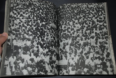
I finally got my hands on a real copy of “Women Are Beautiful” from Garry Winogrand. I did not buy one but found it at the Art Institute of Boston (AIB) library which is located close to Fenway park and not far from where I live. I could not borrow it so I just sat there to browse it and put it back on the shelves. I should add that the AIB library has a strong collection of photo-books, and a small exhibition room (I saw big prints from Meyerowitz on show few weeks ago).

The "Women Are Beautiful" copy at the AIB, Boston

“Women Are Beautiful” by Garry Winogrand was issued in 1975 and has been a commercial failure. It is now out of print and it is really hard to find copies of it. Sometimes you might find some for sale (e.g. on Amazon) but they are very expensive. Not only it is a rare book but also –  and partly because of that – it is kind of “cult”, at least in the contemporary Street-Photography circles where Winogrand is one of the most (if not the most) praised SP master. And this specific book is maybe the most emblematic – or should I say instead “problematic” – of his career, as well as the most difficult to find today.

Probably because of that the first thing that stroke me is that it is actually a little physical thing. I don’t know if another (larger) format exists (*) but the one I browsed is about 8×10 inches, with pictures reproductions inside about 5×7. It is rather thin and it has a soft cover. Actually it is very similar from the blurb book I got. For some (obvious) reasons I thought it was bigger, thicker, with a hard cover (*).

(*) note: there is another version of this book with hard cover, dust-jacket and is probably a larger format.

Also it is rather banal in the way it is made. There is the short essay from Helen Gary Bishop, and then the pictures which are untitled. It looks like if it was done quickly with not too much thoughts nor craft put in it. By that I mean there is no effort to make it a “great” photo book and it probably reflects Winogrand low interest to put too much energy in making a book. Also I am not sure who did the editing, can’t remember to read something specific about that.

The pictures themselves I know almost all of them before, but never saw one in print (although I saw couple of them reproduced in other Winogrand books, such as “The Man in the crowd”). The print quality of the book is not outstanding, to say the least, which reinforces the feeling that this is definitely not a “nice” photo-book. You look at it the same way jazz connoisseurs would listen to old recordings of – say – Charlie Parker. You don’t necessarily expect too much quality in the reproduction but instead are after someone or something who/which has something to say.

As I said before most of the image from the book are familiar to me, but looking at these photographs of women in the context of this book in hand is a rather different experience than looking at jpeg files on a monitor. Of course that is true for most photography work but in that specific case I noticed something that maybe is obvious for many but that I missed before: actually most of these photographs have the women breasts as a pivotal element. Sometimes it can be subtle, such as in this photograph where a woman is standing on the sidewalk and is seen from back, holding something in her hand whilst on the left there are dummies inside a garment store with the light falling on the fake breasts. Or it can be straight forward such as in the photograph below.


In a sense “Women are Beautiful” is almost a series of breasts photographs instead, an iteration of woman breasts, but not much in the voyeuristic sense of it. I guess it can be seen like that … or well I wondered if it is just me … but then I read the essay from Helen Bishop and at the end she elaborates about that very fact too, that the women photographed have their presence made obvious and sexual thanks to their breast (something like this, I should have noted the exact words). More specifically it appeared to me that most compositions were build with the nipples pointing somewhere whilst the eyes are directed in another direction, which kind of creates a strange twist. I believe this aspect of the images makes Winogrand work about women peculiar and sets it apart from the average – and utterly cliched – “woman in the street” photograph.

Out of the 84 images from this book there are few that I did not see before. One that really caught my attention represents a woman lying in a park but who is almost completely hidden by dogs. It is one of the very few image from the book where the presence of a woman (and her breast) is not obvious. Interestingly enough it is to the benefit of another subject matter that Winogrand liked to shoot: dogs.


Engelen van het trottoir
De Amerikaan Garry Winogrand beheerste iets onbeheersbaars: het toeval. Zijn straatfoto's behoren tot de beste die er zijn gemaakt.
Hans den Hartog Jager
21 januari 2005

Sommige fotografen zijn graag jagers. Dat zijn niet degenen die zich opsluiten in hun studio met decors en schermen en lichtmeters en make-up-assistenten. Ook niet de fotografen die hun beelden grotendeels componeren achter de computer – daar houden jagers niet van. De jagers zijn de journalisten, de nieuwszoekers, de thrill-seekers, die hun camera beschouwen als het middel om het volle leven mee te vereeuwigen. Ze vergelijken zichzelf graag met Weegee, de New Yorkse Batman-in-regenjas die in de jaren dertig en veertig van de vorige eeuw misdadigers en lijken naar de beeldenhemel hielp, of met Robert Frank, die de ziel van Amerika in zijn camera probeerde op te sluiten. Romantiek, snelheid, leven, daar houden de jagers van, en hun beelden willen daarvan een weerspiegeling zijn.

Maar hoe maak je in godsnaam een levende foto?

Garry Winogrand (1928-1984) wist dat wel – en hoe. Winogrand werkte in de jaren vijftig als commercieel fotograaf, voor hij, geïnspireerd door het werk van onder anderen Walker Evans en Robert Frank, besloot zelf op straat zijn versie van Amerika vast te leggen. Van dat werk is nu in het Foam in Amsterdam een overzicht ingericht – samen met dat van collega-Street Photographers Mitch Epstein, Lee Friedlander, Joel Meyerowitz en Henry Wessel – dat om verschillende reden niet gemist mag worden. Dit vijftal behoorde tot de eerste generatie die de stad introk, niet om nieuws te vergaren of misdaden vast te leggen, maar om op beeld te jagen. Levend beeld. Beeld met betekenis. Niet voor niets is Winogrands beroemdste uitspraak dat hij fotografeerde `om te zien hoe dingen eruitzagen als ze waren gefotografeerd'. Dat is minder obligaat dan het klinkt: het toont Winogrands besef dat de fotograaf de werkelijkheid kan kleuren, keuzes kan maken, een eigen interpretatie geeft.

Daarbij werd Winogrand, eind jaren vijftig, begin jaren zestig, geholpen door de mogelijkheden van de nieuwe kleinbeeldcamera. Die maakte dat fotograferen geen ingewikkelde procedure meer was. Winogrand ging de straat op (liefst in New York) en als hij iets zag dat hem beviel – een groepje mannen en een vrouw in een auto, een jongen op een dierenshow, een mooie vrouw – stond hij stil, keek door de zoeker (maar lang niet altijd) en drukte af. Zo vaak hij maar wilde, hoogstens beperkt door het aantal rolletjes in zijn binnenzak. Die sta-en-ik-schiet-houding (en daarmee de autonome werkelijkheid van de foto) benadrukte hij nog eens door zich weinig aan te trekken van `ouderwetse' esthetische normen als een rechte horizon en evenwichtige compositie. Daar doet het echte leven ook niet aan.

Zo ontstond, met de opkomst van de eerste generatie straatfotografen een interessante kwestie: wat is, als oude esthetische normen niet voldoen, een goed beeld? Op de tentoonstelling in Foam is, intrigerend genoeg, goed te zien dat de fotografen dat zelf ook niet altijd wisten. Soms ging hun eigen romantiek met ze op de loop. Dat lijkt achteraf gezien misschien begrijpelijk (welke kunstenaar weet nu wél precies wat-ie doet?), maar die zoektocht geeft hun werk in retrospectief ook iets roerends. Zie de jager, in vol ornaat op straat, die niet weet of hij een kip of een olifant gaat schieten.

Anekdote

Het aardige is nu juist dat wij, de toeschouwers, wel kunnen zien wat achteraf het beste gewerkt heeft. En eigenlijk is dat simpel: het is altijd, zonder uitzondering het autonome beeld. Maar wat is een autonoom beeld? Als er iets boeiend is aan deze Foam-expositie, dan is het wel dat je zelden zo goed kon zien wat een goede straatfoto is, en wanneer die werkt.

De belangrijkste val, zo blijkt al snel, is de anekdote. Een beeld is geen anekdote. Dat lijkt een open deur, maar voor de man of de vrouw met een camera blijkt er weinig verleidelijker te zijn dan het vastleggen van een `gekke gebeurtenis'– men werpe een blik in het eigen vakantiealbum. De drie bijna-identieke mannen op het Franse bankje. De fiets zonder achterwiel, eenzaam aan de gracht. Het levende standbeeld. Zulke foto's worden niet gemaakt om het beeld, maar om het verhaal erachter – de foto is niet meer dan een illustratie. Hoe simpel dat besef ook lijkt, toch zwichten zelfs `kanonnen' als Epstein, als Wessel, als Meyerowitz voor het fenomeen. Zo komt Joel Meyerowitz onder andere met een stel in bijna-identieke beige regenjassen die worden weggeblazen door een enorme rookwolk uit een put (lachen!). Mitch Epstein toont een straatscène waarop een dikke politieman in een enorme gaap uitbarst (gieren!). Of een foto van vier meisjes die een reusachtige slang betasten (brullen!). Hierop zijn ook nog variaties te bedenken, zoals de foto van de man die omvalt bij de halte van een metrostation (de Lucky Luke-variant: `ik trok mijn camera en had 'm voor-ie de grond raakte!') Zulke foto's zijn flauw omdat ze het vooral moeten hebben van het verhaaltje dat je als toeschouwer zelf kunt verzinnen. Van het gevoel dat de fotograaf erbij was. Typisch een kwaal van een fotograaf die te lang over straat heeft gezworven en blij is dat hij wat meemaakt.

Een andere valkuil is de `mooie' foto. Meestal is die tegenwoordig het domein van de tweedejaars kunstgeschiedenis en/of kunstacademie, maar ook bij de straatfotografen is die niet afwezig. De `mooie foto' toont vooral de trots van de fotograaf dat-ie esthetiek in het wild heeft herkend – de zware schaduwpartij die over een straat valt, mensen die zonder het te weten op identieke afstand van elkaar staan. Het is de esthetische variant op de `gekke gebeurtenis': mooi, maar betekenisloos en in die zin net zo makkelijk als een door het toeval (of een olifant) gecomponeerd abstract schilderij.

Intellectueel

Wie beseft dat zulke valkuilen door de echt goede fotograaf zoveel mogelijk worden vermeden, ziet meteen dat Lee Friedlander en Garry Winogrand verreweg de beste fotografen op deze tentoonstelling zijn. Friedlander is eigenlijk het buitenbeentje, de intellectueel van het vijftal, die niet voor niets in twee aparte kabinetten hangt. Zijn werk gaat vooral over de rol van de fotograaf als manipulator – op veel van zijn foto's duikt hij zelf op, bijvoorbeeld in de beroemde foto van een vrouw met bontkraag, op de rug gezien, die zwaar overschaduwd wordt door het silhouet van de fotograaf.

Maar de meeste aandacht gaat, terecht, uit naar het werk van Winogrand. Zijn werk is zo bijzonder omdat hij iets lijkt te beheersen wat niet te beheersen valt: het toeval. Om daar iets over te zeggen is het goed te beseffen hoezeer Winogrands oeuvre, net als dat van zijn collega's, altijd het resultaat was van twee keuzes. De eerste keuze was het kiezen van het moment van fotograferen, het zoeken naar het decisive moment, waar jagende fotografen vaak lang over kunnen bomen. Toch doet dat inbreuk aan het belang van de tweede keuze: het achteraf door de fotograaf selecteren van de juiste afdrukken. Over Winogrand gaat niet voor niets de mare dat er bij zijn dood zeker 2.500 onontwikkelde rolletjes in zijn studio werden aangetroffen. Winogrand moet in zijn leven vele honderdduizenden foto's hebben geschoten, en uiteindelijk bleven er maar enkele honderden over die hij goed genoeg vond om te tonen. Dat is louter een kwestie van selectie achteraf, van nog eens kijken, nu niet meer naar de werkelijkheid, maar naar de afgeleide werkelijkheid van de foto's. Juist voor die tweede werkelijkheid had Winogrand een feilloos oog: het is opvallend hoe weinig hij trapt in de valkuil van de `gekke' of de `mooie' foto.

Dat blijkt in de eerste plaats, zij het niet eens opvallend, uit Women are beautiful (1975), bijna in zijn geheel in Foam te zien. Alle foto's uit deze serie zijn van vrouwen op straat, meestal frontaal (Winogrand was duidelijk een borstenman) in `volle actie' genomen. Uit deze serie blijkt goed hoezeer Winogrand trouw was aan zijn eigen adagium: alle vrouwen op deze foto's zijn mooi, terwijl je als toeschouwer ook beseft dat ze dat in werkelijkheid lang niet allemaal geweest zijn. Winogrand maakt ze mooi met een slimme inhoudelijke truc: hij maakt zijn vrouwen mooi door een contrast. Op opvallend veel van Winogrands Women-foto's staat wel een man met een dom gezicht of in een slecht pak, of allebei, of een paard of een groepje geile gluurders, die een schrijnende tegenstelling vormen met de jonge vrolijke, stralende vrouw. (Dat is overigens precies dezelfde truc die het Foam gebruikt om het genie van Winogrand te tonen: door hem te omringen met werk van iets mindere `soortgenoten' springt hij er nog beter uit.)

Lichtbanen

Toch zijn de Women-foto's niet Winogrands beste. Dat zijn die paar foto's waarin vorm en inhoud, anekdotiek en esthetiek, elkaar opstuwen, op zo'n manier dat het Winogrand zelf vermoedelijk ook heeft verbaasd. Neem Los Angeles, California (1969) een foto van drie meisjes. Ze zijn jong en mooi en modieus, en de hogere krachten beseffen dat: ze geven de engelen twee meer dan vrouwbrede lichtbanen mee die stralen over het trottoir. En dat is nog niet alles: precies naast de lichtbanen, in de schaduw, staat een jongen in een rolstoel, zijn hoofd onderuitgezakt, in een machteloze houding – de drie engelen zien hem en kunnen hun afschuw niet onderdrukken. Winogrand heeft dit gezien, misschien niet eens alles tegelijk, maar in ieder geval heeft hij op het juiste moment afgedrukt.

Of neem de foto Staten Island Ferry (1971). We zien de voorkant van de boot, wit, vrolijk en vol. Alle dagjesmensen staan aan de reling, zowel op het centrale dek als op de verdieping erboven. Slechts één echtpaar is in het midden blijven staan, aan weerzijden van de paal die het bovendek ondersteunt. De symmetrie rond de paal is bijna perfect – het is een prachtige verbeelding van eenzaamheid zonder alleen te zijn.

Met zulke foto's, composities die geen composities zijn, treft Winogrand de essentie van de straatfotografie: hij ziet hoe het lot commentaar geeft op haar mensen. Dat lot is de vorm, het licht, een subtiel beeldrijm, die iets inhoudelijks toevoegen aan het beeld dat je zelf nooit zou kunnen verzinnen – niet zou durven verzinnen, zelfs. Neem de foto van een man en vrouw in de dierentuin, een echtpaar, ongetwijfeld. Zij is blond en jong en mooi als een model, hij is goedgekleed en knap en zwart. Alleen: het lot heeft ze allebei een aapje in hun armen gedrukt, twee schattige chimpanseetjes, gestoken in modieuze pakjes als gekoesterde kinderen. Het lijkt idyllisch, als de echo tussen de twee mensen en de twee apen niet tamelijk gruwelijk was; deze foto zegt iets heel sarcastisch over de relatie tussen blank en zwart, over vooroordelen en afstamming dat zich normaal alleen maar in crypto-racistische termen laat beschrijven. Misschien is dat racisme er ook wel, al kun je evengoed volhouden dat het wordt gecompenseerd door de liefdevolle, zelfverzekerde blikken van het echtpaar, het heldere licht en de olijke gezichtsuitdrukkingen van de chimpansees.

Van zulke perfecte foto's heeft Winogrand er wel zes of acht of tien gemaakt. Dat lijkt weinig, maar door de rest van de tentoonstelling wordt duidelijk dat dat er heel veel zijn. Tegelijk is het maar een fractie van Winogrands totale productie. Hoe goed hij ook was, blijkbaar had zelfs hij dit soort foto's niet helemaal in de hand, had ook hij af en toe een duwtje van het lot nodig. Maar dat was Winogrands grote kracht: dat hij het lot wist af te dwingen. Wie zijn werk ziet, krijgt de indruk dat Winogrands obsessie net even groter was dan die van zijn collega's, dat hij net even gedrevener was dan de anderen. Die werklust, dat fanatisme, zijn door het lot beloond met een aantal foto's, die horen tot het beste wat er is gemaakt.

Garry Winogrand and the American Street Photographers. T/m 30 maart in FOAM, Keizersgracht 609, Amsterdam. Dagelijks 10-17u, do en vr 10-21u. Inl. www.foam.nl


Hans Aarsman: 'Alsof je gewoon door een raam kijkt'
In deel 2 van een serie over beeldend kunstenaars en de kunst die hen inspireert fotograaf en schrijver Hans Aarsman over Garry Winogrand (1928-1984).
Sandra Smallenburg
2 juli 2005

'De eerste keer dat ik een foto zag van de Amerikaanse fotograaf Garry Winogrand, vond ik er niet veel aan. Het was in 1980, en Winogrand had net zijn boek Public Relations uitgebracht, met foto's van demonstraties, feestjes en openingen. Veel van die foto's waren plat van voren geflitst, waardoor de achtergrond zwart werd. Ik vond het een soort verjaardagsfotografie. Zelf werkte ik in die tijd voor kranten, maakte journalistieke foto's vanuit een links-idealistische houding.

'Maar toen ik Winogrands foto's terugzag, greep het werk me aan. Ik was op zoek naar relativering van het links idealisme in de documentaire fotografie. Winogrand maakte documentaire fotografie, maar hij deed er iets persoonlijks mee. Hij laat ons de theatrale kant zien van het dagelijks bestaan. Dat het allemaal niet zo gewichtig hoeft. Hij kiest het meest banale onderwerp dat je maar kunt bedenken, mensen op feestjes, mensen die op straat voorbijkomen. Daarin zoekt Winogrand naar iets wat ons bestaan kan optillen.

Spoor bijster

'Eind jaren '70 is Winogrand steeds losser gaan fotograferen. Op dit contactvel is dat mooi te zien. Het komt uit dé monografie over Winogrand, Figments from the Real World, na zijn dood samengesteld door John Szarkow- ski, fotografieconservator van het MOMA in New York. Szarkowski probeert in zijn boek aan de hand van dit contactvel aan te tonen dat Winogrand de laatste jaren van zijn leven het spoor bijster was. Na Winogrands dood in 1984 zijn er duizenden contactvellen en onontwikkelde films boven water gekomen. Szarkowski, een persoonlijke vriend van Winogrand, heeft al dat werk uitgezocht. Hij schrijft in dat boek dat hij zich door Winogrand eigenlijk belazerd voelde, toen hij dat late werk zag. Volgens Szarkowski deed Winogrand maar wat, klikte hij als een gek in de rondte. Voor mij bewees dit contactvel juist het tegendeel. Wat mij betreft is dit juist zijn interessantste periode.

'Mensen zien graag foto's die op schilderijen lijken. Winogrand gooide alle beeldende conventies over boord, het lijkt wel of hij ze niet eens kende. Alsof hij van de maan kwam en voor het eerst op aarde was beland. Op dit contactvel is te zien hoe Winogrand te werk ging. Je ziet hem in die auto zitten - raampje open, raampje dicht. Je voelt de beweging, het rondrijden. Hij speelt met de spijlen van de autodeur, gebruikt het kader van het raam. Of hij volgt een tijdje het trottoir, waardoor de compositie weer wat meer gekanteld is. En dan opeens ziet hij, in de verte, een vrouw met kinderwagen en stelt hij daarop scherp.

'Wat mij zo interesseert aan zijn werk is niet het onderwerp, maar de manier waarop hij kijkt, zijn grondhouding. De manier waarop hij de horizon scheef zette, is geen trucje, geen nieuwe manier om een compositie te maken. Daar was hij niet mee bezig. Het schijnt dat hij een rolletje volschoot in één of twee minuten. Dan moet hij toch steeds iets gezien hebben, er moet iets zijn wat je triggert. Als ik vroeger op reportage was, schoot ik ook wel eens vijf films per dag. Maar dan was ik 's avonds doodop van een dag lang geconcentreerd kijken. Hij deed dat elke dag, zijn hele leven lang.

Leukste foto's

'Het gaat mij bij dit contactvel niet om een enkele foto, maar om het geheel. Boeken en tentoonstellingen van Winogrand vind ik vaak teleurstellend, omdat er dan weer iemand door zijn oeuvre is gegaan die denkt dat hij de beste of leukste foto's eruit gepikt heeft. Zelf was hij niet geïnteresseerd in het maken van boeken, het samenstellen daarvan liet hij vaak aan anderen over. Hij was bezig met dat geheel, met die verzameling. Hij had stapels proefprintjes, maar aan de uiteindelijke selectie kwam hij vaak niet toe. Winogrand vond dat je niet te snel naar je eigen werk moest kijken. Hij liep altijd een jaar of vijf achter met afdrukken. Toen hij doodging, was er nog steeds dat gat van vijf jaar.

'In de jaren '80 heb ik hem erg nageaapt. Ging ik opeens ook schots en scheef fotograferen en flitsen. Na een paar jaar vond ik dat toch te opvallend. De beste foto's zijn de beelden waarbij je niet voelt dat iemand voor je in de weer is geweest. Waarbij je niet denkt: wat knap, of, dat ie dat durft. Alsof je gewoon door een raam kijkt, maar er toch iets is waardoor je blijft kijken. Daarom ben ik na een tijdje heel bewust landschappen gaan fotograferen. Die foto's waren juist het tegenovergestelde van de Winogrand-fotografie. Ik gebruikte zelfs een waterpas om de horizon recht te zetten.

'Ik hou niet zo van mijn eigen foto's. Ik zou ze nooit ophangen. Schilderijen wel, dat zijn hebbedingetjes. Als je een foto ophangt, wordt het ook een hebbeding. Dat wringt. Daarom houd ik zo van Winogrand: zijn fotografie is immaterieel. Het ging hem om het idee, en dat hoort niet in een lijstje. Toch heb ik op allerlei manieren geprobeerd om dit contactvel aan te kopen. Tevergeefs, galeries zijn alleen geïnteresseerd in het verkopen van schilderijtjes. Nu trek ik het boek waarin het contactvel staat een keer of tien per jaar uit de kast, vaak om het aan anderen te laten zien. Ik heb ook een lijst met citaten van hem. Winogrand had fantastische uitspraken, zoals 'There is nothing as mysterious as a fact clearly described.'

'Er bestaat een filmpje waarin je Winogrand aan het werk ziet. Dan zie je hem zo heel losjes de camera voor zijn gezicht heen en weer schuiven. De hele tijd rommelen met dat ding, een beetje klungelig haast, net of hij jeuk had aan zijn voorhoofd. Je begrijpt ook meteen waarom hij nooit een klap voor zijn kop heeft gehad. Je hebt namelijk helemaal niet het idee dat hij aan het fotograferen is. Winogrand was klein, en net zo onopvallend als een lantarenpaal. Ik heb eens gelezen dat hij naar mensen riep die hem vragend aankeken, nadat hij ze gefotografeerd had: You've been immortalized.'

Biografie Hans Aarsman

1951 Geboren in Amsterdam

1970-1978 Studie scheikunde en linguïstiek, Universiteit van Amsterdam

1980-1982 Rijksakademie

1980 Debuteert als fotograaf

1980 Werkt als freelancer voor Nieuwe Revu, De Groene en Skrien

1980 Mede-oprichter fototijdschrift Plaatwerk

1989 Fotoboek Hollandse Taferelen

1993 Fotoboek Aarsmans Amsterdam

1993 Maria Austria Prijs

1994 Roman Twee hoofden, één kussen

1995 Theatermonoloog De wijze van zaal 7

2001 Mede-oprichter fototijdschrift Useful Photography

2002 Theatermonoloog Ruis, over Garry Winogrand

2003 Fotoboek Vrrooom! Vrrooom!, met tentoonstelling in Nederlands Fotomuseum 2004 Fotoboek Onzichtbaar Gent

2004 Column de Volkskrant: De Aarsman Collectie

2005 Theatermonoloog Zeg het maar


Views & Reviews DAY OF PARIS Andre Kertesz EYES ON PARIS PARIS IN PHOTOBOOKS FROM 1890 TO THE PRESENT Photography

$
0
0

DAY OF PARIS / Andre Kertesz, George Davis (Editor)
1945, NY, 148 pages, 183 x 245 x 12


Eyes on Paris shows how artists engaged in photography (French and immigrants alike) saw, experienced and captured Paris with the camera. The artists’ gaze oscillates between documentary interest and subjective perception, a chronicler’s duty and the projection of personal feelings. Around 400 photographic works by important representatives of 20th-century photography enter into a dialog with epoch-making books, portfolios or rare portfolio works. After all, no other city in the world has been the subject of as many outstanding publications as has Paris: from Atget to Ed van der Elsken, from Robert Doisneau to William Klein.


The Poet of Modernism, André Kertész Retrospective, The Hungarian National Museum, Budapest


Text by Alison Frank

Following on from the Royal Academy of Arts‘ show, Eyewitness: Hungarian Photography in the 20th Century earlier this year, The Hungarian National Museum celebrates the career of Hungarian-born photographer, André Kertész, originally named Andor Kohn, (1894-1985) who spent most of his career as an exile, first in Paris, then in New York. The Hungarian National Museum‘s retrospective of his career contains two sections. The main section gives a chronological overview of Kertész’s career; curated by Michel Frizot and Annie-Laure Wanaverbecq, this retrospective was previously exhibited in Paris, Berlin and Winterthur (Switzerland). The second, much smaller section, is a special Hungarian addendum curated by Eva Fisli and Emöke Tomsics as part of the museum’s international conference, Views of Kertész.

The latter section looks at the reception and influence of Kertész’s photography in Hungary from the beginning of his career to the present day. It begins with a copy of the magazine where Kertész published a photograph in 1917, and ends with some pieces by contemporary photographers responding to his work. This text-dense segment of the exhibition explains that under Communism there was an attempt to appropriate the work of Hungarian nationals living on the other side of the Iron Curtain. Successful Hungarian émigrés were taken as examples of innate Hungarian talent, and their work was scrutinised for its sociological dimensions. This led to Kertész being incorrectly categorised in Hungary as a social realist photographer rather than the independent documentarian of emotion he considered himself to be.

The exhibition’s main retrospective spreads across five rooms: one each for Kertesz’s Hungarian, Parisian and New York periods, a round room for his photographic nude “distortions”, and finally a long narrow room displaying magazine spreads of his photojournalism.

Kertész was 18 years old before he received his first camera, but as early as the 1910s, he was already experimenting with night-time and underwater photography: his Underwater Swimmer (1917) appears particularly ahead of its time. Kertész began by taking photographs of friends and family, especially his brother Jenö who was willing to be photographed in a variety of dramatic and athletic poses. When he was conscripted during the First World War, Kertész took photographs of fellow soldiers at rest. Capturing lighter, informal moments of military life, these images offer an unaccustomed image of World War I.

In 1925, Kertész moved to Paris, where (the exhibition notes explain), he became “one of the leading figures in avant-garde photography”, alongside Man Ray. Characteristic of his modernist experimentation was The Fork (1928), in which he made clever use of shadows to alter the object’s usual appearance. For the light-hearted and “racy” Parisian magazine Le Sourire he created a series of “distortions” of female nudes, which he achieved through the use of curved mirrors (hence the curators’ decision to exhibit these images in a curved space). Some of these images are intriguing artistic abstractions; others create bizarre funhouse mirror effects, while others still give a disconcerting impression of deformity.

Kertész achieved a more consistent impression with his photographs of artists’ studios, starting with Mondrian’s. In these, the photographer managed to create a portrait of the artist in absence, making use of light, shadows, personal items and occasionally art pieces to evoke the style and personality of the studio’s inhabitant. In Paris, Kertész made his living through photojournalism, contributing to the birth of a new medium of expression. He worked primarily for the news magazine VU, creating more than 30 photo essays between 1928 and 1936.

In 1936, Kertész moved to New York, where he would spend the rest of his life. He was lured to America by a contract with the Keystone agency, which was broken after just one year. Not speaking English, and classified as an enemy alien during World War II, Kertész felt isolated and unhappy in New York. These feelings were reflected in Kertész’s photographs of lone clouds, menacing pigeons, and general abstraction which rendered the city anonymous. His work was not well-received in New York, and in order to survive, Kertész spent 14 years taking conventional shots for Home and Gardens magazine. Following his retirement in 1961, Kertész saw his work gaining international recognition, with exhibitions at the Venice Photography Biennale, the Bibliothèque Nationale and the MoMA. In 1982 the Ministry of Culture in Paris awarded Kertész the Grand Prix National de la Photographie.

Long after he had become an established photographer, Kertész said, “I regard myself as an amateur today, and I hope that’s what I will stay until the end of my life. Because I’m forever a beginner who discovers the world again and again.” Kertész saw photography as a sort of visual diary that documented the way he felt about the world around him, and insisted that emotion was the basis of all his work, rather than an artistic impulse. The power of Kertész’s images seems accordingly to emanate not just from their strong and balanced composition, but from the intense feeling that they capture.

André Kertész Retrospective, 30/09/2011 – 31/12/2011, The Hungarian National Museum, 1088 Budapest, Múzeum krt. 14-16, Hungary. www.hnm.hu.

The melancholy life of the amazing André Kertész
Though a master of composition, the Hungarian photographer could never really find himself in the frame

Mondrian's Pipe and Glasses, Paris 1926 - Andre Kertesz

Although his name is whispered in hushed tones among many of today's photographers (our own Roger Ballen included) throughout much of his life Hungarian photographer André Kertész laboured much if not unknown then at least overlooked - to his own mind at least. Deeply reserved, Kertész consistently remained true to his beliefs and origins. His work, which received belated recognition from the 1960s on - with another ignitive spark in the 1980s - always drew on his personal life yet never lapsed into autobiography.

As a young man in the early 1920s, he photographed the Hungarian peasants around him. His clarity of style, emotional connection with his subjects and the geometric patterning of his photographs were evident from the outset. For Kertész, taking a photograph involved encapsulating an atmosphere but also solving compositional problems linking form to content.

Susan Sontag has described his work as 'a wing of pathos'. Certainly, his photographs, The Fork and Mondrian's Pipe and Glasses not only constitue admirable formal compositions, but seem to elevate seemingly trivial details into quite meditative poems.  All of which makes us all the happier that he is one of the initial photographers featured in our new Phaidon 55 iBook series which launches next week.

As Kertész's photographs began to be published in magazines so his confidence grew. In 1925 he moved to Paris where he threw himself into the art scene, becoming connected to the Dada movement and taking photographs every day. As persecution of the Jews increased he moved to New York which, as Surrealism and Constructivism began to run out of steam in Europe, supplanted Paris and Berlin as the centre of artistic creation. Kertész drew more commissions and his work spread.

Towards the end of his life however, Kertész often spoke of the lack of close contact with other artists. In Paris, he had created his masterpieces in Mondrian's home or at the Hotel des Terrasses. In New York, he officiated at the Saks stores or at Winthrop Rockefeller's home. The surroundings had changed but he had remained the same. Those who knew him in his later years recall his fatalism and an inclination towards melancholy. Isolated in New York, eternally rootless, without contact with other artists, nothing really stimuated him.

He died in New York in 1985 leaving behind 100,000 negatives many of which to this day, remain unseen. It was Henri Cartier-Bresson who perhaps provided the most fitting tribute when he said: "Each time Andre Kertész's shutter clicks, I feel his heart beating." For now, enjoy the photos and their descriptions below and when you've done that check out the book on iTunes.

Meudon, France, 1928 - Andre Kertesz

Meudon, France, 1928 Kertész used a Leica to produce this miraculous snapshot. This camera first appeared in Germany in the 1920s. Kertész began using one in 1928, three years prior to Henri Cartier-Bresson. Light and easy to
handle, it used film on rolls, and was to become the favourite camera of photojournalists. A vision of movement and speed, capturing people walking in the street and the engine powering over the viaduct, this photograph is an example of what the leader of the Surrealists, André Breton, described as ‘opportune magic’. It is thought that the man in the foreground may be the German painter Willi Baumeister, and the parcel he is holding the stretcher of a canvas. Kertész had known him since 1926, when he photographed him in the company of Mondrian and Seuphor.

Lost Cloud, New York, 1937 - Andre Kertesz

Lost Cloud, New York, 1937 It was unusual for Kertész to give his works proper titles such as this, as opposed to captions used for filing purposes (date,
place, names of individuals, etc.). The adjective ‘lost’ endows the cloud with a
personal, emotional dimension. The picture can be seen as an allegory of Kertesz’s own displacement – far from the artistic fraternity of Montparnasse, poorly used professionally, and cut off from his roots.

The Circus, Budapest, 1920 - Andre Kertesz

The Circus, Budapest, 1920 Kertész often photographed people who were in
the act of looking, rather than focusing on what they were looking at. This
photograph, ironically entitled The Circus, frustrates our voyeuristic curiosity in order to show us the importance of looking. The simplicity of the composition saves the image from being merely an amusing vignette, however, endowing it with value as a metaphor for the photographer’s abiding question: what is truly worth looking at?

The Fork, Paris, 1928 - Andre Kertesz

The Fork, Paris, 1928 This photograph was shown at the ‘Salon de l’Escalier’ (Paris, 1928) and at ‘Film und Foto’ (Stuttgart, 1929) and was used in an
advertisement for the silversmiths Bruckman-Bestecke. The purity of the
composition matches the function of the object – the fork is not depicted merely as a formally beautiful object, but also retains its qualities as a utensil. With
this vivid description of the spirit of an object, Kertész fulfilled an important artistic goal.

Mondrian’s Pipe and Glasses, Paris, 1926 (main image, top of story) First shown in 1927 at the Au Sacre du Printemps gallery, this photograph synthesizes the modernist ideas promoted especially by L’Esprit nouveau (The New Spirit, 1920–25). This journal, founded by poet Paul Dermée, Le Corbusier and the painter Amédée Ozenfant, promoted new forms of expression, which aimed to express the ‘lyrical beauty’ of the world of objects. Through his instinctive ability to integrate refined, abstract forms, Kertész captures the spirit of Mondrian’s paintings.

New York, 1975 - Andre Kertesz

New York, 1975 When taking high-angle shots, Kertész frequently used a zoom lens. In this way, he compensated for his unchanging vantage point through the possibility of surveying a great variety of visual fields. Even if, at the age of eighty-one, the streets were now out of bounds to Kertész, he never completely abandoned the subjects dear to his heart. These photographs echo the series ‘As from my window I sometimes glance’ (1957–58) taken by voluntary recluse W. Eugene Smith from the window of his Sixth Avenue apartment. You can find the André Kertész Phaidon 55 iBook
.


Views & Reviews Unlovely but very Beautiful A New Map of Italy The Photographs of Guido Guidi Photography

$
0
0

A New Map of Italy.
The Photographs of Guido Guidi.
Photographs by Guido Guidi.
Loosestrife Editions, 2011. 120 pp., 64 illustrations, 10½x12".

Selected as one of the Best Books of 2011 by:
Martin Parr
Horacio Fernández
Adam Bell
Marco Delogu

Italian photographer, Guido Guidi began experimenting in the late 1960s with pseudo-documentary images that interrogated photography’s objectivity. Influenced by Neorealist film and Conceptual art, in the 1970s he began investigating Italy’s man-altered landscape. Working in marginal and decayed spaces with a (8”×10”) camera, Guidi creates dense sequences intended as meditations on the meaning of landscape, photography, and seeing. Later he investigated the life and death of modernist architecture, with projects on Scarpa, van der Rohe, and Le Corbusier. Photography for Guidi is something autobiographical. It is synonymous with inhabiting, and the camera is the instrument that allows him to observe, appropriate and collect what lies beyond his doorstep.

From the essay by Gerry Badger: “What seems certain is that Guido Guidi’s “ugly” photographs, as he calls them, are original, complicated in their simplicity, artful and deeply felt. They may be unlovely, but-they are also very beautiful.”


Guido Guidi / Veramente
past / 14 June 2014 / 7 September 2014

Guido Guidi (born in 1941, in Cesena, north-eastern Italy) had originally wanted to be an architect or a painter, but during his studies at the University of Venice he began to develop an interest in photography. By the mid-1960s he had devoted himself entirely to photography. Guidi directs his camera towards urban architecture, industrial landscapes, and periurban environments in an entirely original way. His approach is poetic and attentive, and could also be said to be descriptive in nature. His photographic work has given rise to a rich visual archive of the landscape of Italy, both natural and man-made. In 2013 Guido Guidi won the prestigious PixSea Oeuvre Award, resulting in his international breakthrough.

First-ever retrospective
For Guido Guidi photography is a way of life and the extension of his gaze. In the early years of his career Guidi shot in black-and-white, making series that were strongly influenced by the conceptual art of the period. In the ’80s and ’90s he started using a large-format camera, shifting his focus towards landscape photography. It marked a turning point in his career, after which he would devote increasing attention to his own, innovative approach to photographing his surroundings. The same interest characterized the work of his contemporaries –  including Luigi Ghirri, Mario Cresci and Olivo Barbieri – who, like Guidi, were inspired by the work of Walker Evans and the American photography of previous decades. Veramente is the first-ever retrospective of the 40-year career of this leading Italian photographer, showing Guidi’s experimental black-and-white photos from the 1970s alongside the colour series that have become emblematic of his oeuvre, such as In between cities, A new map of Italy, and Preganziol.

Architecture and photography
The young Guido Guidi studied architecture at the IUAV (Università di Venezia) – an institution founded in 1926 and specialized in architecture and design – and then attended the Corso Superiore di Disegno Industriale in Venice. His teachers included such famous architects as Carlo Scarpa and Luigi Veronesi, whose work has continued to strongly influence his own.

As a photographer of the urban environment, Guidi concentrated on the changes he saw taking place in the contemporary landscape. He wanted to document the Italy nobody knew; life in the margins of Italian culture at its urban ‘edgelands’, border areas that defied conventional description and for which a new idiom needed to be invented. Working outside the constraints of an established viewpoint, and with no prescribed iconography to follow, Guido Guidi developed an entirely original vision of this environment. He looks at it as if he were ‘to one side of his subject, or in its shadow’, as Marta Dahó writes in the exhibition catalogue.

Guidi’s earlier photographs were mostly of his own surroundings: Emilia-Romagna, Ravenna, and Porto Marghera, the industrial area close to Venice.  However, from 1993 onwards he undertook travels through Europe, in the company of the architect Marco Venturi, to document the expansion of the European Union and its newest urban areas. Over the course of three two-week journeys they travelled from Saint Petersburg to Fisterra in Spain. The journey led, in 2003, to the publication of In between cities. Un itinerario attraverso L’Europa 1993–1996. In this series of photographs – a number of which are included in this exhibition – we can already see Guidi’s interest in the marginal: the fragmented, minimalist facets of a landscape in continual motion.

Guido Guidi’s close relationship with architecture can be felt in much of his photography, such as the series he made of the Brion Tomb sanctuary built between 1970 and 1978 by the architect Carlo Scarpa, who had also given Guidi lessons in photography. Guidi has spent years photographing this monument at different moments during the day and in different seasons, using his camera to explore the building’s fundamental principles and the glimpses it affords of the relationship between time and space.

An oeuvre in books
Outside Italy Guido Guidi’s oeuvre has remained comparatively unknown. His photo books, however, are greatly sought after, and form part of the exhibition. The most important titles include Varianti (1995), which spotlights the photographer’s early years, and the monograph A New Map of Italy (2011). A number of photographs from both these titles have also been included in the exhibition. Guidi prefers not to photograph Italy’s familiar holiday destinations, but instead its ‘ordinary’ spots. He focuses on everyday reality, and avoids the country’s stereotypical folkloric and historic subjects. In doing so Guido Guidi has succeeded in creating a magnificent and entirely personal oeuvre – one that has set the tone for many other photographers.

Catalogue
The exhibition is accompanied by the catalogue Veramente, containing an introduction by the exhibition curator Agnès Sire and an article by the photographic historian Marta Dahó.
Guido Guidi, Veramente / texts by Agnès Sire and Marta Dahó / published by MACK / 172 pp. / isbn 978 190 794660 8

MACK published Preganziol in 1983. This original photographic series, made thirty years ago in an abandoned garden house in Preganziol as a study of light, time and environment, has also been included in the exhibition.


A NEW MAP OF ITALY: The Photographs of Guido Guidi
by Adam Bell
A New Map of Italy: The Photographs of Guido Guidi
(Loosestrife Editions, 2011)

Covering the last 20 years, Guido Guidi’s new book A New Map of Italy is an excellent introduction to a seminal Italian photographer. Edited and designed by the photographer John Gossage, A New Map of Italy draws from Guidi’s vast archive of images and past books, but also contains many previously unpublished photographs. Like his influential forefather and near contemporary Luigi Ghirri, Guidi is a photographer whose gritty Neorealist-influenced documentary work is little known and underappreciated in the United States. Working in the tradition of Eugène Atget, Walker Evans, and Stephen Shore, Guidi’s large format color photographs are full of surprises and pictorial sophistication.

Using an 8 by 10 view camera, Guidi’s work is largely concerned with the contemporary Italian social landscape, eschewing the picturesque and romantic. For the past several decades, Guidi has photographed the liminal and man-altered landscapes of contemporary Italy and Europe. While this is a well-trod (and often cliché) subject for photographers, Guidi’s work is distinct and compelling. Along with portraits of strangers and friends, A New Map of Italy focuses on the rugged back roads, trash heaps, scratched walls, dilapidated villas, and abandoned construction sites of Italy to form a complex portrait of a country in decline and flux. Deadpan, weatherworn, and elegant, Guidi’s photographs offer a grim metaphor for the state of Italy.

The view camera that Guidi employs is an awkward but highly precise instrument. Prized for its hyper-real clarity and rich tonal rendition, it also allows users to manipulate the camera’s plane of focus and correct convergent lines in architecture. Heavy, cumbersome and notoriously difficult to master, the camera is handled effortlessly by Guidi, resulting in images that resemble casual snapshots. At the same time, Guidi’s pictures are visually astute and complex—the minor distortions and shifts of focus subtly drawing our attention to the act of looking. Even Guidi’s restrained palette, a muted sun-bleached cyan tone, seems to defy the camera’s intended purposes and matches the images’ restrained, utilitarian aesthetic.

Measuring roughly 10 by 12 inches, A New Map of Italy’s elegant design allows the photographs to take center stage. The book’s end-pages are an especially nice touch. On both the front and back endpages are paired photographs of walls and corners—first leading readers in and around a corner into the book, and then ushering them out at the end. The book also contains two essays by Gerry Badger and Marlene Klein. Badger is one of the preeminent photography critics, and his essay is especially worthwhile. Too often essays in photo books are disposable, pedantic filler. Fortunately, Badger is insightful, astute, and thankfully, free of academic or theoretical jargon.

Quoting Lincoln Kirstein’s afterword in Walker Evans’s seminal book, American Photographs, Badger draws a direct parallel with Evans’s work of the 1930s. As Kirstein wrote, “here are the records of an age before an imminent collapse. [Evans’s] pictures exist to testify to the symptoms of waste and selfishness that caused the ruin and to salvage whatever was splendid for the future reference of survivors.” Like Evans, Guidi’s images are brutally honest, but also deeply affectionate. At the same time that they indict the “symptoms of waste and selfishness,” they celebrate the quotidian beauty of the land and its people.

Another major influence in Guidi’s work—along with Italian Neorealist film, Conceptual Art, and other large-format documentary photographers—is the photographer Luigi Ghirri, a towering figure in Italian photography whose influence can be seen throughout Guidi’s work. The two not only share a similar palette, but also an appreciation for their native Italy’s quotidian beauty. The book’s use of the map can be read as a nod to Ghirri, who not only photographed and loved maps, but also produced a body of work on the subject entitled Atlante.

As the book’s title and the cover photo of a faded map suggest, the work is a remapping, or alternative mapping, of modern Italy. Dense and complex, Guidi’s self-professedly “ugly” pictures provide a deeply nuanced exploration of the contemporary Italian landscape. The broken landscape, buildings, and solemn portraits of Guidi’s work form a narrative of contemporary Italy in flux, but rooted in the commonplace. As Italy and its European neighbors plunge into economic and political turmoil, Guidi’s images point beyond the mythic past or turbulent present to an honest and gritty reality of his subjects and the country he loves.


the Importance of the Performative Process in Photography Nokturno Andrej Lamut

$
0
0

Nokturno

Andrej Lamut – Nokturno
ISBN 978-961-93414-5-2
Dimensions: 17 x 24 cm
Pages: 80 pages
Paper: Munken pure rough cream 150g
Binding: sewn hardcover with open spine
Design: Andrej Lamut & The Angry Bat
High quality offset duotone printing
First Edition of 300 books
Publication date: 2017

Nokturno is a concretization of the ambiguity of photography – photography that has renounced both a demand to be a truthful imitation of an objective external reality, as well as a demand for the projection of a creator’s inner experience on the object of representation. With this project, I would like to encourage the viewers to think about their role in creating meaning through photography and particularly about the importance of the performative process in photography.” – Andrej Lamut

Andrej Lamut, born 1991 in Ptuj, Slovenia, is a Master of Visual Communications Design and recipient of the Prešeren award for outstanding execution of his masters project Performative Process of Photography – Nokturno. In the academic year 2011/12 he received an Award for outstanding achievement and excellence from the Academy of Fine Arts and Design in Ljubljana, Slovenia. Between 2013 and 2015 he was the recipient of the Slovenian Ministry of Culture scholarship grant for his postgraduate studies. In 2016 he was selected as the highest achieving student of post-graduate studies in the Municipality of Ptuj. He is the winner of the international photo competition First Shot / Prvo okidanje 2013 and an ESSL Art Award 2015 Nominee.

Andrej Lamut - NOKTURNO - DummyBook from Lamut on Vimeo.


Views & Reviews My Work Comes out of my Life Speed of Life Peter Hujar Photography

$
0
0


American photographer Peter Hujar (1934-1987) started his career in the 1950s as an assistant to commercial photographers, but became a part of the group of underground artists, poets and musicians who formed the downtown New York art scene of the 1970s and 80s. His portraits of the often outrageous characters who formed the Manhattan art and entertainment scene at that period, as well as his animal and landscape photographs, are meticulously shot and soberly composed. Peter Hujar – Speed of Life, a major retrospective presented by the Hague Museum of Photography in cooperation with the Morgan Library & Museum in New York and Fundación MAPFRE in Madrid, includes over a hundred vintage photographs made by Peter Hujar in the period between the mid-1950s and his premature death in 1987.

Nan Goldin said she believes that Peter Hujar deserves to be as famous as Robert Mapplethorpe (1946-1989), a younger photographer whose photos share similarities with Hujar’s work. However, Mapplethorpe fixated upon outward beauty, celebrity, sensation, shock, and self-promotion, while Hujar focused on character, experience, and the mental life of his subjects, who he encountered in intimate settings. Mapplethorpe’s commercial instincts were much stronger than Hujar’s. Many witnesses describe Hujar as a difficult man and well-known photography critic Vince Aletti – one of his best friends – reports that “he could never sell himself”. But despite his horror of commerce and regular quarrels with major galleries, Hujar spent his life fighting for wider public recognition of his work.
Like artist Alice Neel (1900-1984), the subject of a recent large-scale retrospective at the Gemeentemuseum Den Haag, Hujar was among the people who hung out at Andy Warhol’s Factory. It was there that he met flamboyant figures and transgender individuals like Jackie Curtis and Candy Darling – stars of Lou Reed’s song Walk on the Wild Side. Hujar himself also displayed the courage it took to be openly gay at that time – one of his most important love affairs was with American artist Paul Thek (1933-1988).
Hujar always established a relationship with the subjects of his portraits. He believed it to be a portraitist’s task to elicit the sitter’s singularity. Thus the subjects of his photos always are extraordinary and eye-catching characters, like himself. “My work comes out of my life. The people I photograph are not freaks or curiosities to me. I like people who dare. (…) I photograph those who push themselves to any extreme. That´s what interests me, and people who cling to the freedom to be themselves.” Apart from making portraits of the people around him, Hujar also made photographs of animals and landscapes. These too he approached as a portraitist. A Hujar photograph of a dog is never just any dog; it is a portrait of a genuine individual.
In the 1970s, Hujar acquired a measure of public recognition with his only book, Portraits in Life and Death (1976), for which Susan Sontag wrote the introduction. In Hujar’s work, death is a constantly recurring theme. One of his most celebrated photographs is that of Candy Darling calmly posing for him on her deathbed. His focus on mortality intensified in the 1980s as the AIDS epidemic tore through the New York gay scene. Peter Hujar was only 53 years old when he himself died of the disease on Thanksgiving Day 1987.
After leaving The Hague, Peter Hujar – Speed of Life will go on show at The Morgan Library & Museum in New York (from January to late May 2018). The exhibition is accompanied by an English-language catalogue containing texts by Joel Smith, Philip Gefter, Steve Turtell and Martha Scott Burton (Aperture, €50).
Peter Hujar – Speed of Life is organized by the Morgan Library & Museum, New York, and Fundación MAPFRE, Madrid in cooperation with the Hague Museum of Photography. It has been made possible by the Terra Foundation for American Art.

MOVING AT THE “SPEED OF LIFE” WITH LEGENDARY PHOTOGRAPHER PETER HUJAR
Aperture presents “Speed of Life,” the first major survey of Peter Hujar, a seminal figure on the downtown New York scene during the 1970s and 1980s.

Miss Rosen Apr 10th, 2017


Photo: (l.): Peter Hujar, Self-Portrait Jumping (1), 1974; from Peter Hujar: Speed of Life (Aperture, 2017.  (r): Peter Hujar, New York: Sixth Avenue (1), 1976. Both photos; The Morgan Library & Museum, The Peter Hujar Collection. Purchased on the Charina Endowment Fund,(l):  2013.108:1.37, (r); 2013.108:1.58.

The Man. The Myth. The Mystery. Photographer Peter Hujar (1934-1987) was a fixture in the downtown New York scene during the 1970s and ‘80s, creating a seminal body of work that was quietly captivating. He was a fixture in the East Village, where he lived and worked, when it was a magnet for bohemian artists, writers, performers, musicians, and iconoclasts. Back in the days, the neighborhood was rough and raw, in a perpetual state of poverty that bred the avant-garde.

Perhaps the most telling word in the neighborhood was the word “village”—it was truly a community of friends, families, comrades who were constantly in the mix. Much of New York had been abandoned throughout the decade, leaving the bold and the daring with the run of the place. There was overlap and interplay between the arts as personalities mingled freely in an ongoing dialogue of the times.


Peter Hujar, David Wojnarowcz Reclining (2), 1981; The Morgan Library & Museum, The Peter Hujar Collection. Purchased on the Charina Endowment Fund, 2013.108:1.28.

Hujar began his career in the 1950s as a commercial photographer but soon left the market behind, preferring to focus his energies on the creation of art. In an era when the cost of living was cheap, Hujar was able to set up a studio in his Twelfth Street loft and go from there. Best known for his portraits of some of the most iconic figures of the times, from Susan Sontag, William S. Burroughs, and Gary Indiana to Candy Darling, Rene Ricard, and David Wojnarowicz, Hujar also created nudes, landscapes, cityscapes, photographs of animals, and documentary scenes.

But Hujar was not one for self-promotion. It didn’t suit him at all. Where others like Warhol invented branding strategies way ahead of Madison Avenue, Hujar simply kept to himself, doing his work. “One thing I won’t answer is anything about why I do what I do,” Peter Hujar told David Wojnarowicz in 1983.


This aversion to explaining himself envelops Hujar and his work in an air of mystery, in simply a series of facts and artifacts through which we know his work and his name. Now Aperture introduces Peter Hujar: Speed of Life, the first major photographic survey of his famous and lesser-known photographs. With essays by Joel Smith, Steve Turtell, Philip Gefter, and Martha Scott, the book brings the life of Hujar together in between two covers.

Featuring 160 photographs from Hujar’s archive, the book presents a stunning collection of disparate works that, when taken together, tell a powerful history of a time, while invoking a curious sensibility of autobiography. Hujar’s gift for the classic formal techniques of photography is underscored by his taste for the unexpected, the unconventional, and the compelling beauty of that which is not always the traditional subject of art. There’s a quiet tension between the attractive and the grotesque, continually compelling us to look. A Hujar photograph is striking in more ways than one, perhaps above all for his ability to lay life bare without a sense of judgment. It simply is: alluring, disconcerting, or simply just uncomfortable, but he always seems to make you want more.

Before he decided to cease explaining himself, he took a stab at verbalizing his motivations in an untitled typed paragraph from 1976 in which he wrote, “PETER HUJAR makes uncomplicated, direct photographs of complicated and difficult subjects.” He further illuminated this in an entry for an unidentified directory of photographers in the late 1970s, revealing, “My work comes out of my life. The people I photograph are not freaks or curiosities. I like people who dare.”

And this is what comes across—a deep affinity and empathy for the subject, as though the two speak as one. Perhaps it is in the creation of the photograph that Hujar gives voice to that which words fail to convey, creating a timeless series of moments that equal parts ephemeral and eternal.


All photos: From Peter Hujar: Speed of Life (Aperture, 2017). © The Peter Hujar Archive, LLC. Courtesy Pace/MacGill Gallery, New York, and Fraenkel Gallery, San Francisco

Miss Rosen is a journalist covering art, photography, culture, and books. Her byline has appeared in L’Uomo Vogue, Whitewall, The Undefeated, Dazed Digital, Jocks and Nerds, and L’Oeil de la Photographie. Follow her on Twitter @Miss_Rosen.

Tot in de dood zit briljante fotograaf Peter Hujar zichzelf dwars
Fotografie Fotograaf Peter Hujar was net als Robert Mapplethorpe een centrale figuur in de underground van New York in de jaren zeventig en tachtig. Hij zocht met iedereen ruzie.
Tracy Metz
30 juni 2017

Peter Hujar, Gary, 1979.
Fotografie
Peter Hujar, ‘Speed of Life’ T/m 15 okt. in Fotomuseum Den Haag, Inl. www.fotomuseumdenhaag.nl.
Boek € 39,90.

●●●●●


Hij leed aan depressies en woede-aanvallen en maakte met iedereen ruzie, ook met de conservatoren en galeriehouders die hem in zijn carrière hadden kunnen helpen. Hij wilde nooit zijn werk uitleggen maar voelde zich miskend omdat hij, anders dan zijn tijd- en stadgenoot Robert Mapplethorpe, nooit bij het grote publiek doorbrak. Maar bij de undergroundscene in het New York van de jaren zeventig en tachtig werd fotograaf Peter Hujar wel een centrale figuur. Bij hem vielen tijdsbeeld en zelfbeeld naadloos samen.

Voor het eerst is er nu een groot retrospectief van zijn werk, een samenwerking van vier jaar van het Morgan Library & Museum in New York, de Fundación Mapfre in Madrid en het Fotomuseum Den Haag. Je zou kunnen zeggen dat Hujar nu eindelijk – hij stierf in 1987 op 53-jarige leeftijd aan aids – de erkenning krijgt die hij verdient.

Maar zelfs deze ambitieus opgezette tentoonstelling van bijna honderd vintage zwart-wit prints en het fraaie boek kunnen niet verhullen dat zijn oeuvre, net als zijn temperament, onevenwichtig was.

Dieren en landschappen


Zijn beelden van dieren en landschappen bereiken zelden de diepgang van zijn portretten. En zijn groepsportretten mogen als genre bijzonder zijn voor die tijd, ook die missen de zeggingskracht van zijn up close and personal-portretten. De portretten van zijn naasten, en ook zijn zelfportretten, behoren tot zijn beste werk. ‘Ethyl’ Eichelberger als Minnie the Maid in drag maar ook, ontwapenend, als man, zonder een spoortje makeup en met kort stekeltjeshaar. Een van de beroemdheden uit de New Yorkse scene die Hujar voor zijn lens kreeg was Susan Sontag, die hij achteroverliggend op bed fotografeerde. Van zijn geliefde David Wojnarowicz maakte hij een intens portret, liggend, met een sterk clair-obscureffect. Het had zomaar een Mapplethorpe kunnen zijn.

Soms kon Hujar zijn homoseksualiteit uitbundig vieren, zoals met de foto van een jongeman die met filosofische blik naar zijn eigen indrukwekkend stijf lid kijkt. Maar juist de noodzaak om in het verborgene te leven bracht hem ertoe de geportretteerde voor de foto op een of andere manier te versluieren. ‘Gary Indiana’ draagt op de foto een sjaal met glitters strak over zijn gezicht getrokken als een sluier getrokken. De schone jongeling Beauregard houdt een hondje vast en samen zijn ze in plastic verpakt.

Rand van de samenleving

Als homoseksueel in een tijd waarin die geaardheid niet werd geaccepteerd bewogen Hujar en de zijnen zich letterlijk langs de rand van de samenleving. Een paar jaar geleden toonde het Reina Sofia in Madrid een reusachtige tentoonstelling van foto’s van Peter Hujar van de bouwvallige kades en havengebouwen bij New York die zij als ontmoetingsplekken gebruikten. Ze tonen een ruige, gesloten, geheel eigen wereld, waarin je moest oppassen niet door de vloeren te zakken.


Geheel in Hujars geest, die een aversie had tegen het uitleggen van zijn werk, is er geen toelichting bij de foto’s behalve de thematische teksten waarmee het werk in hoofdstukken wordt verdeeld – maar voor de bezoeker is dat een groot gemis. Tot in de dood blijft deze bij vlagen briljante, eeuwige misfit zichzelf dwars zitten.

Inside The Savoy Martin Parr Photography

$
0
0

A couture high tea, dinner dances and a menu for dogs: Martin Par takes a peek inside one of London’s most iconic hotels

“This place is a regular whispering-gallery,” wrote novelist Arnold Bennett in his 1930 book Imperial Palace, which was based on The Savoy Hotel in London. The story winds through a roll-call of wild characters in the bustling and luxurious hotel, full of whispers and goings on. Ever the curious observer of British culture and class, Magnum’s Martin Parr captured an average day at The Savoy, from the chamber maids, surely the keepers of many secrets, to the customers of the exclusive venue viewing the designs of couturier Suzie Turner, who holds a monthly high tea and fashion show for her glamorous clients.

Guests are treated to the famous cakes and high teas, and even canine companions are not left out – a dog menu serves up treats such as the ‘pupuccino’. And should a guest want to leave their opulent surroundings and head out into London, Tony, the head doorman has finessed a whistle for when he needs to alert a cab for a guest, calling over one of the waiting taxies, which are always queuing up outside.


Views & Reviews This is England Homer Sykes Photography

$
0
0

Homer Sykes This is England Poursuite Editions
Published 2014 for my exhibition at the Maison de la Photographic Robert Doisneau. Paris.
9 x 6.25 inches 36 pages.

Homer Sykes: 'Photographers are lemmings'
Fed up with photojournalism, Homer Sykes decided to chase after Britain’s inner essence in the 1970s. From awkward stripteases to weary miners and picnics at the races, he caught a country seething with class conflict

Miners resting, Snowdown colliery, Aylesham
Snowdown colliery, Aylesham, Kent, 1970s. All photographs: Homer Sykes

Sarah Moroz
Wednesday 9 September 2015 13.37 BST Last modified on Wednesday 9 September 2015 17.04 BST

It’s 1971, and two bashful-looking women are doing a striptease on stage at a village fair. A giant sliver of Humphrey Bogart’s eye is visible too. Bogie’s expression from Casablanca, so key to his legacy, seems prescient here: “Here’s looking at you, kid.” In just one photograph, Homer Sykes has made a perfect voyeuristic echo of a gawking audience, a true glimpse of the male gaze.

You can read a lot into every photograph taken by Sykes. His show My Britain 1970-1980, now on in Paris, traces daily life in the UK – and overflows with social commentary on the crossroads of the class system.

 Striptease tent at Pinner annual fair, 1971

The picture Coal Miners, Snowdown Colliery, Kent (1976) is a case in point. He went to shoot miners voting about the unions, but what could have been a pedestrian look at policy turned into a filmic glance at men smoking, naked and weary, in their locker room. It summed up the plight of the trade forcefully. “I always try to go through the door that’s closed, to see what’s really going on,” Sykes says.

He started out as a photojournalist in the 1970s, working for the Observer, the Telegraph, Newsweek and Time. But photojournalism was often an awkward fit for him. “If you get a pack of guys going off to shoot something … they all do the same picture. Photographers are lemmings,” he says. “I didn’t want to be just a magazine photographer who delivered pictures to fit a brief.”

Instead, he became a portraitist of his own country, probing the customs deemed typically British. In the early 1970s, he went to Lancashire to shoot the local Easter celebrations, which inspired a long-term project. In 1977, he published his first book, called Once a Year: Some Traditional British Customs, on old-fashioned fetes from Garland Day to Burning the Bartle. Forty years on, he’s gone back to re-photograph the rituals, and the differences are palpable. “Everyone’s aware of being photographed now,” he says. Moreover, he explains, in the 1970s “it was relatively easy to distinguish an upper-class couple by the swagger of their dress.” But today’s “urban classless metrosexual man is impossible to pigeonhole”.

 A picnic at the Derby, Epsom Downs, Surrey, 1970

Sykes likes to home in on details that hit a nerve. “I’m always trying to find something that sums up what’s going on, what I’m feeling, what British society is feeling,” he says. “I’m always looking for contrasts.” The working class and the well-to-do are often juxtaposed in comic images that show their incongruities. One such example – A Day at the Races, Derby Day Picnic Horse-Racing at Epsom Downs (1970) – pits the haves and have-nots in the same shot. In the car park at Epsom, a cheery picnic is propped up before a flashy car, whose prim owners have returned with their chauffeur to claim it.

 Margaret and Barry Kirkbride, Workington, Cumbria, 1975

In this exhibition, Sykes makes a mirror using two couples of different social strata. Margaret and Barry Kirkbride. Workington, Cumbria (1975) are photographed in the north of England: long hair, tartan trousers, hip and young and working class. “They looked so typical,” Sykes says admiringly. Nearby hangs another young couple: he’s in a Prince of Wales checked suit and loafers, bottle of Pimms in hand; she’s in a Laura Ashleyesque floral dress and espadrilles. “How English can you get!” he says.

His shots may seem like lucky happenstance, but they’re extremely precise. “I don’t ‘snatch’ pictures,” he says. “Everything is planned – it takes very little time to do it, but it’s all thought about.” He looks for cues from 20ft away; when a person looks promising, he approaches, assessing the appropriate background, until he’s about eight feet away. Back when he was using a Leica camera, he would measure the exposure and pre-focus beforehand. “I normally bend my knees a little bit,” he says, showing me with a little plié, “and go tch-tch-tch – three or four frames. I shoot quietly. No eye contact.” He knows the right background by instinct. One day, he trailed a woman wearing a floral hat around the Chelsea Flower Show in London for some minutes. When she stood right before a wall of flowers, the flora on her head blended in perfectly. He knew it was the perfect shot.

 Waiting for money to be washed up in the tide after a storm, Brighton beach, 1970

Sykes is antsy for greater recognition of his life’s work. He photographs less regularly these days, but he’s still highly ambitious. “When I was younger, I thought I could be a Magnum photographer, and looked up to Cartier-Bresson, Winogrand, Friedlander,” he says. “I arrogantly set about to do that. And I’m still trying.”

My Britain 1970-80 is at Les Douches Gallery, Paris, until 31 October.


Homer Sykes
Nearly four decades after seeing photographic prints hanging on the walls of the Museum of Modern Art in New York, British documentary photographer Homer Sykes welcomes the acceptance of photography by Britain’s art establishment, writes Graham Harrison.

The 2007 Tate Britain show ‘How We Are : Photographing Britain’ was the first major exhibition of photography at the premier gallery for British art.

An examination of the British identity through the eyes of the nation’s documentary photographers ‘How We Are’ featured the work of Martin Parr and Daniel Meadows. It also featured the work of Homer Sykes who was inspired to begin a life as a documentary photography during a visit to another great gallery, nearly 40 years earlier.

FINDING A STYLE

Since that moment of inspiration Sykes’ career has followed a long path that began with self-financed long term documentary projects and also included editorial and commercial commissions, agency work and teaching before returning to the commitment of more personally inspired documentary projects.

The two most recent of these Hunting with Hounds and On the Road Again have been published by Mansion Editions, his self publishing concern created in 2002.

Homer Sykes was born in 1949 in Vancouver, Canada to American and Canadian parents. His father, killed in China before Homer was born, was a keen amateur photographer as too, it transpired, was Homer’s new step father.

He moved to England with his mother when she remarried in 1954 and by the age of 16 Sykes had built his own darkroom under the the eves of the art department at his boarding school. He also had a darkroom at home for use during the holidays (if the chemistry will not be missed the wonder of your own images emerging in the gloomy red glow of a safe-light had an intimate alchemy now lost to the electronic chip and computer screen).

The young Homer became an avid reader of Camera Owner (later  Creative Camera) and the new newspaper colour supplements. He became interested in creative magazine photography, and in images with a personality that could be attributed to a particular creator rather than to just any photographer. He became especially interested in photographs that were good enough to explain themselves and needed no text.

In 1968 Sykes enrolled for a three year photography course at the London College of Printing (LCP – now LCC) and on his first summer vacation travelled to America where in New York he visited the Museum of Modern Art. There, hanging on the same walls as canvases by the greats of modern painting he found prints from the acknowledged masters of documentary photography. Sykes realised that photography was already seen as art in the United States.

Burk Uzzle, Lee Friedlander, Garry Winogrand, Robert Frank, Bruce Davidson and Henri Cartier-Bresson all became instant heroes. “I hoped to – and thought I could – do what they were doing and set out to do it” says Sykes. He wanted to create a fusion in his own style between the American street photographer genre that he loved (because of the way their images appear spontaneous, accidental and stylish) and that of the humanitarian reportage and documentary photography of the old and great Magnum photographers.

Once a Year – Some Traditional British Customs : a discovery in the LCP library led Homer Sykes to his first major, and most career defining subject.

A SUBJECT OF ONE’S OWN

Back at the London College of Printing, Sykes spent his lunch hours wandering the nearby tenements working on his street photography, and browsing magazines in the college library.

Looking for something to shoot for an Easter holiday project he came across a copy of In Britain magazine and a picture of the Bacup Coconut Dancers and decided to travel to Lancashire to photograph their annual Easter dance.

“I then realised that there were many other customs that no one was documenting, and it became fascinating researching the project, which began to grow and grow” said Sykes who spent days at the English Folk Dance Society and other libraries hunting down obscure traditional customs that took place annually around Britain, and then turning up with his Leica M2 and M3 in distant towns and villages to find himself the only photographer in attendance.

Homer Sykes had stumbled upon his first important, and most career defining subject. Success followed with the touring exhibition ‘Personal Views 1850-1970’ put on by the British Council in 1970. In 1971 ‘Traditional British Calendar Customs’ was shown at the Arnolfini Gallery, Bristol, and ‘Traditional Country Customs’ where Homer’s work was shown with the photographs of Sir Benjamin Stone, was held at the ICA in London. Homer’s first book Once a Year – Some Traditional British Customs was published by Gordon Fraser in 1977.

‘How We Are’ : four of the most iconic images of British customs taken by Homer Sykes in 1970 were hung on the walls of Tate Britain in 2007.

BUILDING A CAREER

One of Homer’s teachers at the LCP was David Hurn, the Magnum photographer who had been with the legendary agency since 1965. Hurn’s flat was just down the road from where Homer lived, and the aspiring photographer used to hang out in the famous meeting place to soak up the atmosphere. There he met Josef Koudelka and Ian Berry, both of whom he got to know well. He also became friendly with Peter Turner of Creative Camera, and Bill Jay who was then publishing Album magazine.

Crucial to his future survival Sykes learnt how vital retaining the rights to his work would be “I once went round to Ian Berry’s home to do some copying of colour slides into B/W and he showed me his monthly archive sales statement from Magnum. We talked about copyright and how important it was for a freelance to keep ownership. At a similar time I remember a conversation with David Hurn in his flat about the importance of the Magnum archive, and how keeping the rights was essential for an independent photographer.”

Around that time in the early 70s Sykes started working with and supplying the agency Viva in Paris, the John Hillelson Agency and Camera Press in London, and Woodfin Camp in New York.

“I was shooting weekend demos, and small news features for them, as well as doing general commissions for these agents. So I knew about selling on a story and stock sales, and retaining my copyright when commissioned.”

“Those days were very different from now, I remember when Viva sold to Bunte the German magazine, a set of photographs of mine taken in Barbados in 1973. My share was £200 and this was not for their use – Bunte had bought the first rights, just to look at the pictures !”

As they offered travel and the possibility of regular and interesting well paid work Sykes sought and got work from all three of the UK’s weekend colour supplements The Sunday Times, The Telegraph and The Observer.

Sykes also worked on hard news stories abroad for the weekly news magazines Newsweek, Time, and the short lived Now! magazine. Assignments included covering conflicts in the Middle East, West Africa and Northern Ireland. For some time it seems Homer was a long way from the coconut dancers of Lancashire.

The compromise was the discrete and lightweight old Leicas had to go into a cupboard and he started using Nikon SLRs which with built-in metering, motor drives, and a variety of optics were more suited to shooting the transparency films required by the magazines of the time.

Today Sykes welcomes the new freedoms automated digital cameras have given to the professional photographer. With his Leicas Homer says he always worked in black and white, intuitively “shooting for the shapes” and enjoying the spontaneity the cameras afforded. Moving by necessity to SLRs and slide film slowed the process of working.

But now he believes the full automation of digital equipment has given him back that old Leica spontaneity. This time in colour. “We are just at the beginning of the digital age, and we should explore the freedoms the technology affords us” says Homer. “The nature of digital means the profession is far more competitive than it ever was, however what’s still most important is what you see, why you look, and how you interpret what you are looking at.”

Homer adds, “It doesn’t really matter about 10 or 20 million pixels, ultimately the best photography is about vision.”

HOLDING FIRM

In the 1970s and 80s Homer had many arguments with picture editors and lost commissions because of his insistence on implementing what he had learnt from Berry and Hurn although many picture editors of that generation sympathised with his argument. Some even turned a blind eye to ensure he kept his work.

In 1989 Sykes joined Network Photographers (which had been founded by Mike Abrahams, Mike Goldwater, Barry Lewis, John Sturrock and Chris Davies) but the hoped for stock sales and assignments did not materialise, and by 2000 Network found itself in serious trouble.

Homer believes that neither the agent nor the photographers had grasped the reality of the new photographic age. The old photo agency business dependent on established relationships and courier delivered transparencies and prints was disappearing fast. New well financed global digital corporations like Corbis and Getty were changing the supply and demand of images and editorial stock prices were starting to drop. On top of this new vibrant agencies like Laif and young hungry photographers were moving into Network’s market position.

“We thought Network Photographers could be a boutique agency in a global business and that the Network Photographers name would carry us through the difficult times” says Sykes, “looking back that was quite ridiculous, not least because we were under-funded and badly advised.”

In 2004 fresh finance was found and a new management team was put in place, but it transpired that the new management had no practical experience of the photographic business and Sykes was, “kicked out” of Network because he would not sign an exclusivity contract. Although invited to rejoin in 2005 Homer found that the die had been cast and Network folded in February 2006.

“I never wanted to run my own picture library, but at the same time I was aware of the importance of my collection of images, and of their long term value” says Homer who concedes that life has come full circle, as he now spends most of his time developing and running his archive, much as he had done in the 1970s.

“However, I really wish I was able to do more photography and spend less time in front of a computer screen. But the hope is that once my entire archive is online – and providing the new online libraries don’t change their procedures too much over the coming years – I ought to be able to do less and less online work and get back to photography, creating new stories, sets of images and shooting more personal work.”

The important thing Sykes says is that there is now a massive world market, thanks to the web, “especially for single iconic stand-alone images.”

The Life Library of Photography book Documentary Photography (1970) defines documentary photography under the title, “To See, to Record – to Comment,” as being a visual representation of a deeply felt moment, as rich in psychological and emotional meaning as a personal experience vividly recalled.

For Homer Sykes documentary photography is about working on a subject over a long period of time, getting to know and understand it. “I have always tried to add my personality to the images, to their content and the way in which they are taken, and certainly I want to be involved in how they are edited and put together” says Homer, adding, “all this takes time and commitment.”

“Revisiting my early work has actually allowed me to move forward,” Homer Sykes about On the Road Again, which he self-published in 2003.

To see what Homer means take a look at his most personal of projects, the self-published book On the Road Again. Here photographs taken on his Leica M3 and standard lens during his early travels in the United States in 1969 and 1971 are brought together with images taken in 1999 and 2001 using the same camera and lens which had come back out of the cupboard and been dusted off.

On the Road Again received good reviews, and raised Homer’s profile giving him back the confidence that had been sapped by the Network debacle.

“And of-course it created income. I wanted to start working on my own stories and shoot pictures for myself over long periods of time, as I had originally planned to do. I realised that I had to move on from the day to day, week by week photography that I had been doing to make a living to a more independent, creative position.”

“I also realised that there was an art photography world that I wanted to join. I hoped that my most recent books Hunting with Hounds and On the Road Again might help me into that area, and I think they have.”

“It is interesting that going back and revisiting my early work has actually allowed me to move forward.”

Speaking about his work from the 1970s being hung on the walls of the premier gallery of British art, Homer Sykes says, “the great thing is that photographers have finally been accepted by the art establishment, and this could just be the beginning of a renaissance in documentary photography values in Britain.”


Viewing all 931 articles
Browse latest View live


<script src="https://jsc.adskeeper.com/r/s/rssing.com.1596347.js" async> </script>