Quantcast
Channel: Bint photoBooks on INTernet
Viewing all 931 articles
Browse latest View live

Rescued from the dustbin of NatLab Philips Photo Work Ed van der Elsken Photography

$
0
0

Museum Boerhaave presents previously unexhibited work by Ed van der Elsken

On 12 September photographer Vincent Mentzel will open the exhibition Hit & Run. Ed van der Elsken’s photographs of Philips’ NatLab to mark the start of the Dutch National Photo Week 2014. The exhibition is devoted to the unique series of photographs which Ed van der Elsken (1925-1990) shot of the world-renowned physics laboratory in Eindhoven in the 1980s. Over a hundred original prints, never before shown outside Philips, show a world of nonconformist scientists creating new technologies.

The guest curator of the exhibition is Vincent Mentzel, former staff photographer for the Dutch national newspaper NRC Handelsblad. Mentzel selected and arranged Ed van der Elsken’s photographs, which are preserved in the Philips Company Archives. Alongside the selection are shown some of Van der Elsken’s personal paraphernalia, such as photo boxes, negative strips, letters to Philips and the black and white video camera which was built especially for Van der Elsken at Natlab and which he used for his farewell film Bye.

In 1984 Hans Brink, then head of NatLab’s PR depart ment, asked Ed van der Elsken to document the world of Natlab. Van der Elsken had already esta blished a strong reputation as a great street photographer in the 1950s and 1960s. What he recorded with his camera in Eindhoven were not inaccessible scientists but flesh-and-blood researchers and technicians in their natural habitat of test setups, meeting rooms, workplaces, computer prints and chalk boards Working superfast and without using a flash (‘Hit & Run’) he took surprise photographs of the men and women at NatLab or asked them to sit for him. A strictly internal publication with a selection of these photographs came out in 1989 under the title NATLAB on the occasion of the 75th anniversary of the laboratory.

25 years later, Museum Boerhaave now brings this marvellous collection to public attention with Hit & Run. Ed van der Elsken’s photographs of Philips’ NatLab. The accompanying publication by Dirk van Delft, director of Museum Boerhaave, and Vincent Mentzel (Hit & Run. Ed van der Elsken fotografeert het Philips NatLab, WBooks; € 22,50) will be launched at the opening on 12 September.

The exhibition runs from 12 September 2014 to 4 January 2015 and is a marvellous complement to the 100 Years of Inventions. Made by Philips Research exhibition also showing in Museum Boerhaave. Vincent Mentzel will give a presentation on Ed van der Elsken during Photo Week 2014.

Museum Boerhaave, Lange Sint Agnietenstraat 10, 2312 WC Leiden www.museumboerhaave.nl 

Gered uit de vuilnisbak van het NatLab Philips

Vierentwintig jaar na de dood van Ed van der Elsken is eindelijk zijn negatievenarchief compleet. Vanmiddag droeg Philips 2.500 negatieven van de fotograaf over aan het Nederlands Fotomuseum.

Tekst Arjen Ribbens Door 
Het was hem een doorn in het oog, zegt Martijn van den Broek. Hij is hoofd collecties bij het Nederlands Fotomuseum in Rotterdam. Dat museum beheert in geklimatiseerde depots een groot deel van het fotografisch erfgoed van Nederland, de archieven van zo’n 150 fotografen. Maar uitgerekend het negatievenarchief van Ed van der Elsken (1925-1990), roemrucht straatfotograaf, was incompleet. Van zijn ruim 100.000 zwart-witopnamen ontbraken er circa 2.500. Van den Broek: „Van der Elsken is de belangrijkste fotograaf van Nederland. Zijn archief hoort compleet te zijn. Voor onderzoek en omdat nergens in Nederland archieven zo verantwoord worden bewaard als hier.”
Het ontbrekende deel van Van der Elskens oeuvre is eigendom van Philips. Het elektronicaconcern vroeg de fotograaf in 1984 om het NatLab in beeld te brengen, het natuurkundig laboratorium in Eindhoven waar onderzoekers in hun biotoop van proefopstellingen, werkplaatsen en clean rooms nieuwe technieken ontwikkelen, zoals eind jaren zeventig de compact disc. Van der Elsken fotografeerde in het lab geen ongenaakbare wetenschap maar de aanwezige onderzoekers en technici. Van den Broek: „Een prachtige bedrijfsreportage in typische Van der Elsken-sfeer: mensen recht voor hun raap.”

Negatieven

In 1989 verscheen het boek NatLab, een interne publicatie ter gelegenheid van het 75-jarig bestaan van het laboratorium. De negatieven en de honderden afdrukken die Van der Elsken van zijn opnamen had gemaakt, verdwenen daarna in het bedrijfsarchief van Philips. Uit vrees voor patentschendingen had Philips bedongen dat Van der Elsken zijn negatieven en het auteursrecht op zijn opnamen zou afstaan.
Diverse malen klopte het Nederlands Fotomuseum de afgelopen jaren aan bij de Philips Company Archives. Zonder resultaat. Dat de negatieven en de bijbehorende correspondentie vanmiddag wel door Philips zijn overgedragen aan het museum, is te danken aan Vincent Mentzel, voormalig fotograaf van deze krant en gastconservator van de tentoonstelling Hit & Run, Ed van der Elsken fotografeert het Philips NatLab, die vanaf eind volgende week in Museum Boerhaave in Leiden te zien zal zijn.
Ter voorbereiding van de tentoonstelling, waar vele foto’s van Van der Elsken voor het eerst te zien zijn, sprak Mentzel diverse keren met de beheerders van het Philips-archief. Bij een interne verhuizing waren de negatieven al eens bijna in een vuilcontainer beland, hoorde de hij. Mentzel: „Na drie gesprekken zei Jan Paulussen, het hoofd van het archief, dat hij de boodschap had begrepen. Dat de bewaaromstandigheden in het Fotomuseum optimaal zijn.”

Hoge resolutie videocamera

Saillant detail van de reportage is dat Van der Elsken als honorarium ook een hoge-resolutie-videocamera kreeg die Philips in het NatLab speciaal voor hem bouwde. Terwijl hij bezig was met zijn bedrijfsreportage hoorde de fotograaf in 1988 dat hij uitgezaaide prostaatkanker had. Ook dat „laatste grote avontuur” wilde Van der Elsken vastleggen.
Bye, zoals de film over zijn eigen levenseinde zou heten, werd een maand na zijn dood door de VPRO uitgezonden. Zoals zijn foto’s van sloebers en andere misdeelden nooit larmoyant waren, zo werd ook zijn afscheidsfilm een lofzang op het leven. Een beetje verontwaardiging zat er wel in de film. Gezeten in een rolstoel filmt de fotograaf zichzelf voor een spiegel met zijn Plumbicon-camera rustend op zijn op een schouder: „Wat denken ze daar boven godverdomme wel”, zegt hij. „We hebben het niet verdiend.”


In een persbericht noemt Museum Boerhaave de zwart-witcamera het topstuk van de tentoonstelling over Van der Elskens foto’s van het NatLab.


0109hgved5.jpg
0109hgved3.jpg
0109hgvedschoon.jpg
0109hgved2.jpg
0109hgved4.jpg
Foto’s Ed van der Elsken/Philips Company Archives
0109hgved.jpg
0109hgved7.jpg
Van der Elsken filmt zichzelf voor zijn film Bye (1989) met de camera die Philips voor hem bouwde.
Foto Anneke Hilhorst

    Fotograaf van de zelfkant Ed van der Elsken (1925-1990), zoon van een meubelmaker uit Amsterdam, heeft zichzelf herhaaldelijk de ‘fotograaf van de zelfkant’ genoemd. Hij zwierf graag door de rosse buurten van wereldsteden, zijn camera richtend op zwervers, jonge meiden en andere kleurrijke individuen. Die straatfotografie resulteerde in doorgaans vitale en optimistische foto’s. Met zijn eerste fotoboek, Een liefdesgeschiedenis in Saint Germain des Prés, maakte Van der Elsken in 1956 internationaal naam. Hij maakte meer dan twintig boeken en zo’n vijftien films, vaak met zijn eigen leven als onderwerp.
    Van der Elsken voorzag zijn foto’s meestal van karak teristieke teksten, doorspekt met Frans en Engels. Kenmer kend is zijn inleiding bij zijn foto boek Sweet life (1966): „Sweet Life, sweet and sour, sweet and bitter. (...) Ongelooflijk, fantastic vind ik het hier, vind ik het leven, vind ik de dingen, de birds en the bees, de koe en het kalf en een heel paard half, de blanke top der duinen, het bronsgroen eikenhout”

    Uit NRC Handelsblad van maandag 1 september 2014, 891 woorden (leestijd ongeveer 3'34) Op dit artikel rust auteursrecht van NRC Handelsblad BV, respectievelijk van de oorspronkelijke auteur.


    Geert van Kesteren Why Mister, Why? Every picture tells a story

    $
    0
    0
    Book Description by Amazon.
    Featuring more than 250 images, Why Mister, Why? is a compelling account from photojournalist Geert van Kesteren. For the most part of 2003 and into 2004, van Kesteren made these images in a struggling Iraq, intertwining them with his personal experience of the situation in diary-like notes. In that way, this body of work resonates with an honesty found only when the narrator and photographer of a story are one and the same. The situation in Iraq, following the declaration of "mission accomplished," represented a culture clash of rare proportions, and van Kesteren was witness to what went wrong. He saw clouds of sadness coming from the mass graves created by the Saddam regime, while Shi'ites enjoyed their awakening freedom. Embedded within the ranks of US troops, he witnessed disgraceful raids on Iraqi citizens. And these accounts are presented here for the reader to see, feel, and try to understand. In a clear photojournalistic way, van Kesteren outlines why it will take a long time before the Iraqi people can enjoy the semblance of peace. Accompanying the images is an introduction by Newsweek senior editor Michael Hirsh, with whom Van Kesteren shared several tense moments in Iraq.

    Every picture tells a story, April 6, 2005
    By
    Luan Gaines "luansos" (Dana Point, CA USA) - See all my reviews
    Photographs of Iraq, 2003-2004. This extraordinary series of photographs was taken to document scenes of the war in Iraq, 2003-2004, each chapter dealing with an issue: "Iraqis Proclaim Victory as US Leaves Falluja"; "WMD Contradictions: Bremer and Blair at Odds"; "Who Was in Charge at Abu Ghraib"; and "Bush Says Terrorists Will Not Shake America's Will". The text is written in Dutch and Arabic in the copy I have, but explanations are unnecessary, thanks to the quality of the photographs.

    Whether tinted by night-vision goggles into an eerie bright green that gives a sheen of otherworldliness or the shadowy forms huddled in lamplight, the photographer has reached deep inside a country involved in turmoil, attacks and counterattacks, occupiers and insurgents. Most notable and heartbreaking are the faces of the children, always victims in this world gone awry, the desperation exposed to the camera's avid lens, hungry for the human face of war. There are pages of shabby rooms, frightened family members huddled in corners while soldiers search for weapons or explosives, the darkness shading everything more sinister, threatening.

    Soldiers stand in sharp contrast to the others pictured, weapons at the ready, their faces stoic, determined to complete an unsavory task without incident, children watching wide-eyed as their homes are ransacked, burqa-covered women staring at these young men in army fatigues searching under beds, behind curtains. It is clear that language is a barrier, wives pointing to the handcuffed male relatives, asking questions the soldiers cannot answer. Captive men stand against a wall, hands tied behind their backs, linked to one another, waiting patiently.

    There is no bias in this collection, at least none that I can see, since only the chapter titles are in English; I will leave it to those who read the small amount of text that accompanies the pictures to make that judgment. I prefer to make my assessment of the humanity in these photographs: careful, circumspect soldiers, men of all ages with identity tags duct-taped around their heads, all silent, hands bound. Family photos strewn over colorful patchwork quilts, the occasional soldier stopping to leaf through the album, perhaps with his own memories of family gatherings.

    Female soldiers hunker down next to their male counterparts, exercising, riding in Humvees on patrol, staring into empty pits where the earth has been blown out by bombs. Then there are the mass graves, row after row of bodies wrapped in sheets of plastic, tied with rope fragments, tagged with names when possible. Watching the soldiers, a group of children stand nearby, some faces shy, others smiling and curious, all dressed in mismatched, ill-fitted clothes, bright-eyed. Walls of buildings etched with bullet holes. Soldiers seek shade against rickety buildings in the desert heat, feet outstretched in the sand, scribbling letters to loved ones back home. A pile of abandoned, rusted artillery in the middle of a verdant palm grove, an anomaly.

    The photographer has done an exceptional job, using his talents to capture the harsh realities that seem so far away and are so seldom addressed in the media now that we have grown used to war once more, to soldiers sent across the world in our name. The pictures in this book speak volumes, addressing the nature of war and those who endure it, civilians and soldiers, the living and the lost, but especially the faces of the future, the children. Luan Gaines/2005.


    Geert Van Kesteren
    see for the photographs... http://www.paradox.nl/index.php?PKY_PROJECTOID=40

    Dutch, b. 1966
    Born in Amsterdam, Geert Van Kesteren first worked as a photojournalist in Iraq during Operation "Desert Fox" in 1998. He returned to Iraq in April 2003 and spent several months working on assignment for Newsweek and Stern magazines. His work has been published in many other international magazines, and has led to two books: Mwendanjangula! Aids in Zambia and Why Mister, Why?, about his experiences in Iraq. In 2004, he received the Visa d'or at the Festival Visa in Perpignan. He joined Magnum the following year.
    Geert Van Kesteren is based in Amsterdam.

    Awards2006 Photojournalist of the Year, Netherlands2005 World Press Photo, Hard News/3rd Prize Story Category ("US raids in Samarra, Iraq")2005 Primo del Libro Anno, PhotoEspana: book of the year (Why Mister, Why?) Included in Photo District News Annual New York/best book category (Why Mister, Why?)2004 Kees Schrerer Prijs, book of the year 2003-04 (Why Mister, Why?), Netherlands 2004 GRIN il Libro Nel, book of the year (Why Mister, Why?), Italy2004 Best Book Design 2004 (Why Mister, Why?), Netherlands2003 American Annual Photography Award 2003 ("Bomb at U.N. headquarters in Baghdad")2002 Hansl Mieth Preise (2nd, "Polisario") 2000 Pictures of the Year International, Magazine Division/Issue Reporting Picture Story (“Aids in Zambia")2000 Unicef Photo of the Year (2nd, “Aids in Zambia”) 1998 The Silver Camera Picture of the Year (“Aids in Zambia”) Photojournalist of the Year, Netherlands1994 Utrecht Prize for most talented young photographer of the year, Netherlands
    Exhibitions2005 Mwendanjangula! Aids in Zambia - Intern. Human Rights Documentary Film Festival, Langhans Gallery, Prague, Czech Republic 2005 Why Mister, Why? - Nederlands Fotomuseum, Rotterdam, the Netherlands; Beurs van Berlage,Amsterdam; Recontres de la Photographie, Arles, France; Visa pour l’Image, Perpignan, France2004 Beirut International Book Fair, Lebanon 2002 Child Trafficking & Slavery - World Arts Museum, Rotterdam, the Netherlands 2002 Traveling exhibition through the Netherlands 2000 World Aids Congress, Durban, South Africa (exhibit was banned)
    Books2004 Why Mister, Why?, Artimo, Netherlands2000 Mwendanjangula! AIDS in Zambia, Mets en Schilt, Netherlands


    see for the Dutch description...


    Dutch Standards in the Photobook a History Parr Badger

    WassinkLundgren - Ellen Thorbecke - Ed van der Elsken - Bertien van Manen - Reineke Otten in The Chinese Photobook Martin Parr Photography

    $
    0
    0

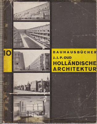
    Whether on a Facebook profile or in a family photo album, we use photographs to tell the stories of our lives. In a similar way, photographs also tell the grand narratives of peoples and nations, although with much more complexity and on a much larger scale. In a sense, The Chinese Photobook, on view at the Aperture Foundation’s gallery space, is China’s own family photo album, spanning the years from 1900 to 2014. (A photobook is a book whose content is primarily composed of photographs and is sometimes a coffee-table book.) Some of the photographs on display are celebratory while others are critical. Some are elegant while others are unsettling. Images captured from vastly different points of view come together to tell the rich, layered, and multifaceted story of this nation. But this diverse show also has great unity, for despite their differences, all the images demonstrate the immense social and political power of photographs.

    Installation shot (Photo courtesy of the author)
    Although this show occupies only a single room, it is remarkably comprehensive. The exhibition includes about 80 photobooks displayed in glass cases, 125 framed pages, and four video slideshows. The photobooks come from a collection gathered by photographer Martin Parr and the Dutch photography team WassinkLundgren. Parr and WassinkLundgren are the curators of this show. In an interview produced by Rencontres d’Arles, Parr remarks that China’s long tradition of photobook publishing has been sadly ignored. He is enthusiastic to share with others what he calls “the forgotten land of incredible photobooks that nobody knew about,” and this exhibition certainly reflects that enthusiasm.
    The show is put together rigorously and meticulously. The detailed descriptive plaques that accompany each photobook reflect thorough research and help viewers place the images in their social, historical, and political contexts. (No need to be an expert on 20th century Chinese history!) Published by Americans, Europeans, Japanese, and the Chinese, these books were intended for audiences ranging from curious American children to Italian fascists, and from Maoist devotees to political dissidents. Each book tells a different story of China.

    The show is divided up chronologically into six sections: From Empire to the People’s Republic of China (1900-1949)Manchuria and the Sino-Japanese War (1931-1947), The Image of a New China (1945-1966)State Publishing: The Cultural Revolution and Beyond (1966-present)The Renaissance of Chinese Photography (1979-present), and Global Perspectives on China (1949-present). The show opens with Westerners’ photographic impressions of “the Orient,” and the theme of imperialism links these images to the Japanese photographs of China in the second section. After defeating the Japanese, the Chinese Communist Party drove out the Nationalist Party, ushering in an era of flourishing visual propaganda, a practice that went hand in hand with oppressive censorship. Of particular interest is a photograph of Mao with Lin Biao, a military and political leader who fell out of political favor. After Lin Biao’s death, photographs of his face were defaced with white crosses. Here, the descriptive plaque suggests that the owner of the book might have crossed out Lin Biao’s face to show solidarity with Mao, an action taken perhaps out of fear of political persecution. Possessing images of Mao’s enemies was grounds for suspicion and arrest.
    An exhibition of Chinese photography would not be complete without Tank Man, and the photograph is dutifully displayed in this exhibition (1). This image, which is banned in Chinese media, is a striking example both of state censorship and of the power of a single individual, armed with a camera (or, in the case of Tank Man, several individuals with cameras) to oppose an oppressive regime. Tank Man provides a transition into the last section of the show, which displays dissident photography that reveals the dark and sinister side of Chinese society and urban life in particular.
    A strength of the show is its use of video installations, allowing us to see inside books that would be too fragile for each visitor to open. For example, the photobook Chinese Medicine: Tongue-Coating Atlas (People’s Medical Publishing House, 1984)—one of the few apolitical photobooks on display, which links photographs of tongues to corresponding medical diagnoses—is the subject of one such video. Above the glass vitrine that holds the book, a screen shows two pairs of hands flipping through the pages, revealing the mind-numbing variety of tongues that the book contains.
    This exhibition is certainly worth a visit—even for those who have little interest in Chinese history—because it speaks to the social and political power of photographic expression, a power that is not limited to a single country, but rather is shared by all of us, even today. This exhibition demonstrates how politicians and activists use imagery to shape how people think. Do we support the illustrious Chairman Mao, to the point where we deface photographs of opposing leaders? Must we forget the Tiananmen Square Massacre, if there are no images to remind us of the event? The Chinese Photobook prompts us to reflect upon how images shape our perception of political leaders and historical events, and how photographs can be both oppressive and liberating.
    (1) The copy of Tank Man on display was taken by Stuart Franklin and reproduced in Franklin’s photobookTiananmen Square (London: Black Sun, 1989).

    Agenda / di 19 mei / 22e Fotokroniek / Pakhuis de Zwijger / Amsterdam


    Het fotografenduo WassinkLundgren, Thijs groot Wassink (1981) en Ruben Lundgren (1982), presenteert exclusief voor Nederland The Chinese Photobook. Een omvangrijk fotoboek waarin Chinese fotoboeken die een indrukwekkend deel van de Chinese geschiedenis prijsgeven, voor het eerst zijn samengebracht. Volgens The Guardian is het een ‘picturale essay’. 
    In samenwerking met de  Britse documentairefotograaf en verzamelaar Martin Parr (1952) werkte WassinkLundgren de afgelopen jaren aan een overzicht van geschiedkundig belangrijke Chinese fotoboeken die sinds 1900 zijn verschenen. Parr richtte zich aanvankelijk op propagandaboeken en sociaal-realistische fotografie. Dat vond Lundgren niet zo’n goed idee,  liet hij onlangs in de NRC weten. Zo’n boek zou vooral de westerse vooroordelen over China bevestigen. Vanaf toen werd het blikveld verbreed. Ook fotografische pioniers, die het land aan het begin van de 20ste eeuw in beeld brachten, tot hedendaagse fotoboeken van opkomende Chinese talenten maken nu deel uit van de verzameling.
    Na acht jaar speuren en verzamelen is daar danThe Chinese Photobook, een werk dat voor het eerst de geschiedenis van het Chinese fotoboek in kaart brengt. The Chinese Photobook bevat niet alleen werk van Chinese fotografen, maar ook buitenlandse, waaronder de Nederlandse Ellen Thorbecke en Bertien van Manen. Ook het fotoboek Empty Bottles, waarmee WassinkLundgren debuteerde en dat in China ontstond, is in het boek op genomen. Hun debuut werd in 2007 op het fotofestival in Arles meteen tot mooiste fotoboek van het jaar uitgeroepen. Het was ook op dat festival dat ze Martin Parr voor het eerst ontmoetten. Je zou kunnen zeggen dat daar de geschiedenis van The Chinese Photobook wellicht ontstaan is.
    中国摄影书集Thijs groot Wassink (woonplaats Londen) en Ruben Lundgren (woonplaats Beijing) zullen uitgebreid vertellen over de geschiedenis van het Chinese fotoboek en de totstandkoming. Fotohistoricus Rik Suermondt verzorgt een presentatie over het werk van Ellen Thorbecke (1902-1973) en Bertien van Manen spreekt over haar boek East Wind West Wind.
    Het project van Martin Parr en WassinkLundgren duikt sinds een jaar af en toe als tentoonstelling op. Vorig jaar was een overzicht van Chinese fotoboeken te zien tijdens het fotofestival in Arles, en begin dit jaar in de Aperture Gallery in New York. Momenteel is de tentoonstelling te bezoeken in hetUllens Center for Contemporary Art in Beijing en in de Photographer’s Gallery in Londen.

    Ruben Lundgren of WassinkLundgren, on "The Chinese Photobook" from Aperture Foundation on Vimeo.


    Empty Bottles Wassinklundgren

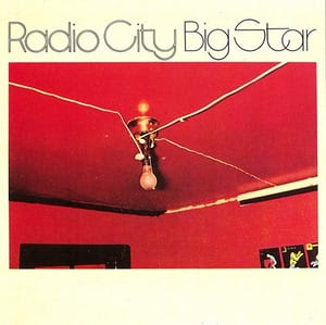
    Published by Veenman Publishers, 2007
    Veenman Publishers, Rotterdam, 2007. Softcover. 64 pages. Small folio. Photographs by WassinkLundgren. Design by Kummer & Herman. Cited in Parr & Badger Vol. 3. Book Condition: Near Fine with small area of wear to the top/center of front cover. Else fine. Winner of the 2007 Contemporary Book Award at the Rencontres d'Arles photo festival and now destined to become a sought after classic! The first printing of Empty Bottles sold out in a matter of days. Also featured as one of Martin Parr's selections in the show he curated for the 2008 New York Photo Festival, where it was shown in book form. "In 2005, conceptual documentary photographer Thijs Groot Wassink and artist Ruben Lundgren spent time in China, the product of which is Empty Bottles. The photographs chart the daily rituals of 24 refuse collectors as they go about their business. Each picture captures the extraordinary combination of roles played out by the men and women - part scavenger, part collector and part cleaner. What is especially striking about the images is the clinical tidiness of the landscapes; it's as if the refuse collectors have picked up the last piece of rubbish each time with a furtive urgency to keep public spaces immaculate at all times. Set against the backdrops of Beijing and Shanghai there's a significant lack of deprivation to the characters and a profound sense of purpose to their business. As a collection the book offers an insight into China's rudimentary social services, which otherwise don't exist or go unchronicled."--Wallpaper magazine. 


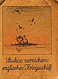
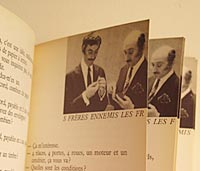
    CATLEEN (THORBECKE), ELLEN. - Peking Studies. Sketches by F. H. Schiff.

    Shanghai, Kelly & Walsh, 1934. Folio. 87pp. With numerous photographic illustrations by Catleen and coloured plan and illustrations by Schiff. Orig. pict. cloth with illustr. dustwrapper and transparent wrapper. First edition. - Bookseller's label on inner back cover: The Peking Bookshop. Grand Hotel des Wagon-Lits, Peking.


    London, George G. Harrap & Co Ltd, 1935. 1 volume in-4, 141 pp., publishers tan paper covered boards with drawing of a chinese woman's face, 32 mounted black and white photographic portrait plates in duotone, with accompanying text, one colour illustration by Shine. A very fine copy with its dust jacket showing some tears and lack of paper on the spine.‎
    ‎First edition of this nicely illustrated volume. Ellen Thorbecke was the wife of the former Netherlands Minister in China. She published books on Hong Kong, Shanghai and Peking. "The author, during four years in the Far East, made a close study of chinese politics and economics as well as the psychological pecularities and customs of the people. She has selected thirty-two photographic portraits which illustrate varying characteristics of the Chinese - of men and women in different walks of life- who represent the old and the new order, from the aristocrat and the philosopher to the humble rickshaw-coolie and the sing-song girl of the tea-house.‎


    THORBECKE, E., - Hong Kong. Photographed [with the Rolleiflex Camera] and depicted. Orig. edn.

    Shanghai, Kelly & Walsh, s.d. [circa], 1935. Orig. pict. col. lithographed boards with matching dustjacked, both designed and drawn by SCHIFF. Title-p. printed in red. 69pp. 23 ills. and plates, being photographs by Ellen Thorbecke, num. col. lithographed ills., of which marginal, in text and almost full-page, incl. on first free endpaper, 2 lithographed coloured plans of Hong Kong all after drawings by Schiff, text printed within a bold black border throughout, list of contents. Boards and dustjacked signed by Schiff. SCAN AVAILABLE UPON REQUEST. A lavishly and charming review of Hong Kong. 

    THORBECKE, ELLEN - Shanghai. Photographed and depicted by Ellen Thorbecke with sketches by Schiff.


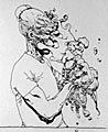
    Shanghai, North-China Daily News & Herald Ltd, [1940]. Sm.4to. 82 pp. Original decorated boards with dustwrapper. With b/w photographic plates and illustrated in colour throughout by Schiff With autograph signed dedication: "To General J.C Pabst with the polite excuses of the author for continually producing perfect horrors to serious-minded people Ellen Thorbecke Shanghai, June 1940''. - Ellen Thorbecke (1902-1973) was married to Willem J.R. Thorbecke, former Dutch ambassador to China while J.B. Pabst was ambassor to Japan during these turbulent years. Pabst had a reputation of a plain living person as Ellen was a flamboyant lady. - Friedrich Schiff (1908-1968), Austrian Jewish painter, came to China in 1930. With his watercolour works and cartoons Schiff revealed his passion for the daily life of the Chinese people during the 17 years he stayed in China.


    Hong Kong: the Way It Was Elsken, Ed Van Der

    Published by Dewi Lewis Publishing, 1997 ISBN 10: 1899235809 / ISBN 13: 9781899235803
    Van der Elsken's photographs of Hong Kong show a city of extraordinary atmosphere. Taken in 1959 and 1960 - though previously unpublished - they present a city not yet overwhelmed by neon and high-rise; a city that combines a deep sense of tradition with energy in its streets which is both exhilarating and exhausting. A magnificent work of 96 duotone plates by one of the major photographers of the 20th century  First edition 1997 (not to be confused with the later 2002 edition), hardcover in fine condition with near fine dust jacket with just some very slight surface wear and light handling indentations - now out of print - 


    East Wind West Wind Manen, Bertien Van

    Published by De Verbeelding, Amsterdam, 2001
    Small 4to, 232pp. Printed wraps as issued. Numerous colour plates. Text in English and Chinese. More images available on request. For a Dutch photographer to have found her way into the intimate corners of Chinese lives must have taken more than that.". The Photographs for this book were made in China between July 1997 and May 2000. In 1994 she published 'A Hundred Summers, A Hundred Winters', a book with photographs made in Russia. This publication was met with critical acclaim and received many awards (Best Photobook of the Year, Maria Austria Prize for Best Photographer of the Year). Such a brilliant book. 


    Een Chinese man poseert naakt op een uitgevouwen krant in een smalle, witte ruimte. Op de grond staan een paar schoenen en twee gipsen afgietsels van een buste van een Chinese kop en van de Venus van Milo. De man kijkt de toeschouwer peinzend aan met de armen gekruist voor zijn borstkas. Zijn kwetsbare houding krijgt een echo in de halfnaakte Venus, die evenals het marmeren origineel in het Louvre geen armen meer heeft om haar geslachtsdelen af te dekken. De foto is gemaakt door Liu Zheng, een jonge Chinese fotograaf die tussen 1995 en 2000 een indrukwekkende portretgalerij aanlegde van zijn land-genoten uit verschillende provincies en bevolkingslagen van China. Welke boodschap bevat dit raadselachtige beeld? Is het een ironische confrontatie van westerse en oosterse schoonheidsidealen? De perfect geproportioneerde, blanke Venus op een sokkel versus de gerimpelde Chinese man, die armetierig op een krant staat? Of is het een cynische reflectie op de gulzigheid waarmee de artistieke avant-garde in China zich de laatste jaren op de westerse kunsttraditie heeft gestort?

    Sinds in 1979 de grenzen open gingen, heeft er in China een enorme inhaalslag plaatsgevonden ten aanzien van de westerse kunst – van Dürer tot Duchamp en van Warhol tot de meest recente ontwikkelingen in Amerika en Europa. Het is verbazingwekkend om te zien met welk gemak de westerse canon door experimentele kunstenaars werd geïncorporeerd om daarmee de oude Chinese traditie nieuw leven in te blazen. China is een land met contrasten. Een land met een vijfduizend jaar oude cultuur waar de modernste kosmopolitische steden van de wereld verrijzen, maar waar tegelijkertijd miljoenen boeren in grote armoede leven. Een economische grootmacht, laverend tussen communisme en consumentisme, die open kanalen onderhoudt met de wereld maar de eigen cultuur aan een stevige censuur onderwerpt.

    Sinds de jaren dertig van de vorige eeuw zijn er regelmatig Nederlandse fotografen in China geweest om te getuigen van de grote sociale omwentelingen in het voormalige keizerrijk. Bijna zonder uitzondering richtten zij hun camera op de bewoners. Zo portret-teerde Ellen Thorbecke in haar boek People in China (1935) traditionele en moderne typen Chinezen – van ‘the concubine’ en ‘the camel-driver’ tot ‘the ultramodern girl’ en ‘the industrialist’. Haar foto’s uit begin jaren dertig reflecteren de oriëntatie op het westen onder Chiang Kai-shek. In 1959 documenteerde de communist Hans Sibbelee Mao’s ‘Grote Sprong Voorwaarts’, terwijl Vincent Mentzel in 1973 afreisde om te getuigen van de Cultu-rele Revolutie (1966-1976).

    Een van de laatsten die China intensief bezocht was Bertien van Manen. Van juli 1997 tot mei 2000 maakte zij veertien reizen langs zowel de grote steden in het oosten en zuiden (Peking, Shanghai, Shenzen, Chongqing, Chengdu en Kunmin) als dorpen op het plat-teland in het westen, niet ver van Tibet. Haar boek East Wind West Wind (2001) geeft een impressie van het dagelijks leven binnen ‘gewone’ Chinese families en de nieuwe, lossere levensstijl van jongeren. Opvallend is de grote mate van intimiteit in haar foto’s, waarmee zij het traditionele beeld van China als een gesloten, private samenleving – ‘a country of walled cities, walled palaces, walled gardens, and walled family compounds’, zoals Ian Buruma in zijn inleiding schrijft – sterk nuanceert.

    In de periode dat Bertien van Manen (1942) in China rondreisde, werkte Liu Zheng (1969) aan zijn ambitieuze reeks zwart-wit portretten van landgenoten. Veel meer nog dan het beschrijven van het moderne leven, betreft het een onderzoek naar de historische en mythologische wortels van de Chinese cultuur. In 2000 verscheen een uitgebreide selectie foto’s op zijn website onder de titel The Chinese. Het is fascinerend om te zien hoezeer zijn documentaire stilistisch en inhoudelijk afwijkt van die van Bertien van Manen en voor mij (als westerling) veel moeilijker te doorgronden is, terwijl beiden een sterk persoonlijke visie delen. Welk beeld construeren zij van het hedendaagse China? Wat ziet Liu Zheng van binnenuit anders dan Bertien van Manen van buitenaf? Wat is er zo ‘tegendraads’ aan hun werk? Met andere woorden: welke stereo-typen willen zij in de beeldvorming over China doorbreken en in hoeverre is hun blik cultureel bepaald? En hoe zit het met de inspiratie-bronnen? Zijn de foto’s in sterke mate geworteld in de eigen Chinese en westers-humanistische cultuur? Of is er ook sprake van cross-over beïnvloeding?

    De mensen, de mythen en de geschiedenis
    Twee clowns in Mao-pakken bij de Chinese opera, een ingepakt Boeddhabeeld, babylijkjes in een draineerbuis, een imitatie-Elvis omringd door geblondeerde danseressen, rouwende vrouwen bij een plattelandsbegrafenis en een dichteres die naakt poseert. Dit is een kleine greep uit de circa 180 zwart-wit foto’s op de website van Liu Zheng, waarin het menselijk bestaan in al zijn dramatiek wordt uitgebeeld. Al bij een eerste aanblik gaat er een verontrustende werking uit van deze esthetisch gecomponeerde beelden. De samenhang van de portretten van mensen uit de wereld van religie, theater en het échte leven ontgaat me, evenals de gecombineerde thematiek van seks en dood (eros en thanatos) en de aandacht voor de Chinese geschiedenis in foto’s van oude sculpturen. Behoren erotiek en religie niet tot de taboes in de Volksrepubliek? En waar is het moderne China zoals we dat kennen uit de westerse berichtgeving: de shoppende middenklasse, karaoke-zingende yuppies, betogende Falun Gong en zakenmensen temidden van hun glinsterende nieuwe kantoren?

    Op de website introduceert Liu Zheng The Chinese als volgt: ‘It analyses the entire (Chi-nese) race drastically from three realms (the world of belief, the world of reality and the world of hell). These three realms exist in contemporary China. So, these photos are not single. In fact, they contact with each other closely. These photos are surrealistic images of China.’In een interview met de kunsthistoricus Wu Hung uit 1998 geeft Liu Zheng toelich-ting op het project, dat dan nog in een voorstadium verkeert. Hij zegt zijn foto’s te willen indelen in drie secties – de mensen, de mythen en de geschiedenis – om zo de Chinese cultuur aan een nieuw onderzoek te onderwerpen. De ‘mensensectie’ bevat een selectie portretten van ‘only those individuals who are simultaneously real and surreal, contempo-rary and transcedent’. Het belang van het theater voor zijn fotografie wordt hier evident. Liu Zheng ziet de wereld als een schouwtoneel en andersom het theater als een afspiegeling van het werkelijke leven. Hij is gefascineerd door het masker waarachter de mens zich verbergt en wil het spanningsveld blootleggen tussen het wezen van een persoon en zijn of haar publieke rol.

    De ‘mythesectie’ zou oorspronkelijk worden opgezet rondom het thema van de seksuele lust. Volgens Wu Hung is het veelzeggend dat Liu Zheng de gehele premoderne fase van China identificeert als een ‘mythische periode’. Die mythes vormen al 900 jaar in allerlei variaties het hoofdthema van de Chinese opera. In barokke ensceneringen laat hij mytho-logische personages uit de Peking Opera naakt en wellustig over elkaar heen buitelen. Buiten het podium poseren verschillende acteurs en actrices als pin-ups en travestieten, waarmee de foto’s een eigentijds jaren negentig karakter krijgen. Maar ook het thema van het kwaad wordt in de mythesectie aangeroerd, in fotografische opnamen van oude sculp-turen met voorstellingen van de hel in Taoïstische tempels.

    De derde ‘historische sectie’ valt samen met het modernisme van de twintigste eeuw, de periode waarin de Chinese cultuur zich sterk op het westen richt. Het is voor Liu Zheng het tijdperk van de fotografie, maar ook van de politieke strijd die in 1949 zou leiden tot het stichten van de Volksrepubliek China. Voor deze sectie was het oorspronkelijke plan om remakes te maken van beroemde historische foto’s – zeer waarschijnlijk inclusief de be-kende propagandabeelden van Mao (bij de stembus, zwemmend in de Jang-tse, etcetera) – om pas achteraf aan de toeschouwers mee te delen dat het vervalsingen zijn. Deze fake foto’s zouden ieder geloof in historische feitelijkheden moeten ondermijnen. Tot een serieuze toepassing van deze postmoderne deconstructietactiek is het niet gekomen. Wel fotografeerde Liu Zheng een monument van Mao als leider van de Rode Gardisten uit de Culturele Revolutie.

    Nostalgie (huai jiu)
    Op de uiteindelijke website-versie zijn de foto’s uit de drie secties volledig met elkaar vermengd, evenals de thema’s van religie, hel en werkelijkheid. The Chinese laat zich aldus lezen als een tijdloos epos over China. De foto’s lijken ook in een ver verleden gemaakt. Dat heeft in de eerste plaats zijn oorzaak in het zwart-wit, dat vandaag steeds minder gangbaar is bij fotoprojecten met een documentaire inslag. Bovendien heeft Liu Zheng zich stilistisch laten inspireren door de ‘klassieke’ portretreeksen van August Sander over de inwoners van Duitsland in de jaren van het interbellum en van Diane Arbus over de New-yorkse freaks uit de jaren zestig. Ten derde heeft hij met name op het Chinese platteland een levensstijl gefotografeerd zoals wij die in het westen nauwelijks nog kennen: een jon-gen in een schooluniform, een fabrieksmeisje achter een oude weefmachine en twee jonge acrobaten met een aapje voor een circustent. Deze beelden roepen bij ons nostalgische gevoelens op naar vroeger, naar de kinderjaren of grootmoeders tijd. Maar welke rol speelt ‘nostalgie’ in China, een land dat de afgelopen honderd jaar zo verschrikkelijk is geteisterd door armoede, oorlogen en revoluties?

    Wung Hu betoogt dat Chinezen het begrip nostalgie (huai jiu) in sterke mate associëren met oude foto’s uit de eerste helft van de twintigste eeuw (dus vóór het communisme) en sinds kort ook met de Mao-memorabilia uit de periode van de Culturele Revolutie. Huai jiu (letterlijk vertaald ‘het missen van het oude’) heeft een specifiekere betekenis dan een algemeen verlangen naar vroeger. De term dient te worden onderscheiden van huai gu (‘mediteren op het verleden’). Beide benamingen kunnen in het moderne Chinees worden vertaald als ‘oud’. Jiu heeft betrekking op een meer recent en bereikbaar verleden terwijl gu verwijst naar vroegere tijden. Jiu beschrijft uitstervende en versleten dingen. Gu verwijst naar begraven of gebroken dingen. Er is dus een duidelijk verschil in tijdsgat. Huai gu betreurt vaak een voorbije keizerlijke dynastie, terwijl huai jiu betrekking heeft op het herinneren van de eigen kindertijd of jeugd.

    Dit specifieke concept van huai jiu verklaart volgens Wung Hu waarom oude foto’s – meer dan oude architectuur, films, mode en affiches – in China de primaire plek voor nostalgie zijn geworden. Het verleden verwijst in historische foto’s niet naar oude keizer-lijke dynastieën, maar naar de jaren van de fotografie zelf: dat wil zeggen naar het ‘moderne verleden van een postmoderne samenleving’. Dit verleden wordt in China het best gerepresenteerd door het mondaine Shanghai van de jaren twintig en dertig, dat de naam had van het Parijs van het Verre Oosten. In zijn opera-ensceneringen, die in de oorspronkelijke plannen deel uitmaakten van The Chinese, imiteert Liu Zheng het oude en het afgesletene. Maar anders dan bij namaak-antiek vangen de fotobeelden alleen de nostalgie van de tijdsgeest en niet hun iconografie. Liu Zheng heeft nooit de behoefte om zich te identificeren met het verleden. Veel meer herdefinieert hij het nostalgische beeld van een oude foto strikt als een kunststijl, en niet als een aansporing tot een echte terugkeer naar een voorbij historisch mo-ment. Feitelijk problematiseert hij de noties van huai jiu en huai gu door beiden in de foto te leggen en zo te spelen met het oppervlakkige uiterlijk (nepantiek) versus de diepere betekenis.

    Een voorbeeld is het werk Legende van de Witte Slang (1997), gebaseerd op een fabel over een witte slang die zichzelf verandert in een mooie vrouw en met haar compagnon, de groene slang, afdaalt naar de aarde, waar ze verliefd wordt op een knappe jongeman. De foto onderscheidt zich van eerdere stills uit de Peking Opera door de naaktheid van de figuren en de ‘antieke’ uitvoering. Liu Zheng heeft het beeld een bruine toon gegeven en de achtergrond voorzien van negentiende-eeuwse draperieën. Volgens Wung Hu geven deze toevoegingen een typisch jaren negentig gevoel aan het werk, terwijl de foto tegelijkertijd verwijst naar de zwoelheid van het hofleven ten tijde van de Ming dynastie (1368-1644). De expliciet erotische uitstraling van de figuren verstoort echter het verlangen tot huai jiu of nostalgie, want de kijker wordt gevangen in een heden-daagse esthetiek van kitsch.

    In een groot aantal portretfoto’s in The Chinese speelt hetzelfde mechanisme, en wordt iedere vorm van sentimentaliteit teniet gedaan door seksuele toespelingen, dislocatie of een afstandelijke blik. Zo verschijnt een jonge vrouw van een van de zes etnische minderheden (welke blijft onvermeld in het bijschrift) niet in de nationale klederdracht, maar uit-dagend naakt in de studio. En staan drie oude actrices van de Peking Opera wulps met hun waaiers te lonken in een doorgang van de metro. Ook het telkens terugkerende thema van de dood ondermijnt ieder nostalgisch zwelgen in ‘het oude’. Voorbeelden zijn de foto’s van een boer in zijn grafkist en van een man gemaskerd als geest bij een volksfeest in de zuidelijke provincie Sichuan.

    Anders dan Liu Zheng laat Van Manen in haar boek East Wind West Wind zien dat de traditionele familieband nog steeds het dagelijks leven van de meeste Chinezen domineert. Onderweg verbleef zij zoveel mogelijk bij de mensen thuis om zo met haar compact camera vanuit een vriendschapsrelatie te kunnen fotograferen. De voor Chinese begrippen ongekende intimiteit komt pregnant naar voren in de talloze foto’s waarop het bed centraal staat. Het is de meest private plek die je in huis kunt bedenken en in China wordt er op geslapen, TV gekeken, gevreeën, gasten ontvangen en van gegeten. Deze documentaire benadering, waarvoor Bertien van Manen in de jaren negentig een van de trendsetters is geweest, loopt vooruit op de hedendaagse ‘lifestyle-fotografie’: het terloops met een kleine camera door middel van gestileerde momentopnamen uitbeelden van menselijke activiteiten. Vrije tijd, kleding, uiterlijk en een zelfbewuste uitstraling spelen een belangrijke rol. Net zoals in een docu-soap doen de modellen zich spontaan en naturel voor. Zij ‘spelen’ het échte leven.

    Verrassend zijn de beelden van twee jongens die zich thuis bezig houden met make-up en travestie. Hiermee raakt Van Manen aan het taboe op homoseksualiteit, waarvan het bestaan door de Chinese autoriteiten nog steeds wordt ontkend. Zo is er de foto van Coco uit Shanghai cross dressing. In een bloemetjesjurk en te grote maat pumps staat de jongen onhandig te wiebelen voor de spiegel, volledig in beslag genomen door zijn zelfbeeld. Van Manen fotografeerde hem kwetsbaar op de rug. Het bed op de voorgrond en de pastel-kleuren maken het tafereel nog intiemer.

    Hoe totaal anders heeft Liu Zheng travestie uitgebeeld. In ‘A man in disguise of an actress’ kijkt een acteur in pin-up houding de kijker uitdagend aan. De invulflits accentueert zijn overdadige make-up en maakt zijn glamoureuze pose volledig over the top. De cryptische titel verwijst naar de traditie van de Peking Opera, waar mannen van oudsher de vrouwenrollen spelen. Gemengde optredens waren bij wet verboden en operagezelschappen werden in China geassocieerd met homofilie. Waar Liu Zheng in zijn portret op subtiele wijze de dubbele moraal blootlegt ten aanzien van homoseksualiteit door te verwijzen naar de traditie van het Chinese theater, daar benadrukt Bertien van Manen in haar foto’s van Coco het intermenselijk contact en de vrije ontplooiing van ieder individu – centrale paradigma’s binnen het westerse humanisme.

    Cross-over
    Eind jaren negentig blikken Chinese avant-garde kunstenaars zowel naar binnen als naar buiten. Er is mondiaal sprake van een sterk toegenomen interconnectie tussen globaliserende invloeden en persoonlijke stellingname. Deze ontwikkeling grijpt sterker om zich heen in de ‘artistieke derde-wereldlanden’ – waartoe China zich rekent – dan in het we-sten. Liu Zheng, die deel uitmaakt van de Beijingse underground, is een echte cross-over kunstenaar. Naast de eigen culturele roots van de Peking Opera en het uit Rusland geïmporteerde sociaal realisme van de Chinese fotojournalistiek is hij naar eigen zeggen sterk beïnvloed door het werk van August Sander (1876-1964), Weegee (1899-1968) en Diane Arbus (1923-1971). Van Sander heeft Liu Zheng een objecti-verende manier van portret-teren overgenomen en de behoefte om de Chinese samenleving typologisch in te delen naar beroepen, religieuze gemeenschappen en klassen. Een voorbeeld is ‘A desert farmer with his camel’, waar een boer in werkpak in een frontale opstelling voor de camera staat met achter hem de sierlijke gestalte van zijn kameel. Net als Sander benadrukt Liu Zheng in dit portret het archaïsche karakter van het boerenleven. Mens en dier zijn innig met el-kaar verbonden en voeren als tweespan eeuwen-oude werkzaamheden uit. Pas in tweede instantie valt het oog op de lelijke stomp van zijn linkerarm, die is afgezet. Dit detail maakt het beeld schrijnend en ondermijnt – anders dan bij Sander – alle nostalgische gedachten over een harmonisch landleven of, vanuit Chinees perspectief, de boer als communistisch rolmodel.

    Met Diane Arbus deelt Liu Zheng een fascinatie voor het masker en voor sprookjes en mythen. Arbusiaans in hun stijl en weirdness zijn zeker de foto’s ‘Two wealthy men in masks at Christmas Eve’ en ‘A local entertainer’. De laatste toont een jonge vrouw gekleed in een sexy turnpakje met cape, pumps en zonnebril, poserend voor een witte muur waar-op een ijslollyreclame met een jolige kabouter is geschilderd. In navolging van Arbus flitst ook Liu Zheng zijn zwart-wit foto’s regelmatig in om de personages van de achtergrond te isoleren en zo een unheimisch effect te verkrijgen. Maar waar Arbus genadeloos onthullend is in haar psychologiserende portretten van Newyorkse families, transseksuelen, circusartiesten en nudisten, daar houdt Liu Zheng meer afstand. Zijn mensen zijn minder geëmotioneerd, lijken niet zozeer aangedaan door een innerlijke gespletenheid alswel door een dosis argwaan en wantrouwen naar de buitenwereld toe.

    Tenslotte verwijst de titel The Chinese naar mijn idee naar het beroemde fotoboek The Americans (1958) van Robert Frank. Beide fotografen hebben de tegendraadse keuze gemaakt om de schaduwzijde van het menselijke bestaan te documenteren in tijden van economische voorspoed, en zo kanttekeningen te plaatsen bij respectievelijk the American dream van de jaren vijftig en het nieuwe China van de jaren negentig. Bij Liu Zheng ontbreekt het door Frank zo fraai gevisualiseerde gevoel van ‘on the road’, ondanks dat zijn portretten op zeer uiteenlopende plekken in China zijn ontstaan.

    De reportage van Bertien van Manen beweegt zich, wél in de geest van haar idool Robert Frank, tussen reisverslag en human interest. Foto’s van mensen en interieurs worden in East Wind West Wind afgewisseld met landschappen, stadsgezichten en straatbeelden. Regelmatig fotografeerde zij door de voorruit van een auto, om een sfeerbeeld te geven van de kleurrijke stoet door elkaar heen krioelende voetgangers, fietsers, motoren en taxi’s in de Chinese steden. Een modisch gevoel komt sterk naar voren in enkele informele foto’s van jongeren. Zo fotografeerde zij een zakenvrouw met hippe bril, laptop en mobiele telefoon in de economische vrijzone Shenzhen en een meisje met ijslolly, rode lipstick en merkkleding in een winkelstraat in Beijing. Al eerder in 1996 portretteerde Van Manen op gelijksoortige wijze extravagante jongeren in Tokio. Mogelijk heeft dat haar ongedwongen snapshot stijl en belangstelling voor trendy mode onder invloed van de kleurrijke Japanse lifestyle-cultuur een extra stimulans gekregen. Maar haar belangrijkste inspiratiebronnen voor de China-foto’s liggen in het westen, bij de Amerikanen Robert Frank en William Eggleston.

    Dubbele moraal
    Liu Zheng en Bertien van Manen geven beiden een zeer persoonlijke visie op China, waarbij stereotypen worden ontkracht of op zijn minst genuan ceerd. Bij Liu Zheng is dat een China met sterke wortels in de mythologie, de geschiedenis en de religie, geactualiseerd door een vrijmoedige omgang met erotiek en aandacht voor de levensstijl van de jongere generatie. In de geest van Goya houdt hij zijn landgenoten een spiegel voor. Hij zoekt de scheur in hun levens: daar waar hun privé-bestaan botst met de publieke buitenkant. Het beeld dat de optelsom van portretten in The Chinese laat zien is veel diverser dan het economisch succes waarmee de leiders van de Communistische Partij te koop lopen. Hij toont de wreedheid van de Chinese cultuur in foto’s van achtergelaten babylijkjes – een uitwas van de eenkindspolitiek. Er is aandacht voor onderdrukte religieuze groeperingen, van katholieken tot boeddhisten, voor de gediscrimineerde Chinese minderheden, bedelende kinderen, gevangenen, gehandicapten, kunstenaars en acteurs. Zijn typologie overstijgt het stereo-type beeld van de optimistische, materialistische Han-Chinees die zich een westerse levensstijl aanmeet.

    Bertien van Manen heeft zich in East Wind West Wind sterk gericht op de snelle verande ringen in menselijke relaties, levens stijlen, smaak en waarden als gevolg van de open houding naar het westen toe. Haar boek bevat geen directe kritiek op het gebrek aan democratie en politieke vrijheid in de Volksrepubliek. Er zijn geen foto’s die refereren aan het schenden van mensenrechten, het falende rechtssysteem of het met militair geweld onder-drukken van religieuze bewegingen als de Falun Gong. Dat zou te zeer een bevestiging zijn van het stereotype beeld in de westerse media. Je zou op haar serie kunnen aanmerken dat die wel een heel positieve indruk geeft van het hedendaagse China: veel kleine menselijke emoties en huiselijk geluk. Tegelijkertijd is Van Manen met haar emotionele mensbeelden erin geslaagd het afbrokkelen van het taboe op het publiekelijk uiten van gevoelens te visualiseren. Kussen, flirten en elkaar aanraken werden door de Communistische Partij tot voor kort afgedaan als ‘bourgeois-decadent’ gedrag.

    Hoe sterk deze foto’s van Bertien van Manen in de westerse media tot de verbeelding spreken, blijkt uit de publicatie van een kleine selectie in ‘Das Magazin’ (juni 2001), de weekendbijlage van de Zwitserse kwaliteitskrant Neue Zürcher Zeitung, ter illustratie van een artikel over de ‘sexuelle Revolution’ in China. De foto’s tonen ondermeer twee vrien-dinnen huilend aan de telefoon (vanwege liefdesverdriet, volgens het bijschrift) een jongen en meisje die met elkaar stoeien op hun bed en een vrijend paartje op straat in Beijing (‘Heisse Szene in Strassen-café in Peking’). De strekking van het artikel is dat seks – na jarenlang te zijn onderdrukt – nu op een glijdende schaal van plezier naar pornografie en prostitutie is terecht gekomen. Chinezen zouden nauwelijks nog in staat zijn tot intimiteiten. Daarmee botst het artikel met de intenties van Bertien van Manen, zeker ook gelet op het feit dat haar meest sensuele foto’s uit de context van East Wind West Wind zijn gelicht. Het ergste voorbeeld is nog de foto van een oom die bij het karaoke-zingen een handkus van zijn nichtje krijgt, terwijl in de tekst wordt gerept over betaalde seks van oude mannen met hele jonge meisjes! Is hier bij Neue Zürcher Zeitung niet sprake van een typisch westerse dubbele moraal? Enerzijds met het vingertje omhoog waarschuwen tegen inhumane omgangsvormen buiten de eigen grenzen en anderzijds een koperspubliek zich laten verlustigen aan opwindende beelden?

    Een gemeen schappelijk punt bij Liu Zheng en Bertien van Manen is dat beiden nauwelijks aandacht besteden aan de werkende Chinees, de arbeider en de boer die in de tijd van Mao als rolmodellen fungeerden van de economische en maatschappelijke vernieuwing. Liu Zheng beperkt zich tot enkele ironische foto’s van mijnwerkers onder de douche; antihelden die zich het vuil van het lichaam schrobben of nonchalant poseren met een sigaret in de hand. Op een enkele uitzondering na zijn er geen beelden van ploeterende boeren, vandaag naar schatting zo’n 900 miljoen in getal sterk, waarvan minstens een derde in grote armoede leeft. Bertien van Manen zegt over deze keuze: ‘Ik heb zoveel mogelijk de clichés vermeden en geprobeerd een ander beeld van China te geven dan de spectaculaire bekende zieligheid en mooie plaatjes. Het is een persoonlijk verhaal en geen sociale documentaire.’


    In dit verband is het opvallend dat ook Liu Zheng heeft laten weten wars te zijn van een sociaal-kritische stellingname, hoewel beiden zich in het verleden hebben verdiept in maatschappelijke kwesties. Liu Zheng, die opgroeide in een mijnwerkersgezin in de noordelijke provincie Shanxi, begon in 1991 als fotojournalist voor The Workers Daily, waar hij de taak kreeg om de mijnindustrie te coveren. In 1993 richtte hij ‘TOPIC fotografie’ op en startte een serie over mensen van het Chinese platteland. Anders dan de meeste fotografen, die gecharmeerd zijn door het exotisme van de etnische minderheden, concentreerde hij zich op de benarde toestand van de Han-boer. Bertien van Manen werd eind jaren zeventig bekend met een aantal reportages over de vrouwenbeweging. Als een van de eersten documenteerde zij in Nederland het isolement van Turkse en Marokkaanse vrouwen. In 1987-88 maakte zij een reportage over mijnwerkersfamilies in hun afgelegen settlements in de Appalachian Mountains in Kentucky, USA. Een internationale doorbraak volgde met A Hundred Summers A Hundred Winters (1994), een rondreis langs Russische families kort na de val van de Muur. In gloedvolle kleuren fotografeerde zij de interieurs en hun door armoede getekende dagelijkse levens.

    Interculturele uitwisseling kan in de fotografie soms verrassend alledaags zijn. Kijk maar naar de foto die Bertien van Manen maakte van een jong, westers gekleed stel aan een tafel in een bar in Shanghai met achter hen een reproductie van het bekende schilderij van Otto Dix van de journaliste Sylvia von Harden (1926). De journaliste, die eveneens in een bar aan een tafeltje zit, toont zich met haar monocle, kort geknipt haar, sigaret en cocktail-drankje in de typisch mannelijke look van de jaren twintig – onafhankelijk, maar ook eenzaam. Het portret van Von Harden biedt lifestyle avant la lettre. Het maniërisme van haar houding vindt een pendant in de manier waarop het meisje de jongen intiem in het oor fluistert en tegelijkertijd met haar hand een afwerend gebaar maakt naar de fotografe.

    Deze caféscène brengt ons terug bij de beginfoto van Liu Zheng: de naakte Chinees en de Venus van Milo. Beide beelden bevatten tekens van westerse invloeden in China. Niet alleen Oost en West, maar ook kunst en leven komen hier samen. De foto’s roepen vragen op over culturele identiteit in tijden van globalisering. Wat is typisch westers, wat is typisch Chinees? Hoe worden decadentie, (on)gewenste intimiteiten en schoonheidsnormen in verschillende landen, regio’s en tijdsperioden uitgebeeld? De Chinese kunsthistoricus Leng Lin vat het probleem in één zin samen: ‘In this postmodern existence, we fully recognize that what makes us different from others is also what gives us a place in today’s world.’
    Rik Suermondt

    Gepubliceerd in: Nelly van der Geest, Kitty Zijlmans, Curry. Het interculturele Kunstdebat, Hogeschool voor de Kunsten Utrecht 2002, pp 12-31 Met dank aan: Hans van Dijk (1946-2002), Sui Hong, Bertien van Manen en Bas Vroege


    OTTEN, REINEKE / KOOLHAAS, CHARLIE - Otten, Reineke; China Daily Life

    Rotterdam, Veenman, 2006. ng pag.. Ill. in kleur. Softcover

    Reineke Otten is both an artist and a social scientist. She is an artist, because her photos capture the strange and inarticulable beauty of everyday life. And a scientist, because her goal is not merely to capture beauty, but also to assemble fragments in a way that demonstrates patterns and orders. Taking a highly structural approach, Reineke’s photography is a research method for a visual sociology. She begins her inquiries from the bottom up, observing the smallest of details and social interactions and, in using these, she suggests how larger-scale institutions operate around them. Her method intensifies a multiplicity of social relations and interactions. Reineke calls her approach Streetology:
    “I divide the visual make up of the street into hundreds of different categories and divide these images into scales. Using photography I am making a street inventory or break down. I am part of this new digital generation, who are making important documents of this century.”
    - Reineke Otten

    Temporary like an Ikea Catalogue

    So what does it mean to be part of the digital generation? In some way it is to share the frantic need to record as a way of absorbing. The digital generation are making massive inventories of ‘everyday life’ around the world; Otten’s work comprises a fragment of this effort. It is frantic and obsessive -a demonstration of the fear that things are changing before we even have time to witness the moment or understand what’s going on. Everything is documented so that It can be digested at a later date. The digital generation are observers rather than participants, they record before they experience, and every exciting moment that isnt recorded is considered a missed opportunity.
    “The quickness of the digital photography matches the rapid changes of the city. 


    Porträt Louise Anna Kubelka: 1978-1996 wöchentlich fotografiert Friedl Kubelka Erik Kessels Special Books Photography

    $
    0
    0

    Friedl Kubelka: Portrait of Louise Anna Kubelka 

    Friedl Kubelka is one of the most renowned art photographers in Austria. In 1998 she completed one of her central works, namely the portrait of her daughter Louise Anna from birth to adulthood. This exceptional body of work is being exhibited and published for the first time in its entirety. 

    Since the early seventies Friedl Kubelka has focused on time structure as a parameter of expansion of the single photograph in her multi-part portrait-tableaus. "Time structure gives the form to the information rather than emphasizing the authenticity" (Friedl Kubelka). 

    The weekly portrait of her daughter Louise Anna over a period of 18 years documents not only the process of growing up or the development of a mother - daughter relationship, but also explores the process of photographic depiction and multi-layeredness of the photographic moment. A catalog will be published on the occasion of the exhibition: 30x38 cm, 36 pages, with a text by Anette Michelson. 

    Friedl Kubelka: Portrait Louise Anna Kubelka, Fotohof 1998.

    ...a headshot photo of her daughter every Monday from the first day of her daughter's life until her 18th year.
    This act of "Monday photo," as her daughter Louise came to call it, is part ritual, part performance, part obsession.

    Arranged in grids of 52 photographs and starting in 1978, we see the passing of 18 years and how it shapes a young woman's face as in a time-lapse film. The framework of photographing Louise's head in close-up against a neutral background accentuates the seeming difference in her moods although photography is too slippery a liar for a true reading.

    ...her "seriousness" seems to be something she grows into as she ages into her teen years.

    By 9 or 10 Louise seems to be shaping her own identity and self-representation apart from her mother. Her hair styles vary and blank spaces appear in the grids where a Monday photo was missed. By the last year, the 18th, only 12 images appear in the first few months until finally the ritual is broken.

    In some ways, this work is a display of a coerced collaboration that even Louise has questioned. "I have asked myself whether my mother had the right to use me as an object in this way."

    RELATED PHOTO PROJECTS

    OTHER ‘PASSAGE OF TIME’ PORTRAIT PROJECTS

    • OPALKA 1965/1–∞ (1965–present)
      Roman Opalka, after every day of painting numbers in his studio, photographs his face. If only we could see documentation of the entire sequence.
    • Carving: A Traditional Sculpture (1972)
      Eleanor Antin diets for 45 days. It is a performance piece, sculpture, photo project, and seminal work of feminist art.
    • The Brown Sisters (1975–present)
      Nicholas Nixon photographs the Brown sisters.
    • The Arrow of Time (1976–present)
      Diego Golberg and family sit down on June 17 for a family ritual.
    • One Year Performance (1980–1981)
      Tehching Hsieh punches a time clock hooked up to a camera in a gallery every hour on the hour for a year. A huge Thank You to Alberto Frigo for sending me the link!
    • Portrait of Louise Anna Kubelka (1980–1998)
      Friedl Kubelka documents the development of her daughter, from birth to adulthood.
    • The Downward Spiral (1983?–1997?)
      "Maria Ramos" as photographed by the New York City Police Department.
    • Everyday (1987 February 23–present)
      Karl Baden is second only to Roman Opalka for the logevity and glorious perfection of his daily photo project.
    • Time of my Life (1991 June 01–present)
      Dan Hanna spins with the sun in this daily aging project.
    • The Adaption to My Generation (1998 October 01–present)
      This is where I fit into the scheme of things, case you were wondering.
    • daily performances (1999 July 24–2009)
      Marc Tasman receives a package of Polaroid film and begins a ten-year process of daily performances in Polaroid
    • La Photo-Sculpture (1999–2006)
      Odile Marchoul discovers 'Photo-Vision' and decides to make identity pictures weekly.
    • Noah K. Everyday (2000 January–present)
      Noah Kalina uses his video camera to try and pinpoint the stages in his life when he's changed.
    • Metabolismo alterado (2000?)
      Héctor Falcón seems to start bodybuilding for art's sake, though I can't be totally sure as I don't understand Spanish.
    • Alarm Clock Self-Portaits (SnoozeButton) (2001?–2004?)
      Dean Baldwin hacks his alarm clock to shoot a digital photograph when he hits the snooze button. Check out his sleeping partners!
    • Hocking DPP (2001 September–present)
      Pete Hocking takes a daily self-portrait and posts it to the internet. He also finds that he becomes the object of the bear community's desire, as well as a few jackasses'.
    • Me (2001 November–present)
      Ahree Lee makes a nice video of three years of everyday photographs.
    • eyemachine (2002 January 01–present)
      Andy Luginbühl takes the portraits, and then set up a system to animate the images with the eyes lined up. I did this with a year's worth of images manually a few years ago. I'd never do it manually again...
    • 09h09 (2002 September 18–present)
      Jean-Michel Gobet takes a photo at 09:09 every day and blogs about it. What's more amazing is that he's awake at 09:09 every day!
    • Lebensbilder [Life Pictures] (2002 December, 2003 October, 2004 April–present)
      Tom, Ralf, and Michaela make the daily photo a German family affair.
    • O's Daily Photo (2003 January 01–present)
      Orin's image collection was randomly found while I was self-servingly looking at my standings in various search engines. She definitely has more interesting t-shirts than I've seen lately. And that domain name is hilarious.
    • Daily Jason (2003 January 06–present)
      Jason Fletcher does the 'Daily Photo Project' with goofy faces and on crack.
    • John Stone Fitness (2003 January 06–present)
      John Stone pasty and flabby --> --> --> John Stone tan and cut. Quite possibly the freakest thing I have ever seen.
    • Russian DPP (2003 August 02–present)
      Vadim Malguine shaves his head and starts taking photographs.
    • Daily Marqs (2003 August 27–present)
      Markus does the daily photo 3/4 shot.
    • Jeden Tag eins mehr... (2003 September 25–present)
      German Stephan H. Schumann is yet another daily shot-maker.
    • Twindex (2003 November 23–present)
      Welcome at[sic] the Daily Photo Project from Sven and Tobias Staude! Twins doing daily photos. It'll be really sad when one dies.
    • Daily Photo Project (2003 November 23–2006 April 14)
      Phil McCombs is another daily dude, though he has some serious lapses in documentation.
    • Ellora Klein (2004–present)
      Arno Klein's working on the full documentation of daughter Ellora. Includes video.
    • Self Portrait (2004 May 14–2005 September 03)
      Trey Bean documents his self portrait via Quicktime.
    • :18 Project (2004 July–2006 January)
      Christine Gatti takes two photos 18 minutes after every hour, every day for 18 months. She takes one self-portrait, and then one of the environment she is in at that time. Amazing work.
    • Olivia Project (2004 July 25–2004 December 25)
      Imelda's friend Olivia Juliana Lyles DeLuna gets her picture taken and her mom posts it on the web. How very cute! I think this project stopped at Christmas-time...bummer.
    • Bent Lips (2004 July 25–2005 July 25)
      Priscilla smiles, and smiles, and smiles. Let's hope she keeps it up for longer than a year!
    • Me, Myself, and I > 27up (2004 September 16–2009 April 24)
      Matthias Hupp starts the craze in Germany, in Black & White.
    • Daily Fratze (2005 August 04–present)
      MC Winkels from Germany...
    • Daily Fratze (2005 August 07–present)
      Michael Simons from Germany is apparently inspired by MC Winkels from Germany... Now a site that "is a small community centered around daily photo projects. You'll find a place with room for narcissism, discussion, in short: documented lives."
    • Jeder-Tag (2006 January 01–present)
      Anthoney from Germany is yet another white guy who looks like he's in IT doing a daily photo.
    • Russell Higgs (2006 July 21–present)
      Russell's only been at it for a couple months, but I am flabbergasted at the results so far.
    • yyyymmdd (2006 November 10–present)
      Taylor Everett's personal daily photo adventure.
    • Jedentag (2007 January 01–present)
      Dimitri comes from Germany/Berlin and he takes every day pictures.
    • Everyday from Birth (2007 January 22–2008 January)
      David P Craig's parents attempt to make him a daily-documented boy.
    • Daily Photo Project (2007 January 31–present)
      Skip Hursh adds to the daily photo milieu.
    • everyday (2007 February 07–present)
      Mark Curry's another fine young lad making his way along the daily photo journey.
    • Cheri Cheri Lady (2007 March 21–present)
      Kotla: “I’m imitating others, because I can't change.”
    • My Maya-a-Day (2007 March 24–present)
      Ben Udkow gets his Maya to be in front of the camera every day since birth.
    • 13 to Infinity (2007 April 07–present)
      David Hinds makes it over 9 months and hopes to continue FOREVER!
    • Documentation of Decomposition (2007 December 19–2008 October 02)
      Sean Hunt MacLean adds his face to the growing collection of Daily photographers.
    • Blog Begins At Forty (2009 March 26–present)
      gedek! begins at forty, who knows when he'll end...
    • Le blog de photos-tous-les-jours (2011 February 14–present)
      Ganael Portet adds himself to the list.
    OTHER OBSESSIVE PHOTO PROJECTS


    • Exactitudes (1994–present)
      photographer Ari Versluis and stylist Ellie Uyttenbroek work together to systematically document the striking dress codes of various social groups. Very nice. indeed.
    • 20 Sites n Years (1973–present)
      Tom Phillips photographs 20 South London sites annually, in order, at the same time of day.
    • Invincible Cities (1977–present)
      Along the same lines as above, Camilo Jose Vergara has been documenting America's ghettos by photographing the built environment in Harlem, the South Bronx, Chicago, Newark and other places since the 1970's.
    • Photo of the Day (1979 March–1997 October)
      Hugh Crawford and Betsy Reid's digital version of Jamie Livingston's 'Photo of the Day' Polaroid project.
    • ID400 (1998?)
      Tomoko Sawada gets in the photo booth for 400 different personas, including her own. [
      her site]
    • First Day (1999 january–present)
      First Day Photography will sell you a photo of the sunrise on your special day.
    • Eat 22 (2001 March–2002 March)
      Ellie Harrison documents everything she eats for one full year.
    • Get In My Belly! (2002 October–present)
      Adam Seifer documents everything (not really) he eats.
    • Pasta-Log Yet another documentation of food, this time, only pasta, and framed beautifully.
    • American Mile Markers Matt Frondorf drives across the USA (New York to San Fran) taking a photo every mile.
    • 30fpd: a day, a week, a year (2003 January 08–present)
      Aaron Ximm is making a movie of his life, one second at a time.
    • Doors I Touched Today (1999 June 03)
      Fluxus Midwest researches the action of doors and knobs.
    • Every Object Interaction (2003 September–present)
      Alberto Frigo photographs and catalogues every object he interects with. It seems like he has almost replaced one of his hands with a camera. At the time he sent me this link, there were 23'308 images entered into the database.
    • 365 Polaroids (1997)
      Andy Walker presents a year's worth of polaroid self-portraits.
    • One a Day Project (2002)
      Aimee Sealfon interacts with, then photographs, 365 people.
    • The Shower Project (1999)
      Brian Benson's successful (?) attempt to shower with 100 different women.


    Views & Reviews Edges Harry Gruyaert Photography

    $
    0
    0

    Edges door Harry Gruyaert (Fotograaf)
    Andere auteursCharles-Arthur Boyer (Voorwoord)
    Mets & Schilt (2010), Editie: Photographic, This title was originally under the imprint of Mets & Schilt, 104 pagina's
    The ‘edges’ that Harry Gruyaert, a pre-eminent member of the Magnum photo agency, explores in this incredibly lush, full-colour book, are the oceans, seas and rivers where humans meet the edge and the water begins. This unusual volume, which opens from the top up, takes the reader to Israel’s Dead Sea, the Mali River in Niger, the North Sea of Iceland, South Korea and Biarritz, as Gruyaert’s sensitive photos record the subtle chromatic vibrations of the edges of the Orient and the Occident. Gruyaert opposes the hustle of the city with a pared-down, yet intense, nature. His landscapes are never empty; they are inhabited places where light, colour, objects, people and situations weave a serene, sublime tableau.

    This beautifully produced photographic manifesto reveals the profoundly poetic character of Harry Gruyaert’s work, and the sensual elegance of his faultless compositions.


    HARRY GRUYAERT
    Born in Belgium in 1941, Harry Gruyaert studied photography and film-making. He made a few films as director of photography for flemish television before turning to colour photographs in his adopted Paris in the early 1960s. By the end of the 1970s he had travelled to the United States, India, Egypt, Japan and Morocco. The latter was a revelation to Gruyaert whose images of the country were later published in two different books. In the early 1970s, while he was living in London, he worked on a series of colour television screen shots later to become the “TV Shots” now part of the Centre Pompidou collections. Around the same period he also photographed his homeland and produced two books, “Made in Belgium” and “Roots”. In 1982, he joined Magnum Photos. Among other importants works, the two editions of Rivages (Edges), published in 2003 and 2008, are the testimony of how Gruyaert likes to work in different environments, with contrasting lights and colours. He had a retrospective of his work in Paris in 2015 and is currently working on a major show due to open at the FOMU in Antwerp in 2018. He lives in Paris and is represented by Gallery 51 in Antwerp.

    Instagram toen het nog niet bestond
    Fotografie Lang voor Instagram werd al neergekeken op die warme snapshots in kleur. Maar kleurenfotografie van de ware meesters, uit de jaren vijftig tot tachtig, is weer volop in trek.

    Rosan Hollak
    9 mei 2017

    Lartigue. Life In Color. Links: ‘Me, Florette’, Old Tucson Studios, Arizona, 1962. Rechts: ‘Florette and Pierre Sieard’, Palm Springs, California, April 1962.
    Foto Abrams (2015) 

    Het eenzame interieur van een kapperszaak. Een arm die uitsteekt tussen twee verschoten gordijnen. Snapshots op Instagram? Nee, kleurenfoto’s die Fred Herzog, een Duitse fotograaf die in de jaren vijftig van de vorige eeuw naar Canada emigreerde, in en rond Vancouver maakte. Zijn deels onbekende foto’s uit die periode werden eind vorig jaar gebundeld in Modern Color, een prachtig fotoboek vol warme Kodachrome-kleuren.

    Modern Color is niet het enige fotoboek met oude kleurenfotografie dat recentelijk op de markt verscheen. Sinds een aantal jaar brengen uitgeverijen als Steidl en Hatje Cantz Verlag boeken uit met kleurenfotografie uit de jaren vijftig tot tachtig van de vorige eeuw. En ook in musea is een revival. Vorig jaar kwam het Amsterdamse fotografiemuseum Huis Marseille met een retrospectief van de Amerikaanse fotograaf Stephen Shore, pionier van de kleurenfotografie, van wie in november dit jaar in het Museum of Modern Art in New York een grote overzichtstentoonstelling staat gepland. Het Nederlands Fotomuseum in Rotterdam bracht met de tentoonstelling American Neon Signs by Day & Night een hommage aan kunstenaar Toon Michiels die midden jaren zeventig roadtrips maakte langs steden als Reno en Las Vegas. Fotografiemuseum Foam in Amsterdam toont op dit moment Los Alamos, de fotoserie van de Amerikaanse fotograaf William Eggleston die tussen 1965 en 1974 roadtrips maakte door de zuidelijke en westelijke staten van Amerika.

    Smoothies
    Waarom is die kleurenfotografie nu weer zo in trek? Hebben sociale media ermee te maken? Wie kijkt naar de beelden die nu worden gepost op Instagram, Snapchat of Facebook ziet dat het inmiddels een wijdverspreid gebruik is om foto’s te delen van een smoothie in een café, een hand met felgekleurde nagels of een schaduw op een muurtje. Het zijn fragmentopnames van kleine, alledaagse momenten, vaak opgeluisterd door een filtertje dat de sfeer van Kodachrome – de oude kleurenfilm van Kodak – weergeeft.

    Die ogenschijnlijke terloopsheid kwam ook al terug in de beelden van Fred Herzog of Eggleston. Maar wat veel Instagramgebruikers als een vanzelfsprekendheid ervaren – het fotograferen van triviale momenten in kleur – werd destijds in de kunstwereld gezien als frivool of zelfs ronduit ordinair. De kleurenfotografie van Eggleston, voor het eerst getoond in 1976 in een solotentoonstelling in het MoMA, werd door collega’s verguisd. Grootheden als Walker Evans (‘Color photography is vulgar’) of Henri Cartier-Bresson haalden hun neus op voor de foto’s die Stephen Shore – hij heeft inmiddels een Instagram-account met ruim 890.000 volgers – in de jaren zeventig in de VS maakte van motelinterieurs, parkeerplaatsen of een pannenkoekenontbijt. De ware fotograaf maakte immers zijn beelden in zwart-wit. Kleurenfotografie was iets voor reclame- of amateurfotografen en werd geassocieerd met ‘het toeval’, zwart-wit fotografie symboliseerde ‘een existentiële visie op de wereld’.

    Bovendien was er nog een praktische reden waarom men zich niet met kleurenfotografie bezighield: het was duur en arbeidsintensief. Terwijl veel fotografen in hun eigen doka zwart-witfoto’s konden afdrukken, moest de fotograaf die zich met kleur bezighield zijn werk laten afdrukken in een fotolaboratorium. Dat gold zeker voor Eggleston, die experimenteerde met het Dye Transfer-procedé, een peperdure druktechniek waarbij kleuren uit een enkel kleurennegatief in fases opnieuw werden samengevoegd tot een volledige kleurenfoto op papier.

    William Eggleston. Portraits. Links: ‘Untitled’, 1965 (Memphis, Tennessee), Rechts: ‘Untitled’, 1965-8 (Memphis, Tennessee).
    Foto National Portrait Gallery Publications (2016)

    Dat arbeidsintensieve proces lijkt nu onwerkelijk, in een tijd waarin een soortgelijke foto, met behulp van een smartphone en een bewerkingsprogrammaatje, zo is gemaakt. Maar wie goed kijkt naar de beelden van deze vroege meesters kan wel degelijk zien hoeveel schoonheid er in de foto’s schuilt. Nergens is rood zo rood als in de afdrukken van Eggelston. Of neem de diepe zwart- en roodtinten in de afdrukken van de Antwerpse Magnum-fotograaf Harry Gruyaert die in de jaren tachtig de verlopen moderniteit van België en Frankrijk vastlegde.

    Ballon voor een gezicht
    Gruyaert, de Europese pionier van de kleurenfotografie die in 2015 een overzichtstentoonstelling had in Parijs, had een opvallende blik als het ging om lijnen en vormen. Een ballon voor een gezicht, een vrouw half in de schaduw, het zijn weloverwogen composities. Deze kunst werd al eerder geperfectioneerd door de Amerikaanse fotograaf Saul Leiter. In de jaren vijftig van de vorige eeuw struinde hij met zijn camera door de straten van New York. Maar zijn fotoboek Early Color, inmiddels een klassieker, werd pas in 2006 voor het eerst bij Steidl uitgegeven. Zijn beelden, die ook wel worden omschreven als urban visual poetry, lijken op gelaagde, abstracte composities die doen denken aan schilderijen van abstract-expressionistische schilders als Barnett Newman of Mark Rothko. Waar een ander aan voorbij zou lopen, bevroor Leiter een gebeurtenis tot verstilde schoonheid.

    FOTOBOEKEN MET VROEGE KLEURENFOTOGRAFIE UIT DE VORIGE EEUW:

    Kodachrome. Luigi Ghirri. Mack, 2017

    Fred Herzog. Modern Color. Hatje Cantz Verlag, 2017

    Langdon Clay. CARS - New York City, 1974-1976, Steidl, 2016

    Harry Gruyaert. Harry Gruyaert/ Magnum Foto’s. Uitgeverij Hannibal, 2015

    William Eggleston. Portraits. National Portrait Gallery Publications, 2016.

    William Eggleston. The Democratic Forest, selected works. David Zwirner Books/Steidl. 2016

    Lartique. Life in Color. Samengesteld door Martine d’Astier en Martine Ravache. Abrahms, New York, 2015

    Saul Leiter. Early Color. Steidl, 2008.

    Het zijn die korte momenten, die destijds met zoveel zorg werden vastgelegd – Eggleston vermeed het woord ‘snapshot’ – die de Instagram-generatie nu opnieuw kunnen inspireren. Dat verklaart wellicht de hernieuwde aandacht voor deze pioniers van de kleurenfotografie. Want hun moderne blik op de wereld is herkenbaar. Destijds had Eggleston er al een term voor: de ‘democratic camera’. Alles wat hij vastlegde, vond hij even belangrijk. Een persoon op straat, een verkeersbord, een glas waar het zonlicht doorschijnt.

    De aandacht die hij schonk aan het alledaagse is inmiddels normaal geworden en maakt nu deel uit van onze democratische blik op de wereld. Met als verschil dat wij alles wat wij zien, met een paar eenvoudige handelingen kunnen delen met de rest van de wereld. Dat was wel anders voor die ploeterende fotografen die, vaak dagen achtereen, in eenzaamheid over de straten slenterden, op zoek naar een moment van schoonheid. Zij waren hun tijd ver vooruit. Hun zorgvuldige blik op de wereld heeft onze snelle visie op het bestaan beïnvloed. Door hen zijn we de wereld gaan bewonderen in al haar details.

    Het verklaart waarom we het nu normaal vinden om in het museum te kijken naar een foto van een felgekleurd reclamebord aan een gevel. Of naar het beeld van een eenzame glijbaan op het strand. Niet zo gek dus dat deze oude kleurenfotografie opnieuw aan populariteit wint. Want ja, inderdaad, we begrijpen nu dat er schoonheid schuilt in een opwaaiend plastic zakje. Of in het schuim van een zorgvuldig geprepareerde cappuccino. Daar mogen we mensen als Herzog, Shore of Leiter dankbaar voor zijn.

    Een versie van dit artikel verscheen ook in NRC Handelsblad van 10 mei 2017


    The photobooks of Contact Uitgeverij Amsterdam

    $
    0
    0


    Amsterdam tijdens de hongerwinter.

    Amsterdam / De Bezoge Bij/ Uitgeverij Contact / 1947 / First edition / 72 p. / cb. in wrappers / b&w photographs / NN / Buch / Zeitgeschichte, Zweiter Weltkrieg - Photographie - Anthologie - Nederland, Niederlande, Amsterdam - 20. Jahrh. - Andriesse, Emmy - Blazer, Carel - Breyer, Charles - Oorthuys, Cas - Taconis, Kryn - Windig, Ad

    Amsterdam tijdens de hongerwinter by Martin Parr and Gerry Badger in : The Photobook: A History volume I
    The book was published two years after the liberation of Holland from the Nazis. It marks both an end and a beginning. When it was published, the leading members of the Underground Camera group, like the country, were about to move on. As members of a new group, GKf, most of them took part in the exhibition 'Foto'48'. Amsterdam tijdens de hongerwinter looked back, while 'Foto'48' looked forward, but both shared a manifesto that made a passionate plea for an anti-formalist documentary photography that would help forge a more just and free Holland, following the occupation.
    Thus this not simply a book remembering and commemorating Amsterdam's dreadful winter of 1944-5, but also a political rallying cry for the future. As the journalist Max Nord wrote in the book's introduction: 'Was it not those times that we dreamed our most beautiful dreams?...While uniformed Germans marched along Amsterdam's canals, their clipped songs resounding past the overcrowed prisons, we had a clear vision of the most perfect freedom.'
    Nevertheless, the publication's first task was to bear witness, as photographers like Cas Oorthuys and Emmy Andriesse knew when they made these pictures, often at some risk. The story told is of extreme hardship - hunger, poverty and cold. People stand in food queues of search desperately for firewood, while others lie dead or dying on the streets. But, it also showed resilience and resistance: the forging of identity cards, the printing of underground magazines. Much of the book is shot in a style that could be ragarded as the opposite of formalist - not exactly anti-formalist, but a mode where the primary considerartion was getting the picture, no matter how out-of-focus or blurred it might have been. This snatched, off-kilter approach generated an immediate, spontaneous aesthetic of its own, which fed directly into postwar Dutch photography in an extremely positive way. So this was an important book in that sense also. It was a landmark publication by a group of photographers with both an ethical and an aesthetic attitude, a group who would exert a great influence on Dutch photography and the Dutch photobook in the late 1940s and 50s.

    Exile on Main Street The Rolling Stones Layout Design John Van Hamersveld and Norman Sheef Concept and Photos Robert Frank Photography

    $
    0
    0

    The Rolling Stones - Exile on Main Street
    This work is derived from the cover of the album Exile on Main Street by The Rolling Stones.
    Original album covert art design credits: concept and photos by Robert Frank, layout design by John Van Hamersveld and Norman Sheef. Album produced by Jimmy Miller. Rolling Stones 1972.


    (Frank’s orignal photo)

    In 1972, Mick Jagger reached out to Frank and ask him to come to the Bel Air villa, the Los Angeles home where Mick and his band was staying while they finished their new album. Their new album was something unlike anything they’ve done yet, something raw and uniquely American. Jagger wanted its album cover to reflect the band as runaway outlaws using the blues as its weapon against the world. The album’s cover had to reflect this feeling of joyful isolation, grinning in the face of a scary and unknown future. It had to be perfect.

    Frank was originally meant to shoot the band as they walked along the seedy Main St. of LA that they were supposedly exiled from, and those photos are all on the album’s back side where the band looks just as strange as the freaks from Frank’s photo. You can see more footage of those sessions here. However, his tattoo parlor photo caught the attention of John Van Hamersveld, who was hired by the Stones to put together the album package. Hamersveld had already worked with the Beatles and Hendrix and had already designed the classic poster for the 1966 surf documentary The Endless Summer, but Hamersveld knew right away that Frank’s photo, which he found among his many American outtakes, was destined to be used for this new album. Impressed with the photo, Hamersveld took Frank’s work and turned it into the famous album cover that we all know and love.

    The final product is below:


    It’s fitting that Frank, an exile himself, would create the image of one of the greatest works about exile and American life. Frank was also a filmmaker, and he filmed the band on their 1972 tour supporting the album he photographed. His filmed was called Cocksucker Blues and it was never officially released due to it being too obscene. Imagine that.


    The photographers who revolutionised album art
    Man Ray nearly did a Rolling Stones cover, Big Star went for William Eggleston’s most famous ceiling shot, and George Michael lifted a Weegee photograph. A curious new exhibition for nerds and fans alike shows the hits and misses of album artwork – and the covers too rude to use

    Sean O'Hagan

    Fri 10 Jul 2015 18.19 BST Last modified on Sat 11 Jul 2015 00.13 BST

    The Rolling Stones album cover design by Man Ray.
    The greatest record cover that never was? ... Man Ray’s original Rolling Stones cover for Exile on Main Street. All photographs courtesy Les Rencontres d’Arles

    In 1972 Charlie Watts, drummer of the Rolling Stones, met with Man Ray and asked if he would design the cover for the group’s new album, Exile on Main Street. The 82-year-old artist agreed and produced a design in which the faces of the five Rolling Stones appeared inside black circles on a white background. The inspiration, he said, was the song Tumbling Dice, the first single from the album.

    Man Ray’s design is one of the great record covers that never happened. The album appeared instead with a sleeve by the great American photographer Robert Frank, whose black-and-white collage of Super 8 images (shot in a tattoo parlour somewhere on Route 66 while he made his groundbreaking book The Americans) is now considered one of the classic rock album sleeves.

    Radio City by Big Star, with William Eggleston photography
    Radio City by Big Star, which uses William Eggleston’s classic red ceiling shot

    Man Ray’s proposed cover for the Stones is one of the highlights of a sprawling, but always intriguing, exhibition at Les Rencontres d’Arles called Total Records: The Great Adventure of Album Cover Photography.

    It traces pop’s relationship with photography using album sleeves that span the history of vinyl recordings, and includes work by pioneering photographers who were either commissioned by labels to shape the identity of an artist or else allowed existing images to be used, often at the musician’s request. That was how Anders Petersen’s picture of an embracing couple from his gritty series Cafe Lehmitz ended up on the cover of Rain Dogs by Tom Waits, an almost perfect reflection of the melancholic music therein. (Intriguingly, the man in the photograph bears a resemblance to the young Tom Waits, both physically and in terms of the beatnik-barfly image Waits once projected.)

    Another photograph that effortlessly evokes the music is Cat Power’s use of an Emmet Gowin portrait for Headlights – the boy’s rapt expression at one with Power’s dreamy, dislocated songs. Likewise, the Memphis cult band Big Star’s use of their fellow southerner William Eggleston’s famous red ceiling (Greenwood, Mississippi, 1973) for their 1974 album Radio City. Oddly, Eggleston does not receive a section to himself here, with only Big Star and two Primal Scream covers on show – the Dixie Narco EP and the Give Out But Don’t Give Up cover. There’s no sign of Alex Chilton’s Like Flies on Sherbert, or Here Come the Snakes by Green on Red, or two other Primal Scream sleeves – Country Girl and Dolls – all of which used the great man’s images.

    Cat Power's Headlights cover artwork by Emmet Gowin. 
    Cat Power’s Headlights cover uses an Emmet Gowin photograph.

    Among the biggest surprises here is the discovery that Richard Avedon shot the dramatic cover for Fresh by Sly and the Family Stone and the stark portrait of Simon and Garfunkel for Bookends. In each instance, Avedon’s black-and-white images utterly compliment the music, the one energetic and exuberant, the other intimate and sad.

    The great Lee Friedlander receives his dues for his pioneering work for Atlantic Records in the 1960s, including unforgettable portraits of John Coltrane and Charles Mingus. At the risk of sounding like a vinyl nerd – which I am – it would have been good to see his cover portrait of Loudon Wainwright III for the singer’s debut album, not least because it is one of the photographer’s few non-jazz album covers and because, again, it so perfectly captures the rawness of Wainwright’s world-weary songs.

    Alongside Freidlander, Francis Wolff gets worthy attention for his timeless portrait photography for Blue Note Records, which all but established its identity as a label made by, and for, the knowledgeable.

    A single from Sly and the Family Stone's Fresh with photography by Richard Avedon

    More problematic is the use of great photographs in contexts that seem barely appropriate to either the music or the artist’s image – why a Weegee image adorns a George Michael album is anyone’s guess. Likewise the characteristically enigmatic Josef Sudek diptych that somehow ended up on a Beautiful South album. Here, musicians may be parading their good taste in visuals, but the images suffer by being reduced to something akin to tasteful adornments.

    That Beautiful South album also features in a short series on censored covers – the woman with a gun in her mouth was replaced in some countries by teddy bears. Stranger still is the cover for a Mamas and Papas album in which they lounge, fully clothed, in a bath tub. In the censored version, an offending toilet bowl has been removed. One wonders how the Butthole Surfers ever got a record released.

    One of the more intriguing mini-narratives is a wall devoted to photographs by Linda McCartney of the shoot for the Beatles’ final album, Abbey Road. Iain Macmillan’s cover shot – which was achieved in a 10-minute shoot from atop a ladder while policemen stopped traffic – has since become one of the most debated record sleeves of all time. A conspiracy theory had it that Paul McCartney was dead because he appeared barefoot. Here, he is pictured in one shot wearing sandals and, in another, chatting to an old lady on the pavement by the famous zebra crossing.

    The Weegee photograph used by George Michael for his album Listen Without Prejudice

    Next to the series is a raft of other covers that pastiche or pay homage to the iconic Abbey Road shot, including Armitage Road by the Heshoo Beshoo Group and Soulful Road by New York City. No Booker T and the MGs though!

    As with any show as ambitious as this, there are inevitable omissions – incredibly, no Dylan, whose shape-shifting musical journey through the 60s can be traced in his album covers, from trad folkie to hipster poet and beyond.

    And where are the Smiths’ covers selected by none other than Morrissey himself for their mix of quintessential northern Englishness and iconic pop cultural resonance. What an omission – even for an exhibition that is, at times, unapologetically and understandably Francophile (lots of Johnny Hallyday but, oddly, no Françoise Hardy.)

    But there is more than enough here to keep the curious and the nerdish enthralled – and show that sometimes images really do speak as loudly as songs.


    Strip Flips! Vol.2 (George) Concept Leslie Lyons Incredibly Small PhotoBooks Paul Kooiker Erik Kessels Photography

    $
    0
    0

    Strip Flips! Vol.2 (George)
    ISBN: 9781576871256

    Photographs and concept by Leslie Lyons
    Flipbooks / Erotica / Wink-Wink Nudge-Nudge Theory
    Paperback flipbook
    6 x 4 inches
    128 pages
    60 four-color photographs
    ISBN: 978-1-57687-125-6
    Photographs and concept by Leslie Lyons
    Flipbooks / Erotica / Wink-Wink Nudge-Nudge Theory
    Paperback flipbook
    6 x 4 inches
    128 pages
    60 four-color photographs
    ISBN: 978-1-57687-125-6
    A new powerHouse Books series, Strip Flips reinvents the performance and playful sexiness of burlesque striptease in photography flip books by famed Nerve photographer Leslie Lyons. Here, in the second volume of these salacious flipbooks, see George strutting her stuff in an airy New York loft, peeling off sexy item by sexy item until she’s down to…
    Leslie Lyons‘ patented approach to photographing the act of the striptease in its entirety cleverly captures each and every classic showgirl gesture, can-can trick, and secret of the stripper’s trade. Careful not to give us the whole tamale, Lyons’ strip flip books rediscover the “tease” in striptease, harkening back to the wholesome—and delightfully naughty—era of benign lust, sexual allure, and powerful eroticism. Each flipbook is available individually, or as a whole set in a limited edition Strip Flip bundle!
    For several years, Paul Kooiker and Erik Kessels have organized evenings for friends in which they share the strangest photo books in their collections. The books shown are rarely available in regular shops, but are picked up in thrift stores and from antiquaries. The group’s fascination for these pictorial non-fiction books comes from the need to find images that exist on the fringe of regular commercial photo books. It’s only in this area that it’s possible to find images with an uncontrived quality. This constant tension makes the books interesting. It’s also worth noting that these tomes all fall within certain categories: the medical, instructional, scientific, sex, humour or propaganda. Paul Kooiker and Erik Kessels have made a selection of their finest books from within this questionable new genre. Incredibly small photobooks is the second volume (after Terribly awesome photobooks) showing this amazing collection.


    TYPOLOGY


    Since the end of the 19 th century, we find flip books distributed as advertising gifts or sold as books or toys. Black and white or colour pictures or drawings of all kinds illustrates them. We classified them in main sections : CinemaSportEroticismAdvertising,News, Comics-Cartoon and animationArtist's Flip booksBooksCut out leaves or stickers' plate, Internet and at last a fewUnclassifiable. For each category, we chose relevant examples from our collection.

    CINEMA
    flipbookCinema and its history brought to the flip books several famous scenes. Around 1897 A.H. Gies produced short silent screen movies, like Edison and Gaumont also did. Extracts from more or less famous movies regularly helped to point up the actor (more than the movie itself). Images do not automatically give priority to the continuity of the scene, but more to pictures removed from the film at regular intervals. A single sequence like the one showing Marilyn Monroe and the Marx Brothers in her first movie « Love Happy» can be enough to make a flip book. The flip book devoted to Marilyn in the series called “Flip-O-Vision”-given in prime by Topps Production- used these pictures. It is presented in cut out and put together stripes and shows scenes of the movie. Another series called « Ideal Moving Pictures» shows each a movie scene with an actor or an ideal situation to flip over. A bit later, a series of 12 flip books called « Moviebook » shows in one of their movies actors of the Metro-Goldwin-Meyer such as Clark GableJoan Crawford or Greta Garbo with under each pictures, elements of their biographies. In 1963, Topps realized 36 flip books marketed per two under the name of « Monsters » because they often represented fantastic characters of Universal Pictures movies such as Frankenstein and Wolfman.
    In order to realize these flip books, it was necessary to get the agreement of the producer and eventually the highlighted actor. So is the contract signed by both Warner Bros et Kellogg for the production of a flip book with Burt Lancaster in 1950; see on page two Burt Lancaster's agreement.
    In 1969 in New York, graphic designers Sandy and Val directed a series of flip books called Pocket-Cinema some using scenes of old movies. In France, a series entitled Pocket Film shows actors such as Michel Simon or Edwige Feuillère in one of their movies. In 1998, the Editions Cent Pages directed a series of flip books showing scenes ofFric-Frac with Arletty and Michel Simon. For the centenary of Luis Bunuel birthday, the Filmoteca Ayuntamiento of Zaragosa devoted a flip book to his famous movie Un Chien andalou. For many years, the Deutsches Filmmuseum of Francfort had been directed several flip books among them in 2003 one devoted to Winnetou, the German western series.
    Flip books have always been made to promote films. The Paramount directed in 1926 Aloma of the South Seas a flip book with Gilda Gray dancing on the beach. Another scene shows Clara Bow nicknamed “The It Girl”, to promote the film It directed in 1927. More recently, we have flip books for the promotion of movies such as FargoTerminatorMatrixStar Wars or Spider-Man.
    The Montreal film archives realized a series of thirteen flip books, that are animated cartoons, at the occasion of the world festival of animation in 1967 and directed by major names of the image such as Peter Foldes or Robert Breer. The Royal Film Archive of Belgium proposed for its 50 th anniversary in 1988 a flip book directed by the painter Alechinsky.
    To celebrate the 100 th anniversary of cinema in 1995, the company DD published four cases containing three flip books each as a tribute to the founders of cinematograph: Émile CohlLéonce Perret, Ferdinand Zecca, Jean Durand et Étienne-Jules Marey. The Institut Lumière in Lyon also published historical flip books taken from the first brother Lumière films: “L'Arroseur Arrosé”, “L'arrivée d'un train en gare de la Ciotat” and “La sortie des usines Lumière”. The Museum of the Moving Image in London also realized for the event a box of four flip books showing extracts of four of the first movies ever directed in Great BritainGermany, United States andFrance. Inside the box, there is a small explanation book about the four films and a short history of flip book called “The Flick Book story”, which is remarkable because almost the only text about it 1. Finally, the British Council, during the exhibition « The Birth of the Movies » published a presentation box of five flip books showing five scenes of the motion picture's early years.
    Jouez l'animationWe do not forget TV series: a flip book on both side directed by the publisher Simon & Schuster shows the Dancing Baby (See animation ), famous character of the series Ally McBeal.
    The artist and American specialist of animation film, Jean-Pierre Trépanier, a long time made of the flip book his main way of expressing himself, he even said. “A flip book can tell a story. And it is cheaper than a movie 2 ».

    SPORT
    Jouez l'animationSport has been one of the main users of flip books, especially in the United States and Great Britain. The flip book can be either a tribute to a sportsman or the celebration of an event (commemoration or memorabilia). At the end of 19 th century, flip books were mainly illustrated by drawings, and then came the photographs. For example, a flip book celebrating the speed record on a mile by the horse Dan Patch in 1906 in Minneapolis was realized a few years later and re-published then. In 1921, an unknown illustrator immortalized the historical boxing match betweenJack Dempsey and Georges Carpentier. On the other hand, original photographs illustrate this rare flip book showing the English aviator Amy Johnson (See animation) probably in the 30's when she won many records before her flipbookdeadly last flight in 1941.
    In 1937, the Goudey Gum Company offered 13 flip books named «  Baseball Movies  » about the main baseball champions. Presented in two parts, they called them afterwards « Thum-Movies ».
    A British company called Flicker Productions directed a series of 35 flip books about different sports -probably made before World War II- and published according to sports: Slazengers Ltd for tennis and Burroughes & Watts forSnooker. The firsts are about cricket then tennis, golf, football, hockey, swimmingsnooker... Cricket or golf fans collect flip books about champions such as Don Bradman or Bobby Jones, they are consequently more difficult to find.
    American people are very fond of the gifts they call Premiums, gifts offered with purchases, more particularly foodstuffs.
    flipbookSam et Gordon Gold upplied between 1920 and 1974 brands for Premiums particularly devoted to sports. They ordered original pictures for a flip book about baseball, but never published it.
    At the beginning of the 60's, the Canadian cereal brand Post offered a series of « Hockey Stars flip books » with texts in English and French as a tribute to championship stars of the time.
    Not dated, this case of eight Swiss flip books « Ski pocket film instructor » shows two Swiss champions teaching skiing techniques.
    At the beginning of the 70's, the Daily Mirror realized a series of commemorative flip books about world football stars.
    More recently, in 1977, the main NBA players – the American basketball championship – were the actors of a series of flip books flipbook(Dell Thumbshots Basketball); each page of each flip book contained on the back information about players' life and statistics. The MLB (Major League Baseball Players) should direct a series of the same type at the same time, but it never went past the prototype with a flip book devoted to Rod Carew. In 1989, a series called Flip Tipps showed baseball players such as Mickey MantleBrett ButlerDon Mattingly…and the famous football player Pelé.
    Most famous sportsmen get, one day or another their flip book, among them, Michael Jordan orTiger Woods. Sometimes brands such as Coke or sponsors realize flip books. In 2001, the 40 th anniversary of the famous Roger Maris's Home Run was the occasion of a commemoration flip book.
    Between 2002 and 2004, the company Flipp Sports produced (with the help of the American professional baseball associations) a series of flip books about the great events of the American championship; they focused on the main players and multiplied the information.
    flipbookSport training also uses the flip book. The movements' break down speaks indeed for itself. A famous series of 1939 entitled Ciné-Sports Library shows many sports, from javelin to golf thanks to a series of flip books in a format between books and the traditional flip books allowing several animations. In 1957, the company Gillette devoted a double flip book to secret gestures made by baseball players to exchange information. In 1978, a series Sport Flip showed the different athletics sports. Flip books represent fighting sport especially well, notably Bruce Lee demonstrations. Flip books can therefore deal with all kinds of sports, even the most unexpected ones: trampoline orStick throwing.


    EROTICISM
    Jouez l'animationEroticism was a great source of inspiration for flip books' publishers. In the 1900's, employees of jouez l'animationspecialized shops of the Rue de la Lune in Paris , sold erotic flip books. Actually, they are more “naughty” than pornographic. Germany too was not the last with its Lebende Photographien. The United States produced photo series of a nude stripper (see animation). More recently in 1988 in Berlin , a company realized four « Erotic Mini Movie » and the German company Harlekin also published some in the 90's. At the beginning of 21 st century, the American publisher PowerHouse produced the Strip Flips of Leslie Lyons. Cartoonists are not outdone, like the German flip books published in 1976 by Comics Production and in 2003 the flip book of de Tom de Pekin(see animation ) published by the Papier Gras gallery in Geneva.


    ADVERTISING
    FlipbookRight after its invention, the flip book served as an advertising object. Relatively easy to make, it can be either a gift or a promotion tool for a brand, or even give the opportunity to show a product in action or the way to use it. Like any other advertising objects, blotting papers or bookmarks for instance, even if they are often printed in huger quantities than those designed to be sold, they Jouez l'animationsometimes are more difficult to find, especially in a good state
    Like the Bon Marché that produced about twenty flip books under the nameCinématographe de Poche, other stores promoted themselves with its help, such as theGrand Bazar et Nouvelles Galeries in Cholet.
    Right after World War II, the Ligget & Myers Tobacco Company realized a series of ten flip books about dancers in action. They promoted the Sultan et Fatima cigarettes. They realized some flip books out of the series that we use in the another way (see animation). In the same way, the brand Turkish Trophies, produced by Sotirios Anargyros from 1890 and taken over by the American Tobacco Company of James Duke, realized about twenty flip books in 1905 showing movie scenes.
    Showing its product is also a way to sell it. For instance, this print machines'manufacturer in Chicago who shows how his machines are working.
    In England, a shoe sole manufacturer explains how to replace the soles in less than one minute. A laboratory shows the astonishing effects of its potion Bovril (see animation) in one of the oldest coloured flip book.
    Some brands used sportive achievements to promote their products. Therefore, the Castrol Oil in two flip books dated 1937 to show the feat of Sir Malcolm Campbell and captain George Eyston winning the world's water speed record.
    After the war in France , a wool manufacturer chose animated cartoons under the name of Pingouinscope, Stemmscope andAdhemarscope.
    Since then, many kinds of brands are making commercial flip books. Car manufacturers are surely the most active; a car in motion is perfect for a demonstration. Volkswagen makes some regularly; the one of 1965 that shows the coccinelle is original, but Volkswagen also realized a flip book to explain how the airbags work. Chevrolet presented the space of its« 1969 Walk-in-Wagon ». Peugeot the working of the sunroof of its Peugeot 200 et 402 and made one for its 206 too. Mitsubishi showed the same way the sunroof of itsSpyder, Mercedes the one of the 300 CE-24 Cabriolet and Honda the manual opening of the CRX. Toyata showed the working of the folding seats of the Yaris Verso. Lancia did the same for the Lybra and a whole series with an original binding for the Ypsilon (see animation). Porsche showed the BoxsterAlfa Romeo its 156 model and Audi its A4. Audi also celebrated its victory in the 24 heures du Mans with a flip book to see 24 hours in 2.4 seconds. The new Mini got also its original flip book as it mixed cartoons and photographs. We do not forget motorbikes with BMW, and a box of six flip books for Harley Davidson.
    Any products can be the occasion of a flip book, like this oven that opens to celebrate the 125 th anniversary of the brand Neff or the illustrations going with the cheese box with grater that Philippe Starck designed and named « Mister Meumeu ».
    Fashion or beauty products' manufacturers made some too, like NikeAdidas or Burberry, in the tradition of the pre-war periodJouez l'animationPresto ! Chanel too, and the beauty products Mac Femme Noir as well as perfumes like Giorgio Beverly Hills'So You or Fragile (see animation) of Jean Paul Gaultier who stuck at the back of his sophisticated flip book a pull up disc to smell the fragrance.
    Alcohol such as the Vodka Absolut explains how to prepare a Cosmopolitan or Glenfiddich directs Charlie Chaplin. More unusual, a tinned sliced pineapple producer shows a stripper in action.
    Flipbook
    NEWS 
    FlipbookNews and politics can take over the flip book. In 1917, the United States made one to promote the « Liberty Bond ». Inside, they presented the American flag with a few pages about its history. In 1925, for the Holy Year, we see Pope Pie XI blessing the crowd. In 1929, the bullfights in Seville and Barcelona are celebrated.
    In Germany, at the turn of 19 th century, we could see the KaiserWilliam II taking off his helmet on a stand. Probably realized in the 30's, a flip book called « Der Führer spricht » shows Hitler talking in a microphone. Also serving the propaganda during World War II, the flip book «  Stukas vernichten englishes Kriegsschiff  » (Stukas destroying English war boats) expressed clearly its intentions in very simple drawings.
    At the same period, another flip book showed General Franco while he raised the arm to greet! At last, King George VI wave at the crowd probably during World War II in front of a war boat.

    COMIC STRIPS, CARTOONS AND ANIMATION
    Jouez l'animationThe form itself of the comic books does not allow transforming it easily in flip books. However, we found a series of four about Marsupilami published in Berlin in 1988. In 1989 and 1990, Semmel Verlag devoted a series of nine flip books to the strip cartoonist Brösel and his character Werner; the first four with black covers then worked again with coloured colors. Rackham Productions in Paris produced and published a series of eight between 1989 and 1992: it starts with two flip books ofWinsor Mac Cay (one of the first American Comic Strip's author), but these are just cartoons' extracts. Strip cartoonists were in charge of the others: Riff Reb'sMoebius (see animation), Pitrak(see animation), Jouez l'animationGotLeconte et Pic. Another flip book of Moebius (see animation) without date or title is even rarer. In 1995, Démons & Merveilles devoted four toSpirou et Fantasio. In 2001, Carlsen Comicks devoted three to Haggi and hisHartmut.
    In Germany , publishers devoted several series to Loriot and Mordillo (among them postcards containing a flip book). Then since 2001, the Editions flblb in Poitiers has been realizing flip books with contemporary comic books' creators.
    FlipbookThe cartoon is more favourable for the use of flip books because it is possible to isolate entire scenes, as we saw for the cinema. Flip books' publishers always used the Max Fleisher's cartoons. They took over at different time Betty BoopKoko the clown and then Popeye andGulliver's Travel. They also rapidly used characters such as Felix the cat, of Otto Messmer or the Flintstonesand The Huckleberry Hound of William Hanna and Joseph Barbera . This back up material affected the other cartoons' publishers, notably Tex Avery with a Démons & Merveilles series in 1994.
    Walt Disney published some since the beginning of his career; he sometimes gave his authorization to use his characters for commercials, but also as by-products sold in his theme parks and to promote his films. Still today, the Walt Disney Company publishes flip books showing extracts of their latest movies. Collins published in 1939 one of the most famous devoted to Donald & Pluto. It is a large booklet holding five flip books in juxtaposition printed on both sides, -it means 2000 pictures-. Hachette published it in French. There is anoter version with ten flipbooks.
    FlipbookDisney published four important series: one for the Disneyland resorts with the Disney characters, a second one with almost exclusively cartoon's scenes of Walt Disney himself and published in the 70's (some often published again, among them one in French by Bernard Carant) ; a third one devoted to the great Walt Disney's cartoons published by Renner Davis in 1993 and 1994 and the last one is always in progress each time a new cartoon is directed. When Disney does not publish by itself, linked brands do it:HyperionMouse Works or Merrimack. Sometimes Disney may also grant to other publishers.
    A series of Walter Lantz's cartoons served as gifts in cereals' boxes in 1949 under the name of Post Grape Nut Flakes. They are all on both sides, but only one side in colour; it was rare for a time when TV was still in black and white and we only could see coloured Tom & Jerry in magazines. Premiums of that kind are generally small, printed in huge number and rather brief. We found the most famous since 1912 in the Cracker Jack, the American popcorn founded in 1893. The oldest that we found shows an extract of a movie with Charlie Chaplin. Drawings illustrated them more often than pictures and publishers printed them in Japan to save the production's costs. We found different sizes and more particularly head-to-tail for some series. As well as Cracker Jack, companies such as Kellogg'sKinder, Storck (Bazooka)(see animationPost, …realized some flip books.
    In the same way and without links to cartoons or comics, since the origins, drawings has been illustrating many flip books and it is still today an important part of the production. From very refined drawings to sophisticated researches, illustrators find in flip books an art form allowing them to express their creativity.
    After rather coarse flip books at the end of 19 th century, they became closer to what we see today in the first part of the 20 th century. Especially series realized by the American toy manufacturers Midgette and Peco, that we can use either in their viewers or as simple flip books.
    Jouez l'animationRegularly, artists exercise. They find publishers, even sometimes avant-garde publishers, or publish themselves, but they all tell their own stories. Patrick Jenkins, who wrote an instruction manual for children to explain how to make their own flip books, Ruth Hayes (see animation) , were the most productive in the United States of the 80's, with very neo-surrealist works, Matt Pollard and Joe Sharpnack in the 90's and Massimo Indrio in Italy (still published by Giunti group and also published again in Canada).
    In France, two illustrators are producing their own flip books since the end of the 90's: Benoît Jacques and Jean-Vincent Sénac.


    ARTISTS' BOOKS
    FlipbookThe definition of the artist's book is wide; it is an artist's creation introducing his work. We include in this category flip books that celebrate artists (Gilbert & George), flip books that show the inventiveness in form (for instance George Griffin and Christophe Boutin) and those directly realized by artists, illustrators or photographs in limited editions. Robert Breer realized a flip book entitled Image par images for the exhibition “Le Mouvement” at the Galerie Denise in 1955. It is the first known artist's flip book. In 1970, during the Vietnam War, Georges Tscherny draw a hand turning into the peace symbol.
    In 1972, the British company Alecto International Limited produced under the name Flikker Book a series of nine flip books realized by artists, among them: Roy GraysonPatrick ProcktorEduardo Paolozzi andFrançois Dallegret.
    The same year, a John Balderassi brochure is an example of artist's book that is not necessarily a flip book, but we can leaf it through and create an animation. John Baldessari made another flip book in 1998: Zorro.
    In 1976, Conrad Gleber produced a flip book, Raising a family (see animation), the picture of a family rises little by little. It is often mentioned as a perfect example.
    In the 70's and 80's, George Griffin realized flip books from drawings (like L'Age Door or Face Phases ) but also combining Flipbookdrawings and photomontage (like Urban Renewal ).
    In 1980, Sol Lewitt published a photo book showing a cockfight entitled Cock Fight Dance. You simply flip through to see the cocks rushing to each other.
    There are three different titles of Gilbert & George, the two firsts were published again. For each of them, we can find a sign and numbered version that is obviously the most wanted. The first one,« Oh, the Grand old Duke of York » (see animation), before being published in a flip book format, was the catalog of an exhibition in Lucerne (Switzerland) in 1972.
    Other artists such as Saburo Murakani in Entrance, Sound exhibit their works during art performances.
    FlipbookIn 1988, the Blue Monday label invited Robert Breer to a video performance. It then realized a flip book with his drawings; Blue Monday published 350 copies and offered them at the end of the year.
    In 1993, the gallery Camille Von Scholz realized what they called four “bibliofilms” packed in an old film box. Made from short movies shot by Patrick Covillon, he hand painted the flip books entitled « Les Visions d'Oskar Serti ». The visual deficient writer could only see colours thanks to the pain special nailed shoes caused him. There are only 35 copies.
    In the 90's, more and more artists used the flip book to express themselves. They often realized them alone. So did Matthew Gilson he realized several flip books from his pictures of Chicago .Anina Schenkerand Stephanie Ognar portray themselves in their pictures. Patrick Kelley adapts the everyday events . Lee D. Böhm and Juliane Otterbach use the illustration and Akiko Hada or Hugh Connelly the montage. Erick de Lyon realized a box of seven flip books about bats.
    The German photographer Volker Gerling, who nicknamed himself the Daumenkinograph, has been realizing since 1998Jouez l'animation flip books showing everyday life events or faces. He already exhibited them, mainly in Berlin.
    The Austrian artist Judith P. Fischer (see animation) also uses the flip book to show her works that are video performance and photography at the same time.
    Jouez l'animationThe American Julia Featheringill (see animation) realizes from photographs of everyday life very exceptional animations and uses all the resources of the flip book.
    The French illustrator Paul Cox also realized himself several very good flip books.
    The French photographer, video director and writer Alain Fleischer has been realizing for a long time photographic flip books. He displayed some of them during an exhibition in the Centre d'Art d'Ivry (Crédac) in 1998. They published one : Le Voyage d'une main.
    In 2002, the issue n°39 of the Visionnaire magazine was a wood box with 16 photographic flip books inside – each issue is different and always an “objet d'art”. Different artists created each a flip book, among them Spike JonzePedro AlmodovarKarl Lagerfeld andMario Testino.
    In 2003, De MO-Design produced under the name of Flip-O-Rama a box of 18 flip books: Italia. These are pictures of d'Elliott Erwittshowing Italian people.
    Other artists such as Pierre BismuthJean-Charles BlaisChristophe BoutinKyle BravoFrançois CurletKeith HaringVincent Julliard,William KentridgeJonathan MonkBruce NaumannTony Oursler or Emmett Williams, contributed significantly to that unknown genre with a great diversity of works.

    BOOKS
    FlipbookMany books have a part to flipping through in order to show an animation. It can be drawings or photographs in the margin of the pages. There are sometimes many in the same book.
    The oldest well known is in the issue of November 1898 of Hamsworth Magazine (Vol.1, n°5). It is a series of 71 photographs of a brothers Lumière movie showing two dancing children to explain the principle of cinema to anybody who did not see it yet 3.
    Some books, rarer, even present the illustrations as actual flip books bound in the book. It is the case in the book of Doctor Theodor Hendrik van de Velde, Sex efficiency through exercises published in London in 1933. He illustrates how a woman should exercise to train her body.
    Sports' books are ideal to demonstrations. A series published in London by Blackie & Son and entitled « Blackie's Sports Series » devoted books to many sports such as boxing or golf. The book due to the golf champion Pam Barton has four flip books: DriveMashie-niblickSpoon et Bunker Shot.
    FlipbookMore recently in 1968, Jean-Jacques Pauvert published a book about the humorists Les Frères Ennemis. There are texts of their sketches and a flip book announced on the cover : « Hold the corner of the book between thumb and forefinger, keep it tight, flip through and you will see Les Frères Ennemis live ».
    In 1972, a book about Fred Astaire and Ginger Rogers, has two extracts of two movies in which they danced together: Swing Times and Follow the Fleet.
    Some comic strips such as Pif Poche Placid et Muzo Poche and Arthur Poche 4 have a flip book on the margin like the American « Better Little Book » that had a flip book in one of its series in the early 40's.
    There are also some books designed to explain to children how to make optical toys, among them flip books. Patrick Jenkins even devoted one almost exclusively to the art of making flip books : Flip Book Animation in 1991.

    CUT OUT LEAVES OR STICKERS' PLATE
    Flip books in cut out leaves or in stickers' plate are most of the time commercial items that brands insert in products. FlipbookSmarties, McDonald's, Lu, Kinder or Kellogg's made some in the 90's.
    We can find others, like the boxes of four flip books for children devoted to Popeye orHuckleberry Hound and published in 1961. Children cut the pictures and put them together.
    FlipbookSame thing a bit later for the two series of flip books published by Thumbflix, they show Mickey and Donald.
    We also found cartoons copied on the margin of pages or cut out leaves inserted in periodicals for children such as the magazine Child life in the 30's, in an issue of Tintin in 1965, Le Journal de Mickey many times in 1991, Youpi in June 1995 andToupie in 2000.
    There is even a stamps' plate published by the Maldives to commemorate the 100 th anniversary of cinema in 1995. The cut out stamps make a (short) flip book.


    WEB
    FlipbookSince the arrival of the internet, it is possible to find on some websites pictures that once printed and put together, make a flip book
    One of the most famous is surely The News Tribune's Kingdome to Kingdoom ! Flip Book . You could simply print it from the News Tribune website and then staple the pictures together. It depicted the implosion of the Seattle Kingdome on 26 th March 2000.
    The flip book found on the website of the Cité des Sciences et de l'Industrie in Paris is more educational. At the occasion of its exhibition Opération Carbone in 2004, it put on line a flip book called “Regardez une plante (Tabebuia) pousser à toute allure” (it was possible to flip through the original at the exhibition). It is about a series of pictures depicting the growth of a plant.
    As well as that kind of news events, the intention of flip books that we find on the web is to offer to children the Flipbookopportunity to make them. For instance, the Bat Flip Book or the Whale Flip Book is easy to put together.
    Notice them because completely different, a cartoonist, Mark Sinclair, who found this way since 1997 to show his hand made flip books on Post-it®; these are unique copies. He uses the web to animate them on his site (www.bigempire.com/postittheater).

    UNCLASSIFIABLE
    FlipbookPlaying cards' back used of flip books. When they are in the right order, they unfold and Flipbookanimate a story. The oldest we found is a Spanish game with drawings of Felix le chat.
    In 1967, the Chewing Gums Topps realized a series of 16 flip books devoted to a pop group The Monkees that became popular in the 60's thanks to a TV series. Each flip book is in a Wrapper (you cannot see inside the envelope). Therefore, you sometimes had to buy many to get the whole 16 flip books.
    The flip books realized by a young couple to announce their wedding and another for the birth of their daughter are funny and ludic.
    To notice too, in 1991, the Mémoires d'un bègue Henri Delhemmes realized in 99 copies. The only way to read it is to flick it through.
    Original too, the flip book for colouring in that British Airways distributed with pencils to children in their planes.

    We could mention many others, but you can discover them in our database.


    1 : « The Flick Book Story » in Where film comes to life, Centenary of Cinema, Museum of the Moving Image, 1995.
    2 : Jérôme Delgado, « Un passionné du dessin d'animation au SAC. Jean-Pierre Trépanier », web site of the newspaper Forum, Université de Montréal, 11-2-98, vol.33, année universitaire 1998-1999.
    3 : Depicted in Maurice Rickards, The Encyclopedia of Ephemera, The British Library, 2000.
    4 : About commercial toys, see the article of Pascal Pontremoli, « Donner pour vendre : éléments pour une typologie du jeu et du jouet publicitaire », 15e partie, Le Vieux Papier, fascicule 350, octobre 1998 (pp.158-159)


    British Journal of Photography The Portrait Issue # 7888 October 2019

    $
    0
    0


    Issue #7888: The Portrait Issue
    written by Marigold Warner
    Published on 4 September 2019


    As the UK lurches towards a possible extension of the Brexit deadline, British Journal of Photography’s annual Portrait Issue returns with a selection of images from this year’s Portrait of Britain award

    The Portrait Issue returns this month, featuring a selection of the 200 shortlisted images from our fourth annual photography exhibition, Portrait of Britain. With the UK embroiled in the Brexit debate, the award makes a timely return, presenting an alternative view of nationhood, defined not by the discord of fiery political rhetoric, but by the everyday realities of its citizens in all their diversity.

    The cover image is of Franko-B — a London-based, Italian performance artist whose work is confrontational, provocative and challenging. The portrait was taken by James Tye, one of the 200 photographers shortlisted for Portrait of Britain 2019.


    The issue, now on newsstands, or available through our app, also features Roger Ballen, who, for nearly 40 years, has operated as an outsider, working on the margins alongside fellow art brut artists. Now, a book and exhibition, featuring a life-sized “alter ego” of Ballen called Roger 2, providesa glimpse inside the workings and processes of his dark mind — a world, he says, that “reveals itself through itself”.

    Michael Jang spent four decades building a vast archive of photography documenting the streets of Los Angeles, from underground artistic communities to adorned celebrities. But, it wasn’t until 2001 that SFMOMA uncovered his hidden talent, which they are now compiling into a new book, and Jang’s first major retrospective.


    The Portrait Issue also features Laura Pannack’s social documentary work, which took her to the Cracker — a stretch of land between two estates in Tipton in the Black Country, where she met the community of young adolescents who call it home. Pannack talks us through the project, revealing that by getting to know her subjects, she was reminded of the challenges of childhood that she too experienced growing up.

    The Intelligence section features Trevor Paglen’s new exhibition on show at the Barbican’s Curve gallery, and, this month’s Agenda section spotlights, Moroccan-born, London-based Hassan Hajjaj, who has given the Maison Européenne de la Photographie a colourful makeover.


    The Projects section introduces three more photography graduates from British colleges — our pick of the Class of 2019. Plus, find out about the best exhibitions launching this October, and Damien Demolder’s verdict on the new Canon RF 85mm f/1.2L lens. 


    The Bauhaus (photo)Books Bauhausbücher covers, № I-XIV (1925-1930) Architecture Graphic Design Photography

    $
    0
    0

    Bauhausbücher covers, № I-XIV (1925-1930)

    Below are the covers to the books in the Bauhausbücher series, № 1-14.

    Walter Gropius, Internationale Architektur. Bauhausbücher 1, München 1925
    Paul Klee, Pädagogisches Skizzenbuch. Bd. 2, München 1925
    Adolf Meyer, Ein Versuchshaus des Bauhauses in Weimar. Bd. 3, München, 1925
    Oskar Schlemmer, Die Bühne im Bauhaus. Bd. 4, München 1925
    Piet Mondrian, Neue Gestaltung. Neoplastizismus. Bd. 5, Eschwege 1925
    Theo van Doesburg, Grundbegriffe der neuen gestaltenden Kunst. Bd. 6, München 1925
    Walter Gropius, Neue Arbeiten der Bauhauswerkstaetten. Bd. 7, München 1925
    Lazlo Moholy-Nagy, Malerei, Fotografie, Film. Bd. 8, München 1925
    Wassily Kandinsky, Punkt und Linie zur Fläche: Beitrag zur Analyse der malerischen Elemente. Bd. 9, München, 1926
    Jan Peter Oud, Holländische Architektur, Bd. 10, München 1926
    Kasimir Malewitsch, Die gegenstandslose Welt, Bd. 11, München 1927
    Walter Gropius, Bauhausbauten Dessau. Bd. 12, München 1928
    Albert Gleizes, Kubismus. Bd. 13, München 1928
    Laszlo Moholy-Nagy, Von Material zu Architektur. Bd. 14, 1929

    Walter Gropius (ed.), Internationale Architektur, 1925. 111 p., 23 cm.

    Walter Gropius (ed.), Internationale Architektur, 1925. 111 p., 23 cm.


    Walter Gropius - Internationale Architektur herausgegeben von Walter Gropius - München, Albert Langen Verlag, 1927 - zweite veränderte Auflage, viertes bis sechstes Tausend - 111 pp. - Linnen gebonden - 23 x 19 cm 

    Informatie: Typografie door L. Moholy-Nagy. Voorwoord door Walter Gropius. - Afgebeeld zijn werken van o.a.: Berlage, Poelzig, Mendelsohn, Bourgeois, Le Corbusier, Oud 


    J.J.P. Oud - Holländische Architektur. Die Entwicklung der Modernen Baukunst in Holland. Vergangenheit. Gegenwart. Zukunft - München, Albert Langen Verlag, 1926 - 1e druk - 85 pp.  - 23 x 18 cm.

    Met talrijke fotografische afbeeldingen.

    Typografische verzorging: L. Moholy-Nagy.
    Inhoud: Geständnis. Die Entwicklung der modernen Baukunst in Holland. Über die zukünftige Baukunst. Der Einfluss von Frank Lloyd Wright. Verzeichnis de Abbildungen.
    Zie ook Wingler.

    J.J.P. Oud, Holländische Architektur, 1926. 107 p., 23 cm.

    J.J.P. Oud, Holländische Architektur, 1926. 107 p., 23 cm.


    Kasimir Malewitsch, Die gegenstandslose Welt, 1927. 104 p.

    Kasimir Malewitsch, Die gegenstandslose Welt, 1927. 104 p.


    Albert Gleizes - Kubismus - München, Albert Langen Verlag, 1928 - Bauhausbücher 13 - 1ste druk - 104 p. - softcover, dun karton met stofomslag - 23 x 18 cm


    Top 40 Photographs Dutch Photography Nieuwe Revu

    $
    0
    0

    Top 40 van de Nederlandse fotografie Een bijlage van Nieuwe Revu


    Honger, Amsterdam 1944, Cas Oorthuys (1908 - 1975). Reportagefotograaf die veel belangrijk werk uit de oorlog naliet.


    Portret Miles Davis, Montreal 1985. Anton Corbijn (1955). Specialist in foto's van de allergrootsten uit de muziekwereld.
    Chili 1973, Koen Wessing (1942). Geengageerd, fotografeerde vooral in Latijns-Amerika vele aspecten van dagelijks leven.
    Man met spoorbaan, Teun Hocks, (1947). Fotograaf-kunstenaar maakt absurde, geensceneerde fotografie met nostalgische kleuren.


    Nicaragua, Koen Wessing (1942). Als gezegd: heeft oog voor de sociale problemen van een land, indringend en betrokken.
    Paris Mortel, Johan van der Keuken (1938). Poetisch, accent op het gevoel, de vergankelijkheid van mensen met de stad als decor.
    Juliette Greco, Emmy Andriesse (1914 - 1953). Maakte wat men in de jaren vijftig, humanistische portretfoto's noemde.


    Zuid-Afrika, Ed van der Elsken (1925). Lichamelijke fotografie. Teder maar ook met agressie en geweldadige emoties.
    De tankcommandant, Co Rentmeester (1936). Werd wereldberoemd met deze foto waarvoor hij in '67 de World Press Photo ontving.
    Vlag leggen Weteringplantsoen, Cas Oorthuys. De illegaliteit left in '45 vlag waar 32 Nederlanders werden neergeschoten.


    Frankfurt am Main 1946, Cas Oorthuys. Maakte deze opname, terwijl hij onderweg was naar de Neurenbergse processen.
    Schietpartij op de dam 7 mei 1945, W. F. Leijns (1884 - 1966). Hij werd als amateurfotograaf wereldberoemd door deze foto.
    Dood vogeltje op straat, Ed van der Elsken. Een opname uit zijn beginperiode gewoon gemaakt met een geleende camera.


    De Zwanegang, Antwerpen, Aart Klein (1909). Subjectieve fotograaf, maakte veel jaarverslagen voor grote bedrijven.
    Warmtebronnen, paul de nooijer (1943). Surrealistisch getint. Betiteld als humoristisch, moraliserend en illusionistisch.
    Nozems Nieuwendijk 1957, Ed van der Elsken. Legt asl Volksfotograaf nummer een al zijn hele leven straatbeelden vast.


    Drijvend Droogdok R'Dam. Johann Georg Hameter (1838 - 1885). Maakte furore met industriele en architectonische foto's.
    Girls Head, Sanne Sannes (1937 - 1967). Schilder, filmmaker maar vooral fotograaf van onorthodoxe vrouwenportretten.
    Zelfportret, Paul Schuitema (1897 - 1973). vormgever en fotograaf die foto's als directer,  sneller medium zag dan woorden.


    Mexicans in poolroom, Ad van Denderen (1943).Niet alleen sociaal fotograaf, liefts zwart wit, vooral mensen.


    Roemenie, Rien Zilvold (1957). Winnaar van de Zilveren Camera '89, fotojournalist voor NRC Handelsblad.
    Kamp Muhlberg, Cor van Weele (1918 - 1989). Illegale opname van kampgenoten. deed daarna veel portretten en reproducties.
    Zigeuners in auto, Han Singels (1942). Documentair. Voorkeur voor langdurige diepgravende projecten.


    Protesttocht DUW arbeiders Groningen 1949, Dolf kruger (1923). Sociaal en politiek fotograaf, vooral schaduwkanten wederopbouw.
    Dood kalf te netersel, Hansd Aarsman (1951). Begonnen in de krakerswereld, steeds op zoek naar nieuwe vormen van reportagefotografie.
    The great sand dunes, Michel Szulc Kryzanowski (1949). Deze opname is afkomstig uit een sequence van zeven.
    De ontdekking van Japan, Ed van der Elsken. Kreeg grote erkenning in Japan. Hij keerde dan ook meerdere malen terug.


    Lise Jordan, zuster van M. Breitner, Willem Witsen (1860 - 1923). eerste Nederlandse fotograaf met aandacht voor portretten.
    Spaarndammerdijk, Amsterdam 1961, Aart Klein. Gemaakt toen hij nog persfotograaf was. Zijn werk wordt gekenmerkt als grafisch.
    Rome 1947, Sem Presser )1917 / 1986'. Bij uitstek een fotograaf van mensen, ook wel de Carmiggelt van de camera genoemd.


    Quatorze Juillet Parijs 1936, Carel Blazer (1911 - 1980). In vakkringen bekend als de vader van de Nederlandse reportagejournalistiek.
    Mark Spitz Olympische Spelen 1972, Co Rentmeester. Begeeft zich nu meer op commerciele dan op journalistieke vlak.


    Portret Kitty Courbois, Govert de Roos (1953). Vooral specialist in portretten van Nederlandse artiesten.
    Captain Beefheart 1980, Anton Corbijn. De hoffotograaf van U2 streek voor deze opname neer in de Mojave Woestijn.


    Chili, Koen Wessing. Wil met deze foto's een bewustwordings-proces op gang brengen bij anderen.
    Ballerina, Hans Neleman (1960). Een door stillevens en elegante portretten bekend geworden kunst- en reclamefotograaf.


    Minister van der Klaauw, Vincent Mentzel (1945). Mentzel bepaalde jarenlang het fotografisch gezicht van het NRC Handelsblad.
    Zelfportret, Marlo Broekmans (1953). Naam gemaakt met zelfportretten waarin licht en eigen lichaam centraal staan.


    Stilleven, Chris Lewis (1945). Begonnen als filmer, nu gericht op het fotograferen van landschappen en stillevens.
    Cafe Torino, Peter van de Velde (1936). Maakt reisreportages die mooier zijn dan de werkelijkeheid.

    Views & Reviews Portretten Huizen Sterren Stedelijk Museum Amsterdam Thomas Ruff Photography

    $
    0
    0

    Thomas Ruff. Portretten, Huizen, Sterren
    Foreword (in Dutch, French and German) by Dr. W.A.L. Beeren. Text (in Dutch, French and German) by Els Barents. Includes biographical information, exhibition history and a checklist of the exhibition. 84 pp., with 30 four-color plates, beautifully printed by Mart. Spruijt bv, Amsterdam.
    Published on the occasion of the 1989-1990 exhibition Thomas Ruff: Portretten Huizen Sterren at the Stedelijk Museum Amsterdam (also traveled to Grenoble and Zürich).

    Text: Barents Els. cm 23,5×30; pp. 84; COL; paperback. Publisher: Stedelijk Museum, Amsterdam, 1990.


    Foto's als vraagtekens
    Hans den Hartog Jager
    23 februari 2012

    Porno, daar gaat het allemaal om. Het duurt even voor je het beseft, maar dan komt de klap des te harder aan, in het Haus der Kunst in München: voor de Duitse kunstenaar Thomas Ruff is het maken van een foto net zoiets als het vervaardigen van porno. Voor alle zekerheid: wie hoopt dat dit stuk nu verder gaat over prikkeling en seks en geilheid (mede gestimuleerd door Ruffs nudes-serie, waarvoor hij zeer expliciete pornografische foto’s van internet zo bewerkte dat al die handelingen verdwijnen achter een waas van pixels) moet ik teleurstellen – geilheid interesseert Ruff namelijk maar marginaal. Wat wel: dat fotografie je net als porno, een wereld voorschotelt die ergens geworteld lijkt in de werkelijkheid, die bereikbaar zou kunnen zijn, mogelijk zelfs echt, maar die je, desondanks, zelf nooit zult ervaren.

    Je zou dat zelfs een kernprobleem van de fotografie kunnen noemen (ooit al prachtig beschreven door Susan Sontag): dat elke foto, simpelweg door het feit dat ie wordt gemaakt, de werkelijkheid esthetiseert, optilt, verbijzondert. Daar is op zich weinig bezwaar tegen, zo lang je als toeschouwer dat mechanisme maar doorziet.

    Maar dat is het probleem: juist doordat we zo vaak met zo veel foto’s om de oren worden geslagen, zijn we steeds meer geneigd te denken dat er ergens in die esthetisering een kern van waarheid zit (net zoals je, door lang in interieurbladen te kijken denkt dat jouw huiskamer met die specifieke bank ook al bijna design is). En daar komt Ruff weer om de hoek kijken: hij heeft als fotograaf zo z’n twijfels bij de stille conventies van zijn vak, bij het esthetiseren, de suggestie van uniciteit. Tegelijk is Ruff geen moralist: hij wil dat esthetiseren niet veroordelen, hij toont vooral hoe het werkt en stelt er vragen bij, om de toeschouwer uit die lome schommeling van de beeldenvloed te sleuren. Om ons opnieuw op scherp te zetten. Beter te kijken.

    Dat is ook meteen het intrigerende aan het grote Ruff-overzicht in München: de spanning, de twijfel die Ruff altijd heeft gehad over zijn eigen medium wordt er prachtig zichtbaar. Thomas Ruff (1958) begon zijn carrière als leerling van het beroemde fotografenduo Bernd en Hilla Becher met twee voor hem (en zijn leermeesters) typerende series. Zowel in ‘Häuser’ als ‘Porträts’ probeerde hij de huizen en de gezichten van mensen zo objectief mogelijk vast te leggen. Vooral de portretten-serie werd legendarisch: Ruff regisseerde zijn modellen zo dat alle expressie, alle emotie, ieder lachje van hun gezicht verdween en er van hun hoofden niets anders overbleef dan ‘gipsen bustes’ – waar hij opvallend vaak in slaagde. Maar juist doordat je als toeschouwer niet gewend bent om in het gezicht van een ander (onder wie overigens ook Stedelijk-conservator Leontine Coelewij, die nu door heel München hangt te pronken als de Mona Lisa van de tentoonstelling) helemaal niets te kunnen lezen, word je nog sterker geprikkeld je tot deze ‘koppen’ te verhouden. Om iets in ze te projecteren.

    Al snel maakt Ruff echter een inhoudelijke omslag: vanaf het begin van de jaren negentig gaat hij steeds vaker onderwerpen verbeelden die in het normale leven ‘ongezien blijven’ – en die hij dus, uit de aard van de zaak, niet met z’n eigen camera kan vastleggen. Ruff wordt steeds meer een appropriation photographer: een kunstenaar die zijn beelden niet per se zelf hoeft te maken, maar wiens werk er vooral uit bestaat foto’s van anderen uit te kiezen en eventueel naar eigen inzicht te bewerken – om de beelden op die manier zichtbaar te maken, zijn toeschouwers om de oren te slaan met gecompliceerde werkelijkheden die anders buiten hun zicht zouden blijven. Zo bouwt Ruff al vroeg een opmerkelijke fascinatie op voor foto’s van de ruimte. Prachtig zijn de enorme, zeer precieze zwart-witafbeeldingen van sterrenhemels (waarvoor hij originelen gebruikt van het European Southern Observatory) – grote diepzwarte vlakken met uiterst geconcentreerde witte puntjes en nevels – ons sterrenstelsel. De afgelopen jaren voegt hij daar onder andere foto’s van Mars (gemaakt door de NASA) aan toe en foto’s die werden gemaakt door de ruimtesonde Cassini. De kracht van deze werken zit ’m precies in de onzekerheid waarmee Ruff je slaat: ze zijn prachtig, je weet dat ze zijn geworteld in de werkelijkheid, maar je komt niet te weten in hoeverre hij ze heeft gemanipuleerd. Hoe mooi ze ook zijn, je kunt er niet werkelijk van genieten – je voelt je vooral verloren en op het verkeerde been gezet. Waar kijk ik eigenlijk naar?

    Waar houdt de werkelijkheid op? Wie Ruffs hemelfoto’s ziet kan zich ineens goed voorstellen dat er mensen zijn die geloven dat de maanlanding van 1969 nooit heeft plaatsgevonden en de beelden allemaal in scène zijn gezet. Noem het ruimteporno.

    Iets soortgelijks geldt op een veel subtielere manier voor de zogenaamde jpeg-serie, waar Ruff vanaf 2004 aan werkt. Hiervoor gaat hij appropriaton-technisch nog een stap verder: hij haalt simpelweg foto’s, suggestieve foto’s, mooie foto’s, van anderen van internet. Die blaast hij zover op dat ze uiteenvallen in grove pixelblokken – neem je als toeschouwer genoeg afstand (wat in de immense grote zaal van het Haus der Kunst geweldig kan), dan vloeien ze langzaam weer tot een beeld ineen. Op die manier stelt Ruff opnieuw de grenzen van de beeldbeheersing aan de kaak: wat is eigenlijk de betekenis van een foto op internet, die enorme beeldenvloed waar foto’s niet eens meer in materiële vorm bestaan, maar alleen nog maar simpele blokkendozen zijn die je op willekeurig welke manier in elkaar kunt zetten?

    Zo beschreven lijkt Ruffs werk misschien vrij deconstructivistisch en theoretisch, maar het bijzondere is dat hij je, ondanks dit besef, telkens weet te verleiden. Een bezoek aan deze tentoonstelling is als een voortdurende confrontatie met de grondslagen van de fotografie. Waar kijk ik in vredesnaam naar? Wat betekent het? En als ik dit mooi vind, wát vind ik dan mooi?

    Precies in die verwarring, in die bijna oneindige opeenstapeling van gedachten en emoties weet Ruff zijn doel perfect te bereiken. Gescherpt, geprikkeld maar ook een tikje verward ga je na afloop weer naar buiten. Zou je deze beelden ooit zelf kunnen vinden?

    Thomas Ruff. T/m 20 mei in Haus der Kunst, Prinzregentenstrasse 1, München. Inl. www.hausderkunst.de

    Een versie van dit artikel verscheen ook in NRC Handelsblad van 23 februari 2012


    The PTT Letterbox in the Dutch Landscape Design Friso Kramer Jan-Dirk van der Burg Photography

    $
    0
    0

    De PTT-brievenbus: een icoon in het Nederlandse landschap
    Jan-Dirk van der Burg
    5 september 2019


    De PTT-buitenbus mag gerust een landschappelijk icoon in het Nederlandse landschap worden genoemd. Ooit bedacht om de bezorgronde van de postbode niet tot een uitputtende veldtocht te maken. Elk huis dat verder dan 10 meter van de stoep af staat, was vanaf 1972 verplicht om de postbode een handje te helpen en een buitenbus te plaatsen.

    Ik heb altijd gedacht dat dit een prachtig gebaar van de PTT naar hun werknemers was, maar wat blijkt: het was gewoon een bezuinigingsoperatie! Deze maatregel bespaarde 360 arbeidsplaatsen per jaar omdat men met veel minder postbodes toe kon.

    Ieder huishouden was trouwens volkomen vrij om een eigen bus te kiezen, maar de reden waarom de PTT-bus het hele buitengebied in korte tijd heeft veroverd, valt met de Vaderlandse volksaard te verklaren: hij was gratis.

    Jan Dirk van der Burg is Fotograaf des Vaderlands. Maandelijks maakt hij een beeldverslag van Nederland.

    Na een proef in Drachten had de PTT al snel 450.000 bussen geïnstalleerd. Alleen in Gelderland waren problemen, daar werd post uit de bus gestolen en in Friesland werden ze opgeblazen met oud & nieuw. Dat de PTT dan niet wéér een gratis een bus kwam bezorgen, zorgde wel voor veel verontwaardiging.

    Ik vind de bus, een ontwerp van Friso Kramer een meesterwerk. Onder postbodes geliefd om zijn binnenklep en comfortabele inwerpgleuf, hoewel je van de PTT ‘inwerp-opening’ moest zeggen, vanwege de eventuele schunnige connotatie.

    We kunnen inmiddels een aantal opvallende gebruikerscategorieën onderscheiden. De mensen die een nisje voor de bus in hun heg zagen, de groene sokkel, de camouflage-poging of de hurkhoogte-variant. De buitenbus heeft gezorgd voor een permanente expositie van onze Nederlandse creativiteit.

    De groene buitenbrievenbus, een herinnering aan Friso Kramer (1922-2019)
    22 februari 2019

    Het is eind jaren 1960 en er wordt meer en meer post verstuurd. Voor de PTT (de voorloper van PostNL) is efficiency enorm belangrijk, en zoekt een manier om de routes van de postbestellers sneller en goedkoper te maken. De PTT bepaalt dat wanneer je voordeur met brievenbus verder dan 10 meter van de weg af ligt, je van de PTT een buitenbrievenbus aan de weg moet plaatsen. Dat scheelt veel lopen voor de postbode! Hoewel daar tegenover staat dat je zelf naar je buitenbrievenbus moet gaan om je post te halen.

    Een design van Friso Kramer
    Hein van Haaren is hoofd van de Dienst Esthetische Vormgeving van de PTT en vraagt aan Friso Kramer om een buitenbrievenbus te ontwerpen. Kramer heeft een flinke staat van dienst als industrieel ontwerper. De Revoltstoel uit 1953 en de straatverlichting uit 1960 zijn een feit en hij werkt aan kantoormeubilair en heeft bestuursfuncties in het culturele veld. Met het ontwerpbureau Total Design heeft hij zich beziggehouden met de vele facetten van designvraagstukken.

    Ontwerp brievenbus
    Is het bedenken van een brievenbus niet veel te simpel voor hem? Reken maar dat de brievenbus slim doordacht is en ingenieus in elkaar zit! Hoe zorg je ervoor dat de post er goed in past, door zowel postbode als ontvanger van de post prettig te gebruiken is, hij mag van binnen niet nat worden, de klep moet niet hinderlijk klapperen in de wind, de naam en adresgegevens moeten er duidelijk op (met bijgeleverde kaartjes, plakletters en cijfers). Inclusief beveiliging tegen post-diefstal, door een slotje.

    Als materiaal kiest Kramer voor kunststof, dat is goed in grote aantallen te produceren want het werd in matrijzen geperst. De bussen moeten wel lang meegaan, in weer en wind. Daarom zijn ze geverfd in een donkere kleur. De keuze viel op groen, om precies te zijn RAL 6005.

    400.000 brievenbussen
    Kramer en Van Haaren plaatsen 1000 van deze brievenbussen op proef, in Drachten. Na drie maanden evalueren ze ter plaatse en voeren ze verbeteringen door. In 1972 bestelde PTT 400.000 buitenbussen bij Wavin NV te Zwolle. En evenzoveel bevestigingsmateriaal, palen, slotjes, kaartjes, plakletters en cijfers. Sinds 1973 maken ze onderdeel uit van het straatbeeld.

    1971 buitenwoningbrievenbus Friso Kramer

    1971 buitenwoningbrievenbus Friso Kramer
    1. Maximale camouflage


    2. Nis in de heg


    3. Groene sokkel


    4. Dubbelbus


    5. Bovenwaartse uitsparing


    Een versie van dit artikel verscheen ook in NRC Handelsblad van 7 september 2019

    15 Years after the Atomic Bomb Hiroshima Tozu Nagata Photography

    $
    0
    0

    Patria Shoten
    The Patria publishing house published several books on Japanese news. In 1960 after the publication of "The Children of Chikuho", he published this book about Hiroshima 15 years after the atomic bomb, through the lives of several of the bombing survivors; a school teacher, a fisherman, an elderly couple, an official, a blind man, etc.

    This publication appears in the Japanese photobooks History book, "The Japanese photobooks 1912-1990" published by Steidl.

    This edition was printed on very poor quality paper, so that it would be cheap and affordable for everyone. As you can see in the photographs the paper is very yellow, but this is the condition in which this book is.

    土門拳(1909-1990)の代表作『筑豊のこどもたち』がパトリア書店から出版されたのが1960年の1月。本書は同じ年の夏に同出版社から出版された写真集。裏表紙のプロフィールによると著者である永田登三は毎日新聞大阪本社に勤務するアマチュアカメラマンとある。毎週休日の日ごとに夜行で広島へ行き、また夜行で大阪に戻るという撮影生活を続け、被爆者たちの生活を記録したんだそう。被爆から15年しか経っていない広島。造本は先の『筑豊のこどもたち』を踏襲している。表表紙の裏には謹呈+署名あり。別刷りの英文テキストが一葉付属している。

    まえがき:ロベルト・ユンク(Robert Jungk)

    目次
    まえがき ユンク
    あとがき 永田登三
    ある女教師.1
    ある女事務員.2
    ある漁夫.3
    ある夫婦.4
    ある老サラリーマンの一家.5
    ある老夫婦.6
    ある老婆.7
    わたしらには戦後はない.8

    出版社 publisher:パトリア書店/Patoria Shoten(Patoria Bookshop)
    刊行年 year:1960
    ページ数 pages:95
    サイズ size:H255×W180mm
    フォーマット format:中綴じ/saddle stitch
    言語 language:和文/Japanese
    付属品 attachment:
    状態 condition:少傷み。/slightly damaged.


    Andy Warhol Photobooth Pictures BookMarket Utrecht september 15 2019 Photography

    $
    0
    0
    '
    Andy Warhol Photobooth Pictures
    Miller, Robert
    Published by Robert Miller Gallery (1989)

    See also


    Focus Media Groep


    Chambre Close
    Rheims, Bettina; Serge Bramley

    Published by Gina Kehayoff, Munich (1992)

    ISBN 10: 3929078031 ISBN 13: 9783929078039
    Gina Kehayoff, Munich, 1992. Hardcover. First edition, first printing. Fine in a Fine dust jacket, now protected by a mylar cover. Patterned-silver-paper-bound hardcover in matching dj with red, printed paper belly-band. The conceit of this volume is that a trove of photographs have been found with an accompanying text explaining the unknown author's fetish of asking female strangers to pose nude for him. The color photographs show a variety of attractive women in anonymous hotel-room settings of patterned wallpaper and cheap furniture in various stages of erotic undress. The subsequent editions don't even try to duplicate the exquisite, elegant and expensive details of this gorgeous book. Photographs by Bettina Rheims; text by Serge Bramley. 144 pages; 69 full-page, color plates; 9 x 10.75 inches.


    Amsterdam : De Verbeelding; 88 p, 21×29 cm

    [Schirmer/Mosel] (1999), Edition: 1ST, Hardcover, 64 pages

    Duizend en Een Uitgeverij (2018), 48 pagina's

    Amsterdam, De Bezige Bij


    Angus McBean Paperback – Import, 1982
    by McBean, Angus; Woodhouse, Adrian (Author)
    Paperback: 119 pages
    Publisher: Quartet Books; First Edition edition (1982)
    Language: English
    ISBN-10: 0704300400
    ISBN-13: 978-0704300408


    Amsterdam : Fragment; 80 p, 23×23 cm


    Wayne Miller the making of The Family of Man Photojournalism Photography


    Andere auteursBettina Rheims
    Kehayoff (Gina) Verlag,Germany, Hardcover


    Andere auteursText Joost de Klerk
    Printed by Meijer's Boek- en Handelsdrukkerij, Wormerveer (boekdruk). - Opdrachtgever: NV Nieuwe Schoolvereeniging (50-jarig bestaan)


    Amsterdam : Fragment; 142 p, 33 cm


    Fragment (1988), Unknown Binding, 154 pages


    Views & Reviews The fascination of Inez & Vinoodh for the Manipulated Body Inez van Lamsweerde Vinoodh Matadin Photography

    $
    0
    0

    The Ravestijn Gallery is proud to present ‘I See You in Everything’, the first solo exhibition at the gallery of the artist duo, Inez van Lamsweerde and Vinoodh Matadin, better known by their collaborative name Inez & Vinoodh. Without a singular theme or period, the exhibition will comprise of an array of work selected from a colossal career that sprawls over thirty years.

    Their maverick ways of working have facilitated a new perception of fashion photographs in the context of art, seeing their work grace the pages of fashion magazines and the walls of museums in equal measure. Thirty years on, Inez & Vinoodh still taunt the temporality of much modern fashion, trading trends for timeless photographs, some which are re-contextualized decades later, just as this exhibition intends to do.

    Inez & Vinoodh have created ad campaigns for an innumerable list of leading brands that include Christian Dior, Yves Saint Laurent, Gucci, Louis Vuitton, and Chanel, and have photographed personalities such as Kate Moss, Lady Gaga, Tom Cruise, Rihanna, Kanye West, and Paul McCartney. Their work has also been exhibited in galleries and museums internationally including the Stedelijk Museum and Van Gogh Museum in Amsterdam, the Hayward Gallery in London, the Deichtorhallen in Hamburg, and the Whitney Museum of Contemporary Art in New York. A retrospective show titled Pretty Much Everything 1985–2010 began it’s international tour at FOAM, Amsterdam in the summer of 2010 and has since travelled to the Pavilion Bienal in Sao Paulo, the Dallas Contemporary in Dallas, and Fotografiska in Stockholm.

    De fascinatie van Inez & Vinoodh voor het gemanipuleerde lichaam
    Fotografie De grens tussen modefotografie en kunst is verdampt in het werk van Inez & Vinoodh. Op een compacte expositie bij The Ravestijn Gallery ligt de nadruk op het meest recente werk.

    Inez & Vinoodh, Lady Gaga, Leonor, 2015
    Foto Courtesy The Ravestijn Gallery 

    Fotografie

    Inez & Vinoodh: I See You in Everything. T/m 19/10, The Ravestijn Gallery, Amsterdam.

    Inl:theravestijngallery.com

    ●●●●●
    Tracy Metz
    11 september 2019

    De mislukte fotoshoot in Groningen in 1991 is inmiddels onderdeel van de legendevorming rond het beroemde Nederlandse fotografenduo Inez van Lamsweerde en Vinoodh Matadin. Het regende en ze waren na afloop niet tevreden met hun beelden. Dus gingen ze iets nieuws proberen: op de computer nieuwe foto’s van de modellen over eerder gemaakte zonnige stadsbeelden heen monteren. Een werkwijze was geboren, Inez & Vinoodh zijn die tot de dag van vandaag blijven doorontwikkelen; ze hebben er een genre op zich van gemaakt.

    Dat is goed te zien op de tentoonstelling I See You in Everything, hun eerste solotentoonstelling in de Amsterdamse The Ravestijn Gallery. De grens tussen modefotografie en kunst is verdampt; wat blijft is de fascinatie voor het gemanipuleerde lichaam. Hun werk beweegt zich moeiteloos tussen tijdschrift, museum – en galerie. Zoals Van Lamsweerde een paar jaar geleden in een interview zei: „Ik maak niet meer wat de tijdschriften willen; ze willen nu wat ik maak.”


    Inez & Vinoodh, Cindy Sherman, The Gentlewoman, 2019 en Inez & Vinoodh, LucyFer, 2011.
    Foto Courtesy The Ravestijn Gallery

    In 2010 hadden Inez & Vinoodh een overweldigende overzichtstentoonstelling in Foam met ruim 300 werken, die terecht de titel Pretty Much Everything kreeg. Deze presentatie bevat daarentegen slechts zestien beelden. Die wordt aangekondigd als een selectie uit hun oeuvre van de afgelopen dertig jaar, maar bij die selectie is de keuze wel gevallen op recent werk: het oudste is van 2005 en de meeste van veel korter geleden. Het werk boeit als altijd, maar deze expositie blijft daardoor beperkt tot een verkoopkanaal zonder verhaallijn, met prijzen tussen de 25.000 en 55.000 euro.

    Inez & Vinoodh, Dutch Tulip, 2019
    Foto Courtesy The Ravestijn Gallery

    Een enkele keer is het juist het gebrek aan manipulatie dat verrast. Op de cover van het tijdschrift The Gentlewoman staat een totaal naturel foto van kunstenaar Cindy Sherman, die we anders alleen van haar talrijke verkleedpartijen kennen. Ah, ziet ze er zo uit! Maar aan de wand hangt een grote afdruk van diezelfde Cindy Sherman gekleed in kimono met een woest opgemaakt gezicht en één hand diep in een grote zak chips gestoken. Ook verrassend van directheid zijn de grote afdrukken van bloemen tegen een spierwitte egale achtergrond. Alsof de kunstenaars even afstand nemen en vormen en kleuren vieren, waar ze niets aan veranderd hebben.

    Views & Reviews How do You Move between Guilt and Involvement in South Africa? A Journey to the Homeland Katharine Cooper Photography

    $
    0
    0

    The exhibition ‘A Journey to the Homeland’ by the South African photographer Katharine Cooper (1978, Grahamstown) presents a probing portrait of white Africans. Major political events, such as the collapse of Apartheid in South Africa in 1994 and the expulsion of white farmers from their houses in Zimbabwe in 2000, significantly changed the position of these Africans. Although many of them managed to secure a certain future for themselves after these changes, others were not so lucky. In 2013, Cooper returned for a journey through the countries of her childhood, South Africa and Zimbabwe. In a respectful way, she captured members of the white minority that she used to belong to herself.

    For her photo series ‘A Journey to the Homeland’, Katharine Cooper used her Hasselblad camera to photograph the white farmers, with a special focus on their children, who got caught up in political and economic forces beyond their comprehension. More than thirty-five analogue black and white photographs not only show poverty and vulnerability, but also reveal a certain amount of pride and love for the continent where Cooper grew up. Pride and joy are tempered by vulnerability, while a smile accompanied by a riffle hides the uncertainty. The presence of animals in the photographs adds a deeper layer of meaning. A little boy clumsily holding a kitten, and therefore experiencing some kind of love, or a young man assuming the same huddled-up and defenceless position as the bunny in his lap.

    Cooper plays with light, geometry, texture and intensity, and excels in the space between the personification of the families and the way in which they are portrayed. The analogue images seems to have been framed in their square formats. These silver gelatine prints give the impression that the photographs were made decades ago, while the black and white also refers to the journalistic character of the subject. Although she consciously decided to focus on one of the many minorities in South Africa – a minority she once belonged to herself –, this should not be perceived as either a victory over or an apology for the colonial past.

    KATHARINE COOPER
    In 2004, Katharine Cooper graduated from the ‘École Nationale Supérieure de la Photographie’ in Arles, France, after which she worked in the studio of the renowned photographer Lucien Clergue. She developed into a socially committed documentary photographer and now travels all over the world. In 2013, Cooper returned to Africa for a four-month journey through Zimbabwe and South Africa. This journey resulted in the photographic series ‘White Africans: A Journey to the Homeland’ for which Cooper received the 2013 photography award of the Académie des Beaux-arts in Paris. Cooper is also interested in the problems of the Middle East and, since 2015, has made several journeys to war zones in Syria and Iraq. In these places she also photographs families that are struck by fate.

    Katharine Cooper, Nina with her children Mayrie and Max and their Oupa Lindsay in the Beadle Street house in Grahamstown, South Africa, 2013, photo ©Katharine Cooper, courtesy of Flatland Gallery

    Hoe laveer je tussen schuld en betrokkenheid in Zuid-Afrika?
    Fotografie

    Katharine Cooper: A Journey to the Homeland. T/m 13 oktober 2019 in de Kunsthal Rotterdam.

    ●●●●●
    Rianne van Dijck
    26 juli 2019

    Fotografie In haar poëtische portretten richt Katharine Cooper haar lens voornamelijk op Zuid-Afrikaanse witte kinderen – die zich nauwelijks lijken te realiseren welke geschiedenis ze op hun rug meetorsen.

    Katharine Cooper, Simoné Vlooh and Oogies the cat, early in the morning at Coronation Park, Krugersdorp, South Africa, 2013. (60 x 60 cm)
    Courtesy Flatland Gallery

    Ze zijn ontroerend; het portret van een groepje stoere jongemannen dat met een rugbybal midden op straat uitdagend staat te poseren, de foto van de gehandicapte Hunter Koen, die – zo lezen we in het bijschrift – door zijn ouders is verlaten en nu in een sloppenwijk woont. Hun overduidelijke armoede contrasteert met de beelden van de rijke families: de jongens in schoolkostuum met hun kraakheldere bloesjes, het gezin dat met de zwarte dienstmeid poseert voor hun riante huis in Jeffreysbaai. Wat de mensen op deze foto’s met elkaar gemeen hebben, is dat ze allemaal wit zijn in een land met een voornamelijk zwarte bevolking.

    In de Rotterdamse Kunsthal is deze zomer A Journey to the Homeland te zien van Katharine Cooper (Zuid-Afrika, 1978); foto’s die Cooper in 2013 maakte in Zuid-Afrika en Zimbabwe, landen waar ze woonde tot ze als negentienjarige fotografiestudent naar Londen vertrok om zich uiteindelijk te vestigen in het Franse Arles.

    Katharine Cooper, Boys with pellet guns on Ledbury Farm, Mazowe, Zimbabwe, 2013. (80 x 80 cm)
    Courtesy Flatland Gallery

    Als je als witte Zuid-Afrikaan besluit een fotoserie te maken over witte Zuid-Afrikanen, dan kies je voor een beladen onderwerp. Niets is immers neutraal in een verhaal over een land waar de ene bevolkingsgroep lange tijd werd onderdrukt door de andere en waar ook in de 25 jaar na de afschaffing van de apartheid de sporen van die catastrofale geschiedenis nog lang niet zijn uitgewist. Hoe ga je om met die geschiedenis, hoe laveer je tussen begrippen als schuld, verantwoordelijkheid en betrokkenheid?

    In de foto’s van Cooper zien we dat sinds 1994 weliswaar een grote groep witte Zuid-Afrikanen de rijkdom van voor de apartheid heeft behouden, maar dat er ook een groep is die de privileges niet heeft behouden en in armoede is vervallen – al is die groep een heel stuk kleiner dan zwarte Afrikanen die in armoede leven.

    Katharine Cooper, Naughty Boys: Petrus, Hansie, Raymon and Jason at Coronation Park, Krugersdorp, South Africa, 2013. (60 x 60 cm)
    Courtesy Flatland Gallery

    Cooper focust in haar werk niet op de politieke of sociaal-economische, noch op de dramatische kant van die leefomstandigheden. In haar poëtische portretten richt ze haar lens voornamelijk op kinderen – die, of ze nu rijk zijn of arm, zich in hun onschuld (wat Cooper benadrukt door ze regelmatig met een dier te fotograferen – een konijn, een kitten, een papegaai) nauwelijks lijken te realiseren welk een geschiedenis ze op hun rug meetorsen. Haar intieme portretten stralen eerder een soort tijdloosheid uit dan dat het harde, registrerende nieuwsfoto’s zijn. Het meisje dat verlegen voor een oude schuurdeur staat met een grote slak in haar handen, doet denken aan de beelden die Dorothea Lange bijna een eeuw geleden maakte van de arme boerenbevolking in het Amerikaanse Zuiden. Het jongetje dat met zijn blote voeten en z’n blonde kop recht de lens inkijkt, roept associaties op met de straatkinderen die Lewis Hine aan het begin van de 20ste eeuw fotografeerde.

    Met deze aanpak neutraliseert Cooper de lading die het onderwerp heeft. En laat ze met haar subjectieve documentaire beelden zien dat in een land waar de geschiedenis zo’n stempel heeft gedrukt op de samenleving, er kwetsbaarheid is, en trots, en weet ze dat gevoel op te roepen dat het gaat om mensen die ergens thuis zijn – maar ook weer niet.

    Een versie van dit artikel verscheen ook in NRC Handelsblad van 13 september 2019

    Het thuisland van witte Afrikanen
    Fotograaf Katharine Cooper (1978), geboren in Zuid-Afrika, maakte in 2013 een portretserie over de witte bevolking van Zuid-Afrika en Zimbabwe, na de afschaffing van de Apartheid in het eerste land (1994) en de verdrijving van witte boeren in het tweede land (2000). Veel van hen weten na de omwentelingen een zekere toekomst te behouden, anderen hebben minder geluk. Cooper wil geen politiek statement maken over kolonialisme en maakt vooral persoonlijke en kwetsbare portretten van kinderen. Katharine Cooper: A Journey to the Homeland is tot en met 13 oktober te zien in Kunsthal Rotterdam.
    Christian Sier
    13 augustus 2019


    Broers op hun veranda of ‘Stoep’ in Coronation Park, Krugersdorp, Zuid-Afrika 2013
    Foto Katharine Cooper/ Flatland Gallery


    Ondeugende jongens: Petrus, Hansie, Raymond en Jason in Coronation Park, Krugersdorp, Zuid-Afrika 2013
    Foto Katharine Cooper/ Flatland Gallery


    Rugbyteam in Coronation Park, Krugersdorp, Zuid-Afrika 2013
    Foto Katharine Cooper/ Flatland Gallery


    Jongens met luchtbuksen op Ledbury Farm, Mazowe, Zimbabwe 2013
    Foto Katharine Cooper/ Flatland Gallery


    Werkster met Beth en de buurkinderen op Ledbury Farm, Mazowe, Zimbabwe 2013
    Foto Katharine Cooper/ Flatland Gallery


    Karin, Johan & André Smit met Maria Lokomo voor hun huis in Jeffreysbaai, Zuid-Afrika 2013
    Foto Katharine Cooper/ Flatland Gallery


    Nina met haar kinderen Mayrie en Max en hun opa Lindsay in Beadle Street House in Grahamstown, Zuid-Afrika 2013
    Foto Katharine Cooper/ Flatland Gallery


    Nadine Vorster wacht op de trein op Princess Station, Krugersdorp, Zuid-Afrika 2013
    Foto Katharine Cooper/ Flatland Gallery


    Zane van Hoff en zijn vriendin Vanessa Grobler in Koffiebaai, Wildkust, Zuid-Afrika 2013
    Foto Katharine Cooper/ Flatland Gallery


    Simoné Vlooh en kat Oogies, vroeg in de ochtend in Coronation Park in Krugersdorp, Zuid-Afrika 2013
    Foto Katharine Cooper/ Flatland Gallery


    Hunter Koen (20), verlaten door zijn ouders, nu woonachtig in Coronation Park in Krugersdorp, Zuid-Afrika 2013.
    Foto Katharine Cooper/ Flatland Gallery


    Corrie Saymaan, parkeerwachter bij Queen’s Mall, Oudtshoorn, Zuid-Afrika 2013
    Foto Katharine Cooper/ Flatland Gallery

    Views & Reviews Brassaï Determined the Image of Paris with his Photos Retrospective Photography

    $
    0
    0

    Brassaï (1899- 1984)created countless iconic images of 1930s Parisian life. He was famous for capturing the grittier aspects of the city, but also documented high society, including the ballet, opera, and intellectuals - among them his friends and contemporaries like Pablo Picasso, Salvador Dalí and Henri Matisse. The exhibition at Foam traces his career with over 170 vintage prints, plus a selection of drawings, a sculpture and documentary material.

    Brassaï gathers many of the artistic facets of the photographer, from photos to drawings of female nudes. It is organized in twelve thematic sections: Paris by Day, and by Night, Minotaure, Graffiti, Society, Places and Things, Personages, Sleep, Pleasures, Body of a Woman, Portraits – Artists, Writers, Friends and The Street. Each is very different from the next – reflecting the diversity of Brassaï’s photographic work.

    See also


    Met zijn foto’s bepaalde Brassaï het beeld van Parijs
    Fotografie Brassaï werd beroemd als fotograaf, maar had ook talent voor schilderen, beeldhouwen en schrijven. „Je wordt voortdurend verscheurd door je gaven.”

    Brassaï: Gezicht op de Pont Royal richting Pont Solferino, (1933).
    Foto Estate Brassai Succession Paris 

    Tentoonstelling
    Brassaï. T/m 4/12, Foam, A’dam. Inl: foam.org

    ●●●●●
    Rianne van Dijck
    18 september 2019 om 17:41

    Op een nacht in 1933 kocht Brassaï de conciërge van de Notre-Dame om. Hij wilde na sluitingstijd naar boven, de toren van die magistrale kathedraal op om van grote hoogte foto’s te maken van nachtelijk Parijs. De conciërge, een voluptueuze dame met hartproblemen, zei dat hij dan maar alleen de tweehonderd treden moest beklimmen. Haar enige voorwaarde: zorg dat er geen enkel licht te zien is als je daarboven staat – dan zouden de gendarmes hem kunnen ontdekken en dat zou haar haar baan kunnen kosten. Dat was geen probleem voor Brassaï die zich had bekwaamd in het fotograferen in de duisternis.

    De anekdote over de Frans-Hongaarse fotograaf Brassaï (uit Brasov, een stadje in Transsylvanië, echte naam: Gyula Halász, 1899-1984) is te lezen in Bystander, een vuistdikke bijbel over straatfotografie. Brassaï was behalve een uitzonderlijk fotograaf, én een begaafd schilder, beeldhouwer en filmmaker, ook een begenadigd schrijver die zijn ervaringen, werkwijze, gedachtes en gevoelens op papier zette en zo zijn foto’s voorzag van een uitgebreide context aan verhalen.

    In Le Paris secret des années 30 (1976) vertelt hij bijvoorbeeld levendig over het obscure Parijse nachtleven uit de jaren 30; over de prostituees, de pooiers, de criminelen en de hoerenlopers die de bars en bordelen in Montmartre bevolken. Beroemd is ook Brassaïs Conversations avec Picasso uit 1964, over zijn jarenlange vriendschap met ’s werelds beroemdste schilder die hij met regelmaat bezocht in diens atelier in rue La Boétie. „Als je me echt wilt leren kennen, lees dan dit boek”, zei Picasso bij de verschijning van Conversations. „Helaas is zelfs een lang leven kort en moet men kiezen”, zei Brassaï in 1980.

    Brassaï: Street-walker near Place d’Italie (1932).
    Foto Estate Brassai Succession Paris

    In de grote overzichtsexpositie, nu in Foam Amsterdam, zijn naast een beeldhouwwerkje en een paar tekeningen 170 van zijn vintage-prints te zien; afdrukken die hij destijds zelf maakte. De straatfoto’s van Parijs-bij-dag hangen er, en de portretten van beroemde kunstenaars als Picasso, Matisse, Giacometti en een piepjonge Dalí. En natuurlijk de prachtige foto’s waar Brassaï het beroemdst mee werd: de indrukwekkende nachtelijke beelden van beregende kasseien, spookachtige stadsgezichten, enge doorkijkjes onder de Seine-bruggen, meestal genomen in een mistige nacht waardoor de harde, elektrische verlichting zachter en diffuser werd – film noir avant la lettre.

    De foto’s werden gepubliceerd in zijn nu iconische boek Paris de nuit in 1933, dat Brassaï in één klap een bekend kunstenaar maakte in een tijd dat fotografie nog maar nauwelijks werd gezien als een serieuze kunstvorm.

    Brassaï koos voor de fotografie, maar heeft daar soms twijfels over gehad. „Als iemand een talent voor schilderen of beeldhouwen heeft, is de weg gemarkeerd, zonder aarzeling. Maar als je meerdere talenten hebt, dan is dat bijna een ramp. Je wordt voortdurend verscheurd door je gaven, vol spijt van wat je had kunnen doen maar niet deed.”


    Brassaï: ‘Ik was bekend met het obscure leven, kende alle prostituees, de pooiers, de criminelen’
    Brassaï (1899 – 1984), de Franse fotograaf van Hongaarse komaf, maakte talloze iconische beelden van het Parijse leven in de jaren 30. Hij stond bekend om zijn sfeervolle nachtelijke beelden van de stad, met haar prostituees, travestieten, pooiers en criminelen, maar fotografeerde ook de high society, het ballet, de opera en de intellectuelen – waaronder zijn vrienden en tijdgenoten als Pablo Picasso, Salvador Dalí en Henri Matisse. Henry Miller, met wie hij ook goed bevriend was, noemde hem 'Het oog van Parijs'. Foam Fotografie Amsterdam toont tot en met 12 december een groot retrospectief van zijn werk.
    Rianne van Dijck
    13 september 2019


    Zonder titel, Parijs, 1937. Deze foto van een billboard met het gezicht van Marlene Dietrich verscheen in het fotoboek Camera in Paris, dat in 1949 in Londen uitkwam. In het bijschrift staat: ‘Iets om naar te kijken’– het is niet duidelijk of dit door een redacteur of door Brassaï zelf werd geschreven. Van Brassaï is bekend dat hij zijn foto’s vaak ensceneerde. Of deze fietskoerier zich daadwerkelijk aan de Duitse filmster stond te vergapen, of dat Brassaï hem hiernaartoe heeft geloodst, is onbekend.
    Foto Estate Brassaï Succession


    Op de Boulevard Saint-Jacques, 1930-1932. Brassaï, met zijn voorliefde voor het nachtleven van Parijs, was een van de eerste fotografen die zich waagde aan fotografie in het donker. Met zijn Voigtländer Bergheil-camera en 24 glasplaten trok hij er ’s nachts op uit, om in de ochtend zijn foto’s te ontwikkelen in zijn appartement. Hij werd een aantal keren gearresteerd door de politie, die hem ervan verdacht zich in het donker bezig te houden met criminele activiteiten.
    Foto Estate Brassaï Succession


    Prostituee, bij de Place d’Italie, 1932. ,,Dankzij mijn eindeloze nachtelijke wandelingen kon ik mijn gang gaan en de mensen bestuderen die de nacht bevolkten. Ik was bekend met het obscure leven, en zelfs met de criminelen uit die tijd. Ik kende alle prostituees, de pooiers, de bordelen…”, schreef Brassaï in het fotoboek Le Paris sécret des années 30, dat hij publiceerde in 1976.
    Foto Estate Brassaï Succession


    Fat Claude en haar vriendin in Le Monocle, c. 1932. Brassaï fotogafeerde’s nachts in bars en clubs, onder andere in Le Monocle, een bar voor homo’s en lesbiennes in rue Edgar-Quinet. Zelf schreef hij bij deze foto: ‘Lesbisch stel in Le Monocle, Parijs’. Fat Claude heette in het echt Violette Morris. Ze was een beroemd Frans atlete en een van de eerste transgenders – ze liet haar borsten verwijderen. Later zou ze zich aansluiten bij de nazi’s, in 1944 werd ze door het Franse verzet geliquideerd.
    Foto Estate Brassaï Succession


    Le Môme Bijou, Bar de la Lune, Montmartre, 1932. Over Madame Bijou, een met sieraden behangen 70-jarige prostituee, schreef Brassaï: ‘Achter haar glinsterende ogen, nog steeds verleidelijk, flakkerden de lichten van de Belle Époque. Het was alsof in die ogen de geest van een jong meisje glimlachte, alsof de ouderdom daar geen vat op had gekregen.’ Fun fact: In de film Titanic tekent Leonardo di Caprio’s personage Jack Dawson een oudere vrouw die hij in Parijs zou hebben ontmoet en die elke nacht in een bar zit, wachtend op een verloren liefde. De tekening is gebaseerd op Brassaï’s foto.
    Foto Estate Brassaï Succession


    Stel in een café, bij de Place d’Italie, 1932. Rond 1930 was de fotografie, vooral in slechte lichtomstandigheden, nog een kwestie van lange sluitertijden, magnesiumflitsen en massieve, houten statieven. Het ligt dus niet voor de hand dat deze beroemde foto van een kussend stel een ‘gestolen moment’ was, waarbij de man en vrouw niet wisten dat ze gefotografeerd werden. Brassaï was daar ook helemaal niet op uit; hij wilde een ,,mise-en-scene creëren om zo een verhaal te vertellen”, zo schreef hij zelf.
    Foto Estate Brassaï Succession


    A Monastic Brothel, rue Monsieur-le-Prince, c. 1931. Dat Brassaï zelfs ín de Parijse bordelen fotografeerde en prostituees en hun klanten mocht vastleggen, geeft aan hoezeer hij kind aan huis was in het obscure nachtleven. In diverse interviews zegt hij overigens dat hij ook zijn assistent soms liet figureren als ‘klant’ – of dat ook het geval is op deze foto, is onbekend.
    Foto Estate Brassaï Succession


    Gala-avond bij Maxim’s, mei 1949. Ook na de oorlog, toen Brassaï aan de slag ging voor Harper’s Bazaar, bleef hij het nachtleven van Parijs vastleggen. Maxim’s, in 1893 geopend door de Parijse ober Maxime Gaillard, was een van de meest populaire en trendy restaurants in Parijs, met een even rijke als beroemde clientèle waaronder Marcel Proust, Maria Callas, Aristoteles Onassis en Jean Cocteau.
    Foto Estate Brassaï Succession


    Henri Matisse met zijn model, 1939. Behalve de danseressen, de prostituees en nachtvlinders, fotografeerde Brassaï ook kunstenaars en schrijvers als Matisse, Bonnard, Giacometti, Sartre en Beauvoir. Met onder andere Picasso en Henry Miller ontwikkelde hij hechte vriendschappen. Op deze foto is Matisse 70, het model is Lydia Delectorskaya, zijn muze, secretaresse, assistent en goede vriendin tot zijn dood in 1954.
    Foto Estate Brassaï Succession


    Morris Column, avenue de l’Observatoire, 1934. ,,Mijn foto´s werden als ‘surrealistisch’ beschouwd omdat ze een verzonnenen onwerkelijk Parijs onthulden, ondergedompeld in duisternis en mist”, schreef Brassaï over zijn nachtelijke stadsbeelden. Maar, zo legde hij uit: ,,Ik wilde gewoon de realiteit vastleggen – omdat niets surrealistischer is dan dat.”
    Foto Estate Brassaï Succession


    Passage de Clichy, 1930-1932. In de Passage de Clichy, om de hoek van de Boulevard de Clichy, bevonden zich veel kleine hotels. Het nauwe straatje, om de hoek bij de Moulin Rouge en de rosse buurt van Quartier Pigalle, trok veel prostituees en hun klanten.
    Foto Estate Brassaï Succession


    Doorkijkje door pont Royal naar de pont Solférino, c. 1933. Brassaï fotografeerde graag bij mistig, nat weer, omdat de mist de harde, elektrische verlichting zachter en diffuser maakte. ,,‘s Nachts ontstaat een schemerwereld, een wereld van verschuivende vormen, van valse perspectieven. Er is iets griezeligs, zelfs verontrustends aan”, schreef de Franse schrijver en dichter Paul Morand in zijn voorwoord bij het fotoboek Paris de Nuit (1933).
    Foto Estate Brassaï Succession

    Impression of the Unseen Photo Festival Amsterdam 2019 Street Photography

    $
    0
    0

    Unseen is an international platform dedicated to contemporary photography practices. Focusing on what’s new in the international art scene, Unseen discovers and presents artworks of upcoming artists and helps them to develop their practice, as well as presenting the latest work of established artists.

    Unseen creates a unique space for exchanging ideas and knowledge, hearing different voices, raising awareness of the burning issues of today and expanding the international community.

    Unseen currently consists of the following:

    UNSEEN AMSTERDAM
    Unseen Amsterdam is an event that lies between an art fair and a contemporary photography festival taking place in September that showcases the latest developments in the field of contemporary photography practices.

    Here you can expect to discover artists, both emerging and established, whose works are asking questions that open up new ways of thinking and break existing prejudices. With over 25,000 visitors each year, we are excited to present a programme that invites and welcomes the international art community to discuss and debate the current and future issues and challenges of our reality and the world we live in. From the Fair (53 international galleries), Exhibitions and Living Room (three-day speakers programme) to the Book Market, On-site Projects and City Programme, you can immerse yourself in the real pleasure and experience of contemporary photography practice.

    UNSEEN FOUNDATION
    Unseen Foundation is an independent not-for-profit organisation that aims to increase the impact of artists working with photography on society. Unseen Foundation endeavours to launch initiatives to promote the work of emerging artists, with a specific focus on young talent. Through various events, Unseen Foundation aims to create environments where those with personal and professional interests in contemporary photography can exchange ideas - pushing the medium of photography ever forward and bringing artists into contact with new audiences every step of the way.

    UNSEEN PLATFORM
    Unseen Platform is an online resource for artists, professionals and enthusiasts that presents artworks and projects focusing on new developments in contemporary photography. We invite curators, theoreticians and creatives to collaborate with us to create online content around the most cutting-edge projects of the moment. Follow Unseen Platform for unparalleled insights into the world of contemporary photography and visit the Unseen Shop to discover and acquire collectable artworks.

    UNSEEN MAGAZINE
    Charting key developments at the forefront of contemporary photography, Unseen Magazine is a bi-annual publication that is distributed all over the world and invites a selection of instrumental voices to provide their take on the position of the medium today.

    UNSEEN ON TOUR
    Unseen hosts and collaborates with partners and organisations to create events that are designed to encourage international exchange and develop conversations that will engage and connect people from different cultural backgrounds. By bringing Unseen around the world, we aim to hear different voices and enlarge our community. So far, events were held in Moscow, Hamburg, Beijing, Paris and London.

    Amsterdam Unseen Photo Festival september 22 2019

    Amsterdam Unseen Photo Festival september 22 2019

    UNSEEN AMSTERDAM 2019: A THRIVING EIGHTH EDITION. The 2019 edition of Unseen Amsterdam attracted a t

    UNSEEN AMSTERDAM 2019: A THRIVING EIGHTH EDITION. The 2019 edition of Unseen Amsterdam attracted a truly global audience and strong sales.


    ABECEDA [Alphabet] VITEZSLAV NEZVAL KAREL TEIGE Graphic Design

    $
    0
    0


    NEZVAL, VITEZSLAV; TEIGE, KARELdesign.
    ABECEDA [Alphabet]
    "In Nezval’s Abeceda, a cycle of rhymes based on the shapes of letters, I tried to create a 'typofoto' of a purely abstract and poetic nature, setting into graphic poetry what Nezval set into verbal poetry in his verse, both being poems evoking the magic signs of the alphabet." -Karel Teige


    FIRST EDITION IN ORIGINAL WRAPPERS, one of 2000 copies printed, of one of the most important and influential books of European modernism. Illustrated with 25 black and white photomontages.


    "The 1926 book Alphabet (Abeceda) is a landmark achievement in European modernism. Its frequent reproduction in exhibition catalogues and scholarly articles has made it a key symbol of Devetsil (1920-ca. 1931), the Czech artists' collective within whose ranks the book was conceived, and its importance is increasingly measured in international terms as well. The book consists of a series of rhymed quatrains by Devetsil poet Vitezslav Nezval, titled and ordered according to the letters of the Latin alphabet. Facing each set of verses is a Constructivist photomontage layout by Karel Teige, a painter turned typographer who was also Devetsil's spokesperson and leading theorist. Teige developed his graphic design around photographs of dancer and choreographer Milada (Milca) Mayerova, a recent affiliate of the group, who had performed a stage version of "Alphabet" to accompany a recitation of the poem at a theatrical evening in Nezval's honor in April 1926... The project to create a new alphabet epitomizes the proselytizing attitude of avant-gardists in various fields in the years after World War I. From Dada poetry to Constructivist architecture and design, from calls to overhaul theater to revolutions in literary theory, a panoply of experiments took the alphabet as their model or target and disclosed the potency of this elementary linguistic structure as a trope for creative renewal and social revolution. With its large print, childlike verses, and an instructional sequence that matches a single letter in text and image on every page spread, Alphabet presents itself as the class reader for that internationally sponsored course in universal reeducation." (Matthew S. Witkovsky, "Staging language: Milca Mayerova and the Czech book Alphabet").


    "An important landmark of the Czech Avant-Garde and ... one of the first conceptual artists' books"; an "important book which attempted to challenge both conventional artistic hierarchies and class distinctions with an art that could be equally embraced by a professor or a street cleaner" (The Photobook).


    Viewing all 931 articles
    Browse latest View live


    <script src="https://jsc.adskeeper.com/r/s/rssing.com.1596347.js" async> </script>