WOMAN AJAR
(ISBN 10: 9067710202 / ISBN 13: 9789067710206 )
Marien, Marcel
4to. 111pp. Foreword by Patrick Hughes. One hundred b/w and color photographs. Marien uses collage and juxtaposition of elements and objcets to create surreal, 'talking pictures.' Erotic, startling, sometimes sexually explicit, they include scissors dangling from a nipple; a nude suckling a reproduction of the Venus de Milo; a woman holding a seashell, its opening painted bright red, over her vagina; the hole in a painter's palette revealing a scene of cunnilingus; mirror play, and more. Marien's work combines classic Surrealist gestures with uncanny moves of his own. This is the first English-language edition, published simultaneously in French as La Femme Entrouverte, and in Dutch as De Openstaande Vrouw. Boards in dust jacket.
Marcel Mariën: Ne faites pas attention à la photographie
By France Lejeune
Ne faites pas attention à la photographie
Don't pay attention to the photography
Marcel Mariën was born in Antwerp, Belgium, in 1920, a single child in modest and rather unhappy surroundings. His mother was eager for him to leave school so that he could earn some money.
")
Alice Devenue Grande (Alice Becomes Large)
When he left school at the age of 15, he became an apprentice to a photographer for a year, doing all the menial jobs. He set up a small studio at his home, but continued to work in odd jobs.
He became acquainted with Surrealist publications, and, at the age of 17, he went to Brussels to meet René Magritte. He, a youngster 20 years junior to Magritte, was welcomed into the circle of Brussels surrealists.
In 1937 he started to make collages and some photos in the surrealist tradition. In December 1937 he participated in the group exhibition 'Surrealist Objects and poems' in the London Gallery.
In Paris he met Breton, Eluard, Picasso, Hugnet...
He came to art, not being able to draw or paint. However it was not a major constraint for Mariën. He made two- and three-dimensional collages, exposing the physical and metaphysical connections between things.
In 1939 he enlisted in the Belgian Army and did his military service. In the early stages of WWII, he was captured and made a prisoner of war in Germany. After his release, he returned to Brussels, where he wrote the first monograph on René Magritte.
During the war, he met a young widow, Elisabeth Altenloh, with whom he had a tumultuous relationship for eight years.
In order to make ends meet during the war, René Magritte painted fakes (e.g., false Max Ernst and de Chirico paintings). Mariën was given these works to sell in Paris on commission.
In 1948 Mariën opened the bookshop 'Au miroir d'Elisabeth'. The business is not a great success. In 1950 Mariën had to close it down.
In 1953 he helped René and Paul Magritte to distribute false bank notes on the Belgian coast.
He left Belgium and worked on a Danish cargo ship for two years.
In 1959, he directed the film 'L'imitation du cinéma' with his associate Leo Dohmen. Dohmen, Mariën and Gilbert Senecaut set up a scheme to win a contest at the newspaper where Mariën was working. With the winnings, they financed the making of the film. The film caused a scandal and was banned in France.
Mariën continued to write and publish numerous books. His best known publication was the magazine 'Les Lèvres Nues', for which Guy Debord wrote a contribution.
In June 1962, a Magritte retrospective was shown in the casino of Knokke. At this point, there is general recognition and wide acceptance for Magritte. Together with Leo Dohmen, Mariën made and distributed the pamphlet 'Grande Baisse'. They pretended that the pamphlet came from Magritte himself. In this pamphlet the 'Great painter' advertised big discounts on his most successful works. These could be ordered in various sizes. A majority of supporters, intellectuals and journalists were taken in by this fake communication. The episode put an end to 25 years of friendship between Magritte and Mariën.
At the end of 1962, Mariën lived in New York. When he tried to return home, through the Orient, he ended up in communist China. He went to work for the French edition of a propaganda magazine. This was not from sympathy for Mao or China, but simply due to lack of money. The Chinese were the only ones to offer him a job and a ticket for the boat back to Belgium.
In 1965 he finally moved back to Brussels. His friend Leo Dohmen encouraged him to go back to making collages.
In 1969 he had his first solo exhibition in Brussels at Galerie Defacqz. From that point on he received many solo and group exhibitions in Belgium and abroad.
Mariën was not a very practical man. His companion Hedwige Benedix helped him with the production of his works. After she died, Mariën returned to photography.
From 1980 until his death in Brussels in 1993, he never stopped taking photographs.
During the last years of his life, he was also a very prolific publisher. Among his many books were two publications on his photographs. In 1984 he published “Le sentiment photographique” and in 1985 “La femme entrouverte”.

Mariën was not, like his friend Leo Dohmen, a good-looking and natural-born rascal, so he made big efforts to lead an adventurous and exciting life.
In 1988 he published his autobiography, 'Le radeau de la mémoire'. In his book Marien recounts his first visit to prostitutes, his time as a prisoner of war, his (sex) life as a sailor on a cargo ship and the schemes with Magritte to sell falsified paintings and distribute forged bank notes. But we learn very little about his more emotional and personal relationships. He was careful to hide his feelings behind stories of adventure and mischief.
"Don't pay attention to (the) photography" might seem a bizarre title for a book on photographs. It is inspired by the title of Mariën's 1974 solo show in Liège in the Galerie de l'APIAW, 'Ne faites pas attention à la peinture'. It meant that we should focus on the ideas in his work and not on the execution.
In the same way, we should not pay too much attention to the technical aspects of his photographic work. Photography for him is just another tool to cause embarrassment and pleasure, laughter and poetical emotion. He arranges intriguing scenes, usually with the body of a woman as canvas, playing with objects, toys and words. Then he records the scene by taking the photo.
![]() Erik Kessels / Paul Kooiker, Terribly awesome photo books 30 x 37 cm 64 pages news paper print edition of 1000 ISBN 9789490800093
Erik Kessels / Paul Kooiker, Terribly awesome photo books 30 x 37 cm 64 pages news paper print edition of 1000 ISBN 9789490800093
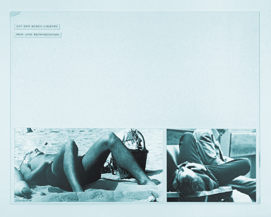
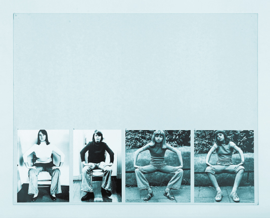
For several years, Paul Kooiker and Erik Kessels have organized evenings for friends in which they share the strangest photo books in their collections. The books shown are rarely available in regular shops, but are picked up in thrift stores and from antiquaries. The group’s fascination for these pictorial non-fiction books comes from the need to find images that exist on the fringe of regular commercial photo books. It’s only in this area that it’s possible to find images with an uncontrived quality. What’s noticeable from these publications is that there’s a thin line between being terrible and being awesome. This constant tension makes the books interesting. It’s also worth noting that these tomes all fall within certain categories: the medical, instructional, scientific, sex, humour or propaganda. Paul Kooiker and Erik Kessels have made a selection of their finest books from within this questionable new genre.
![]()
![]()
![]()
![]()
![]()
![]()
![]()
![]()
![]()
![]()
![]()
![]()
![]()
![]()
![]()

For several years, Paul Kooiker and Erik Kessels have organized evenings for friends in which they share the strangest photo books in their collections. The books shown are rarely available in regular shops, but are picked up in thrift stores and from antiquaries. The group’s fascination for these pictorial non-fiction books comes from the need to find images that exist on the fringe of regular commercial photo books. It’s only in this area that it’s possible to find images with an uncontrived quality. What’s noticeable from these publications is that there’s a thin line between being terrible and being awesome. This constant tension makes the books interesting. It’s also worth noting that these tomes all fall within certain categories: the medical, instructional, scientific, sex, humour or propaganda. Paul Kooiker and Erik Kessels have made a selection of their finest books from within this questionable new genre.


.jpg)

+1.jpg)
+1.png)

.jpg)
.jpg)
.jpg)
.jpg)
.jpg)


.jpg)