Quantcast
Channel: Bint photoBooks on INTernet
Viewing all 931 articles
Browse latest View live

Jazz in the Concertgebouw Amsterdam '50s Miles Davis Ed van der Elsken Photography

$
0
0
Jazz by Ed van der Elsken 
...but Van der Elsken's is the work of an authentic jazz fan and a maker of authentic photobooks...


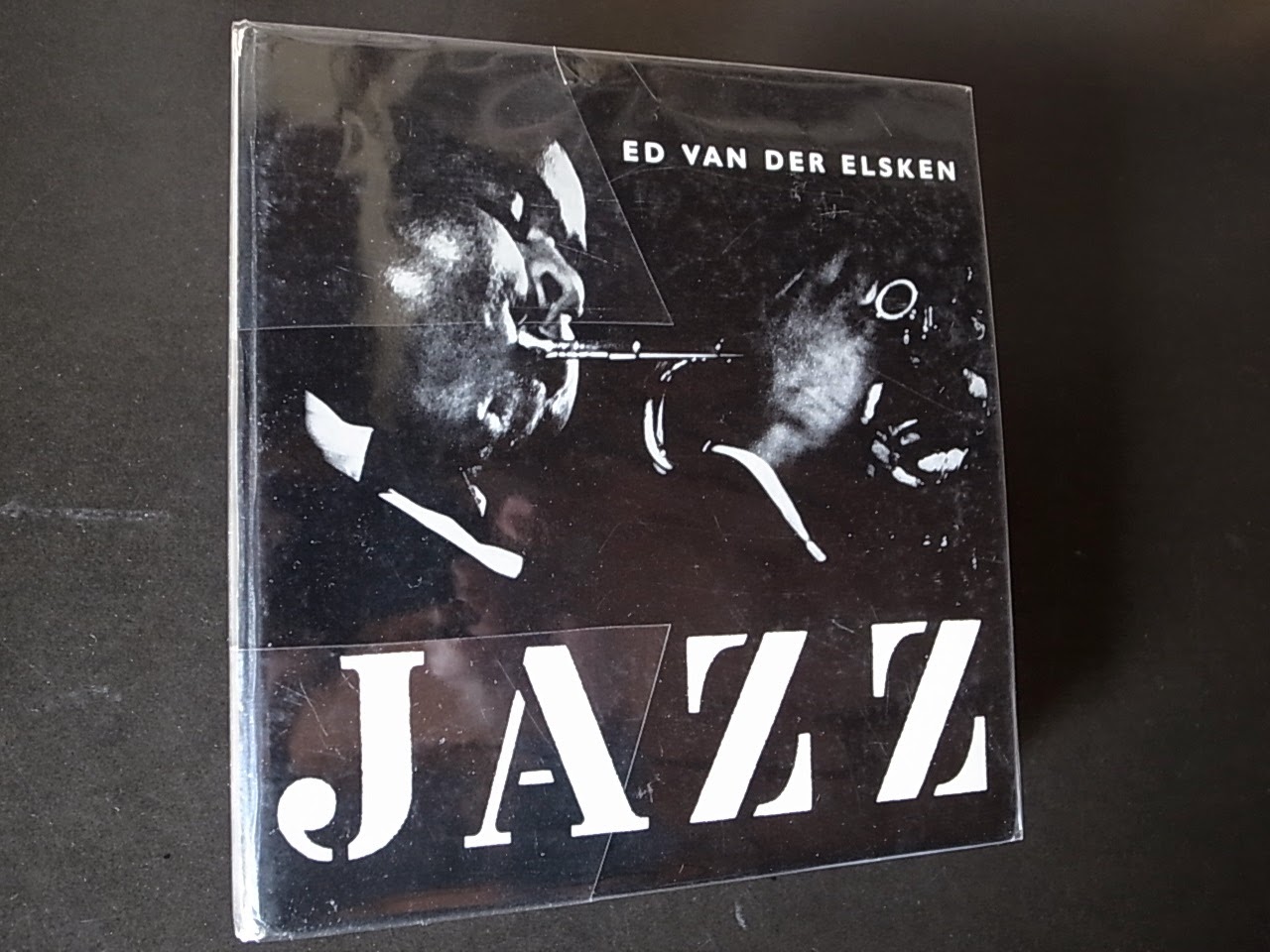
Jazz by Ed Van der Elsken
First Edition, First Printing, 1959

This is a rare first edition, first printing of Van der Elsken’s critically acclaimed photobook “Jazz” published by De Bezige Bij, Amsterdam in 1959.  Parr & Badger in “The Photobook: A History” write, “…this book is perhaps the most successful of numerous attempts to capture photographically the essence of jazz because it is more than just "a succession of musicians' portraits, or even a documentary record of performance, but a book that visually echoes the music itself. Other photographers, perhaps closer to the Jazz community, have made books on the subject, but Van Der Elsken's is the work of an authentic jazz fan and a maker of authentic photobooks.” Vince Aletti in “The Book of 101 Books: Seminal Photographic Books of the Twentieth Century” adds, “In a sense Van der Elsken turned his books into cinematic self-portraits, photographing and finding the ideal graphic shape for his passions. One passion was for jazz, and his 1959 book on the subject, shot at concerts in Amsterdam and The Hague, is clearly a devoted fan's attempt to capture not just the performer but the performance".
Featuring 79 black-and-white photogravure plates and measuring approximately 7” x 7”, the book is bound in photographically illustrated laminated boards. The edition was issued without a dust jacket.  
Cited in all three reference works on photobooks: “The Book of 101 Books: Seminal Photographic Books of the Twentieth Century” by Andrew Roth, “The Photobook: A History” by Parr & Badger, and “The Open Book” by Andrew Roth.
Ed van der Elsken Jazz
The 1950s consituted a golden age for jazz music. The decade was also renowned for classic small-camera photography, much of it as rough and ready as the best experimental jazz. The two art forms combine to perfection in Ed van der Elsken's gem of a book, Jazz.

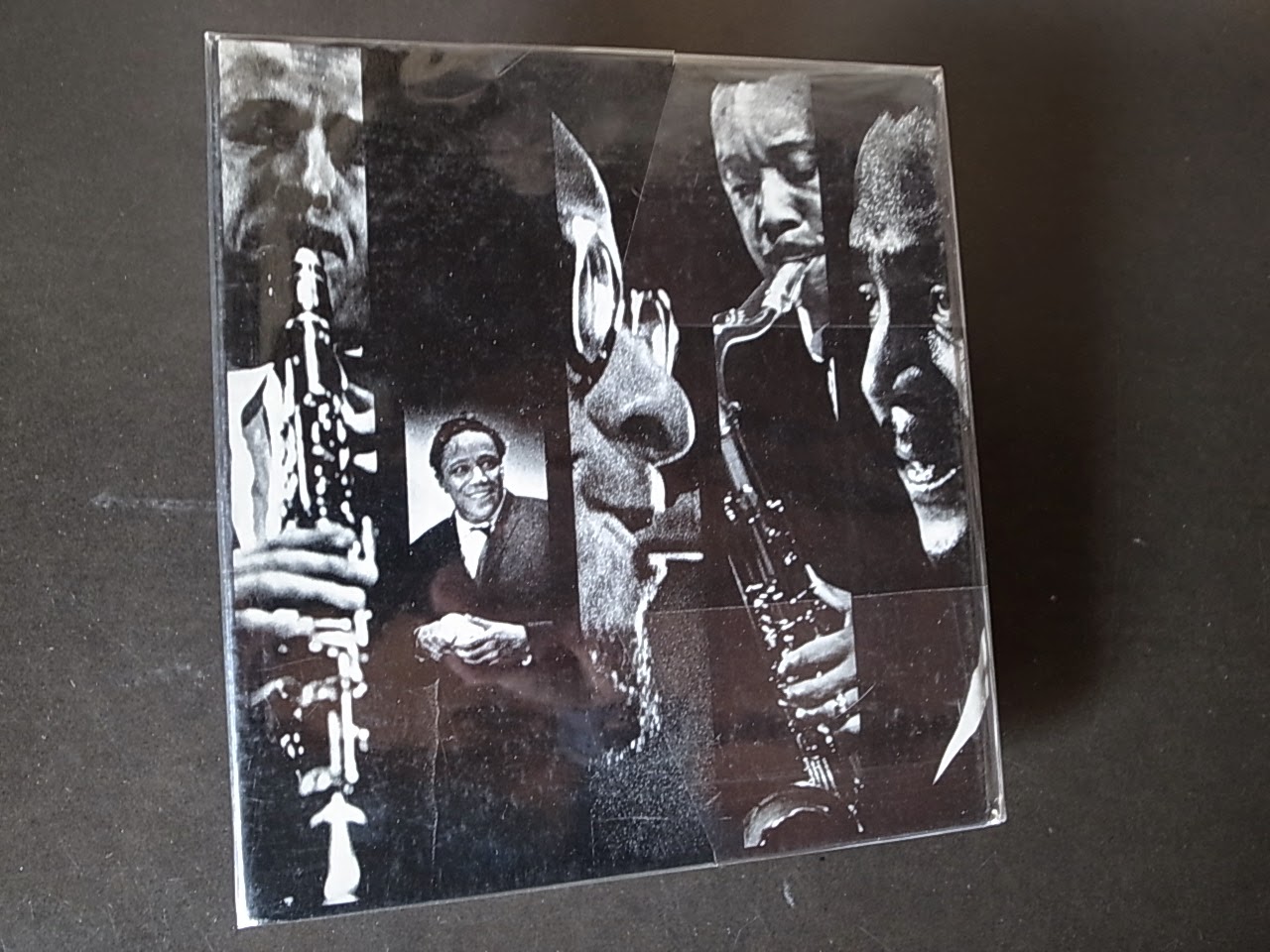
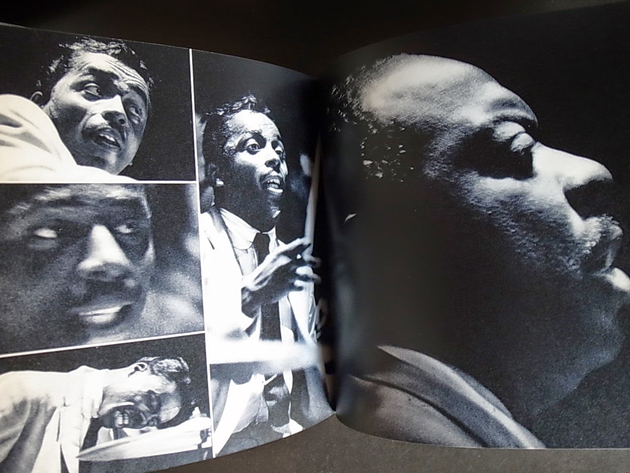
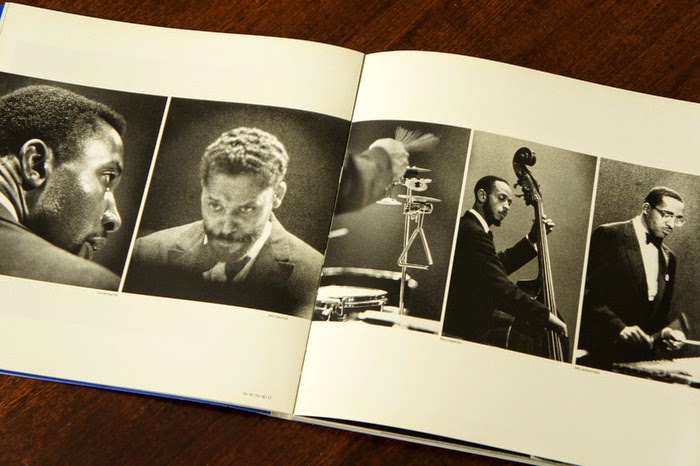
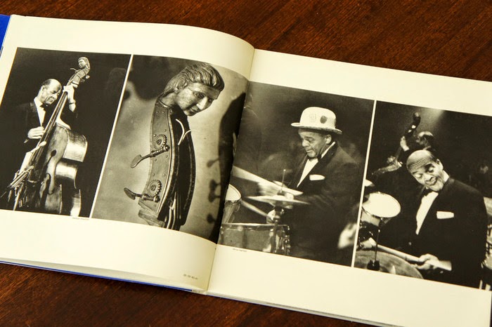
Jazz is an elusive art form, and there would seem to be two aspects to pinning it down in a photobook: the form of the photographers and the form of the book. Van der Elsken's assiduous attention to both makes this modest volume probably the most successful of the numerous attempts to do so. Jazz is a spontaneous, fluid, improvisatory art, best caught on the wing, and this generally means photographing in a variety of illlit places. Formal, carefully lit studio portraits may be perfect for album covers, but they hardly catch the essence of a performance. Small cameras and available light, using a slow shutter speed, are much more effective ways of ambushing the practioners of what Whitney Balliett called the 'sound of surprise''.

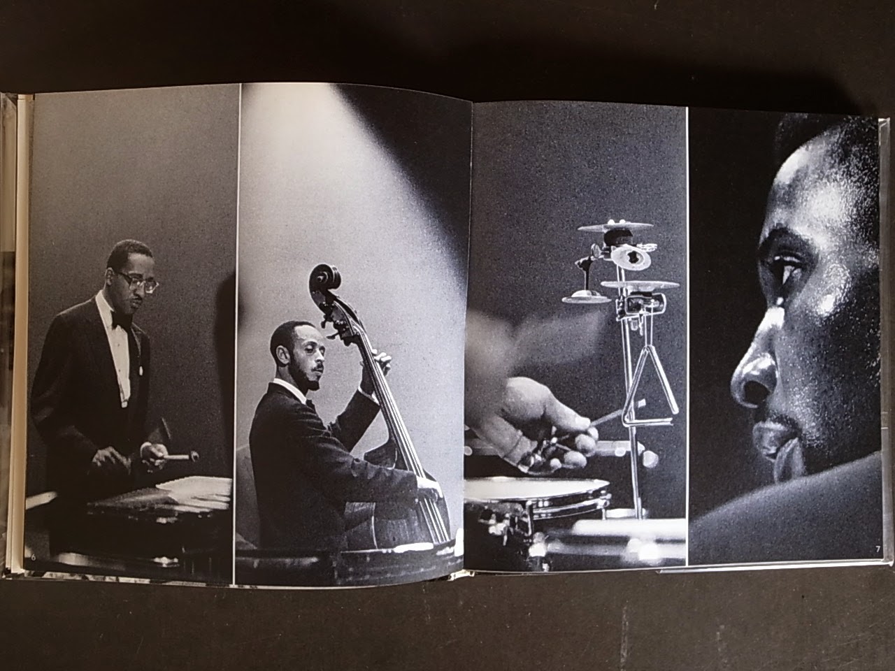
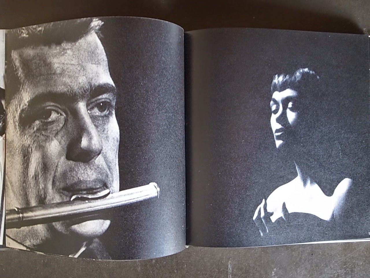
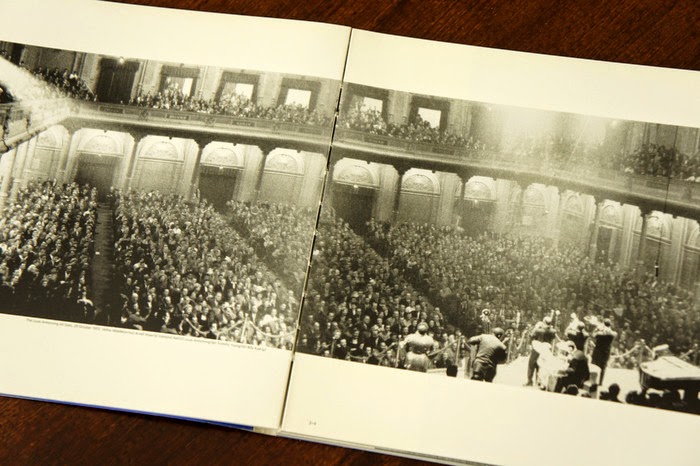
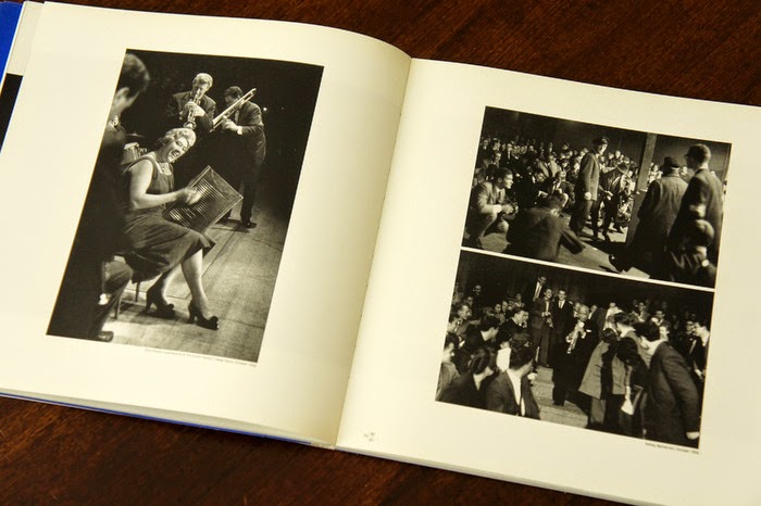
The form of the book itself owes much, one suspects, to Klein's New York, and possibly to Brodovitch's Ballet. As with Sweet Life, the covers varied according to the country of publication. Inside the book begins with an image of crowd 'digging' a concert, then builds into a series of variations on the relationship between performers and audience, constructed in much the same way as a jazz musician constructs an improvised solo. Pages are split into two-, three-, four-, and six-part image combinations, resembling the clusters of notes in a saxophone or trumpet run. Graphically, vertical clusters of images suggest piano keys, while horizontal, stretched images recall held notes. The result is not just a succession of musicians' portraits, or even a documentary record of performance, but a book that visually echoes the music itself. Other photographers, perhaps closer to the jazz community, have made books on the subject, but Van der Elsken's is the work of an authentic jazz fan and a maker of authentic photobooks.

Martin Parr and Gerry Badger: The Photobook A History volume I: Memory and reconstruction: The Postwar European Photobook

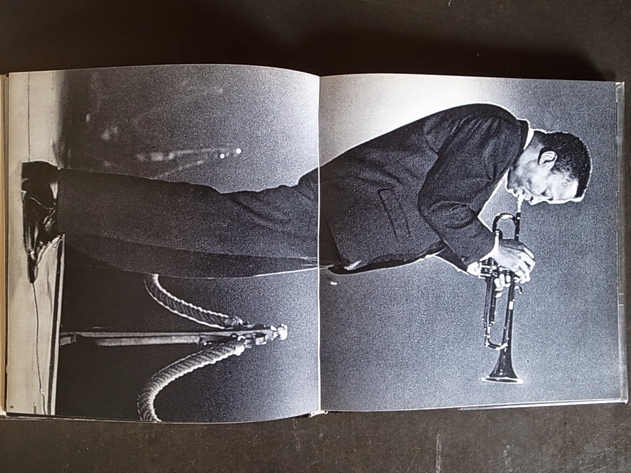
I know I have already made my favorites list for 2007 but I do want to slip one late arrival in under the wire while we still have a couple days left. Jazz by Ed Van Der Elsken, originally published by De Bezige Bij in Amsterdam in 1959, has just been released in a facsimile edition from Karl Lagerfeld’s Edition 7L in Paris. This is one of several books that Edition 7L has created a facsimile edition of and in each case they have done so with beautiful results. This small book, unassuming from the outside with its 6 ¾ by 7 ¼ inch trim size, reveals itself within the span of just a few pages to be a remarkable document in both photography and book design. Elsken’s small format camera and fast speed film is the perfect combination to catch the spontaneity of what is transpiring both on stage and in the crowd. Within a few frames he shifts our vantage point from passive observers of the musicians to placing us in the shoes and on stage among the players. Jumping from wide shots to extreme close-ups, the strength of the photography is its ability to be as energetic as the music.

The design, also by Elsken, is another achievement in raising the energy level. The page layouts have their own rhythms and structure that are as metaphorically musical as necessary to create a visual accompaniment that expresses the excitement felt while listening to the music. The book starts with the crowd responding to the first notes and the layout progresses in a fairly traditional way until Miles Davis steps to center stage; Elsken makes a double page spread out of a vertical photo and turns Miles sideways so he defies gravity.

Parr and Badger in their citation of this book in Photobook Vol. 1 name William Klein’s New York as a likely influence to the design. I would add that some of Elsken’s page layouts echo the John Hermansader and Reid Miles Blue Note album covers of the late 1950’s with their heavily cropped and contrasty photos of musicians emerging from the darkness. For me, one of the more seductive qualities of the book is how the difference in the coarseness of the film’s grain varies from photo to photo and becomes another element in the design. Few of the images in Jazz escape with their original Leica proportions intact. Elsken crops the images down to their purest form and mostly for the sake of the book’s design. In one particularly creative page, Elsken splices the faces of Coleman Hawkins and Roy Eldridge onto the same head to form a tenor sax and trumpet playing hybrid. The book ends with a sequence of Sarah Vaughn building to a final never-ending note. The production work on this facsimile edition was done by Steidl. The original was printed in gravure and with this edition; Steidl has accomplished a beautiful faux-gravure printing that is ever so slightly silvery-blue in tone and deeply rich. The paper choice and tack sharp grain of Elsken’s photos complete the feeling of vintage gravure printing. The texts by Jan Vrijman, Hugo Claus, Simon Carmiggelt, Friso Endt and Michiel de Ruyter along with a song list of recommended listening appear in their original Dutch. A separate thin-paged booklet of English translations sits in the endpapers. The regular edition retails for only $30.00 which I find surprising inexpensive considering the fine quality. There is a special edition of 1000 copies also available for $100.00. This special edition is a facsimile made from an original copy of Jazz from Ed Van Der Elsken’s estate where he had written the names of all of the performers in silver ink directly onto the pages. 5B4


Elsken,Ed van der

foto-jazz. Mit 116 s/w Fotos.

- Autoren/Mitwirkende: Ed van der Elsken, Joachim E. Berendt, Ausführung: gebunden, Hardcover, Auflage: , Jahr: 1959, Umfang: 110 Seiten im Format ca. 18,5cm x 17,5cm, Sprache: Deutsch, Erhaltung: gebraucht, sehr gut, leichte Gebrauchsspuren, Buchdeckel etwas gewölbt


JAZZ ("JAZZ 1955-1959.61") - Rare Fine Copy of The Revised Edition/First Printing

Van Der Elsken, Ed (Photographer); Van Den Berg, Eric & Bernlef, J. (Conributors)

Published by Amsterdam, Netherlands: Fragment Uitgeverij Amsterdam, 1991 (1991)
ISBN 10: 906579042X / ISBN 13: 9789065790422
1st Printing. 150 pages. Published in 1991. Revised Edition of the photographer's classic. Possibly the single greatest photography book on jazz ever published. The first appearance of the 1991 Edition. Precedes and should not be confused with all other subsequent editions, including the new posthumous edition of 2008. The edition is now rare. A brilliant production by Fragment: Oversize-volume format in oblong shape. Black softcovers with white titles on cover and spine, as issued. Photographs by Ed van der Elsken. Essays by Eric van den Berg and J. Bernlef. Printed on thick coated stock paper in Amsterdam to the highest standards. In publisher's original plastic wrappers. In pictorial DJ with white titles on the cover and spine, as issued. Re-presents, in a handsome new edition, Ed van der Elsken's 1959 classic, with new photographs added that were taken subsequently in 1960 and therefore did not appear in the original edition. There is a whole shelf of great photography books on jazz. With each passing year, Ed van der Elsken's contribution is seen by both photography and jazz lovers as the single greatest book ever published on its inexhaustible subject thus far. "Ed van der Elsken's entry into music photography appeared just before the decisive moment when rock n' roll cemented its place as the popular music of choice for young people. It is perhaps the most successful of the era's many photographic attempts to capture the essence of jazz because it is more than just a succession of musicians' portraits or even a documentary record of performance, but a book that visually echoes the music itself" (Publisher's blurb). "Visually echoes the music itself" cannot be improved upon. The photographs, all of them unposed, of jazz's legendary artists are all here, performing before us, giving it all they got, and as Frank Sinatra once said of jazz, "dying a little bit" in the process: Ray Charles, John Coltrane, Dizzy Gillespie, Sonny Rollins, Louis Armstrong, Chet Baker, Count Basie, Dave Brubeck, Duke Ellington, Ella Fitzgerald, Benny Goodman, Lionel Hampton, Coleman Hawkins, Oscar Peterson, and Sarah Vaughn, among others. Francois Truffaut (his "Shoot The Piano Player" is one of the greatest films on jazz) once said that America has produced only two art forms that are authentically American: The Hollywood film of the Golden Age and jazz. An absolute "must-have" edition for Ed Van Der Elsken collectors and jazz aficionados alike. This title is now highly collectible in its own right. This is one of few copies of the Revised Edition/First Printing still available online, is still in the publisher's original plastic wrappers, and is in especially fine condition: Clean, crisp, and bright, a pristine beauty. All other copies of this edition online have major flaws while the 1959 Edition is rare and commands several thousand dollars when it turns up on the market. This edition is a lovely and accessible alternative, and offers additional photographs that appear for the very first time. A rare copy thus. 190 plates. Ed van der Elsken's "Jazz", "Love On The Left Bank", and "Sweet Life" were selected as three of the greatest photography books in "The Photobook". One of the greatest photographers of the 20th century. 


DUTCH JAZZ ARCHIVE SERIES
Jazz at the Concertgebouw
Miles Davis in Amsterdam

It is still the most controversial jazz concert ever at the Amsterdam Concertgebouw: Saturday, April 9, 1960, the Miles Davis Quintet with John Coltrane. Hundreds of fans walked out in protest and disgust that night, while the other half of the audience was mesmerized by the new sounds they were hearing. Most of the critics reacted with astonishment and sometimes pure anger. Decades later, some of them would still feel ashamed about their harsh pronouncements. The Dutch jazz magazine Rhythme really exploded in its May issue: 'Following Dada standards, equipped with fool's cap and little green trumpets, the limit of the acceptable was cheerfully crossed. [...] What John Coltrane presented us with, was frankly scandalous and bore no relation whatsoever with playing the saxophone. Folks who dare call this the "music of tomorrow" don't have the slightest comprehension of music.' About the only reviewer who did not have to take back one word of his judgment afterwards, was Michiel de Ruyter of the Amsterdam daily Het Parool. Miles Davis' melodies, he wrote, 'are not just among the most beautiful (jazz) music of today, but will possibly one time be - in two, five or ten years - THE style and form.' 

In retrospect, it is difficult to understand what all the fuss was about. In the spring of 1960, John Coltrane was cautiously exploring new ways of playing. He had recorded his first multiple tones in December 1959, on the album Coltrane Jazz, but his truly groundbreaking performance was still a year and a half away: Chasin' the Trane, November 1961. Dutch jazz fans, however, were ill prepared for even Coltrane's most moderate experiments. In those days, it sometimes took more than a year before American LPs were released in Europe. In April 1960, we knew the John Coltrane of the original Miles Davis Quintet of 1955-'56, we knew his albums Blue Train (1957) and Soultrane (1958), but we had never heard the sheets of sound on Giant Steps (May 1959), let alone the multiphonics of Coltrane Jazz. For Miles Davis' music the same was true. His 1958 albums Milestones and Porgy And Bess had been released here, but we had to wait until the late summer of 1960 to discover the modal improvising on Kind Of Blue (recorded March-April 1959). Holland was not alone that spring in its mixed reaction to the music of Miles Davis and John Coltrane. Three weeks before the Amsterdam concert, on March 21, 1960, the quintet had played at the Olympia in Paris, and the audience there expressed its discontent with loud whistling en booing during Coltrane's solos in On Green Dolphin Street and particularly Bye Bye Blackbird. 

Barney Wilen (ts), Miles Davis (t), René Urtreger (p, hidden), Pierre Michelot (b), Kenny Clarke (d) 
during the concert in  the Concertgebouw, Amsterdam, December 8, 1957

On April 9, the Miles Davis Quintet was part of a Jazz At The Philharmonic package, assembled by Norman Granz and brought to Holland by impresario Lou van Rees, which before the intermission presented the Oscar Peterson Trio (with Ray Brown and Ed Thigpen) and the Stan Getz Quartet (with Swedish pianist Jan Johansson). There had first been an evening concert at the Kurhaus in Scheveningen, of which the final Miles Davis set was broadcast directly by VARA radio. Consequently the majority of the midnight audience at the Amsterdam Concertgebouw had already heard the quintet that evening, and many of them were absolutely shocked by Coltrane's playing. I must confess that, four days before my 18th birthday, I was no exception. Listening to the radio, I couldn't comprehend at all what Coltrane was trying to do. So I arrived at the Concertgebouw full of apprehension. Miles Davis had performed in The Netherlands twice before, in November 1956 with the Birdland '56 show (sharing the stage with Lester Young, Bud Powell and the Modern Jazz Quartet), and in December 1957 with his Ascenseur pour l'échafaud quintet (including Kenny Clarke). Both times my parents wouldn't allow me to go. Now that I was finally old enough to get their permission, would my first Miles Davis concert turn out to be an enormous disappointment? Strangely enough, my dark expectations didn't really come true. During the midnight concert I was mostly surprised by Coltrane's passive attitude. At times he seemed almost reluctant to play. So I had ample opportunity to enjoy the rest of the group: Miles Davis' intense and inspired improvisations, Wynton Kelly's joyful piano solos, and the swinging perfection of the rhythm section with bassist Paul Chambers and drummer Jimmy Cobb, carrying the soloists along with the effortless comfort of a large Cadillac. 

It is still a mystery to me why Coltrane sounded so timid at the Concertgebouw, after his overpowering performance at the Kurhaus. (He blasts into an eight and a half minute solo in the Scheveningen performance of So What, officially released in 2008 by Columbia Records as part of the Kind Of Blue 50th Anniversary Box. By contrast, the entire Amsterdam version of So What lasts just ten minutes, with a four minute Coltrane solo that starts almost pensively and only slowly gets off the ground.) Some critics, who also noticed the difference between Scheveningen and Amsterdam, speculated that Coltrane simply may have been tired. That Saturday morning at six, the musicians had been woken up in Zurich, Switzerland, but they missed their plane to Amsterdam and arrived there with three hours delay - after which they hurried to the Kurhaus, and immediately afterwards had to leave for the Concertgebouw. Another possible explanation is that Coltrane didn't feel satisfied anymore as a member of the Miles Davis Quintet, since he wanted to start his own group. 'He was restless and uneasy throughout the entire tour, making it clear to all members of the band that he would rather be elsewhere, working on his own music on his own terms,' Jack Chambers wrote in his Miles Davis biography Milestones. So Coltrane may not have been motivated to give his all during two concerts on the same day. In his review for Het Parool, Michiel de Ruyter specified that his comments on Coltrane mostly pertained to the evening concert at the Kurhaus. 'Coltrane, who has been experimenting lately, among other things, with simultaneously obtaining two high, flageolet-like tones from an instrument that in principle can produce only one at a time, made high demands on the listener's capacity to absorb and understand,' he wrote. 'But it is fascinating to witness these experiments oneself now, that they are not done privately so that we can only hear the final result.' 

During the Amsterdam concert of April 9, Miles Davis performed the exact same four tunes as the day before in Zurich: If I Were A Bell, Fran-Dance, So What and All Blues. (In Scheveningen he had played three different tunes after So What, namely On Green Dolphin Street, 'Round Midnight and Walkin'.) We don't know whether he consciously felt the need to compensate for Coltrane's less than complete commitment at the Concertgebouw. But one thing is certain, Miles Davis is playing at his top level here. Just listen to the transition from muted to open trumpet in All Blues: you will rarely hear a more convincing way to start a jazz improvisation. 

Notwithstanding the controversy about Coltrane's playing, most of the Dutch critics remained in awe of Miles Davis as probably the most important leader in modern jazz. The reviewer of the national daily de Volkskrant praised his 'long melodic lines with extremely refined harmonies', and called his playing 'mystical'. Another critic, in the daily De Telegraaf, described him as 'the trumpet player with the most original style in today's jazz world'. And a profile in Het Vaderland, a daily paper from The Hague, presented him as 'the central figure in the jazz of the fifties'. So in October 1960, just half a year after the tumultuous April performances, it was a logical decision of Norman Granz and Lou van Rees to bring Miles Davis to Holland again. This time he gave two full concerts at the Kurhaus and the Concertgebouw. The rhythm section was still the same, but John Coltrane had indeed given his notice immediately after returning to the U.S. In May 1960, he premiered his own quartet at the Jazz Gallery in New York. 
Davis replaced Coltrane briefly with Jimmy Heath, but that turned out to be impractical. Heath had just finished serving a fifteen-month term on a narcotics conviction, and the parole board wouldn't let him travel beyond ninety miles of his hometown Philadelphia. So Miles Davis was forced to hire another saxophonist. He chose Sonny Stitt, a bebop virtuoso who felt little inclination to apply himself to the modal music the group was focusing on since the release of Kind Of Blue. Stitt would leave after only a few months, in the beginning of 1961, but he played the whole European tour of September and October 1960. 

At the Concertgebouw on Saturday, October 15, the Miles Davis Quintet logically was received with less controversy than in April. The Dutch jazz audience by now had been able to familiarize itself with the album Kind Of Blue and the new sounds it represented. Ironically, most fans in the hall (including myself, as I can see in the notes I made that night on the concert program) thought they heard Flamenco Sketches, while the band was playing All Blues. On the original edition of Kind Of Blue, Columbia Records had stupidly switched the two titles. But the big difference, of course, was the absence of John Coltrane, whose first Dutch concerts with his own group, one year later in November 1961, would again give rise to much heated debate. 

Sonny Stitt, however, was not welcomed with unanimous enthusiasm as a new member of the Miles Davis Quintet. In the modal tunes So What and All Blues he audibly does not feel comfortable. In But Not For Me he uncharacteristically appears to run out of licks and ideas toward the end of his alto solo. In fact, the only times Stitt really seems willing and able to stretch out are during Stardust and Old Folks, his two gorgeous ballad features, without Miles Davis, after the intermission. I remember talking to my jazz friends after the concert, and referring to Stitt's playing as 'frustrated'. Imagine my surprise on reading Michiel de Ruyter's review in Het Parool on Monday: 'I would be inclined to start analyzing the frustration of alto saxophonist Sonny Stitt, with his - relatively - rather orthodox playing.' (Clearly, my insight into the music had grown since April 9.) 'But there is so little purpose to all this,' De Ruyter continued, 'and I feel little need to coolly analyze - one of the critic's tasks. I would much rather state, emotionally, that the jazz we heard at the Kurhaus and the Concertgebouw was music of the very highest order, an intensity, a nobility, an unearthly beauty, so much so that it is difficult to acclimatize afterwards.' 

In his memoir What It Is: The Life of a Jazz Artist, saxophonist Dave Liebman looks back on his period with Miles Davis (1973-'74). The most important thing he learned, Liebman says, 'is that once the count-off is finished, this is serious business. It was as if there was no past, no future, and any fooling around or anything less than a dead serious attitude was not cool.' Whatever the circumstances, 'you are expected to play like your life depends on it.' This, more than anything, is the impression I retain after hearing these two concerts again, more than half a century later. Whatever Miles Davis demanded of his sidemen, he first of all demanded of himself. And his superhuman intensity leaves the listener with wonder and admiration. 

BERT VUIJSJE
Jazz journalist and author of Rita Reys: Lady Jazz (Thomas Rap, Amsterdam, 2004) 

Literature:
Jack Chambers: Milestones 2 - The Music and Times of Miles Davis Since 1960. William Morrow, New York, 1985. Dave Liebman (with Lewis Porter): What It Is - The Life of a Jazz Artist. The Scarecrow Press, Inc., Lanham (Maryland), 2012.


Souvenir Album Midden-Java Djocjakarta, N.V. v/h H. Buning Dutch East Indies Photography

$
0
0

Souvenir Album Midden-Java

Djocjakarta, N.V. v/h H. Buning [c. 1925] - Dark green paper portfolio with cover printed in gold containing 13 (of 20?) photo plates depicting Javanese dancers , opiumsmokers, brassworkers, batiking women, Javanese antiquities, the court of the Sultan of Djocja, a gamelan orchestra, etc., all with printed legends in Dutch, English, French and German measuring 23,5 x 28 cm. each. Slight wear to portfolio, plates in excellent condition.


Nederlands-Indië in foto's, 1860-1940
Photography in the Dutch East Indies

The commercial photographers who started working in the Dutch East Indies from 1845 led a nomadic existence. They would set up a studio in a large town or hotel or at the home of an acquaintance, advertise in the local paper and take a photograph of anybody who had money to spare for that purpose. After a couple of weeks or months when the market had become saturated, they moved on to the next town. Among these pioneers were the two young Englishmen Walter Bentley Woodbury and James Page. From 1857 to 1908 Woodbury & Page was a leading firm in the photography sector in the Dutch East Indies.

Primarily, the commercial photographers took portraits of people, more particularly of prominent individuals. In addition, they sold topographic photos, i.e. pictures of important buildings, streets, volcanoes or agricultural enterprises. Pictures of the various population types in the colony also formed part of their repertoire. The topographic photos were chiefly sold as ‘souvenirs’.

During the last decades of the nineteenth century, the photographers’ wanderings came to an end. At that time, every large town had one or more permanently established photographers. The Surabayan photographers Onnes Kurkdjian  and Herman Salzwedel and the Javan, Kassian Céphas (who worked in Yogyakarta) were famous names at the time.

The heyday of commercial photography was over by the beginning of the twentieth century and the role it played in forming an image of the Dutch East Indies diminished noticeably. There were two reasons for this. The introduction of the picture postcard brought an end to the market for topographic photos. And then, thanks to the many technical improvements, photography had essentially become the domain of amateurs: now everybody could make his or her own ‘souvenirs’.

See also 

the Souvenir Photo Albums of the Dutch East Indies by Kurkdjian & Co Photo Studio Photography


 The Aloen-Aloen at Djocjakarta


 Javanese Orchestre

 Thronehall of the Sultan of Djocjacarta

 The Tjandi Mendoet

 The Tjandi-Prambanan

 The Boro-Boedoer Temple

Small gate on the cemetery of the Sultan at Pasargede

 Statue of Boeddha in the Tjandi Mendoet

 Tandak-Dancer

Tandak-Girl

Card-Players

Opiumsmokers

Copperengraving

Batikmaking

Sex, drugs and boredom Tulsa Larry Clark Photography

$
0
0

Larry Clark - Tulsa & Teenage Lust

Foam presents two renowned and controversial projects by photographer and filmmaker Larry Clark. Tulsa (1971) and Teenage Lust (1983) are Clark's earliest bodies of work and reveal a youth culture, which at the time was totally unknown to the greater public.  Images of sex, violence and drug use permeate both series, which were also published as books. At the time of their release, both projects caused a great deal of commotion due to the rawness of the images, but the truth of what they revealed also gave way giving them an iconic status. Being shown alongside the photographs, Tulsa (64 min) is a 16 mm film that was shot by Clark in 1968;  he made contact prints from a section of the film, but didn't do anything with the rest of the footage and put it away.  The film was rediscovered by the artist in 2010 and is a fascinating precursor for his later cinematic oeuvre.

Larry Clark established his reputation in 1971 with the Tulsa series and the eponymous book, which he worked on between 1963 and 1973. The book became an instant classic and launched a true revolution in documentary photography. In graphic black-and-white Clark showed confrontational, autobiographical images focusing on the violent underworld of Tulsa. The use of hard drugs, explicit violence and sex play a prominent role. Tulsa was shot in a new documentary style: subjective, alienated and completely free of any social agenda. It became the prelude to raw, unpolished photography that was not based on objective observation by an outsider but instead came from the experience of those directly involved. Based on Tulsa, Clark received a grant from the National Endowment for the Arts to realise his next project. This, however, took ten years, due to Clark's heroin addiction and a prison sentence.

He finally finished his second extremely innovative project, Teenage Lust. In the book that appeared in 1983, his interest in the drug culture had been replaced by sexual obsession. Clark's own troubled life and that of his friends form the background for the images in this series. Clark combined self-portraits and photos from his youth in Tulsawith images of young male prostitutes he met in Times Square in New York in the early 1980s. It is an incisive document spanning a period of thirty years about a group of youngsters who made a different choice than the typical American Dream.

Clark's photographic and filmic oeuvre both deal with the challenges faced by young people in a culture that idealises its own youth as well as commercialises it violently. Clark is considered worldwide as one of the most important and influential American photographers of his generation.

The exhibition is comprised of vintage photos from the Olbricht Collection, Essen, Germany. Larry Clark is represented by Luhring Augustine Gallery, New York.

Larry Clark "Tulsa" from Landscape Stories on Vimeo.


Seks, drugs en landerigheid Door 
Zijn werk sloeg in als een bom. Toen de Amerikaanse fotograaf Larry Clark in 1971 het controversiële fotoboek Tulsapubliceerde, reageerde het publiek geschokt. Clark fotografeerde jongeren in de stad in Oklahoma die de tijd stuksloegen met drugs, seks en geweld. Een knappe James Dean-achtige jongen met een naald in de arm. Een jonge vrouw, hoogzwanger, die een shot zet. Larry Clark (1943) was zelf een van die jongeren. Hij groeide op in Tulsa-waar-helemaal-niets-te doen-was, spoot vanaf zijn zestiende amfetamine en zou zijn leven lang kampen met een drugsverslaving. De zwart-witte, grofkorrelige foto’s lieten nou niet bepaald een beeld zien zoals Amerika dat graag had van zijn middenklasse tienerkinderen.
In het Amsterdamse Foam zijn nu alle foto’s te zien van Tulsa, het boek dat onmiddellijk een cultstatus kreeg. Samen met de foto’s uit zijn tweede boek Teenage Lust (1983), waarin we jongeren zien die in al hun landerigheid een beetje hangen, drugs gebruiken en omdat er verder toch niks te beleven valt, seks met elkaar hebben.
Clark was een van de eerste fotografen die zijn eigen sociale kring zo openhartig en rauw weergaf. Hij zou er generaties fotografen mee inspireren. Nan Goldin vond in zijn foto’s de bevestiging dat ze op de goede weg was met haar werk over haar verslaafde New Yorkse vriendenkring. Richard Billingham zou de ontluisterende foto’s van zijn alcoholistische vader en obese moeder waarschijnlijk nooit gemaakt hebben als Clark niet die voorzet had gegeven.
Nu, ruim veertig jaar later, blijven de rauwe, krachtige poëtische foto’s van Clark fascineren. En blijven de expliciete foto’s waarin jongeren – kinderen eigenlijk nog – seks hebben ongemakkelijk. Zeker als je je realiseert hoe dicht Clark daar met zijn camera bovenop zat.


1406tzlarrygroot3.jpg
1406tzlarrygroot2.jpg
1406tzlarrygroot5.jpg
Werk van Larry Clark uit de boekenTulsa en Teenage Lust. Met de klok mee, links bovenaan beginnend:Tulsa(1963),New York City (1968),Dead (1970),Untitled (1963) enJack and Lynn Johnson Oklahoma City (1973).
Foto's Larry Clark/ Courtesy of the artist and Luhring Augustine New York
1406tzlarrygroot4.jpg
1406tzlarrygroot1.jpg

  1.  
  2.  
  3.  
  4.  


Roma-meisje Sabrina een kleine prinses in een houten hut Stefano Carini Photography

$
0
0

Roma-meisje Sabrina, een kleine prinses in een houten hut
Door Nynke van Verschuer & Stefano Carini
17 juli 2014  
Sinds vier jaar volgt fotograaf Stefano Carini het Roma-meisje Sabrina en haar familie. ‘Het is eigenlijk een heel beschermde omgeving.’
‘Het begon niet erg romantisch. Ik studeerde aan de fotoacademie, ik moest een reportage maken om te oefenen. Ik koos als onderwerp de Roma-gemeenschap in Turijn. Ik kom uit Turijn, ik kende de zigeuners, bedelend bij het stoplicht of schoenen poetsend in het centrum. Ik had eigenlijk geen benul waar ze woonden en hoe ze leefden, dus besloot ik een aantal van hun kampen te bezoeken en daar een verhaal van te maken. Dat viel niet mee – de bewoners zaten niet te wachten op zo’n studentje met een te grote lens.

De enige die me welwillend begroette, was de grootmoeder van Sabrina, Sabina. We raakten aan de praat, ze vertelde mij over haar leven. Ze kwam uit Roemenië. Na de val van Ceaușescu was ze langzaam maar zeker alles kwijtgeraakt: eerst haar baan, toen haar huis. Ze had een broer hier, in Turijn, die haar zei dat het in Italië makkelijker zou zijn om een nieuw leven op te bouwen dan in Roemenië. Samen met haar man en haar zwangere schoondochter reisde Sabina naar Italië. Hier aangekomen barstte ze in tranen uit. “Aan de oever van de rivier stonden een paar houten schuurtjes, de stank van het open riool was ondraaglijk en het stikte er van de ratten.”’
“De hemel,” zei ze, “die moet blauw en niet zo grijs"
‘In 2003 werd Sabrina geboren. Toen zij net een jaar oud was, vond Sabina haar op een matras in de hut. Haar moeder was verdwenen. Vanaf dat moment zorgen Sabrina’s grootouders voor haar. Sabrina noemt hen mama en papa.

De reportage over de verschillende Roma-kampen heb ik nooit meer gemaakt. Sabrina en haar familie ontmoette ik in 2010, sindsdien kom ik er regelmatig over de vloer en fotografeerde ik het huis en het dagelijks leven. Ik stond ervan versteld wat een doodgewoon gezinsleven zij hebben. Sabrina is dol op haar grootouders en andersom. Ze wonen in een houten hut met twee kamers, zonder stromend water of elektriciteit. Toch hebben ze er alles aan gedaan om het gezellig te maken, met wandkleden om het hout achter te verstoppen, tapijtjes, planten en potten en pannen.

Inmiddels is Sabrina bijna elf, ze gaat dit najaar naar de middelbare school. Haar grootmoeder is een intelligente vrouw die er alles aan doet om ervoor te zorgen dat Sabrina ooit wel een baan krijgt en in een huis van steen kan wonen.

Het bleef moeilijk voor me om me voor te stellen wat het nu precies betekent om geboren te worden in zo’n kamp, wat het doet met je denkbeelden en je dromen. In het begin maakten we weleens tekeningen samen, zoals je dat met kinderen doet. Het bracht me op het idee om Sabrina ook een camera te geven en haar tekeningen op te nemen in mijn verhaal, zodat zij zelf kon laten zien hoe ze de wereld om zich heen bekijkt.

Ik maakte een foto van het kamp, van veraf. Sabrina en ik keken ernaar, kinderen dromden om ons heen en waren verrukt, ze hadden hun kleine dorp nog nooit zo van de buitenkant bekeken. Ik vroeg Sabrina hoe het zou moeten zijn. “De hemel,” zei ze, “die moet blauw en niet zo grijs.” We kleurden de hemel blauw. ‘En we hebben helemaal geen planten, laten we ook bloemen nemen.’ En zo tekenden we het hele kamp vol met bloemen.’
'Het is heel raar en een beetje lachwekkend om te zien hoe kinderen van tien, twaalf jaar daar met elkaar omgaan alsof ze volwassen zijn'
‘Na schooltijd speelt het hele leven zich af in het kamp. Het is eigenlijk een heel beschermde omgeving voor een kind om op te groeien, iedereen kent elkaar en mensen van buiten zijn niet welkom. Sabrina speelt met haar leeftijdsgenootjes of helpt in het huishouden. Maar hoewel ze nog niet eens elf jaar is, is ze in de Roma-gemeenschap al bijna een vrouw.

In een houten schuurtje in het kamp is een bar ingericht, met een biljart en een muziekinstallatie. Het is heel raar en een beetje lachwekkend om te zien hoe kinderen van tien, twaalf jaar daar met elkaar omgaan alsof ze volwassen zijn. De meisjes dragen al veel make-up en ze dansen uitdagend met de jongens.

Sabrina zegt dat ze lerares wil worden, of kapster. Maar soms wordt ze ook opstandig als je haar vraagt wat ze later wil worden. “Ik wil een zigeuner zijn!” roept ze dan. Haar vader, haar broer en haar zus wonen nog in Roemenië. Soms droomt ze ervan om bij hen te wonen. Sabrina is een lief kind, heel zorgzaam, en ze helpt graag in het huishouden. Maar ze wordt als enig kind in het gezin ook heel erg verwend en zelden tegengesproken. Ze noemen haar hun kleine prinses. Een kleine prinses in een houten hut, dat wel.’


Foam: new steps in Fashion Photography

$
0
0

The Don't Stop Now: Fashion Photography Next exhibition, organised by Foam in collaboration with guest curator Magdalene Keaney, starts out from the fact that fashion photographers are first and foremost photographers. The exhibition provides a platform for a new generation of image-makers who work with fashion. Don't Stop Now: Fashion Photography Next offers an exciting glimpse into the wealth of contemporary practices in fashion photography, resulting in a dynamic, colourful and multi-faceted presentation.
Variety and hybrid are two major characterisations of the work of these young photographers. The exhibition shows the diversity in approaches, as well as the abundance of photographic methods. Developments in fashion photography proceed for the most part equally as those in other fields of photography. Contrary to the possibilities presented by digital technology, many emerging photographers turn to analogue techniques and process their own images in the darkroom. Some photographers are particularly interested in the artificial character of the fashion image and are pushing the limits of the medium via manual interventions and manipulation; others, on the contrary, investigate the possibilities  offered by the digital aesthetic. To do so, various forms are juxtaposed and combined, such as studio and location shots, and genres such as still life, landscape, portrait and abstraction. Collage, sculpture, installations and performance also naturally assume a place in their method of working. The most important rule is that there are in fact no rules.
The emergence of zines, independent underground publishers and self-publishing has offered a welcome alternative to the monopoly position long held by the major publishing companies. This has created a kind of underground circuit that allows more space for experimentation, existing parallel to the world of the established global fashion industry. The opportunities presented by self-publishing and social media are for many of the photographers discussed here a major instrument of promoting their own work without mediation by galleries, agencies or established institutions.
The photographers who are featured here are considered as a new generation making groundbreaking work and following in the footsteps of famed colleagues of the established order, such as Mario Testino, Steven Meisel, Jürgen Teller or Inez & Vinoodh. Concurrent with this exhibition, a book by Magdalene Keaney with the same title will be published by Thames & Hudson. Don't Stop Now: Fashion Photography Nextis intended as a positive statement regarding the work of the young photographers included in the exhibition and the book, both now and in the future.

Foam: nieuwe stappen in modefotografie
DoorSandra Heerma van Voss
DONDERDAG 24 JULI 2014

 Mooie jonge mensen in grote onderbroeken, stoeiend in een kaal huis – dit hebben we eerder gezien. Net als de treurige mannequin met sprietjeshaar die een kleine, stille pauze neemt van de catwalk-chaos om haar heen.
Deze foto’s van Chad Moore ( VS, 1987) en Kasia Bobula (Polen, 1983) voldoen aan de grootste clichés in de modefotografie: het quasi-nonchalant etaleren van benijdenswaardige fysieke schoonheid. Opvallende styling is leuker, doet de kleding meer recht en lijkt gek genoeg bereikbaarder, zeker als een fotograaf voor afwijkende modellen kiest. Charlie Engman (VS, 1987) plaatst zijn eigen moeder – rood recht haar, chagrijnige tronie – in designkleding voor kleurige kartonnen studiodecors.
Bij Erik Madigan Heck (VS, 1983) vergroeien kostuums, kapsels en achtergrond middels digitale bewerking tot een soort geometrisch behang waaruit alleen de bleke huid van de mannequins oplicht. Het zwart-witportret dat de Nederlander Philippe Vogelenzang (1983) maakte van actrice Gabourey Sidibe, als rijzige operazangeres in een plisséjurk van Issey Miyake, is zo mooi dat het de grenzen van het genre ver overstijgt. Elk detail draagt bij aan een karakterstudie.
Alle vijf de fotografen werden door curator Magdalene Keaney geselecteerd voor Fashion Photography Next, een prachtig uitgegeven boek waarin ze een nieuwe lichting onder bredere aandacht wil brengen. Voor fotomuseum Foam in Amsterdam stelde Keaney rond deze 35 namen een bescheiden tentoonstelling samen, met werk dat grotendeels met het boek overlapt. Een generatie is het niet echt; er zitten twintigers en veertigers bij, en ook stilistisch zijn de onderlinge verschillen groot.
Er kleven nogal wat stigma’s aan de term modefotografie, blijkt uit Keaneys interessante inleiding. Het voorvoegsel ‘mode’ duidt op trendy, helemaal van nu, en dus vergankelijk, gekoppeld aan de waan van de dag. Binnen het kunstfotografisch establishment geldt het als een oppervlakkig subgenre. Keaney vindt dit grote onzin. Doordat het zo snel is, kan modefotografie voorloper en zelfs aanjager zijn op technisch en sociaal-maatschappelijk gebied – denk aan Calvin Kleins unisex-parfumreclames. Bovendien is het een echt vak: de fotografen uit Fashion Photography Next zijn veelal academisch opgeleid en breed kunsthistorisch onderlegd. Ze klonteren vanouds samen in de drie modecentra (Londen, New York, Parijs) en werken met ouderwetse, langzame camera’s.
Grote kledingconcerns en prestigieuze papieren (!) tijdschriften – VogueWThe gentlewoman – zijn nog altijd de machtigste en/of meest begeerde opdrachtgevers, hoewel de creatieve mogelijkheden hier ondergeschikt zijn aan de wensen en het budget van de klant.
Nieuwe ontwikkelingen zijn er ook. De macht van bedrijven, bladen en de kunstscene is niet meer allesbepalend; dankzij internet en ‘independent’ tijdschriften is een bloeiende undergroundcultuur ontstaan. Wie nu een boek wil maken, neemt een onafhankelijke uitgever in de arm en verkoopt het online. ‘Zines’, blogs en social media geven een fotograaf de kans om in alle vrijheid en zo snel als hij (of zij; het aantal vrouwen áchter de camera neemt voor het eerst in de honderdjarige geschiedenis van het vak snel toe) wil een publiek voor zijn werk te vinden.


2407kunfoamm.jpg
Een van de moderne modefotografen in Foam: de Amerikaan Charlie Engman, met een titelloze foto uit 2013.
 
Foto Charlie Engman


The Poetry of the Great City in Color and Black and White Photography

$
0
0

THE RUSH AND CALM, MOMENTS IN THE CITY

A deserted 1950s theatre versus a packed metro train with passengers flattened against the windows. Just one of the many contrasts waiting to be discovered in The rush and calm, moments in the city, a major photo exhibition opening at the Hague Museum of Photography on 5 July.
Where else are social divisions so apparent? The city is a reflection of society and of the complexity of life. No wonder that its psychology is such a source of inspiration for photographers. The modern city presents an array of antitheses: it is both highly planned and labyrinthine, structured yet chaotic, a fast-moving and exciting place to live but at times a war zone from which to flee. In this show, 40 different photographers offer us their vision of the city in around 150 images. Most of the photographs come from one of the finest (anonymous) private collections in the Netherlands; a few are drawn from the collection of the Gemeentemuseum Den Haag. Top names include Karl Hugo Schmölz, Lee Friedlander, Diane Arbus, Ed van der Elsken, Mitch Epstein, Dana Lixenberg, William Klein, Walker Evans and Michael Wolf.     
The exhibition starts with around 70 vintage photos by German architectural photographer Karl Hugo Schmölz (1917-1986). In the 1950s, Schmölz documented the austere buildings erected during the post-war reconstruction and industrial regeneration of Cologne in images full of icy precision and devoid of human presence. Few photographers have ever captured the serene abstraction of the city as perfectly as he did. His pictures – made with a technical camera (negative format 18 x 24 cm) – meticulously record the German Wirtschaftswunder and portray the new office blocks, department stores, cinemas and theatres conjured from the rubble of the Second World War. The modern, functional architecture of the new buildings is matched by Schmölz’s coolly detached and rational style. Yet he manages to introduce dramatic effects, for example by making his images as empty as possible or by taking his pictures at dusk in order to maximise the contrast between light and dark.
The exhibition goes on to trace the emergence of post-war social unrest and the advances of the 1960s and 70s via trends in urban photography such as ‘street photography’ (Ed van der Elsken and Lee Friedlander) and the ‘new topographics’ (Henry Wessel and Lewis Baltz). It closes with a look at the rise of colour photography in the 1980s and 90s (Mitch Epstein and Martin Parr) and at contemporary 21st-century developments in urban photography (Larry Sultan and Jitka Hanzlová).
In stark contrast to the serene perfection of Schmölz’s images, the show includes photographs in which you can almost hear the hustle and bustle of the city: photos like the clandestine images of the Barcelona red light district created by Joan Colom in 1958-1961 or the pictures snatched by paparazzo Ron Galella. Michael Wolf goes further, viewing the city as a claustrophobic nightmare, and his Tokyo Compression series shows long-suffering commuters flattened against the windows of crammed subway trains.
De poëzie van de grote stad, in kleur en zwart-wit
Door 

Soms is de stad stil, donker en ijzingwekkend netjes, zoals op de foto’s van de Duitse fotograaf K.H. Schmölz (1917-1986). Tegenover de chaos van de Tweede Wereldoorlog plaatste hij de naoorlogse vooruitgang – welvaart, moderniteit – centraal in beelden die geheel van mensen zijn gespeend. Schmölz’ hoofdpersonen zijn de gebouwen zelf. Ze staan aanlokkelijk te stralen in de duisternis: een bioscoop, een autoshowroom, een benzinestation, een concertzaal. Allemaal leeg maar o zo begeerlijk.
Met ruim zeventig foto’s is Schmölz een van de pijlers van de tentoonstelling De stad, de stilte en het gedruis in het Fotomuseum Den Haag. Die bevat rond de 150 foto’s van veertig fotografen, grotendeels afkomstig uit een veel grotere verzameling van een anoniem Nederlands echtpaar. Alleen al van Schmölz hebben zij rond de honderd originele afdrukken. Ze nodigden curator Wim van Sinderen uit om naar een thema van zijn keuze een expositie samen te stellen, hier en daar aangevuld met werk uit de eigen collectie van het museum.
Het thema dat Van Sinderen koos, ‘de stad’, was weliswaar geïnspireerd door het werk van Schmölz, maar biedt vervolgens alle ruimte aan alle soorten fotografie uit de afgelopen halve eeuw. Naast het strak geregisseerde van Schmölz vind je de straatfotografie met Daido Moriyama’s snapshots van Tokio en Ed van der Elskens vetkuiven en suikerspinnen. De kleurenfotografie verschijnt ten tonele met het aardbeien- en slagroomtoetje in hoogglans technicolor van Martin Parr, de documentaire verhalen worden verteld met de ontroerende portretten van de New Yorkse daklozen van Dana Lixenberg.
Van stilte tot gedruis, de tentoonstelling waaiert net zo vrij en chaotisch en kleurrijk en fragmentarisch uit als het stadsleven zelf. Van Sinderen noemt het zelf „een losjes, bijna jazz-achtige improvisatie op een thema”. Als bezoeker moet je op je gevoel varen, want duiding of betoog of chronologie is er niet, behalve een summiere inleiding en wat citaten op de muren van uiteenlopende figuren als Bono en Robert Musil en fotografe Diane Arbus die zegt: ‘I have never taken a picture I’ve intended. They’re always better or worse.’ Onwillekeurig vraag je je af: haar portretten die hier hangen, zoals die van een Puertoricaanse huisvrouw en een burlesque danseres, zijn die better or worse?
Nog sprekender dan de naoorlogse reeks van Schmölz heeft de Amerikaanse fotograaf Lee Friedlander het stedelijke gevoel te pakken met zijn serie The New Cars. Het tijdschrift Harper’s Bazaar gaf Friedlander opdracht om de nieuwe auto’s van 1964 te fotograferen. Zoals voor Schmölz de gebouwen de hoofdrol speelden, waren dat voor Friedlander deze auto’s. Hij plaatste ze als quasi-onopvallende passanten in het gruizige stadsdecor van autosloperijen, of achter de glazen voordeur van een diner, of terloops half in beeld langs de stoep.
De autofabrikanten waren niet tevreden en het tijdschrift heeft ze niet afgedrukt. In het museum is te zien dat ze ongelijk hadden: Friedlander heeft juist van de auto’s de ongekroonde koninginnen gemaakt van de Amerikaanse stad van hun tijdperk.
In 1958 maakte Ray Metzker een foto in Chicago, Light lines geheten. Zo simpel als het onderwerp is – de benen van twee mensen die oversteken en de schaduwen die ze op het asfalt werpen – zo vol optimisme en ongekende mogelijkheden is die foto. De Duitse fotograaf Michael Wolf laat in Azië een andere wereld zien, met zijn beelden van forensen die tegen de ruiten vol condens van de metro worden geplet en hun reis in lijdzaamheid ondergaan. De stad bevrijdt, de stad bedrukt.


2507kuntracy3.jpg
2507kuntracy2.jpg
Boven: Saul Leiter, Taxi, 1957Onder: Ray Metzker,Light Lines, 1958
 
Foto’s Fotomuseum Den Haag
2507kuntracy3.jpg
2507kuntracy2.jpg
Boven: Saul Leiter, Taxi, 1957Onder: Ray Metzker,Light Lines, 1958
 
Foto’s Fotomuseum Den Haag

  1.  


Bread to Keep the Peace Food Henk Wildschut Photography

$
0
0


Henk Wildschut, Food


JTF (just the facts): Published in 2013 by Post Editions (here). Hardcover, 144 pages, with 91 color photographs and 95 black and white thumbnails (with accompanying captions). Includes a short artist statement on the jacket flap. (Spread shots below.)

Comments/Context: Food production is one of those touchy subjects that we all seem to have a strong opinion about, even though we are largely uninformed about its realities and details. With cues from the farm to table and slow food movements and lessons from Michael Pollan’s The Omnivore’s Dilemma rattling around in our brains, we know we want good healthy food (“organic “or not), grown not too far from where we live, raised in conditions that wouldn’t make us think twice or pull back in horror. We also want food that is relatively inexpensive, abundant, and undeniably safe. And increasingly, we are demanding evidence of supporting production processes that aren’t unnecessarily harmful to the animals or the environment. So the obvious challenge for modern farmers is that with consumers off in a blissful fog of happy cows in sunshine filled meadows, they need to come to grips with a set of conditions that are often contradictory, or at least in general opposition, while still finding a way to make a living.
Henk Wildschut’s photographs of Dutch food production sites bring this challenge into crisp clinical focus. Diving into technical details and industrial methods with the attention of a forensic scientist, his pictures sweep aside romanticism and dig deep into the cutting edge technologies being deployed in today’s most innovative farms. Depending on your perspective, given that his findings are so far from our 19th century ideals, your reaction will be somewhere between impressed with our collective ingenuity or astonished and a bit frightened by our increasingly technical optimizations. His point is that food production is far more nuanced and complicated than we generally understand, and even when we do the homework and get better educated, the answers aren’t easy – they require trade-offs that reasonable people will still disagree about, regardless of whether we’re talking about tomatoes and lettuce, milk and yogurt, potatoes and freshwater fish, or pork and beef.
His book is divided into six ominous sounding sections: Source, Protocol, System, Location, Product, and Hygiene, with each one supported by a selection of representative images from various different farms. One of the things that becomes immediately clear is that if we want inexpensive food, it needs to be farmed at larger scale, and with larger scale comes the need for standardization and regulation, as well as more systematic efforts at nearly every step in the chain to prevent infections, diseases, and other problems. Like Thomas Struth’s images of sites of technology, Wildschut’s photographs take on a eerie futuristic quality, as professionals in bunny suits normally found in a semiconductor clean room worry over special purpose computerized machinery designed to improve, automate, and track everything from vaccinations to packaging.
Wildschut’s photographs are framed and titled with deadpan accuracy, bringing unemotional scientific rigor to his subjects. Each image is a tiny object lesson in highly controlled process detail: petri dishes of infected leaves, highly accurate measuring systems, fluorescent lit industrial washing stations, custom built conveyor belts, and data centers filled with racks of servers. His monotone descriptive titles take on an ironic edge when closed door reality and our imagined fantasy don’t entirely align: Playground captures piglets in repeated rectangular pens with plastic flooring while River shows us rows of circular breeding tanks for farm raised fish. But it’s these inversions that really provoke new realizations about the state of modern farming. Lavatory shows an ingenious indoor fencing system that manages pig waste effectively, while Semi-finished shows a conveyor belt of brown and white chicks, color coded for easy separation between male and female. Innovative thinking is being applied at every stage, and a pervasive paranoia around cleanliness and order is found almost everywhere.
Photographically, Wildschut’s pictures alternate between squared off wider views of technology rich scenes (greenhouses, machinery, technical facilities) and closer in still lifes of isolated equipment, animals, and workers. His eye is often attracted by the puzzling or incomprehensible – odd looking machines with unfathomable (but later found to be important) functions, regimented racks of carcasses, perfect greenhouses that seemingly stretch to the horizon, and workers in hairnets and shower caps keeping the massive operations running. The photographs are just as controlled as the environments being depicted, obsessively crisp and clear, and yet still mysterious. Every visual puzzle is later unraveled in the captions to thumbnail images in the back of the book, educating us after we have taken the ride to wary incomprehension and back.
What makes this book work so successfully is its unwavering balance; it is neither a celebration nor an indictment of today’s farming, but simultaneously both – each photograph has the potential to look amazingly brilliant or delusionally crazy, depending on your vantage point. That open endedness ensures that the pictures provoke discussion, rather than stifling it with a one sided visual argument. It’s the kind of book that will likely kindle arguments, so casually leave it on your coffee table and wait for the sparks to fly.
Collector’s POV: Henk Wildschut just had a show of this body of work at Kominek Gallery in Berlin (here). His work has not yet reached the secondary markets, so gallery retail remains the best/only option for those collectors interested in following up.
Voedsel voor de vluchtelingen
Een vluchtelingenkamp is niet zomaar gevoed. Fotograaf Henk Wildschut onderzocht in Jordanië wat er bij komt kijken.
550 duizend ton graan
Ondanks het feit dat er in Jordanië geen tarwe wordt verbouwd, is brood het belangrijkste onderdeel uit het voedingspakket. Met de vier bestaande graansilocomplexen heeft Jordanië een opslagcapaciteit van ongeveer 550.000 ton graan. Genoeg om de bevolking voor zes maanden van brood te voorzien. Op dit moment wordt er op de grens met Saoedi-Arabië een groot nieuw silocomplex gebouwd met een capaciteit van 250.000 ton. Ook elders in het land wordt gewerkt aan een extra opslagcomplex. De silo’s vormen een extra buffer tegen de fluctueringen op de wereldgraanmarkt en maken Jordanië iets minder kwetsbaar voor grote prijsschommelingen. Daarnaast is de uitbreiding noodzakelijk in verband met de grote vluchtelingenstroom uit de omringende landen.
Gratis brood
R. Hammad leidt voor het World Food Program (WFP) de voedselvoorziening in het vluchtelingenkamp Za’atari. Het kamp is qua aantal inwoners – in maart van dit jaar waren het er 110.000, op dit moment zijn het er 82.000 – de vierde grootste stad in Jordanië . Elke dag verstrekt WFP 23 kubieke meter brood aan de inwoners. Per maand krijgt elke vluchteling een voucher ter waarde van twintig euro om zelf voedsel te kopen in de kampsupermarkt. Brood valt buiten dit programma en wordt gratis vertrekt. Maandelijks besteedt WFP 1 miljoen dollar aan brood. H. Hammad maakt strenge afspraken met de vier gecontracteerde bakkers over de kwaliteit en de leveringsvoorwaarden. Slechte kwaliteit brood kan onrust veroorzaken in het kamp. Het door WFP bij de bakkers gekochte brood valt niet onder de subsidieregeling van de Jordaanse overheid, WFP betaald dus de reguliere broodprijs.
Jordan Silos Company
Mohamed Abul Ghanam is directeur van de Jordan Silos and Supply General Company en is verantwoordelijk voor het goed opslaan van het door de Jordaanse overheid geïmporteerde graan. Het afgelopen jaar heeft hij ongeveer 1 miljoen ton tarwe opgeslagen in zijn silo’s en gedistribueerd naar de meelfabrieken in het land. In de laatste drie jaar heeft hij de opslag zien stijgen met 200.000 ton. Deze stijging is voor het grootste deel terug te voeren op de toestroom van vluchtelingen. De Silos Company is een onderdeel van het Jordaanse ministerie van Handel dat de tarwe inkoopt op de wereldgraanmarkt.
Twee maanden voor anker
De Captian P. Egglezos is met een lading van 45.000 ton graan in 22 dagen van Argentinië naar Aqaba, de haven van Jordanië, gevaren. Al het graan voor Jordanië wordt via Aqaba aangevoerd en vanuit graansilo’s over het land gedistribueerd. Het meeste graan komt uit Oekraïne, Rusland, India en Argentinië. In januari heeft de Captian P. twee maanden voor anker gelegen voor de kust van Iran. De reder wachtte tot de graanprijzen zouden stijgen om zo een betere prijs te kunnen krijgen voor de lading.
110 kilo brood per persoon
Gemiddeld eten Jordaniërs 110 kilo brood per jaar (in Nederland is dat 60 kilo). Om onrust bij de bevolking door bijvoorbeeld sterke fluctuering van de tarweprijzen te voorkomen, wordt brood door de overheid met 75% gesubsidieerd. Door de instroom van grote hoeveelheden vluchtelingen uit de omringende landen staat de economie in Jordanië onder grote druk en stijgen de prijzen, ondanks de zware subsidiëring.
240 gram per dag
Tussen zes en halfacht mogen de inwoners van het Za’atari vluchtelingenkamp brood halen bij een van de vier distributiepunten in het kamp. Per persoon is er 240 gram brood.
Lokale medewerkers van Save the Childeren zijn verantwoordelijk voor het uitdelen van het brood.
De UNHCR heeft op dit moment ruim 600.000 vluchtelingen geregistreerd in Jordanië, bovenop de vermoedelijk 1,4 miljoen ongeregistreerde vluchtelingen in het land. Jordanië telt 8 miljoen inwoners.
Kinderen halen het brood
Traditiegetrouw wordt het brood in Syrië meestal door kinderen bij de bakker gehaald. Zo ook in het kamp. Omdat er door drukte en stress vaak ongeregeldheden onder de volwassen onstaan, heeft WFP geprobeerd dit te veranderen. De traditie bleek sterker dan gedacht. Tijdens de distributie houden bewakers de gang van zaken nauwlettend in de gaten.
Alles is lekker
Ahmad woont nu een jaar in het kamp en heeft net voor acht personen brood gehaald. Thuis in Syrië haalde hij het brood van de bakker om de hoek, maar die is nu verwoest. Hij klaagt niet over de kwaliteit van het brood in het kamp omdat hij na een jaar belegering van zijn dorp ervaren heeft wat honger is. Nu is alles lekker.
Distributiekaart
Per familie is er één brooddistributiekaart waarmee ‘s morgens vers brood kan worden gehaald. Om de vijftien dagen moet de kaart opnieuw worden opgehaald en geregistreerd. Hierdoor krijgt WFP een goed overzicht van wie zich nog wel en niet meer in het kamp bevindt. Het kamp heeft een constante stroom van bewoners die komen en weer gaan. In de piektijd in 2012 woonden er bijna 144.000 mensen.
Vier distributiepunten
Het kamp, met een totaal oppervlak van 3,3 vierkante kilometer, heeft vier distributiepunten waar mensen op hetzelfde tijdstip in de rij moeten staan voor hun brood. WFP zoekt naar een manier om de brooddistributie net als de voedseldistributie uit te besteden aan een commerciële partner. Sinds maart van dit jaar staan er twee commerciële supermarkten in het kamp waar inwoners met vouchers voedsel kunnen kopen. Het voordeel van dit systeem is dat de inwoners van het kamp weer keuzevrijheid en eigenwaarde krijgen. Brood durft WFP nog niet uit handen te geven aan een commerciële partner, want het is van cruciaal belang dat de verstrekking ordelijk en betrouwbaar verloopt om onrust onder de bewoners te voorkomen.


The Empty Spaces Left Behind by flight 17 Malaysia Airlines Crash Ilvy Njiokiktjien Photography

$
0
0

The Empty Spaces Left Behind by Malaysia Airlines Crash


Across the Netherlands, a small country of 16 million, there are empty houses, empty offices and empty seats belonging to the 194 Dutch nationals who died after Malaysia Airlines flight 17 was shot out of the sky over the eastern Ukraine, last week Thursday.
Relatives, friends, neighbors and co-workers are reminded of those who are no longer there, uncertain what to do with the places left behind. Dutch photographer Ilvy Njiokiktjien documented the lives lost.
Sascha Meijer’s sun bed
Each summer, Sascha Meijer, 24, a journalism graduate, would return home to her family’s house in Amersfoort. During high school she and a group of friends would sunbathe, sing and try to do their homework on the terrace.  “After a sleepover we would even have breakfast up there,” said a friend, Tessa Schop, 24.
“She was sharp, a really good journalist,” said a friend, Fleur Launspach. “I’m confident she would have made great documentaries in the future.”
Credit: Ilvy Njiokiktjien for The New York Times

De leegte die achterblijft 

De Nederlandse fotografe Ilvy Njiokiktjien maakte de fotoserie The Empty Spaces Left Behind by Malaysia Airlines Crash. De serie is eerder gepubliceerd door The New York Times.
Door Peter van der Ploeg WOENSDAG 30 JULI 2014

Ilvy Njiokiktjien zat in de auto op de dag dat in Nieuwegein de bijeenkomst voor nabestaanden was. „Op Radio 1 zeiden ze dat de nabestaanden veel vragen stelden over praktische zaken: wat doen we met de verzekeringen, de telefoon, de bankpasjes en al die kamers met spullen? Jeetje, dacht ik. Ze moeten met die praktische dingen aan de slag, met al die leegheid die achterblijft. Ik wilde dat proberen vast te leggen.
„Tegelijk kreeg ik van The New York Times de opdracht een nabestaande te portretteren. In de zoektocht naar iemand heb ik zo veel families gesproken. Het viel me zwaar ze ook nog te vragen om op de foto te gaan. Uiteindelijk besloot ik het daarom zonder mensen op de foto te doen.”
Was je zelf bang dat het té gevoelig zou liggen?
„Ja ik twijfelde enorm. Ik wilde het twintig minuten voor de deadline nog afblazen. Ik had wel eerst in mijn omgeving een steekproef gedaan en aan tien mensen de foto’s laten zien. De ene helft vond het heel mooi en de andere helft niet. Ik heb het doorgezet om twee redenen. Eén: de families stonden erachter, dat is het belangrijkste. En twee: ik vind het zelf een subtielere manier dan gewoon de nabestaanden in beeld brengen. Subtiel bestaat natuurlijk bijna niet in deze context, maar ik heb in elk geval geprobeerd het zo integer mogelijk te doen.”
Wilden alle nabestaanden die je benaderde meewerken?
„Eén familie die ik benaderd heb niet. Verder zei niemand nee.
„Ik heb ook bij niemand aangedrongen. Ik heb nooit gezegd: je moet dit echt doen, het wordt heel mooi. Nee, ik heb gezegd dat het negatief kan uitpakken en dat mensen het vreselijk kunnen vinden. Iedereen begreep dat, maar wilde toch meewerken.
„Gisteren heb ik iedereen nog gesproken en allemaal zeiden ze dat ze heel veel positieve reacties hadden gekregen. Daar ben ik enorm blij om.”
Wat waren de redenen voor vrienden en familie om mee te werken?
„Dat was heel verschillend. De familie van het gezin Kooijmans bijvoorbeeld, die wilden graag laten zien hoe liefdevol het gezin was. Dat je dat kon zien aan het huis, en hoe erg het is dat zo’n heel gezin is weggeslagen uit het bestaan terwijl dat bestaan zo perfect was.
„Er zijn ook mensen die in kranten stukjes lazen die helemaal niet klopten. Ze waren soms helemaal niet gebeld, maar de stukjes waren bij elkaar gescharreld via Facebook enzo. Die zeiden: ‘Ik ben blij dat je belt, we hebben veel gelezen waar niets van klopte’.
„Ik merkte ook dat niemand negatief reageerde dat ik zomaar uit het niets belde. Terwijl ik dat met lood in de schoenen en met tegenzin deed.”
Wie is Ilvy Njiokiktjien?
Fotograaf Ilvy Njiokiktjien is geboren in 1984, in Maarssen als dochter van een half-Chinese vader en een Nederlandse moeder. Ze begint aan de School voor Journalistiek in Utrecht en gaat in 2004 een half jaar op uitwisseling naar Zuid-Afrika. Daar werkte ze voor dagblad The Star in Zuid-Afrika. In 2007 wint Njiokiktjien de Canonprijs (onderdeel van de Zilveren Camera) voor jong fotografisch talent.
In 2012 wint ze bij de World Press Photo de tweede prijs in de categorie ‘Hedendaagse Kwesties Enkel’ met haar fotoserie Afrikaner Blood.
In 2013 wordt Njiokiktjien aangesteld als Fotograaf des Vaderlands. Ze is de eerste die deze titel draagt. Tijdens het jaar van haar aanstelling, fotografeert ze verjaardagen overal in Nederland. Deze serie wordt gepubliceerd in NRC Handelsblad.
In 2014 wint Njiokiktjien de Zilveren Camera.

Uit NRC Handelsblad van woensdag 30 juli 2014, 631 woorden (leestijd ongeveer 2'31) Op dit artikel rust auteursrecht van NRC Handelsblad BV, respectievelijk van de oorspronkelijke auteur.


De leegte die achterblijft

 De slaapkamer van Mira Kooijmans (12). Ilvy Njiokiktjien / NYT
De Nederlandse fotograaf Ilvy Njiokiktjien maakte de fotoserie The Empty Spaces Left Behind by Malaysia Airlines Crash. De serie is eerder gepubliceerd door The New York Times.

Hoe ben je met dit project begonnen?
Ilvy Njiokiktjien: “Op de dag dat de bijeenkomst voor nabestaanden was in Nieuwegein, zat ik in de auto. Op Radio 1 zeiden ze dat de nabestaanden veel vragen stelden over praktische zaken: wat doen we met de verzekeringen, de telefoon, de bankpasjes en al die kamers met spullen? Jeetje, dacht ik. Ze moeten met die praktische dingen aan de slag, met al die leegheid die achterblijft. Ik wilde dat proberen vast te leggen.

“Tegelijk kreeg ik van The New York Times de opdracht een nabestaande te portretteren. In de zoektocht naar iemand heb ik zo veel families gesproken. Het viel me zwaar ze ook nog te vragen om op de foto te gaan. Uiteindelijk besloot ik het daarom zonder mensen op de foto te doen.”

 Was je zelf bang dat het té gevoelig zou liggen?
“Ja ik twijfelde enorm. Ik wilde het twintig minuten voor de deadline nog afblazen. Ik had wel eerst in mijn eigen omgeving een steekproef gedaan en aan tien mensen de foto’s laten zien. De ene helft vond het heel mooi en de andere helft niet.

“Ik heb het doorgezet om twee redenen. Eén: de families stonden erachter, dat is het belangrijkste. En twee: ik vind het zelf een subtielere manier dan gewoon de nabestaanden in beeld brengen. Subtiel bestaat natuurlijk bijna niet in deze context, maar ik heb in elk geval geprobeerd het zo integer mogelijk te doen.”

Wilden alle nabestaanden die je benaderde meewerken? 
“Eén familie die ik benaderd heb niet. Verder zei niemand nee.
“Ik heb ook bij niemand aangedrongen. Ik heb nooit gezegd: je moet dit echt doen, het wordt heel mooi. Nee, ik heb gezegd dat het negatief kan uitpakken en dat mensen het vreselijk kunnen vinden. Iedereen begreep dat, maar wilde toch meewerken.

“Gisteren heb ik iedereen nog gesproken en allemaal zeiden ze dat ze heel veel positieve reacties hadden gekregen. Daar ben ik enorm blij om.”

 Wat waren de redenen dat ze meewerkten?
“Dat was heel verschillend. De familie van het gezin Kooijmans bijvoorbeeld, die wilden graag laten zien hoe liefdevol het gezin was. Dat je dat kon zien aan het huis, en hoe erg het is dat zo’n heel gezin is weggeslagen uit het bestaan terwijl dat bestaan zo perfect was. “Er zijn ook mensen die in kranten stukjes lazen die helemaal niet klopten. Ze waren soms helemaal niet gebeld, maar de stukjes waren bij elkaar gescharreld via Facebook enzo. Die zeiden: ‘Ik ben blij dat je belt, we hebben veel gelezen waar niets van klopte’.
“Ik merkte ook dat niemand negatief reageerde dat ik zomaar uit het niets belde. Terwijl ik dat met lood in de schoenen en met tegenzin deed.”

Interview door Peter van der Ploeg

Zonnebed bij het ouderlijk huis van Sascha Meijer (24)
3007WEBAPPstilSACHA
Ilvy Njiokiktjien / NYT
Sascha Meijer (24), freelance journalist uit Amsterdam, ging vaak terug naar Amersfoort om haar familie te zien. “Bij haar ouders vond ze rust”, zegt jeugdvriendin Tessa Schop. “Ze had een heel druk leven. Toch vond ze altijd tijd om af te spreken. Ze vond familie en vrienden belangrijk.” “Vroeger, toen we nog op de middelbare school zaten, waren we veel te vinden op de ligbedjes op het dakterras”, zegt Schop. “Ze had veel humor, je kon met haar lachen. Ze was een krachtig persoon, ze had overal een mening over. Een echte journalist.” Met haar vriend Tim Nieburg was Sascha op weg naar Indonesië voor een rondreis van een maand. Ze was bijna klaar met een master journalistiek en werkte als researcher aan een programma van de EO. Vrienden en familie hoopten dat ze in Indonesië zou ontspannen. Studiegenoot Fleur Launspach: “Ze was ontzettend gedreven en getalenteerd, op een eigenzinnige manier. Ze hield van de onderwerpen die je niet elke dag in de krant ziet. In de klas was ze meestal terughoudend, maar ze kon ook vlijmscherp en grappig uit de hoek komen. Ik weet zeker dat ze nog hele mooie documentaires had kunnen maken.”

Coffeeshop Andersom in Utrecht, waar Willem Grootscholten (53) werkte
3007WEBAPPstilWILLEM
Ilvy Njiokiktjien / NYT
Op Bali was portier Willem Grootscholten (53) zijn droomvrouw tegengekomen. Hij had zijn huis, zijn auto en zijn Harley Davidson verkocht en was naar zijn vrouw op weg om niet meer naar Nederland terug te komen. Voor vertrek nam hij ontslag, officieel is hij nog in dienst tot het einde van de maand. “Willem was een grote teddybeer, een man van 130 kilo. Eén bonk spier, maar een fijne kerel”, zegt zijn collega-portier Bob Ockhuizen die zeven jaar met hem werkte. „Er komen op een normale dag een paar duizend man naar deze coffeeshop. Nu komen er nog meer, en iedereen wil over Willem praten. Hele nette mensen, die hier normaal gesproken nooit binnen zouden komen stappen nu met bloemen binnen om ons te condoleren.”

De kleedkamer van voetbalclub FC Zutphen waar Rowen Bats (12) voetbalde
3007WEBAPPstilROWEN
Ilvy Njiokiktjien / NYT
Rowen Bats (12) was net klaar met groep acht, vertellen zijn vader Peter Bats en stiefmoeder Jessica. “Hij was op vakantie met zijn moeder en diens nieuwe vriend naar Bali. Wij wisten niet welke vlucht ze precies hadden, maar om kwart voor tien stond ons buurmeisje voor de deur met een filmpje op haar telefoon. In het filmpje hielden ze de paspoorten open van mijn ex en haar vriend. Een derde paspoort in de hand was waarschijnlijk van Rowen. “Voetbal was zijn passie. Rowen voetbalde in de D3, maar hij ging net over naar een ander team. Bij de laatste bekerfinale zaten de jongens in kleedkamer negen, en hij speelde ook met nummer 9. Hij heeft nog gescoord in die kampioenswedstrijd, het werd 6-1. “Hij was warm en sociaal, had geen kwaad in de zin en was erg geliefd op school. De laatste weken zat hij achterin de klas, dichtbij een grote landkaart. Hij had erg veel zin in de reis en keek op de kaart waar Bali lag. Hij was net klaar met groep 8 en op woensdag is hij, onder luid applaus van zijn klasgenootjes, over de rode loper de school uitgelopen. “We voelen ons verdoofd. We gaan binnenkort op vakantie, alsnog even uitwaaien. Ik denk dat het dan pas inslaat dat hij er niet bij is, want dan vertrekken we met één lege plek in de auto.”

Het bureau van Pim de Kuijer (32) bij het Aids Fonds in Amsterdam
3007WEBAPPstilPIM
Ilvy Njiokiktjien / NYT
Pim de Kuijer (32) was van jongs af aan bezig met de wereld, vertelt zijn broer Paul de Kuijer (29). Hij liep stage bij de VN in New York, hij was in Sierra Leone voor de VN. En hij zat voor de Europese Commissie in Kuala Lumpur (2009-2011). “Hij heeft toen ook vrienden gemaakt en er een paar jaar gewoond.” Ook werkte hij in het Europese Parlement en als verkiezingswaarnemer in Oekraïne, Montenegro, Tunesië en Egypte. Pim was ook een hele sociale jongen, vertelt zijn broer, die met allerlei mensen, van verschillende achtergronden een klik had. “Hij hield van feestjes, organiseerde er ook veel.” “Nu ging hij naar Australië voor werk, maar hij had het zo gepland dat hij daarna door Australië zou reizen, en vervolgens naar Kuala Lumpur om oude vrienden op te zoeken.” Bij het Aids Fonds en STOP AIDS NOW! was hij parlementair lobbyist voor de internationale aidsbestrijding. “Vrijdag ben ik op kantoor geweest, ik heb toen met een aantal collega’s gesproken. Ze hadden snoep voor hem neergelegd, dat waren dingen die hij vaak kocht. Chocolade en dropjes.
Zijn werk betekende veel voor hem, hij was er veel mee bezig. Maar zijn interesses waren breder. Hij had over veel dingen een idee, wilde aan veel werken, wilde veel verbeteren. Dit was wel een belangrijke missie voor hem.”

De keuken in het Rotterdamse restaurant van Jenny Loh en Shun Po Fan
3007WEBAPPstil
Ilvy Njiokiktjien / NYT
Jenny Loh en Shun Po Fan, eigenaren van restaurant Asian Glories in Rotterdam, waren op weg met grootmoeder Siew Po Tan, om haar naar huis te brengen in Maleisië. Zij was op vakantie geweest in Nederland, vertelt zoon en kleinzoon Kevin: “Mijn moeder is heel vrolijk en warm. Actief en gezellig. Haar Nederlands was niet zo goed, maar als ze iets wilde zeggen zei ze het gewoon. Dat kon haar niets schelen. En ze was heel lief, dat had ze van haar moeder.” “Mijn vader was een strenge, serieuze man. Voor anderen en voor zichzelf. Thuis banjerde hij door de kamer en wilde hij eigenlijk naar het restaurant gaan, maar mijn moeder hield hem tegen. Mijn vader was er altijd het eerste, eerder dan het personeel. Ik denk dat het de sleutel is voor een succesvolle keuken. Mijn ouders werkten hier zes dagen per week.” “Ik ben zelf vijf jaar geleden begonnen in de keuken van het restaurant. Deze plek betekent alles voor hen, dat is de reden dat ik graag door wil gaan en op 4 augustus gaan we weer open.”

Het bureau van Hanny Timmers-de Haan (58) in Basisschool de Boschuil
3007WEBAPPstilHANNY
Ilvy Njiokiktjien / NYT
Hanny Timmers-de Haan (58) en haar man Geert Timmers (61) waren lid van fietsclub TC Woensel. Ze gingen samen op fietsvakantie op Bali. Hanny was leerkracht van groep 6, haar man gaf les op Fontys Hogeschool. “Hanny was altijd als een van de eersten op school en ging als een van de laatsten weer weg”, vertelt adjunct-directeur John Kantelberg van Basisschool de Boschuil in Eindhoven, waar zij zeventien jaar werkte. “Ze was een enorme perfectionist. Tijdens een herdenking bij de school zeiden de kinderen dat ze zoveel van haar geleerd hadden en dat ze duidelijk en streng was. Je zag dat kinderen in haar klas meer zelfvertrouwen kregen. “Geert speelde jarenlang Sinterklaas bij ons op school. Hij hield haar een spiegel voor en gaf tegengas, want ze werkte vaak te hard. Geert en Hanny waren een twee-eenheid. Zij kon functioneren door hem, mede doordat hij ook leraar was herkenden ze veel van elkaar. “Ze is uniek in de organisatie. Alles is altijd netjes, als er een vervanger kwam dan had ze alles op de juiste plek liggen, geordend en volledig. Ze besteedde veel aandacht aan de inrichting, bij rekenles was er een andere opstelling dan bij spelling. Ik weet zeker dat ze zal denken: ‘Ik hoop dat mijn klaslokaal geen rommeltje wordt.’”

Het drumstel van Cor Schilder (33) in zijn oefenruimte
3007WEBAPPstilCOR
Ilvy Njiokiktjien / NYT
Cor Schilder (33) was al vijftien jaar drummer van de band Vast Countenance. “Hij had de lach aan zijn kont hangen”, zegt bassist en vriend Johan Molenaar. “Elke repetitie weer zorgde hij voor de lach.” In 2008 gingen ze op tournee naar de Verenigde Staten. Op de avond dat Obama president werd, traden ze op. “Prachtig.”
“Onze band bestaat uit zes man, maar we weten nog niet of we verdergaan zonder Cor. Er komt in ieder geval een benefietconcert en een cd opgedragen aan Cor en Neel, zijn vriendin. We waren net bezig met een album, in juni heeft Cor de drumtracks opgenomen, hij heeft acht nummers gedrumd. We dragen de cd aan hen op. “Neel (30), was onze grootste fan. Ze gingen lekker op vakantie. Samen reizen, daar hielden ze van. Hij was een levensgenieter, hier lag hij vaak in zijn hangmat met een biertje en een sjekkie. “De oefenruimte was een bijzondere plek voor hem. Hij nam vaak bier mee en iets te roken. We praatten over van alles en nog wat. Het zou raar zijn als er straks iemand anders achter dat drumstel zit.”

De slaapkamer van Bryce Fredriksz (23) en zijn vriendin Daisy Oehlers (20)
3007WEBAPPstilBRYCE
Ilvy Njiokiktjien / NYT
Bryce Fredriksz (23) was een voetbalgek, vertellen zijn moeder Silene Fredriksz-Hoogzand (51) en vader Rob Fredriksz (66). “Maar trainers werden gek van hem, altijd kunstjes op het veld.” Een kopie van zijn vader was hij ook. Dat wil zeggen: makkelijk, chaotisch, hij maakt zich nergens druk om. En: warm, lief, niet gierig. “Daisy was een perfect match met Bryce. Toen hij wat met Daisy kreeg veranderde hij in een getrouwde man. Hij zorgde voor haar. Daisy’s moeder is 2,5 maand geleden overleden, Bryce zorgde ervoor dat Daisy goed bleef eten, hij schepte voor haar op. Daisy heeft niet veel familie, we namen haar erbij. Ze woont nu al twee jaar bij ons. We zorgden voor haar alsof het onze eigen dochter was. “Na die moeilijke tijd, rond het overlijden van haar moeder, wilden we iets fijns voor ze. We wilden ze een reis cadeau doen, naar Bali. Bryce kon duiken en wilde dat ook laten zien aan Daisy. “Ik weet niet goed wat ik met de kamer moet. Eerder dacht ik nog weleens: het zou lekker zijn als die twee uit huis zijn, dan hebben we een kamer erbij, wat extra kastruimte ook. Maar nu denk ik: nee, ik laat de kamer zo, misschien over vijf jaar dat ik het eens weg haal. In het begin durfde ik de kamer niet in, nu, op dag acht wel. Ik voel er een soort van rust. Af en toe moet ik wat spulletjes pakken daar en nu went het.”

De woonkamer van de familie Kooijmans
3007WEBAPPstilAPRIL
Ilvy Njiokiktjien / NYT
Familievriendin Astrid van Noort (47) leerde April Kooijmans (45) acht jaar geleden kennen via de hockeyclub van hun dochters. “Het was een bijzondere vriendschap die nog zeker vijfendertig jaar door had moeten gaan.” “Ze woonden hier prachtig in Doesburg. Voordat ze het kochten had Barry al eens tegen April gezegd: ‘Als je hier toch eens kon wonen’. En toen ze er woonden zei ze dat ze zich elke dag bij het thuiskomen op vakantie waande, zo mooi vond ze het.” “Ze hadden zo veel zin in deze reis. Ze wilden de kinderen meegeven dat niet iedereen het geluk heeft dat zij hebben. Dat wilden ze laten zien. Ze hadden daarom backpacks met kleding mee voor arme kinderen.”
“We hadden dezelfde waarden en ideeën. Zo weten we allebei zeker dat je niet maar één keer op aarde komt. Je komt terug, daar geloof ik in.”

De slaapkamer van Isa Kooijmans (10)
3007WEBAPPstilISAb
Ilvy Njiokiktjien / NYT
Isa Kooijmans (10) keek uit naar haar reis naar Azië, vertelt haar nichtje Paula van Triest (12). “Isa was verrassend en grappig, heel levendig. Ze had zin in de vakantie, maar was wel bang dat ze veel te veel tempels zouden gaan bekijken in Myanmar. Ze had haar rainbow loom mee om aan de kinderen die ze zou ontmoeten uit te leggen hoe het werkt. “Ze was een beetje slordig, en ze had het idee dat haar kamer te roze was voor haar leeftijd. Het voelt gek om in haar kamer te staan. Je voelt dat er iets helemaal mis is, maar op de manier waarop ze het heeft achtergelaten weet je dat ze gelukkig was en klaar om op reis te gaan.”

De slaapkamer van Mira Kooijmans (12)
3007WEBAPPstilMIRA2
Ilvy Njiokiktjien / NYT
Mira Kooijmans (12) hield van gitaarspelen en Harry Potter. Haar kamer in Doesburg kijkt uit op de weelderige tuin. “Eén van de leukste dingen om te doen met Mira vond ik koken en knoeien in de keuken”, vertelt Lieke van Noort (13), vriendin van Mira. “We hebben samen kip gevuld, dat was een vies werkje. Maar we hebben ook samen cupcakes gemaakt en taarten.” Mira had veel zin in de reis, zegt Lieke. “Ze had het er al over gehad met veel van onze vriendinnetjes.”

De werkplek van Barry Kooijmans (47) op het hoofdkantoor van Nomad
3007WEBAPPstilNOMAD
Ilvy Njiokiktjien / NYT
“Barry was bevlogen. Dit klinkt heel cliché, maar ik ken weinig mensen met zo’n drive voor wat ze doen”, vertelt Mathijn Konings, die dertien jaar werkte met Barry Kooijmans (47), de directeur van outdoor-bedrijf Nomad, die omkwam met zijn gezin. “Hij wilde niet op een saai kantoor werken dat net zo goed van een accountant kon zijn. We zouden na zijn vakantie nadenken over verbouwen.” Konings: “Ze gingen een rondreis maken met het gezin, samen met het gezin van zijn zus Anouk. Barry was toe aan vakantie. Ik heb veel met hem door Azië gereisd, dertien jaar lang, en als ik zei dat ik erheen ging met mijn vriendin, zei hij: ‘Dat wil ik ook met mijn gezin’.” “Ik zei: ‘Barry ga nou. Laat de dingen gaan, ga naar Azië.’ De tijd was er goed voor. De druk op het werk, en de leeftijd van de kinderen. Die zijn tien en twaalf, die konden zo’n reis heel bewust meemaken.”

De slaapkamer van Robert Ploeg (21)
3007WEBAPPstilROBERT
Ilvy Njiokiktjien / NYT
De werkkamer van Alex Ploeg (58)
3007WEBAPPstilALEX
Ilvy Njiokiktjien / NYT
De slaapkamer van Alex Ploeg en Edith Ploeg-Cuijpers (53)
3007WEBAPPstilEdith
Ilvy Njiokiktjien / NYT
Sandra (18) en Mirjam Ploeg (22) zijn als enigen overgebleven van hun gezin. Ze vertellen over hun moeder, vader en broer: “Onze moeder was een duizendpoot. Ze gaf EHBO-les, ze hielp mijn vader met zijn administratie, ze gaf Djembe-les en kookles, en ze had een eigen bedrijfje met verkleedkleding voor kinderfeestjes. Ze was altijd voor anderen bezig. “Onze vader was vooral bezig met kikkers, salamanders en gekko’s in zijn kantoor, dat was zijn hobby en passie, hij is bioloog. Hij vond zijn werk leuk, als hij de loterij zou winnen, dan zou hij doorwerken. “Onze broer was veel bezig met game design, met programmeren. Je kon hem altijd achter de computer vinden. “Ze gingen op vakantie naar Maleisië, Bali en Singapore. Ze zouden ook bij vrienden verblijven. Wij hadden thuis altijd veel gasten uit Azië, via mijn vaders werk. Dat werden ook echt vrienden en daar wilden ze nu langs gaan.
“Onze vader vond het heel fijn om een eigen plek te hebben om te zitten, buiten huis. Hij kon daar rustig aan zijn artikelen werken, zonder de herrie van spelende kinderen. “Onze moeder speelde harp, die stond bij hen in de slaapkamer. Vroeger speelde mijn moeder harp om ons in slaap te brengen, dan lagen we op het bed van mijn ouders en speelde zij tot wij sliepen. Ze heeft haar harp van haar eerste salaris gekocht, het was een grote hobby van haar. “Ik denk dat we uiteindelijk allebei uit het huis gaan. Het is te groot en het zou vreemd zijn er te wonen, dus we gaan het verkopen waarschijnlijk. We slapen nu in de huiskamer, dat voelt fijner, dan kunnen we samen liggen.”


Paris «Paříž v Paříži» 1967 Josef Prošek [Jan Řezáč (ed.), Oldřich Hlavsa (graphic design)] Photography

$
0
0

Josef Prošek [Jan Řezáč (ed.), Oldřich Hlavsa (graphic design)] : «Paříž v Paříži», Prague, Mladá fronta, 1967
21 x 19,5 (8.5” by 7.75”), 160 pp.’
With many thanks to Mr Alfonso Melendez 

From the profession of a typesetter, Oldřich Hlavsa (1909-1995) developed his artistic sensitivity through a long practice in printing industry, studying type history and avant-garde trends. He admired Teige’s constructivist ideas on one side, but also respected how Sutnar, Menhart and Muzika transfered tradition into modern design. In Hlavsa’s work, typography was conceived as a visual interpretation of the content. Hlavsa was a self-tought designer, and got a first major opportunity to experiment with illustrative typographic compositions as an artistic editor of the Plamen (Flame) magazine. Although Hlavsa has never been officially teaching, encouraged throughout his career by friend Ladislav Sutnar, he spread his knowledge in the typography manual Typografická písma latinková(1957), which was also published in English by New York’s Tudor Publishing as A book of Type and Design (1960). During the Czechoslovakia’s normalization period of the 1970s and 1980s, Hlavsa put his views and polygraphic experiences in a three volume book Typographia 1 (1976), Typographia 2 (1981), Typographia 3(1986) that became an important reference for the Czech typographic and book culture. See for Oldřich Hlavsa: Book Covers
Hlavsa


Portraits from the cosmopolitan Caucasus ERMAKOV PHOTOSTUDIO PHOTOGRAPHER COLLECTOR AND ENTREPENEUR Photography

$
0
0

ERMAKOV PHOTOSTUDIO

PHOTOGRAPHER, COLLECTOR AND ENTREPENEUR

Created on 22 APR 2014
From 14 June to 31 August 2014, the Nederlands Fotomuseum will present more than a hundred vintage prints from the archives of the photographer, collector and entrepreneur Dimitri Ermakov (Georgia, 1846-1916). This substantial collection consists of pictures that Ermakov made himself, supplemented by photos made by contemporaries from the Caucasus.
The pictures give a unique depiction of the Caucasus – which is still relatively unknown to many people in the Western Europe – at the end of the 19th century. Everyday life, the population and the landscapes, as well as the early modernization of the region, have been captured conscientiously and in great detail. Ermakov later opened a photostudio in Tbilisi (capital of Georgia) where he, as a modern entrepreneur, sold photos from his collection. Ermakov’s archives belong to the few reasonably complete photo archives to have survived from this period, and are therefore of great historical significance. The archives are kept in the National Museum of Georgia and have been restored and preserved by the restoration department of the National Museum of Georgia and the Nederlands Fotomuseum over the past ten years. Stichting Horizon has been closely involved in the restoration.
Ermakov as a traveller 
Ermakov began his career as a travelling photographer in around 1860. One of his first trips took him to Constantinople (now Istanbul), where he focused his lens on architecture and everyday urban life. In subsequent years, he travelled further through the Caucasus and surrounding regions, visiting Armenia, Azerbaijan and Persia (Iran), among other countries.

Photos of local crafts, markets and city scenes give a lively impression of 19th-century life in the Caucasus. The fact that Ermakov was already renowned in his own time is demonstrated by the fact that he was the official photographer to the Shah of erstwhile Persia.

Besides everyday scenes and portraits, Ermakov’s collection provides a very accurate picture of modernization in the Caucasus. The images illustrate the advance toward the 20th century, which is primarily oriented toward mobility and industrialization. There are shots of the construction of railways, stations and bridges, the oil fields near the city of Baku, and the opening of the first industrial exhibition in Tbilisi (1896).

Ermakov Photostudio
In 1880, Ermakov returned to Tbilisi, the capital of Georgia, where he opened a photostudio in the centre of town. He had in his possession a great many photos from the then Ottoman Empire (present-day Turkey), which he supplemented with new photographic collections from third parties in the course of time. His studio was a sales outlet to collectors. Travellers, too, came to his studio to buy a photo as a souvenir. There was a choice of photos of cities, landscapes and ethnic groups from the Caucasus. The archives also show that Ermakov continued to make portraits in his studio.

The detailed administration of the collection is rather exceptional. Every negative is accompanied by a title and a sequence number, and is stored in a numbered chest. Prints of the negatives are ordered according to theme or location, and clustered in numbered photo albums. All data are brought together in indices so that Ermakov could access a corresponding negative or print in a photo album with great ease.

Photostudio in the exhibition
The exhibition presents a copy of Ermakov’s photostudio, and contains some original material from his studio. The restoration studio of the Nederlands Fotomuseum is also on show, where the visitor can catch a glimpse of the specialist preservation and restoration work performed by the Nederlands Fotomuseum behind the scenes.

Ermakov collection on tour after the restoration
With more than 20,000 original prints, around 16,000 glass negatives, 13,000 stereo photocards, more than 100 photo albums and various cameras, the National Museum of Georgia is the proud owner of most of Ermakov’s collection. The rich archives are among the very few photo archives from that period that are relatively complete, thus making them of great historical significance.

From 1999 to 2010, the restoration studio of the Nederlands Fotomuseum worked with the National Museum of Georgia on the restoration, conservation and inventory of this archive, supported by a generous financial contribution from Stichting Horizon. An exceptional selection from Ermakov’s archives will be presented in the Nederlands Fotomuseum to conclude this substantial restoration project. The exhibition will later be on display in the Dahlem Museum in Berlin, the Historische Huizen in Ghent, and the National Museum of Georgia in Tbilisi. 

Portretten uit de kosmopolitische Kaukasus 
Door 

Een smaakvolle salonkamer had Dimitri Ermakov (Georgië, 1846-1916), met porseleinkasten vol fotolijstjes en een sierlijke eettafel, waar hij zijn bezoekers gastvrij ontving. Geregeld stapten daar goedgeklede zakenmannen uit hun koets, nieuwsgierig geworden door die foto’s in hun hotellobby van landschappelijke panorama’s en rokende olievelden. Receptionisten verwezen hen naar Ermakov, een man met een glinsterende baard, die hen met zijn fotoalbums uitvoerig zou verhalen over zijn eigen reizen door Turkije, Perzië en Armenië.
In die zitkamer annex fotostudio konden de bezoekers dan zelf op de foto, een langdurig maar hypermodern proces. Maar geregeld verliet Ermakov het mondaine Tblisi om met zijn ‘mobiele’ fotografie – een koets en tent met apparatuur en chemicaliën – rond te reizen langs straathandel, bokswedstrijden, militaire troepen.
Een tentoonstelling in het Nederlands Fotomuseum toont zijn nalatenschap: de kosmopolitische smeltkroes van de Kaukasus in die late tsarentijd. Ossetische vrouwen, Chinese handelaars, derwisjdansers, een mooie kantoorklerk met tulband en zulke gevoelige ogen dat hij de posters van de tentoonstelling siert. Hij is strategisch gekozen: een jongeman van vlees en bloed, wiens melancholische blik ons gevoel versterkt dat we hier kijken naar een voorbije wereld. Ook hij is niet meer. Nostalgischer kan fotografie je niet doen voelen.
En dat terwijl Ermakov juist een vernieuwer was – technisch dan, niet beeldend. Zijn composities waren zelfs bewust traditioneel, met klassieke stadsgezichten en liggende vrouwen à la Titiaan. Want hoe schilderkunstiger de composities leken, hoe groter de kans op acceptatie van deze nieuwe techniek. Maar intussen toonde Ermakov wel degelijk een nieuwe tijd. Tussen de traditionele dansers en prinsen zie je in het fotomuseum de aanleg van wegen, de komst van machinerie, en die eerste olievelden in Baku: houten bouwsels boven de zwarte putten, een dreigend leger in een van gifdampen vertrokken lucht. Prachtig zijn ze. Met de kennis van nu kun je er een voorbode in zien van de door conflicten verscheurde regio van later, maar in de tentoonstelling niet. Zonder stank en geluid passen ze daar in een dromerige sprookjeswereld van dansers en badhuizen.
Tienduizenden foto’s en negatieven liet Ermakov na, die na verloop van tijd uiteen begonnen te vallen. Het Nationaal Museum Georgië en het Nederlands Fotomuseum werkten ruim tien jaar aan de restauratie ervan. Dat maakt de expositie ook een bewijs van het soort werk dat musea doen zonder dat het grote publiek ervan weet. Het was geen gemakkelijk proces: tijdens de restauratie vond in Georgië de Rozenrevolutie plaats. De smeltkroes van destijds, met zijn mooie odalisken met waterpijpen, is een onrustig gebied geworden waarin die Azerbajdzjaanse olievelden geen onbelangrijke rol spelen. Daardoor zullen Nederlanders en Georgiërs Ermakovs werk heel verschillend zien: een exotisch Verweggistan versus een nationale trots.
Wie het niet erg vindt om de nostalgische betovering te verliezen, kan in het fotomuseum een trap lager de tentoonstelling Oil & Paradise van Ad Nuis zien. Hier dezelfde regio maar dan anno nu, fullcolour, hard en nabij, waar de olie-industrie zonder verzachtende sepiatinten zo smerig oogt als ze in Ermakovs tijd ook gedaan moet hebben. Zie ook

Zo zag creatief ondernemerschap eruit in de negentiende eeuw ...


0608kun1ermakovvv.jpg


Fotostudio Ermakov

London Londýn Miloň Novotný [A.G. Hughes (ed.), Libor Fára (graphic design)] Photography

$
0
0


‘Miloň Novotný [A.G. Hughes (ed.), Libor Fára (graphic design)], Londýn, Prague, Mladá Fronta, 1968, 19.5 x 21 cm (7.75 x 8.5 ”), 136 pp.
With many thanks to Mr Alfonso Melendez

"Here our ‘dear, damned, deceptive city’ is portrayed uniquely and novelly,” wrote the British journalist A. G. Hughes for the album London / The Photography of Miloň Novotný. This book, first published in 1968, has retained a timeless quality. Yet we need not have been there ourselves to appreciate the pre-eminence with which the photographer reproduced the cosmopolitan port on the Thames estuary and, in doing so, uniquely captured the mood of a city blazing a trail through the 1960s. That is not to say that this extremely complex subject is limited to topography. A decay, of sorts, in the prominence of the British empire was reflected in the souls of its inhabitants. Miloň Novotný recognised this and conveyed it in his singular way. This book is revisited not so much because of its subject-matter as for the fact that it has become a milestone in the history of photography, primarily on account of its concept.It contains a new foreword written by the author and journalist Josef Moucha.

MILOŇ NOVOTNÝ

London in the 1960s

14. 2. — 11. 4. 2014 
Miloň Novotný (1930–1992), a pioneer of twentieth-century Czech humanist photography, is today a classic. He is of the generation influenced by the legendary ‘Family of Man’ exhibition organized by Edward Steichen. Like Henri Cartier-Bresson, he photographed only in black and white, worked on principal with a Leica, and was a photographer of the ‘decisive moment’. Though his oeuvre includes photographs, for example, of the funeral of Jan Palach (who, in protest against the Soviet occupation of Czechoslovakia and the apathy of other Czechoslovaks, set himself on fire in 1969), the focal point of his work is definitely not reportage. He was a photographer-poet of everyday life, with an extraordinary ability to perceive the profound humanity in seemingly banal scenes.
Novotný came from a family in rural Moravia. He was completely self-taught as a photographer, and was thus, fortunately, not influenced by any art education in his creative development. In 1956, he went to Prague to meet Josef Sudek (1896–1976) and ask him to select photographs for his first exhibition in Olomouc. The two photographers, each from a different generation, soon developed a lifetime friendship. A year later, Novotný moved to Prague, working, for example, on the magazines Kultura (The Arts) and Divadelní noviny (Theatre news), and photographing theatre, mainly the Činoherní klub. He published about 500 photos a year, and used most of the earnings to travel.
With the implementation of the ‘normalization’ policy of the re-established hard-line Communist régime months after the Soviet-led military intervention, Novotný found himself blacklisted. His photos could no longer be published in Czechoslovak periodicals and he was not permitted to take photographs even for theatres. He therefore earned a living mainly by making portraits of musicians for the Association of Czechoslovak Composers, but that could hardly satisfy his creative ambitions.
After the collapse of the Communist régime in November 1989, Novotný began to travel the world again. When he celebrated his sixtieth birthday, it seemed that nothing could slow down the rapid opening up of his potential as a photographer. Unfortunately, he was to live only two and half more years. The few superb photos he succeeded in bringing back from his last trips, however, are evidence that he truly deserves his reputation of being one of the best Czech photographs right to the end of his life.
Novotný became part of the history of Czech photography with his outstanding book Londýn (London), which could be published in Communist Czechoslovakia in 1968 thanks to the more relaxed atmosphere of the Prague Spring. The photos included in this project, however, were not publicly shown till 2002, in an exhibition to mark the tenth anniversary of his death. Unfortunately, the exhibition, held in the Prague House of Photography, became a victim of the August floods soon after it opened, and the exhibition had to close early. Leica Gallery Prague is thus presenting this set, legendary in the history of Czech photography, in a renewed première. Concurrently with the exhibition, KANT is publishing a re-edition of Londýn, with a new preface by the photographer and critic Josef Moucha.
Dana Kyndrová, Curator

Exhibition: London in the 1960s

Since yesterday there is a new exhibition at the Leica Gallery in Prague by a Czech photographer Miloň Novotný. It consists of street photographs from sixties London. And - similarly to the previous exhibition by Elliott Erwitt - it is short and nice :)
Od včerejška je v Leica Galerii v Praze nová výstava českého fotografa Miloně Novotného, která se skládá ze záběrů pouličního života šedesátých let v Londýně. A - podobně jako předchozí výstava Elliotta Erwitta - je krátká a milá. Takže jestli máte rádi street photography a/nebo Londýn, určitě si tam skočte :)


"London's stellar era, when it profited from its status as the capital of a wealthy empire, remained inscribed in architectual monuments and resonates with the curious contrast of its genius loci. For all that, the decay, of sorts, that had descended on the megacitywas reflected in the souls of its inhabitants. Miloň Novotný was able to distinguish this and convey it in his singular way." 
"Hvězdná éra, kdy Londýn těžil z postavení hlavního města bohaté říše, zůstala vepsána v architektonických památkách. Jistá zašlost megalopole se ovšem promítá do duší jejích obyvatel. Miloň Novotný to dokázal rozeznat a osobitě podat." 


See also 

Brian Duffy Photographer of the Swinging Sixties Photography


Errata Photobook Classics Martin Parr: Bad Weather Richard Billingham: Ray's a Laugh Donigan Cumming: The Stage Photography

$
0
0

Books on Books #17
Martin Parr: Bad Weather
Essays by Thomas Weski, Peter Turner, Jeffrey Ladd
Hardcover w/ Dustjacket
90 pp, 9.5 x 7 in.
50 Duotone illustrations
ISBN: 978-1-935004-33-2

Martin Parr's Bad Weather is the debut book from Britain's most world-renown and prolific photographers. Armed with wry humor (and a water-proof camera), Parr captured the social landscape of the UK during downpours, snow storms and the most challenging elements. Published in 1982, Bad Weather has been long out of print and is one of Parr's most sought after books. Books on Books # 17 offers an in-depth study of this important photobook including a new essay by Thomas Weski called Even the Queen Gets Wet. 


Books on Books #18
Richard Billingham: Ray's a Laugh
Essays by Charlotte Cotton, Jeffrey Ladd
Hardcover w/ Dustjacket
108 pp, 9.5 x 7 in.
90 Color illustrations
ISBN: 978-1-935004-35-6

Richard Billingham's Ray's a Laugh is considered one of the most important contemporary photobooks from Britain. Centered around Billingham's working-class family who live in a cramped Birmingham high-rise tenement apartment and his father Ray - a chronic alcoholic - these candid snapshots describe their daily lives in a visual diary that is raw, intimate, touching and often uncomfortably humorous. Books on Books #18 contains every page spread from this classic book including a contemporary essay by Charlotte Cotton. 


Richard Billingham // Ray's a Laugh from haveanicebook on Vimeo.


Books on Books #19
Donigan Cumming: The Stage
Essays by Robert Enright, Jeffrey Ladd
Hardcover w/ Dustjacket
240 pp, 9.5 x 7 in.
275 Duotone & Color illustrations
ISBN: 978-1-935004-37-0

Donigan Cumming's The Stage is one of the most challenging photobooks published in the last century. Collaborating with his subjects to explore a kind of psychological portraiture, Cumming created a theatre of domestic and institutional interiors peopled by the strange and eccentric. Books on Books #19 presents an in-depth study of this remarkable and little known Canadian photobook with an essay by Robert Enright called The Overwhelming Quotidian: Donigan Cumming and The Stage. 


Photos that do not freeze time Oscar Muñoz. Protographs Photography

$
0
0


from 03 June 2014 until 21 September 2014 Paris


Born in 1951 in Popayán (Colombia), Oscar Muñoz is regarded as one of the country’s most important contemporary artists, whilst also garnering attention on the international art scene. A graduate of the Escuela de Bellas Artes in Cali, he has built up over a period of four decades a body of work whose images deal with the realm of memory, loss and the precarious nature of human life. Muñoz’s work defies systematic classification because he works in so many different media: photography, printmaking, drawing, installations, video and sculpture.

“Protographs“ (a term coined to evoke the instant just before or just after that split-second when the photographic image is captured and frozen for ever) presents his major series grouped by theme. These themes poetically and metaphorically juxtapose Muñoz’s own past and the different material states of the image. For example, he combines the dissolution, deterioration or disintegration of the image with the inherent fragility of memory and the impossibility of making time stand still; or the image’s evaporation and transformation with the tension between rationality and chaos in our urban societies. Finally, in the main part of his work, he creates ephemeral images that, as they disappear, invite the spectator to share in an experience that is simultaneously rational and sensual.

Oscar Muñoz began his career in the 1970s in Cali in a period when a whirlwind of cultural and cross-disciplinary activity saw the emergence of a generation of writers, photographers and filmmakers who today play a leading role in the contemporary art scene (with Carlos Mayolo, Luis Ospina, Fernell Franco and Andrés Caicedo to name but a few). At that time, Muñoz was drawing with charcoal on large-format supports presenting a cast of sad and sometimes sordid characters with a deep emotional charge.
The main characteristics of his work emerged at an early stage. These include a profound and tireless interest in social questions, an original approach to materials, the use of photography as an aid to memory and the exploiting of the dramatic possibilities afforded by the play of shadow and light in defining the image. Moreover, the artist developed a phenomenological approach to minimalism by insisting on the relationship between the artwork, the spectator and the surrounding exhibition space.

In the mid-1980s, Oscar Muñoz moved away from traditional artistic methods and began to experiment with innovative processes that created a real interactive exchange with the spectator. This was the time of a radical reassessment of his artistic practices, whether drawing, printmaking, or photography, and a questioning of the relationship between the artwork and its surroundings. He abandoned traditional formats and techniques, whilst preserving something of their roots and wellsprings, to investigate ephemerality, highlighting the very essence of the materials themselves and their poetic associations. His use of the fundamental elements – water, air and fire – refers to the processes, the cycles and the transcendental manifestations of life, our very existence and death itself. “My work attempts to understand why the past and the present are so full of violent acts”, says the artist. By choosing to use a diverse selection of media and to apply innovative and unique processes, Oscar Muñoz blurs the boundaries between artistic disciplines.

The “Protographs” exhibition showcases a career that has lasted nearly forty years. It presents series of works grouped around the artist’s major themes, starting with his works on paper and his series of large format hyperrealist drawings in charcoal (1976–1981) – bearing witness to his deep interest in social context – and the drawings and engravings that he started making in the 1980s, which marked the relinquishing of paper for an exploration of unconventional materials and processes (printing on damp plastic, the use of sugar and coffee, etc.); continuing with his experiments in the 1990s and 2000s on the stability of the image and its relationship to the processes of memory; and including his latest works (2009–2014), characterised by a continual process of appearance and disappearance, including a new work produced specifically for the exhibition.

OSCAR MUÑOZ: “Protographs” (english subtitles) from Jeu de Paume / magazine on Vimeo.
Foto’s die de tijd niet stilzetten
De Colombiaanse kunstenaar Oscar Muñoz maakt foto’s die hij niet fixeert. Ze vergaan waar je bij staat. Zijn tentoonstelling in het Jeu de Paume in Parijs is gewijd aan herinneringen. 

Door  DONDERDAG 14 AUGUSTUS 2014
Een vriendin vertelde ooit dat ze als ze zich iets wilde herinneren net deed alsof ze er een foto van maakte – dit was in de prehistorie van de mobiele telefoon. Klik zei ze in zichzelf, om in haar hoofd een beeld op te slaan van een Grieks eiland, een zonsondergang, een gezicht. Gezichten onthouden is misschien wel het moeilijkste, juist omdat je ze zo vaak ziet. Als je er geen foto's van maakt, echte of denkbeeldige, kan je geheugen later niet kiezen, niet bevriezen. Je kunt wel iemand herkennen, maar echt voor je geestesoog zien is lastig. Ik heb tenminste een heleboel gezichten waarop ik in mijn geheugen niet scherp kan stellen.
Wie dit vaag vindt klinken, moet naar het Jeu de Paume in Parijs. Daar is een werk te zien dat precies weergeeft wat ik bedoel: Re/trato van de Colombiaanse kunstenaar Oscar Muñoz. Het is een filmpje uit 2004 van 28 minuten waarin Muñoz probeert een zelfportret te schilderen. Muñoz kan goed schilderen, met een paar streken geeft hij geloofwaardig een oor, een neus, een oog, een wenkbrauw weer. Maar helemaal af raakt het nooit, want Muñoz schildert niet met verf maar met water en voor hij zijn kin af heeft, is zijn haar al weer opgedroogd; dit zelfportret wordt door de zon steeds uitgewist.
Muñoz (Popayán, 1951) blijkt in Parijs geobsedeerd door herinneren en vergeten. Zijn hele tentoonstelling in het Jeu de Paume is eraan gewijd. Niet verrassend misschien, als je bedenkt dat bijna iedereen hiermee worstelt, ook in het digitale tijdperk; nog minder verrassend als je bedenkt dat Muñoz uit Colombia komt, land met de meeste politieke ‘verdwijningen’ van Zuid-Amerika. In de catalogus rakelt iemand de letterlijke betekenis van het woord amnestie op; het komt van het Griekse woord amnestia, wat vergeten betekent. De Oude Grieken beboetten soms zelfs iemand die een te vergeten feit toch in herinnering bracht. Nu kennen we het recht om vergeten te worden.
In Fade to White maakt Muñoz zijn werk zelf opeens nogal persoonlijk. Het is weer een korte film waarin we in een witte kamer zijn oude vader zien zitten, in het wit gekleed. Aan de muur achter hem hangt een zwart-witfoto van zijn – naar ik aanneem – al overleden moeder. Een wit gordijn wappert soms in beeld. Af en toe doet de vader zijn ogen dicht. Zou hij dan zo’n denkbeeldige foto nemen? Valt hij in slaap? Of zijn de gesloten ogen een prelude op de dood? Het sluiten van de ogen van een dode lijkt een universeel gebaar, dat in elke cultuur voorkomt. Aan het zien is een einde gekomen. Aan het herinneren ook.

Analoge kiekjes

Muñoz is in Nederland nog niet zo bekend, ook al won hij vorig jaar een prijs van het Prins Claus Fonds en had hij deze zomer op het kantoor van dit fonds in Amsterdam ook een kleine presentatie. Voor de meeste werken op het retrospectief in het Jeu de Paume gebruikt Muñoz analoge fotografie. Soms omdat dit de enige fotografie was die voorhanden was. Muñoz verzamelt de kiekjes die fotografen in de jaren zestig en zeventig op straat namen en die de geportretteerden niet hebben gekocht. Wat een melancholieke verzameling.
Vaak maakt Muñoz zelf foto’s, maar die drukt hij op ongewone dragers af, niet op papier maar op douchegordijnen, suikerklontjes, spiegels en zelfs op water, iets wat onmogelijk lijkt maar Muñoz toch voor elkaar kreeg door op een laagje water houtskoolpoeder aan te brengen. Muñoz fixeert de afbeeldingen vervolgens niet, waardoor de foto’s niet meer doen waar foto’s juist beroemd om zijn: ze leggen niet vast, ze bewaren niet, maar ze vervagen juist. Ze vergaan waar je bijstaat.Protographies, noemt Muñoz zulke beelden, ‘protofoto’s’, die we nu alleen kunnen blijven zien omdat hij hun ontstaan en vergaan digitaal heeft vastgelegd.

Camera obscura

Historisch gezien was het nemen van een foto niet het moeilijkste; dankzij de camera obscura en andere machines was het mogelijk langs mechanische weg een beeld te verkrijgen (reeds de oude Chinezen schrijven daarover). Of denk aan de spiegel, waarover de Romein Apuleius al zei: alle beeldende kunsten leggen het bij het maken van een goede kopie af tegen de „kunstig vervaardigde gladheid en scheppende schittering van de spiegel”. Voor ons is het nu moeilijk voor te stellen, maar spiegels waren kostbaarder dan schilderijen. Zelfs eeuwen later was een goede Venetiaanse spiegel duurder dan een schilderij van Rubens.
Het probleem was deze scheppende schittering te bewaren, vast te leggen. Er werd al lang met allerlei chemische verbindingen geëxperimenteerd om dat mogelijk te maken, bijvoorbeeld door Thomas Wedgwood, voor het Niépce in 1826 lukte om een beeld te fixeren en de tijd te slim af te zijn. Muñoz’ ongefixeerde fotografie gaat dus terug in de tijd, naar het moment waarop dit nog niet mogelijk was, en leert daardoor iets over de hedendaagse fotografische praktijk, waarin juist het tegenovergestelde gebeurt. Er zijn nu, denk ik, meer mobiele telefoons dan spiegels. Zien is bijna synoniem met vastleggen geworden.
De technieken die Muñoz gebruikt zijn niet praktisch meer maar poëtisch, niet meer letterlijk maar figuurlijk. Zo ook in zijn Confronting the image. Voor dit werk in oplage uit 2010 liet Muñoz het eerste portret dat ooit gefotografeerd is, een zelfportret door de Amerikaan Robert Cornelius uit 1839, etsen op een spiegel, waarvan het oppervlak opnieuw niet is gefixeerd. Na verloop van tijd zal de spiegel gaan wolken en niets meer weerkaatsen. Tot die tijd zie je niet alleen jezelf maar ook Cornelius.
Muñoz’ werk bekoort het meest als hij het materiaal waarmee hij werkt ook tot onderwerp weet te maken. De vorm wordt de inhoud. Maar niets is wat het lijkt, ook bij Muñoz niet. Het filmpje van Re/trato wordt bijvoorbeeld versneld afgespeeld; in werkelijkheid duurt het heel wat langer om zo’n portret met water te schilderen en te laten verdwijnen dan de paar minuten die het nu kost. Toch ook bij Muñoz niet alleen ontmaskering maar ook verhulling. Illusies. Alle kunstenaars zijn tenslotte goochelaars. Misschien is kunst vooral ernstig goochelen.
De vriendin die foto’s maakte met haar ogen, probeerde haar herinneringen te sturen. Maar je kunt van tevoren nooit weten wat achteraf belangrijk blijkt te zijn. De achterkant van een krantenknipsel kan jaren later interessanter zijn dan de voorkant. Alles vastleggen biedt geen oplossing, want om dat alles te bekijken heb je een nieuw leven nodig. In dit leven zal er altijd weer een achterkant zijn. Soms haalt een kunstenaar die naar voren. Muñoz maakte een serie korte filmpjes van foto’s, zoals ze op dressoirs en schoorsteenmantels staan, ingelijst en achter glas. Hij filmde wat doorgaans weggedacht wordt: de reflecties in het glas voor de foto. Een televisie in een rivier, een deur voor een oog, een zoon naast zijn overleden moeder. Ook wat gefixeerd is, blijft zo in beweging.


1408csmunoz2.jpg

Boven: The Game of Probabilities (2007) van de Colombiaanse kunstenaar Oscar Muñoz
Foto’s uit catalogus Protographies
1408csmunoz4scan.jpg
1408csmunoz.jpg

  1.  
  2.  


The Shortlist The Unseen Dummy Award 2014 Amsterdam Photography

$
0
0

Unseen and Lecturis have designed a photobook dummy award to showcase the work of exceptional photographers from around the world and to give them a chance to realize and publish their photobook dummy. The Unseen Dummy Award will give the winning photographer an entry into the international photography industry.  The shortlist :

  • Jorge Miguel Reis de Almeida & Diogo Bento - Journey [01]
  • Natalia Baluta - After a While


    Shadow Lives - Jon Lowenstein from José Bautista on Vimeo.

  • Lajos József Major -  s=eee
  • David McBride - The Most Beautiful Girl in the World 
  • Karola Mech - It will surely be a good weather tomorrow 
  • Barbara Modolo - HOTEL TV 
  • Ohri Ogi - Line Guide 
  • Stefan Nozomi Ohkubo - Tomato 
  • Projektil - FIXED MUSCLES 


  • Constance Proux - Akkar 


  • Megumi Sato - ENTROPY 
  • Yuki Shimizu - mayim mayim 


On Friday 19 September, the international jury will come together at Unseen to select one photobook dummy as the winner, at the Unseen Dummy Award and Book Launch

Members of the jury include photographer and winner of the Unseen Dummy Award 2013 Heikki Kaski, director of Lecturis Paul van Mameren, Dutch publisher, curator and galleriest Willem van Zoentendaal, founder and owner of Mörel Books Aron Mörel, Librarian and Archivist at the International Center of Photography (ICP) Matthew Carson and graphic designer Sybren Kuiper

Ger van Elk was Here (1941 - 2014) Photography

$
0
0


‘Ger van Elk was here’

In the National Gallery in London there is a full-length double portrait of the Italian merchant Giovanni Arnolfini and his bride Giovanna Cenani, painted in 1434 by the Flemish artist Jan van Eyck. She has placed her hand in his; as they stand before the nuptial bed the two of them are entering into a pact. Between them hangs a convex mirror reflecting these two figures from behind and also two others facing the mirror, one of them probably the artist, for above the mirror is written ‘Johannes de eyck fuit hic’ (Jan van Eyck was here). These words not only give the panel a signature but make it into a document. This must have been the first time that an artist portrayed himself in a designated function.
The Dutch artist Ger van Elk (1941-) has frequently assigned himself a particular role in his work. In various interviews he has always explained this by saying that he himself was the cheapest model because he was always available. In Amsterdam he attended what is now known as the Gerrit Rietveld Academy from 1959 to 1961, when he left for Los Angeles. There he continued his training until 1963, but concentrated on studying history of art at the Immaculate Heart College. After travelling extensively through South and Central America he returned to the Netherlands in 1967. He still divides his time between the Netherlands and the New World.
Ger van Elk was twenty-two years old when the musician and designer George Maciunas explained in a manifesto the choice of the name ‘fluxus’ for his international and interdisciplinary movement. Fluxus was against expensive works of art, marketable art and commercial galleries. Fluxus rejected the attention given to individual artists, and as an antidote to this organised group activities of an unconventional nature. Cologne, Paris, London and Amsterdam were some of its centres in Europe. Among the participants were Wolf Vostell, Nam June Paik, Christo, Cage and Wim T. Schippers. It seemed as if the spirit of Dadaism had been reborn. Schippers and Ger van Elk worked together in 1962. Van Elk did not take part directly in the international fluxus movement but he felt drawn towards its informal collaborative way of thinking and acting. And some art critics rightly saw a
[p. 216]

illustratie
Ger van Elk, Well Polished Floor Piece. 1969, Photograph, 150 × 150 cm. Museum Boymans-van Beuningen, Rotterdam.

similarity between Marcel Duchamp, forerunner of the Dadaists, and Ger van Elk in their way of thinking and working; for both of them an unconventional theme was more important than the form.
An early example is the cactus that Ger van Elk lathered with shaving soap in 1969 and subsequently shaved clean with a safety razor. Two photos of The Well Shaven Cactus are evidence of this act. The first photo shows the lathered-up cactus with shaving tackle; in the second the tackle has been moved and the cactus stripped of its stubble. The photos do not make a documentary record of the action as a film or a series of photos would do, but by choosing the two important phases, before and after shaving, the emphasis is placed on the absurdist idea. The act itself, which for fluxus is always the main aim, remains, as does the performer, out of sight.
Yet this is not the case in the Well Polished Floor Piece dating from the same year. The photo that celebrates the floor-polishing shows a pair of male legs which tell us Ger van Elk was active here. They stand there like initials, a sign that the work has been completed and can be released, like a signature on a piece of sculpture or a painting. Unlike the group activities of fluxus, they attest to the individual artist's involvement in his work.


In Ger van Elk's oeuvre the photo occupies a prominent, even central position. Originally the photo recorded a single act as in The Well Shaven Cactus, but eventually the medium was to lose its documentary character. Since a photo - however much it may be manipulated - records whatever is there to be observed, it can be said that, as Ger van Elk himself has said, his art aims at a realistic depiction of non-realistic situations.
The photos of The Well Shaven Cactus record a Dadaist-absurdist event, the photo of the Well Polished Floor Piece a domestic activity: the polishing of a parquet floor. In his later work Ger van Elk has often made use of the triangle as a composition form: always seeking to stimulate the viewer's visual faculty, he has developed a preference for unusual frames.
[p. 217]

‘What I am after is a realistic depiction of non-realistic situations’

When Ger van Elk was in Los Angeles in 1971 he was confronted by the aftermath of an earthquake. Under a chunk of asphalt from a road that had been torn open he found a cigarette packet with some cigarettes still in it. This gave him the idea for the two photos of The Discovery of the Sardines. He replaced the cigarettes by sardines because he is crazy about sardines. Emerging from the cracks in the road, the small silver fish at first seem to be emerging from a dark underworld of human society, making a fascinating surrealistic image. In contrast with this enigma from another world, a fast car is speeding by whose chauffeur apparently has no eye for miracles.
The subtitle Placerita Canyon, Newhall, California indicates that the artist has not yet relinquished the documentary character of The Discovery of the Sardines; he is eager to convince us of the veracity of his vision.
So in addition to an affinity to Dadaism Ger van Elk's work has a bond with surrealism, the movement that was to succeed Dada historically. Van Elk's surrealism, however, has no Freudian overtones, nor is it in any way didactic, probably because wonder is its source of inspiration. What Van Elk offers us is not figments of the imagination but, like Picasso, finds and inventions.

In the series The Missing Persons (1976) Ger van Elk likewise presents us with a realistic depiction of a seemingly realistic situation. For example, in one photo from the series five statesmen are standing in a row for the official photographic record of their historic meeting, with an uncomfortable gap between two of them. In another three people are sitting together in overstuffed armchairs, all eyes directed towards an absent party. The photos allude to the way in which under dictatorial regimes figures are removed from official photos when people who have fallen from favour have to be expunged from the nation's memory. Ger van Elk constantly accentuates the

illustratie
Ger van Elk, The Discovery of the Sardines. Placerita Canyon, Newhall, California. 1971. Two colour photographs (separately framed; 4th ed.), (2x) 65.5 × 55 cm. Collection Becht, Naarden.

illustratie

[p. 218]

illustratie
Ger van Elk, The Missing Persons. Conversation Piece. 1976. Coloured photograph, 106 × 124 cm. Collection Nigel P. Greenwood, London.

artificiality of this kind of situation through, for instance, the poses the figures strike, their shiny pomaded hair or the garish nature of their surroundings. The photos are coloured in and sometimes rephotographed to bring home to the viewer how he has begun to take artificiality for granted.
In the series The Adieu (1974) the realism in a non-realistic situation is more complex. The artificiality is already anticipated in the title derived from two languages. A painting may be seen on an easel; on the painting is a path bordered by wintry-looking trees, a cliché for the romantic attitude to nature. The path leads the eye to the horizon as in Hobbema's famous Avenue in Middelharnis (1689), a painting that has been inspiring both professional and Sunday painters of the realistic-naturalistic type for over three hundred years now. On the path in The Adieu Ger van Elk is standing waving goodbye to the viewer, as if about to turn around, walk down the path and vanish. Relatively speaking, he is not much larger than Jan van Eyck in the National Gallery portrait but here he is the only figure doing anything, in fact he is the only figure in the ‘painting’ on the easel, which is foreshortened. If the canvas were to be turned further away from us the figure of Van Elk would also become invisible. The foreshortening emphasises the artist's gesture of farewell which gives the work its title. The ‘canvas’ on the easel also seems to be about to disappear through the heavy blue curtains that ‘hang’ behind it. The clichéd counterfeit of nature, not even painted in oils but a coloured-in photograph, is framed by luxurious textile. The one artificiality reinforces the other. Is art going to disappear together with Van Elk? In any event, with its incongruous frame The Adieuprovides an ironic and whimsical commentary on the artificiality of traditional painting.
[p. 219]

‘The only thing one can do is rebel’

In a 1977 interview with the German art historian Antje von Graevenitz Ger van Elk said that he wanted to reconsider his point of view continually. To this he added: ‘The only thing one can do is rebel.’ These remarks clearly show that Ger van Elk has no intention of pursuing the same artistic course all the time. As his art is chiefly defined by its content, this, if it is to be innovative, requires shifts of view point. In the same spirit, the Flemish avantgarde poet and theoretician Paul van Ostaijen (1896-1928) wrote: ‘I get up in the morning with the problem: what can I do now that hasn't been done before.’ The problem of artistic renewal, crucial to every artist, is even more urgent for Ger van Elk because, preoccupied with the subject matter as he is, he is averse to an unchanging, recognisable style. His art, like his theoretics, is essentially dynamic.
In 1980 a large work, Triangle Balance Pull, came into being. Two figures appear to be pulling so hard on a rope that, with the soles of their feet set against each other, they and the rope form a horizontal diagonal. It is a trial of strength between two adult men, in which perspectival lengthening (of the legs) and foreshortening (of the trunk) give the viewer the sensation of witnessing a supreme effort. A formal balance is struck not only by the triangle, the various shades of red for the figure on the left also offset the violet-blue of the figure on the right. It is Ger van Elk who with his full length pits himself against Ger van Elk and in this way holds himself in balance.
By rejecting the support of a consistent style Ger van Elk frequently

illustratie
Ger van Elk, The Adieu. 1974. Gouache and ink on colour photograph (in irregular quadrilateral frame), 132 × 84 cm. Stedelijk Museum, Amsterdam.
[p. 220]

illustratie
Ger van Elk, Triangle Balance Pull. 1980. Colour photographs and acrylic paint on canvas, 110 × 490 cm. Stedelijk Museum, Amsterdam.

illustratie
Ger van Elk, Paysage Saignant (Pressure Sandwich). 1991. Oil on canvas / steel / paintings, 226 × 254 × 50 cm. Collection Liliane and Michel Durant-Dessert, Paris.

arrives at crossroads where he has to decide his direction without the help of a map. This is why he makes a figure of himself, or sometimes even two figures; Van Elk tussling with Van Elk in Triangle Balance Pull or Van Elk debating with Van Elk in The Western Stylemasters (1987). Furthermore, the title of the second work is in deliberate opposition to his desire not to be a stylemaster.
[p. 221]
In 1971 in The Return of Pierre Bonnard, 1917-1971 Ger van Elk displayed the back of a painting with stickers on it showing where and when it had been exhibited. And in 1975 in The Last Adieu, a work from the series The Adieu, he showed three paintings visible from the back only. If the artist was portrayed, the method of presentation made him invisible. In 1991 he took up the theme of the back that becomes the front once more by giving it the form of a sandwich. Since then he has employed the concept of the sandwich in a large number of variations.
The work created in 1991 has the half English, half French title ofPaysage Saignant (Pressure Sandwich). As in The Return of Pierre Bonnard, 1917-1971, it is the back of a painting that is shown to us. Four canvasses have been screwed together, with a number of small landscape paintings wedged between them. Parts of these small paintings protrude out of the sandwich; the screws, one must assume, go right through some of them. The large splotches of paint around the screws create the impression, reinforced by the title, that the paint has been squeezed out of the small wedged-in paintings.
This drastic representation, which almost hurts the viewer physically, takes sides in the clash between serious artists and the numerous unoriginal producers of painted landscapes. The second-rate work is a wan reflection of the great movements and styles; it is the work of the imitators of the masters. There is no question of peaceful co-existence: great art crushes the rest, puts thumbscrews on it, reduces it to the garbage of art history. This is art's blood-stained battlefield.

In the spring of 1993 a large exhibition of new work by Ger van Elk was held in the Boymans-van Beuningen Museum in Rotterdam. The sandwich concept was so central to the exhibition that it was entitled Sandwiches, Pressing, Pushing, and Pulling. The tone was set by three-dimensional objects, varying in size from two to five metres. As early as 1968 Ger van Elk had made three-dimensional objects. In 1977 he told Antje von Graevenitz: ‘I chose film in order to add moving parts to sculpture’ (my italics).
At the Boymans-van Beuningen exhibition photographed and painted men's heads, already familiar to the viewer, were subjected to physical torture

illustratie
Ger van Elk, Bitch. 1992. Gloss paint and varnish on wood / framed photographs under glass, 74 × 452 × 63 cm (Photo: Museum Boymans-van Beuningen, Rotterdam, 1993 exhibition).
[p. 222]
in various objects. In Bitch (1992) it is the turn of the female sex to be tormented. Photos of parts of female breasts and buttocks which, encased in circular pink frames, form an erotic ensemble, join forces to resist the pressure of the broad planks they are wedged between. The danger of being crushed makes the tension even greater than in Triangle Balance Pull. The ‘jaws’ that threaten to snap shut can, as the title suggests, also be seen as a vagina.
Exercise of Love, Hope and Faith from the same year is equally misogynistic. Stabbing red-, white- and black-lacquered women's fingernails protrude between the layers of a circular threedecker sandwich. On the top small pink noses poke through cracks in five places, suggesting that the rest of the bodies have been crushed. The size of the noses indicates that these men were no match for the super vamp. As in Bitch,deeply rooted fears are expressed here.
In his most recent work Ger van Elk depicts realistic situations surrealistically. Here he introduces a new theme: the battle between the sexes, its aggressivity and the traumas which result from it. While his early work already showed a remarkable amount of physical activity, violence has come to the fore since 1991.
In these latest works Ger van Elk is more present than ever. It can no longer be maintained, as he himself has done in various interviews, that he presents himself because he is the cheapest model. His own existence is now what is at stake. Presenting himself in his work has come to mean an almost physical resistance to threatening forces. With this, the rebellion which has been the guiding principle of his work down the years, has taken a dramatic turn.

jose boyens
Translated by Elizabeth Mollison.


illustratie
Ger van Elk, Exercise of Love, Hope and Faith. 1992. Gloss paint and varnish on wood / ceramic / steel / photographs, 71 × 263 cm (Photo: Museum Boymans-van Beuningen, Rotterdam, 1993 exhibition).

Ger van Elk, Nederlands boegbeeld conceptuele kunst, overleden (73)

Ger van Elk. Foto VINCENT MENTZEL/ NRCH 2010
Ger van Elk in 2010 met op de achtergrond twee foto's die van hem zijn gemaakt in 1993 in museum Boijmans van Beuningen in Rotterdam. Foto NRC / Vincent Mentzel
CULTUUR
De internationaal vermaarde beeldend kunstenaar Ger van Elk is overleden. Dat melden twee galeries die hem vertegenwoordigen. Van Elk was onder meer bekend van zijn conceptuele sculpturen, installaties en beschilderde foto’s. Hij is 73 jaar oud geworden.
Twitter avatarBorzoArt Borzo GalleryIn Memoriam GER VAN ELK. Overleden op zondag 17 augustus. Groot kunstenaar en lieve vriend.16 uur geleden
Van Elk wordt samen met Jan Dibbets en Marinus Boezem gezien als de belangrijkste vertegenwoordiger van de conceptuele kunst in Nederland. Hij werkte met allerlei materialen, waaronder touw, canvas en hout. Zijn kunst is tentoongesteld in het Stedelijk Museum in Amsterdam, Museum Boijmans Van Beuningen in Rotterdam, het Museum of Contemporary Art in Chicago en The Museum of Modern Art in New York.

EEN BESCHEIDEN MEESTERWERK

“Hij was één van de weinige Nederlandse kunstenaars die internationaal is doorgebroken”, zegt redacteur beeldende kunst Sandra Smallenburg. Hij was vertegenwoordigd in internationaal toonaangevende tentoonstellingen, zoals ‘Op losse schroeven/Situaties en cryptostructuren’ in het Stedelijk Museum, ‘When Attitudes Becomes Form’ in de Kunsthalle in Bern, beide in 1969, en ‘Sonsbeek buiten de perken’ in 1971. Smallenburg:
“Vorig jaar was bij de Fondazione Prada in Venetië, gelijktijdig met de Biënnale, een remake te zien van ‘When Attitudes Becomes Form’. Daar zat Van Elk weer bij, samen met Walter De Maria, Robert Smithson en Jan Dibbets.”
Zijn meesterwerk was La Pièce, zegt Smallenburg, een klein, witgeschilderd blokje hout op een roodfluwelen kussentje.
“Hij schilderde het midden op de oceaan wit, omdat de lucht zo zuiver en stofvrij mogelijk moest zijn. Hij maakte het op kruising van twee oceaanwinden. Het was een klein werkje, dat hij later exposeerde op een roodfluwelen kussen onder een glazen stolp, alsof het een diamant was. Het was een reactie op de spektakelkunst van de Amerikanen, zoals Robert Smithson, die in de jaren zeventig zo megalomaan mogelijk werkten door bijvoorbeeld in de natuur kilometers lange kunstwerken te bouwen.”

Foto van Sportive Time Study van Van Elk in het Kröller-Müller. Foto ANP/Ed Oudenaarden

GEEN FOTOGRAAF, GEEN SCHILDER. WEL NIEUWSGIERIG

Van Elk was in zijn kunst veel bezig met de kunst zelf. “Ik ben geen fotograaf en een schilder ben ik ook niet”, zei hij in 2012 in een interview met NRC Handelsblad.
“Ik ben geen fotograaf. Een schilder ben ik ook niet, zelfs niet als ik schilder. Ik onderzoek wel vaak de tradities van de schilderkunst. Ironisch zou ik mijn werk niet willen noemen. Ik ben eerder een romanticus. Als ik iets ben, is het nieuwsgierig. Voor sommige mensen lijkt het alsof ik van de hak op de tak spring, maar ik ben streng op wat ik maak.”
Van Elk over zijn meesterwerk La Pièce:
“La Pièce heb ik pas een paar jaar geleden verkocht. Christophe Cherix, conservator van het Museum of Modern Art in New York zag het bij mij op het atelier in Amsterdam en zei: ‘Hé, heb je er nog een gemaakt?’ Hij kon niet geloven dat La Pièce niet was aangekocht door een museum. Een paar weken later kreeg ik opeens bezoek van Evert van Straaten, de directeur van het Kröller-Müller. Hij vroeg wat ik ervoor wilde hebben. Twee ton, zei ik. ‘Dat gaan we organiseren’, zei hij. En dat is gelukt. Ach, mensen zien op het moment zelf bijna nooit wat goed is.”
Van Elk over zijn jeugdjaren in de VS:
“Toen ik twaalf was, was ik een lastig jongetje. Hopeloos. Op school in Nieuwendam wisten ze niet wat ze met me aan moesten. Ik moest een test doen bij het nationaal katholiek instituut voor beroepskeuze. Daar kwam uit dat ik fotograaf of binnenhuisarchitect moest worden. Mijn vader, die toen al lang in Los Angeles woonde, zei, ‘Ach jongen, kom maar naar Amerika, kom bij mij werken.’ Hij werkte in de tekenfilmindustrie, bijvoorbeeld voor The Flintstones. Ik ben inderdaad na een jaar op de Rietveld Academie naar Amerika gegaan, niet naar mijn vader, maar naar het Immaculate Heart College. Dat was een te gekke school, je kreeg les van allerlei rare types. Ik kreeg kunstgeschiedenis van nonnen, maar dan wel nonnen die in Cadillacs rondreden. John Cage gaf er ook les.”
“Ik heb lang tussen Amerika en Nederland op een neer gereisd. Nu ben ik alweer tien jaar vooral hier. Amerika is heel spannend, maar ik heb ook de melancholie van Europa in me.”

Ger van Elk, kunstenaar from Deen van der Zaken on Vimeo.
Een bezoek aan een tentoonstelling in het Stedelijk Museum zou eigenlijk 75 euro moeten kosten, zei Van Elk in NRC.
“Een kaartje voor het Concertgebouw kost 75 euro en het Concertgebouw zit gewoon vol. Maar bij kunst heeft niemand er voor over wat het echt kost. Ik ben een oude VVD’er, een rechtse bal. Ik geloof ernstig in vraag en aanbod. Ik was het wel eens met de bezuinigingen op kunst. Als je er niets voor over hebt, betekent het niets, net als in de liefde.”

From the Isle of Man to the Butlin's Holiday Camps Photobooks from those damp little islands Photography

$
0
0

A small selection of Photobooks from those damp little islands

There is this group of islands off the coast of northern Europe – roughly divided into England, Ireland, Scotland and Wales – where sometimes it is extremely beautiful and sometimes it is merely compelling in it’s bland ordinariness. At other times these islands are bleak and gritty and yet still other times they are mysterious and ancient. Here is a small sample of photobooks from those damp little islands:
Here comes everybody, Chris Killip’s Irish photographs  – Chris Killip
Thames & Hudson, 2009. 96 pp., 121 illustrations, 78 in color, 13x9½". 
Chris Killip is one of the most influential photographers, curators, and teachers to come out of the United Kingdom. His images of the northeast of England in the late 1970s and 1980s powerfully evoke the human disaster of de-industrialization and Thatcherism. They formed part of a body of work by a generation of photographers including Paul Graham and Martin Parr that firmly established documentary photography within an artistic context. 

'Here Comes Everybody' is a phrase that echoes repeatedly in James Joyce's Finnegan's Wake, and as such it aptly captures the intense poetry of this new collection of photographs taken over repeated trips to Ireland between 1993 and 2005. On each visit Killip attended the annual pilgrimages at Croagh Patrick and Maamen in the West of Ireland, places of wild beauty and ancient spirituality. His poignant photographs of the pilgrims' trek are complemented by landscapes, townscapes, and details photographed in the West of Ireland and beyond: seaside bathing spots, whitewashing cottages, street scenes, drystone walls, and shrines to the Virgin. These images include the first color photographs Killip has ever published. 

Chris Killip’s images of Ireland from 1993 to 2005 which document the annual pilgrimages at Croagh Patrick and Maamean in the west of Ireland, as well as other places of ancient spirituality. See for the album ...
London/Wales – Robert Frank 
Photographs by Robert Frank. Text by Philip Brookman. 
Scalo, Zurich, 2002. 208 pp., 90 tritone illustration, 9x11". 

London/Wales, photographs Frank made during a lengthy visit to the United Kingdom in 1951. The show of ninety photographs from which this book is derived was organized by Philip Brookman of the Corcoran Gallery of Art. This trip predates Frank's searing work in The Americans by several years; his aptitude and discerning eye are in full effect, however, even at this early stage. The photography community's fixation upon the The Americans is broken by this addition, representing a much-needed step towards a fuller understanding of this complex artist. 


Robert Franks trip to London in the early 1950’s took him on a tangential journey to the west to visit with the working class miners of Wales.

Who are the English? And what images spring to mind when you think of the English and England? Ask a tourist and they would probably say Big Ben, English 'bobbies', the London Eye or maybe even the Queen. Ask a Scot, Welshmen or Irishman and you may get a different answer. However, ask an Englishman (or woman) and you will probably get more intimate (and printable) answers ...mowing the lawn, going down the pub or maybe braving the beach on a frigid summer's day. Ask Chris Steele-Perkins and he'll have a multitude of answers and what's more, as an internationally acclaimed and award-winning "Magnum" photographer of 40 years standing he has the images to share. In his new book, Chris presents a sweeping, unique record of what he thinks makes England truly English. From Sunday cricket matches to snoozes in a deckchair; intimate family portraits to carefree children at play; circus shows with performing bears to the wilder performers of a street carnival; and from Saturday night dancing to race riots. Each picture tells a story of time and place and many of the images collected will strike a chord or a memory in the viewer. These natural and authentic photographs are a personal selection of the best and most important of Chris's images that he has taken over 40 years of photographing in England. Some are drawn from books he has made on English themes, others from stories he has worked on, others from pictures of family and friends, from random events encountered. This book is an honest testament to this odd but magnificent country that is England, the England of the people.

A 40 year accumulation of images on the theme of England from the canonical magnum photographer Chris Steele-Perkins.
In Flagrante – Chris Killip
Killip, Chris
Publisher Errata Editions
ISBN 9781935004394

Chris Killip’s 'In Flagrante' is often cited as the most important photographic book on England in the 1980s. Published in 1988, this work portrays the steady decline of communities in Northern England – former manufacturing powerhouses that were gradually compromised by the policies of Margaret Thatcher and her predecessors from the mid-1970s onward. Killip’s black-and-white photographs provide an unflinching look at these disenfranchised northern towns and the poverty visited upon them by deindustrialization. Books on Books No. 4 reproduces Killip’s work alongside John Berger and Sylvia Grant’s original essay plus a specially commissioned essay, "Dispatches from a War Zone," by photo historian Gerry Badger.

108 p, ills colour & bw, 18 x 24 cm, hb, English
The original of this book is rather expensive and hard to come by – thank god for Eratta Editions. This is the landscape and the people of Thatcher’s ugly and vile era.

2/2 - Chris Killip: What Happened Great Britain 1970-1990 from LE BAL on Vimeo.

Josef Koudelka: Reconnaissance Wales
Ffotogallery, Cardif, 1999. Unpaged, 16 duotone illustrations, 11¼x9¼". 

With very limited availability, this rare Koudelka monograph is destined to become very collectable. In Reconnaissance, the longtime Magnum photographer continues his panoramic camera work, creating a dark, lyrical, and compelling view of the Welsh countryside. Unique and beautifully printed, the book is designed as an accordion-fold with spectacular double-page images and an illustrated index.

Koudelka’s panoramic work depicting the dark, lyrical, and compelling Welsh landscape. Filled with beautiful imagery. I wish the cover was more interesting. . ., see for the album ...
Isle of Man: A Book About the Manx – Christopher Killip 
London: Arts Council of Great Britain. First edition Wide paperbound quarto. Preface by John Berger. A photographic monograph on the people and localities of the Manx. A gorgeous fine copy in bound photo-illustrated wrappers. With 69 pp of text and photos followed by a section of reference information. Early and beautiful work by Killip. 
Isle of Man native Chris Killip explores the places and peoples of this harsh and ancient homeland. See for thealbum ...
Bruce Davidson: England/Scotland 1960 – Bruce Davidson 
Photographs by Bruce Davidson. Essay by Mark Booth-Haworth. 
Steidl, Gottingen, 2006. 192 pp., 120 tritone illustrations, 9½x10½". 

In 1960, after spending an intense year photographing a notorious Brooklyn street gang called The Jokers, Bruce Davidson decided that he needed to get away from the tension, depression, and potential violence connected to that work. He took on a commission to photograph Marilyn Monroe during the making of John Houston’s film The Misfits in the Nevada desert, and then traveled to London on a commission for The Queen magazine. Edited by Jocelyn Stevens, The Queen was a magazine devoted to British lifestyle and Davidson was charged, with no specific agenda, to spend a couple of months touring England and Scotland to build a photographic portrait of the two countries.

England/Scotland 1960 offers a visionary insight into the very heart of English and Scottish cultures. Reflecting a postwar era in which the revolutions of the 1960s had hardly yet filtered into the mainstream, Davidson’s photographs reveal countries driven by difference-the extremes of city and country life, of the landed gentry and the common people-and lucidly portrays the mood of these times in personal and provocative imagery that is as fresh today as it was in that time. Published in this book for the first time in its entirety, this is one of undiscovered gems of late 20th-century documentary photography. 


Bruce Davidson spent two month in 1960 recording the peoples and places of England and Scotland. This is the book of that experience which was finally released in 2006.


British Photography from the Thatcher years – Susan Kismaric
Catalogue from an exhibition that opened at MOMA, New York, on Valentine’s Day 1990 displaying documentary images of Britain under the regime of the ‘milk snatcher’. See for the album ...


The English at Home – Bill Brandt 
The English at Home by Bill Brandt
First Edition, First Printing, 1936
This is a scarce first edition, first printing of the classic photobook, “The English at Home” published by B.T.Batsford, Ltd., London in 1936. “The English at Home” was Brandt's first published collection of photographs and provides a unique insight into the extremes of British society between the wars. In the mid-1930s such photo-journalism was very rare and the unsettling social questions raised by Brandt's photographs rarely discussed. Although not initially well-received and quickly remaindered, “The English at Home” is now seen as a rare example of artistic photojournalism. Brandt favored pre-arranged to candid pictures, giving his work a cinematic and often surreal quality. Commenting in “The Book of 101 Books: Seminal Photographic Books of the Twentieth Century”, David Levi Strauss wrote, “'The English At Home' may look like a fairly conventional self-congratulatory celebration of 'the English'...[but] as the book proceeds, the strictly divided class structure of England is increasingly reflected in the layout, with an image of a desolate street...juxtaposed with children in fine clothes looking bored...and a group of upper-class Brits in top hats and tails at the races contrasted with a mother and her three children in a dirty, cramped room in a village of East Durham in Northern England.” Brandt became a regular contributor to Picture Post and Harper's Bazaar and was famously commissioned by the Ministry of Information to photograph life in the London Underground bomb shelters during the Blitz. His uncompromising style and eye for detail made Brandt one of Britain's most influential and internationally admired photographers of the 20th century his work influencing Robert Frank among others.
Containing 63 gravure plates and measuring approximately 9” x 7.5”, the book is bound in photographically illustrated laminated boards and has photographic endpapers, each being a double page image. The book is in Near Fine condition with sunning to the spine and a rub to the bottom left corner of the upper board without the glassine dust jacket as issued.  Overall, this is an excellent copy of a notoriously fragile and highly sought after ground breaking photobook rarely found in this condition.
Cited in all three reference books on photobooks: “The Book of 101 Books: Seminal Photographic Books of the Twentieth Century” by Andrew Roth and “The Photobook: A History”, by Parr and Badger, and “The Open Book” by Andrew Roth.
Classic depiction of the sublime and quiet horrors of the English class system.
The Battle of Waterloo Road – Robert Capa 
An extensive photographic essay of London during the blitz described by the celebrity photojournalist and champagne socialist Robert Capa.

Megaliths – Paul Caponigro 
Ancient structures from 5000 years ago are to be found all over these mysterious islands (and they even extend over the English channel to those folks in Brittany).
The Donegal Pictures – Rachel Giese [with poems by Ciaran Carson]
A book of images of the everyday lives of villagers from an Ireland of long ago. These photographs are bathed in a sensual light.
Dublin, A portrait – Evelyn Hofer
This is remarkable documentary work of a Dublin past. I especially love the beautiful image of the four sporting fellah’s from Phoenix Park on a Sunday. See for the album ...
Tair a’ mhurain: Outer Hebrides – Paul Strand
Paul Strand, Basil Davidson: Tir A'Mhurain. Outer Hebrides. Photographs by Paul Strand. Texts by Basil Davidson and Catherine Duncan. VEB Verlag der Kunst, Dresden, 1962. Quarto. First German edition (with text in English)*. Clothbound in photo-illustrated dust jacket. 105 gravure reproductions. 
EDITION NOTE: A German language edition of Tir A'Mhurain from the same publisher was issued; this English language edition, published in Germany by the same house is, thus, likely part of a very small print run. 

"The decision as to when to photograph, the actual click of the shutter, is purely controlled from the outside, by the flow of life, but it also comes from the mind and the heart of the artist. The photograph is his vision of the world and expresses, however subtly, his values and conviction."--Paul Strand.
For three months in 1954 Strand and his wife Hazel traversed the island of South Uist, off the west coast of Scotland. A Paul Strand classic, beautifully printed in gravure! 


Paul strand’s glorious images of the island of South Uist where he spent three months in 1954. See for the album ...


A1: The Great North Road – Paul Graham
Paul Graham describes in colour the A1 Road which links London to Edinburgh and illuminates all the places in between.

Paul Grahamn - A1: The Great North Road from Photobook Club on Vimeo.

The British Landscape – John Davies
John Davies surveys the landscape of Britain with great solemnity and brings the ordinary to life in a large and dramatic way.


Hackney Wick – Stephen Gil
Photographs by Stephen Gill. 
Nobody., London., 2005. Unpaged, 8¾x8¾". 

"Hackney Wick sits in East London between the Grand Union Canal, the river Lea and the Eastway A106. I first came across the area in January 2003 when I was photographing the back of billboards. Although I had lived in London for nine years and thought I knew east London well, Hackney Wick threw me; it completely changed my mental map of this part of London." Stephen Gill 


Equipped with a 50p camera Stephen Gil diligently documents and describes a vast east London flea market which closed in 2003. See for the album ...
LDN – Antony Cairns 

These streets and buildings strip-lit spotlit smudged and smeared and looking up to space and shadow and night-time silence and some concrete corner we remember and forget and remember again are fragments of memory touching other memories of cold city corridors where people live but none are seen in the hours of subway haunting and drifting over high rise and low rise.
Now the lens is a power drill in the hands of a chimera. The target missed reveals the ante-chamber behind the subject which is a mysterious place we can all enter. Walk through central London late at night and you will sense this space. Don’t linger but be aware that horror will emerge from an unexpected source.


LDN3, the third of Antony Cairns’s LDN books, expands upon his vision of a nocturnal concrete London lit by glaring lights from windows of unseen rooms in looming buildings. A sense of movement pervades, a sense of the reader as passer-by in a strange landscape, drawn away through the dark labyrinth of night without discovering the secrets concealed in those rooms, on to the next bleary edifice and on again, only to realise at last that what we see is home.

Dark abstract images of a contemporary subterranean London printed on tracing paper.http://www.antony-cairns.co.uk/
Our True Intent Is All For Your Delight: The John Hinde Butlin’s Photographs – John Hinde.

Butlin’s Holiday Camps are a unique British institution conceived by Billy Butlin for post-war Britain. He dreamt of a holiday centre for the great mass of working-class families, where they could have a good time irrespective of the unreliable British weather.
In the late 1960s and early 1970s the photographer, innovator and entrepreneur John Hinde, a key figure in the development of the colour photograph as a postcard, set about recording the ‘social revolution’ that was Butlin’s. Hinde’s postcards not only provide a valuable documentation of the Butlin’s phenomenon, but an account of the rise of leisure society in post war Britain. Set apart from the more romantic, black and white documentary images of Britain at that time, these images have been overlooked by the history of photography. This exhibition provides an opportunity to re-assess their importance.
Through the bold use of colour throughout the frame, cutting edge printing techniques and his use of props and narrative content, the Hinde postcards quickly established a competitive advantage over rival manufacturers. In the 1960s Hinde’s success attracted the attention of Billy Butlin who commissioned him to develop a range of colour postcards of his holiday camps. By 1965 Hinde had given up doing the day-to-day photography himself and was using the young German photographers, Elmar Ludwig and Edmund Nägele, later joined by the British photographer David Noble.
Following an exhibition from the archive of Hinde’s work in 1993 at The Irish Museum of Modern Art in Dublin, this is the premier touring exhibition dedicated to the Butlin’s photographs.
Photographs by Elmar Ludwig, Edmund Nägele and David Noble
Exhibition curated by Martin Parr
Produced by Chris Boot
In association with Les Rencontres d’Arles
Images filled with ‘fun’ from the leisure industry ‘holiday camps’ of mainstream Britain recorded in their heyday during the 1960’s and 1970’s.

The Cost of Living – Martin Parr
This is a colourful look at the intricacies and complexities of British social life from the legendary documenter of the intricacies and complexities of British social life Martin Parr. See for the album ...


Martin Parr, Election Party on board the SS Great Britain, 1988
Martin Parr, Election party aboard the SS Great Britain from The Cost of Living, 1986-9
The Britain of the 1980s wasn’t all about strikes and unemployment of course. There was another side to the story: just as there were the have-nots, so there were the haves. For some, Thatcher’s Britain was a comfortable place. The rich were, after all, getting richer. And with that, for those who belonged, came the social whirl of an entitled class at play. In fairness, it doesn’t look like much fun.
In The Cost of Living, Martin Parr captured the comfortable lives of the well-heeled revealing the degree to which one section of the population was cushioned from the day to day reality of life for the rest and the often grotesque of culture of wealth and upward mobility.
Martin Parr, Conservative 'mid summer madness' party, 1988
Conservative ‘mid summer madness’ party, 1988
Just as I wouldn’t want to wait for hours on end week in, week out in the dole offices documented in Paul Graham’s Beyond Caring, I’d hate to spend time at most of the events Parr recorded.
It’s not just that the pictures are now period pieces – a reminder of a different time – it’s that neither the people nor the places look like much fun. There is a grim determination to, well to what? To network maybe? To keep up appearances? To support the cause? To pass as belonging? Though many of the pictures are of parties, there seems to be more evidence of anxiety than of enjoyment.
Martin Parr, Young Conservative's BallYoung Conservatives’ Ball
The Young Conservatives look conservative, certainly; but only some of them look young. And if this is a ball, then I’ll take a pint in the pub any day. In part of course it’s that this is somewhat alien territory. My background and life experience maybe firmly middle class but I’m pretty sure I couldn’t have blended in and passed for ‘one of us’ at any of these events. In the main though the grotesqueness is down to Parr’s picture-making. The camera angles, use of colour and Parr’s trademark use of fill flash all conspire to build a gloss of unpleasantness. The upwardly mobile, frozen in the moment
Martin Parr, Clifton College semmer fete, 1987

Clifton College Summer Fete

Rescued from the dustbin of NatLab Philips Photo Work Ed van der Elsken Photography

$
0
0

Museum Boerhaave presents previously unexhibited work by Ed van der Elsken

On 12 September photographer Vincent Mentzel will open the exhibition Hit & Run. Ed van der Elsken’s photographs of Philips’ NatLab to mark the start of the Dutch National Photo Week 2014. The exhibition is devoted to the unique series of photographs which Ed van der Elsken (1925-1990) shot of the world-renowned physics laboratory in Eindhoven in the 1980s. Over a hundred original prints, never before shown outside Philips, show a world of nonconformist scientists creating new technologies.

The guest curator of the exhibition is Vincent Mentzel, former staff photographer for the Dutch national newspaper NRC Handelsblad. Mentzel selected and arranged Ed van der Elsken’s photographs, which are preserved in the Philips Company Archives. Alongside the selection are shown some of Van der Elsken’s personal paraphernalia, such as photo boxes, negative strips, letters to Philips and the black and white video camera which was built especially for Van der Elsken at Natlab and which he used for his farewell film Bye.

In 1984 Hans Brink, then head of NatLab’s PR department, asked Ed van der Elsken to document the world of Natlab. Van der Elsken had already established a strong reputation as a great street photographer in the 1950s and 1960s. What he recorded with his camera in Eindhoven were not inaccessible scientists but flesh-and-blood researchers and technicians in their natural habitat of test setups, meeting rooms, workplaces, computer prints and chalk boards Working superfast and without using a flash (‘Hit & Run’) he took surprise photographs of the men and women at NatLab or asked them to sit for him. A strictly internal publication with a selection of these photographs came out in 1989 under the title NATLAB on the occasion of the 75th anniversary of the laboratory.

25 years later, Museum Boerhaave now brings this marvellous collection to public attention with Hit & Run. Ed van der Elsken’s photographs of Philips’ NatLab. The accompanying publication by Dirk van Delft, director of Museum Boerhaave, and Vincent Mentzel (Hit & Run. Ed van der Elsken fotografeert het Philips NatLab, WBooks; € 22,50) will be launched at the opening on 12 September.

The exhibition runs from 12 September 2014 to 4 January 2015 and is a marvellous complement to the 100 Years of Inventions. Made by Philips Research exhibition also showing in Museum Boerhaave. Vincent Mentzel will give a presentation on Ed van der Elsken during Photo Week 2014.

Museum Boerhaave, Lange Sint Agnietenstraat 10, 2312 WC Leiden www.museumboerhaave.nl 

Gered uit de vuilnisbak van het NatLab Philips

Vierentwintig jaar na de dood van Ed van der Elsken is eindelijk zijn negatievenarchief compleet. Vanmiddag droeg Philips 2.500 negatieven van de fotograaf over aan het Nederlands Fotomuseum.

Tekst Arjen Ribbens Door 
Het was hem een doorn in het oog, zegt Martijn van den Broek. Hij is hoofd collecties bij het Nederlands Fotomuseum in Rotterdam. Dat museum beheert in geklimatiseerde depots een groot deel van het fotografisch erfgoed van Nederland, de archieven van zo’n 150 fotografen. Maar uitgerekend het negatievenarchief van Ed van der Elsken (1925-1990), roemrucht straatfotograaf, was incompleet. Van zijn ruim 100.000 zwart-witopnamen ontbraken er circa 2.500. Van den Broek: „Van der Elsken is de belangrijkste fotograaf van Nederland. Zijn archief hoort compleet te zijn. Voor onderzoek en omdat nergens in Nederland archieven zo verantwoord worden bewaard als hier.”
Het ontbrekende deel van Van der Elskens oeuvre is eigendom van Philips. Het elektronicaconcern vroeg de fotograaf in 1984 om het NatLab in beeld te brengen, het natuurkundig laboratorium in Eindhoven waar onderzoekers in hun biotoop van proefopstellingen, werkplaatsen en clean rooms nieuwe technieken ontwikkelen, zoals eind jaren zeventig de compact disc. Van der Elsken fotografeerde in het lab geen ongenaakbare wetenschap maar de aanwezige onderzoekers en technici. Van den Broek: „Een prachtige bedrijfsreportage in typische Van der Elsken-sfeer: mensen recht voor hun raap.”

Negatieven

In 1989 verscheen het boek NatLab, een interne publicatie ter gelegenheid van het 75-jarig bestaan van het laboratorium. De negatieven en de honderden afdrukken die Van der Elsken van zijn opnamen had gemaakt, verdwenen daarna in het bedrijfsarchief van Philips. Uit vrees voor patentschendingen had Philips bedongen dat Van der Elsken zijn negatieven en het auteursrecht op zijn opnamen zou afstaan.
Diverse malen klopte het Nederlands Fotomuseum de afgelopen jaren aan bij de Philips Company Archives. Zonder resultaat. Dat de negatieven en de bijbehorende correspondentie vanmiddag wel door Philips zijn overgedragen aan het museum, is te danken aan Vincent Mentzel, voormalig fotograaf van deze krant en gastconservator van de tentoonstelling Hit & Run, Ed van der Elsken fotografeert het Philips NatLab, die vanaf eind volgende week in Museum Boerhaave in Leiden te zien zal zijn.
Ter voorbereiding van de tentoonstelling, waar vele foto’s van Van der Elsken voor het eerst te zien zijn, sprak Mentzel diverse keren met de beheerders van het Philips-archief. Bij een interne verhuizing waren de negatieven al eens bijna in een vuilcontainer beland, hoorde de hij. Mentzel: „Na drie gesprekken zei Jan Paulussen, het hoofd van het archief, dat hij de boodschap had begrepen. Dat de bewaaromstandigheden in het Fotomuseum optimaal zijn.”

Hoge resolutie videocamera

Saillant detail van de reportage is dat Van der Elsken als honorarium ook een hoge-resolutie-videocamera kreeg die Philips in het NatLab speciaal voor hem bouwde. Terwijl hij bezig was met zijn bedrijfsreportage hoorde de fotograaf in 1988 dat hij uitgezaaide prostaatkanker had. Ook dat „laatste grote avontuur” wilde Van der Elsken vastleggen.
Bye, zoals de film over zijn eigen levenseinde zou heten, werd een maand na zijn dood door de VPRO uitgezonden. Zoals zijn foto’s van sloebers en andere misdeelden nooit larmoyant waren, zo werd ook zijn afscheidsfilm een lofzang op het leven. Een beetje verontwaardiging zat er wel in de film. Gezeten in een rolstoel filmt de fotograaf zichzelf voor een spiegel met zijn Plumbicon-camera rustend op zijn op een schouder: „Wat denken ze daar boven godverdomme wel”, zegt hij. „We hebben het niet verdiend.”
In een persbericht noemt Museum Boerhaave de zwart-witcamera het topstuk van de tentoonstelling over Van der Elskens foto’s van het NatLab.


0109hgved5.jpg
0109hgved3.jpg
0109hgvedschoon.jpg
0109hgved2.jpg
0109hgved4.jpg
Foto’s Ed van der Elsken/Philips Company Archives
0109hgved.jpg
0109hgved7.jpg
Van der Elsken filmt zichzelf voor zijn film Bye (1989) met de camera die Philips voor hem bouwde.
Foto Anneke Hilhorst

  1.  
  2.  
  3.  
  4.  
  5.  
  6.  
Fotograaf van de zelfkant Ed van der Elsken (1925-1990), zoon van een meubelmaker uit Amsterdam, heeft zichzelf herhaaldelijk de ‘fotograaf van de zelfkant’ genoemd. Hij zwierf graag door de rosse buurten van wereldsteden, zijn camera richtend op zwervers, jonge meiden en andere kleurrijke individuen. Die straatfotografie resulteerde in doorgaans vitale en optimistische foto’s. Met zijn eerste fotoboek, Een liefdesgeschiedenis in Saint Germain des Prés, maakte Van der Elsken in 1956 internationaal naam. Hij maakte meer dan twintig boeken en zo’n vijftien films, vaak met zijn eigen leven als onderwerp.
Van der Elsken voorzag zijn foto’s meestal van karakteristieke teksten, doorspekt met Frans en Engels. Kenmerkend is zijn inleiding bij zijn fotoboek Sweet life (1966): „Sweet Life, sweet and sour, sweet and bitter. (...) Ongelooflijk, fantastic vind ik het hier, vind ik het leven, vind ik de dingen, de birds en the bees, de koe en het kalf en een heel paard half, de blanke top der duinen, het bronsgroen eikenhout”

Uit NRC Handelsblad van maandag 1 september 2014, 891 woorden (leestijd ongeveer 3'34) Op dit artikel rust auteursrecht van NRC Handelsblad BV, respectievelijk van de oorspronkelijke auteur.


Choise from passionate work is difficult for director Ruf Photography

$
0
0

Storytelling in Contemporary Photography and Graphic Design.


Sarah Carlier, The Lamb (video still), 2013, courtesy Sarah Carlier en LhGWR gallery

The Stedelijk Museum Amsterdam presents the exhibition On the Move: Storytelling in Contemporary Photography and Graphic Design. It is the latest edition of the Proposals for Municipal Art Acquisitions that the museum organizes every two years, with the financial support of the City of Amsterdam. The selection of acquisitions from this exhibition always comprises an important addition to the holdings of the museum.
The photo essay and the photo book are both classic ways of telling stories through photographs. But photographers are increasingly exploring new ways of storytelling made possible by technological advances. Apps, audiovisual installations, and websites present opportunities for less linear forms of narrative. This development also reflects in graphic design. The role of the graphic designer is no longer confined to “choosing the image sequence” of a photo book.
On the Move focuses on recent developments in photography and reveals the myriad ways in which artists and photographers build their narratives in dialogue with graphic designers. The title On the Move refers to the journeys taken by many of the photographers in creating their projects, as well as the new directions in photography.
Last autumn, the Stedelijk invited artists living and/or working in the Netherlands to submit work in which they explore new, playful, critical, and challenging forms of narrativity. The museum received 471 submissions. 
A jury consisting of Carolien Glazenburg (curator of graphic design, Stedelijk Museum), Anne Ruygt (junior curator of photography, Stedelijk Museum), Ad van Denderen (photographer), Karin Krijgsman (course leader of the photography department at the AKV St. Joost), and Dimitri Nieuwenhuizen (co-founder of design studio LUST) selected 28 submissions from young and emerging artists. The selected works include both existing projects and works never previously exhibited, which are currently being developed especially for the exhibition.

THE SELECTION

A number of multimedia productions have also been selected for On the Move. These large-scale projects are often co-creations and were developed for different platforms. One such example is Love Radio, a multiplatform documentary about the Rwandan genocide made by photographer Anoek Steketee and journalist Eefje Blankevoort with designers Kummer & Herrman and interactive designer Sara Kolster. The object of many photography projects of this kind, which can take years to create, is not just to be presented in a museum or gallery; the projects are increasingly shared with audiences via both traditional and new media, during its making process. Take The Sochi Project, for example, by photographer Rob Hornstra and journalist Arnold van Bruggen which, over a five-year period, has been presented in the form of various photo books, exhibitions, interim cahiers, and a website
Many artists and photographers in On the Move utilize alternative sources, such as citizen journalism and visual material from the internet. In some cases, they do so as an extension of their own photography practice, where the photographer also plays the role of editor or curator. In other instances, these sources are subjected to a critical visual analysis. Thomas Kuijpers, for instance, collected photographs of American soldiers who took part in a Twitter protest against their government’s position in the Syrian civil war. The images, together with the staged photos that Kuijpers uploaded, are united under the hashtag #IDIDNTJOIN. This raises the question of how we can know with any certainty whether we are looking at an “authentic” or propagandist image. 


Cover Club Donny #10, journal door Samira Ben Laloua, Frank Bruggeman en Ernst van der Hoeven. Coverbeeld: Wolfgang Tillmans, Untitled, 2001 (detail)

On the Move also presents a selection of photography books – often self-published – by young artists. And the exhibition features serial magazines such as the “gesamt kunstwerk”Club Donny and Theo Niekus’s autonomous cahiers of Amsterdam street photography.  
Several photographers re-examine and re-visit their early work, such as Petra Stavast. In 2002, Stavast made an extraordinary portrait of Ramya, her landlady at the time. This year, after Ramya’s death, she returned to Ramya’s life story. Other artists explore the work of fellow photographers, such as Andrea Stultiens, who started a conversation with the work of Ugandan studio photographer Deo Kyakulagira.
On the Move is curated by Carolien Glazenburg, Anne Ruygt, and Hripsimé Visser. During the exhibition, Beatrix Ruf, director of the Stedelijk Museum, will select a number of works to be purchased for the Stedelijk’s permanent collection. 


Kiezen uit gedreven werk wordt lastig voor directeur Ruf 

On the Move, t/m 18 jan. in het Stedelijk Museum, Amsterdam Door MAANDAG 1 SEPTEMBER 2014

De genocide in het Rwanda van midden jaren negentig werd onder meer via de radio uitgevochten. Radio Libre des Mille Collines hitste de Hutu’s op hun landgenoten als kakkerlakken uit te roeien. Nu wordt op dezelfde frequentie wekelijks de verzoeningssoap Musekeweya uitgezonden, oftewel ‘Nieuwe Dageraad’. Haast het hele land luistert – weer – mee.
Filmmaker en journalist Eefje Blankevoort en fotograaf Anouk Steketee reisden naar Rwanda en maakten onder de naam Love Radio een indringende en poëtische productie over Rwanda: foto’s, een interactieve webdocumentaire waarin soapacteurs het verhaal navertellen, interviews met scriptschrijvers en luisteraars.
Love Radio is zowel in FOAM te zien (t/m 7 sept) als in de tentoonstelling On the Movein het Stedelijk. Daar is het een van de 28 projecten die de nieuwe directeur Ruf mogelijk aankoopt. Thema is storytelling en de manier waarop fotografie en grafische vormgeving in elkaar overlopen: van fotoboek tot audiovisuele installatie, van app tot tijdschrift, van reportage tot website.
De tentoonstelling is inhoudelijk én visueel een schot in de roos – actueel, gedreven, veelzijdig, en goed ingericht. Een van de vondsten is om de (foto)boeken niet alleen op tafels neer te leggen, maar ook op de vloer films te projecteren waarbij je twee handen erdoorheen ziet bladeren.
In sommige projecten vallen onderwerp en materiaal één op één samen, zoals bij de steenkoolbergen die Witho Worms fotografeerde in België, Polen, Duitsland Frankrijk en Wales. Van elke berg nam hij kolen mee die met een in onbruik geraakte negentiende-eeuwse techniek als pigment in het fotopapier zijn verwerkt. De publicatieCette Montagne c’est Moi maakte hij in samenwerking met vormgever Hans Gremmen.
Makers maken geregeld gebruik van alternatieve bronnen, zoals burgerjournalistiek, en verkennen daarmee de grenzen tussen feit en fictie. Rune Peitersen nam screenshots van live beelden op internet van betogingen in Istanbul vorig jaar en zette ze in een lange reeks in een sereen zwart kader op de muur – de lijst is nu het scherm, en het project draagt de veelzeggende naam ‘At a Safe Distance’.
Thomas Kuijpers raakte geïntrigeerd door de hashtag #Ididntjoin, die een hype werd na de chemische aanval van Assad in Syrië vorig jaar. Het leek een protest van Amerikaanse militairen die zich – in uniform – lieten fotograferen achter briefjes waarop stond dat ze niet het leger in waren gegaan om Al-Qaeda te helpen. Maar toen bleek het een slimme mediatruc te zijn van een pro-Assad groep. Wat is waar? Kuijpers kocht een Amerikaans uniform en tekende zelf een #Ididntjoin-briefje – dan maar een eigen waarheid.
Fotografen, vormgevers, filmers, programmeurs, journalisten, sound- en interactieve designers – iedereen doet het met iedereen. Het is een opbeurende moesjawara die het geweeklaag over het verdwijnen van het boek, het tijdschrift en de fotografie doet verstommen. Directeur Ruf krijgt het bij het kiezen van de aankopen voor het museum niet makkelijk.


0109kunonthemove.jpg


Unbreakable eggs and luminous deer An Ocean of Possibilities Photofestival Noorderlicht 2014 Photography

$
0
0

Photofestival 2014An Ocean of Possibilities

Between August 31 and October 26, 2014, Noorderlicht Photography returns to the Fries Museum in Leeuwarden, which will host the 21st edition of the world-renowned festival for photography in their newly inaugurated building.

The main exhibition ‘An Ocean of Possibilities’ is produced jointly with Singapore International Photography Festival (SIPF), and continues to travel to Singapore where it will be shown from 31 October to 28 December 2014.


An Ocean of Possibilities is inspired by the growing quest for different means to shape our collective future, in a hopeful answer to the structural failings of our current economic and political systems.
An Ocean of Possibilities looks at the decisive potential of those who go against the tide and plot their own course.


The 21st Noorderlicht International Photofestival is inspired by the growing quest for different means to shape our collective future, in a hopeful answer to the structural failings of our current economic and political systems. 

With To Have and Have Not (2013), Noorderlicht shed light on the causes and agents behind the current global economic and political crisis. An Ocean of Possibilities moves beyond dissecting what went wrong, and looks at the decisive potential of those who go against the tide and plot their own course.

These may be individuals, small communities, busi- nesses that think in terms of sustainability, or social enterprises. Whatever their form, they set out to realize a better future, not only for themselves but also for others, even if that means an uncertain outlook.


Some political analysts speak of the challenges we are facing as a crisis of agency. They use the term to signify the struggles with the global corporations, whose powers threaten the sovereignty of the nation states, undermine representative democracy and corrode the ecosystem of the entire planet.

Within this framework, nothing much seems expected from common people beyond a passive role as consumers and spectators, or as providers of ever cheaper labor.

As the effects of this struggle are increasingly spilling over into our personal lives, this crisis of agency is now felt by all. It is taken by some as a challenge to reclaim agency over their own lives and that of their community, amidst social structures that are liquefying at an alarming rate, while it pressurizes others to renegotiate the conditions of their existence.

Simultaneously, we are learning to imagine ourselves as planet dwellers, thanks to the achievements of scientific programs that study global processes, or bring us back spectacular images from Mars and our solar system. We have been made thoroughly aware that the shared responsibility for an essentially fragile home – and still the only one we have – does not end with the borders of one’s country, but extends on a global scale. The enormity of this thought is truly daunting, and recent history has shown that we have serious trouble grasping the consequences, let alone acting on them.

Among younger generations, who have grown up in the age of the Internet and worldwide mobility, an understanding of what global citizenship could mean is on the rise. They feel less tied to nations, faiths, cultures, lands, and lead nomadic lives either forced by necessity or by choice. They are also the ones to ask themselves, as artist, engineer and activist Natalie Jeremijenko did in a recent interview: “What to do (...) in the face of so many environmental and political challenges. What do I do as an individual, collective, or community? How do we produce a desirable future? Do we have any agency to imagine and redesign our collective relationship to natural systems? Can we make desirable imaginative changes?”

These are the questions An Ocean of Possibilities sets out to answer as it called on photographers to introduce us to those who try their hand at brokering alternatives that make our world less wrong, and perhaps even a little better.

What emerged from the extensive search –including the more than 700 entires – is a preliminary map, with many waters left to charter. On this map we find seemingly groups of people in the process of making changes that appear minute or even futile, but which could grow into major movements shifting the course of history. Because everything seems impossible until it happens.


This is the reason why An Ocean of Possibilities has brought together grassroots movements in self-government with testimonies of individual soldiers taking up position against the wars they fought. Or found a small village in Finland where Congolese immigrants are actively encouraged to come settle down. It connects us to small IT start-ups in crisis-stricken Greece, it explores the face of social innovators, enterprises and marketbased approaches to poverty in Africa. It reconnects Asian urban dwellers with the nature they left behind when migrating from the country side. It follows families and individuals who prefer to seek a life off the grid, going back to small scale farming, and helping each other to accomplish just that by sharing knowledge and experiences. It illuminates those campaigning for land rights, the protection of valuable ecosystems, or self- determination. It speaks of youths in the Arab world pursuing their dreams and hopes in times of social and political transitions.

In short, it makes visible how we may rise to the challenges put befroe us, not guided by a single Utopian dream, but by trying to hack the forces of the present that would like us to believe our future is already set in stone.


Onbreekbare eieren en lichtgevende herten

Op de fotomanifestatie Noorderlicht gaan fotografen dit jaar niet alleen op zoek naar wat is, maar vooral naar wat zou kunnen zijn. De vraag is of je kunt geloven wat je op deze documentaire foto’s ziet.

Door >DONDERDAG 4 SEPTEMBER 2014

Het klinkt weids en jubelend, zo van: klop dat oude tafelkleed nu eens uit en verlos jezelf van je angsten over een leeglopende bankrekening, een huis dat onder water staat, de ecologische afbraak van de planeet of de gruwelijkheden van IS. Verstar niet, maar kom in beweging. Wees vindingrijk, creatief en bedenk alternatieven waarvan de uitkomst – oké – ongewis is, maar misschien wel veel beter dan de status quo waar je nu al zolang naar staart.
De net geopende fotomanifestatie Noorderlicht, het oudste festival voor documentaire fotografie in Nederland, staat dit jaar in het teken van An Ocean of Possibilities. Noorderlicht, dat jaarlijks rouleert tussen Groningen en Leeuwarden, zetelt sinds dit weekeinde in Leeuwarden met een ode, zoals de organisatie het zo mooi omschrijft, aan „de rusteloze geesten, die de waan van de vaste grond onder hun voeten prijsgeven voor een leven gewaagd op open zee”.
Die ode is opgesplitst in een aantal subthema’s. Daarvan zijn die van Call of the Wild (in het Natuurmuseum), Rise over de massale opstanden van 2013 (in etages in winkelcentrum Zaailand) en die over alternatieve leefwijzen het interessantst. De hoofdtentoonstelling in het Fries Museum – een plek die voor een geëngageerde fotomanifestatie als Noorderlicht eigenlijk te steriel is – omvat met zo’n 350 foto’s van dertig internationale fotografen alle thema’s. Hier hangen schitterende projecten waarin het hele spectrum van documentaire fotografie aan bod komt: van documentair tot pure kunst, van rauwe fictie tot gestileerde werkelijkheid, van geëngageerd tot zelfzuchtig.
Zo fotografeerde de Franse Cyril Marcilhacy hoe in de bossen van Fontainebleau een hoopvolle caravangemeenschap is ontstaan van 115 daklozen. Ze worden aangevoerd en vooral in toom gehouden door de ex-biker, ex-gevangene en ex-zwerver Brann du Sennon. Beste foto is die waarop de ontzagwekkende Du Sennon in zijn legerkloffie de plaatselijke supermarkt bezoekt. Hij doet zijn bestelling bij de vleeswarenafdeling, keurig achter zijn winkelwagentje. De winkeljuffrouw bedient hem, maar met een blik die even subtiel is als veelzeggend. Het is niet alleen de toonbank die deze twee mensen van elkaar scheidt.
De Oostenrijkse Katharina Fitz (1985) daarentegen gaat vooral als autonoom kunstenaar te werk. Haar Urban Gardening Patchwork is een door en door geconstrueerde verbeelding van de vier seizoenen in een alternatieve moestuingemeenschap op het voormalige vliegveld Tempelhof in Berlijn.
Fitz diept een genre op dat in de zestiende en zeventiende eeuw in de schilderkunst van de Lage Landen populair was, in de loop der eeuwen tot oubollige kitsch verwerd, maar dat zij nu overtuigend naar het hier en nu katapulteert. Haar vier grote foto’s van winter, lente, zomer en herfst zijn melancholieke mozaïeken. Daarop ontdek je van alles over verschillen, het verglijden van tijd en de noodzaak om aandacht te besteden aan wat klein en fijn is.
Na het zwaarmoediger onderwerp van vorig jaar, toen Noorderlicht ging over de wanstaltige rijkdom van jonge en oude roofkapitalisten en de ellendige leefomstandigheden van de have nots, is An Ocean of Possibilities lichtvoetiger maar niet minder serieusBinnen de fotografie is het thema bovendien actueel: nu foto’s niet meer automatisch geloofwaardig zijn, zouden documentaire fotografen niet alleen meer op zoek moeten gaan naar wat is, maar ook naar wat zou kunnen zijn.
Een goed voorbeeld daarvan is Zhao Renhui (Singapore, 1983), die met haar Guide to the Flora and Fauna of the World in het Fries Museum is te zien. Haar foto’s – in zowel statig zwart-wit als verleidelijk glossy – vertellen een verhaal over natuur die door de mens is veranderd. De kleurenfoto’s van flora en fauna losgesneden van hun context zijn als de bladzijden van een goed vormgegeven aanbiedingscatalogus. Zo ‘zweeft’ op een babyroze ondergrond een prachtig vierkante, rode appel. Daarnaast hangt een sappig stuk tot ‘rundvlees’ gemodificeerd varkensvlees, een ‘onbreekbaar’ ei, een goudvis van vier kilo. Alle producten (ook de dieren) zijn genetisch gemodificeerd.
Renhuis zwart-witfoto’s roepen de meeste vragen op: een hert met in het donker oplichtende ogen is volgens de bijschriften door een Russische wetenschapper geïnjecteerd met het lichtgevende gen van een paddenstoel, om aanrijding van herten in het donker te voorkomen. Adam, de neusaap die op een tak zit te luieren, heeft volgens de fotograaf door Japanse wetenschappers het FOXP2-gen (het gen dat zorgt voor menselijke spraak) ingeplant gekregen. Adam zou daarmee de eerste sprekende aap ter wereld zijn. Moet je geloven wat je op deze documentaire foto’s ziet, of beter van niet? Adam heeft vooralsnog het wereldnieuws niet bereikt en de vierkante appel is nog niet in de schappen verschenen.

0409csfitz2.jpg
0409csvisje.jpg
0409csnoord.jpg
0409csmarcilhacy.jpg
Links: Twee foto’s uit de serie The Village van Cyril Marcilhacy
0409csvleesje.jpg
0409csfitz1.jpg
0409csblub.jpg
0409csvliegje.jpg

  1.  
Uit NRC Handelsblad van donderdag 4 september 2014, 859 woorden (leestijd ongeveer 3'26) Op dit artikel rust auteursrecht van NRC Handelsblad BV, respectievelijk van de oorspronkelijke auteur.


Jan Banning - Red Twilight

The Story of a Childhood Todd Hiro BredaPhoto Photofestival 2014 Photography

$
0
0

BredaPhoto 2014

Songs from the Heart
With this theme, BredaPhoto 2014 dives into 21st-century Romanticism. We focus on romantic ideals like authenticity, sincerity and uniqueness which have been around for over two centuries, but which are still very much alive today. Think of that handmade cup of slow coffee you ordered a while ago at that authentic coffee place. Or that restaurant that only serves locally grown ingredients. They are popular products with a better story behind them than the exchangeable, mass-produced supermarket foods. But also think of Facebook where by simply liking a book or TV-series you can distinguish yourself from others. During BredaPhoto, fifty-four photographers show that Romanticism is still very much alive today.

Photographers

This autumn, BredaPhoto will again bring the best of contemporary photography to Breda. Several photographers have already confirmed their participation in the festival. Among them are Tom Hunter and Todd Hido. The Dutch National Photographer of the year Koen Hauser will show his newest project. In addition, photographers Ola Lanko, Jan Rosseel, Bert Danckaert, Martijn van de Griendt and Eelco Brandt worked on projects exclusively for BredaPhoto.
The program now looks as follows, but more names are to be revealed soon. Todd Hido, Hans Wilschut, Andre Bush, Gregory Halpern, Jan Rosseel, Ola  Lanko, Bert Danckaert , Martijn van de Griendt, Koen Hauser, Karin Borghouts, Simon Roberts, Eelco Brand, An-Sofie Kesteleyn, Debby Huysmans, Wayne Lawrence, Wiesje Peels, Alexander Gronsky, Andrej Glusgold, Mariska van Zutven, Kris Vervaeke, Jakub Karwowski, Jos Jansen, Bryan Schutmaat, Joshua Lutz, Sven Fritz, Stephanie Roland, Tom Hunter.

Todd Hido

Dark and personal, is what Todd Hido (United States, 1968) calls his Excerpts from Silver Meadows. He alternates his own work with vintage prints. His photos show imminent landscapes and seemingly peaceful American suburbs, but beneath the surface something is lurking.

Silver Meadows Revisited

by   Posted: Updated: 

2013-07-30-phpRBfzWoAM.jpg
#10789-2109 © Todd Hido 2012
First off, I should say that I appear in this book as a model.
Todd Hido's Excerpts from Silver Meadows (Nazraeli Press 2013) describes what might be a recognizable place, geographically speaking, to anyone familiar with midwestern suburbia. Hido has taken as inspiration his old neighborhood in Kent, Ohio. Far from being a paean to place, however, the Silver Meadows of the book is more an amalgam of memories retouched and distorted by time, and luridly-painted settings for imagined narratives. Houses and untended yards appear as they would in memory, through fogged or rain-streaked windshields dappled with sun spots. Lonely, bald trees stand silhouetted against goth-grim empty flatlands, as darkness creeps into the frame from the edges. Women appear and reappear in altered dress and coiffure connoting different eras. Hido himself is present, in a blurred-over yearbook photograph from early adolescence.
Hido has said that the images are not, individually or as a series, autobiographical, and that even the scattered objects from his own life, including family photos and a newspaper clipping of his varsity footballer father, are only there to "contaminate the artifice" of the staged scenes of his own creation. But this denial of Silver Meadows as some sort of personal history seems disingenuous. The inclusion of personal objects in the series invites us to infer that the collection as a whole is at least impressionistically autobiographical, and certain characters, some real and some fictitious or possibly composite, take on a real vitality. His father emerges as a fearsome figure, appearing in his football uniform in one image and in another, holding Hido's brother in one arm and a keg in the other, in a spread that also includes an image of a wall with three holes punched through it. Of course, it doesn't matter -- who cares if it is or isn't "about" Hido? -- except that it means one might scratch one's head when one comes to the women -- and there are pages and pages of them, and many different ones, but who all seem to be employed and portrayed for the same purpose. Hardly any of them are dressed, many of them are on a bed or in the back seat of a car, or slouching against the wood-look paneling. They all seem sexually available, whether from desperation or apathy. Some are optimistically made-up and lingeried, but all are photographed without glamour, gamely attempting their best Hustler poses on dowdy woven cushions or in cheap hotel rooms with dirty carpets and merciless cheap hotel room lighting. Set as they are, many in fold-out spreads, amongst the pages that can resemble a Hido family scrapbook, these different but thematically interchangeable women might cause one to wonder at the implication that his straw-haired and bespectacled youth in the Ohio suburbs was populated by this improbable parade of nubile women spreading their cheeks for his benefit.
But ok, take it for granted that the superfluity of females and their shabby surroundings don't represent actual experiences from Hido's life, and that he never intended to imply that they did, despite having juxtaposed them with pictures of himself and his family in a project named after the street he grew up on. The scenarios are drippingly suggestive, not just of sex but of every regrettable, even disastrous, situation you can imagine involving sex and its pursuit (every situation except love, that is) -- one cannot accuse Hido of not knowing how to stage a compelling scene. It's clear why his work is so often described as "cinematic." One spread features photographs of two characters ("played" by the same model). One recalls the wild girl from high school, who climbs into a car and lies in the backseat, drinking out of a paper bag-covered bottle. The other, a smartly-dressed and undressed adult, peeks out from a dainty headscarf in one photograph, and bends in sheer panties over a naked mattress in another. There is also in this spread a found vintage photograph of a totaled car. Silver Meadows is full of image pairings like this, that hint at disaster but never admit to a plot. This is the great seductive power of the book; it creates an atmosphere of a great crime or horror story -- the clenched sphincter of suspense and the keening aftermath -- without any of the satiating details. Contributing to this atmosphere is Hido's use of color (beautiful beyond the dreams of Winsor & Newton), Hitchcock lighting and economy of detail. There is often a single object or prop that focuses the attention like a clue: a string of pearls, a receiver off its hook, a child's tricycle lying on its side against a bare wall, a gnomic-looking fluffy cat.
2013-07-30-9248a3500x3460.jpg
#9248-a © Todd Hido 2011
But as in so many horror films, the women of Silver Meadows seem to be little else than agents and victims of disaster, and their salient characteristic is their sexuality.
If the women in these images are fictions, or liberal extrapolations from real women he knew, that is actually more troubling than interpreting the collection as a not-quite credible version of Hido's life. It means that while the modern progressive axiom is that women can be anything, Hido chooses for his women to be just one thing. Hido was born and raised to adulthood in an era with women's lib well underway, when women were noisily proclaiming the multifariousness of their abilities and rejecting the narrow scope their society had traditionally allowed them. He works in a field in which he no doubt interacts with talented, formidable, surprising, even oddball women on a daily basis. Yet with what one can presume is a vast and nuanced imagination to play with, he chooses to envision and portray women as these clichés, and ones from a particularly bleak vista in our cultural landscape, at that. The "woman as sex object" trope is a trope because it's been done and done and done, and we call it a trope instead of something loftier like "motif" or "archetype" or even "tradition," because sophisticated people of both genders recognize its paltriness and are rightly tired of it. It doesn't take a prude to find something spiritually debilitating about the glut of sameness in Hido's women, their sameness to these tropes that are relentlessly flogged in our culture despite cries against women's objectification, their sameness to each other, as if a change of wig and panty color will distinguish the humanity in one woman from that of the next. One can't but note the sameness even to women in Hido's other projects: the female inhabitants of Silver Meadows also share that sameness with the ones in his Between the Two (Nazraeli 2006) series, and even with the model (also cast in Silver Meadows) in One Day (Kehrer Verlag, 2011). In the former, the coloring and lighting are mellower, the setting seems more modern, and there isn't the shadow of violence that colors Silver Meadows and infuses the book with its considerable drama, but these could be the same women -- naked or almost naked, mostly looking vulnerable or bored or ready for or resigned to whatever sex act one might propose, however grisly. Even Hido's Instagram feed (possibly the platform's most depressing), repeats it. And one has to remind oneself that it's not that the women these characters are based on (however loosely), or the models themselves, are the same or even similar; it's that Hido for some reason wants to see them that way. And not just in Silver Meadows, but, apparently, everywhere.
It turns the book into a grandiose memento masturbatori, a chronicle of a still-adolescent fixation shaped by the hand-me-down prurience of B-film kitsch, locker-room anecdotal one-upsmanship and the magazines one hides under the mattress until finally moving out of the basement.
And yet one can't really fault Hido for his obsessions. After all, whose business is it to tell an artist what or how to think -- if this troubling spectacle is what's in his soul crying to be let out, well, then, so be it. But one might wonder why this work is as applauded as it is within the art world. It's been decades since Hollywood has been able to portray women in such a simplistically obscenified way, even in corny genre films, without significant blowback. Neither could a "serious" contemporary writer get away with peopling his fiction with such one-dimensional characters without garnering verbose accusations of sexism from within his field. Fashion is in a continual battle between its own racking compulsion to exploit female insecurities and opposing forces intending to protect both the women working in the industry and the legions of women susceptible to their sometimes malign influence. In other industries, an artist dealing in the reduction and objectification of women stokes controversy (even while making plenty of money at it), and risks a diminution of his reputation as, well, a serious artist. But in the world of fine art, you can do the same and your work will sell for thousands of dollars and you will be regarded as one of the great practitioners in the artform and the top brass at the country's most prestigious photography galleries will promote your work in magazines and elsewhere.
This has all been a bit harsh. But consider Silver Meadows's women as juxtaposed with its houses and landscapes. You'll never look out a rain-spattered car window again without wishing you could see what Hido sees through it. He's a poet of muddy driveways and peeling clapboard. Silver Meadows's naked trees, snowswept hills and lonely decrepit tract housing, all supernaturally dark, vivid and familiar, elicit a deeper ache than mere nostalgia. He's taken a setting that we think we know, the cliché of the tattered suburban Midwest, and shown a hidden world that the clichés haven't begun to approach. Every tiretrack in the snow, abandoned chair in the weeds, the fierce light shining out of an unassuming home in the foggy night, seems to have not only a story to tell, but an epic of lost joys and tragedies.
2013-07-30-phpxqPz2oPM.jpg
#2810© Todd Hido 2001
But Hido infuses these inanimate objects with more humanity than he finds and reveals in the living women he photographs. What if he as diligently avoided cliché in his depictions of women as he does in his depictions of houses, cars, trees, street signs, the ground, the sky, etc.? What if he looked at a woman and considered that she might be nearly as interesting and complex as a broken chair?
I've generalized here -- there's one photograph of a woman, other than the occasional "found" one, that doesn't fit with my assessment of the rest. It's the one Hido made of me. This isn't due to anything special I did, except possibly that he knew I wanted to be depicted differently from what he may or may not know are informally referred to in the local photo community as "Hido Girls." Probably not even that, as he directed the shoot down to every detail, from where I looked, to the expression on my face, to where I placed my hand (and, I should point out, conducted a sitting that was spotlessly professional, friendly and fun). It's a close-up, one of the very few portraits in the book in which the model is not looking into the camera. I'm staring "offscreen" with what could be fear at what might happen or horror at something that has happened already. What's interesting about the photograph isn't that I'm not half-naked or splayed out on a bed or some awful couch, although that does set it apart from the majority of Silver Meadows's portraits. It's that while the other women seem to exist as supporting props ("character" implies more dimension than he gives them) in someone else's experience, the effect of my portrait is to draw the reader into my own experience. Whatever is to be found out about me must be sought in my eyes; my body and its possible uses are simply not available for consideration. I'll never tell what I was thinking at the moment Hido released the shutter, but the image offers the reader nothing else but to imagine what that was.
What other portrait of a woman in Hido's repertoire would one look at and wonder what she was thinking? There might be a few, but it doesn't seem like that is ever the point with "Hido Girls." This would be fair enough if the vision of the feminine that Hido offered departed from stereotype, but it doesn't. Why is it left to an obscure art reviewer to point this out when it should be clear, when it should be ballsmackingly obvious to anyone with any regard for the way women are portrayed in this or any field? For a photographer of Hido's obvious talent and stature, one who, no doubt, has friends and colleagues with both discernment and influence (on him and in the industry), one hopes that somebody will steer him to rethink his artistic relationship with the female, even if market forces never do.
2013-07-30-phpLEZMvYPM.jpg
#10967-2498 © Todd Hido 2012
Many of the images discussed in the above article were not available for reproduction in the press.

Het verhaal van een jeugd

3 september 2014 
 Leestijd: 4 minuten
Dit is niet echt. Deze foto’s zijn niet gewoon echt. Ze zijn échter dan echt. Todd Hido vertelt met de foto’s het verhaal van zijn jeugd in Kent, Ohio. Niet een heel zonnige jeugd, denk ik, die hij daar had in de buurt rond de eindeloze straat Silver Meadows.
Maar is het verhaal dat de foto’s vertellen ook compleet? Is wat Hido in zijn beelden laat zien ook het echte verhaal van zijn jeugd?

Nou, normaal gesproken klopt het natuurlijk nooit, dat weten we allemaal: een weerslag is nooit compleet, een weerslag in beelden is niet het echte. Bovendien heeft Hido nu, na zijn jeugd, nog nieuwe foto’s gemaakt ook, en die er gewoon bij gestopt. Daarom zou dit een niet-echt verslag moeten heten, niet-echt documentair, oftewel wat men noemt: fictie.

Verschillende verhalen

Mmm, maar nu andersom: dit is echt wel het verhaal dat Todd zich herinnert. Dit is het verhaal van een jeugd die voor Todd Hido nog bestaat. In zijn hoofd. Echt waar. In zijn hoofd is dit het echte verhaal.

Je zou kunnen zeggen: hoe Todd Hido zich zijn jeugd herinnert en hoe zijn jeugd écht was, dat zijn twee verschillende verhalen. Maar hoe was zijn jeugd dan écht? Hoeveel mensen moeten we spreken, hoeveel beelden moeten we zien om dáár achter te komen?

Ik zeg: het verhaal in Todds hoofd is échter. De werkelijkheid is geen tweedimensionaal fotobeeld. De werkelijkheid wordt ingevuld door geuren, stemmen, gevoelens, herinneringen, ervaringen, intelligenties. Die houden we allemaal vast wanneer we herinneren. Het geheugen kent geen losse platte plaatjes. In het geheugen zijn de moleculen heel anders georganiseerd.
Grauw. Nat. Vies.

Om te laten zien hoe dat bij hem is, die jeugd die opgeslagen ligt in zijn hoofd, en om mee te laten voelen hoe zijn verhaal voelt voor hem, zet Todd Hido een snapshot van toen hij twaalf was naast opnieuw gemaakte en geënsceneerde beelden. Hel!, soms gebruikt hij niet eens zijn eigen beelden maar foto’s die hij heeft gevonden op rommelmarkten. Alle tezamen noemt Todd dit: ‘de architectuur van mijn kindertijd.’

Nou, leuke kindertijd, met al die grauwte en dat verlatene. We zien een vrouw met overtuigende lippenstift vanuit een auto geschoten, ze kijkt als was ze een prostituee in de aanbieding. En een vrouw met een hoog en bewerkelijk kapsel, in een hoek in panty’s, kijkt ze treurig? Haar panty’s zijn raar gescheurd. Een stoeiende jongen, verlaten auto, weg, alleenstaand huis.

Grauw. Nat. Vies.
Ik bedoel, ik zie geen zonnebloemen.
Todd zegt er zelf van: ‘Conceptueel denken wordt gewaardeerd, terwijl schoonheid een lelijk woord is geworden. Ik wil schoonheid. Ik wil emotie.’
Zou Todd daarom zoveel door natte of beslagen ramen heen fotograferen? De vraag wat nou van toen is, wat later is gemaakt en of het uit een vergeten fotoboek van heel iemand anders komt, is helemaal niet interessant. In Todds hoofd zit een moeras van herinnering aan een grauwe jeugd, waarin hij gelukkig ook nog genoeg schoonheid en emotie terug kan vinden. 
BredaPhoto

Het thema van de zesde editie van het fotofestival BredaPhoto is Songs From the Heart. Het Festival duurt zeven weken, van 11 september tot 26 oktober, op verschillende locaties binnen en buiten.

Dat thema Songs From the Heart slaat op een exploratie van De Nieuwe Romantiek: volgens BredaPhoto zijn de romantische idealen van authenticiteit, oprechtheid en uniciteit ook in deze tijd nog springlevend. Daarom zal de fotografie steeds te maken hebben met de volgende deelthema’s: De Romantiek als historische stroming, De Nieuwe Romantiek en Echt versus onecht. Er doet een groot aantal fotografen mee, er zijn masterclasses en er is een Photo Talent Weekend.

Voor het programma: www.bredaphoto.nl
Tijdens BredaPhoto zijn vijftig à zestig foto’s van Todd Hido te zien. Er is ook een boek: Todd Hido, ‘Excerpts from Silver Meadows’, Nazraeli Press


Viewing all 931 articles
Browse latest View live


<script src="https://jsc.adskeeper.com/r/s/rssing.com.1596347.js" async> </script>