Quantcast
Channel: Bint photoBooks on INTernet
Viewing all 931 articles
Browse latest View live

Views & Reviews Eugène Atget’s lost Photographs of Paris Photography

$
0
0

Eugène Atget’s lost photographs of Paris

An important portfolio of images by Eugène Atget, one of the ‘founding fathers’ of modern photography, was thought to have been lost — until it was rediscovered ‘almost by chance’ among the archives of the artist André Derain

When the descendants of André Derain found a portfolio, hidden in the artist’s former Paris home, they had little idea of how important their discovery would turn out to be. Inside were works by Eugène Atget, one of the ‘founding fathers’ of modern photography, whose work had a profound influence on Derain’s own compositions.

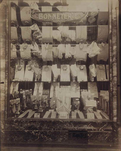
Born in 1857, Atget first began taking photographs in 1890, documenting the architecture of Paris’s streets, from door handles to monuments and shop windows. Specialist Elodie Morel explains, ‘He wanted to make an inventory of the city, which could then be used by artists in their paintings.’ Atget’s work soon caught the eye of some of the great names in art history, including Man Ray and Georges Braque, who became collectors of his work.

Eugène Atget (1857-1927), Pont Neuf, 1902-1903. Titré et numéroté 4654 au crayon (verso), imagefeuille 22.2 x 17.8 cm (8¾ x 7 in), (2). Estimate €8,000-12,000. This lot is offered in Photographies on 10 November 2016 at Christie’s in Paris

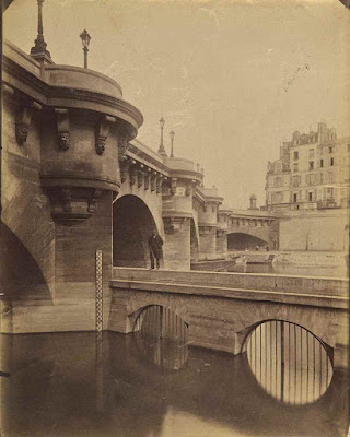
In this video Geneviève Taillade, André Derain’s niece, describes the moment she discovered Atget’s photographs. ‘I thought they were beautiful,’ she says, ‘but didn’t realise they had been taken by such a prestigious artist.’ Certain images in the portfolio reveal complicity between Derain and Atget, who are believed to have been friends: a photograph of the Pont Neuf  (above), re-emerges at the same angle in an engraving by Derain.

‘What I love about my work is that opportunity to find links with the past — to go back in time to a bygone era, and discover a story,’ says Morel. In establishing the affinity between these two great artists, this story is also ‘a discovery for the history of photography’, she adds. ‘This collection has been referenced many times but had never seen the light of day — until now.’

Foto's Eugène Atget sprankelen nog steeds
(Un)common Places: Stephen Shore, Korrie Besems, Eugène Atget. T/m 11 mei in Nederlands Foto Instituut, Witte de Withstraat 63, Rotterdam. Open: di t/m zo 11-17u. Catalogus: ƒ 20.
Eddie Marsman
29 maart 1997

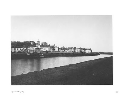
Dat fotografie zo simpel kan zijn, denk je telkens weer bij het zien van de foto's van Eugène Atget. Neem die welke hij omstreeks 1900 maakte in de rue Mouffetard in Parijs. Café Aux Vieux Chêne staat erop en, zij het maar voor de helft, een drogisterij plus het poortje naar een binnenplaats. Dat is het wel zo'n beetje. En al trekt dat café veel aandacht, je kunt niet zeggen dat de foto erover gaat - de foto gaat over alles tegelijk: in één oogopslag is het bij elkaar geveegd, zelfverzekerd en toch alsof het nauwelijks is gezien.

Op dezelfde bijna achteloze manier zou Atget enkele jaren later de rue Montorgeuil samenvatten in een foto van restaurant Au Rocher de Cancale en Hôtel Lavalette met haar waterval van stenen en houten trappen. Het is Eugène Atget in een notedop: alledaags, vanzelfsprekend en onopgesmukt.

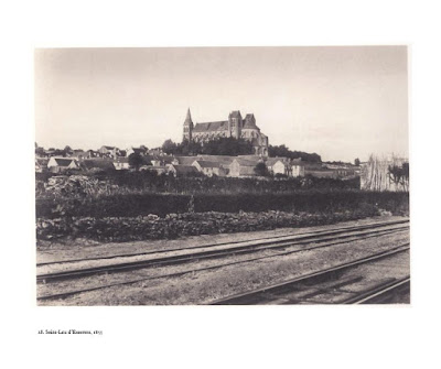
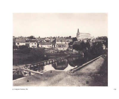
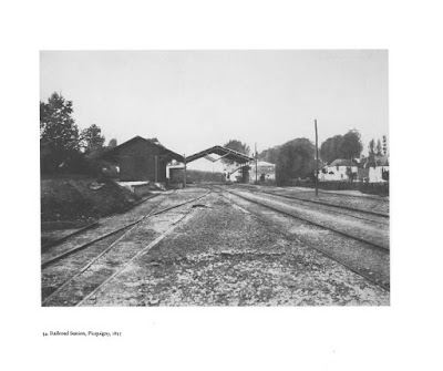
Bij leven was hij een tamelijk onbekende straatfotograaf die in de rust en het egale licht van de ochtend systematisch de straten van zijn woonplaats Parijs afschuimde, op zoek naar 'zestiende- tot en met negentiende-eeuwse architectuur in de oude straten; historische en bijzondere huizen; fraaie façades en deuren, betimmeringen en deurkloppers; oude fonteinen; houten en gietijzeren trappen; interieurs van alle kerken (overzichten en details)', aldus een in 1920 door hemzelf opgestelde lijst. Inmiddels wordt de Fransman (1857-1927) allerwege beschouwd als de voorloper van de moderne, dat wil zeggen zich van ieder schilderachtig effect afkerende, fotografie.

Zijn foto's vormen momenteel het hartveroverende middelpunt van een expositie in het Nederlands Foto Instituut, waarin voor het eerst (op één na) alle in openbare Nederlandse collecties aanwezige Atgets bij elkaar worden gebracht: tien foto's in totaal (op één na vintage prints), afkomstig uit het Rijksmuseum en het Stedelijk Museum in Amsterdam, het Van Abbe Museum in Eindhoven en het Prentenkabinet van de RU Leiden. Een tweede grote bijdrage bestaat uit een serie moderne afdrukken uit het Parijse Musée Carnavalet die een minder bekende kant van Atget laten zien; de foto's die hij maakte in de zone, de verfomfaaide rafelrand buiten de oude stadswallen met haar armoedige steegjes en geïmproviseerde bouwsels. Jammergenoeg valt het drukwerk van deze foto's vanwege het gebruik van hedendaags barietpapier (het klassieke daglichtpapier zou geëigender zijn geweest) nogal tegen: ze ogen somber en vlak, waar de oorspronkelijke afdrukken ondanks de opgetreden vergeling nog altijd sprankelen in toonschaal en detaillering.

Het werk van Atget vormde een inspiratiebron voor de meest uiteenlopende fotografen, van Walker Evans in het Amerika van de jaren dertig tot het duo Bernd en Hilla Becher in het Duitsland van nu. En ook de eveneens in het NFI exposerende Amerikaanse new topographer Stephen Shore en de Nederlandse Korrie Besems hebben het nodige van hem opgestoken. Besems presenteert ruim twintig Poolse stadstaferelen in kleur, in 1995 gemaakt op plekken waar de sporen van de Tweede Wereldoorlog en daarop volgende jaren van verwaarlozing zichtbaar zijn. Van Shore zijn tachtig stedelijke landschapsfoto's uit de jaren zeventig te zien van steegjes, achtertuintjes, kruispunten en parkeerplaatsen.

Evenals Atget begeven Shore en Besems zich bij voorkeur naar onooglijke locaties en hanteren ze een onnadrukkelijke stijl van fotograferen - al krijgt het resultaat ook bij hen als vanzelf een mysterieuze aantrekkingskracht. Uncommon Places noemt Shore zijn plekken niet voor niets. Het NFI koos het als titel voor de complete tentoonstelling, zij het dat het wel het ontkennende voorvoegsel tussen haakjes plaatste; alsof iemand de subtiele essentie van het origineel zou kunnen ontgaan.

Er is een cruciaal verschil tussen de oude Atget en zijn navolgers. Zijn werk heeft een authenticiteit die vandaag de dag nog slechts te benaderen is. Want waar zijn onnadrukkelijkheid een intuïtieve was, is ze voor de moderne fotografen een doelbewust streven. Hun werk is veel nadrukkelijker gefotografeerd, zoals ook mag blijken uit de soms wat krampachtige manier waarop Shore zijn foto's van menselijke aanwezigheid probeert te ontdoen en Besems, zich schikkend in het onvermijdelijke, ze juist stelselmatig een rol geeft in het brandpunt van haar foto's. Bij Besems zoeven kinderen op skateboards over het troittoir, wordt een stoep geschrobt en zeult een man met boodschappentassen tussen het metershoge onkruid en de gehavende gevels van de Ulica Wodna. En al mag het resultaat er zijn, het geeft haar foto's een anekdotische lading die ver verwijderd is van de nulgraad van de fotografie die Atget gestalte gaf.


Views & Reviews I’m not afraid of Heights I’m afraid of Falling Paris Texas Wim Wenders Photography

$
0
0

PARIS, TEXAS / Wim Wenders (Director), Sam Shepard (Writer), Chris Sievernich (Editor)
1984, Berlin, 511 pages, 193 x 240 x 23


by David H. Schleicher

Let’s go for a drive.

…Paris

Texas!

Paris, Texas

Putting the two words together is something of an oxymoron.  A comma between them becomes a pregnant pause.  Two places couldn’t be further apart than Paris and Texas.  We can’t seem to come to terms with its existence as a real place…but then we see a picture of that barren stretch of land.  For a man named Travis and his son Hunter it becomes the center of their universe, the origin of all things, a place achingly unreachable, alive only in their dreams where they long to be with a woman named Jane in a faraway land where the purchase of a remote plot of dirt represents the key to a happiness that could never be.

It’s a place that can only exist as an “idea   ——-   of her…love…family…redemption…the movies.”

As I recently announced on my own ever-expanding list of favorite films, and soon to be registered in the Best Films of the 1980’s polling at Wonders in the Dark, Wim Wender’s 1984 Palme D’Or winning Paris, Texas is hands-down my pick for the greatest film of the decade.

I decided to revisit Paris, Texas, which I only saw for the first time back in 2005.  It was one of those weirdly magical movie-watching experiences.  I was flipping through the channels on TV and came across it totally unaware of its existence before that moment, not realizing I had missed the first thirty minutes or so…but I was instantly transfixed.  By the end of the movie, I was beside myself and re-watched the entire film from the beginning the very next day when it was rerun.  Shortly thereafter I purchased the DVD and re-watched it yet again.

Dont give me that look...Ive been waiting for you forever in PARIS TEXAS.

Jane is not a fancy woman…that’s only her in a movie.

Looking back on my original review, I’m surprised I didn’t see fit to mention the following:

Ry Cooder’s unforgettable and blisteringly unique film score that travels across the desert along with Wim’s camera and hits all the right chords.  Only Anton Karas’ zither score from The Third Man or Jonny Greenwood’s moody strings from There Will Be Blood could possibly outrank Cooder’s high-water mark for originality in film music composition.
The beautiful photography of the LA hills and valley and the Houston cityscape.  One will always be scorched by the photography of the barren desert, but these haunting shots of civilization are equally as powerful.
Some great movie moments when Travis becomes entranced watching the shadow of an airplane move across the ground as it takes off or when he attempts to walk his son home from school after the maid gives him lessons on being a “rich father/poor father”.  Both of these scenes are brilliant and simple examples of a director telling his story and revealing something about the characters through what is seen in camera — the classic “show, don’t tell” move.
Hunter’s fascination with “space” revealed in his ramblings about the Big Bang and time travel while on the road with Travis…or his perfectly 80’s LA kidspeak where he’s always on the verge or pre-irony and innocent precociousness and clips phrases by saying things like “I want to come with” instead of “I want to come with you” and “Night” instread of “Good night.”
In my original review I failed to name the writers (a most grievous sin from a fellow writer) — L. M. Kit Carson and Sam Shepard — who were later honored in my post on The Best Screenplays of All Time.
There’s also a pensive and quiet suspense that is only experienced on repeat viewings when you know everything is slowly building up to that moment when Hunter spots Jane for the first time at the bank…and then Travis follows her to that down-and-out Houston neighborhood with the Statue of Liberty mural on the back wall by the dumpsters, and he enters the peep-show where the audience finally meet Kinski’s Jane in person.  On first viewing you expect a show when she appears, but on repeat viewings you hold your breath…for all that conversation.  “You can just talk…she’ll listen.”

In the years since first seeing it, my love for it has only grown, and any time it is mentioned — oh, how I became tinged with meloncholy when I learned it was rumored to have been Kurt Cobain’s favorite film, and oh, how I laughed the other day when it was referenced in a skit from The State (finally on DVD), and yes, I could probably set the record for  x hours straight spent talking about Paris, Texas — I get an immense feeling of satisfaction.

Yes…Paris, Texas…I’ve been there, and it is wonderful.  If you’ve never been, you’ll never know…so visit soon and visit often.  When you layover in Houston, we’ll be waiting for you at The Meridian…room 1520.

Written by David H. Schleicher

And I would walk 500 miles...just to be in Paris, Texas again.

MOVIE REVIEW
'PARIS, TEXAS' FROM WIM WENDERS

By VINCENT CANBY
Published: October 14, 1984
A most peculiar-looking figure wanders slowly but with purpose across the bleached expanse of a southwestern American wasteland. He wears a dusty, double-breasted suit, shoes so ragged they no longer qualify as footwear, a dirty shirt with a filthy but neatly knotted necktie, plus a maroon baseball cap. He stops, drinks the last of the water from a plastic container and continues his journey. From nowhere to nowhere.

When, eventually, he stumbles into a seedy little trailer camp, he collapses before he can open a soft-drink bottle. The man, who refuses to talk, is more or less threatened back to life by an ominous, German-accented doctor who, going through the man's pockets, finds a Los Angeles telephone number, which he calls.

These constitute the opening scenes in Wim Wenders's initially promising, new ''road'' movie, ''Paris, Texas,'' written by Pulitzer Prize- winning playwright Sam Shepard (''Buried Child''), whose screenplay was adapted by L. M. Kit Carson. The movie, the winner of the grand prize at this year's Cannes Festival, will be shown at 8:30 tonight at Avery Fisher Hall to conclude the 22d New York Film Festival at Lincoln Center, and will open here commercially some time in November.

The desert derelict is eventually identified as Travis (Harry Dean Stanton), whose younger brother Walt (Dean Stockwell), a prosperous manufacturer of road signs, flies from Los Angeles to Texas to reclaim the brother who has been missing and presumed dead for four years.

As Travis and Walt begin their long drive back to Los Angeles - Travis sitting silently in the back while Walt drives, ''Paris, Texas'' looks as if it's going to be another classic Shepard tale about sibling relations, explored most effectively in Mr. Shepard's current Off Broadway hit, ''Fool for Love,'' and in his ''True West,'' which recently concluded a long run at the Cherry Lane Theater. Travis and Walt could be first cousins to the brothers in ''True West,'' in which one brother is a foul-mouthed, possibly psychotic thief and the other an uptight, fastidious fellow who aspires to become a screenwriter.

''Paris, Texas'' begins so beautifully and so laconically that when, about three-quarters of the way through, it begins to talk more and say less, the great temptation is to yell at it to shut up. If it were a hitchhiker, you'd stop the car and tell it to get out.

''Paris, Texas'' has the manner of something to which too many people have made contributions. One problem may be that Mr. Shepard is the kind of writer who writes best when he writes fast. No matter how serious he is, he's also funny. His art - and his temperament - do not seem to adjust well to the sort of long, collaborative process by which movies are made. ''Paris, Texas'' seems to be a movie that's been worried to death.

Though Mr. Wenders is fascinated by the American scene, as he has shown in his ''Alice in the Cities,''''The American Friend'' and ''Hammett,'' his feeling is as much the result of his knowledge of American movies as of the first-hand experience out of which Mr. Shepard writes. He has a sense of humor, but it's more theoretical than actual.

The first half of ''Paris, Texas'' is Shepard at his best, as, gradually, Travis begins to respond to Walt during the drive to California. At one point, Travis shows Walt a snapshot of a scrubby field in Paris, Texas.

Walt: ''How come you got a picture of a vacant lot in Paris, Texas?''

Travis: ''I bought it.''

Walt: ''You bought a picture of a vacant lot?''

Travis: ''I bought the lot.''

Travis, it turns out, believes that he was conceived in Paris, Texas, and he's always had the dream of one day moving there with his wife, Jane, who has been missing almost as long as Travis, and their small son, Hunter, who has been living with Walt and his wife, Anne, since his parents disappeared.

What has Travis been doing during these last four years, and where is Jane? I've no doubt that, left to his own devices, Mr. Shepard would have come up with a resolution to these mysteries that would have provided a far more satisfactory payoff than the one arrived at by the playwright working in collaboration with the director and Mr. Carson. Mr. Shepard's method is to distill from ordinary experiences and feelings a reality that is so dense it appears to be surreal.

This is exactly the quality that illuminates the first half of ''Paris, Texas,'' when Travis, back in the middle-class environment of Los Angeles, attempts to establish some sort of connections with Hunter, played with enormous, comic self-assurance by Mr. Carson's seven-year-old son, also named Hunter.

Life in the small Los Angeles house is not easy for any of them. Anne (Aurore Clement) is afraid that if Travis takes the boy away, it will somehow threaten her marriage to Walt. Walt is torn by his affection for his older brother, for the boy and for his wife. The boy can't reconcile having a foster father he adores and a real father he doesn't know and whose shabby appearance is - well - embarrassing to him in front of his friends.

Travis is at loose ends. He can't sleep and, on his first night back, he spends the entire night shining every pair of shoes in the house.

The film is wonderful and funny and full of real emotion as it details the means by which Travis and the boy become reconciled. Then it goes flying out the car window when father and son decide to take off for Texas in search of Jane (Nastassja Kinski), Hunter's long-lost mother. Everything suddenly becomes both too explicit and too symbolic. It's not giving anything away to reveal that what the movie - rather tardily - seems to be all about is the difficulty in communication between men and women, nor that the sequences in which this is demonstrated are awful.

Mr. Stanton, who can be seen currently in the riotous ''Repo Man'' and will be remembered for, among other things, his performance in John Huston's ''Wild Blood,'' is a marvelous Shepard character. Every foolish endeavor in American history appears to be written in the deep lines and hollows of his face. There is a gentleness about him that at any moment may erupt in inexpicable violence.

Mr. Stockwell, the former child star, has aged very well, becoming an exceptionally interesting, mature actor. Miss Clement, whose French accent is a bit thick for someone who is supposed to have been living in California for a few years, is also moving as Walt's baffled wife. Miss Kinski, however, is memorably miscast. The more she tries to act, the worse her performance becomes, which is more than unfortunate, considering the importance of her scenes to the end of the film.

Prominent in the supporting cast are Bernhard Wicki, the German director who appears as the menacing doctor early in the movie, and John Lurie, one of the stars of ''Stranger Than Paradise,'' who does a tiny walk-on here for Mr. Wenders, who was one of the earliest supporters of that Jim Jarmusch film.

As photographed by Mr. Wenders's long-time associate, Robby Muller, ''Paris, Texas,'' a French-German co-production made in this country, looks great. However, the film, at best, is extremely diluted Sam Shepard.

The Cast PARIS, TEXAS, directed by Wim Wenders; written by Sam Shepard; adaptation by L. M. Kit Carson; photography by Robby M"uller; edited by Peter Przygodda; music by Ry Cooder; produced by Don Guest. At Avery Fisher Hall, as part of the 22d New York Film Festival. Running time: 145 minutes. This film has no rating. Travis Harry Dean Stanton Jane Nastassja Kinski Walt Dean Stockwell Anne Aurore Clement Hunter Hunter Carson Doctor Ulmer Bernhard Wicki Carmelita Socorro Valdez Crying Man Tom Farrell Slater John Lurie Stretch Jeni Vici Nurse Bibbs Sally Norvell Rehearsing Band The Mydolls


Geïmproviseerd meesterwerk Paris, Texas 
door Marcel van den Haak6 januari 2007

Een man in pak loopt door de woestijn. Het pak is verfomfaaid, de man draagt een baard van een paar weken en heeft een petje op tegen de zon. Dit is de openingsscène van Paris, Texas (1984) en dit is ook het eerste idee waarmee regisseur Wim Wenders en scenarioschrijver Sam Shepard in de zomer van 1982 aan het verhaal begonnen. Een man die door de Mojave-woestijn dwaalt zonder dat duidelijk is waar hij vandaan komt of waar hij naar toe gaat.

Wenders en Shepard konden die zomer nog niet bevroeden dat ze twee jaar later een meesterwerk zouden afleveren waarmee ze een Gouden Palm zouden winnen. Het verhaal kwam met horten en stoten tot stand, zo blijkt uit Wenders' audiocommentaar op de dvd, en ze hadden nog geen idee waar ze zouden eindigen toen ze al met filmen waren begonnen. Een riskante onderneming dus, waar geen Hollywoodstudio zich ooit aan zou wagen. Maar Paris, Texas is een Duits-Franse coproductie, en in Europa had Wenders met onder meer Der Amerikanische Freund en Im Lauf der Zeit al genoeg krediet opgebouwd om het vertrouwen van de producenten te winnen.

Onvoorstelbaar

Het is onvoorstelbaar dat Paris, Texas onder deze omstandigheden toch zo goed heeft uitgepakt. Toen de eerste helft van de film gedraaid werd, wist geen van de betrokkenen waarom de man (gespeeld door de vooral van bijrollen bekende acteur Harry Dean Stanton) door die woestijn liep en zweeg in alle talen. Waarom zijn broer (Dean Stockwell) al vier jaar taal noch teken van hem en zijn vrouw vernomen had en waarom hun zoontje bij die broer was achtergelaten. Dat is lastig om te acteren, maar de scènes met de twee broers die elkaar na al die jaren weerzien worden er niet minder om. Alleen achteraf, met de kennis over het vreemde productieproces, zie je dat de acteurs eigenlijk nog geen idee hadden waar ze mee bezig waren.

Toen de scènes in de woestijn en in Los Angeles – waar de man zijn inmiddels bijna achtjarige zoontje (Hunter Carson) terugziet en er een langzame toenadering tussen hen ontstaat – gedraaid waren, was het einde van het script bereikt. Schrijver Shepard was inmiddels met een andere film bezig (als regisseur), waarop Wenders besloot in zijn eentje het vervolg te schrijven. De cast en crew kregen twee weken vrij. Vanaf dat moment had het finaal mis kunnen gaan. Er was een verzameling prachtige scènes, niet in het minst door het felgekleurde camerawerk van Robby Müller en de lome gitaarmuziek van Ry Cooder, maar met een afgeraffeld tweede deel heb je natuurlijk geen goede film.

Vader-zoonfilm

Na een kunstgreep – vrouw van broer weet meer, maar had het nooit iemand verteld – kan Stanton gericht op zoek gaan naar zijn vrouw, en hij neemt zoonlief mee. Op basis van het ruwe script van Wenders improviseren de twee er in de auto op los, met veel verhalen van het joch over astronomie. Ook hier zakt de film wonderwel niet in. Van een film over de relatie tussen twee broers is het een vader-zoonfilm geworden, en een heel goede. Subtiel, zonder al te veel sentiment. Begeleid door imponerende beelden van een spaghetti aan wegen en viaducten, die de desolate woestijn uit het begin van de film hebben vervangen.

Shepard was op tijd terug om het laatste deel van Wenders' schetsen, dat zich afspeelt in Houston, in sneltreinvaart nader uit te werken. De acteurs (Stanton en Nastassja Kinski, die zijn teruggevonden vrouw speelt) kregen vervolgens drie dagen de tijd om de nieuwe tekst uit hun hoofd te leren. Deze haastklus mondt uit in een van de hoogtepunten uit de filmgeschiedenis, waarvan ik inhoudelijk niets zal prijsgeven. Maar een twintig minuten durende dialoog in een op z'n zachtst gezegd ongewone omgeving, met langdurige close-ups van de luisterende in plaats van de sprekende partij, en een onafgebroken emotioneel shot van acht minuten, dat is simpelweg filmmaken op zijn best. "Als ik de film nu gemaakt zou hebben, zou ik veel vaker gesneden hebben," zegt Wenders twintig jaar later, "mensen zijn zo snel verveeld tegenwoordig." Godzijdank dateert deze film uit 1984 en kunnen we er nu nog, op dvd, van genieten.


Steel Cathedral in Disrepair North Korea Eddo Hartmann Photography

$
0
0

Setting the Stage: Pyongyang sees photographer Eddo Hartmann and North Korean art specialists Koryo Studio collaborate on a project documenting the North Korean endeavour to shape the ultimate socialist city and the lives of the people in it. In any socialist regime, architecture plays a key part in the process of building up a new social and political environment. The project was shown at "Museum Huis Marseille" Amsterdam and at the Seoul Museum of Art.


Fotodocument
 
Staalkathedraal in verval
 
Vrij Nederland • 9 november 2016
Ooit vormde de staalsector de ruggegraat van de Noord-Koreaanse economie. Hoogovens en staalfabrieken gelden in Noord- Korea als kathedralen van de industriële vooruitgang. Staalarbeiders zijn er de hogepriesters van een onwrikbaar geloof in de vooruitgangsgedachte. Nog steeds voert de Noord-Koreaanse kunst staalarbeiders op als heroïsche figuren die de krachten van de natuur bedwingen en plooien naar de wil van de...
Lees verder

SETTING THE STAGE: PYONGYANG, NORTH KOREA
02 Apr 2015 - Floriek Landeweerd

Wat krijg je als journalist te zien in een land dat afgesloten is van de buitenwereld? Eddo Hartmann bezocht de perfect georganiseerde, aangeharkte en socialistische stad Pyongyang. Een stad waar de mensen niet beter weten, dan de maatschappij waarin zij leven, in hun ogen is de stad waarin zij leven volmaakt. Het eten is het lekkerste eten ter wereld. De grote leider van het land is uitermate intelligent en bijzonder breed getalenteerd, zo heeft hij honderden opera’s en duizenden boeken geschreven. Daarnaast zorgt hij voor prachtige muziek, mooie gebouwen, zwembaden en parken, kort gezegd: hij geeft de inwoners alles wat zij nodig hebben.

Althans, dit is wat je hoort wanneer je als toerist of journalist iemand op straat aanspreekt. Leider Kim Jong-un wordt als God aanbeden, dit wordt op de peuterschool al bij kinderen in geprogrammeerd; via dansjes en liedjes leren zij hoe belangrijk het leger en de grote leider is. Noord-Korea, een land waar al 70 jaar een politiek experiment in stand wordt gehouden. Hartmann reisde met organisatie Koryo-Tours naar de hoofdstad van Noord Korea, waar sinds 1946 niet-communistische invloeden en elke vorm van religie worden geweerd, onderdrukt en dodelijk worden afgestraft. Het mysterieuze land weet een perfect gestileerd beeld aan toeristen en journalisten te tonen, in de serie Setting the Stage: Pyongyang, NorthKorea, toont Hartmann het beeld zoals hij dit op zijn strikt georganiseerde reis op een dienblad voorgeschreven kreeg.


Deze twee geheel bronzen beelden van de twee vorige generatie grote leiders van het land, links Kim il-sung en rechts Kim Jong-il. zijn te zien op de Mansu heuvel.Uit dankbaarheid voor de leiders worden hier felgekleurde bloemen voorgelegd: het lijken wel Hindoestaans of Boeddhistisch bloemenoffers. Voor het maken van een foto van de beelden, dien je een diepe buiging te maken. Big Brother is watching you. De beelden mogen alleen recht van voren in zijn geheel gefotografeerd worden.


Rijen vol met flatgebouwen, het ene gebouw nog fiercer dan de andere. Na de Koreaanse oorlog (1950-1953) is deze stad snel opgebouwd, destijds waren dit moderne gebouwen. In de tussentijd lijkt er echter niet veel veranderd en is modern wel het laatste waar je aan denkt bij dit aanzicht: de gebouwen vormen een grauw en deprimerend geheel. De beelden die Hartmann, onder strikt toezicht, weet vast te leggen doen denken aan een arthouse film, die je in een achteraf bioscoop in Parijs bekijkt. Een decor dat voor weinig geld op de kop is getikt, omdat het eigenlijk al veel te oud is. Een oude metro uit Duitsland, interieurs geheel van marmer in combinatie met glimmend metaal. De vergane glorie van in de toekomst, want als een sciencefiction verhaal is er het alziend oog, waardoor je continu in de gaten wordt gehouden. Dit alziende oog zit verstopt in de portretten en beelden van de grote leiders, maar ook in de blik van de politieagent en zelfs in die van de vriendelijke gids. Een staat waarin iedereen elkaar in de gaten lijkt te houden, uit angst om opgepakt te worden. Doordat de inwoners al vele generaties leven in deze socialistische staat is het voor hen haast onmogelijk om buiten de vaste kaders te denken. Om een beter beeld te krijgen van de Koreanse denkwijze lees ik op de website Ted het verhaal van een jonge vrouw die Engelse les heeft gegeven op een afgesloten school voor de elite van Noord-Korea. Wanneer zij haar leerlingen de opdracht geeft een essay te schrijven blijkt dit eigenlijk buiten de manier van denken te staan. Een essay, met je eigen ideeën, waarin je argumenten geeft en dingen tegen elkaar afweegt. De jonge Koreanen hebben dit niet geleerd, zij hebben namelijk altijd maar een waarheid voorgeschoteld gekregen. Uiteindelijk staan de essays van de leerlingen vol kritiek tegenover McDonald’s, Amerika en zelfs tegenover het feit dat de Engelse juf te weinig rijst eet.

Noord-Korea, een land dat in zijn geheelheid lijdt aan smetvrees, de inwoners poetsen dan ook continu hun kleding, parken en gebouwen op. Het internet wordt voor de inwoners schoon gehouden van slechte kapitalistische invloeden. De grootste ellende achter deze utopische staat is echter onzichtbaar gemaakt, want dat is alles behalve rein. Een strafkamp, zo gruwelijk dat iedere vorm van verdraagzaamheid en tolerantie even netjes is weggepoetst als al het andere. Noord-Korea ontkent het bestaan van de kampen, maar satellietbeelden liegen er niet om.

Hartmann weet met zijn gestileerde beelden vragen op te roepen. Ondanks dat hij zich netjes aan de regels heeft gehouden houdt hij met deze tentoonstelling het gesprek rondom Noord Korea actueel en in leven. De expositie Eddo Hartmann - Setting the Stage: Pyongyang, North Korea is tot 7 juni 2015 te zien bij fotomuseum Huis Marseille aan de Keizersgracht in Amsterdam.


Travels in a Wounded Landscape Le Chemin de Fer du Nord Édouard-Denis BALDUS Theo Baart & Cary Markerink (Company) Photography

$
0
0

Édouard-Denis BALDUS (1813-1889). Chemin de fer du Nord - Voyage de Paris à Compiègne par Chantilly - Petites vues Photographiques. Vers 1860. 77 photographies présentées dans un très bel album oblong. Reliure plein maroquin bleu nuit aux armes de la famille de Rothschild, écoinçons au chiffre JR surmontés d’une couronne (pour le baron James de Rothschild). Titre en lettres d’or au dos. Chasses décorées de frises à motifs floraux et gardes moirées rouge vif. Très belle page de titre et index aux lettres enluminées. Légendes et n° de planches calligraphiés sur chaque montage au-dessus des images. Planches numérotées de 1 à 74, trois sont numérotées 11 bis, 66 bis et 69 bis. Format moyen des épreuves : 6,5 x 7,5 à 8 x 16 cm. Album : 23,5 x 33 x 4 cm. Très rare album réalisé à la demande du baron James de Rothschild (1792-1868), président de la Compagnie des chemins de fer du Nord. Cet exemplaires à ses armes est probablement son album personnel. Littérature : « Des photographes pour l’empereur, les albums de Napoléon III », BnF, Paris, 2004. Voir la notice page 68. Belles épreuves aux tonalités homogènes. Très belle reliure qui nécessite toutefois une restauration (manque une des gardes en fin d’album).


After Baldus |Cary Markerink
After Baldus is a multi disciplinary international research project that investigates the relationships between history, memory, memorialization and photography in the built landscapes of Picardy, France. Developed collaboratively by Dutch artists/photographers Cary Markerink and Theo Baart and American writer/historian/curator Alison Nordström, the project will lead to an exhibition an publication in 2017.

The inspiration and starting point for this project is the 1855 photographic album Chemin de Fer du Nord by Eduard-­Denis Baldus. Commissioned by Baron de Rothschild, Baldus, and probably other photographers as well, photographed the newly constructed railway line between Boulogne-­sur-­Mer and Paris by which Queen Victoria would travel during her state visit to France.
The album contains 50 large albumenized salt-­prints that depict, not only the stations, bridges and other structures directly related to the railroad, but also reveal the built landscapes that defined and were defined by the railroad, including the harbor, chateaux, cathedrals and other places of interest not visible from the train. Although the images vary in content, they share a straight informational style that, in the 20th century, would have been called documentary. The photographs embody the inherent tension between the descriptive and the artistic that we find in many early historical photographs, and raise profound issues about how we know what we know of the past. 
The Chemin de Fer du Nord album is of interest for several additional reasons. It is, in a sense, one of the world’s first photographic books, produced in an edition of 25 and distributed to the train’s royal passengers and wealthy sponsors. Historically, its images can be read as markers of their time, what noted art historian Malcolm Daniel called “icons of Second Empire Grandeur”, noting the photographer’s “monumental depictions of France’s architectural patrimony, dramatic landscapes and his visual celebrations of the achievements of modern architects and engineers.” Of greatest significance to this project, it also constitutes an early systematic photographic survey of a region that has continued to be subject to similar efforts for military, economic and artistic reasons. This is the aspect of the early work thatAfter Baldus will address and interpret.
In both the book and the exhibition of After Baldus, Baldus’s images will be accompanied by 50 large color photographs by Baart and Markerink that examine the visual present of this area in the context of its past. Emphasising the built elements of highways, trains, bridges, and housing, the work will consider the influences people and the land have had on each other.  The exhibition will be accompanied by a publication of these old and new photographs combined with texts that consider the history and the visuality of the region, readings of the historical album, the role of the 'engineer' photographer as author, the history of changes in use and understanding of these images, and the circumstances of the project’s making. 

Twenty-five-year-old Édouard Baldus arrived in Paris to study painting in 1838, shortly before Louis Daguerre first showed his magically precise photographic images to the world. In Paris, the self-taught Baldus worked outside the École des Beaux-Arts and atelier system, but submitted work to each of the annual Salons of painting and sculpture in Paris from 1841 to 1851. As a painter he met with little success and achieved no critical mention, but in the decade that followed, from 1851 to 1861, Baldus abandoned the easel and took up the camera, rose to the top of his new profession, won international critical acclaim, secured commissions from government ministries and captains of industry, and created a body of photographs now considered early masterpieces of the art.

Baldus first experimented with photography in the late 1840s, when the negative-positive process for paper photographs, invented by the Englishman William Henry Fox Talbot, began to flourish in France. By 1851, he was recognized as one of the few photographers to combine aesthetic sensitivity with an astonishing technical prowess in the still experimental and handcrafted medium. In that year he was one of five artists selected by the Commission des Monuments Historiques, a government agency, to carry out Missions Héliographiques, photographic surveys of the nation’s architectural patrimony, focusing particularly on those monuments in need of restoration. Baldus was sent south, to Fontainebleau, through Burgundy, the Dauphiné and Lyonnais, Provence, and a small part of Languedoc.

So impressive were Baldus’ pictures from the standpoint of clarity, beauty, and scale (some, printed from multiple negatives, reached three feet in length), that he quickly won government support for a project entitled Les Villes de France photographiées, an extended series of architectural views in Paris and the provinces designed to feed a resurgent interest in the nation’s Roman and medieval past. After focusing on the chief monuments of the French capital in 1852, Baldus traveled again to the south of France in the autumn of 1853, approaching his subjects with a rigor that banished precisely those picturesque elements and anecdotal details traditionally considered necessary to animate topographic prints of the period.

The following summer, Baldus coursed the dirt roads of the countryside by horse-drawn cart, moving from ruined castle to thatched hut, from pilgrimage church to paper mill, from town square to wooded chasm, through the fertile lowlands and rugged mountains of the Auvergne, in central France. Perhaps owing to the different physical character of this region, Baldus made photographs of the land itself, adding a poetic force to the graphic power and documentary value of his earlier photographs.

By 1855, Baldus had established a reputation as the leading architectural photographer in France, and his pictures drew much public attention and critical notice at the 1855 Exposition Universelle in Paris. In August of that year, Baron James de Rothschild—banker, industrialist, and president of the Chemin de fer du Nord (Northern Railway)—commissioned Baldus to produce an album of the highest quality. Showing views along the rail route from Paris to Boulogne-sur-Mer, the album was intended as a gift for Queen Victoria, a souvenir of her passage on the line during her state visit to Paris. The lavishly bound album is still among the treasures of the Royal Library at Windsor Castle, and the beautifully composed and richly printed photographs of cathedrals, town, and railroad installations included in it are among the photographer’s finest. They embody a classic, objectified vision softened by lessons learned in the landscapes of the Auvergne, and an equilibrium of documentation and artistry, of descriptive directness and picturesqueness, of presenting the scene to the viewer and inviting the viewer into the scene.

Also in 1855, Baldus began photographing on the work site of the New Louvre, documenting for architect Hector Lefuel every piece of statuary and ornamentation made for the vast complex linking the Louvre and Tuileries palaces. As individual records, these photographs served a practical function on the bustling work site, keeping track of the hundreds of plaster models and carved stones sculpted for the project; but as a collected whole, they formed a new means of comprehending and communicating a complex subject, bit by bit, to be reconstituted by the mind. Only photography—precise, omnivorous, prolific, and rapid—and then only in the hands of an artist both sensitive and rigorous—could produce an archive as a new form of art. Baldus’ photographs of the grandest of Napoleon III’s building projects were assembled in albums (four volumes in each set) and presented by the emperor to government ministers, the imperial family, and the reigning monarchs of Europe.

In June 1856, in the midst of his work at the Louvre, Baldus set out on a brief assignment, equally without precedent in photography, that was in many ways its opposite: to photograph the destruction caused by torrential rains and overflowing rivers in Lyon, Avignon, and Tarascon. From a world of magnificent man-made construction, he set out for territory devastated by natural disaster; from the task of recreating the whole of a building in a catalogue of its thousand parts, he turned to the challenge of evoking a thousand individual stories in a handful of transcendent images. Baldus created a moving record of the flood without explicitly depicting the human suffering left in its wake. The “poor people, tears in their eyes, scavenging to find the objects most indispensable to their daily needs,” described by the local Courier de Lyon, are all but absent from his photographs of the hard-hit Brotteaux quarter of Lyon, as if the destruction had been of biblical proportions, leaving behind only remnants of a destroyed civilization.

In the years that followed, Baldus expanded his highly successful series of large-format views of historic monuments, in both Paris and the provinces, and around 1860 he photographed the rough alpine regions of southeastern France. But it was in the second of his two railway albums, commissioned in 1861 by the Chemins de fer de Paris à Lyon et à la Méditerranée, that Baldus again pioneered new aesthetic ground and drew from a decade’s work to speak forcefully and eloquently about the relationship of history and progress. The album is a masterfully composed sequence of sixty-nine photographs of the landscape, towns, principal sites of interest, and railroad structures along the line from Lyon to Marseille and Toulon. By interspersing boldly geometric images of the railroad tracks, stations, tunnels, and viaducts with his classic views of historic architecture—the ramparts of Avignon, the Maison Carrée, Saint-Trophîme, the Pont du Gard—Baldus presented Second Empire engineers as the natural heirs to a great tradition of building that stretched back to Roman and medieval times.

The final section of the album presents the natural beauty of the Côte d’Azur, including the majestic rock formations at La Ciotat. The concluding pair of images restate the album’s central theme of progress: wilderness and civilization—Nature and Man—are juxtaposed. The rocky Ollioules Gorge is barren and untamed, walled in by cliffs at left and right (an effect emphasized by the dark edges of the photograph). Turn the page and one is in a different world: at the railroad station of Toulon, there is a Cartesian order to the arrangement of space and structures; the materials are iron and glass, dressed stone and brick; everything is crisp, industrial, modern. Most dramatically, the tracks race straight back through the station, as if pointing toward Nice and the Italian frontier (lines already viewed as the logical extension of the rail network)–and toward the future.

The photographs of Édouard Baldus are inextricably linked to the principal ideas of his age. Beginning with the Mission Héliographique, his views of historic monuments presented the vestiges of the past with unromanticized clarity for the architect, archaeologist, historian, and armchair traveler. His photographs of the construction of the New Louvre celebrated the glory of the Second Empire and created an art of the archive. And his presentation of a landscape transformed by modern engineering confidently espoused a belief in technological progress. In ten years, Baldus established the model for photographic representation in genres that barely existed before him.

Malcolm Daniel
Department of Photographs, The Metropolitan Museum of Art
October 2004

Theo Baart & Cary Markerink / After Baldus: Travels in a Wounded Landscape
10.12.2016–5.3.2017

Boulogne-sur-Mer © Cary Markerink

  • Na hun gelauwerde fotoprojecten Nagele en Snelweg richtten Theo Baart en Cary Markerink hun lens op het cultuurlandschap van Noord-Frankrijk
  • In het spoor van de 19e-eeuwse fotograaf Édouard Baldus
  • Geïnspireerd door een van de oudste fotoalbums: Le Chemin de Fer du Nord
  • Anderhalve eeuw veranderingen in het cultuurlandschap van Noord-Frankrijk: de impact van industrialisatie, verstedelijking, globalisering en oorlog

Geïnspireerd door het fraaie 19e-eeuwse fotoalbum Le Chemin de Fer du Nord traden Theo Baart en Cary Markerink – gelauwerd om hun documentaire fotoprojecten zoals Nagele en Snelweg – in het spoor van fotograaf Édouard Baldus (1813-1889) en richtten zij hun lens op het cultuurlandschap van Noord-Frankrijk. In hun serie After Baldus registreren ze – in kleur – de veranderingen die deze regio in anderhalve eeuw onderging ten gevolge van industrialisatie, verstedelijking, globalisering en verschillende oorlogen. Van 50 foto’s maakten ze afdrukken voor hun eigen album, dat qua formaat en opzet gelijk is aan dat van Baldus. Waar in musea doorgaans niets mag worden aangeraakt, biedt deze tentoonstelling in Huis Marseille de unieke mogelijkheid om het album van Baart en Markerink met handschoenen aan voorzichtig door te bladeren.

De kiem voor het fotoproject After Baldus werd gelegd in 2009, toen Baart en Markerink in het depot van het George Eastman House te Rochester, New York, de gelegenheid kregen om Baldus’ album te bestuderen. De Franse fotograaf vervaardigde Chemin de Fer du Nord. Ligne de Paris à Boulogne. Vues Photographiques in 1855 in opdracht van baron James de Rothschild, de vermogende bankier en financier van de gloednieuwe spoorlijn uit de titel. Op monumentale wijze demonstreert het grootformaat album het technische vernuft van de Franse industrie: niet alleen dat van de spoorlijn en de infrastructuur langs het traject, maar ook dat van de nog jonge uitvinding fotografie zelf. Dit album vormde het uitgangspunt voor Baart en Markerinks serie After Baldus, waarvoor zij in het spoor van de Franse fotograaf traden.

In samenwerking met cultuurhistoricus Alison Nordström (destijds als conservator verbonden aan het George Eastman House) begonnen Baart en Markerink hun onderzoek naar de (fotografische) geschiedenis van het gebouwde landschap tussen Boulogne-sur-Mer en Parijs. Hun foto’s vormen nadrukkelijk geen één-op-één vertalingen van die van hun voorganger, maar registreren op vergelijkbare wijze de status-quo van het cultuurlandschap langs hetzelfde traject in de 21e eeuw. Waar Baldus’ omgeving nog aan de vooravond van de industrialisatie stond, heeft die van Baart en Markerink niet alleen het hoofd geboden aan industrialisatie, maar ook aan verstedelijking, globalisering en verschillende oorlogen.

Waar in musea doorgaans niets mag worden aangeraakt, biedt Huis Marseille de unieke mogelijkheid om het grootformaat album met 50 kleurenfoto’s van Baart en Markerink met handschoenen aan voorzichtig door te bladeren. Dit fysieke aspect van de kijkervaring is immers inherent aan het medium. Het antiquarische album van Baldus zelf, met zijn 50 albuminedrukken, is te zeldzaam en kwetsbaar voor een dergelijke hantering, maar in een video slaat een conservator van het George Eastman Museum bladzijde voor bladzijde om in de veilige omgeving van het depot.

Theo Baart (1957) en Cary Markerink (1951) studeerden beiden fotografie aan de Gerrit Rietveld Academie te Amsterdam. Sinds 1987 ondernemen ze regelmatig gezamenlijke fotoprojecten. Een terugkerend onderwerp in beider oeuvre is het cultuurlandschap: de door mensen en machines gevormde omgeving. Voor hen vormt het fotoboek een belangrijk medium, omdat dit de mogelijkheid biedt om hun werk, dat een documentair karakter heeft, in een samenhangende context te tonen. Hun fotoboeken geven ze in eigen beheer uit via hun stichting Ideas on Paper. Individuele projecten van Baart en Markerink zijn o.a. Werklust, biografie van een gebruikslandschap (Baart, 2015) en Memory Traces (Markerink, 2009). Het fotoboek After Baldus: Travels in a Wounded Landscape, met het gelijknamige essay van Alison Nordström, verschijnt in 2017 bij Ideas on Paper (onder voorbehoud).


Édouard Baldus, Saint-Riquier (Chemin de Fer du Nord, 1855), Courtesy George Eastman Museum, Rochester NY


 ATM – Boulogne-sur-Mer © Cary Markerink


Édouard Baldus, Gare de Longueau (Chemin de Fer du Nord, 1855), Courtesy George Eastman Museum, Rochester NY


Saint-Denis © Theo Baart


Édouard Baldus, Église d'Auvers (Chemin de Fer du Nord, 1855), Courtesy George Eastman Museum, Rochester NY


Saint-Léonard © Theo Baart


De Kabelfabriek in Amsterdam-Noord 1910-2016 Draka Bart Sorgedrager Company Photography

$
0
0

SORGEDRAGER, BART De kabelfabriek in Amsterdam- Noord 1910-2016. Amsterdam, Draka, 2016 orig cloth in slipcase issued without dust jacket 112 pp 25,5 x 26,5 cm text in Dutch signed


Photographer Paul Huf Paul Huff: Highlights (English and Dutch Edition) once commented succinctly on his work as follows: 'They get what they ask for, but I deliver damn good work' - the very thing that makes industrial photography books so attractive. The books show work from a period during which photographers could not make a living as artists/photographers and depended on such prestigious commissions. With this highly professional approach, photographers like Violette Cornelius Violette Cornelius and Ata Kando: Hungarian Refugees 1956, Cas Oorthuys 75 Jaar Bouwen, Van ambacht tot industrie 1889-1964, Ed van der Elsken , Ad Windig Het water - Schoonheid van ons land and Paul Huf established their reputations and influenced our present-day impression of workers and entrepreneurs in the postwar Netherlands. Experimental poets and well-known writers also contributed to these books, fifty of which are on show. 'Het bedrijfsfotoboek 1945-1965. Professionalisering van fotografen in het moderne Nederland' Het Bedrijfsfotoboek 1945-1965 . 

See also

Cas Oorthuys Veertig Jaar DRAKA: Geschiedenis van de NV Hollandsche Draad- en Kabelfabriek Amsterdam Company Photography


Abschied von der Kabelfabrik

Bart Sorgedrager fotografierte bei DRAKA

Sorgedrager_Schuber_2

2016 wird für die Mitarbeiter der Kabelfabrik DRAKA den Verlust ihrer Arbeitsplätze bringen. Die Produktion von Elektrokabeln wird nicht eingestellt, sondern von Amsterdam ins kostengünstigere Ausland verlegt.
Bart Sorgedrager (* 1959) ist nicht nur als Fotograf, sondern auch als Sammler von Fotobüchern über Firmen bekannt geworden. Als Experte für „Company Books“ ist er zugleich Spezialist für das Fotografieren von Firmenportraits. Normalerweise erscheinen solche Bücher zur Werbung, als Produktkataloge, zur Einweihung von Neubauten oder zu Firmenjubiläen. Sorgedrager Analyse der Situation der Wirtschaft und seine Kenntnisse im Bereich des Firmenbuchs führten ihn zu einer Marktlücke: das Buch zum Ende eines Betriebs, insbesondere, wenn sich dieses schon einige Zeit vorher abzeichnete, so durch eine Verlagerung der Produktion oder die planmäßige Stilllegung aus anderen Gründen. Nur so hat der Fotograf Zeit, sein Konzept vorzustellen, nämlich eine Art Gedenkbuch zu erarbeiten mit einer kurzen Darstellung der Firmengeschichte, Bildern aus den letzten Monaten der Produktion und mit Portraits möglichst aller der zuletzt dort beschäftigten Mitarbeiter. Diese erhalten dann kurz vor der Schließung zum Abschied ein Exemplar des Buches überreicht, sicherlich ein hoch emotionialer Vorgang, denn jahrelange Betriebszugehörigkeit wird von einem Tag auf den anderen zu Papier.
So geschah es auch bei dem Buch über DRAKA. Sorgedrager, der selbst nicht weit entfernt von der Fabrik wohnt, hatte die Firmenleitung von seinem Konzept überzeugt und konnte in der Kabelfabrik fotografieren und recherchieren. Die fertigen Bücher wurden den Mitarbeitern kurz vor Weihnachten 2015 mit auf ihren weiteren Lebens- und Berufsweg gegeben.
Sorgedrager_4
Sorgedrager_2
Das Buch beginnt nach dem Vorwort des Firmenchefs mit zwei Luftbildern (einst – heute) und einem Grundriss des Betriebs. Die sachlich und unaufgeregt fotografierte Bildstrecke ist als Gang durch die verschiedenen Abteilungen der am Hafen Amsterdams angesiedelten Fabrik angelegt, man beginnt beim Pförtner und endet im Versand. Dann folgen 78 kleine Portraits (fast) aller Mitarbeiter. Am Schluss stehen eine Firmenchronik und der Blick in zwei ältere Firmenbücher, einen Produktkatalog von 1934 und das von Cas Oorthuys fotografierte Jubliäumsbuch von 1950.
Sorgedrager_5
Sorgedrager_1
Sorgedrager analysiert nicht nur die Produktpalette und die Firmengeschichte einschließlich älterer Drucksachen, sondern zieht auch Lehren daraus für die Gestaltung des jeweiligen Buchprojekts. So war es schon bei dem mit Griffregister gestalteten Buch über eine Gabelstaplerfabrik. In dem neuen Buch über die Kabelfabrik finden sich Elemente eines Katalogs in Gestalt der Wiedergabe von gezeichneten, auf Transparentpapier gedruckte Kabelquerschnitt-Typen. Die farbigen Seiten der Kapiteltrenner nehmen den Stil der Zeit um 1960 auf. Außerdem gibt es zu diesem in Leinen gebundenen Buch keinen Schutzumschlag, aber einen Schuber, wie es bei vielen der älteren Firmenbücher der Fall war. Der dünne, raffiniert gefaltete Schuber ist beidseitig mit schwarzweißen Bildern bedruckt.
Sorgedrager_3
Das Buch erinnert in seinen Fotos an die traditionelle Arbeitswelt mit Maschinen, Materialstapeln, zuweilen chaotisch wirkenden Kabelgewirren und Beschäftigen in Blaumännern. Die Arbeit wird nicht (wie in der Industriepropaganda im Stile von Dr. Wolff & Tritschler) heroisiert, sondern vor allem in ihrer Komplexität erlebbar gemacht. Szenen der Produktion werden in Mitteleuropa immer seltener; übrig bleiben werden Fotobücher wie das neue, in einer Auflage von immerhin 500 Exemplaren im Eigenverlag gedruckte, in jeder Beziehung perfekte Werk von Sorgedrager.
Sorgedrager_Cover
  • Titel: DRAKA – De Kabelfabriek Amsterdam-Noord 1910-2016
  • Untertitel: 
  • Bildautor: Bart Sorgedrager
  • Textautor: Chris Rossenaar (Vorwort)
  • Herausgeber: DRAKA Amsterdam-Noord
  • Gestalter: Piet Gerards
  • Verlag: (Eigenverlag)
  • Verlagsort: Amsterdam
  • Erscheinungsjahr: 2016
  • Sprache: niederländisch
  • Format: 
  • Seitenzahl: 112
  • Bindung: Leinen, illustrierter Schuber
  • Preis: 45 Euro
  • ISBN: ohne


104 jaar oude kabelfabriek verdwijnt uit Amsterdam


Medewerkers van Draka aan het werk in de fabriek op de IJ-oever. © Jean-Pierre Jans
 
Na 104 jaar komt er een einde aan de kabelfabrieken van Draka in Amsterdam. De in 2011 door het Italiaanse Prysmian overgenomen kabelfabrikant verplaatst de laatste Amsterdamse fabriek naar Delft.

DOOR: BART VAN ZOELEN 2 JULI 2014, 16:43
In de fabriek voor laagspanningskabels aan de oever van het IJ in Noord werken momenteel 78 mensen. Het overgrote deel kan meeverhuizen naar Delft, volgens Prysmian. Zo'n acht staffuncties vervallen.

Vorig jaar verdween al met stille trom het Nederlandse hoofdkantoor uit de stad waar Jan Teeuwis Duyvis in 1910 de Hollandsche Draad- en Kabelfabrieken begon. Daarmee verdwenen toen al 85 arbeidsplaatsen naar Delft. In Amsterdam rest nu alleen nog een klein restje van de Draka holding aan de De Boelelaan.

Overcapaciteit
Will Hendrikx, de topman van Prysmian Nederland, verklaart de verplaatsing van de productie van laagspanningskabels naar Delft door de noodzaak om te snijden in de kosten. 'Er is sprake van structurele overcapaciteit en prijsdruk in onze markt en in de bouwwereld,' zegt Hendrikx.

Vanuit Amsterdam worden laagspanningskabels gemaakt voor de groothandel en installateurs. Dat zijn toch al niet de markten waar Prysmian zich de grootste groeikansen toedicht voor de toekomst. Die liggen vooral in onderzeese kabels naar de offshore-industrie, glasvezel en hoogspanning.

Bij de overname van Draka verplichtte Prysmian zich in Nederland tenminste drie jaar geen fabrieken te sluiten. Die termijn is in maart verstreken. Dat het nieuws van de verhuizing daar zo kort op volgt tekent volgens een woordvoerder dan ook wel de noodzaak. 'We moeten de kosten omlaag brengen om de winstgevendheid niet in gevaar te laten komen.'

IJ-oever
Prysmian belooft zich maximaal in te zetten om deze acht naar een nieuwe baan te begeleiden. Medewerkers die verder dan anderhalf uur reizen van Delft wonen is er de uitweg van het al bestaande sociaal plan.

De verhuizing naar Delft zal in de eerste helft van volgend jaar plaatsvinden. Het vertrek van het Nederlandse hoofdkantoor werd door Hendrikx vorig jaar al betreurd. 'Amsterdam is wel een nostalgische plek. Eigenlijk is het hier 103 jaar geleden allemaal begonnen,' wees hij op de prachtige locatie aan het IJ. 'Nu zitten we aan de Schie in Delft. Ook mooi, maar anders.'

Wat er met het fraai gelegen fabrieksterrein aan de IJ-oever tegenover het Javaeiland gaat gebeuren is nog niet bekend. 'Daar zijn we op dit moment niet mee bezig," zegt de woordvoerder. Prysmian richt zich eerst op de verhuizing. "Het terrein wordt daarna waarschijnlijk verkocht.'


The Bauhaus (photo)Books Bauhausbücher covers, № I-XIV (1925-1930) Architecture Graphic Design Photography

$
0
0

Bauhausbücher covers, № I-XIV (1925-1930)

Below are the covers to the books in the Bauhausbücher series, № 1-14.

Walter Gropius, Internationale Architektur. Bauhausbücher 1, München 1925
Paul Klee, Pädagogisches Skizzenbuch. Bd. 2, München 1925
Adolf Meyer, Ein Versuchshaus des Bauhauses in Weimar. Bd. 3, München, 1925
Oskar Schlemmer, Die Bühne im Bauhaus. Bd. 4, München 1925
Piet Mondrian, Neue Gestaltung. Neoplastizismus. Bd. 5, Eschwege 1925
Theo van Doesburg, Grundbegriffe der neuen gestaltenden Kunst. Bd. 6, München 1925
Walter Gropius, Neue Arbeiten der Bauhauswerkstaetten. Bd. 7, München 1925
Lazlo Moholy-Nagy, Malerei, Fotografie, Film. Bd. 8, München 1925
Wassily Kandinsky, Punkt und Linie zur Fläche: Beitrag zur Analyse der malerischen Elemente. Bd. 9, München, 1926
Jan Peter Oud, Holländische Architektur, Bd. 10, München 1926
Kasimir Malewitsch, Die gegenstandslose Welt, Bd. 11, München 1927
Walter Gropius, Bauhausbauten Dessau. Bd. 12, München 1928
Albert Gleizes, Kubismus. Bd. 13, München 1928
Laszlo Moholy-Nagy, Von Material zu Architektur. Bd. 14, 1929


Walter Gropius - Internationale Architektur herausgegeben von Walter Gropius - München, Albert Langen Verlag, 1927 - zweite veränderte Auflage, viertes bis sechstes Tausend - 111 pp. - Linnen gebonden - 23 x 19 cm 

Informatie: Typografie door L. Moholy-Nagy. Voorwoord door Walter Gropius. - Afgebeeld zijn werken van o.a.: Berlage, Poelzig, Mendelsohn, Bourgeois, Le Corbusier, Oud 


J.J.P. Oud - Holländische Architektur. Die Entwicklung der Modernen Baukunst in Holland. Vergangenheit. Gegenwart. Zukunft - München, Albert Langen Verlag, 1926 - 1e druk - 85 pp.  - 23 x 18 cm.

Met talrijke fotografische afbeeldingen.

Typografische verzorging: L. Moholy-Nagy.
Inhoud: Geständnis. Die Entwicklung der modernen Baukunst in Holland. Über die zukünftige Baukunst. Der Einfluss von Frank Lloyd Wright. Verzeichnis de Abbildungen.
Zie ook Wingler.


Albert Gleizes - Kubismus - München, Albert Langen Verlag, 1928 - Bauhausbücher 13 - 1ste druk - 104 p. - softcover, dun karton met stofomslag - 23 x 18 cm


Views & Reviews Arresting Images of Innocence (or Perhaps Guilt) DREAMS OF A YOUNG GIRL David Hamilton Photography

$
0
0

Hamilton, David and Robbe-Grillet, Alain.
DREAMS OF A YOUNG GIRL.
NY: William Morrow and Co. 1971. Hamilton, David. First American edition. 4to., 143 pp., color and b&w photo graphs.

Portraits in pastoral setting, often provocative and nude of seminude. The first book by this photographer.

Critic's Notebook; Arresting Images of Innocence (or Perhaps Guilt)
By SARAH BOXERMARCH 4, 1998

The people who need defending on principle are not always the ones you would actually want to defend. They may not be the worthiest people, or the nicest or the wittiest. Often they are mediocre or gross or self-aggrandizing. Think of Larry Flynt, the publisher of Hustler. Or Karen Finley, the performance artist best known for smearing her body with chocolate. Just because they are under siege legally doesn't mean they are worth the trouble of defending on other grounds.

Consider two photographers who have recently been called child pornographers. There is David Hamilton, whose book ''Age of Innocence'' (Arum Press) is full of simpering, soft-focus pictures of naked girls with budding breasts, paired with quotations about their forthcoming deflowering. And there is Jock Sturges, who posed nude, blond, teen-age girls and boys in ''Radiant Identities'' and ''The Last Days of Summer'' (Aperture). After Mr. Sturges's studio was raided seven years ago by Federal agents, a grand jury declined to indict him on charges of child pornography. He's back.

Mr. Hamilton and Mr. Sturges are on the public's mind these days thanks to Randall Terry, the conservative radio talk-show host and founder of the anti-abortion group Operation Rescue, who prodded his followers to locate prosecutors interested in pressing a case against Barnes & Noble for selling these photographers' books. The plan worked.

Last month, an Alabama grand jury indicted the company on 32 charges of child pornography for selling ''obscene material containing visual reproduction of persons under 17 years of age involved in obscene acts.'' Three months earlier, a Tennessee grand jury indicted Barnes & Noble on similar charges for displaying the two men's books without their plastic wrapping on shelves low enough for children to reach.

In a related incident, British police have seized one of Robert Mapplethorpe's books, which contains pictures of bondage and sadism, from the library of the University of Central England, in Birmingham. Calling it obscene, the police said they wanted to destroy the book, which survived an obscenity trial in Cincinnati 10 years ago.

This is great advertising for Mr. Hamilton and Mr. Sturges. Without the indictments, there wouldn't be much cause for writing about them now or much reason, esthetic or moral, for defending them. These two men are legal footnotes. That doesn't make them wonderful photographers.

You wouldn't know it from the shelves at Barnes & Noble. Last week, only days after the Alabama action was announced, the chain's store at Astor Place in the East Village was out of both Mr. Sturges's ''Radiant Identities'' and Mr. Hamilton's ''Age of Innocence.'' The store had one well-thumbed copy of Mr. Sturges's ''Last Days of Summer.'' And there were a few golf books by another David Hamilton. The shelves were disheveled. A clerk suggested there might be some copies of Mr. Sturges's and Mr. Hamilton's books on the tables of the men who regularly steal books from Barnes & Noble and sell them on the street.

The next stop was the bookstore at the International Center of Photography, on West 43d Street in Manhattan. There was ''Radiant Identities'' in a plastic wrapper. Finding Mr. Hamilton was still a problem, though. Three more bookstores were sold out. Finally a Barnes & Noble in Chelsea had two copies, both wrapped. (By the way, the plastic serves two purposes: It stops the prying eyes of curious children and keeps the potential purchaser from discovering what trash it is.)

''The Age of Innocence'' is the essence of icky. The author could certainly be considered a dirty old man. (He has a Web site offering peeks of pubescent bodies under the headings ''Fantasies of Girls'' and ''Dreams of a Young Girl,'' and he has made soft-core flicks like ''First Desires'' and ''Tender Cousins.'') ''The Age of Innocence'' is full of photographs of girls in bed, looking dreamy and spent, with their fingers in their mouths or in their underpants. All look willing, and almost all have exactly the same small breasts.

In the final pages of the book, Mr. Hamilton writes, fantasizing: ''In her daydreams she thinks about this man who will one day come to her in answer to her questions. Perhaps he is a prince, a knight on a white stallion, a man in military uniform. . . . She is lovely, our nymph, and her potential is infinite. Heaven grant her the man who is worthy of her, and who comes to her bringing sex with tenderness. She has her virginity and her innocence; she will, if she is fortunate, trade them in due course for experience and love.'' The words are accompanied by pictures of a teen-age girl being carried around by a teen-age boy, who, on the final page, is bending over her.

Mr. Sturges is not nearly as nauseating. In fact, museums and galleries seem to like him. Many of his models are ''naturists,'' nudists he knows in France. All of them, he notes, have given their consent, and most of them happen to be blond-haired, blue-eyed girls with small breasts. He likes to photograph them sprawling on towels with sand stuck to their bottoms, or showering together. Some look straight at the photographer, and some shut their eyes. They are ornaments for the beach and the blanket.

His photographs, though often vacant, invite gushing interpretation. In the introduction to ''Radiant Identities,'' the photography critic A. D. Coleman argues that Mr. Sturges's photographs of bodies ''poised on the cusp of change'' are ''metaphors of metamorphosis.'' In ''The Last Days of Summer,'' Jayne Anne Phillips writes about one of Mr. Sturges's subjects, a nude girl lying across the couch: ''she is an image of Christ, of crucifixion, of conscious sacrifice and sorrow . . . a child offered up as Christ was offered.'' Then again, maybe she is just a J. Crew model with no clothes to sell.

Not all photographers of exposed children have wasted their time on such bland shots. Sally Mann, the author of ''Immediate Family,'' is known for photographing her own children with insect bites on their arms and Popsicle juice running over their genitals. She took a picture of her youngest child, Virginia, sleeping on a wet spot on the mattress. It's slyly disturbing, but hardly titillating.

Lewis Carroll photographed lots of rakish and waifish children with their clothes memorably ripped and a look of defiance on their faces. Despite his trespasses, the children appear to have some existence beyond his fantasy. The pictures are intriguing and complex, the kind you might actually want to defend.

Someone should defend Mr. Sturges and Mr. Hamilton legally. Esthetically, they're on their own.

See also

Dutch Books of Nudes Alessandro Bertolotti Sanne Sannes Anthon Beeke Ed van der Elsken Ginger Gordon Diana Blok Graphic Design Typography Photography


Met David Hamilton sterven ook de seksuele mores van de jaren zeventig
De Britse fotograaf was vermaard om zijn soft focus plaatjes van pubermeisjes.
Coen van Zwol
28 november 2016 om 10:12

David Hamilton in 1983 voor de poster van zijn erotische film ‘First Desires’.
Foto Pierre Verdy / AFP

De bekende Britse fotograaf van pubermeisjes David Hamilton is vrijdagavond op 83-jarige leeftijd dood in zijn appartement in Parijs gevonden. Hij pleegde zelfmoord, volgens de politie, aldus Le Monde, na een wekenlang schandaal.

Vorige maand schreef de nu 42-jarige Franse presentatrice Flavie Flament in haar geromantiseerde memoires ‘La Consolation’ hoe ze als dertienjarige was verkracht door een wereldberoemd fotograaf in naturistenkolonie Cap d’Agde. Op de kaft stond David Hamiltons foto van haar uit 1987. Na die weinig subtiele hint werd Hamilton in een talkshow met naam en toenaam van verkrachting beticht. Twee weken geleden kwam tijdschrift L’Obs met drie anonieme, indertijd eveneens minderjarige ex-modellen met soortgelijke verhalen, waarna Flament de fotograaf rechtstreeks beschuldigde.

Onverwachts was het allemaal niet: David Hamilton maakte geen geheim van zijn pedofiele inclinaties. Hij brak begin jaren zeventig door, toen porno mainstream werd en pedofilie spoedig leek te volgen. In 1977 gaf Roman Polanski toe schuldig te zijn aan illegale seks met een minderjarige, de 13-jarige Samantha Geimer. De aanklacht was verkrachting. Playboy en Penthouse zetten de elfjarige Eva Ionescu naakt op de voorpagina, Louis Malle vierde triomfen met Pretty Baby, met Brooke Shield als kindprostituee in New Orleans.

Toevluchtsoord Frankrijk

En geen land was zo ruimdenkend als Frankrijk, Polanski’s toevluchtsoord na zijn vlucht uit Hollywood. David Hamilton woonde daar toen al. Hij onderbrak op zijn twintigste zijn studie architectuur in Londen om in Parijs vormgever te worden bij tijdschrift Elle, en daarna art director van warenhuis Printemps. Als fotograaf ontwikkelde hij in de loop van de jaren zestig zijn kenmerkende softfocus-stijl. ‘Flou hamiltonien’, zo heette het.

Zijn fetisj waren blonde, blauwogige, bleke en dromerige meisjes van twaalf, dertien jaar. Op zijn fotoboek ‘Dreams of a Young Girl’ in 1970 volgde een serie inwisselbare fotoboeken met miljoenenoplagen, waarin zonlicht diffuus door vitrages viel op hun slaperige lichamen. Bloemen en kreukelige lakens hoorden erbij. En tenenkrullende onderschriften, literair en klef erotisch zinspelend op de spoedige ontmaagding van zijn ‘nimfen’. Na het succes van Bilitis (1977) maakte Hamilton nog vier speelfilms, of bewegende plaatjesboeken, waarin speelse nimfen in een wazige zomer ontmaagd worden door een rijpe minnaar.

In de minder tolerante tijden die volgden trok Hamilton wat meer in zijn schulp. Hij shuttelde tussen Parijs en St Tropez, was getrouwd met twee ex-modellen, en leefde van zijn royalties terwijl zijn stijl uit de mode raakte, en daarna in diskrediet. Vooral in de preutse Angelsaksische wereld. In 1998 werd zijn bestseller Age of Innocence tot kinderpornografie verklaard in de staat Alabama. Liberalen schoten met dichtgeknepen neuzen te hulp; Hamilton zelf noemde zijn oeuvre in een interview erotisch, maar zeker geen porno. Het was allemaal jaloezie van ‘the great unlaid’, spotte hij.

Jacht op pedofielen

Maar de tijden werden er niet milder op. In het Verenigd Koninkrijk kreeg de jacht op pedofielen, in de jaren tachtig ingezet, een nieuwe impuls door het schandaal rond BBC-presentator en serieverkrachter Jimmy Saville, terwijl Graham Ovenden, eens gerespecteerd schilder van naakte meisjes, in 2013 werd veroordeeld voor seksueel misbruik – vorig jaar oordeelde een Britse rechter dat zijn privécollectie foto’s en schilderijen vernietigd moest worden.

Maar in Frankrijk voelde Hamilton zich veilig. „De feministen hebben me hier altijd met rust gelaten”, zei hij in 2015 in Gala. Omdat ze inzagen dat zijn werk kunst was, en ‘ver af stond van de vulgariteit van deze tijd’.

Met de affaire-Flament, breed uitgemeten in de Franse pers, leek ook zijn laatste bastion geslecht. Hamilton ontkende, stelde dat Flavie Flament uit was op „15 minuten roem”, dreigde met een smaadproces. In plaats daarvan benam hij zich vrijdag van het leven, hoewel zijn misdaad onder de Franse wet verjaard was. Een laffe daad, vindt Flament, niet rouwig over de dood van de man die „haar eerste keer stal”. „De horreur van zijn daad zal nooit onze slapeloze nachten uitwissen.”

Hoe vier krankzinnige jaren bijna alles in de samenleving veranderden
Sixties In het V&A Museum in Londen kun je zien hoe ongeveer alles is veranderd door vier krankzinnige jaren: 1966-1970.
Sandra Smallenburg
25 september 2016


Het is een beduimeld stukje papier dat in een vitrine van het Londense V&A Museum hangt, op de pas geopende tentoonstelling You Say You Want a Revolution? Records and Rebels 1966-1970. Toch vormen de slordig geschreven zinnen vol doorhalingen, die schuin over het papier lopen, een document van historische waarde. Ze werden in 1966 door John Lennon geschreven vlak nadat hij een lsd-trip had gemaakt. ‘Turn off your mind, relax and float downstream’, zo staat er in haast onleesbare hanenpoten. Het is de beroemde eerste regel van ‘Tomorrow Never Knows’, de psychedelische soundscape waarmee het Beatles-album Revolver eindigt.

Dankzij dit nummer maakten in 1966 miljoenen jongeren wereldwijd kennis met de geestverruimende werking van lsd. Lennon was sterk beïnvloed door het boek The Psychedelic Experience (1964) van de Californische drugsgoeroe Timothy Leary toen hij de songtekst schreef. Hij zou passages uit het boek op tape hebben gezet en die gedraaid hebben tijdens zijn acidtrip. ‘Put down all thought, await the shining void’, schreef hij herhaaldelijk op het A4’tje, een zin die later in de officiële songtekst werd veranderd in ‘Lay down all thoughts, surrender to the void’. Het voelt intiem, om hier met je neus op Lennons priegellettertjes te mogen staan. Dichter bij de oorsprong van een historische revolutie kun je haast niet komen.

THE WHOLE EARTH CATALOGUE


Hét tijdschrift voor de tegencultuur, in 1968 in Californië uitgegeven door Steward Brand. Bevatte een schat aan handige informatie voor mensen die communes wilden stichten. Zoals waar je de beste kerosinelampen kon kopen, welk boek over geiten houden je zou moeten lezen en hoe je zelf een koepelwoning à la Buckminster Fuller kon bouwen. De suggesties kwamen van lezers uit heel Amerika, waarmee het een van de eerste vormen van ‘crowdsourcing’ was. Meer netwerk dan boek, werd The Whole Earth Catalogue later door Steve Jobs geprezen als ‘Google in paperbackvorm’ en ‘de Bijbel van mijn generatie’. Diezelfde Steve Jobs zei overigens dat het gebruiken van lsd „een van de twee of drie belangrijkste dingen” was die hij in zijn leven had gedaan.
De jaren vijftig, zo zei Bob Dylan eens, eindigden pas in 1965. In Groot-Brittannië waren homoseksualiteit en abortus op dat moment nog illegaal. De doodstraf bestond er nog. De pil werd alleen verstrekt aan getrouwde vrouwen, scheiden was haast onmogelijk. Racisme was aan de orde van de dag. In de VS waren gemengde huwelijken tot 1967 verboden. Maar in 1970, slechts 1.826 dagen later, zag alles er anders uit, zo schrijven de samenstellers van de tentoonstelling in de catalogus. Er had een ‘youthquake’ plaatsgevonden. De baby’s die vlak na de oorlog massaal geboren waren – in Engeland alleen al waren dat er meer dan een miljoen in 1947 – hadden zich ontpopt toch opstandige tieners. Er was een nieuwe, idealistische generatie opgestaan die wilde breken met zo’n beetje alles wat hun ouders hadden opgebouwd.

COLLAGE ROBERT RAUSCHENBERG VOOR EARTH DAY


Op 22 april 1970 werd in Amerika de eerste Earth Day gehouden, een dag waarop op duizenden scholen en universiteiten werd stilgestaan bij de toekomst van de aarde. In de diverse staten kwamen in totaal 20 miljoen mensen bijeen om te demonstreren tegen milieuproblemen. De bekende pop-artkunstenaar Robert Rauschenberg ontwierp het affiche, een collage met foto’s van bedreigde diersoorten en milieurampen.
De expositie Records and Rebels wil laten zien wat voor impact die bevrijdende periode van 1966 tot 1970 op onze huidige samenleving heeft gehad. Talloze maatschappelijke veranderingen die we nu gewoon vinden, zoals gelijke rechten voor vrouwen, homo’s en zwarten, werden in die jaren bevochten. Het was een tijd waarin de middenklasse massaal drugs begon te gebruiken, een periode die de geboorte zag van de milieubeweging, van rockfestivals, macrobiotisch eten, communes, new-agefilosofieën, de eerste Apple-computer. En vooral: een tijd waarin een gezond wantrouwen tegen het establishment begon te groeien.

HAIR PEACE EN BED PEACE


De foto van de Bed-In die Yoko Ono en John Lennon in 1969 ter promotie van de wereldvrede hielden in suite 702 van het Amsterdamse Hilton Hotel is wereldberoemd. Maar op de zwart-witfoto is niet te zien dat de tekstborden met daarop de leuzen ‘Hair Peace’ en ‘Bed Peace’ eigenlijk geel waren. Die originele borden, uit de collectie van Yoko Ono, hangen nu in het V&A Museum. Aandoenlijk amateuristisch zijn ze, met lichtbruine vlekken waar de plakbandjes zaten.

Witte fiets zonder slot

THRONE (2004) SAM DURANT


Huey Newton, een van de leiders van de Black Panther Party, werd in september 1968 onterecht veroordeeld voor de moord op een politieagent in Oakland een jaar eerder. Hij werd later vrijgesproken. Op een beroemd portret staat de zwarte leider afgebeeld op een rieten troon. De Amerikaanse kunstenaar Sam Durant maakte in 2004 een bronzen replica van die troon, getiteld Monument for the Alameda County Courthouse. De titel verwijst naar de plek waar veel Black Panthers terechtstonden in de jaren zestig.
De tentoonstelling focust op de ontwikkelingen in Swinging Londen en de Amerikaanse westkust, op de minirokken van Twiggy dus, en de hippies van Haight-Ashbury. En passant worden ook revoluties in andere regio’s aangestipt, zoals de studentenopstanden in Parijs in 1968, de demonstraties van de zwarte bevolking in het Diepe Zuiden van de VS en zelfs Mao’s culturele revolutie in China. De Nederlandse Provo-beweging komt ook zijdelings aan de orde, in de vorm van een replica van een witte fiets die achteloos tegen een wand geparkeerd staat – uiteraard zonder slot.

Meer dan 350 objecten vullen de overvolle zalen – posters, kostuums, boeken, flyers, foto’s, schilderijen, films, tarotkaarten, elpeehoezen – en schetsen zo een beeld van de tegencultuur. De twee samenstellers, V&A-conservatoren Victoria Broackes en Geoffrey Marsh, maakten eerder de zeer succesvolle David Bowie-tentoonstelling. Net als die expositie is ook Records and Rebels een multimediale show, waar iedere bezoeker een koptelefoon krijgt met een interactieve soundtrack die zich aanpast aan de looproute. Hoor je bij binnenkomst nog de zoete tonen van Simon & Garfunkels ‘The Sound of Silence’ uit 1964, een zaal verder toetert al ‘My Generation’ (1965) van The Who door de koptelefoon, terwijl je door een bordkartonnen versie van Carnaby Street loopt, het hart van The Swinging City.

RUIMTEPAK WILLIAM ANDERS


Als astronaut aan boord van Apollo 8 maakte William Anders in 1968 voor het eerst een foto van de ‘blauwe planeet’, de aarde. De foto werd later door Life Magazine verkozen tot een van de honderd belangrijkste foto’s van de twintigste eeuw. In Londen is het originele maanpak van Anders te zien. Ernaast: een stuk maansteen dat V&A in bruikleen kreeg van NASA.

Bij de entree van de tentoonstelling heb je dan al de eerste tekenen van verzet kunnen zien. Daar ligt bijvoorbeeld het dagboek van de Amerikaanse folkzanger Woody Guthrie in een vitrine. In nette blokletters schreef hij in 1944: ‘Op mijn Gibson gitaar heb ik een kreet geschilderd, die luidt: This Machine Kills Fascists. En ik meen ieder woord dat daar staat.’ Op je koptelefoon hoor je intussen Sam Cookes ‘A Change is Gonna Come’, een lied dat hij in 1964 schreef nadat hij en zijn vrouw vanwege hun huidskleur geweigerd waren bij de Holiday Inn in Shreveport, Louisiana. Het werd het lijflied van de burgerrechtenbeweging.

Ook in die eerste zaal ligt, heel onopvallend, een kostbaar kleinood: een originele versie van Thomas Mores Utopia uit 1516. Het is dit jaar precies vijfhonderd jaar geleden dat de Engelse humanist daarin zijn ideale samenleving beschreef, als een eiland waar verschillende religies in vrede naast elkaar kunnen bestaan en waar iedereen gelijke rechten heeft. Zo maakt Records and Rebels meteen duidelijk waartoe deze tentoonstelling de bezoeker wil inspireren: dromen van een betere wereld. Om dat te benadrukken staat er in koeienletters een slogan van Margaret Mead op de muur, de Amerikaanse cultureel antropologe die een belangrijke woordvoerder was van de seksuele revolutie: ‘Twijfel er nooit aan dat een kleine groep van nadenkende, toegewijde burgers de wereld kan veranderen.’

Mick Jagger zei het zo, in 1968 in een interview met de International Times, het lijfblad van de tegencultuur: „Ik ben geïnteresseerd in het idee van een alternatieve samenleving die voortkomt uit de ontwikkelingen van de afgelopen paar jaren. Niet een specifiek hippieding of een drugsding, maar een algemene herevaluatie van zaken waar mensen zich mee bezighouden. Ik denk dat dit het einde betekent van de ene maatschappij en het begin van een andere, in plaats van alleen maar de oude maatschappij in een nieuwe te veranderen.”

Veel platgetreden paden

De sixties vormen een periode die al vaak in beeld is gebracht. Ook Records and Rebels heeft daaronder te lijden en slaat regelmatig platgetreden paden in. Het is een tentoonstelling die sterk teert op nostalgie en fandom. Dat zie je ook aan het publiek, dat voor een groot deel bestaat uit babyboomers, sommigen nog altijd met lang haar en met dampende e-sigaret in de hand. Ze vergapen zich aan de relieken van hun helden die als juwelen worden uitgelicht: het ziekenfondsbrilletje van John Lennon, het sexy pakje dat Jane Fonda droeg in de film Barbarella (1968), de brokjes gitaar die restten van het optreden dat Jimi Hendrix gaf op 4 juni 1967 in het Londense Saville Theatre.

In de zaal die de politieke opstanden in 1968 in beeld brengt, wordt de chaos je haast te veel. Boven je hoofd draaien de wieken van een helikopter, terwijl op je koptelefoon geweerschoten klinken. Beelden tonen protesterende studenten, posters schreeuwen om gelijke rechten voor vrouwen en homoseksuelen. Een gekmakende chaos is het, maar ook een doeltreffende manier om duidelijk te maken hoe snel de ontwikkelingen elkaar opvolgden, in die woelige late jaren zestig.

Het is moeilijk om in die overdaad aan beeld, geluid en vloeidia’s te onderscheiden wat nu de werkelijk waardevolle stukken zijn. Want die zijn er zeker: er hangen originele kunstwerken van Bridget Riley en David Hamilton, en een indrukwekkende mandala van de Duitse fijnschilder Mati Klarwein, favoriet kunstenaar van Andy Warhol en beroemd vanwege zijn vele psychedelische hoesontwerpen.

Ook nuttig is de toevoeging van een affiche van Jugendstil-kunstenaar Alphonse Mucha. Daardoor snap je opeens waar de hippies hun druiperige, amoebe-achtige letters en hun bloemenpracht vandaan hadden: van zijn zwierige art nouveau.

Net als de Bowie-tentoonstelling eindigt ook Records and Rebels met een spektakelstuk. Bij Bowie was dat een zaal waar je op videoschermen een legendarisch concert kon bijwonen, hier word je ondergedompeld in het festivalgevoel van Woodstock. Liggend in zitzakken, of op het hoogpolige groene tapijt, is treffend de sfeer van een festivalweide nagebootst. Op drie grote videoschermen speelt The Who nogmaals ‘My Generation’, terwijl in vitrines de artefacten van Woodstock staan opgesteld: de kapotgeslagen gitaar van Pete Townsend, het westernjasje met slierten van Roger Daltrey. Het is theatraal, maar het werkt. Als je even later op de tonen van Lennons ‘Imagine’ de show verlaat, krijg je spontaan zin in een joint en een nieuwe summer of love.


Top Photography Books 2016 NYTimes Sunday Book Review

$
0
0
From Daido Moriyama’s series “Tokyo Color.” Credit Daido Moriyama Photo Foundation

A Spotlight on the Season’s Top Photography Books
By LUC SANTENOV. 30, 2016


There is possibly no more omnivorous photographer alive than Daido Moriyama. His pictures have an identifiable look: black-and-white, grainy, off-center, tilted, high-contrast — but within those bounds he has covered an encyclopedic range of subjects and approaches in the dozens of books he has published since the early 1970s. (Note that such a figure is not unusual for photographers in Japan, where books are often small, cheap and quickly produced — conditions that favor grain and high contrast.) In his newest, DAIDO TOKYO (Fondation Cartier Pour l’Art Contemporain/Thames & Hudson, $40), he counters expectations: Half the pages are in color. His subject is Shinjuku, the neighborhood around Tokyo’s major train station, historically not unlike Times Square: filled with bars and love hotels, rife with low-level crime and lurid advertising. It has been gentrified somewhat in recent decades, and also features verdant parks and sleek skyscrapers, but Moriyama nevertheless locates all his favorite textures: fishnet, chain-link, steel tubing, tangled cables, broken glass, torn posters, cracked PVC, dust.

Like all of Moriyama’s books, this one invites rapid-fire cinematic immersion. The color photos are full-bleed and crammed together, sometimes four per spread. The second half of the book, called “Dog and Mesh Tights,” is printed on black uncoated stock, the photos black-and-silver, the count here rising as high as eight pictures in a spread. Over all, the photos range from close-up to long shot, and they show people, animals, landscapes, the moon — but primarily they concern the urban surface, in every kind of light and condition. You often don’t know whether it’s day or night, whether an ostensible subject is three-dimensional or an image within a poster, whether it’s merchandise or trash. You are invited to be a fly, landing on a tree branch, in an alleyway, on a store window, in a bathroom, on a dinner plate. One by one the pictures are often astounding, bravura displays of Moriyama’s mastery of light and composition. In bulk they are dizzying, a high-speed chase, and seemingly tossed off like so many phone pictures.


Sally Mann’s REMEMBERED LIGHT: Cy Twombly in Lexington (Abrams/Gagosian Gallery, $50) demands exactly the opposite form of attention: extended quiet contemplation. Mann shared a hometown in Virginia with her painter subject (1928-2011) — a member of the tribe of Southern-born artists who came of age in the 1950s and also included Jasper Johns and Robert Rauschenberg — who spent half the year in Italy but always came back to yard sales, Walmart and the studio that is the principal setting of these pictures. Twombly himself does not appear, except metonymically: in his works, his marks, his drips, his paint-saturated rags, his objets d’art, his slippers. But as the title indicates, Mann seeks his essence primarily in light, a warm, honeyed, Southern light that pours in through windows or leaks through Venetian blinds and that persists as a trace of the artist even after he has died and his studio has been emptied and repainted. The light is palpable, seems to possess mass and weight, and if you knew nothing of the context of the photographs you’d still want to give the light partial credit for the wonderful paintings and sculptures it slides across.


Light also takes its place as the hero of Geoffrey Batchen’s EMANATIONS: The Art of the Cameraless Photograph (Govett-Brewster Art Gallery/DelMonico/Prestel, $60). People have been making images without the use of lenses, by allowing light to pass around and through objects on sensitized surfaces, since before the dawn of the photographic medium — Nicéphore Niépce was making heliographic copies of engravings as early as 1822 — but the subject has largely been relegated to the margins of the medium’s history. And yet it is a succession of splendors, from William Henry Fox Talbot’s first impression of lace (circa 1834) and Anna Atkins’s glorious collection of marine vegetation on cyanotype (1840s) to the mid-20th-century “Rayographs” of Man Ray and “Schadographs” of Christian Schad to an abundance of recent works. The array includes every sort of picture falling outside the realm of photography as it is usually understood, ranging across art, science and pseudoscience: X-rays; solarizations; effects produced by electrification, magnetization and chemical processes; even Louis Darget’s “photographs of thought,” from the 1890s, which he allegedly realized by placing photosensitized plates on people’s foreheads. Theory aside, all the pictures are dazzling, explosive and liberating to the medium in much the same way that the birth of abstraction freed painting from its earthly bounds.


Another sort of marriage of science and art is celebrated in THE PLANT KINGDOMS OF CHARLES JONES (Thames & Hudson, $24.95), By Sean Sexton And Robert Flynn Johnson. Jones (1866-1959) was an estate gardener, at least in the earlier half of his life; not much is known about his later years. In 1981, Sean Sexton came upon a trunk at the Bermondsey flea market in London that contained hundreds of photos of vegetables, fruits and flowers, all of them titled and initialed by Jones, some of them signed. The trunk had been passed over repeatedly, and Sexton bought it for a pittance. There is no available information about how Jones came to engage in photography, or whether he ever intended to make his work public, but his pictures are not only lush and nearly edible, they are surprisingly, severely modern in appearance — they resemble the work of Karl Blossfeldt, and anticipate that of Irving Penn. The subjects are posed simply, against neutral backgrounds, solo or in pairs or pyramids. The peas in their pods glint like pearls in a velvet compact; the cabbage heads are nestled in their leafy wraps like swaddled babes; a recumbent marrow suggests a Titian nude. Do I need to mention that each specimen appears to represent the very apex of its species?


The quality of discovery inherent in early photography is on full display in REAL/IDEAL: Photography in Mid-Nineteenth-Century France (J. Paul Getty Museum, $59.95), edited by Karen Hellman. The book primarily focuses on a key group of photographers — Édouard Baldus, Gustave Le Gray, Henri Le Secq and Charles Nègre — who worked with paper negatives in the 1840s and ’50s, when the practice and technology of the medium were still unsettled, and situates them in the current of realism that was also beginning to affect French painters and novelists of the time. It was an extraordinary break from the idealism and Neo-Classicism that had flourished since the Napoleonic era, and you can see the photographers easing into it by training their lenses on the brilliant details of Gothic architecture and the varied splendors of the French landscape. Very soon we are among the peasants in the country, the buskers and peddlers in the city, the alleyways and the factories and the earthquake ruins and the devastations of floods. And yet somehow all of them, captured in delicate salted-paper prints that luxuriate in ethereal velvety grays, are serenely beautiful. More than any other mid-19th-century practitioners, those French artists now seem like the old masters of photography.


A different sort of journey through realism appears in the winding career of Anthony Hernandez (born 1947), a native Angeleno who records his native city (and a few other places along the way) with an unsparing but transcendent eye. He began in the 1970s as a street photographer, heavily influenced by the confrontational style of Garry Winogrand. Later that decade he started taking large-format landscapes that documented how people employ their city: car dumps, bus stops, a collection of insalubrious-looking fishing spots. He acknowledged Tinseltown and its money only once, in a strikingly nuanced series on Rodeo Drive from the ’80s. Soon, though, he was exploring marginal and transitional settings: the remains of homeless encampments, the sinister trash deposits in the Angeles National Forest, the stages of construction projects that sometimes feel as though they will never be completed. Along the way, he pared down the noise in his pictures. By the 21st century they had become lapidary — each a single usually unpopulated image, often symmetrical, in the lush colors of environmental pollution, as charged as tarot cards: drainage tunnels, unfinished corridors, walls of cardboard or safety-orange fabric, graffiti scratched on glass or carved on a tree, a box standing in bright-green water, a drowned bird in purple. They convey impermanence from the inside, convert anxiety and despair into something nearly liturgical. Hernandez is a major artist who belatedly just had his first retrospective, and its accompanying monograph, ANTHONY HERNANDEZ (San Francisco Museum of Modern Art/D.A.P., $49.95), edited by Erin O’Toole, provides a gripping narrative.

Americans in Paris in a 1954 Inge Morath image. Credit The Inge Morath Foundation/Magnum Photos


Inge Morath’s life and work convey a kind of glamour that now seems permanently out of reach. Born in Austria in 1923, she survived the war (assigned to an aircraft-parts factory alongside Ukrainian P.O.W.s after refusing to join the Hitler Youth), began to take pictures soon afterward, was invited to join Magnum in 1949, then traveled the world as a photojournalist. In certain circles she may be best known for covering the shooting, in 1960, of John Huston’s “The Misfits,” with Marilyn Monroe and Clark Gable, and then, two years later, marrying its screenwriter, Arthur Miller, with whom she later collaborated on books about Russia and China. She was both imbued with and fascinated by style, andINGE MORATH: ON STYLE (Abrams, $65), with an introduction by Justine Picardie and edited by John P. Jacob, collects much more than just fashion photography. There are charity balls, well-dressed window shoppers in Paris and London, heroic bohemians Vali Myers and Juliette Gréco, sundry aristocrats, the professional debut of Yves Saint Laurent, American models in Paris, debutantes, Harry Belafonte, Vera Zorina, Audrey Hepburn, a training session at the Helena Rubinstein Beauty Salon, Edith Head at work, Andy Warhol with Louise Bourgeois and of course Hollywood. The pictures are varied — some studied and others on the fly, but always as stylish as their subjects — while the book itself is a voyage back to a time of exacting standards and hard-won panache.

An untitled William Eggleston photo from the late 1960s. Credit Eggleston Artistic Trust, via Yale University Press


Style is, of course, readily available in less glamorous settings, as is amply demonstrated in WILLIAM EGGLESTON: Portraits (Yale University, $50), by Phillip Prodger. The abundance of recent collections of Eggleston’s work does not diminish the allure of this one, which shifts the focus somewhat from the usual topics — use of color, portrayal of the South — in favor of faces and bodies. Some of the pictures are extremely well known, such as the cover image of a slack-jawed but immaculately coifed supermarket bag boy rounding up shopping carts, while others are less so: page after page of riveting, often untitled character studies, some of them in black-and-white and from very early in his career. A confident young black man in a disco shirt and disco shoes leans on a car, looking like a cousin of Malick Sidibé’s subjects. Marcia Hare in a flowered dress, face cast upward, may be dancing or may be possessed by a spirit; in a more famous picture she lies on the grass in a different flowered dress, clutching a plastic box camera, blissed out. Charles Boykin, sitting on his single bed, displays his revolver in the middle of a long story. Leigh Haizlip, in what seems to be a kitchen, is angry and tearful. The photographer himself, in the possibly drunken embrace of a friend, looks quizzical. There are numerous photos of Eggleston here, including photo booth pictures, which demonstrate that he can rival any of his subjects for sheer style. There are pages of small stills from his uproarious, densely populated home movie, “Stranded in Canton” (1973-74). There is a laconic but engaging interview. If you’re curious about Eggleston but don’t have room for all 10 volumes of “The Democratic Forest,” the boxed set that covers his career in great detail, this book is not a bad place to start.

Luc Sante’s most recent book is “The Other Paris.”

photo-eye’s Best Dutch photoBooks of 2016 Photography

$
0
0

As in the last ten years, photo-eye asked photo book lovers from across the world to share their favorite books of the year. Our contributors for 2016 are:

Alec Soth
Ania Nałęcka-Milach
Anne Wilkes Tucker
Antone Dolezal
Carolyn Drake
Ceiba
Christian Michael Filardo
Christopher J Johnson
Cristina de Middel
Daniel Boetker-Smith
David Chickey
Eamonn Doyle

Éanna de Fréine
Forrest Soper
Fred Ritchin
Jeffrey Ladd
John Gossage
Larissa Leclair
Martin Parr
Melanie McWhorter
Moises Saman
Sara Terry
Sarah Bradley
Tony Cederteg
Yumi Goto

For the 2016 Best Books list, photo-eye’s staff wanted to try something new. It might be better to say, something different, as it is still a list of books that experts in the field of photography and photobooks admired, deemed significant, or otherwise loved since the publication of our 2015 Best Books last December.

In previous years, we asked our contributors to select ten books each. This year we asked for three. In doing so, we wanted our experts to spend more time writing about why they had selected each title. What we received was a wonderful assortment of books along with some moving and informative writing.


Beyond Maps and Atlases. 
Photographs by Bertien Van Manen. 
Mack, London, England, 2016. 60 pp., 32 color illustrations, 10¼x11½". 
Read the review by Blake Andrews on photo-eye Blog

A book shot in several trips to Ireland after van Manen lost her husband. I knew van Manen for her intimate and subjective photographs of people, so this book’s dearth of human subjects took me by surprise. It is as instinctive, loose and raw as her previous work in Russia and China, but instead of searching for people, she turns to the landscape and nature. I see the book as a form of grieving ritual, a mystical inquiry, a personal search for essence. With no text except a short poem by Seamus Heaney on the final page, the images read like a visual poem. This photographer’s version ofThe Year of Magical Thinking.


Automagic. 
Photographs by Anouk Kruithof. Designed by Piera Wolf. 
stresspress.biz, Rotterdam, The Netherlands, 2016. 768 pp., 528 illustrations, 6¾xx20¾". 


Drawing from her personal image archive shot and catalogued over many years, Kruithof worked existing images into montages and screenshots to recontextualize and reinvent them. It is a digital experiment turned into a book - ten books actually, each with a different color and paper, brought together in a transparent box. The result is open-ended; not a narrative, but what happens when the creative mind and technology are let loose. It is about photography, but, refreshingly, rather than condemning the medium or harping on its inadequacies, the book celebrates its expanding possibilities.


New Ways of Photographing the New Masai. 
Photographs by Jan Hoek. 
Art Paper Editions, 2014. 72 pp., color and black & white illustrations, 9½x13". 


An extraordinarily funny and smart foray into collaborating with one’s subjects, in this case urban Masai, and allowing them to choose how they want to be photographed, which photographs are best, and then asking a group to vote for those that are most representative of all of them. The Dutch photographer was interested in breaking the outmoded pictorial stereotype of the Masai as people jumping in unison wearing tribal costumes, and instead wanted to represent them as they want to be represented today: as people with specific tastes (no nudes, not lazy) and with idiosyncratic interests (photograph me as a spider, on a silver car). The handwritten text makes it seem part family album, part manifesto. A joy to find a photographer so eager to share the power.


stills. 
Photo-collages by Katrien De Blauwer. Music by Danny Clay. 
iikki books, Plouër-sur-Rance, France, 2016. 112 pp., 75 illustrations, 11¾x8¾". 


The deceptive simplicity of the Dutch collage artist Katrien de Blauwer can hold its own regardless of the package, but llKKI Book’s attentive presentation of her work in stills is extraordinary. This work is a dialogue between De Blauwer and musician Danny Clay from which springs both collage and sound work – each that can be approached either individually or as a coupling – that offer multiple experiences.


The Greatest (Dutch) Photobooks of All Time Source 88: The Photobook Issue Photography

$
0
0

Source 88: The Photobook Issue

Greatest 150 Photobooks:
(greatest 25 and the following 125 that received two or more votes)

1 The Americans, Robert Frank, 1958.

2 Evidence, Larry Sultan and Mike Mandel, 1977.

3 The Ballad of Sexual Dependency, Nan Goldin, 1986.

4 New York, William Klein, 1956.

5= In Flagrante, Chris Killip, 1988.

5= Farewell Photography, Daido Moriyama, 1972.

7 Ravens, Masahisa Fukase, 1986.

8 The Map, Kikuji Kawada, 1965.

9= Diane Arbus: An Aperture Monograph, 1972.

9= Sentimental Journey, Nobuyoshi Araki, 1971.

9= William Eggleston's Guide, 1976.

9= For a language to come, Takuma Nakahira, 1970.

13= American Photographs, Walker Evans, 1938.

13= The Decisive Moment, Henri Cartier-Bresson, 1952.

13= Waffenruhe, Michael Schmidt, 1987.

16= Redheaded Peckerwood, Christian Patterson, 2012.

16= U-NI-TY, Michael Schmidt, 1996.

6 votes:

18= A Shimmer of Possibility, Paul Graham, 2007.

18= Broken Manual, Alec Soth, 2010.

18= Paris de nuit (Paris By Night), Brassaï 1932.

18= Paris, Moi Ver, 1931.

18= Raised by Wolves, Jim Goldberg, 1995.

18= Ray's A Laugh, Richard Billingham, 1996.

18= Sleeping by the Mississippi, Alec Soth, 2004.

18= Twentysix Gasoline Stations, Ed Ruscha, 1963.

18= The Afronauts, Cristina de Middel, 2012.

5 votes:

Telex Iran, Gilles Peress, 1984.

Every Building On The Sunset Strip, Ed Ruscha, 1966.

Exiles, Josef Koudelka, 1988.

4 votes:

American Prospects, Joel Sternfeld, 1987.

Candlestick Point, Lewis Baltz, 1989.

Common Sense, Martin Parr, 1999.

Drum, Krass Clement, 1996.


Flamboya, Viviane Sassen, 2008.

Gypsies, Josef Koudelka, 1992.

Naked City, Weegee, 1945.

Ordeal by Roses, Eikoh Hosoe, 1963.

Parallel Encyclopedia, Batia Suter, 2007.

Pictures from Home, Larry Sultan, 1992.

Rasen Kaigan, Lieko Shiga, 2013.

Self Portrait, Lee Friedlander, 1970.

Sent a Letter, Dayanita Singh, 2007.

The Great Unreal, Taiyo Onorato and Nico Krebs, 2011.

The Holy Bible, Adam Broomberg and Oliver Chanarin, 2013.

Towards the City, Yutaka Takanashi, 1974.

Uncommon Places, Stephen Shore, 1982.

Utatane, Rinko Kawauchi, 2010.

3 votes:

Amazonia, Claudia Andujar, 1978.

Anonyme Skulpturen, Hilla and Bernd Becher, 1969.

Atlas, Gerhard Richter, 2015.

Bad Weather, Martin Parr, 1982.

Coexistence, Stephen Gill, 2012.

Erotos, Nobuyoshi Araki, 1993.

Face of our time, August Sander, 1929.

Fait, Sophie Ristelhueber, 1992.

Hidden Islam Nicolò Degiorgis, 2014.

Illuminance, Rinko Kawauchi, 2011.

Immediate Family, Sally Mann, 1992.

Imperial Courts, Dana Lixenberg, 2015.

Lebensmittel, Michael Schmidt, 2012.


Love on the Left Bank, Ed van der Elsken, 1956.

Neue Welt, Wolfgang Tillmans, 2012.

New Topographics, Britt Salvesen, 1975.

Observations, Richard Avedon, 1959.

Photographs of British Algae: Cyanotype Impressions, Anna Atkins, 1843.


Poppy, Robert Knoth and Antoinette de Jong, 2012.

Red String, Yoshikatsu Fujii, 2014.


Sequester, Awoiska Van Der Molen, 2014.

She Dances on Jackson, Vanessa Winship, 2013.

Silvermine, Thomas Sauvin, 2013.

Sputnik, Joan Fontcuberta, 1997.

Subway, Bruce Davidson, 1986.

The Pond, John Gossage, 1985.

Tokyo Suburbia, Takashi Homma, 1998.

Tulsa, Larry Clark, 1979.

Untitled Film Stills, Cindy Sherman, 1990.

Valparaiso, Sergio Larrain, 1991.


Why Mister Why, Geert Van Kesteren, 2005.

Wisconsin Death Trip, Michael Lesy, 1973.

2 votes:

A Day Full of Miracles, Karol Kallay, 1963.

A Criminal Investigation, Watanabe Yukichi, 2011.

A Night in London, Bill Brandt, 1938.

A Period of Juvenile Prosperity, Mike Brodie, 2013.

A Storybook Life, Philip-Lorca Di Corcia, 2003.

A suivre - préambule, suite vénitienne, la filature, Sophie Calle, 1998.

A Way of Seeing, Helen Levitt, 1965.

Algerien L'algérie, Dirk Alvermann, 1960.

American Pictures, Jacob Holdt, 1977.

Another Water, Roni Horn, 2000.

Atget: Photographe de Paris, Eugène Atget, 1930.

Autobiography, Sol Le Witt, 1980.

Ballet, Alexey Brodovitch, 1945.

Bilder, Hans Peter Feldmann, 1968.

Blind, Sophie Calle, 2011.

Café Lehmitz, Anders Petersen, 1978.

Canary, Lieko Shiga, 2007.

Changing New York, Berenice Abbott, 1939.


Chili September 1973, Koen Wessing, 1973.

Concresco, David Galiaard, 2012.

Dalston Anatomy, Lorenzo Vitturi, 2013.

Dark Knees, Mark Cohen, 2014.

Deadline, Will Steacy, 2016.

E, Yamamato Masao, 2000.

Early Color, Saul Leiter, 2006.

East 100th Street, Bruce Davidson, 1970.

Elasticity, Aglaia Konrad, 2002.

Fabrik, Jack Tuggener, 1943.

Fig, Adam Broomberg and Oliver Chanarin, 2007.

Floh, Tacita Dean, 2001.

Francesca Woodman, Francesca Woodman, 1998.

Fushikaden, Issei Suda, 1978.


Give Me Your Image, Bertien van Manen, 2006.

Grays the Mountains Sends, Bryan Schutmatt, 2014.

Greater Atlanta, Mark Steinmetz, 2009.

Hackney Flowers, Stephen Gill, 2007.


How Terry Likes His Coffee, Florian van Roekel, 2010.

Illustrations of China and Its People, John Thompson, 1873.

In the Shadow of the Pyramids, Laura El-Tantawy, 2015.

Jens F, Collier Schorr, 2005.

Kamaitachi, Eikoh Hosoe, 1969.

Karma, Oscar Monzón, 2013.

Let Us Now Praise Famous Men, Walker Evans and James Agee, 1941.

Lick Creek Line, Ron Jude, 2012.

Lisboa, Cidade Triste e Alegre, Victor Palla and Costa Martins, 1959.

Looking For Love, Tom Wood, 1989.

Los Angeles Spring, Robert Adams, 1986.

Métal, Germaine Krull, 1927.

New Europe, Paul Graham, 1993.

New York Arbor, Mitch Epstein, 2013.

Nothing Personal, Richard Avedon, 1964.

Oh! Shinjuku, Shomei Tomatsu, 1969.

Park City, Lewis Baltz, 1980.

Photie Man, Tom Wood, 2005.

Photographs 1920-1934, Man Ray, 1934.

Public Relations, Garry Winogrand, 1977.

RFK Funeral Train, Paul Fusco, 2000.

Spain: Idai Naru Gogo / Grand Tarde, Ikko Narahara, 1969.

Summer Nights, Walking, Robert Adams, 2009.


Sweet Life, Ed van der Elsken, 1966.

The Democratic Forest, William Eggleston, 1989.

The End of the Game, Peter Beard, 1965.

The Lines of My Hand, Robert Frank, 1972.

The Pencil of Nature, William Henry Fox Talbot, 1844.

The Sweet Flypaper of Life, Roy DeCarava and Langston Hughes, 1955.

Trying to Dance, JH Engstrom, 2003.

Until Death Do Us Part, Thomas Sauvin, 2015.

Urformen der Kunst, Karl Blossfeldt, 1928.

Vietnam Inc., Philip Jones Griffiths, 1971.

Vinter, Lars Tunbjörk 2007.

Waiting, Sitting, Fishing and Some Automobiles, Anthony Hernandez, 2007.

Walls paper, Gordon Matta-Clark, 1973.

You Are The Weather, Roni Horn, 1997.


Photos as Photography and Photos as Art The Photographs of Josef Albers Bauhaus

$
0
0

ALBERS, JOSEF - The Photographs of Josef Albers. A Selection From The Collection of The Josef Albers Foundation.

1987. Paper. New York: The American Federation of Arts. 1987. (First edition). small quarto. Stiff lettered wraps. A beautiful copy of this uncommon and beautifully reproduced catalog issued on the occasion of the exhibition "The Photographs of Josef Albers" organized by The American Federation of Arts.


THE LITTLE-KNOWN PHOTO COLLAGES OF JOSEF ALBERS
By Philip Gefter   November 29, 2016

Herbert Bayer, Porto Ronco, August, 1930.
© 2016 The Josef and Anni Albers Foundation/Artists Rights Society (ARS), New York

In 1923, decades before he began his pioneering work in color theory, Josef Albers became the first student of the original Bauhaus, in Weimar Germany, to join the school’s faculty. He had trained there as a painter, and was hired to teach a workshop on the craft of stained glass. But the school’s climate of experimentation—and in particular its animating interest in the tension between handcrafted and mechanical forms of production—would eventually push him to explore the emerging medium of photography. In 1925, his Bauhaus colleague László Moholy-Nagy published his polemical book “Painting Photography Film,” in which he suggested that it was the latter two media, and not the centuries-old tradition of painting, that were best equipped to glimpse the soul of a newly industrialized society. Three years later, when Walter Gropius, the Bauhaus founder and director, resigned, students and faculty gave him a book of their photo collages. When Albers moved into the house Gropius vacated, he discovered a darkroom in the basement. He soon picked up a Leica, the first handheld camera on the market, and by the time he left the Bauhaus, in 1932, had made seventy photo collages of his own based on pictures he took during the latter half of his decade at the school.

This month, this little-known body of Albers’s work is being published for the first time, in the Museum of Modern Art’s volume “One and One is Four,” which coincides with an exhibit at the museum organized by the curator Sarah Meister. The practice of photo collage, which had become a pervasive tool of advertising and political propaganda after the First World War, was naturally suited to the Bauhaus interest in integrating the machine-made object with the art of handicraft. But Albers’s pieces, which engage vigorously with conceptual ideas of perception and form, are equally intriguing for the intimate look they provide at the consequential artists of the Bauhaus, who appear in his photographs in informal moments of playful artistic dialogue.

Take, for instance, Albers’s study of his admired colleague El Lissitzky, the Russian artist and designer, who appears in one collage from two angles: the first, oriented vertically and taken from Lissitzky’s left, shows him smiling and looking into the camera; the second, oriented horizontally and taken from the right, shows him talking and looking away. Albers’s work isn’t a portrait per se but, rather, a perceptual meditation on his friend, as well as an investigation of photography and time, playing with the cinematic. Other collages by Albers show a single subject in a sequence of poses—Paul Klee in the flow of conversation, or Vasily Kandinsky smoking a cigarette—that mimics the movement of images in a film reel or the repetition on a contact sheet. In the magnificent “Bullfight, San Sebastian, 1929,” Albers presents three photographs arranged to create a swirling theatre-in-the-round view of the crowded arena stands, while a fourth image, arranged below, shows rows of cars in traffic shot from above—a deliberate comment on the encroaching mechanization of human experience.

Albers’s geometric arrangements of photographs prefigured some of his lifelong artistic preoccupations as a painter: serial variations, studies of perception, the use of the “square” as a signature graphic device in his investigations of color. In 1933, Albers left pre-Nazi Germany to come to the United States, where he was asked to create the curriculum for the brand-new Black Mountain College, in North Carolina. At Black Mountain, where Albers would remain as the head of art education for a decade and a half, and recruit faculty members including John Cage, Willem de Kooning, Buckminster Fuller, and Robert Motherwell, he would deliver his only lecture about photography, a 1943 talk titled “Photos as Photography and Photos as Art.” The young medium, he said, “has all the advantages and disadvantages of childhood. It is still unafraid of spontaneity and directness.” He also touched upon the science of perception: “The most significant difference between the human eye and the camera is that the lens of the eye is flexible, and the lens of the camera, inflexible.” In his photo collages, though, it’s as if Albers was working against this perceived limitation: with his fragmented and layered sequences of images he conjured movement, played with time, and seemed to bend photography to the lively demands of his own eye.

Philip Gefter, the author of “Wagstaff: Before and After Mapplethorpe” (Liveright, 2014), is at work on a biography of Richard Avedon.

Biarritz, August, 1929.


Walter Gropius and Schifra Canavesi, Ascona, August, 1930.


Andreas Grote and his mother, spring, 1930.


Hotel staircases, Geneva, 1929.


Vasily Kandinsky, master on the terrace at Hannes Meyer’s, spring, 1929.


Paul Klee in his studio, Dessau, 1929.


Erdmannsdorfer Mannequins, 1930.

Reinventing Photography: Josef Albers' Bauhaus Photocollages
2016-10-15

Apart from his oeuvre and his famous series "Homages to the Square", Germany-born American photographer Josef Albers is also known for his contributions to teaching art, most especially at the Bauhaus, Black Mountain College and Yale University.

His extraordinary career in the arts as photographer, practitioner and teacher was only brought attention after his death; his photocollages are remarked as extraordinary and inventive engagement with photography as it concerns seriality, perception and the connection between handmade and mechanical production.

His works will be up for viewing in the upcoming show One and One Is Four: The Bauhaus Photocollages of Josef Albers at the Museum of Modern Art, New York on Nov. 23.


Josef Albers (American, born Germany 1888-1976). Marli Heimann, All During an Hour. 1931/1932. Gelatin silver prints mounted to board, 11 11/16 × 16 7/16″ (29.7 × 41.8 cm) overall. The Museum of Modern Art, New York. Gift of The Josef and Anni Albers Foundation. © 2016 The Josef and Anni Albers Foundation / Artists Rights Society (ARS), New York. Photo: John Wronn


Josef Albers (American, born Germany 1888-1976). Paul Klee, Dessau. 1929/1932. Gelatin silver prints mounted to board, 11 11/16 × 16 7/16″ (29.7 × 41.8 cm) overall. The Museum of Modern Art, New York. Gift of The Josef and Anni Albers Foundation. © 2016 The Josef and Anni Albers Foundation / Artists Rights Society (ARS), New York. Photo: John Wronn


Josef Albers (American, born Germany 1888-1976). Paris, Eiffel Tower. 1929/1932. Gelatin silver prints mounted to board, 11 5/8 × 16 3/8″ (29.5 × 41.6 cm) overall. The Museum of Modern Art, New York. Acquired through the generosity of Jo Carole and Ronald S. Lauder, and Jon L. Stryker. © 2016 The Josef and Anni Albers Foundation / Artists Rights Society (ARS), New York. Photo: John Wronn


Josef Albers (American, born Germany 1888-1976). El Lissitzky, Dessau. 1930/1932. Gelatin silver prints mounted to board, 11 5/8 × 16 3/8″ (29.5 × 41.6 cm) overall. The Museum of Modern Art, New York. Acquired through the generosity of Jo Carole and Ronald S. Lauder, and Jon L. Stryker. © 2016 The Josef and Anni Albers Foundation / Artists Rights Society (ARS), New York. Photo: John Wronn


Josef Albers (American, born Germany 1888-1976). Untitled (Bullfight, San Sebastian). 1930/1932. Gelatin silver prints mounted to board, 11 5/8 × 16 3/8″ (29.5 × 41.6 cm) overall. The Museum of Modern Art, New York. Acquired through the generosity of Jo Carole and Ronald S. Lauder, and Jon L. Stryker. © 2016 The Josef and Anni Albers Foundation / Artists Rights Society (ARS), New York. Photo: John Wronn

Josef Albers, Quetzalcoatl Monument, Calixtlahuaca, undatiert, © The Josef and Anni Albers Foundation, Bethany 1976.7.632.

De hippe Albers
Sandra Smallenburg
23 november 2016

Hij is de kunstenaar over wie iedereen het heeft, van veilingmeesters in Londen tot de recensenten van The New York Times. En nee, hij is geen hippe twintiger die sculpturen maakt uit afval of trendy dertiger die met video werkt. Josef Albers (1888-1976), maker van abstracte schilderijen met vierkante kleurvlakken, is al veertig jaar dood. Toch staat hij nu, postuum, volop in de schijnwerpers. Deze week opende in het MoMA in New York een tentoonstelling van zijn fotocollages. In november 2017 volgt een Albers-expositie in het Guggenheim. En het Musee d’Art Moderne in Parijs bereidt een retrospectief voor.

Niet dat de in Duitsland geboren en naar Amerika geëmigreerde Bauhaus-leraar voorheen een onbekende was. Als docent aan Black Mountain College en Yale was hij van grote invloed op kunstenaars als Robert Rauschenberg en Cy Twombly. Albers deed mee aan twee Documenta’s en kreeg in 1971 als eerste levende kunstenaar een solo in het Metropolitan Museum. Maar hij bleef ook altijd een beetje een kunstenaar voor liefhebbers, een artist’s artist, overschaduwd door de roem van zijn studenten.

Nu wordt Albers in de markt gezet als de ‘missing link’ tussen het vooroorlogse, Europese Bauhaus en het naoorlogse Amerikaanse abstract-expressionisme. Een markant moment in zijn herwaardering vond plaats in februari 2015. Toen hing Michelle Obama twee van zijn schilderijen op in de eetkamer van het Witte Huis. Kort daarop maakte een van ’s werelds grootste galeriehouders, David Zwirner, bekend dat de nalatenschap van Albers voortaan door hem beheerd werd. In Zwirners New Yorkse filiaal zijn deze maand werken in grijstinten te zien, in Londen volgen in januari de gele schilderijen.

Op de kunstmarkt lopen de prijzen voor Albers intussen flink op. Een schilderij uit de serie Homage to the Square kostte tot voor kort zo rond de 250.000 dollar. Op Frieze Masters in Londen verkocht Zwirner in oktober een Homage uit 1964 voor een miljoen dollar. Vorige week leverde een Homage uit 1973 bij Christie’s in New York een recordbedrag op van 1.927.500 dollar, ruim twee keer de geschatte waarde.

Op Art Basel in Miami Beach wordt zijn werk volgende week door acht verschillende galeries getoond. Voorraad is er genoeg: Albers maakte tussen 1949 en 1976 zo’n 2.400 exemplaren van zijn eerbetonen aan het vierkant.


De korte maar woelige geschiedenis van het Bauhaus
Bauhaus: het gezicht van de 20ste eeuw, Ned.3, 23.18-24.08u..
Tracy Metz
18 november 1994

Het Bauhaus, kunstacademie voor de avantgarde in het interbellum, heeft slechts veertien jaar bestaan, maar in die korte tijd heeft het een rol van doorslaggevende betekenis gespeeld in de kunst en vormgeving van deze eeuw. Verscheidene Bauhaus-ontwerpen zijn zelfs nog altijd in produktie. Van revolutie tot vertrouwd begrip: er is al zoveel over gezegd en geschreven, dat het haast onmogelijk lijkt daar iets aan toe te voegen. De documentaire van BBC/RM Arts, die de NOS vanavond uitzendt, pretendeert dat dan ook wijselijk niet. De Engelse kunsthistoricus Frank Whitford, auteur van het boek Bauhaus, heeft een compacte en degelijke samenvatting gemaakt van de korte maar woelige geschiedenis, en die verlevendigd met archiefbeelden en interviews met architecten, critici, conservatoren en oud-studenten.

Het Bauhaus is in 1919 opgericht door de architect Walter Gropius, die na de gruwelen van de Eerste Wereldoorlog de macht van de mens over de machine wilde herstellen. In het begin stond daarom het individuele handwerk voorop; de werkplaatsen waren het kloppend hart van de school. Veel kunstenaars van naam kwamen er les geven, onder wie Paul Klee, Kandinsky, Oskar Schlemmer, Josef Albers, Johannes Itten en de Hongaarse constructivist Moholy-Nagy. Later verschoof de nadruk naar industriële vormgeving en ontstonden produkten die nog steeds tot de canon van de vormgeving behoren, zoals de Wassily-stoel (naar Wassily Kandinsky genoemd) van Marcel Breuer. Er werd zelfs een prototype voor de volkshuisvesting gebouwd, het Haus am Horn, maar het bleef een unicum.

Gropius zelf is een van de mensen die aan het woord komen. In een interview uit 1968 vertelt hij over de utopische ideeën uit het begin van zijn leven die hij in het Bauhaus gerealiseerd zag. Het zijn vooral de oud-studenten die tot de verbeelding spreken, stokoude mannen inmiddels die terugkijken op een beslissende periode in hun leven. Dr. Alec Armstrong bijvoorbeeld, die er tussen 1922 en 1924 studeerde en met een zucht van ontroering die ervaring als volgt samenvat: “Fantastic and wonderful, quite wonderful.”

Het revolutionaire van het Bauhaus droegen de studenten ook uit in hun levensstijl. Gewoontes als naakt zwemmen en het dragen van zonderlinge kleding riepen weerstand op bij de burgers van Weimar - “Ze haatten ons omdat we anders waren”, zegt oud-student Kurt Kranz - en in 1925 verhuisde het instituut naar een door Gropius ontworpen gebouw in Dessau. Ten slotte verhuisde het, inmiddels onder leiding van Mies van der Rohe, naar een oud fabrieksgebouw in Berlijn, waar het in 1933 bij een inval van de nazi's werd opgedoekt. Maar het gedachtengoed van Bauhaus ging niet verloren: Gropius, van der Rohe, Albers en Moholy-Nagy kwamen in Amerika terecht en hebben daar, in het bijzonder in Chicago, opnieuw hun stempel gedrukt op het ontwerpen en bouwen.


The Best PhotoBooks 15NL + 5 2016 de Volkskrant Photography

$
0
0

Views & Reviews The Bread Book Kenneth Josephson Conceptualism Photography

$
0
0

THE BREAD BOOK
by Josephson, Kenneth
Austin, TX: University Of Texas Press, 2016. First Edition. First Printing.. Softcover. As New/No Dust Jacket, As Issued.. Austin, TX: University Of Texas Press, 2016. Softcover. As New/None, As Issued. First Edition/First Printing. 20 pages. Collection of photographs, presented as an Artist Book. One of the most important Conceptual art photography books of our time, in a New Edition. Limited Edition of 250 signed copies. Published as a softcover original only that will not be reissued once all of the copies are sold. An austerely elegant production by Kenneth Josephson and Only Photography Press: Regular-sized volume format. Pictorial softcovers with titles on the cover, as issued. Photographs by Kenneth Josephson. There is no text. Printed on pristine-white, thick coated stock paper in Berlin, Germany to the highest standards. The photographer himself has said that the production quality is superior to the original edition in the way that it captures the tonal nuances which, of course, is the whole point of the book. Without DJ, as issued. Re-presents, in a Limited Edition format, Kenneth Josephson's "The Bread Book". Pioneering Conceptual art photography at its Minimalist best, long before Minimalism itself became a full-fledged and dominant movement. "A deceptively simple object - photographs of the fronts and backs of ten slices of bread with no accompanying text - this Artist Book raises questions about the nature of photography and its ability to transform an object into an idea or concept while creating yet another object: The book itself. The result of this act of transformation is that the original loaf no longer functions as a loaf of bread, but as a self-contained book that considers the ideas of sequence and illusion" (Publisher's blurb). "A monument of the photobook. It's the book itself that is the work of art, not the individual images. Like most of the best Conceptual photography, the idea is devastatingly simple on the surface yet infinitely complex when you look beyond the surface" (Gerry Badger). Originally published in an edition of 1800 copies, "The Bread Book" has been out-of-print for a very long time. Here it is, in a production that Kenneth Josephson himself regards as definitive and superior to its original realization. An absolute "must-have" title for Kenneth Josephson collectors. This title is a late-modern art photography classic.  One of the greatest artist/photographers of our time. 

The Bread Book by Kenneth Josephson (1973) is a small booklet of twenty pages printed in offset. Starting with the front cover, which shows, besides the title, the cap of a loaf of bread. Each sheet progressively shows the front and back of all ten slices of a small loaf of bread. The back cover therefore shows the other end of the loaf.

Josephson created this book in direct response to the photo story sequences that were being created and published by Duane Michals at about that time.

“If you look at a Duane Michals book you see it and you get it, and you never look at it again,” Josephson said. “With The Bread Book there is nothing to get. You can even look at it backwards.”

What started life as a fairly cheap and affordable book now retails for quite some dough.


Kenneth Josephson is one of the foremost conceptual photographers in America. Since the early 1960s, when institutions such as MoMA privileged photography in the documentary mode, Josephson has championed the photograph as an object “made,” not taken, by an artist pursuing an idea. Using innovative techniques such as placing images within images and including his own body in photographs, Josephson has created an outstanding body of work that is startlingly contemporary and full of ideas that stimulate the digital generation—ideas about the nature of seeing, of “reality,” and of human aspirations, and about what it means to be a human observing the world.
The Light of Coincidence is the definitive, career-spanning retrospective of Kenneth Josephson’s work and one of the few volumes ever published on this major artist. Josephson has worked in series over long periods of time, and this book beautifully reproduces representative selections from every series, including Josephson’s best-known Images within Images. Lynne Warren places Josephson’s art in historical context, from his early studies with Aaron Siskind and Harry Callahan at the Institute of Design and with Minor White at the Rochester Institute of Technology, to his mature work, which shares affinities with that of conceptual artists such as Cindy Sherman and Ed Ruscha, to his shaping influence on generations of students at the School of the Art Institute of Chicago, where he taught for over thirty-five years. Preeminent photo historian Gerry Badger’s foreword confirms Josephson’s stature as an artist who has explored “in a thoroughly creative and complex, yet accessible, way, the perhaps narrow but infinitely deep gap between actuality and image.”
“Kenneth Josephson’s photographs have life because they are great pictures. That is why they are not only satisfying but have resonated in our consciousness for so long. . . . He has produced one of the foremost bodies of work that explores how photographic images operate and their ultimate purpose.” -Gerry Badger, from the foreword to The Light of Coincidence
“A monument of the conceptual photobook. . . . It’s the book itself that is the work of art, not the individual images. . . . Like most of the best conceptual photography, the idea is devastatingly simple on the surface, yet infinitely complex when you look beyond the surface.” —Gerry Badger on The Bread Book, author of The Photobook: A History
“The book shows the tremendous range of image-making styles, from street photography to collage, poignant family photos, references to photo history, and cheeky nudes. It’s easy to imagine they’ll continue to resonate deep into the future as well. –Famous in Chicago? What a Concept, New York Times Lens Blog article on Kenneth Josephson
Read a Wall St. Journal review of his most recent exhibition here
“Ken makes photographs through conceptualism using expedient formal strategies calling attention self-consciously to the medium’s limits. It is conceptual and accessible because it is so clearly formal while playful wit and irony prevails. His images of humor and clarity that simultaneously invite pondering speak to generations in their freshness. And curators have long taken note and continue to speak to his influence in contrast to the relative under-representation of his rich and varied oeuvre.” — Marilyn Zimmerwoman, photographer/activist/educator
Kenneth Josephson was born in Detroit in 1932. He began his formal photography training at the Rochester Institute of Technology, earning an Associate Degree before being drafted into the army in 1953, where he spent several months in Germany doing photolithography for aerial reconnaissance. He returned to R.I.T. immediately after to earn his B.F.A. studying under the new program head, Minor White. Josephson started his graduate studies at the Institute of Design in 1958 studying under Harry Callahan and Aaron Siskind. In 1960 Josephson became an instructor at The School of the Art Institute of Chicago, where he taught until 1997. Josephson has participated in numerous exhibitions, and his works are in major museums around the world, including the Bibliothèque Nationale, Paris; the Center for Creative Photography; the George Eastman House; the Metropolitan Museum of Art; the Museum of Modern Art; the Tokyo Metropolitan Museum of Photography; and the Whitney Museum of American Art, as well as countless private collections.


Visual Criticism in Photography

Jno Cook, Nit & Wit Magazine, November 1981

Photography is somewhat different from the other visual arts. Much of what has passed as photo-criticism in the last one hundred and forty years, and there has been very little of it, has been written by photographers. This has been so because, historically, photography represented more of a guild community, and therefore fell upon its own membership to formulate a critique. There were no objective outsiders who took any interest in the field, and few of the insiders have been articulate. Additionally, that photo community had little awareness of its own history, a condition that prevailed into the sixties, and photography's status as art was not firmly established until the seventies.

But at that point in time we not only see a rise in the volume of literature dealing with photography, but for the first time we start to see what might be understood as a criticism that is expressed in the same medium. It is photographic work done by photographers which deals with the work of other photographers. But there is little of it, and it is often inconclusive. The sparsity of work is in some ways difficult to understand, for when it comes to turning out work the photographic process has much greater possibilities for less of an investment than, for example, painting. More likely it stems from the discomfort many photographers must feel in attempting critical work. Because it is mostly absent or goes unrecognized, there is no clear legitimacy for photographic criticism done photographically, for work that forms a reaction, a condensation, or an understanding of the work of others. I am not speaking here of simply the art-historical allusion, references to the medium, or of conceptual explorations. And I'm not speaking of ifluences or derivative work. I'm speaking of genuine reactions, direct responses. Let me give two examples.

As a first example, consider the work done by a number of photographers which has had a clear reference to the work of the nineteenth century photographer Eadweard Muybridge, who in 1887 published some 800 motion studies under the title, Animal Locomotion. Muybridge had demonstrated in 1877 what a galloping horse looked like, and specifically that all four feet were off the ground at some point. But the studies of 1887 went far beyond his initial effort. Animal Locomotion showed the gaits of elephants and camels and other animals borrowed from the Philadelphia zoo, as well as humans, most often in the nude, in every type of activity. The colotype prints of these activities generally showed a dozen or more consecutive frames, and often simultaneous views were shown from the front, the side, and obliquely. Bound into books, the studies represented eleven volumes.

In 1974, Jim Snitzer spoofed the Muybridge efforts with a series of prints titled "Animal Crackers." Within the consecutive frames of each print animal crackers were being transformed, perhaps by being eaten. At about the same time, Marion Faller and Hollis Frampton produced a set of 16 prints under the label "Vegetable Locomotion," which did similar things with vegetables. Significant of the date -- 1974, 1975 -- is the fact that this seems to be the earliest time at which this type of activity is allowed while simultaneously the requirement is made of the viewer that it be taken seriously. It needed to be taken seriously, to the extent that that was possible, because all three of these persons were students in an art curriculum at the time. Snitzer was at the School of the Art Institute of Chicago, and Faller and Frampton were at the Visual Studies Workshop in Rochester.

But what kind of activity is this? How are we supposed to react to this work? Despite the fact that both of these series are the products of working artists, there seems to be little or nothing we can clearly label as art. The work does not deal with personal concerns or larger social issues. None of it calls up an emotional response, nor is any of it important as an appeal to its inherent sensual quality. To understand how this work functions one has to recognize the use of humor, parody, the historical allusion, and the exuberant display of imagination as intellectual activities, and realize that when the allusion becomes the primary reference of the work we are simply dealing with criticism. The legitimacy of an intellectual basis for work was, of course, firmly established in the other visual arts, but in photography it was tolerated much less. Photographers have always had problems in not dealing with real subject matter. This may explain the hesitancy with which these ventures are undertaken, and the fact that they fall short of their goal. For, although both of these studies can be understood as a reflective critique of Muybridge's Animal Locomotion, both miss the central reality of Muybridge's work: its in credible compulsiveness and exhaustiveness. It is this, after all, that makes Muybridge stand out as an exemplary figure in the history of photography. Those 800 studies were produced over the span of three or four years, and who can tell how much additional work was never published. A dozen prints, therefore, do not adequately address Muybridge's work or personality in scope or essence. A portfolio of a hundred prints would have been more to the point. Neither Snitzer nor Faller and Frapton, for example, blow up their subjects with a stick of dynamite as Muybridge did with a turkey, or use deformed vegetables as subjects.

Another example of criticism within the media is found in the work of Kenneth Josephson. Josephson teaches photography at the School of the Art Institute of Chicago, and much of his work over the years has dealt with an analytical exploration of photography in itself. Among his works, for example, is a continuing series dealing exclusively with allusion to the history of photography. Josephson is facile and at ease witht his type of work, and it is therefore no surprise that he was able to shift to a piece of work that was decidedly more critical than conceptual; the 1973 production of The Bread Book. The Bread Book is a small booklet of ten leaves, that is, twenty pages if the covers are counted, printed in offset. At first glance it might seem like yet another conceptual statement. Starting with the front cover which shows, besides the title, the cap of a loaf of bread, each sheet progressively shows the front and back of all ten slices of a small loaf of bread. The back cover therefore shows the other end of the loaf. It is easily dismissable unless some thought is given to what is being presented here, and how that is being accomplished. And it gains considerable significance if one knows that Josephson created this in direct response to the photo story sequences that were being created and published by Duane Michals at about that time.

"If you look at a Duane Michals book you see it and you get it, and you never look at it again," Josephson said. "With The Bread Book there is nothing to get. You can even look at it backwards." Josephson is notorious for the understatement. He doess not make mention, for example, what must be obvious after a moment's reflection, that the bread book incorporates the physical aspects of a loaf of bread. It not only records the bread in detai1, but the form of the book is the plan and layout for the reconstruction of the loaf. When you stand the book on end it becomes a sliced loaf of bread again. And like the building plans for a house, it has been condensed to a thickness of a mere eighth of an inch. Similar to other books of instructions with similar deadpan titles which appeared in the seventies -- books The Dome Book, The Massage Book -- Josephson's book seems to hold the same promise of completeness and no-nonsense authenticity. And it is. It's all there, the whole loaf. The slices are even reproduced full-size.

The Bread Book also comments on art and the making of art, and especially on the lack of taste or intelligence that goes into the preferences of the buying public. Duane Michal's work was selling. By 1974 Michals would have an exhibit at LIGHT gallery in NewYork. But for Josephson's bread book, the possibility of monetary rewards seemed limited, for the book sold for only two dollars and fifty cents. But that was the point of it. For Josephson, who normally dealt in single photographic peints, matted and signed, there was a gesture in the inexpensiveness of The Bread Booh just as there was in its availability. "I have quite a few left," Josephson remarked recently.

I have to admit that I had to struggle with The Bread Book when I first saw it. Its most significant aspect at first was the clever way in which the paradigm of subject and object had been retained. The book not only duplicated a loaf of bread, but any loaf of bread now became a model for The Bread Book. That is the sort of thing that makes Siskind's photograph of a discarded glove work in the same way that a photograph of a shoe woulddn't work -- for gloves, or hands, exist in the vertical, but a shoe on the wall would have been an absurdity.

What next became obvious is that I was here dealing with a book, and would tend to look at it with those presumptions which we nornally have about books. We immediately assume a narrative character, a progression from front to back, and a content that starts and completes itself within the covers -- not, as with this book, on the Covers.

We even assume that serial images are located in time. The Bread Book satisfied none of these requirements. Instructive as this might be in enlightening our ignorance, just as we might delight in those parallels that are being shown between books and bread, all of this make much more sense when seen in the context of Josephson's purpose. Compare The Bread Book now with the books of Duane Michals which play with space and physical transformations, but which are always located in time, always meant to be read from left to right, always assume a narrative unfolding.

As I mentioned above, efforts such as these seldom occur in photography, and when they happen they often fall short. Direct critical work is often reduced to a display of humour, and does not involve the requisite activities of amassing data, of analytic comparisons, or even of expressing a complete response to the work of others. The two critiques of Muybridge are obviously incomplete. Josephson's book, too, is inconclusive in that he never revealed his target publicly. But then, Josephson never deals in specific subject matter. For him the concepts incorporated in the book are more important than a specific reference to Duane Michals would have been. Josephson was wise enough to choose a small loaf -- there are only ten slices -- not only apropos for a small book, but perhaps also for a single roll of film, and at any rate just enough to establish it as a toss-off. His target, Josephson might have suggested, didn't require any more comment than that.


Photos: Matthew Carson

Kenneth Josephson was born on July 1, 1932 in Detroit, Michigan and he is one of the early and influential practitioners of Conceptual photography. Layering his images within other images and playing with the act of picture-making, investigating the nature of truth and illusion in the photographic medium. He is one of the great photographers of the latter part of the 20th century. Information. Happy birthday, Kenneth!

Matthew Carsonis a Librarian and Archivist at the International Center of Photography [ICP] in New York. Information. He is one of the committee members of the Contemporary Artists’ Book Conference at the New York Art Book Fair [NYABF] and is also a co-founder of the 10×10 Photobook organization. In 2013 he was a curator of the book component of the ICP Triennial: A Different Kind of Order. Information. Information. As a photography enthusiast and bibliomaniac he is the editor and a writer for the ICP library blog, Monsters & Madonnas.


The Book of Bread. Text by Owen Simmons. Uncredited photographer. Maclaren & Sons, London, 1903. 360 pp. Large quarto. First edition. Hardbound with debossed title. 27 black-and-white and 11 color reproductions (8 tipped-in) plus 2 pasted-in silver gelatin prints. 

Of all the books mentioned in Parr and Badger's The Photobook: A History, vol. I, one of the titles most often mentioned in reviews was this idiosyncratic (mainly because it is so doggedly literal) look at the world of bread. As they explain, even though the book was published in 1903, it is related to nineteenth century attempts to catalogue and classify the "things of the world.""Here, at the beginning of the twentieth century," they write, "one of the humblest, yet most essential of objects is catalogued as precisely, rigorously and objectively as any work by a 1980s Conceptual artist."


A Gate of Heaven will Open Hiroshi Sugimoto Photography

$
0
0

Japanese photographer Hiroshi Sugimoto given solo exhibition at Foam
Written by Tom Seymour

Bay of Sagami, Atami, 1997. All images © Hiroshi Sugimoto, courtesy Foam

An overview of the work of Japanese photographer Hiroshi Sugimoto is about to launch at Foam, Amsterdam.

Born in Tokyo in 1948, Hiroshi Sugimoto moved to the USA in 1970 to study photography.

A multi-disciplinary artist, he works in sculpture, architecture, installation and photography.

He reportedly took his earliest photographs in high school, photographing film footage of Audrey Hepburn as it played in a movie theater.

In 1970, Sugimoto studied politics and sociology at Rikkyō University in Tokyo. In 1974, he retrained as an artist and received his BFA in Fine Arts at the Art Center College of Design, Pasadena, California.

Hyena, Jackal, Vulture, 1976. Gelatin silver print © Hiroshi Sugimoto

Afterwards, Sugimoto settled in New York City. He soon started working as a dealer of Japanese antiquities in Soho.

With extreme attention to light and shadow, Sugimoto sees his work as a way of exploring our ideas and understanding of memory, its preservation and its representation.

This is most apparent in his ongoing series Seascapes, which began in 1980.

Writing of the series, Sugimoto says: “Water and air. So very commonplace are these substances, they hardly attract attention―and yet they vouchsafe our very existence.

“The beginnings of life are shrouded in myth: Let there water and air. Living phenomena spontaneously generated from water and air in the presence of light, though that could just as easily suggest random coincidence as a Deity.

Lightning Fields 327, 2014 © Hiroshi Sugimoto

“Let’s just say that there happenedto be a planet with water and air in our solar system, and moreover at precisely the rightdistance from the sun for the temperatures required to coax forth life. While hardly inconceivable that at least one such planet should exist in the vast reaches of universe, we search in vain for another similar example.

“Mystery of mysteries, water and air are right there before us in the sea. Every time I viewthe sea, I feel a calming sense of security, as if visiting my ancestral home; I embark on avoyage of seeing.”

Sugimoto’s work is represented in international collections such as the MoMA and the Metropolitan Museum of Art in New York, the Smithsonian in Washington, and the National Gallery and Tate Modern in London.

Working with traditional methods, the artist reinterprets some of the principal genres in the classic tradition of photography, engaging with highly meditated conceptual elements.

The exhibition at Foam, Amsterdam, is divided into five sections devoted to the artist’s major series: Theaters (1976-ongoing); Lightning Fields (2006-ongoing); Dioramas (1976-2012); Portraits (1994-1999); and Seascapes (1980-ongoing).

On display are a total of 34 large-format works, selected by guest curator Philip Larratt-Smith, that offer a survey of the artist’s last forty years of artistic activity.

Een hemelpoort gaat voor je open
Fotografie
Hiroshi Sugimoto kan als geen ander ongrijpbare begrippen als ruimte, tijd en licht vangen in heldere foto's. En zo de toeschouwer de eeuwigheid in lanceren.
Hans den Hartog Jager
21 december 2016 om 20:08


Eigenlijk is het heel eenvoudig. Hiroshi Sugimoto is een van de beste fotografen ter wereld omdat hij erin slaagt ongrijpbare begrippen als ruimte, licht en tijd te vangen in foto’s die zo helder zijn, zo precies, dat ze lijken te stralen van pure overtuigingskracht.

Maar doe het maar eens.

Neem de openingszaal van Sugimoto’s overzichtstentoonstelling in Foam, Amsterdam. Daar, tegen grijze wanden en met tamelijk theatraal licht, hangen zes foto’s uit zijn serie ‘Seascapes’. Ze zijn in principe heel simpel: stuk voor stuk tonen ze een kalme zee, in zwart-wit, zonder mensen en met een horizon net even boven het midden. Toch is de zaal een knockout. Want Sugimoto slaagt erin dat overbekende landschap tot grote hoogten op te stuwen. Eerst brengt hij het terug tot zijn essentie, twee vlakken met een scheidingslijn, maar vervolgens drukt hij dat geheel zo perfect af, met zoveel gevoel voor nuance en licht en detail, dat hij die schijnbaar alledaagse werkelijkheid met een grote zwaai optilt, ver boven elke ervaring die je normaal uit het leven kent. Voor je ogen transformeert Sugimoto de zee zo tot de essentie van licht en ruimte en oneindigheid – een eeuwig beeld, waarin de tijd stilstaat en je alles om je heen kunt vergeten. Dat is op zich al een bijzondere ervaring, maar dan doen deze ‘Seascapes’ ook nog eens denken aan het werk van Mark Rothko. Volkomen terecht natuurlijk: ook Sugimoto’s foto’s gaan over het sublieme, roepen onbeheersbare emoties op – en dus maakte Sugimoto, ook niet gek, zelfs een ‘Seascape’ van de zee bij Rugen, de plaats waar oer-romanticus Caspar David Friedrich telkens terugkeerde om te schilderen.

Precies de spanning tussen verleiden en optillen aan de ene kant en beheersen en analyseren daar tegenover is de grote kracht van Sugimoto’s werk – alleen zou je dat door die sublieme, verleidelijke foto’s in de eerste zaal zomaar kunnen vergeten. De volgende zalen, waarin vier klassieke Sugimoto-series worden getoond, laten eigenlijk veel beter zien wat hem fascineert. Sugimoto heeft zichzelf altijd in de eerste plaats als een intellectueel beschouwd, een conceptueel kunstenaar die er niet op uit is zijn toeschouwers weg te laten zweven in verleiding en illusie, maar ze juist wil laten nadenken over werkelijkheid, beeld en perceptie. Hoe betrouwbaar is de fotografie? Is ze altijd een illusie? Of is ze, op haar best, juist in staat ons veel intenser naar de wereld te laten kijken dan normaal?

En inderdaad: in de rest van de tentoonstelling gaat het vooral over de kloof tussen het fotografische beeld en ‘de’ werkelijkheid, tussen constructie en illusie. Dat is het duidelijkst in ‘Lightning Fields’, een serie foto’s waarvoor Sugimoto stroomstoten direct ‘ving’ op het fotopapier, in al hun spontaniteit en grilligheid. Perfecte symbolen van de kortstondigheid van het moment zijn het, maar daardoor ook een tikje vrijblijvend – en wel érg esthetisch. Spannender zijn wat dat betreft de twee series foto’s van wassen beelden en van diorama’s. Sugimoto neemt hierbij beide keren een nadrukkelijk geconstrueerde werkelijkheid als uitgangspunt (mensen van was of dieren in een natuurdiorama) waarbij de makers iets proberen te bewerkstelligen wat eigenlijk onmogelijk is: leven suggereren en dat leven tegelijk stilzetten. Maar omdat fotografie natuurlijk precies hetzelfde doet, biedt die verdubbeling Sugimoto de kans om de verwarring over dat ‘stilgezette’ leven nog eens lekker aan te zetten. In hoeverre representeert een wassen beeld het echte leven? Of is het juist de dood? Verhoudt een foto zich überhaupt altijd tot de werkelijkheid als een wassen beeld tot een levend mens?

Al Sugimoto’s thema’s en fascinaties komen prachtig bij elkaar in zijn beroemde bioscopen-serie, die in Foam de laatste zaal vult. Hiervoor fotografeerde Sugimoto lege, vaak heel theatraal gebouwde bioscoopzalen in de Verenigde Staten op een opmerkelijke manier: de sluitertijd was precies even lang als de duur van de gedraaide film. Het resultaat is geweldig: door de extreem lange sluitertijd wordt de architectuur op de foto’s mysterieus en theatraal en vol subtiele grijs-nuances, terwijl het projectiescherm diep, lonkend wit toont als de poort naar de oneindigheid. Juist door dat prachtige contrast denk je meteen weer aan de ‘Seascapes’: alsof Sugimoto er opnieuw in is geslaagd jou, als toeschouwer, via het licht en de ruimte in de eeuwigheid te lanceren. Dat is de grote kracht van deze foto’s: steeds als je denkt dat je deze wereld beheerst, dat je de zaak onder controle hebt, trekt Sugimoto een hemelpoort voor je open – en weerstand bieden is geen optie.

Expositie

Hiroshi Sugimoto. Black Box. In Foam, Amsterdam. T/m 18 maart.

From Our House to Your House a Collection of Home-made pictorial Christmas cards from the 1930s to the 1990s Martin Parr Photography

$
0
0

The Presentation House Gallery has a great bookshop for photography titles. I picked up another Martin Parr book: From Our House to Your House.

This is a collection of home-made pictorial Christmas cards, from the 1930s to the 1990s. There is the usual cavalcade of outdated fashion, poor taste, and even worse humour. Families arrayed in their Sunday best, stiff and upright, or laboriously showing off their skills as performers or musicians. The 1979 card from "The Ritchie family": full colour, appalling clothes, dubious mantelpiece ornaments, porn-star moustaches. The 1980 card from Merrily and Dick Gifford, their children "Debbie, Deanna, Dick, Dan, Daurie, Ann, David, and Dicksie" all lined up by the side of the pool.

Most extraordinary, however, are the image manipulations. Often these entail distortions of scale: a family playing among outsize Christmas baubles, for instance. And there's a peculiar fascination with the notion of giant children who have their parents, literally, in the palm of their hands.

From Our House
These cards (and their attendant Christmas letters) are the means by which American families presented themselves to the world, to their extended network of friends and acquaintances. But the cracks and faultlines within those families are also all too visible, all too painfully on show.

De invloedrijke Brits fotograaf Martin Parr heeft lang ansichtkaarten en andere fotografische ephemera verzameld en publiceerde verschillende boeken met behulp van dit materiaal, met inbegrip van saai ansichtkaarten. Dit boek bevat een selectie van gepersonaliseerde kerstkaarten uit de jaren 1950 tot de jaren 1970 dat dat gezinnen zou zelf maken of van aanpassen leeg voorgedrukt voordat ze worden verzonden naar vrienden en relaties. Een eigenzinnige boekje voor het feestelijke seizoen.

Hardback in gewatteerde rode covers en in uitstekende staat.


Door dewi lewis publiceren, Stockport 2002 gepubliceerd. Eerste editie.


Bint photoBooks on INTernet would like to wish you a happy holiday weekend. All the Best & Thank you for another fun and memorable year!


Views & Reviews Being a Photographer is like Writing a Diary Poste Restante Christer Strömholm Photography

$
0
0

Christer Stromholm - Poste Restante


Publisher Art And Theory Publishing
ISBN 9789188031365
Idea Code 16620

Christer Strömholm, born in 1918 in Sweden, began is photographic career in earnest in1958, traveling to places like Paris, Los Angeles, Tokyo, Calcutta, and Nairobi. He is most known for his intimate black-and-white street photography portrait series. This is the first English edition of ‘Poste Restante’, a book originally published in Swedish. It comprises the original photographs, layout, and texts, including the unrevised introduction from 1967, a text based on a taped interview with Strömholm conducted over five days at a hotel in Paris. Titled “Before the Photographs”, in it he recounts childhood memories and various of his experiences during World War II.

124 p, ills bw, 21 x 25 cm, hb, English

Martin Parr, The Photobook, vol 1, page 251, 802 photo books from the M.+M. Auer collection, page 466. Very scarce and important publication of only a few existing with photos by the legendary photographer, who is also famous for "Place Blanche" or "Till minnet av mig själv" (The Open Book, Hasselblad Center, page 216/217, 802 photo books from the M.+M. Auer collection, page 443). 


-Being a photographer is like writing a diary, he said. “In Memory of Myself” he titulated one of his many books (and an exhibition).

Strömholm is known for his intimate black and white street photography portrait series and is  particularly known for his depictions of transsexuals in the Place Blanche area of the 1950’s Paris, published as Les amies de Place Blanche.

He ran Fotoskolan in Stockholm in the 1960-1970s where many great artists studied, among them Billie August and Anders Petersen.

in 1997 Strömholm received the Hasselblad Award described as “one of Scandinavia’s leading photographers, and the first post-war photographer to gain international renown”.


SWEDISH PHOTOGRAPHY FROM CHRISTER STRÖMHOLM UNTIL TODAY
by Anna Tellgren

“… for me, working with photographic images is A WAY OF LIFE. When I think of it, and when I look carefully at my images, ALL of them, each in its particular way, are nothing but SELF-PORTRAITS, a part of my life.”

This quote is from a lecture held by Christer Strömholm in 1983 at the Royal Academy of Fine Arts. It was reproduced a few years later in a book about the photographer published by Kalejdoskop. The exhibition ‘A Way of Life’ presents Christer Strömholm and his friends, and brings together a group of photographers who have taken documentary photography in a more personal and artistic direction. The focus is on that which is private, intimate, intrusive, and on the subjective tendencies in Swedish photography, with the addition of a few foreign examples. The period spans from the 1940s, via the 1980s, to the 21st century. The exhibition is based on the Moderna Museet collection, presenting more than 300 pictures by 29 photographers. It highlights three contemporary photographers, Martin Bogren, Anna Clarén and JH Engström, all of whom have pursued the subjective movement in photography in different ways and on different terms.

© Christer Strömholm/Strömholm Estate, Shinohara, 1961

Christer Strömholm (1918 –2002 ) is a seminal figure in Nordic photography. He became interested in photograpy in the 1940s, via graphic art. Through the German artist Wols, he came into contact with Fotoform, a group that promoted and practised a creative and personal style of photography, far removed from the instrumental image of advertising or reportage. The head of Fotoform was the medical doctor and photographer Otto Steinert, who had begun teachIng photography at the State School of Art and Craft in Saarbrücken after the Second World War. Steinert’s ideas went back to the 1930s and the photographic experiments at Bauhaus. In the 1950s, under the collective concept of “subjective photography”, he produced three major exhibitions of modern photography that had a strong impact on many young contemporary photographers. Strömholm was featured in the first exhibition in 1951 but left Saarbrücken the following year.

While living in Paris in the 1950s and ’60s, Christer Strömholm’s style developed towards street photography. He also travelled with his camera to Spain, Japan, India and the USA during this period. He discovered and was inspired by famous French humanist photographers like Edouard Boubat, Brassaï and Henri Cartier- Bresson. But Strömholm’s photographs appear slightly more harsh and brutal in comparison, with none of the romantic or humorous allusions often found in pictures of the French capital just after the war. His motifs and approach had more in common with the revealing and personal photo-documentations of US-based women photographers Lisette Model and Diane Arbus; in Strömholm, this influence was at its strongest in the photographs of his transsexual friends at Place Blanche.

© Christer Strömholm/Strömholm Estate, Hotel Central, Paris, 1951/198

Christer Strömholm returned to Paris in the early 1970s, after a few years in Stockholm, and tried to live as an independent photographer. Christer Strömholm’s images and methods have inspired generations of Swedish photographers, but the general public did not discover him until 1986, with the exhibition 9 Seconds of My Life at Moderna Museet in Stockholm. Aged 68, he was just what the public wanted, fulfilling a general desire to highlight photography as a personal and artistic means of expression. In the mid-1950s, Christer Strömholm had begun holding photo courses, together with Tor-Ivan Odulf, at Kursverksamheten’s adult education centre in Stockholm. The courses developed into the famous Fotoskolan, which was attended by more than 1, 200 students from 1962 to 1974. The curriculum was largely based on Otto Steinert’s methods, where the key theme was to encourage individualistic, creative photography; and thus, the subjective movement has long existed as a strong undercurrent in Swedish and Nordic photography. Among Fotoskolan’s students were: Bille August ( DK ), Yngve Baum ( SE ), Dawid ( SE ), Ann Christine Eek ( SE ), Agneta Ekman ( SE ), Leif Gabrielsen ( NO ), Neil Goldstein ( SE ), Kenneth Gustavsson ( SE ), C.G. Hagström ( FI ), Walter Hirsch ( SE ), Ben Kaila ( FI ), Eva Klasson ( SE ), Tom Martinsen ( NO ), Robert Meyer ( NO ), Anders Petersen ( SE ), Håkan Pieniowski ( SE ), Marco Plüss ( SE ), Jo Selsing ( DK ), Ulf Simonsson ( SE ), Gunnar Smoliansky ( SE ), Odd Uhrbom ( SE ) and Risto Vuorimies ( FI ).

The exhibition ‘A Way of Life’ includes examples of Yngve Baum’s famous ‘Shipyard Workers’ series from the early 1970s, where he gets really close to the people and environments he portrays. We also show examples from Odd Uhrbom’s Mine project from 1968, a shattering reportage from Sweden. Both photographers rose to prominence in the genre of documentary photography, a field that grew strong, not to say dogmatic, in Sweden in the 1970s. Ann Christine Eek’s long series from the former Yugoslavia also belongs to this tradition, along with Håkan Pienowski’s photographs from Poland. From Ulf Simonsson’s oeuvre we have chosen a few affectionate child portraits from various times and settings, and Neil Goldstein is represented with four images telling about the life of the last crown crofters in the village Naisheden in the North of Sweden. Eva Klasson attended Fotoskolan for a few months, before Strömholm dispatched her to Paris. In the mid-1970s, she was widely acknowledged for a series of intimate close-ups of her own body, which she called ‘Le troisième angle’ ( The Third Angle ), alluding to the three levels or states of mind she wanted to express in her photographs. Another interesting project is ‘Poltava med guds hjälp’ ( Poltava with the Aid of God ) from 1992 by Marco Plüss, in which he interpreted and reconstructed the place and the war in a series of mysterious black-and-white pictures of nature and historic artefacts. It is possible to discern two different approaches among the students: those who leaned towards the documentary photo reportage, and those who ventured in a more poetic, private, dramatic direction – towards art.

© Nina Korhonen, Kati i båten, 1987-1995

The inner circle around Christer Strömholm included a few photographers who began as his students but eventually went on to become teachers at Fotoskolan. One of these is Gunnar Smoliansky, who attended one of Strömholm’s first evening classes in the mid- 1950s. Smoliansky has been a highly consistent photographer, portraying the objects around him on innumerable walks through the city, gradually moving more and more towards an abstract idiom. For a few years around 1990, a number of photo exhibitions were held at Lido in Stockholm. One of these featured early pictures by Christer Strömholm, selected and printed by his friend and colleague Gunnar Smoliansky. These prints were later incorporated in Moderna Museet’s collection. Another photographer who belonged to the first group of students at Fotoskolan, and who later taught there, was Agneta Ekman. Her early and only published artistic project was the photo book ‘Tall-Maja’ ( Pine-Maja, 1967 ), where she used experimental photographs to enact old folk tales about the wood nymph in the Värmland forests. The teachers also included Rune Jonsson, who studied British photography in the 1970s and is represented here with a series of his own photographs from England and Wales. Rune Jonsson had a background in the so-called Photo Club movement in Sweden, and was the editor of ‘Fotografisk Årsbok’ for four years; he also taught at the Konstfack University College of Arts, Crafts and Design until his retirement.

Walter Hirsch belonged to this innermost circle, and a series of diary pictures from the early 1980s are shown here, including portraits of several of the photographers in the exhibition. Walter Hirsch, Gunnar Smoliansky and Dawid started the publishing company DOG in 1982, together with the art director and designer Mats Alinder, which published books with their own photographs in conjunction with exhibitions at Fotografiska Museet in Moderna Museet. Later on, DOG donated a photographic collection to the Museum, and we have selected a few of these pictures, including Stina Brockman’s intimate, terse self-portrait and studies of interiors in the homes of old people at Södermalm in Stockholm’s inner city. The photographer Gerry Johansson was also involved in DOG, and the exhibition includes a series of his enigmatic nature studies produced as contact prints. Denise Grünstein became famous for her innovative portraits, and we are showing portraits of Dawid at the age of 30, and of the writer Klas Östergren in West and East Berlin. Worth mentioning in this context is Johns S. Webb’s fine artist portrait of Christer Strömholm in Höganäs, where he lived periodically during the last twenty years of his life. Dawid is represented with a double portrait of Stina Brockman and Gunnar Smoliansky, but also with examples from his ‘135–36’ and ‘Rust’ series, the latter in the characteristic deepred wooden frames. ‘Rust’ was published as a book in 1983 by DOG.

© Anders Petersen, Zigeuner-Uschi with her third husband. From the series Café Lehmitz, 1967-1970

Anders Petersen, however, is perhaps the one photographer who and has most distinctly continued in Strömholm’s spirit. He studied at Fotoskolan from 1966 to 1968, and it was during this time that he started on his series from Café Lehmitz in Hamburg ( 1967–70 ). This is still his best-known work, and it was published a few years later by Schirmel & Mosel, Germany. Throughout his career, Petersen has continued to seek out people and environments that are challenging or interesting in various ways. He has published a dozen or so books, on themes such as the Gröna Lund amusement park, circuses, prisons, mental institutions and the carnival in Venice. His approach involves making contact and being accepted – photography as a way of relating to reality; a way of life. ‘City Diary’is a work in progress which involves travelling to different cities and staying there for a while to experience and explore, before moving on. He enlarges his images to 70x100 cm, and in his most recent exhibitions he has let the pictures cover the walls almost entirely, like wallpaper, to achieve the desired effect. Anders Petersen started the Saftra group in 1967 with Kenneth Gustavsson, and in the years that followed, they made several widely acknowledged photo reportages. Moderna Museet has a collection of some 30 Saftra images that were donated by Mira Galleri. Saftra merged with Mira Bildarkiv, which was founded in 1979 and eventually represented some 40 independent photographers in Scandinavia. Among them were Ann Christine Eek, Nina Korhonen, Maud Nycander, Anders Petersen and Håkan Pieniowski. Mira, with its collective darkroom, became a meeting place, but also managed sales for its affiliated photographers, and produced several exhibitions in its own gallery.

One of the photographers who were inspired by Anders Petersen and worked alongside many male photographers in this tradition, was Catharina Gotby. Her first book, ‘Evigt brinnande tid’ ( Eternally Burning Time, 1992 ), was the result of many years working at mental institutions in Sweden and Nicaragua during the second half of the 1980s. Gotby had a distinctly documentary approach. Over time, however, she has become more interested in social issues and psychoanalysis, and her pictures examine female identity and the underlying causes of violence. Another photographer worth highlighting in this context is Nina Korhonen, whose book Minne, Muisto, Memory ( 1997 ) portrays her childhood summers in Finland in soft black and white images. In her second book, Anna, American mummu ( 2004 ), Korhonen delivers a portrait in words and images of her grandmother, who went to New York and stayed there for 40 years. For this project she used colour and larger formats.

© Kenneth Gustavsson Estate, Berlin, 1983

At the time of Christer Strömholm’s exhibition at Moderna Museet, he had attracted a following of photographers, copyists, designers and journalists from a new generation. Johan Ehrenberg and the magazine ETC carried reportages by older and younger photographers. For a few years, they also published the photo magazine ‘Picture Show’. Its first issue was devoted to Christer Strömholm and was produced in conjunction with the 1986 exhibition. The ensuing issues were about Finnish photography, polaroids, Russian underground, Spanish Harlem; the tenth and final issue included a series of photographs from Paris in 1989 by Lars Tunbjörk. Issue No 7 was also a catalogue for the exhibition of Swedish photography at FotoFest in Houston, Texas in 1988. Six photographers took part: Håkan Elofsson, Kenneth Gustavsson, Tuija Lindström, Anders Petersen, Gunnar Smoliansky and Hatte Stiwenius. Kenneth Gustavsson presented a series of new photographs in a slightly larger format, in which he continued his probings into the darkness, beauty and ambiguity of black-and-white images. Several of these photographs are now in the Moderna Museet collection, and they are featured in this exhibition. Tuija Lindström was represented in Houston by a series of female nudes – a theme she explored and elaborated on for several years, and which developed into the conceptual suite ‘Kvinnorna vid Tjursjön’ ( The Women at Lake Tjursjön, 1991 ). From 1992 and ten years onwards, Tuija Lindström was a professor at the School of Photography, University of Gothenburg. During this time, the curriculum changed in a more theoretical and artistic direction, which had a great impact on the students.

© Tuija Lindström, Maria i en båge. From the series ‘Kvinnor vid Tjursjön’, 1991

Lars Tunbjörk has recounted the powerful effect that Christer Strömholm’s book ‘Poste Restante’ ( 1967 ) had on him, and he later became one of the many young photographers who visited Strömholm to ask for advice, show their photographs, and discuss image production and life’s great questions. Tunbjörk is featured with a few examples from his breakthrough, ‘Country Beside Itself. Pictures from Sweden’ ( 1991 ), but also from his morose series Winter, which was originally shown in a solo exhibition at Moderna Museet in 2007. One of Tunbjörk’s close friends is the Latvian photographer Inta Ruka, who belongs to a generation of Baltic photographers who have documented the post-Soviet era. She has strong ties to Sweden and is one of the prominent Baltic photographers in the Moderna Museet collection of photography.

JH Engström made his breakthrough with the book ‘Härbärge’ ( Shelter, 1997 ), which has a short preface by Robert Frank. For several years, he documented the women in an institution for the homeless, portraying them in uninhibited black-and-white images. Engström has progressed from classical black-and-white documentary photography to colour. His motifs have grown increasingly personal – and revealing – over the years, with nude portraits of friends and girlfriends and pure self-portraits. In this exhibition, we show works chosen from his latest project, ‘Tout va bien’, a tale of his life and the people around him.

© JH Engström, from the series ‘Tout va bien’, 2014

In Swedish photography we often refer to a succession, where Christer Strömholm is followed by Anders Petersen, and JH Engström is a successor of both. All three are represented by Galerie Vu in Paris, where owner Christian Caujolle early discovered and exhibited Strömholm. French photography, and France/Paris as a setting, has impacted on the output of all three. The legacy of Christer Strömholm has largely been that of the independent ( male ) photographer who travels, exposes himself to life, in search of himself, and who has a secret, bohemian existence thanks to his camera. But the women photographers have, as we have seen, always been there as a strong force and tradition in Nordic photography.


© Anna Clarén, from the series ‘Holding’, 2006

Anna Clarén, like JH Engström, belongs to a generation of photographers who made their debut in the late 1990s. Her major breakthrough came with the book ‘Holding’ ( 2006 ), a project that encompasses some 50 pictures, and with a narrative that builds on an existential crisis. In bright colour photographs – dominated by pastel blue and pale skin tones – we meet people and places close to the photographer. Anna Clarén has been one of the principal teachers at Nordens Fotoskola on Biskops-Arnö. The school has an explicit policy on image production, stating that it strives to promote the authenticity of editorial pictures and that it is the photo journalist’s responsibility and subjective choices that give the image authenticity. This has of course grown even more important in our digital era, but the question of responsibility has always been paramount in documentary photography. It also reflects Christer Strömholm’s many statements on responsibility and veracity in connection with his own photography.

Martin Bogren is the third contemporary photographer highlighted in this exhibition. In ‘Lowlands’ from 2011, his atmospheric black-and-white images tell of a small rural village in Skåne, his memories, his friends, and his longing to get away. But he returned, and through the people and surroundings he experienced and photographed his own childhood and upbringing. Thus, his project is exceedingly personal and, ultimately, a self-portrait.

© Martin Bogren, from the series ‘Lowlands’, 2011

In several interviews,Nan Goldin has emphasised that she was influenced and inspired by both Christer Strömholm and Anders Petersen. One of JH Engström’s inspirations, a photographer he has collaborated and exhibited with, is Nan Goldin. She also came to Nordens Fotoskola as a guest teacher in 1992. These are some of the reasons why Nan Goldin is included in this exhibition of Swedish photography. Her entire oeuvre focuses on documenting the people and places she loves and has a special relationship to, deeply private experiences encompassing the lighter and darker aspects of existence. Christer Strömholm said that all his images were, in some way, part of his life – a perspective that is significant for all the photographers presented here. Our selection also includes several self-portraits, friend portraits, and portraits of the photographer Christer Strömholm. Through the photographers in this exhibition, we have the opportunity to see a large range of fantastic photographs that show different ways of life.

MORE INFO:
Swedish Photography from Christer Strömholm until Today
Stockholm 6 September 2014 - 15 February 2015

© Moderna Museet, Stockholm


What was Actually the Best Photobook of 2016? Libyan Sugar Michael Christopher Brown Magnum Photography

$
0
0

Published on 14 November 2016
Libyan Sugar wins Paris Photo First PhotoBook Award
Written by Tom Seymour
LIBYA. MISRATA. April 20, 2011. 16:38:05. Photographer Michael Christopher Brown at Hikma hospital after being hit by the mortar.

Main image: Mistrata, Libya, April 20, 2011. Photographer Michael Christopher Brown at Hikma hospital after being hit by the mortar. All images from the series Libyan Sugar © Michael Christopher Brown, courtesy Magnum

Centered around the 2011 Libyan Revolution,Libyan Sugar is a road trip through a war zone, detailed through photographs, journal entries, and written communication with family and colleagues. Michael Christopher Brown's series is the winner of $10,000 in the First PhotoBook category in the prestigious Paris Photo–Aperture Foundation PhotoBook Awards.

A final jury at Paris Photo selected this year’s winners: Paul Graham (Photographer), Jens Hoffmann (Director of Special Exhibitions and Public Programs, Jewish Museum, New York), Agnès Sire (Director, Fondation Henri Cartier-Bresson), Katja Stuke (Artist and Designer, BöhmKobayashi, Düsseldorf), and Thomas Zander (Gallerist).

Thomas Zander said of the First PhotoBook winner: “An impressive book—you feel as though you are in the war with the photographer.”

Katja Stuke said: “Libyan Sugar offers a strong combination of the personal and the documentary.”

A record of Michael Christopher Brown’s life both inside and outside Libya during that year, this new photobook details is about a young man going to war for the first time and his experience of that age-old desire to get as close as possible to a conflict in order to discover something about war and something about himself, perhaps a certain definition of life and death.

LIBYA. BENGHAZI. March 20, 2011. At a morgue, he was killed during fighting in Benghazi.

Brown, who is represented by Magnum Photos, worked as a freelance photojournalist for seven years prior to photographing in Libya.

When he learned about developments in Libya, he felt a strong attraction to know more about a country that was, until that point, largely closed to the world.

In Libya he was injured twice and lost colleagues, including the celebrated photojournalist Tim Hetherington, while they tried to photograph the violence. The experience  “caused him to search for meaning and the relationship between Libya and his home in the United States.”

LIBYA. TRIPOLI. August 28, 2011. 12:56:48. Remains of a body, at Abu Salim Hospital.

The book reveals the physical and emotional toll on the storyteller and their loved ones. As a follow up to the work, Brown is working on a mixed media installation incorporating video, images, sound, and artifacts which will complete the project.

Raised in the Skagit Valley, a farming community in Washington State. His career has included series on the electronica music and youth scene in Havana, Cuba, the ongoing conflict in the Democratic Republic of the Congo, and a series of works from road and train trips across the plains of China.

A contributing photographer at publications such as the National Geographic Magazine and The New York Times Magazine, he was subject of the 2012 HBO documentary Witness: Libya.

LIBYA. BENGHAZI. March 1, 2011. Learning antiaircraft weaponry at a captured government army base.

His photographs have been exhibited at the Massachusetts Institute of Technology, the Instituto Cervantes (New York), The Museum of Fine Arts (Houston), the Annenberg Space for Photography (Los Angeles) and the Brooklyn Museum.

Libyan Sugar is published by Twin Palms. See more of Brown’s work here.

Gruwelijk en gortdroog
Rosan Hollak
2 januari 2017

Wat was eigenlijk het beste fotoboek van 2016? Er is één werk dat eruit springt. Libyan Sugar van Magnum-fotograaf Michael Christopher Brown, dat vorig jaar zomer verscheen, toont de gruwelen van de opstand in Libië. Brown, die in 2011 vertrok naar het oorlogsgebied, maakte een roadtrip door het land en legde met zijn iPhone de gevolgen van de hevige strijd vast. Zijn keiharde, maar ook esthetische beelden, wisselt hij af met emails en sms’jes die hij tijdens die periode ontving van familie en vrienden. Vooral zijn ouders zijn betrokken bij iedere stap die hij onderneemt. Liefdevolle teksten die worden afgewisseld met gruwelijke afbeeldingen van bijvoorbeeld een gids die, geraakt door een raket, nog maar een half hoofd heeft. Het gortdroge commentaar dat Christopher Brown op deze gebeurtenis levert in een skypegesprek met een vriend - „de man zat gisteren nog te lang op de wc” – bewijst wel hoe noodzakelijk humor is in zo’n onwerkelijke wereld. Libyan Sugar geeft een goed beeld van een jonge fotograaf die, gedreven door de adrenalinekick, een keiharde reportage aflevert van een hopeloze strijd.

Rosan Hollak
Michael Christopher Brown, Libyan Sugar.
Twin Palms, 412 blz.

Libyan Sugar Michael Christopher Brown Twin Palms Publishers from Paris Photo on Vimeo.

The Rebellious Image Kreuzbergs Werkstatt für Photographie and the Young Folkwang Scene in the 1980s Michael Schmidt Photography

$
0
0

The Rebellious Image
Kreuzberg’s "Werkstatt für Photographie" and the Young Folkwang Scene in the 1980s
December 9, 2016 – February 19, 2017


The working-class district of Kreuzberg at the end of the 1970s on the outer edge of West Berlin – and yet the lively center of a unique transatlantic cultural exchange. In the midst of the Cold War, the newly founded Werkstatt für Photographie (Workshop for Photography) located near Checkpoint Charlie started an artistic "air lift" in the direction of the USA, a democratic field of experimentation beyond traditional education and political and institutional standards. A special artistic approach emerged from a dialog between renowned photographers and amateurs, between conceptual approaches and documentary narrations, between technical mediation and substantive critique and altered the styles of many photographers over time thanks to its direct access to their reality. The Werkstatt für Photographie reached the highest international standing with its intensive mediation work through exhibitions, workshops, lectures, image reviews, discussions and specialized courses.

In 1976, the Berlin-based photographer Michael Schmidt founded the Werkstatt für Photographie at the adult education center in Kreuzberg. Its course orientation with a focus on a substantive examination of contemporary photography was unique and quickly lead to a profound understanding of the medium as an independent art form. When the institution was closed in 1986, it fell into obscurity.

On the occasion of the 40th anniversary of the Werkstatt für Photographie, C/O Berlin, the Museum Folkwang Essen and the Sprengel Museum Hannover are presenting a joint exhibition project, which for the first time portrays the history, influences and effects of this institution and its key players divided between three stages. Furthermore, the three stages outline the situation of a changing medium, which focuses on independent, artistic authorship encouraged by consciousness of American photography. As such, they’re designing a lively and multi-perspective presentation of photography in the 1970s and 1980s that adds an additional chapter to the history of West German photography of the time beyond that of the Düsseldorf School.

C/O Berlin is addressing the history of the Werkstatt für Photographie in its contribution entitled Kreuzberg – Amerika (December 10, 2016 – February 12, 2017). Within the context of adult education, a unique forum for contemporary photography emerged. A special focus is placed on the exhibitions of the American photographers that were often presented in the workshop for the first time and had an enormous effect on the development of artistic photography in Germany. The exhibition combines the works of faculty, students and guests into a transatlantic dialogue.

The Museum Folkwang in Essen is exploring the reflection of the general change of those years in its own Folkwang history with its work entitled The Rebellious Image (December 9, 2016 – February 19, 2017). After the death of the influential photography teacher Otto Steinerts in 1978, a completely open and productive situation of uncertainty reigned. Essen became more and more of a bridgehead for the exchange with Berlin and a point of crystallization for early contemporary photography in the Federal Republic. Along with Michael Schmidt, who made provocative points during his time as a lecturer at the GHS Essen, Ute Eskildsen counted among the key players at Museum Folkwang as a curator. Early photography based in Essen addressed urbanity and youth culture, discovered color as a mode of artistic expression, asked questions following new documentarian approaches, authentic images and attitudes and contrasted the objective distance of the Düsseldorf School with a research-based and subjective view.

The Sprengel Museum Hannover complements both exhibitions with a perspective in which the focus rests on publications, institutions and exhibitions that encouraged the transatlantic exchange starting in the mid 1960s. Using outstanding examples And Suddenly this Expanse (December 11, 2016 – March 19, 2017) tells of the development of the infrastructure that laid the foundation for and accompanied the context of the documentarian approach. The photo magazine Camera also takes on an equally central role as the founding of the first German photo galleries such as Galerie Wilde in Cologne, Lichttropfen in Aachen, Galerie Nagel in Berlin and the Spectrum Photogalerie initiative in Hanover. The documenta 6 from 1977 and the photo magazines that emerged in the 1970s, particularly Camera Austria, have separate chapters devoted to them.

Werkstatt für Photographie 1976 – 1986
A cooperation between C/O Berlin, Museum Folkwang, Essen, and Sprengel Museum Hannover

Sprengel Museum Hannover
And Suddenly this Expanse
December 11, 2016 – March 19, 2017
www.sprengel-museum.de

C/O Berlin
Kreuzberg – Amerika
Werkstatt für Photographie 1976–86
December 10, 2016 – February 12, 2017
www.co-berlin.org

For the exhibition Koenig Books is offering the joint publication "Werkstatt für Photographie 1976 – 1986".

Michael Schmidt (1945–2014)
07.24.14

Michael Schmidt, Ein-heit (U-ni-ty), 1991–94, gelatin print, 20 x 13 1/2”.

GERMAN PHOTOGRAPHER MICHAEL SCHMIDT died on May 24, 2014 after a long illness. He will be remembered by his friends for his great warmth and loyalty, as well as for his uncompromising honesty and utter lack of sentimentality. “Life is not a holiday,” he liked to say. He was a very serious guy, but he had a robust sense of humor—a big smile and even bigger laugh. He will also be remembered by his peers for his dedication to his work and to theirs, and for his affecting brand of high ambition stripped of the even slightest pretense. “I am the best photographer in the Wartenburgstrasse” was another refrain, and nothing pleased him more than a strong new body of work made by a friend.

Schmidt will be remembered above all for photographs and books rooted in his native Berlin. He was born there in October 1945, just shy of five months after the end of the war in Europe. “The pre-natal period was very important,” he insisted. So, too, was the location. He was born in what would become West Berlin, but when he was a child his family lived in the East for several years before fleeing back to the West. Schmidt started out as a cop (it’s what his parents wanted) and learned photography on his own in his early twenties. In 1969 he began teaching photography at the Volkshochschule (adult education center) in his neighborhood of Kreuzberg, and at the center in 1976 he founded the Werkstatt für Photographie (Workshop for Photography).

That same year, Bernd Becher was appointed professor at the Düsseldorf Art Academy, which dwarfed the Workshop in scale and prestige, and the art world soon became obsessed with photographic doings in Düsseldorf. But during Schmidt’s five years of involvement with the Workshop it was a beehive of impressive visits and/or exhibitions by the likes of Robert Adams, Lewis Baltz, Larry Clark, William Eggleston, John Gossage, and Stephen Shore. It is extraordinary that a neighborhood community center was among the first and most active institutions in Europe to embrace the vitality of postwar American photography.

Meanwhile, Schmidt in his own work was applying the lessons of American work to his deeply personal experience of his battered and divided hometown. His early books were devoted to the Berlin neighborhoods of Kreuzberg (1973) and Wedding (1978) and to the city and its inhabitants more broadly (Berlin: Stadtlandschaft und Menschen, 1978). The photographs are as brittle and unadorned as Robert Adams’s early pictures—minus the bracing sunshine of the American Southwest—and the new buildings seem just as grim as the city’s nasty scars. The pictures nonetheless convey familiarity and affection—and a weighty regard for the inhabitants.

Berlin nach 45 (Berlin since 45), the strongest of Schmidt’s early series, was photographed in 1980 but not published until 2005. Pristine pictures devoid of people survey a cityscape whose bombed-out lots remained barren after the Wall went up in 1961. Here, Schmidt’s steady gaze often met the blank firewalls of buildings that were half their former selves, and the stripped severity of the photographs slices like a sharp knife. Despite the nominal reserve of the images, Schmidt’s emotion enters our hearts through our eyes, as it would again in a series titled Waffenruhe (Ceasefire) that he began in 1985 and published in ’87. Here, reserve gave way to high pictorial drama: Extreme details, croppings, overlappings, disparities of focus, and somber tones transform drab and ugly patches of the city into monuments of funereal pain. And though many of the pictures are fragmentary, murky and cryptic—as if it hurt Schmidt to look—there’s no question that the main subject is the Berlin Wall.

The stylistic evolution of Schmidt’s work from the early ’70s to the mid ’80s was remarkable. Perhaps still more remarkable was the passage that led from the expressionist immediacy of Waffenruhe to the dense, complex, and demanding Ein-heit of 1996. The single German word broken in half signalled Schmidt’s skepticism toward Germany’s euphoric rush to reunification in 1990—a message unfortunately diluted by the English title U-ni-ty. About half of the book’s 163 photographs are by Schmidt; the rest are his photographic copies, often decisively cropped, of images from newspapers, magazines, propaganda magazines, and the like. The deliberate, poetic sequence simultaneously evokes the painful complexities of German history after 1933 and interrogates the reader, who is obliged to interpret the uncaptioned images and the implications that arise from the sequence. Among photobooks, Ein-heit is at once the most creative response to Walker Evans’s American Photographs since Robert Frank’s The Americans and a wily embodiment of postmodern sophistication.

After Ein-heit, Schmidt stopped photographing in Berlin. He went on to complete valuable projects on women (Frauen, 2000), provincial Germany (Irgendwo, 2005), and the food industry (Lebensmittel, 2012, for which he was awarded the Prix Pictet three days before he died). But his most important and lasting legacy is his sustained, artistically vital, and deeply moving engagement with his native city.

Peter Galassi is a scholar and curator whose principal fields are photography and nineteenth-century French art.


Views & Reviews Randstad Ahrend Bijenkorf Ben Bos Company Graphic Design

$
0
0

Tributes to Ben Bos (1930–2017) by Tony Brook and Adrian Shaughnessy
Words by Tony Brook and Adrian Shaughnessy, Thursday 05 January 2017

Andrew G Hobbs: Ben Bos portrait

Ben Bos, the influential Dutch graphic designer and key member of pioneering firm Total Design for 28 years, has died aged 86. In celebration of his career and lasting impact on graphic design history, Tony Brook and Adrian Shaughnessy have written tributes to the designer, with whom they collaborated on a book about Total Design in 2011, for Unit Editions.

Ben Bos: an appreciation, by Tony Brook

I was introduced to Ben Bos through Wim Crouwel. I had seen Ben’s fabulous book ‘Design of a lifetime’ published by BIS in the Spin studio and was blown away by his work. On a visit to Amsterdam with Warren Beeby, I asked Wim if it might be possible to meet Ben, he pulled out his mobile phone (a surprise in itself, though I’m not sure why) and 30 seconds later I had an appointment.

I confess, I was daunted, however the welcome from Ben and his wife Elly was so incredibly warm and effusive that any nerves soon evaporated. They asked to see Spin’s work, their response was unadulterated enthusiasm accompanied by (frankly embarrassing) praise, if he approved of you and your work, he could be the most generous and warm hearted of men.

Ben was not always the easiest of people, he could be seen as awkward on occasion, I think this was down to his innate sensitivity, he was someone who felt very deeply, and was compelled to tell the truth as he saw it. It might be seen as a fault by some, but I think it made him invigorating company. He was an intensely passionate and engaged man who lived his life fully in the moment. Not a second seemed wasted for him.

A gifted writer, Ben possessed an encyclopaedic knowledge of graphic design history and made good use of it. He was that rare individual, a talented practitioner and a natural communicator. I would like to think that the Total Design book is a worthy testament to his talent. We were all privileged to have worked with him and shall miss him.

Finally, the picture I have etched in my minds eye when I think of Ben, is of him laughing, his joy was infectious. For someone who could be so serious and earnest, he had a surprisingly mischievous sense of fun which was a complete delight to behold. His shoulders hunched and shaking uncontrollably, he would explode in rapturous delight. Sparky and sparkling, he was one of those special people that, once met, is never forgotten.

Working with Ben Bos, by Adrian Shaughnessy

When we first started to think about Unit Editions, and the sorts of books we’d like to publish, a book on Total Design was high on our wish list. As he explains in a related post, Tony Brook already knew Ben Bos, so it was an easy question to ask – would Ben like to write a book for us on Total Design? The answer was yes.

TD 63—73: Total Design and its Pioneering Role in Graphic Design. An insider’s View by Ben Bos, to give it its full title, became our third publication. It sold remarkably well, selling out within year. But more importantly, it enabled us to discover that there was an audience for books on 20th century design history. Without the success of TD 63—73, Unit Editions might not be here today. And for this, we will always be grateful to Ben.

The book is a rarity in the literature of design. It is written by a practitioner, and yet has the critical and historical underpinning that only a few designers are capable of. In fact, Ben started life as a writer and editor, but under the spell of his hero and early mentor, Wim Crouwel, he underwent a conversion, and became a designer.

Working with him on TD 63—73 was demanding. But he was as demanding of himself as he was of others – and he was never willing to take the easy route. He and his wife Elly came to London, from their home in Amsterdam, and worked with us on the complex task of editing and designing a 320pp book. Facts were checked, pictures were captioned and text was rewritten. Ben never flagged.

He was capable of great charm and personal generosity, but he could also be prickly, and he could be stubborn over details that the rest of us thought unimportant. Sometimes, as his editor, I had to stop him restaging ancient feuds, the memory and scars of which he had carried around for 50 years. But it was never petty stuff. His disputes and disagreements with people were always about matters of principle.

He was ethical, cultured and politically engaged – a man of the left. But most of all, he was the keeper of the soul of Total Design, the company to which he had devoted the best years of his life. In TD 63–73, and in the expanded edition that we published in 2015, he brought an insider’s eye to the golden era of TD.

He was also a great designer, disciplined and rational in the neo-modernist manner. Many of his logos – most notably the Randstad logo – have long since passed into the European design canon. He was a witty speaker at conferences. And in his various books, most notably the two books he did for us, his monograph Design of a Lifetime_, and his magnificent history of AGI (_AGI: Graphic Design Since 1950, written with Elly) he has added to design scholarship in a unique and idiosyncratic way.

Here you can read an extract from TD 63–73 , written by Ben Bos, which we published earlier this year.


www.uniteditions.com

Words by Tony Brook and Adrian Shaughnessy, Thursday 05 January 2017


Serieuze ontwerper trad niet graag op de voorgrond
Ben Bos (1930-2017) Grafisch ontwerper Ben Bos ontwierp de huisstijl van Randstad. Ook het Lux et libertas-logo van NRC bedacht hij in 1970.
Arjen Ribbens
6 januari 2017

Portret Ben Bos, datum onbekend. Het logo voor uitzendbureau Randstad uit 1967. Brochure uit 1977 van organisatieadviesbureau Twijntstra Gudde.
Beeld Nederlands Archief Grafisch Ontwerpers (NAGO) 

De laatste jaren manifesteerde Ben Bos zich als een schrijver van vileine ingezonden brieven. De 3 januari op 86-jarige leeftijd overleden grafisch ontwerper maakte zich druk over zulke uiteenlopende onderwerpen als SUV’s en de geringe beloning voor de gouden tip naar de dader van de moord op Els Borst.

Bos verwoordde zijn venijn op geestige wijze. Toen Jan Bennink, topman bij Douwe Egberts, in een interview met de Volkskrant liet weten de verpakking van zijn Senseo-pads maar niks te vinden, reageerde Bos met: „De ‘slappe’ verpakking van dit nep-espresso product is gewoon een zuivere afspiegeling van het troosteloze bakkie, meneer Bennink.”

Bos had verstand van huisstijlen. In dienst van het markante bureau Total Design werkte hij decennialang als ontwerper voor bedrijven als kantoorinrichterAhrend, Randstad en Schiphol. Toch traden zijn collega’s Wim Crouwel en Anthon Beeke meer op de voorgrond.

„Ben glansde minder”, zegt oud-collega Paul Mijksenaar. Hij noemt Bos een serieuze, zeer gemotiveerde werker, die zich soms kon opwinden over pietluttigheden. „Ik herinner me dat hij als directeur van Total Design een missive op het prikbord hing, dat het niet de bedoeling was dat we in de kantine het beleg drie lagen dik op onze boterhammen deden.”

Alleraardigste man

Krantenontwerper Koos Staal kwam in 1973 als stagiair bij Total Design werken. De Groningse student keek huizenhoog tegen Bos op, maar toen hij zich op zijn eerste werkdag veel te vroeg meldde, leidde directeur Bos hem drie kwartier rond. „Een alleraardigste man met wie ik 43 jaar lang contact heb gehouden.”

Dat de andere ontwerpers van Total Design in de publiciteit meer op de voorgrond traden, stak Bos, zegt Staal. „Hij liet soms blijken dat zijn rol als ontwerper niet altijd op de juiste waarde werd geschat.”

Dat merkten we bij de krant ook. Toen in 2010 een geschiedschrijving van de vormgeving van NRC Handelsblad verscheen, stuurde Bos allerlei documentatie op, waaruit bleek dat het niet zijn collega’s van Total Design waren die in 1970 het basisontwerp van de fusiekrant hadden gemaakt, maar hij. Ook de masthead, de naam van de nieuwe krant met het Lux et libertas-logo in het midden, was van zijn hand.

Bos publiceerde diverse boeken over het ontwerpvak, onder meer een lijvige geschiedenis van Total Design. Vlak voor zijn dood voltooide hij nog een monografie over collega Benno Wissing, een ontwerper die naar zijn smaak meer waardering verdient.

Grafisch ontwerper Ben Bos. Grafisch ontwerper Ben Bos. © Jochem Jurgens

Ben Bos drukte met zijn ontwerpen een onuitwisbare stempel op bedrijfsleven

Postuum Ben Bos (1930 - 2017)

Grafisch ontwerper Ben Bos is overleden. Bos (1930, Amsterdam) werkt vanaf de oprichting 1963 bij ontwerpbureau Total Design. Dit is het eerste moderne ontwerpbureau van Nederland door het samenvoegen van disciplines onder één dak, waaronder productontwerp, architectuur en grafische vormgeving. Tijdens 'Het Grote Avontuur', zoals hij zijn indiensttreding bij Total Design later noemt, ontwerpt Bos meer dan 120 logo's en huisstijlen, waarvan die voor uitzendbureau Randstad de bekendste is.

Door: Jeroen Junte 5 januari 2017, 14:30
 
Zijn kleurrijke maar heldere stijl heeft uitgesproken grafische elementen en een herkenbare typografie in strakke 'Zwitserse' letters. Met dit expressieve minimalisme drukt hij een onuitwisbare stempel op het Nederlandse bedrijfsleven tot zijn vertrek bij Total Design in 1991. Volgens eigen zeggen dankt Bos zijn pakkende stijl aan zijn directe invallen: "Al meteen bij de opdrachtomschrijving komt een idee op, als een fontein. Soms zelfs zo snel dat ik zelf ga twijfelen of het wel goed kan zijn. Maar het eerste idee is bijna altijd het beste."

VEELZIJDIG ONTWERPER

Het logo van uitzendbureau Randstad, ontworpen door Ben Bos. © ANP

Bos begint zijn loopbaan als copywriter voor meubelfabrikant Ahrend. In de avonduren schoolt hij zich om tot grafisch ontwerper aan de Rietveld Academie. Een van zijn docenten is grafisch ontwerper Wim Crouwel, die dan net Total Design is begonnen met en typograaf Benno Wissing en industrieel ontwerper Friso Kramer, die net als Bos voor Ahrend werkt. Bos is de eerste werknemer en heeft al snel een eigen afdeling. Total Design groeit uit tot het gezaghebbende ontwerpbureau van Nederland; Bos is er van 1972 tot 1980 directeur. Ook bekende ontwerpers als Jurriaan Schrofer, Anthon Beeke en Paul Mijksenaar werken dan bij Total Design, dat sinds 2000 Total Identity heet.

Bos is een veelzijdig ontwerper van kalenders, postzegels en later ook affiches voor maatschappelijke organisaties. Al vroeg in de jaren zeventig ontwikkelt hij de visuele identiteit van de nieuwe poldergemeente Dronten en later ook Capelle aan de IJssel. Hij is daarmee een pionier in city branding. Ook is hij betrokken bij de restyling van Het Parool en het Algemeen Handelsblad (nu NRC). Maar zijn voorkeur is altijd uitgegaan naar reclame en zakelijke opdrachtgevers als de Bijenkorf en Ahrend, waarvoor hij in de jaren negentig ook een bedrijfsmuseum opricht. Na zijn loopbaan bij Total Design werkt Bos als zelfstandig ontwerper. Ook blijft hij actief met het geven van lezingen en als oprichter en bestuurder van het Nederlands Archief Grafisch Ontwerpers (NAGO). Ben Bos is 86 jaar geworden.


Interview Ben Bos

Waarom heb je voor dit vak gekozen?
‘Ik heb voor het vak gekozen omdat ik ermee geconfronteerd werd toen ik als copywriter bij Ahrend werkte. Het was mijn opdracht om de stapels postordercatalogi van Ahrend drastisch te reduceren. Ik liet alle producten langskomen en omschreef ze zo effectief mogelijk, in zo min mogelijk woorden. Ik zat de hele dag te tikken en gaf mijn schrijfsels dan aan de collega die ze moest vormgeven. Toen ik zag wat hij deed, leek me dat veel leuker om te doen. Ik besloot om in de avonduren de opleiding “lay-out” te doen bij de Amsterdamse Grafische School. Ik slaagde na een jaar met lof en ging meteen verder naar wat nu de Rietveld Academie is. Vijf jaar lang ging ik elke avond naar school. Ik had daarnaast een fulltime baan en een gezin en kreeg hier en daar ook al wat kleine opdrachten, onder meer van docent Wim Crouwel die wel eens zei dat hij me niks meer kon leren.
Bij Ahrend had ik me van copywriter ontwikkeld tot conceptbedenker. Onze publiciteit was bijzonder innovatief en het leverde ons niet alleen commercieel profijt maar ook veel reclameprijzen op.
Op een dag werd ik gebeld door architect Edo Spier die me zei dat ik als art-director aan de slag kon bij het toen leidende reclamebureau Smits en dat ik daar het dubbele kon verdienen van bij Ahrend. Met dat bericht ben ik naar mijn chef gestapt en een uurtje later was ik art-director bij Ahrend en verdiende er wat Smits geboden had. Gemengde gevoelens … niemand bij Ahrend begreep wat de functie van art-director betekende. Ik legde uit dat ‘art’ gewoon kunst was, en dat director voor zichzelf sprak. Meteen was ik welkom geworden aan de lunchtafel met ‘het gezag’ en zat ik op de eerste rij bij Ahrend-evenementen. Na een tijdje vond mijn baas dat Ahrend Publiciteit een winstgevend bedrijfje kon worden en besloot daarvoor een andere art-director aan te trekken. Dat pikte ik natuurlijk niet en er ontstond een flink conflict.
In die tijd werd Total Design opgericht. Friso Kramer werkte ook bij Ahrend en die kende mijn mogelijkheden al. Wim Crouwel was mijn academiedocent en tevens parttime opdrachtgever. De derde beoogde ‘senior designer‘ was Benno Wissing en wij maakten kennis tijdens het oprichtingsoverleg. Met hem kon ik het erg goed vinden en ik heb enorm veel van hem geleerd. Ik werd de eerste medewerker van Total Design, werd aanvankelijk hoofd van alle assistenten, maar toen dat niet lekker werkte kreeg ik, naast de oprichters, mijn eigen team.
Al snel kreeg ik tal van de corporate identities op mijn bordje. Dat bleef lange tijd mijn uitgesproken specialisme. Ik denk dat ik ongeveer 120 logo’s en bedrijfsstijlen heb ontworpen.’

Hoe ging je te werk?
‘Ik heb een idiote gave – du moment dat ik geconfronteerd wordt met een project weet ik vrijwel meteen wat ik zal maken.
Ik analiseer de essentie, weet welk beeld daarbij hoort en schets eigenlijk nauwelijks. De logo’s ontstonden als vanzelf. Het merendeel is beeldend, de rest typografisch. Ik presenteer altijd maar één ontwerp aan de opdrachtgever. Dat was overigens ook een criterium dat we bij Total Design hanteerden: ontwerpen is het stapsgewijs doorlopen van een keuzeproces en de klant hoeft daar niet aan deel te nemen.
Ik heb uiteindelijk maar één keer in mijn carrière ervaren dat een ontwerp werd afgewezen. En hoe! Toen Randstad 50 jaar bestond wilden ze een variant van het logo dat ik in 1967 voor ze ontworpen had. Er was een nieuwe marketingmanager en die wees mijn voorstellen tot vijf keer toe af. Uiteindelijk zei de (lagere) publiciteitschef dat hij ’s avonds wel met zijn dochter aan de keukentafel zou gaan zitten om iets te bedenken. Dat heeft hij ook echt gedaan en dat beeld is toen gebruikt. Het was niet al te best, zal ik maar zeggen.’

‘De overgang naar het computertijdperk is vreemd verlopen. Bij Total Design werd een enorme ontwerpcomputer in gebruik genomen, lang voordat de Apple op de markt kwam. Ik zag het niet zitten om een cursus voor operator te volgen en ik heb mijn ontwerpen dan ook altijd op de vertrouwde ‘handmatige’ manier gemaakt. Onze operators zetten mijn werk dan om in computerbestanden. De enige eis die ik daarbij stelde, was dat mijn handschrift herkenbaar moest blijven. Dat is eigenlijk altijd goed gegaan. Ik liet anderen voorgaan in het investeren in apparatuur, software en vaardigheid.
Na mijn tijd bij Total Design ontmoette ik iemand die sindsdien mijn ontwerpen uitwerkt. Ik kan fantastisch met hem werken en hij weet precies wat ik wil. Ik dicteer mijn ideeën, zo nodig per telefoon. Als team zijn we razendsnel en hoogst effectief. Maar ik werk nu ook graag en veel met mijn vrouw Elly – zij is heel vaardig “op de toetsen”.’

Wat typeert je werk?
‘Tijdloosheid. Ik heb me altijd verre gehouden van welke trend dan ook. Verder is mijn werk “zonder ruis”. Ik vind de mogelijkheden tot gelaagdheid die de computer biedt te vaak leiden tot “artistieke” toevoegingen, die een heldere overdracht van de boodschap in de weg kunnen staan. Het gevaar is dat de ontwerper dan toch een beetje de kunstenaar uithangt. Het doet meer dan nodig (en gewenst) is. Ik streef naar directheid in een heldere beeldtaal. Ik ben het functionalisme en modernisme altijd trouw gebleven. Overigens met inbegrip van emotie en passie, als dat kan bijdragen. Als je die benadering goed weet te verwoorden straalt dat ook autoriteit uit. Ook tegenover de machtigste Captains of Industry, zoals de CEO’s vroeger genoemd werden. Het ging er mij bij klantcontacten altijd om dat het duidelijk was dat wij helemaal geen kunstenaars zijn, maar dienstbare leveranciers van toegevoegde waarde. Tenslotte spelen wij een spel met de centen van de opdrachtgever.’

Wat voor opdrachten deed je graag?
‘Ik ontdekte al heel snel dat corporate identities mij goed lagen. Binnen Total Design was Wim Crouwel daar minder in geïnteresseerd. Iedereen had zijn eigen specialismen en dit was het van mij. Ook Benno Wissing hield zich met huisstijlen bezig, maar hij verliet ons bureau in 1972. In die tijd kwamen er andere ontwerpers bij, onder wie Jurriaan Schrofer, Anthon Beeke en Paul Mijksenaar. Elk met een volstrekt eigen inbreng.
Corporate Identity was dus mijn sterkste kant en dat leidde dikwijls tot zeer duurzame werkrelaties. Ik was een (soms parttime) “Ahrend mens” van 1954 tot 2006. Hulp voor Onbehuisden hielp ik van 1956 tot 1991, bijna altijd zonder een rekening te sturen. Furness van 1968 tot 1996. Randstad deed ik van 1967 tot 1996.
Toen ik wegging bij Total Design bleef Randstad aanvankelijk bij hen. Ze verwachtten dat mijn team het wel van mij over zou kunnen nemen. Maar mijn voornaamste medewerkers hadden het bureau ook op dezelfde dag verlaten. Na twee jaar belde het hoogste gezag van Randstad mij op en bekende dat hij een misrekening was gemaakt. Ze gingen in de Verenigde Staten aan de slag en hij vroeg me om het bedrijf daar vorm te geven. Ik heb toen weer vijf jaar voor ze gewerkt. Als reizend consulent.’

Wat had je heel graag nog eens willen maken?
‘Wat ik het liefste zou doen is een luchtvaartmaatschappij aankleden. Ik heb een verleden met de luchtvaart. Als kind verzamelde ik van alles wat met luchtvaart te maken had en las er veel over. Ik heb bij de luchtmacht gezeten en ook een tijdje bij KLM gewerkt. Het was me met de paplepel ingegoten. Mijn vader moest na de Eerste Wereldoorlog de boekbinderij van zijn overleden vader overnemen en ging naar de Leipziger Messe om machines te kopen. Eenmaal daar besloot hij passagier te worden op een lijnvlucht naar Berlijn. Hij was daarmee een van de eerste Europeanen die als (enige) passagier meevloog in een voormalig militair tweedekkertje.
Ik heb een keer de kans gehad een ontwerp te maken voor een kleine chartermaatschappij van een buurman, maar dat is uiteindelijk niet doorgegaan.
Bij de lancering van de supersine Concorde was Air France ook bij Total Design gekomen om een gooi naar de opdracht te doen. We maakten een sterke presentatie, maar werden niet gekozen ‘omdat we geen coloriste in dienst hadden’. Alsof die nodig zou zijn voor de specificatie van de Franse driekleur… Het feest ging niet door. Vals spel.
Maar mijn diepste wens nu is een monumentaal boek te realiseren over mijn fabelachtige collega Benno Wissing – waarmee ik helemaal terug-bij-af ben: als schrijver/ontwerper.’


BARBARBER 47 K. Schippers Photobooks of Found Photographs since the 1960s: New Neorealism Mirelle Thijsen

$
0
0

BARBARBER., SCHIPPERS, K., BRANDS, G. & BERNLEF, J. - Barbarber 47. Tijdschrift voor teksten. Verschijnt maandelijks, augustus 1966. Redactie K. Schippers, G. Brands en J. Bernlef.
Amsterdam, Querido. Geniet, oorspronkelijke omslag. 34 x 10,8 cm. 28 pag.

Subtitled “a magazine of texts”, Barbarber was founded in 1958 by J. Bernlef , K. Schippers and G. Brands and ran until 1972, producing a total of 87 editions. Published in Amsterdam, the poetry magazine featured many found poems, from shopping lists to newspaper articles and pages from the phone book. This April 1968 issue (Barbarber 59) featured only samples of wallpaper, and cost the magazine it’s funding as a literary periodical.

K. Schippers (the pseudonym of Gerard Stigter; Amsterdam, 1936) made his first appearance in Dutch literature in 1958 as the editor of the remarkable magazine Barbarber. The magazine portrayed everyday reality with an ironic verve that was in stark contrast with the expressionism of the ‘Fifties’ poets who formed the dominant movement at that time. The method has produced countless drily comic classics. Schippers is an observer of everyday live and his poetry lacks any pretension.

De stencilmachinerevolutie
Op het omslag van zijn tijdschrift Van proefschrift tot communiqué zette Esteban López trots voor zijn naam: ‘samenstelling, vermenigvuldiging, verspreiding, inning’. In de vijftiger en zestiger jaren van de vorige eeuw had je helemaal niemand nodig om een literair tijdschrift te maken, behalve een pak papier, een schrijfmachine en een stencilmachine. En misschien toch ook: abonnees.
Barbarber (1958-1972), waarschijnlijk het bekendste stenciltijdschrift, werd al snel ingelijfd door Querido, omdat uitgeverijdirecteur Reinold Kuipers wel iets geks aan zijn fonds wilde toevoegen. Zonder de druk- en afzetmogelijkheden van een grote uitgeverij had Barbarber het, denk ik, nooit zo lang volgehouden.

Tijdschriften als Kadans (1961) en Spaak (1964) maakten hun eerste jaargang niet eens af. Andere tijdschriften die de stencilmachine amper draaiende konden houden, lukte het een doorstart te maken: Bouke Jagts periodiek Scripta Manent (1959-1960) ging op in Reprimande (1959-1960). López begon in 1955 met Proefschrift, maakte vier overgangsnummers onder de titel Van proefschrift tot communiqué, om in 1957 te vervolgen met Vertoning. De meeste van zijn vaste medewerkers, onder wie Heere Heeresma en Jan Arends, nam hij mee.

Officiële verkoopkanalen (anders dan verspreiding op het middelbare schoolplein, de mensa en in het café) hadden deze literaire tijdschriften niet. Het ondergrondse karakter komt ook tot uitdrukking in het nogal losjes omspringen met het fenomeen copyright: bekende gedichten van Campert en Lucebert werden herdrukt zonder toestemming van dichter of uitgever. Als poëzie je op het lijf geschreven is, trek je je niets aan van juridische kwesties.

En net zo makkelijk werden bijdragen gerecycled: beginnende schrijvers stuurden hun kopij naar verschillende tijdschriften, blij met alles wat geplaatst werd. Ook al ging het soms om hetzelfde stuk. In 1959 zag Frans Pointl (die zelfs Hugo Neirinckx te Merelbeke (België) ten behoeve van diens obscure Argo-Cahiers met nieuw werk bestookte) zijn gedicht ‘kinderverdriet’ zowel in het ‘algemeen niutanistisch periodie’ Dim Dom staan als in literair maandblad Debutant. Honorarium was er overigens niet; twee keer niks is niks.

Een publicatie in een stenciltijdschrift is vergelijkbaar met een optreden in een achterafzaaltje voor het grote podium binnen bereik komt. Iedereen begint onderaan de ladder.

De met Het Plein, Dwars, Muza en Spaak vergelijkbare tijdschriften uit de Verenigde Staten worden heftig verzameld. Men spreekt daar van de Mimeo Revolution, naar het gelijknamige apparaat waarmee de tijdschriften goedkoop en gemakkelijk gedrukt werden. Particuliere en institutionele verzamelaars gebruiken het ‘ground-breaking source book’ A Secret Location on the Lower East Side (1998) als checklist. Bloggers proberen elkaar met zeldzame aanwinsten af te troeven. Een losse aflevering van Ed Sanders’ Fuck you. A magazine of the arts (1962-1965) is onvindbaar – en anders wel onbetaalbaar.

In Nederland begint de aandacht voor stenciltijdschriften langzaam toe te nemen. Bibliofilie van de twintigste eeuw was altijd verbonden met hoge heren en hun trapdegels, voor wie eeuwigheid altijd voor ogenblik ging. Het begint nu te kantelen, heb ik gemerkt. De makers van stenciltijdschriften hadden geen typografische achtergrond. De kracht van dit functionele, hyperactuele drukwerk zit in de roestige nietjes en de rafelranden, niet in de scheprand. Steeds meer mensen zien dat.

Omdat stenciltijdschriften van hand tot hand gingen, verkeren ze nooit in nieuwstaat. Een Mimeo-verzamelaar looft koffievlekken en prijst vliegenpoep. Handgeschreven adressen en scheefgeplakte postzegels op het omslag: alles ter verhoging van de rauwe, ruige en aanraakbare esthetiek.


Subtitled “a magazine of texts”, Barbarber was founded in 1958 by J. Bernlef , K. Schippers and G. Brands and ran until 1972, producing a total of 87 editions. Published in Amsterdam, the poetry magazine featured many found poems, from shopping lists to newspaper articles and pages from the phone book. This April 1968 issue (Barbarber 59) featured only samples of wallpaper, and cost the magazine it’s funding as a literary periodical.


BARBARBER 77
oktober 1969
theme issue:
" Omkadering van qua formaat bruikbare maar niet voorradige Barbarber-items "                     
( roughly translated: " Frames of Barbarber items, usable in size but not in stock ")
the so-called 'Kader-nummer'

Barbarber, Tijdschrift voor teksten
ed.: K. Schippers, J. Bernlef, G. Brands
Querido, Amsterdam
nr.77-1969
1st (only) ed.
[limited edition: 500 copies]
[24 + IV] pag.
34 x 10.7 cm.

This Barbarber issue is one of the famous theme issues of the magazine.
Actually: it is one of the most extreme ones.

The magazine had relations with avant-garde art movements like Zero,
the Nul Beweging / Movement, Minimal Art / Minimalism, De Nieuwe Stijl and Fluxus.
This issue can be seen as a piece of art on itself, or a multiple.


Viewing all 931 articles
Browse latest View live


<script src="https://jsc.adskeeper.com/r/s/rssing.com.1596347.js" async> </script>