Quantcast
Channel: Bint photoBooks on INTernet
Viewing all 931 articles
Browse latest View live

Pictures with a Passion for Architecture 52 Weeks 52 Cities Iwan Baan Architecture Photography

$
0
0

52 Weeks, 52 Cities Photographies by Iwan Baan

In his project “52 Weeks, 52 Cities” developed exclusively for Marta Herford, Iwan Baan takes the viewer on a one-year photographic journey around the world – always on the lookout for ingenious homes in unexpected places and outstanding construction projects.

Iwan Baan was already represented at the Marta Herford in the exhibition “Richard Neutra in Europe” (2010) with several striking building pictures. In the meantime he is influencing “our image of architecture like no other” (Süddeutsche Zeitung) and is working very successfully worldwide for architects including, for example, Rem Koolhas, Herzog & de Meuron, Toyo Ito or Zaha Hadid. A characteristic of his pictorial language is the engagement with the close relationship between humans and architecture, between social use and the various spatial situations.

The exhibition features 52 photographs from last year accompanied by personally spoken commentaries by the photographer. These are sensitive encounters with everyday and extraordinary places all over the globe which Baan has put together to form an engaged commentary on human living and survival strategies. His documentation, for example, of a 45-storey, uncompleted skyscraper in Caracas occupied by around 750 families who are living “extra-legally” in a “vertical slum” has become one of his best known projects. Here and elsewhere the boundaries between architecture documentation and the interpretation of social living spaces become blurred.

Catalogue
Text: Jörg Häntzschel
Format: 30 x 24 cm
ca. 144 Pages
ca. 70 images
Hardcover
Language: German| English
Editor: MARTa Herford gGmbH
Verlag: Kehrer, Heidelberg

Foto’s met een hart voor architectuur
Door Tracy Metz
Een fris smetteloos overhemd tekent Iwan Baans nomadische levensstijl: hij leeft in hotels, en heeft dus altijd een was- en strijkservice tot zijn beschikking.
In luttele jaren tijd is Iwan Baan beroemd geworden als fotograaf van gebouwen en van steden. Hij heeft een TEDtalk gegeven, designbladen publiceren pagina’s lange profielen van hem, en op de Architectuurbiënnale van vorig jaar in Venetië werd hij – samen met twee architecten en een journalist – met een Gouden Leeuw bekroond.
En zijn adembenemende foto van Manhattan dat door orkaan Sandy half in duisternis is gedompeld, ging vorig najaar als een bliksemschicht over de wereld.
Op de tentoonstelling 52 weken, 52 steden in het museum MARTa, in het plaatsje Herford in het Ruhrgebied, is nu te zien wat er zo bijzonder aan is. Hoewel de inrichting van de expositie droog is, op het fantasieloze af – 60 genummerde foto’s, allemaal even groot op die Sandy-foto na, met korte teksten van de fotograaf zelf – biedt de verscheidenheid aan beelden heel goed inzicht in wat hem bezighoudt.
Dat blijkt veel meer te zijn dan zijn bekende foto’s van blitse nieuwe gebouwen van internationale coryfeeën uit de architectuur als Zaha Hadid, Herzog De Merron, Sanaa en Toyo Ito. Hij verstaat de kunst om het gevoel en de ervaring in beelden te vangen die een gebouw teweegbrengt – daarom staan de architecten bij hem in de rij. Architectuur is bij Baan een vehikel voor een verhaal, en die verhalen gaan vaker over mensen dan over stenen.
Soms zijn dat mensen die in grotten wonen, zoals in de Chinese province Hedong – ‘architecture by subtraction’ noemt hij dat, bouwkunst die ontstaat door aarde weg te halen in plaats van het op te spelen. Of het zijn de schoolkinderen in een drijvend driehoekig gebouw van Kunlé Adeyemi in Makoko, een slum van Lagos met 150.000 inwoners die allen op het water leven. Het kan ook een dame zijn die in het Hermès-paviljoen van Toyo Ito in Basel rondloopt met een Hermès-tas van duizenden dollars.
In zijn TEDtalk vertelt Baan over zijn fascinatie voor ingenieuze woningen op onverwachte plekken – plekken die vaak slums worden genoemd maar waarvan de bewoners een indrukwekkende zelfredzaamheid aan de dag leggen. Het project waarvoor hij mede de Gouden Leeuw kreeg, was de inzending over Torre David, een onvoltooid bankgebouw in het centrum van Caracas, dat zo’n 750 dakloze gezinnen zich hebben toegeëigend. Ze hebben er appartementen in gemaakt, een ingenieus systeem ontworpen om water omhoog te brengen, op de kale betonnen verdiepingen hebben ze kappers en kruidenierswinkels gevestigd. Het resultaat is in feite een volledige stad, maar dan vertikaal.
Iwan Baan is wel de lieveling van de haute couture van de architectuur, en in Herford is óók goed te zien waarom. Maar eigenlijk gaat zijn hart uit naar architectuur waar geen architect aan te pas is gekomen.
0601kunexpo_baan.jpg


Opblaasbare concertzaal van Anish Kapoor en Arata Isozaki in Matsushima, Japan, 2013.
 
Foto Iwan Baan

Baku, Azerbaijan: Heydar Aliyev Cultural Centree by Zaha Hadid


Ichihara, Japan: Ladies’ restroom by Sou Fujimoto


Dakar, Senegal: shop


Allahabad, India: Kumbh Mela


Cairo, Egypt: Zabaleen community


East Lansing, Michigan, USA: Eli and Edythe Broad Art Museum by Zaha Hadid


New York City, USA: Power blackout after hurricane Sandy


New York City, USA: Power blackout in Lower Manhattan after hurricane Sandy

Makoko, Lagos Nigeria: floating school by Kunle Adeymi

State of the Art the Meta-List the Best PhotoBooks of 2013 Photography

$
0
0

BEST PHOTOBOOKS 2013: THE META-LIST

I am compiling again a meta-list of best photobooks for the year, using the same methodology as for the Best Photobooks 2012 Meta-List.The meta-list was seeded with the Aperture/Paris Photo PhotoBook Awards Shortlist – curiously, AOI [COD.19.I.I.43] – AZ7 [S/COD.23](2013) by Rossangela Renno, who won that award (as well as Arles) was the last of all 10 titles to be mentioned on another list. It then includes every “real” list on the phot(o)lia compilation, which I encourage you to visit to follow the links to those lists. I will update it on a weekly basis until the end of the year, when Photo Eye releases their own meta-list. Although overlapping is inevitable, this meta-list will not use the Photo Eye entries. At that point, there will be two large and distinct meta-lists which will be interesting to compare. The Photo Eye contributors are “photo luminaries” while the source for this meta-list is more democratic, including mainstream publications and individual bloggers.

Last year, I had waited for the flow of lists to subside before compiling the meta-list, but by that time, several of the titles were already sold out. Although this year I am releasing the meta-list early, as of beginning December, several top titles – some of them released in the fall – are sold out (I bought the last copy of two of them) notably Dalston Anatomy, Iris Garden, Silvermine, Karma, Grays the Mountain Sends, She Dances on Jackson, Two Rivers. Those who follow closely the world of photobooks and attend festivals certainly do not need the meta-list to hear about interesting titles. I hope that for others, like me, the meta-list can be a useful starting point.

Final update Dec 30, 2013

(22 votes)
Rasen Kaigan. LIEKO SHIGA Akaaka

(21 votes)
Holy Bible. BROOMBERG & CHANARIN Mack
The PIGS. CARLOS SPOTTORNO RM Verlag/Phree

(17 votes)
A Period of Juvenile Prosperity. MIKE BRODIE Twin Palms Publishers

(12 votes)
Iris Garden. WILLIAM GEDNEY & JOHN CAGE Little Brown Mushroom

(11 votes)
Dalston Anatomy. LORENZO VITTURI Jibijana Books/SPBH Editions
She Dances on Jackson. VANESSA WINSHIP Mack

(9 votes)
Excerpts from Silver Meadows. TODD HIDO Nazraeli
Two Rivers. CAROLYN DRAKE self-published

(8 votes)
Ametsuchi. RINKO KAWAUCHI Aperture
Control Order House EDMUND CLARK Here Press
Dark Knees. MARK COHEN Editions Xavier Barral
Emmet Gowin EMMET GOWIN Aperture
Grays the Mountain Sends. BRYAN SCHUTMAAT Silas Finch Foundation
Karma. ÓSCAR MONZÓN RVB/Dalpine
Photojournalists on War: The Untold Stories from Iraq. MICHAEL KAMBER (editor) University of Texas Press
Sergio Larrain.SERGIO LARRAIN Aperture / Thames & Hudson
Silvermine. THOMAS SAUVIN Archive of Modern Conflict

(7 votes)
New York Arbor. MITCH EPSTEIN Steidl
The Canaries. THILDE JENSEN Lena Publications

(6 votes)
An Atlas of War and Tourism in The Caucasus. ROB HORNSTRA & ARNOLD VAN BRUGGEN. Aperture
Away From Home. KURSAT BAYHAN self-published
Birds of the West Indies. TARYN SIMON Hatje Cantz
Food. HENK WILDSCHUT Post Editions
In and Out Of Fashion. VIVIANE SASSEN Prestel
Scoffing Pig. NOZOMI IIJIMA Reminders Photography Stronghold
The Grey Line. JO METSON SCOTT by Dewi Lewis
The Photography of Nature & The Nature of Photography. JOAN FONTCUBERTA Mack
This is Mars NADA/MRO Xavier Barral

(5 votes)
Far. EMILE HYPERION DUBUISSON Adad books
Paris in My Time MARK STEINMETZ Nazraeli
Scarti. ADAM BROOMBERG & OLIVER CHANARIN Trolley
Sometimes I can not smile. PIERGIORGIO CASOTTI self-published
Tokoyo No Mushi. YOSHIICHI HARA Sokyusha
Vía Pan Am KADIR VAN LOHUIZEN Paradox

(4 votes)
Almost There. ALEIX PLADEMUNT Mack
Ezekiel 36:36. NICK BALLON LAB Project
Hotel Oracle. JASON FULFORD The Before long Institute
Mass. MARK POWER GOST books
Surrendered Myself to the Chair of Life. JIN OHASHI Akaaka
Swell. MATEUSZ SARELLO Instytut Kultury Wizualnej
The Secret History of Khava Gaisanova. ROB HORNSTRA & ARNOLD VAN BRUGGEN Sochi Project
Top Secret: Images from the Stasi Archives. SIMON MENNER Hatje Cantz
Tractor boys. MARTIN BOGREN Aman Iman / Dewi lewis.
Wall. JOSEF KOUDELKA Aperture
We Make the Path by Walking. PAUL GAFFNEY self-published

(3 votes)
10X10 American Photobooks. RUSSET LEDERMAN, OLGA YASKEVITCH & MATTHEW CARSON (ed) bookdummypress
82 DAVID THOMSON Archive of Modern Conflict
A01 [COD.19.1.1.43] — A27 [S | COD.23] ROSÂNGELA RENNÓ RR Edições
Across the Ravaged Land. NICK BRANDT Abrams
Amateurs & Lovers. NIKOLAY BAKHAREV Dashwood Books
Ariphoto selection vol. 4. ARIMOTO SHINYA Totem Pole Photo Gallery
Bright Nights.TOD SEELIE Prestel
Casa de Campo ANTONIO XOUBANOVA Mack
Dual 1 and Dual 2. TOSHITHUGU YAMAWAKI
Garry Winogrand. GARRY WINOGRAND Yale University Press
Genesis SEBASTIÃO SALGADO Taschen
Gregory Crewdson. GREGORY CREWDSON Rizzoli
Hesitating Beauty. JOSHUA LUTZ Schilt Publishing,
History of the Visit. DANIEL REUTER Self-published
Hustlers. PHILIP-LORCA DICORCIA SteidlDangin
Imitation of Christ. WILLIAM E. JONES Mack
L’amoureuse. ANNE DE GELAS Le caillou Bleu
Orchard Beach: The Bronx Riviera. WAYNE LAWRENCE Prestel
Self publish be happy book club vol. III. CRISTINA DE MIDDEL, Self Publish Be Happy
Self-Portraits. VIVIAN MAIER Powerhouse
Skeletons in the Closet. KLAUS PICHLER self-published
Stakeout Diary. YUKICHI WATABE roshin books
The Arrangement. RUTH VAN BEEK RVB Books
Water EDWARD BURTYNSKY Steidl
Zimbabwe: Your Wounds Will Be Named Silence. ROBIN HAMMOND Actes Sud/Foundation Carmignac Gestion
_08:08 Operating Theatre. PINO MUSI

(2 votes)
A Guide to the Flora and Fauna of the World ZHAO RENHUI Institute of Critical Zoologists
A Remote Barely Audible Evening Walz. MAX SHER Treemedia
AKT. MAJA FORSSLUND Steidl
Ad Infinitum. KRIS VERVAEKE self-published
After the Threshold. SANDI HABER FIFIELD Kehrer
Ahlan! NURIA CARRASCO Self-published
Almost. GUY ARCHARD
American Colour 1962-1965. TONY RAY-JONES Mack
Anticorps. ANTOINE D’AGATA Editions Xavier Barral
Beautiful Pig. BEN SCHONBERGER Self-published
Before They Pass Away JIMMY NELSON Teneues
Bill Brandt Shadow and Light. BILL BRANDT | Moma
Black Country Females. MARTIN PARR Multistory
Breathing the Same Air. NELLI PALOMAKI Hatje Cantz
Cinque Paesaggi, 1983-1993. GUIDO GUIDI Postcart/ICCD
Conflict Resolution LOUIS PORTER self-published
Contacts. TOSHIO SHIBATA Poursuite
Costa JOSÉ PEDRO CORTES Pierre Von Kleist
Cut Shaving. JAAP SCHEEREN Fw:
Dorothea Lange. Grab a Hunk of Lightning. DOROTHEA LANGE Chronicle Books
Einmal ist keinmal. MIKA KITAMURA Therme
Empire. JON TONKS Dewi Lewis
Etan & Me. VIVIANE SASSEN Oodee
Eternal Chase. TAMIKO NISHIMURA
Field Trip. MARTIN KOLLAR Mack
Fires. RON JUDE Museum of Contemporary Photography
Flash Up (reprint). SEIJI KURATA Zen Photo Gallery
Foreclosures. BRUCE GILDEN Brown Editions
Fragments of calm. SUDA ISSEI Toseisha
Gasoline. DAVID CAMPANY Mack
Gecko. TAKUMA NAKAHIRA Little Big Man
Here are the Young men. CLAIRE FELICIE self published
Hier. JITKA HANZLOVA Koenig Books
How to be a Photographer in Four Lessons. THOMAS VANDEN DRIESSCHE André Frère Éditions.
Humans of new york. BRANDON STANTON St. Martin’s
I smell like rain. VERENA BLOK Self-published
Imaginary Club. OLIVER SIEBER GwinZegal & BöhmKobayachi
Imogen Cunningham. IMOGEN CUNNINGHAM TF Editores/D.A.P.
Kennedy in Berlin. ULRICH MACK Hirmer
LDN2. ANTHONY CAIRNS Archive of Modern Conflict
Love and War. GUILLAUME SIMONEAU Dewi Lewis
Lucas. ERIC STEPHANIAN Self-published
Mandy and Eva. WILLEKE DUIJVEKAM Eigenverlag
Mitakuye Oyasin. AARON HUEY Radius Books
Nangokusho ATSUSHI FUJIWARA Sokyusha
Offrenda. SEBASTIAN SZYD & NANDITA RAMAN AC Photo
Ostalgia. SIMONA ROTA. Fabulatorio
Paris mortel retouché. JOHAN VAN DER KEUKEN Willem van Zoetendaal
Pierdom. SIMON ROBERTS Dewi Lewis
Ping Pong Conversations. ALEC SOTH with FRANCESCO ZANOT Contrasto
Ping Pong. ALEC SOTH, GEOFF DYER & PICO IYER Little Brown Mushroom
Prince Street Girl. SUSAN MEISELAS. Catherine & André Hug
Shanxi.ZHANG XIAO Little Big Man
Sheets. RINKO KAWAUCHI Kominek
Shinan. MICHAEL KENNA Nazraeli
Shrove Tuesday. KAI KEIJIRŌ Totem Pole Photo Gallery
Speaking of Scars. TERESA ENG If / Then Books
Splinter. EVA VERMANDEL
Still Lifes, Portraits and Parts. DANIEL GORDON Morel Books
Storms. MITCH DOBROWNER Aperture
Strangely Familiar. PETER MITCHELL Nazraeli
Sworn virgins. PEPA HRISTOVA Kehrer Verlag
The Black Photo Album / Look at Me: 1890–1950. SANTU MOFOKENG Steidl
The Christmas Tree Bucket. TRENT PARKE Steidl
The Disappeared. VERONICA FIEIRAS self-published
The End of la Belle Epoque. MISHA PEDAN Kimaira Publishing
The Fourth Wall. MAX PINCKERS Self-published
The Non-Conformists. MARTIN PARR Aperture
The Waiting Game. TXEMA SALVANS RM Editorial
The good earth. ANDREAS WEINAND Peperoni
Twin Boat. KOJI ONAKA Session Press
Vanishing existence. KOSUKE OKAHARA Backyard project
Veins. ANDERS PETERSEN & JACOB AUE SOBOL Dewi Lewis Publishing
Vietnam, the Real War PETE HAMILL Abrams
VisibleInvisible. DOROTHEE DEISS
Você está feliz? MIGUEL RIO BRANCO
War/Photography: Images of Armed Conflict and Its Aftermath. ANNE WILKES TUCKER Yale University Press


Hoarding Shadows: The Best Photo Books Of 2013


I love the end of the year. There are three main reasons for loving the run-up to January 1: The first, which I'll cover in more detail in my forthcoming 2014 resolutions post, is that I love the mental state of starting over that comes with the dawning of a new year. Second, at the New Year's party I attend, everyone breaks out their reserve stock of rare beers, but you probably don't care about that. Third, I get to read a slew of amazing articles and blog posts in which savvy people talk about their favorite music and books of the year. This is great for me, since, hey, I'm a full time artist and being buried in the studio so much, I miss things. I've already bought a whole bunch of albums and added some interesting books to my reading list. 

Yet, one set of lists is bothering me. I'm a photographer, and I love photo books, so of course I seek out the lists of best photo books. I collect obscure contemporary black metal, experimental and jazz vinyl, so I'm used to dealing with the vagrancies of tracking down self published and import work. But as I clicked through the menagerie of tomes I noticed a disheartening trend. In this article I want to take a look at the 2013 best of list (http://blog.photoeye.com/2013/12/the-best-books-of-2013.html) created by PhotoEye, one of America's premier photo book bookstores. I don't want to call them out specifically, since they are an amazing store filled with smart and dedicated staff but the reason I want to use their list is because it is very representative of which books are showing up on these lists (that is, it's filled with the photo book equivalents of Deafheaven's Sunbather album). 

The first book on the list, Rasen Kaigan/Album by Lieko Shiga had me pulling out my credit card to buy it, but it was not available from their store. There are 6 copies on Amazon going for the low low price of $245.00 to $485.00… Let's just assume that's one of those stupid Amazon bot pricing issues (such a futuristic problem to have!) and move on. Cool, the next book has a couple of copies of the in stock for $75.00, but Amazon is out of stock and already the price is creeping up past $124.00. Book three - out of stock, but there are two used copies floating on Amazon for $80.00. Unless you want a first printing which would run you $240.00. Book four - well, that's not available on Amazon OR at PhotoEye. Next book, only two used copies, going for $373.00 and $445.00 respectively. 

Let's just skip to the chase: This isn't some weird Amazon bot-pricing issue. Additionally, just to be clear that I'm not pitting a mega-corporation against an indie bookseller, PhotoEye partners with Amazon, and co-lists these prices. But more importantly, my concern is availability: Of the 27 books in PhotoEye's best of the year list, only 6 are available to buy new at their store. 5 I could find direct from their respective publishers, mostly in Europe, some of which were possibly unavailable (I had to rely on Google translate to let me know if they were in stock or not). 6 aren't available to buy at either PhotoEye or Amazon. Of the last 10, which are available on the secondary market, their average price for the cheapest copy available is $219.21! 

Let's push aside the secondary market speculation/inflation/bubble issue for a moment (which is still a very valid conversation in this economy where the middle class's presence in fine art is disappearing) and talk about this list, and it's brethren across the internet, just from a perspective of being a fan and wanting to check out the best work that came out in the last 12 months. 

If this were Pitchfork's Top 100 albums of 2013 it would break down as: 22 albums would be available. 19 would be available as imports with all the hassle and fees associated. 37 albums could be found in highly limited supply on the secondary market for two to ten times their initial asking price. The final 22 wouldn't be available anywhere. This isn't a list of "greatest of all time," this is a list of the best stuff since the last college football season ended. Put in to terms of music, hopefully you can begin to see how insanely exclusive, opaque and reclusive the photo book world has become. For reference, of the 100 albums on the Pitchfork list, 100 are available in complete versions, usually in multiple formats; the same is true of the New York Times 2013 notable book list.

Despite the bluster and hype, when you break down this community in to these weird numbers, it begins to speak volumes about the possible unhealthiness of the photo book in its marketplace ecosystem. I'm part of the group that believes that the art of the photo book is experiencing an exciting and fearlessly creative period of maturation. Working in photo book form is crucial for a number of my projects. But I get anxious when I stop and think about what might happen to my art in this hyper-rarified landscape.

If only a tiny, self-selected population of speculators, sycophants and the wealthy ever see these magnificent objects, what does it mean for the possible ability of the art to affect the world? I mean, most artists who aren't already famous (sorry Alec Soth, I actually really like your book reviews) certainly aren't seeing these books. The same can be said for most fans of art, since these books aren't ever displayed in a physical space like a $100,000 painting might appear in a gallery or at least a fair to be gawked at briefly. 

So is the photo book field just a new set of luxury items for the rich?  Are these just objects that will disappear in to the collector-mists (in acid free archival wrap like a body bag) the moment they come in the mail? Are they just fodder for online markets and auctions the way that silly colored vinyl releases from bands like Uncle Acid are used to drive publisher headlines and speculator bankrolls? Are photo books just some cute old-timesy product like a tin photo at an amusement park or a hand-blown glass ornament? Are they just a flashy symbolic gesture of taste for the Vice magazine kids? Basically, as someone deeply invested in making these sorts of objects, I'm thinking out loud if this just a boom based on NOT seeing; a boom based on hoarding shadows? 

I don't have answers to these questions, of course, but I honestly do believe in the amazing work coming from the artists that are making these books. Well, from what I've seen of their work in bits online and various prints at galleries, not of course, from the books themselves.

EDIT:

It was obvious to me when I wrote the article that I wasn't accusing PhotoEye of anything negative but I'm not sure if that came through as well as it should. To be as clear as possible, PhotoEye should be commended if anything. First, they actually had most of this data out in open. I had been thinking of writing this article about a half dozen other, earlier, lists but I couldn't quite get a concrete handle on the topic. Second, and most important, you can really tell this is a list of books they loved. I mean, PhotoEye is a store and they only stock 22% of their recommended titles! They could easily have made a very reasonable editorial decision to fill their list with in-stock titles to bolster their sales.

Dreaming In Color On India’s Streets Arko Datto Photography

$
0
0

The bookshops on College Street in Calcutta are among the last remnants of the quaint old-world charm that the city was once known for. They each specialize in a genre like literature, engineering, or medicine, but at night serve another purpose: a place for people to sleep in the open air. Most of the sleepers are migrant workers from the states of Bihar and Uttar Pradesh, and have left their families to search for work in Calcutta. Sleeping in the open saves them the cost of renting a proper room, as it is difficult for most laborers to afford accommodations with their low wages—even in a city where rents are relatively cheap. And so the daytime din gives way to an eerie stillness at day’s end, and the shops lining the ancient streets turn into nighttime refuges. The men sleep bathed in the colors of their surroundings, slumbering in settings of red, yellow, purple, green.
Calcutta, a cultural and economic capital in India’s east, is home to tens of thousands of homeless people. Many of the migrant workers who sleep on College Street find day jobs in the neighboring markets or the city’s port, and some have their own carts to ferry goods from place to place. They sleep here after the bookshops close at night; at dawn, they wake to look for work. And at night, they sleep again among the colors of the bookshops.  

Fotodoc: Onder de blote hemel van Calcutta

Fototalent Arko Datto (1986) belicht het lot van de tienduizenden verscholen slapers in Calcutta.Fototalent Arko Datto (1986) belicht het lot van de tienduizenden verscholen slapers in Calcutta.
De illegale arbeidsmigranten die overdag zwoegend hun dromen najagen, zoeken ’s nachts onzichtbaar beschutting.
Hij wilde hen uit het donker halen, zegt fotograaf Arko Datto. Het lot van de vele tienduizenden die onder de blote hemel van Calcutta slapen, moest belicht worden.

De meesten van hen verruilden een dorp in het diepe oosten van India voor de miljoenenstad in de hoop er werk en misschien wel een beter bestaan te vinden. Zodra de zon opkomt, trekken ze naar de pleinen waar zetbazen elke ochtend hun werklui ronselen. Als ’s nachts het krioelen van de metropool tot stilstand komt, zoeken ze in straten en stegen naar iets van beschutting. Ook de boekenstalletjes van College Street, in de universiteitswijk, doen dienst als slaapplek.
Arko Datto (1986) struinde er vaak rond toen hij nog droomde van een glorieuze toekomst als wetenschapper. Met de studentenvakbond deelde hij af en toe lakens en eten uit aan de daklozen. Op zekere dag realiseerde hij zich de tragiek van College Street. In de kraampjes waar hij bij daglicht zijn klassiekers kocht, duimdikke werken waarin schrijvers en wetenschappers hun wereldbeeld ontvouwden, lagen ’s nachts de armsten van de stad, die waarschijnlijk zelf niet konden lezen, op harde planken. Waarvan ze droomden vroeg hij hen niet. Arko Datto liet de slapers slapen.

Zelf had hij de kans om zijn geluk elders te beproeven. Als zoon van een weinig vermogende vader, zelf fotograaf, kreeg hij een studiebeurs voor Europa. Op zijn twintigste vertrok hij naar Parijs, waar hij wiskunde, bouwkunde en theoretische natuurkunde studeerde. Ook daar bleven illegale arbeidsmigranten hem fascineren. De mannen die plastic Eiffeltorens verkochten of toeristen probeerden te strikken voor een polaroid. ‘Ze staan op de hoek van de straat, maar niemand ziet hen. Niemand vraagt hen wie ze zijn, waar ze wonen. Sommigen kwamen uit hetzelfde land als ik, waren even oud. Er was slechts één verschil: ik had iets meer geluk gehad.’
Fotograferen deed hij aanvankelijk alleen in het weekend. De wetenschap zou hem verder brengen, daar was hij vast van overtuigd. Totdat hij bij toeval ontdekt werd in een masterclass. Inmiddels studeert hij aan een prestigieuze fotoacademie in Denemarken en trekt hij als veelbelovend talent de wereld rond. Voor zijn nieuwste project zoomde hij in op de Arabische woestijn, waar onderbetaalde Indiërs in de brandende hitte hele steden uit de grond stampen. Hij maakte zijn foto’s via Google Maps. ‘Ik ben tenslotte ook een Indiër, en daar hebben de Arabieren geen hoge pet van op. Ik was zeker opgepakt als ik op de bouwplaats was komen fotograferen. Mijn luchtfoto’s zijn een eerbetoon aan het werk van al mijn landgenoten, zwoegend in een anonieme massa.’

Het lot van de migrant zal voor hem een vanzelfsprekend thema blijven, zegt Datto. ‘De afgelopen zeven jaar reisde ik steeds op en neer tussen Europa en India. Ik voel me verwant met al die mensen die zich voortdurend verplaatsen. Ze jagen hun dromen na, en ik heb er mijn werk van gemaakt hun verhalen te vertellen.’ 
10-01-2014


The PhotoBook List Incredibly Small PhotoBooks Paul Kooiker Erik Kessels Photography

$
0
0
Incredibly Small PhotoBooks Paul Kooiker Erik Kessels


Chinese Book


Potato Head
Andrea Roiter
Ezra and Cecile Zilkha Gallery 1994


Pferde
Schwarz-Bildbucher


Bogart’s face
Random House


Rear Window
Signe Guttormsen
Fung, Sway


Victorian Colored Glass
William Heacock
Antique Publications 1976


Het V&D boekje
Giel Louws
self-published


Kunsthaefte nr. 16
Jesper Fabricius
Space Poetry 2008


Peekasso
Edition Taube 2010


Vedettes
Raymond Hains
Galerie du jour agnes b.
2012


Flipbook


Pixi peuter boek
Omnium


Iedereen is een astronaut
Jan van den Dobbelsteen


ID400
Tomoko Sawada
Seigensha Art
Publisher, inc 2004


Strip Flips
George Leslie Lyons
powerHouse Books 2001


Gekleurde etsen en de rest
Piet Holstein
Galerie espace 1972


Comedy of errors
Tony Hayward
Tony Hayward 2004


Riesenbusen
Euro-Discount 1973


Nothing happens
Victor Bockris
Nadana Editions,
New York 1978


Wenn ich ein Deutscher ware
Boris Mihailov, Sergej Solonskij, Serge Bratkov
Verlag der Kunst
Dresden 1995


Silvermine
Thomas Sauvin
Archive of Modern Conflict 2013


Asher mixtape hell 2
Asher Penn
A 100% publication 2009


Wat kan mijn man anusje van alles
Espe, Heerlen


Boek der oogziekten
PS 1992


Archief Total Design - pam
Nederlands Archief
Grafisch ontwerpers 2009


The Ten Commandments
Sugmurdur Gudmundsson
Frans Hals Museum 1974


Barrage
Steve McQueen
Walther Konig 2000


Ash
Kamila Steblik & Xavier Fernandez Fuentes
Centerfold - Editions


Madonna + Child
Nancy Linn
A White Publishing Company 1984


Fleurs la laine
3 Suisses


Who F*rted
Philip Cammarata
Angus & Robertson Publishers 1984


Chinese war story
1981


Dead predators
Postindustrial Animism #2
Eric Angenot
Self-published 2012


Passage
Telfer Stokes
Weproductions 1972


Ship high in transit
Veronique Bourgoin
Horizon a Marseille 2008

Little Aaron, me and my friends

Pictoplasma Publishing
Berlin 2010


Ein Ort
Ruedi Schill
Self-published 1976


Bas Fontein
Self published


Lambertus Lambregts
De Harmonie


Het Raam
Waterval serie no. 2
Piet Holstein
Inkling @ Bitling 1996


On and on
Marijke van Warmerdam
CCA Kitakyushu 2006


Eine zeit ohne worter
Jurgen Becker
Suhrkamp Verlag 1971


Meubels / furniture
Krijn Giezen
Cultureel Centrum ‘T Hoogt 1981


Collection of 39 Japanese protest books [Japan: Various Publishers, 1960–1978.] Photography

$
0
0

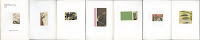
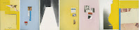
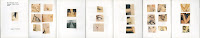
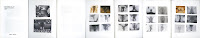
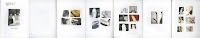
[Japan: Various Publishers, 1960–1978.]. Collection of 39 Japanese protest books from a private collection, representative of the highlights of the genre, assembled over the course of several years and several trips to Japan. Includes seminal publications by Kazuo Kitai, Tadao Mitome, Osamu Nagahama, Shomei Tomatsu, and Takashi Hamaguchi, among other photographers.

See also

THE PROTEST PHOTOBOOK 1956 – 2013 CURATED BY MARTIN PARR - TEXTS BY GERRY BADGER OPEN BOOK Exhibition Grand Palais Paris


1.
(All Japan Garrison Forces Labor Union Okinawa Branch). Document Zengunro Tososhi / History of the Struggle of the All Japan Garrison Forces Labor Union.
Okinawa: Ryukyushinpo-sha, 1978. First Edition. Quarto. A document of student and labor demonstrations in Okinawa, complied by the local Okinawan newspaper. No photographers credited. 

2.
(All Japan Students - Photographers Association). Hiroshima Hiroshima Hiroshima.
Tokyo: 491, 1972. First Edition. Quarto. Anthology of student images of Hiroshima shot in the Provoke style. 

3.
FUKUSHIMA, Kikujiro. Report from a Battlefield: Sanrizuka 1967-1977.
Tokyo: Shakai Hyoronsha, 1977. First Edition. Quarto. Japanese protest book. Very thorough documentation of the battle over Narita Airport, with an introduction and some captions in English. Gripping bw images of all facets of the struggle. 

4.
FUKUSHIMA, Kikujiro. Gasu Dan no Tanima Kara no Hokoku / A Report from the Valley of the Gas War.
Tokyo: M.P.S. Shuppanbu, 1969. First Edition. Quarto. Excellent images of the 1969 Tokyo student protests. Only one copy in OCLC.

5.
HAMAGUCHI, Takashai. The Shudders of Narita Airport.
[Tokyo]: Self-published, 1978.

6.
AMAGUCHI, Takashi. Document Angle.
Tokyo: Nippon Camera-sha (1973). First Edition. Small quarto. Images from a cross-section of Japanese life, shot in a variety of styles that encapsulate the movements of the time: from Provoke, to the gritty realism of Miyako Ishiuchi, to the banal eroticism of Araki. 

7.
HAMAGUCHI, Takashi. Documentary Photographs of Takashi Hamaguchi.
Tokyo: Nippon Camera-sha (1969). First Edition. Small quarto. Great juxtaposition of Hamaguchi's documentary work, with extraordinary war and protest pictures.

8.
HAMAGUCHI, Takashi. Document Sanrizuka Junen no Kiroku / Document Sanrizuka Record for 10 Years.
Tokyo: Nihon Sahshin Kikaku, 1977. First Edition. Small quarto. SIGNED by Hamiguchi in Kanji. Hamaguchi's images of the protests surrounding the building of Narita Airport in Tokyo. 

9.
HAMAGUCHI, Takashi. Daigaku Toso Nanaju-nen Ampo (Anpo) E.
Tokyo: Yuzankaku Shuppan, 1969.

10.
HAMAYA, Hiroshi. Ikari to Kanashimi no Kiroku / Record of Anger and Sadness.
Tokyo: Kawade Shobo Shinsha, 1960. First Edition. Small quarto. An early protest book - likely the first major example - by a photographer best-known for his photographs of Japan's snow country. The book documents riots and protests resulting from the ratification of the 1960 Security Treaty between Japan and the United States. At the time Hamaya was one of Japan's leading photographers, yet these images were censored from the mainstream press, leading to the creation of small, independent, and inexpensively produced volumes that constitute the beginning of the protest book culture in Japanese photography. Hamaya's photograph of left-wing leader Michiko Kanba, brutally beaten to death by the police, was later published by Life magazine and was directly responsible for his subsequent inclusion in Magnum.

11.
HANABUSA, Sinzo. Noson karano shoen / Testimony by the Farmers.
Tokyo: Asahi-shinbunsha, 1971. First Edition. Quarto. 

12
ISHIKAWA, Bunyo. The Vietnam War and the People.
Tokyo: Asahi Shinbunsha (1971). First Edition. Quarto. Images and text by Ishikawa. Riveting images that rival the best documentary work of the Vietnam War. The Japanese photographers who covered the war (Ishikawa, Kyochi Sawada, Keisaburo Shimamoto) have been woefully under appreciated in the Western photographic world. 

13.
(Japanese protest book). 10.21 towa nanika / What is October 21st?
Np: Privately published [1969]. First Edition. Small octavo. A small book by anonymous photographers documenting the antiwar struggle in Shinjuku, Tokyo, on October 21, 1968. Electric images shot in style of the Provoke photographers; one of the best and scarcest of the protest books. 

14.
(Japanese protest book). '69 11/13-17 Sato Hobei Soshi Toso / Fight to Stop Sato from Visiting America.
[Tokyo]: Privately published [1969]. First Edition. Small octavo. A sequel of sorts to the Aperture referenced 10-21 towa nanika, published in a similar format, and documenting student protests in opposition to Prime Minister Sato's trip to the US to renegotiate the AMPO treaty. Highly charged nighttime images of violent street demonstrations rendered in the Provoke style, though the blurriness and heightened use of flash might have been the result of the environment rather than an artistic choice. The lack of scholarship on Japanese protest books combined with their relative scarcity makes it difficult to contextualize individual works within the larger body of Japanese photographic literature. By 1969, however, the Provoke movement had become the predominant force in Japanese photography, making it entirely feasible that the unattributed photographers of this book had a style in mind when they went out into the Tokyo streets to document the event. As usual with most protest books, no copies can be located in OCLC. 

15.
(Japanese protest book). Kono chijo ni wareware no kuni ha nai / Kogai kyampen shashinshu / No Country on the Earth for Us / Public Nuisances Campaign.
Tokyo: Public Nuisances Campaign Executive Committee of All Japan Students Photo Association, [1970]. First Edition. Octavo. Japanese environmental protest book, one of the best of this limited subset within the protest genre. No individual photographers identified. Images of factories, pollution, toxic waste and sludge, bellowing smokestacks, Minamata disease, housing projects, etc. No copies in OCLC. 

16.
(Japanese Protest Book). Yurusenaihi kara no Kiroku / Record from Unforgiving Day.
Tokyo: Mugi Shobo, 1960. First Edition. Small quarto. Early Japanese protest book. The photographers are unidentified. With some of the well-known images of riots protesting the 1960 Security Treaty between Japan and the United States. No copies in OCLC. 

17.
(Japanese Protest Book). An Advance of Japanese Victory: The Struggle Against the U.S. - Japan Security Treaty.
Tokyo: Publishing Section of the C.P. of Japan, N.d. (but c. 1960). First Edition. Small quarto. Like Hiroshi Hamaya's Record of Anger and Sadness, this book by unidentified photographers documents riots and protests resulting from the ratification of the 1960 Security Treaty between Japan and the United States. Some text in English, with one image of people beaten to death, followed by another image of a funeral. These publications mark the beginning of the protest genre in Japanese photographic literature. 

18.
KANAYAMA, Toshiaki. Dotou / Years of Violent Change.
N.p.: N.p., 1970. First Edition. Quarto. Little-known Japanese protest book documenting various demonstrations between 1976-1970. Exceptional images. No copies in OCLC. (A book by this photographer published in 1984 appears in OCLC.)

19.
KITAI, Kazuo. Sanrizuka 1969-1971.
Tokyo: Nora-sha, 1971. First Edition. Quarto. SIGNED by the photographer. A documentation of the Sanrizuka farmers' opposition and resistance to the government's plan to build Narita airport. The most powerful example we have seen of an entire subset of little-known Japanese photobooks that deal with this struggle. Although not an official member of Provoke, Kitai was a pioneer in the photographic style championed by the group. His first book, Resistance, published in 1965, was greatly admired by the founders of Provoke, Daido Moriyama and Takuma Nakahira. Near fine in photo-illustrated wrappers and original publisher's card slipcase. A scarce book purportedly published in small numbers. No copy in OCLC. Possibly slated for inclusion in Parr / Badger 3, and a forthcoming Steidl publication on protest books.

20
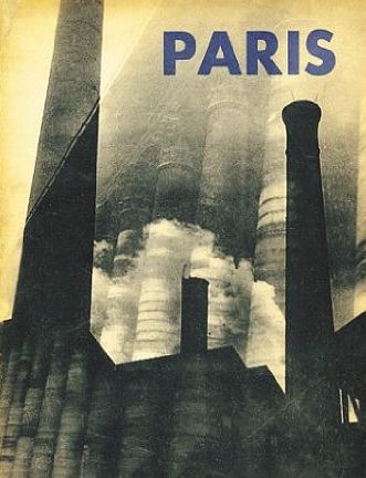
KITAI, Kazuo. Teikoh. (Resistance).
Tokyo: Murai-sha (1965). First Edition. Square quarto. Text by Kosei Inoue. The first book by unheralded Japanese photographer Kazuo Kitai, documenting student protests in the early 1960s; SIGNED by Kitai in Kanji and English. One of several important protest and antiwar books virtually unknown in the West. Interestingly, several blurred and grainy pictures would seem to presage the work of the Provoke photographers. According to Kitai, both Daido Moriyama and Takuma Nakahira - the founders of Provoke - were huge admirers of the book. Kitai was also the publisher of Ihei Kimura's Paris, and the recipient of the first Ihei Kimura award for his 1976 book "To the Village." Near fine copy in photo-illustrated wrappers with the instantly recognizable cover image of helmeted soldiers marching. No obi as issued. No copy in OCLC.

21.
KOH, Yoshioka. Okinawa 69-70.
Tokyo: Shashin Ichigun, 1970. First Edition. Quarto. Okinawa protest book published by Shashin Ichigun, a group of photographers opposed to the American occupation of Okinawa. Many images shot by Yoshioka Koh. 

22.
KURIHARA Tatsuo and Makoto Nakajima. Ikari o hibi no kate ni.
Tokyo: Tojusha, 1969. First Edition. Quarto. Excellent 1969 Japanese protest book. 

23.
KURIHARA, Tatsuo. Shashin hokoku Okinawa, 1961-1971.
Tokyo: Asahi Shinbunsha, 1970. First Edition. Quarto. Booklet laid in. Japanese protest book. With an interesting section of color images at the rear. 

24.
MITOME, Tadao. Records of Revolts 60-70: ANPO, Okinawa and the Struggles on School Campuses.
Tokyo: Taihei Shuppan-sha, 1969. First Edition. Octavo. 

25.
MITOME, Tadao. Sanrizuka - Moeru Hokuso daichi / Document 1966-71.
Tokyo: Shinsensha, 1971. First Edition. Quarto. Excellent book documenting protests surrounding the building of Narita Airport. Edited by Kayoshi Awazo and photographed by Tadeo Mitome, among others. This copy INSCRIBED by Mitome in Japanese and dated March 13, 1973. 

26.
NAGAHAMA, Osamu. Atsuhu nagai yoru no shima / A Hot and Long Night in Okinawa.
Tokyo: Hogashoten (1972). First Edition. Quarto. Pictures of the seamy underside of life in Okinawa, shot in the style popularized by the Provoke photographers, with a section each printed on green and blue paper. Unlike the overtly political Okinawa protest books, Nagahama focuses more on the American soldiers and their extracurricular activities outside the military zone. One of the best unreferenced Japanese books of the era.

27.
NAGATA, Touzou. Hiroshima 1960.
Tokyo: Patoria Shoten, 1960. First Edition. Quarto. 95pp., printed on cheap paper. Survey of Hiroshima in 1960. Feels and looks like a protest book, but is more pure social documentary. Three copies in OCLC. 

28.
[Nichidai zenkyoto kirokuhan / All University Joint-Struggle Committee of Nihon University]. Graf Nichidai toso / Student Struggle of Nihon University.
Tokyo: Godosangyo-shupanbu, 1969. First Edition. Quarto. Excellent Japanese student protest book published in 1969. To the best of my knowledge the specific photographers are unattributed. No copies in OCLC.

29.
(NON Magazine). TAKUMA, Akio et al. Non: Volumes 1 and 2. (Vol. 1: Han-sen Eno Shisaku / For Antiwar Thoughts. Vol. 2: Okinawa Wa Niga-Yo / Okinawa is a Bitter World.)
Tokyo: Gendai Shokan, 1969-1970. First Editions. Quarto. The first and only two volumes of the annual Japanese protest magazine: Non. Edited by Akio Tamura and Takao Iida. Both volumes printed in a deep gravure. Volume 1 has images of Mimamata and sections on various protests; volume 2 is devoted to Okinawa. 

30.
SAWADA, Kyoichi. Battlefield.
N.p.: The Mainichi Newspapers (1971). First Edition and scarce thus: most copies sold are later editions, improperly identified. Square quarto. A tribute to Pulitzer Prize-winning Japanese war photographer, Kyoichi Sawada, killed in Cambodia during the Vietnam war. Illustrated with Sawada's gripping UPI photographs. The book was apparently in production when Sawada was killed. One of the best of the Japanese Vietnam war books. 

31.
SAWADA, Kyoichi. Dusty Death.
Tokyo: Kodansha, 1971. First Edition. Quarto. Posthumous collection by Pulitzer Prize-winning UPI photographer Kyoichi Sawada, killed on assignment in Cambodia in 1970. Riveting images of the Vietnam War. On par with his better-known book, Battlefield, and certainly as good as anything by Philip Jones Griffiths or David Douglas Duncan. As a whole, the group of Japanese photographers in Vietnam produced perhaps the best photographic record of the particular horrors of that conflict. OCLC locates a single copy at Texas. 

32.
SHIMAMOTO, Keisaburo and Akihiko Okamura. Kare wa Betonamu de shinda / He Died in Vietnam.
[Tokyo] 1972. First Edition. A stunning and little-known book of Vietnam war photography by Keisaburo Shimamoto, later shot down in a helicopter along with photographers Kent Potter and Larry Burrows. Among many remarkable photographs in this book, one in particular of a boy peering over the railing of a flat bed truck where his dead mother or sister has been loaded in like a dead animal is agonizing. This same scene was also photographed by Phillip Jones Griffiths in Vietnam Inc., but Shimamoto's image is better. 

33.
TAMURA, Shigeru. Nawabashigo to Tetsukabuto / Rope Ladders and Steel Hats.
Tokyo: Pen Poporo, 1960. First Edition. Small quarto. Early protest book, with images by Shigeru Tamura (among others). Decidedly pre-Provoke in feel. 

34.
TAMURA, Shigeru. Kita Betonamu no Shogen / Testimony of North Vietnam.
Tokyo: Shin-Nihonshuppansha, 1967. First Edition. Small quarto. A book documenting the effects of war on the North Vietnamese people. Winner of the Japan Photo Critics Society Special Award in 1967. There is a long list of little-known Japanese photobooks documenting the Vietnam war. 

35.
TAMURA, Shigeru. Minna Ga Eiyu.
Tokyo: Mainichi-shibunsha, 1965. First Edition. Small quarto. Photographs of North Vietnamese during the war, predominately women, soldiers and civilians, shot from the Communist perspective, and providing an angle on the war almost never seen in western photography. Some color images, including the cover which depicts a gun-toting female standing in rubble. OCLC locates only two copies. Tamura's 1960 book Rope Ladders and Steel Hats is one of the original Japanese protest books. 

36.
TOMATSU, Shomei. Okinawa.
Tokyo: Shaken (1969). First Edition. Oblong quarto. SIGNED by Tomatsu in Japanese and dated in the year of publication. Three promotional flyers laid in. Images of Okinawa presented in a Provoke style with a more documentary and social bent than other books by Provoke photographers. (Auer 503) 

37.
URESHINO, Kyoko. Okinawa.
Tokyo: Shin-Nihonshuppansha, 1968. First Edition. Small quarto. 103pp. Okinawa protest book. 

38.
WATANABE, Hitomi et al. Todai Zenkyoto / The All-Campus Joint Struggle at Tokyo University.
Tokyo: Sanichi Shobo, 1969. First Edition. Octavo. Hitomi Watanabe, a female member of Provoke, was one of the most important photographers to shoot the student riots at Tokyo University. While Japanese photobooks have become better known in the West over the past ten years, there are perhaps dozens of exceptional works on the Vietnam War and the Sixties that fly largely under the radar. OCLC locates a single copy. 

39.
WATANABE, Hitomi. (Student Power League of Tokyo). Kaihoku '68 / Liberated Area '68.
Tokyo: Japan University Students Power League Office, 1968. First Edition. Small octavo. Chronological report about the famous 1968 student riot in Tokyo, with most photographs taken by Hitomi Watanabe. An exceptional protest book with countless gripping images. One copy in OCLC. 


 WHAT IS 10/21? (1969) : THE ‘10.21 TO HA NANIKA’ PUBLISHING COMMITTEE


CAPTURING THE ORDINARY: RUSSELL LEE IN SOUTHEASTERN LOUISIANA Documentary Photography

$
0
0

March 2007
by J.B. Colson
Photographers, like actors, can be typecast. When you are the go-to person for a particular kind of job, it's an advantage. When you can't get the out-of-type assignments you'd like to increase your income and demonstrate your scope, it's a curse. The same thinking applies to the history of photography where even the greatest photographers are too often known for a particular style or subject, ignoring the broader range of their accomplishments. A few best hits oft repeated become our signature memory of their careers.

Photo history has typecast Russell Lee as a documentary photographer who photographed American life in the 1930s during the hard times of the Great Depression. That work was done for the Farm Security Agency (FSA), a federal agency to help displaced farmers that also documented them and other Americans as part of its mission. Working for the FSA earned Lee his place in the pantheon of photographers to respect and remember. However, typecasting, a self-effacing nature and limited distribution of his later work have resulted in a general failure to fully appreciate Lee's accomplishments, an array of visual insights that extend far beyond his work for the FSA.

Lee and his wife Jean, who traveled with him for many of his projects, donated his personal collection of negatives and associated files to The Center for American History at the University of Texas at Austin. The original materials for everything but his work for the government, some commercial work, and his color photography are included. There it has joined a growing photographic collection that documents American life and history. In 2005 the University of Texas Press asked CAH photo archivist and curator Linda Peterson to submit a proposal for a Russell Lee book project. The proposal was approved and Linda engaged the great curator and historian John Szarkowski to write the preface and me to write the introduction. Linda kept the plum job of selecting and arranging the photographs for herself with a lot of input from me, Roy Flukinger, and Dr. Don Carleton, the Center's director. This was a heartfelt project for me. Many Friday afternoons I had joined a group that drank Scotch and enjoyed Central Texas barbecue with Russ. I used his personal copy slides to teach about his work in my history of photography classes. In his last year Dr. Julianne Newton and I helped him review his files and determine their disposition. In his last hours I had a final conversion with this great photographer who was optimistic and forward-looking to the end.

Chronologically, the CAH Lee archive begins with nearly 40 35mm rolls of his earliest work from 1935-36, before he joined the FSA. He approached a far greater range of subjects than the famous sad street scenes of out-of-work men in New York City where he spent winters, and the desperate auctions of household goods in the Woodstock artist's colony where he lived in milder weather. His Contax I camera pointed to upscale life as well as the unfortunate. He managed interiors as well as exteriors despite the limits of slow film and no flash synch. The themes he continued to explore throughout his photographic life were established early including political life, street scenes, shopping, portraiture, personal and public spaces.

Frowning political speaker. Note his forefinger stuck in the watch pocket of his vest and the array of expressions on those behind him. This penetrating document was Lee’s earliest take on American political life, a subject he dealt with extensively during his Texas years. 1935/36.
Lee's omni vorous vision was supported by profound advan tages for someone becoming a photo grapher. He was trained as a chemical engineer and from the beginning worked 35mm processes beyond their normal limits. His first wife, Doris Emerick, was a painter and Lee quit work as a young man to join her immersion in art. It was his frustration with painting that drove him to take up the camera in hopes of getting more "life" in his portraiture. When Doris' success as an artist and his as a photographer on the road led to parting, he later married Jean, a journalist who wrote his captions and field notes. A family trust provided a limited but adequate income beyond the modest pay most of his photography afforded. These resources were integrated by a man of uncommon charm and great personal discipline. Charm he learned, perhaps, while coping with an unfortunate childhood (his parents were divorced, his mother killed by an automobile as he watched at age 10, his relatives unhappy to care for a child). Intense private schooling (Culver Military Academy) reinforced his sense of discipline. Although he was a self-confident, physically strong and handsome six-footer, Russell Lee made you feel comfortable and glad to be with him. He had one of the most important assets for a photojournalist or documentary photographer: a talent for relating to strangers
.
Old woman in shawl, Piazza Armerina, Sicily, 1960
After the FSA there was WWII in which he served as a Captain photo graphing for the Air Transport Com mand. After the war there was a national crisis with the mining industry resulting in a book-length govern ment report exten sively illustrated with Lee's photography. In 1947, exhausted and ill, Lee retired to Austin with Jean to take up fishing, his personal recourse to recreation. He was soon involved in photographing for a variety of political and social causes, many of them driven by Jean's active political life. Occasionally he did a media or commercial assignment, but he was not driven by ego or financial need to pursue a photographic career.

He did reconnect with Roy Stryker, for whom he had worked at the FSA. Stryker was now working with Standard Oil creating an industrially motivated documentary project. This led Lee to commercial projects for oil and steel companies, travel to Saudi Arabia and Europe, and some of his finest large-format photography.

Two projects of special interest in the CAH collection are photography for the Study of Spanish-Speaking People in Texas (1949), and for a special issue of a University publication, Texas Quarterly, titled Image of Italy. He traveled through the country in the summer of 1960, from Sicily to the Dolomites, to provide over 150 illustrations. He was at the height of his photographic power. Italy was ripe with photographic potential. Scholar William Arrowsmith, who edited the volume of writing and photography, noted in his foreword that, "In a half hour's drive out of almost any city in Italy you can pass through three or four successive centuries, all of them simultaneously alive…" Both the Study of the Spanish-Speaking People and Image of Italy files provide a rich treasure of little-known photography.
Hats on chair, Brazos River Authority Tour, 1956
Even a brief discussion of Lee would be incom plete without mention of his contri butions as a teacher. In the early years of the Missouri Workshop, where so many fine photographers have either taught or improved their documentary skills, Russ and Jean were co-directors. They were credited by noted educator Cliff Edom, founder of the workshop as well as the first university program in photojournalism, with helping to shape the workshop. Later Lee taught photography in the Art Department at the University of Texas. His charge there was limited to helping visual artists "see" more effectively, but some of his students became successful photographers.

For a privileged few the 1930s Great Depression did not disrupt the good life. A close-up in this series of the facial artist indicates that the subjects acknowledged this photography, although it seems candid. From the beginning Lee sometimes worked with what photojournalists later called the “posed/unposed” method in which the subjects cooperated to give natural-looking pictures by following their normal routines for the camera. 1935/36.
The full measure of Lee's photo graphy is hard to take in because it does not depend on a singular subject or approach. Stylis tically it is both varied and trans parent. Trans parent in that it does not call attention to itself, but has you looking directly at what's in the frame. Varied in that it ranges from complex, precise compositions using a view camera to some of photography's most decisive candid moments. His camera moved from exquisitely detailed object studies to broad landscapes. From portraiture and people in action to intimate moments. The moods range from dark and profoundly sad to brightly comic. It is work that is easier to appreciate with seeing than with explanation. Lee's great empathy with the human condition shows throughout it all.

Lee was an active photographer for more than three decades after the FSA. There has been one significant survey of his career (F. Jack Hurley, 1978), long out of print. Linda Peterson and I are grateful for the opportunity that the Center for American History and its supporters have provided to offer a broad selection of Lee's personal files in Russell Lee Photographs, all of it beyond the FSA, much of it not known to the viewing public.

For more about The Center for American History go to: http://www.cah.utexas.edu/.
Information about their Photography Collections is at:
The complete series of negatives Lee shot on assignment for the Study of the Spanish-Speaking People of Texas is at: http://www.cah.utexas.edu/ssspot/.
More about Russell Lee Photographs is available at the University of Texas Press:http://www.utexas.edu/utpress/.
© J.B. Colson

J. B. Colson studied under the direction of Clarence White for his BFA in photography. After serving as a Signal Corps photographer in Panama he studied documentary film at UCLA. He made non-theatrical films in the Detroit area before teaching photojournalism at the University of Texas, where he inaugurated a program at the Bachelors, Masters, and Ph.D. levels. In the 1980s he worked in Mexico with Jean Meyer and the Collegio de Michoacan documenting village life in the High Meseta. Professor Emeritus, School of Journalism at The University of Texas and a fellow at The Center for American History, he still teaches a graduate course in the history and criticism of photography. He penned the introduction to John Ficaro's photo story, "Black Farmers in America," for The Digital Journalist's March 2006 issue and, more recently, the "Coal Hollow" feature in May 2006


Istanbul’da Stil Pesinde / Style Hunting in Istanbul ANALYSING WORK TODAY Foto Industria Bologna 2013 Martin Parr Company Photography

$
0
0

Commisioned by Mavi Jeans in 2006 to celebrate their 15th birthday. Portraits were made of some of the key cultural players in Istanbul, such as designers and architects. These were complimented by street food photos and observations found in the Turkish capital. Shot in four days and published within a month to a high standard, the book was given away to Mavi clients and friends. Istanbul’da Stil Pesinde / Style Hunting in Istanbul. Published by Mavi Jeans, Istanbul. 2006. Designed by Esen Karol. Printed by Mas Mataacilik, Istanbul. Hardback with ‘belly band. 100 colour photographs. w 248 x h 325 mm.


ANALYSING WORK TODAY extends the genre of Company Photobooks the present-day, and is based on the research and book selection maded  for Schaden_cahier 001 (2010). This selection of seminal company photobooks and daring annual reports is compiled from the private collections of Hans Gremmen, Erik Kessels, Bart Sorgedrager and Mirelle Thijsen/IPhoR.

Top 10 photobooks of the decade by Gerry Badger
PARRJECTIV: JEANS HUNTING IN ISTANBUL
Martin Parr, Mavi Jeans, 2006
A 'company' book, made in a few days, but containing great pictures and packaged together strongly. It even has a bellyband

Read more: http://www.bjp-online.com/british-journal-of-photography/report/1646009/top#ixzz2hxORXugp 


One of the most beautiful books of the G(erman) D(emocratic) R(eplubic) Keine Experimente Dirk Alvermann Photography

$
0
0

TUESDAY, NOVEMBER 18, 2008

Keine Experimente by Dirk Alvermann by 5B4 ...


The name of the photographer Dirk Alvermann has only been familiar to me for about a year. Surprised by the photographs, design and layout of his book L'Algerie - his account of the Algerian war for independence published in 1960 - he is definitely worth knowing although it isn't easy to find the books nor information on him. While in Paris I found his second book Keine Experimente published in 1961.

Keine ExperimentePictures of Basic Law is a book about the general attitude of the West German population towards the changes brought about in West Germany with the election of the CDU party. Konrad Adenauer, the first Chancellor of the Federal Republic of Germany ushered in an era of rapid economic growth for post-war Germany that was essentially a free-market economy that spurred upwards of 8 percent growth per year. Adenauer's"Keine Experimente" (No Experiments) slogan symbolized a more practical approach to politics for people who had just years prior experienced the ideologies and economic upheavals of the war period. Although living standards did improve for most Germans, it was a policy that would have a similar effect to "trickle-down" economics of Reagan in the United States where large gaps between the rich and poor would be created and where wages for workers stagnated.

Alvermann's photographs made between 1956 and 1961 are juxtaposed against the first 9 articles of the Basic Law of the Federal Republic of Germany and in part acts as a critique of the consumerism and the attitudes that the free-market brought. The book opens with a page spread of a crowd locked behind a gate reminiscent of a concentration camp. A reminder of a difficult history that many of the population wished to disappear -- something the new economic policies made easier. When the gates open into this new society we are faced with billboards offering the Ten Commandments and bottles of Coca-Cola. The faces of the workers on the following spread seem confused and uncertain.

Much of the work is festive in tenor with many images of carnivals and gaiety. Brass bands and parades of uniformed soldiers march announcing the new era in stark contrast to an attitude of reducing militarism. When he shows similar scenes of workers shuffling along, their lack of energy and despondence is a point of focus.

Alvermann's design and image juxtaposition is full of experiment. He clips and crops images into graphics to make his point. He reminds readers of the Nazi past while the people in the images seem to be more willing to turn away. He focusses on the young children playing in the streets, the young generation which will return to confront the past with more introspection than any since. In many images Alvermann seems to be passing the torch to them, reminding us that they will be the ones to suffer for the populace's will to turn from its history. In one telling image Alvermann photographs a child aiming his toy gun at his own head in mock suicide while a line of saints in a store window stand over him.


Keine Experimente's construction and, again, Alvermann's use of design is most effective. Like with his book on Algeria, he creates a kind of photojournalist's Klein's New York utilizing slivers of photos and graphic pairings that are visually exciting creating new meanings from disparate images -- a kind of assemblage of history and commentary.

Keine Experimente is a pocket-sized book with glossy illustrated hardcovers and is not much larger than a common novel. The printing is on rather cheap paper but the low-fi production is very seductive and adds a gritty edge to a supposed bright reality.


Kunsthaefte 16 by Jesper Fabricius Incredibly Small PhotoBooks Paul Kooiker Erik Kessels Photography

$
0
0

Kunsthaefte nr. 15

Copenhagen: Space Poetry, 2008.
ISBN: 9788776030858
softcover

Kunsthaefte nr. 16

Copenhagen: Space Poetry, 2008.
ISBN: 9788776030865
softcover

Incredibly Small PhotoBooks Paul Kooiker Erik Kessels
For several years, Paul Kooiker and Erik Kessels have organized evenings for friends in which they share the strangest photo books in their collections. The books shown are rarely available in regular shops, but are picked up in thrift stores and from antiquaries. The group’s fascination for these pictorial non-fiction books comes from the need to find images that exist on the fringe of regular commercial photo books. It’s only in this area that it’s possible to find images with an uncontrived quality. This constant tension makes the books interesting. It’s also worth noting that these tomes all fall within certain categories: the medical, instructional, scientific, sex, humour or propaganda. Paul Kooiker and Erik Kessels have made a selection of their finest books from within this questionable new genre. Incredibly small photobooks is the second volume (after Terribly awesome photobooks) showing this amazing collection.

SUNDAY, DECEMBER 2, 2007

Kunsthaefte 1 - 14 by Jesper Fabricius by 5B4 ...


Around the time of the Printed Matter Art Book Fair this past summer I mentioned buying a set of books from a Danish artist named Jesper Fabricius. Jesper publishes small handmade artist booklets that range from 8 pages to 20 pages in length under the imprint Space Poetry. One ongoing series of books called Kunsthaefte is currently 14 books strong and counting (I assume there will be more).

Using snippets from existing printed images from magazines he emphasizes relationships of color and texture while giving hints to the original image’s content. For instance, many of the crudely cut snippets seem to have derived from porn magazines or books published in the late 1970’s and 1980’s so after Jesper’s scissors are through, an image might draw your attention incidental details like to part of someone’s face and a painting hanging on the wall behind them instead of the act of sex.

Kunsthaefte nr. 1 was published in 1998 is the largest in trim size of all of theKunsthaefte series at 8 by 11 ½ inches and contains 8 pages of images in stapled folios. The images use multiple pieces of cutouts placed on the page to create more of a sense of collage than most of the other books have.

Kunsthaefte nr. 2 was published two years later in 2000 and here the trim size has been dramatically reduced to a petite 4 by 5 inches which is the smallest of the entire series. Here the content is abstracted to the point of being a kin to abstract painting. Only rarely does the viewer have enough information of the object the patterns and color were taken from to identify what it is. This is the first of the books that is several folios sewn together in a simple figure 8 stitch as a binding.

Kunsthaefte nr. 3 was published in 2002 is slightly larger in size at 4 by 5 ½ inches and this seems to be the standard for the rest of the series with only a couple exceptions. The content is arrangements of cutout speech balloons. I wish I knew what they say.

Kunsthaefte nr. 4 published in 2002 is one of the shortest at only 8 pages and four images. The content is close up cutouts of a woman or a couple women alternated with two images of a girls hair parted with blue ribbons.

Kunsthaefte nr. 5 published in 2002 is also a short one of 8 pages of women’s breasts.

Kunsthaefte nr. 6 published in 2006 is 12 pages drawing our attention to flower arrangements and plants.

Kunsthaefte nr. 7 published in 2002 is 12 pages of abstracted background patterns some with printed flowers.

Kunsthaefte nr. 8 published in 2003 is a larger booklet of 16 pages at a trim size of 5 ½ by 8 ½ inches. The content is more like nr. 1 with its multiple image collage. Each page has a different background color so the emphasis seems to be on the entire composition of the page rather than on the individual image like in numbers 2 - 7.

Kunsthaefte nr. 9 published in 2004 reverts back to the 4 by 5 ½ inch trim size and it is the first of a few that are sexually explicit in subject matter. Here we are bombarded with creative image grids of close ups of genitalia and intertwined bodies that are bizarre, surreal and often very grotesque.

Kunsthaefte nr. 10 published in 2004 draws our attention to the paintings hanging on the walls just above the faces and tops of heads of people presumably having sex.

Kunsthaefte nr. 11 published in 2007 is 12 pages of photos of vaginas arranged in grids.

Kunsthaefte nr. 12 published in 2007 is 16 pages of photos of penises arranged in grids.

Kunsthaefte nr. 13 published in 2007 is 20 pages of people’s heads. This is an interesting one as the individual pictures are common daily expressions except you notice that some (maybe all) are taken from images of people’s faces while engaged in sex.

Kunsthaefte nr. 14 is 12 pages of individual images of women’s breasts and torsos bound by different configurations of rope.

I like these books for their ready-made and casual look. They probably are labored over by Jesper in their creation but they have an un-precious and disposable feel that suits the imagery. Jesper is one of many artists that uses material at his disposal to re-contexualize the image and divert our attention away from the original intention. As we look, he may be challenging us to pull our mind away from its primal instinct of voyeurism and push our thoughts elsewhere. As we try to evaluate each photo as a new work of art that is complete in its own way, our imaginations and instinct try to expand those boundaries far past what he has presented. This tug and pull is what makes many of these booklets interesting.

The books are occasionally available through Printed Matter in New York City or through the website. Space Poetry. Printed Matter sells most of the recent booklets for around $4.00 US.

Photo Magazine ARCHIVO Martin Parr Miroslav Tichy Paul Kooiker Photography

$
0
0

ARCHIVO explores remarkable archives.
The issues of the quirky photo magazine  ARCHIVO are now bundled into one solid folder. Each issue consists of two folio paper quires devoted to the personal archive of a photographer.
The originators of this project, photographer Paul Kooiker and graphic designer Willem van Zoetendaal who both live and work in Amsterdam, selected intriguing images made or collected by young photographers. Their list includes Harold Strak, Eva-fiore Kovacovsky, Johannes Schwartz, Daya Cahen, Paul Kooiker, Qui Yang, Kyungwoo Chun, Erik van der Weijde, Sara Blokland, Martin Parr and the duo Anuschka Blommers & Niels Schumm. Four further issues are devoted to a series of obscure television images photographed by Miroslav Tichy, an overview of the distinctive photography books designed and published by Van Zoetendaal, multi-cultural baby pictures by Lee To Sang and some rare and superb propaganda books from the collection of Martin Parr.
Lee To Sang is the odd one out here, as a retired portrait photographer he could neither be categorized as a promising emerging or as an autonomous working photographer. Still the beautiful baby portraits Kooiker and Van Zoetendaal selected from his immense archive are both revealing and hilarious. To Sang Photo Studio was located in the middle of a 19th-century working class area in Amsterdam with immigrants from Suriname, Turkey, Morocco, Pakistan, China and Kurdistan, to name a few. Everyone from the neighborhood, including the native Dutch, sooner or later had his or her picture taken at To Sang’s.
The other excerpts from the photographer’s archives can be personal, conceptual or documentary and sometimes all at the same time. Daya Cohen shows her reportage on the growing Russian youth movement inspired by the ideals of Valdimir Putin. Blommers and Schumm recorded a comical costume party with and by designers Victor & Rolf. The contributions of Blokland, Chun, Kooiker, Schwartz and Strak are quite conceptual, but there’s always room for a personal touch and/or a special sense of humor.
All together ARCHIVO represents the adventure, the sheer infinity of possibilities of the medium as a vehicle of creativity, of ways to look at our world. This project is made with knowledge of and passion for photography — and it shows. (text by Han Schoonhoven for Photo-eye).

ARCHIVO de Lee To Sang from Tipi Bookshop on Vimeo.

ARCHIVO de Daya Cohen from Tipi Bookshop on Vimeo.

Archivo de Miroslav Tichy from Tipi Bookshop on Vimeo.

ARCHIVO de Kyungwoo Chun from Tipi Bookshop on Vimeo.

Archivo de Johannes Schwartz from Tipi Bookshop on Vimeo.

ARCHIVO de Martin Parr from Tipi Bookshop on Vimeo.

ARCHIVO de Erik van der Weijde from Tipi Bookshop on Vimeo.

ARCHIVO de Anuschka Blommers & Niels Schumm from Tipi Bookshop on Vimeo.

ARCHIVO de Qui Yang from Tipi Bookshop on Vimeo.

ARCHIVO de Sara Blokland from Tipi Bookshop on Vimeo.

ARCHIVO de Paul Kooiker from Tipi Bookshop on Vimeo.


Some Rare and Superb Propaganda photoBooks from the collection of Martin Parr Archivo Photography

$
0
0

Archivo

Amsterdam: Archivo, 2009.
softcover

Archivo is a bi-monthly journal and fully dedicated to the personal archives of photographers.

PYONGYANG

HardCover. Pub Date: 1980 Pages: 304 Publisher: FOREIGN LANGUAGES PUPLISHING HOUSE 


by Anonymous

Santiago, Chile: Editora Nacional Gabriela Mistral, nd [1975] Paperback First edition, first printing. Good paperback with wear at the edges and extremities, a small tear at the crown, and shelf wear; interior clean and bright. BOOKS SHIP THE NEXT BUSINESS DAY, WRAPPED IN PADDING, IN A BOX. 100 pages; 119 b&w and 1 color photograph; 9.5 x 9.5 inches. Text in English, Spanish and French. Published by the military junta after the 1973 coup to show what a better place Chile was now that the Communists were out of power. See Fernandez, The Latin American Photobook, p103.

Nicaragua : la guerra de liberación = der Befreiungskrieg / Ernesto Cardenal, Richard Cross.

[Managua, Nicaragua] : Ministerio de Cultura de Nicaragua


Photo album published by the Press and Publication Office run by Theodore Sarrouf in Jaffa in 1933 about the demonstrations in Palestine.


(RABIN, Yitzhak) (REAGAN, Ronald) Bar-On, Mordechai, Col., editor. Israel Defence Forces. The Six Day War 5.6.67… 10.6.67. Israel: Israel Defence Forces, and the Publications Division of the Ministry of Defence, 1968. Large quarto (10-3/4 by 12 inches), original brown paper boards, graphic endpapers, original dust jacket. Housed in a custom clamshell box.
First edition of a seminal early record of the 1967 Six Day War, an exceptional presentation/
association copy inscribed on the second page of text, shortly after publication, by then General Rabin to Ronald Reagan as Governor of California. Rabin, who became Israel’s Fifth Prime Minister, won the Nobel Peace Prize with Shimon Peres and Yasser Arafat one year before his assassination, and Reagan became America’s 40th President. This authoritative work, containing text by both Rabin and Moshe Dayan, features 12 full-page maps with color-outlined overlays and is profusely illustrated with hundreds of photogravures, many full page (15 in color), including photographs by noted photographers Cornell Capa and Don McCullin.
This highly memorable presentation/association copy of Israel Defence Forces is inscribed by Yitzhak Rabin soon after publication to Ronald Reagan, America’s 40th President, who was then Governor of California. As General, Rabin led Israel to victory in the 1967 Six Day War and became Israel’s fifth Prime Minister. In 1994 Rabin won the Nobel Peace Prize with Shimon Peres and Yasser Arafat, the same year he was awarded the Ronald Reagan Freedom Award, and only one year before his tragic assassination. In a prefatory essay to this important work, Moshe Dayan, as Israel’s Minister of Defence, writes: “During those Six Days, the Israel Defence Forces fought a coordinated campaign without let-up in desert and on mountain, in the air and on the sea, in night and day actions, with amour and infantry, from the walls of Jerusalem to Mount Hermon in the north and to Sharm e-Sheikh in the south.” In his own introduction Rabin pays further tribute to hard-fought struggle, adding: “most important of all was the spirit of the individual fighting man ready to risk his life at all times. This book tells the story of the battles… But it is dedicated to the entire nation of Israel, who stood with steadiness and courage behind their defenders.” With prefatory essay by Moshe Dayan and introduction by Rabin. Text by Nathan Shaham.


Now the Story Can Be Told: The PLO


1957 in Eng land A Sou venir of the lives and times of peop le supporting and accompanying the 47th Bombardment Wing, Tactical United States Air Force during the historic year of nineteen hundred and fifty-seven

Published by United States Air Force, Sculthorpe, Norfolk, 1957

Unpaginated. Front cover creased and dog-eared, and spiral binding broken at the bottom. Contents clean w just a little finger-creasing. Packed with photographs, mainly black and white, a pictorial souvenir of England.


People of Vietnam Will Triumph! the U.S. Aggressors Will Be Defeated!: a Collection important Paperback – January 1, 1965


The illustrations for this exhibition are taken from the book Portugal 1934[3] published in Lisbon and edited by S.P.N. The acronym stood for the Secretariado Nacional de Propaganda in the days before Joseph Goebbels put such negative connotations on the word that it is still difficult to use it. This book was the official propaganda book for the Estado Novo, the right-wing regime inaugurated by António de Oliveira Salazar in 1933 and it includes photographs by the most famous Portuguese photographers of the time:Alvão, A. RasteiroJoão MartinsDiniz SalgadoFerreira da CunhaFrancisco SantosHorácio NovaisJ. BenolielJosé MesquitaLuis TeixeiraPinheiro CorreiaMário de NovaisOctávio BoboneRaimundo VaissierRaúl ReisSalazar DinizSerra Ribeiro and V. Rodrigues


Footnotes 
  

  1. Λ David Elliott (ed.), 1979, Alexander Rodchenko, 1891–1956, (Oxford, England: Museum of Modern Art); S.O. Khan-Magomedov, 1986, Rodchenko: The Complete Work, (Cambridge: The MIT Press); Alexander Lavrentiev, 1995, Alexander Rodchenko: Photography 1924–1954, (Edison, NJ: Knickerbocker Press); Peter MacGill & Gerhard Steidl (eds.), 2012, Rodchenko, (Steidl Pace/MacGill); P. Noever (ed.), 1991, Aleksandr M. Rodchenko and Varvara F. Stepanova, (Munich: Prestel); Margarita Tupitsyn (ed.) & Christina Kiaer, 2009, Rodchenko and Popova: Defining Constructivism, (Tate) 
      
  2. Λ Erika Wolf, 1999, "When Photographs Speak, To Whom Do They Talk? The Origins and Audience of SSSR na stroike (USSR in Construction)", Left History, vol. 6 no. 2, pp. 53-82 
      
  3. Λ Black cover. Fully illustrated with almost 200 photographs. This large format edition was published with three different covers (orange, green and black). The book includes several half-size pages, full double-pages bleeds and fold-outs. 


Moi Ver from Photography (Paris, Wilna ein ghetto im Osten) to Book Illustration

$
0
0
paris moi-ver

by twicemodern ~ All Aspects of Design 1900-2000 13 feb 2013

One of the hardest to find 20th Century seminal photobooks is one by MosheRaviv-Vorobeichic titled  PARISpublished in 1931 by Editions Jeanne Walter in Paris, France in an edition of 1000 copies. Here are the two pages dedicated to this edition in the bibliographic photobook catalog The OpenBook published by the Hasselblad Center:
img482img483
img465
Moshe Vorobeichic (1904-1995), pictured above, was born in Vilnius, Lithuania. He published his photographic work under the artist name of Moi-Ver and produced an extraordinary book incorporating new photo techniques and different photographic viewpoints for his photographs. The book titledPARIS (shown above) became an avant garde icon and an ode to the city of Paris.
Moi-ver had previously worked on another photo reportage in the form of a book that actually appeared before the Paris book. This small size photobook was published in 1931 titled Wilna , ein ghetto im Osten (A ghetto in the East).
Clipboard01The book is a photo reportage on the life of the Jewish inhabitants of Vilnius (Wilna) Lithuania Jews as in many ( East) European towns had lived in the Jewish quarters (the Ghetto) of the old town for centuries. The book was simultaneously published in several editions a German-Yiddish version, a German-Hebrew version and an English-Hebrewversion and below are two links to tell you more about the various editions. Interesting is the fact that the book, the 27th in a series was printed in Switzerland by the Orell Fuesli Verlag

Here you can see the entire range in the series:  http://www.photobibliothek.ch/seite007h.html
If you would like read all about the Ghetto book, in particular, here is a link with pictures to another superb site:
(Parr/Badger, The Photobook) comments as follows on the book:
“ The book, with both Hebrew and German text, featured his photographic record of the Jewish ghetto in the Lithuanian capital of Vilnius, documenting a way of life that would soon disappear under terrible circumstances. Even more so than ParisEin Ghetto im Osten was ostensibly a documentary book, but as he had done in his view of the French city, Moï Ver could not resist pushing the envelope of the documentary form. Once again, he used a variety of New Vision strategies, the most obvious being to take many images from upstairs windows looking on to the narrow streets of Vilnius’s old Jewish quarter. This creates odd angles and a dynamic mise en scène for his pictures of people going about their everyday business on the street…But Moï Ver didn’t stop there. He also introduced cinematic cutting and montaging techniques to heighten the interest… A poignancy has been added [to Ein Ghetto im Osten] in hindsight: it was made at the beginning of a desperately traumatic time for European Jewry” .
In 1932 Moi-Ver was asked to visit Palestine to do a photo essay for the French magazine VU. Here is a link to a page describing some of the VU magazine issues from our friends at Studio Montespecchio in Italy:
A short artist biography is in order at this point:
In 1934 Moshe Verobeichic born in Wilna or Vilnius as a Jew decided that the Zionist cause to settle the land of Eretz Israel was a worthwhile cause and moved to Israel where he would live for the rest of his live. He adapted the Hebrew version of his name,  from Moshe Vorobeichic and Moi-Ver to   Raviv and everything he designed carries that signature. In the mid-twenties he studied at the Bauhaus in Germany and underwent the influence of the painters Paul Klee and Wassily Kandinsky. Much of his later artistic work in Israel was done by illustrating, drawing as well as painting. In the early 1950′s an artist colony, of which he was one of the founders, was established in the millennium old town of Safed.
img462
Here is one of the books Moshe Raviv illustrated titled Tales in praise of the ARI published by the Jewish Publication Society of America in 1970.
img468
img467
This brings us to the circle of acquaintances of Moshe Raviv. One is the fellow Jewish artist Ismar David, an important book illustrator and type designer who designed several Hebrew alphabets like the one on the flyleaf of the book above and who excelled in calligraphy. The lettering on the front cover is but an example. The back cover of the book has the initials JPS intertwined, those are the initials for the Jewish Publishing Society.img463
Every new paragraph in the book has an initial done by Ismar David as well. The entire book is a superb example of artist collaboration who shared similar experiences in life and a common religious background. The duotone plates in the book are sepia tone drawings on white paper and speak of a very developed drawing skill by Moshe. The cloth binding is by Ismar David. Here are some illustrations from the book:img469
img470
img464
For more on other book jackets designed by Ismar David follow the link here:
Misha Beletsky is the author of a recent book on the book jackets of Ismar David, as well as a graphic designer himself. More on the book at the publishers site:
Ismar David’s work is also covered in an older (2005) and more comprehensive book by author Helen Brandshaft published by the same publisher:
The best reference site for work by Ismar David in my opinion is here:
I have recently seen a You tube video about the life and work of Moshe Vorobeichic posted by Helen Raviv but it is entirely in the Hebrew language unfortunately.

Because these Photos are so Catchy and so Far-reaching American Neon Signs by Day & Night Toon Michiels Photography

$
0
0

MICHIELS, Toon.
American Neon Signs by Day & Night.
Nuth: Rosbeek, 1980.

(200 x 200 mm, folding pages open to 200 x 392 mm), pp.58 (inc. 14 gatefolds). 30 colour photographs. Colour illustrated card covers, upper cover folding, spiral-bound.

This promotional book is one of a number of interesting publications produced to showcase the work of Rosbeek, the renowned Dutch printers. It contains 15 pairs of colour photographs showing neon signs within the American landscape, first in daylight and then by night.


Israel Defence Forces The Six Day War 5.6.67… 10.6.67. Propaganda photoBooks Martin Parr Archivo Photography

$
0
0

(RABIN, Yitzhak) (REAGAN, Ronald) Bar-On, Mordechai, Col., editor. Israel Defence Forces. The Six Day War 5.6.67… 10.6.67. Israel: Israel Defence Forces, and the Publications Division of the Ministry of Defence, 1968. Large quarto (10-3/4 by 12 inches), original brown paper boards, graphic endpapers, original dust jacket. Housed in a custom clamshell box.
First edition of a seminal early record of the 1967 Six Day War, an exceptional presentation/association copy inscribed on the second page of text, shortly after publication, by then General Rabin to Ronald Reagan as Governor of California. Rabin, who became Israel’s Fifth Prime Minister, won the Nobel Peace Prize with Shimon Peres and Yasser Arafat one year before his assassination, and Reagan became America’s 40th President. This authoritative work, containing text by both Rabin and Moshe Dayan, features 12 full-page maps with color-outlined overlays and is profusely illustrated with hundreds of photogravures, many full page (15 in color), including photographs by noted photographers Cornell Capa and Don McCullin.
This highly memorable presentation/association copy of Israel Defence Forces is inscribed by Yitzhak Rabin soon after publication to Ronald Reagan, America’s 40th President, who was then Governor of California. As General, Rabin led Israel to victory in the 1967 Six Day War and became Israel’s fifth Prime Minister. In 1994 Rabin won the Nobel Peace Prize with Shimon Peres and Yasser Arafat, the same year he was awarded the Ronald Reagan Freedom Award, and only one year before his tragic assassination. In a prefatory essay to this important work, Moshe Dayan, as Israel’s Minister of Defence, writes: “During those Six Days, the Israel Defence Forces fought a coordinated campaign without let-up in desert and on mountain, in the air and on the sea, in night and day actions, with amour and infantry, from the walls of Jerusalem to Mount Hermon in the north and to Sharm e-Sheikh in the south.” In his own introduction Rabin pays further tribute to hard-fought struggle, adding: “most important of all was the spirit of the individual fighting man ready to risk his life at all times. This book tells the story of the battles… But it is dedicated to the entire nation of Israel, who stood with steadiness and courage behind their defenders.” With prefatory essay by Moshe Dayan and introduction by Rabin. Text by Nathan Shaham.

Archivo

MARTIN PARR (ED) Amsterdam: Archivo, 2009. softcover

Archivo is a bi-monthly journal and fully dedicated to the personal archives of photographers.
Yitzhak Rabin 1922-1995 Oorlogsheld koos voor vrede

TEL AVIV, 6 NOV. Kort na het zingen van het 'vredeslied' is de soldaat Yitzhak Rabin (73), negende premier van Israel, zaterdagavond in het hart van Tel Aviv vermoord. Twee kogels uit het pistool van Yigal Amir, student rechten aan de religieuze Bar-Ilan-universiteit, maakten een einde aan het leven van Israels oorlogsheld die op zeventigjarige leeftijd voor vrede met de Palestijnen koos.

Door  MAANDAG 6 NOVEMBER 1995
Meer dan honderdduizend Israeliërs stroomden zaterdagavond op het grote Plein Der Koningen van Israel voor het stadhuis van Tel Aviv samen om hun steun en ook liefde voor de vredespolitiek van de regering-Rabin te betuigen. Het was één van Rabins mooiste momenten in zijn lange loopbaan als soldaat van Israel en staatsman voor de veiligheid en vrede van zijn land. Een verlegen glimlach van geluk vloog over zijn gelaat toen de menigte juichte toen hij op het grote bordes voor het stadhuis van Tel Aviv het woord nam. “Rabin, Rabin, Rabin” galmde door de ruimte voor het stadhuis, dat als een groot klankbord diende. Op dat moment, vlak bij zijn volk, ontving Rabin met ontroering de erkenning voor zijn vredespolitiek, die zo vaak door de nationalistische oppositie als “verraad van het land en volk van Israel” werd verguisd.
Voor zijn geest moet op dat moment ook de grote fotomontage zijn gegaan die hem tijdens een anti-regeringsdemonstratie van Likud in Jeruzalem uitbeeldde als Gestapo-officier. Vaak heeft hij het daarover gehad. Het deed hem pijn door zijn tegenstanders op één lijn te worden gesteld met de verdelgers van het joodse volk in de Tweede wereldoorlog. Zaterdagavond was het intense gejuich van de massa, die met leuzen als “een sterk volk maakt vrede” voor hem stond, de morele compensatie voor de karaktermoord die door de oppositie en, feller nog, dag in dag uit, door kringen van de kolonisten in de bezette gebieden op hem werd gepleegd.
“Ik ben ontroerd”, waren zijn eerste woorden zaterdagavond. Als een profeet van zijn eigen dood op deze mooie en gelukkige avond in Tel Aviv, de grootste joodse stad ter wereld, veroordeelde hij het geweld in de Israelische samenleving. “Geweld ondermijnt de basis van de Israelische democratie. Geweld moet worden veroordeeld, worden uitgestoten en geïsoleerd. Dat is niet de weg van de staat Israel”, zei hij.
Als rationeel mens wist Rabin dat zijn leven in gevaar kon zijn, maar als Israeli onder Israeliërs, als jood onder joden, wilde deze in Jeruzalem geboren sabre niet geloven dat een joodse moordenaar om de hoek zou staan. Een kogelvrij vest weigerde hij te dragen. “ Wat, ineens een kogelvrij vest? Zijn we soms in Afrika?”, antwoordde Rabins echtgenote Lea uit zijn naam zaterdagavond een Israelische journaliste die zich zorgen maakte over de veiligheid van haar man.
In zijn laatste rede sprak Rabin zijn geloof uit in het diepe en oprechte verlangen van het Israelische volk naar echte vrede: “Ik wil zonder omhaal zeggen dat we onder de Palestijnen een vredespartner hebben gevonden - de PLO was een vijand en heeft de terreur gestopt.”
Rabins besluit om tegen zijn diepste emotie in de vroeger door hem als aartsterrorist verguisde Yasser Arafat voor het oog van de wereld in Washington de vredeshand te reiken, stempelt hem tot één van Israels grootste leiders. Op dat moment - het proces is in gang gezet - erkende hij het zelfbeschikkingsrecht van het Palestijnse volk en daardoor ook de deling van Erets-Israel in een joodse en Palestijnse staat, hoewel hij het nooit zo heeft willen formuleren.
Kort voor een bezoek aan Nederland, in 1993, vroeg ik Rabin of het voor de vooruitgang van het vredesproces in het Midden-Oosten niet wenselijk zou zijn dat Israel rechtstreeks vredesoverleg met de PLO zou voeren. Voordat hij zijn antwoord formuleerde keek hij me misschien wel een minuut lang doordringend aan. Ik kon niet weten dat Rabin me bestudeerde om na te gaan of ik wellicht iets wist van het geheime vredesoverleg met de PLO, dat toen al in Oslo aan de gang was. Rabin had toen, begin 1993, zijn historische beslissing om de PLO als vredespartner te erkennen, al genomen en vreesde kennelijk dat mijn vraag op een informatielek zou kunnen wijzen dat dit initiatief in gevaar zou kunnen brengen.
Voor de veldheer Rabin, die als opperbevelhebber het Israelische leger in juni 1967 in zes dagen naar een indrukwekkende zege op Egypte, Syrië en Jordanië, voerde, was de diplomatieke opening naar de PLO ook de erkenning van Israels onmacht om de in 1987 uitgebroken Palestijnse volksopstand met militaire middelen op te lossen. Bij het uitbreken van de intifadah in december 1987 was Rabin, toen minister van defensie in de regering van nationale eenheid onder premier Yitzhak Shamir, in de VS.
De ernst van de situatie ontging hem, want hij keerde niet onmiddellijk naar Israel terug. En toen hij weer op zijn post in Tel Aviv was, dacht hij “met het breken van de botten van de Palestijnen” hun volksopstand te kunnen onderdrukken. “Met de PLO wordt uitsluitend op het slagveld gepraat” was een van zijn befaamde uitspraken.
Maar aan het hoofd van de door hem in 1992 gevormde Arbeidspartij-regering, na de val van het Sovjet-imperium en de Golfoorlog, slikte hij die uitspraak in. Daarmee getuigde Rabin ervan dat hij een pragmatische inslag had en dat hij openstond voor nieuwe ideeën, zelfs als die kwamen uit de rijke geest van Shimon Peres, zijn aartsrivaal, die toen als minister van buitenlands zaken de weg voor Rabin, hemzelf èn Arafat plaveide naar de Nobelprijs voor de vrede. Het geloof in de vrede entte zich in Rabins ziel en hij heeft daarvoor zaterdagavond de hoogste prijs betaald, de prijs die eerder ook van de Egyptische president Anwar Sadat voor diens vrede met Israel werd bedongen.
De snelle politieke carrière van Rabin, na 27 jaar leger en na een geslaagd ambassadeurschap in de VS, was het indirecte gevolg van zijn afwezigheid in Israel tijdens de Grote Verzoendagoorlog in 1973. Hem kon die traumatische gebeurtenis niet door de regerende socialisten worden aangerekend en daardoor werd hij in 1974 de natuurlijke opvolger van de in ongenade gevallen Golda Meir.
Als premier schonk Rabin met zijn uitgesproken strategische oriëntatie op de VS de Amerikaanse minister van buitenlandse zaken Henry Kissinger het vertrouwen om de troepenscheidingsovereenkomsten met Egypte in de Sinaï-woestijn te bemiddelen. Daardoor werd de basis gelegd voor de Israelisch-Egyptische vrede, die door de Likud-leider Menahem Begin in 1978 in Camp David met een vredesakkoord werd bekroond. Als premier gaf Rabin in 1976 de order tot de bevrijding van Israelische gijzelaars in Entebbe. Maar voor de Gush Emoniem, het nationalistische verbond der getrouwen dat een illegalenederzettingencampagne in Samaria op de Westelijke Jordaanoever lanceerde, ging hij door de knieën. Dat is een van de butsen in zijn leiderschap.
Tot 1992 is Rabins politieke carrière doorkruid met bittere persoonlijke rivaliteit met Shimon Peres. Ze wisselden elkaar als partijleider en premier af, voor en na het bewind van Likud, dat bij de algemene verkiezingen van 1992 de macht verloor. In dat jaar leidde Rabin de Arbeidspartij met een duidelijke vredesboodschap naar een kleine verkiezingszege.
Rabin, die voor de stichting van de staat Israel in de Palmach (een linkse para-militaire beweging) zijn militaire loopbaan begon en bij vrijwel alle belangrijke veldslagen tot na 1967 was betrokken, inclusief de opening van de weg van Tel Aviv naar Jeruzalem in 1948 en de verdrijving van Palestijnen uit Ramle en Lod in dat jaar, ontwikkelde zich op hogere leeftijd tot een voorvechter van de vrede. Hij kon zelfs erkennen dat de Palestijnen onrecht was gedaan. Evenals David Ben Gurion vóór hem kwam hij tot de conclusie dat het joodse en democratische karakter van de staat Israel alleen maar kon worden bewaard door afscheiding van de Palestijnen in een vredesproces dat zich van Jordanië ook tot Syrië en Libanon zou moeten uitstrekken. Over een vredeskans met Syrië sprak hij zaterdagavond in Tel Aviv ook, voordat de kogels zijn weg naar nòg een vrede, na Jordanië, met een Arabisch buurland afsneden.
Uit NRC Handelsblad van maandag 6 november 1995, 1.327 woorden (leestijd ongeveer 5'18) Op dit artikel rust auteursrecht van NRC Handelsblad BV, respectievelijk van de oorspronkelijke auteur.


Album Photographs of the Demonstrations which took place in Palestine 1933 Propanganda photobooks Archivo Martin Parr Photography

$
0
0

Photo album published by the Press and Publication Office run by Theodore Sarrouf in Jaffa in 1933 about the demonstrations in Palestine.


Archivo

Amsterdam: Archivo,2009.
softcover

Archivo is a bi-monthly journal and fully dedicated to the personal archives of photographers.


First Class Portraits by Robert Delford Brown Artists' Book Photography

$
0
0

First Class Portraits by Robert Delford Brown

BROWN, Robert Delford (A.D. Coleman, ed)

Published by First National Church of the Exquisite Panic Press, New York, 1973

29 of Brown's xero graphic "portraits" of figures from the contem porary New York art scene. Portraits feature the artist's friends and contemporaries, including Allan Kaprow, John Coplans, Edward Kienholz, Joseph Cornell, John Russell, Suzy Gablik, the Colemans, Joanna Beall, H.C. Westermann, Larry Bell, Claes Oldenburg, Lucas Samaras, Carolee Schneemann and others. A fine copy, with original mailer included from Brown's Great Building Crack-Up Gallery. Oblong quarto (22cm x 28cm). Original comb-bound stiff pink wrappers; [35] leaves (chiefly illustrations); printed on pink paper.

Robert Delford Brown
(1930-2009)
Artist and “religious leader”
Robert Delford Brown, dead at 78
by Mark Bloch

The body of 78-year-old artist Robert Delford Brown, an innovator linked to many of the late 20th Century's major art movements including Happenings, Fluxus, self-publishing and performance art, was found the evening of March 25 in the Cape Fear River, near his home in Wilmington, North Carolina. 

Local officials ruled the death as accidental. Brown moved to Wilmington from New York City two years ago in anticipation of a major museum exhibition at the Cameron Art Museum.

The late Allan Kaprow, originator of “Happenings” in the early 1960s, once credited Robert Delford Brown with "ecstatic power" and “transcendent vision” saying he "threw a monkey wrench into the avant garde in those days. Brown's work is important. He touches a nerve at the core of the social codes that organize not only our behavior but also the limits of our art.”

Walter Hopps, the late, legendary American curator said in 2004, “There were some outrageous performances of the time. Brown took this to an apogee, always wonderfully worked out-- not a passing gesture. Those of us who have been involved with him really know and admire his work.”

Brown stepped beyond art, calling himself a “religious leader” when he founded The First National Church of the Exquisite Panic, Inc. in 1964. The central concept in his self-styled religion, also known as Funkupaganism, is his Theory of “Pharblongence”, the anglicized version of an ancient word of Yiddish origin meaning "total confusion". “Many religions teach how to get to Nirvana. They all give very complicated directions. The First National Church of the Exquisite Panic, Inc. tells you how to get to NEVADA. It sounds close, and it’s simple: YOU TAKE A BUS!”

Robert Delford Brown was born in October 25, 1930 in Portland, Colorado. Both sides of his family had been in the USA since Revolutionary times. The family moved to Long Beach, California when he was 12.

Brown studied art at Long Beach College and UCLA, receiving his B.A. from UCLA and his M.A. there in 1956. He also studied drawing with the Surrealist and Organic Cubist Howard Warshaw (1920-1977).

As a young man, Brown met other art world fixtures-to-be such as painter Ed Moses and curator Walter Hopps who would go on to run the Menil Collection and remained a lifetime friend. In 1952, Brown had his first show in L.A. Hopps said in a 2004 interview, “After the show was over, he took it all out to the back yard of the place and burned it. He had been known to do this with his art.”

In 1959, Brown moved to Manhattan. There he met Harriet “Rhett” Cone, his wife and art-partner for the next three decades, who died of lung cancer in 1988. “My most fervent admirer, as well as co-conspirator, founded the Cricket Theater on Second Avenue where she produced and directed plays by such writers as Edward Albee and Samuel Becket.” Brown told an interviewer. With Rhett and her daughters, Peggy and Carol, in tow, Brown’s iconoclastic art career took off.

“I met Allan Kaprow when were in Paris on our honeymoon.” Brown said. Kaprow encouraged Brown’s participation in his upcoming presentation of the musical play entitled "Originale" by the German avant garde composer Karlheinz Stockhausen to be held as part of the “Second Annual Avant Garde Festival” in 1964. Brown elevated the intellectual affair to the level of spectacle with his outrageous image of "the mad painter" which earned him national headlines.

Later that year, Brown created a second success d'scandale, “The Meat Show”, staged in a large refrigerated space in Manhattan’s Meat District. Brown took as his palette, “200 pounds of beef livers, 50 gallon barrels of lungs, a pig, several lamb heads and 25 pounds of human hair.” With the event announced on the society pages of the Daily News, limos deposited shocked aristocrats at a scene more reminiscent of an episode of the “Three Stooges” than an art opening. Suddenly everyone in New York knew the “Delford Browns.”

Next, Brown tackled another taboo with his most well-known and longest-lasting creation, The First National Church of the Exquisite Panic, Inc. Brown incorporated his “charismatically inclined, transcendental, humorist” church which featured a cross-eyed deity called “Who Knows?” as well as tenets, a commandment: Live! and a prohibition: Do not eat cars!

In 1967, Rhett and Robert bought and transformed the Jackson Square Branch library on West 13th Street in Greenwich Village into physical headquarters of the Church, dubbed “The Great Building Crack-Up.” Large ceremonial plaques explained that the “Crackup” was a collision between two architects and two centuries: the 19th’s William Morris Hunt who designed the base of the Statue of Liberty and 20th century Modernist Paul Rudolf. For the next three decades it provided a home for dozens of unorthodox art exhibitions, gatherings and performances.

Brown also created “events” in Los Angeles and Nice, sported pink hair decades before it was fashionable, causing a London scandal in the Sixties. Brown also anticipated the “appropriation” movement and other unorthodox techniques with his books “Hanging” and “Ulysses” and “First Class Portraits.” The “post-punk” 1980s and skateboard culture of the last two decades also increased appreciation for Brown’s work in non-art circles.

He eventually transformed the Church’s cross-eyed “Who Knows?” face-as-logo into a forward looking “What Great Art!” icon. He emblazoned his collages of the last decade with messages like “People Helping People is the Future” as he increasingly embraced Utopian politics and Buckminster Fuller’s theories, believing that a “total and complete global transformation” was coming.

In the 1990s Brown sold his beloved “Building Crackup,” stating “because of cyberspace, real estate is dead now.” He jettisoned his TV and began to get all his news from alternative sources on the Internet. Since the early 1990s, the early entrant to cyberspace communicated via the “Church” website, Funkup.com, a twisted acronym of the First National Church of the Exquisite Panic, Inc.

His physical collaborations became “Collaborative Action Gluings” where by email and telephone, he arranged for a space and an audience of non-artists. He’d show up with glue, scissors, colored paper to cut up and several canvases for the attendees to embellish collectively with their unschooled musings.

In 2008, Robert Delford Brown was the subject of Robert Delford Brown: Meat, Maps and Militant Metaphysics, a major exhibition at the Cameron Art Museum, with an extensive catalogue chronicling Brown from the 1950s to the present. Director Deborah Velders said, "He was intense about his art, and he was intense about the world. He was intense about life."

Velders also said, “Robert Delford Brown's intense, visionary commitment to art as a vehicle of social change invites comparison to the British revolutionary poet-artist William Blake. Brown is certainly the William Blake of our time.”

Brown’s work appeared in hundreds of exhibitions and publications over the years. He is represented in the collections of (partial list): The Museum of Modern Art, New York City; Smithsonian Institution, Washington D.C.; Denver Art Museum, Denver, Colorado.

He leaves a step-daughter Carol Cone of Weston, Massachusetts and Wellington, Florida.

Two celebrations of his life will be held in this spring in Wilmington, N.C. and in New York City. Contributions in his name can be made to the Cameron Museum of Art, Wilmington, N.C. 
Mark Bloch is the author and designer of Robert Delford Brown: Meat, Maps and Militant Metaphysics, (Cameron Art Museum, Wilmington, N.C., 2008.)


Heavy metal beats ‘greyer sky’. Interpretations of The Netherlands by foreign photographers 1890-1930 Photography

$
0
0

Depth of Field, volume 3, no 1 (December 2012)

Heavy metal beats ‘greyer sky’. Interpretations of The Netherlands by foreign photographers 1890-1930[1]

Abstract


In 19th century ‘the picturesque’ became a real topic in photography of Dutch scenery, landscape and old cities. In recent years Dutch institutions have been adding more photographs by foreign photographers to their collections. The quest for beauty and the depiction of vast landscapes first turned into ways to express the sensation of photographing outdoors, and thus the atmosphere of the scene: ‘All is cold and grey for it is early spring and last year’s grass is only a shade deeper than the sand, which stretches hillock beyond hillock until they meet the greyer sky…’, James Craig Annan wrote while visiting the Netherlands. Pictorialists Alfred Stieglitz, Heinrich Kühn, Alvin Langdon Coburn, Robert Demachy and many others were to follow in his footsteps. This article re-examines the early interpretations, and observes crucial changes in the first decades of the 20th century, when modernism took its final turn.

As a rule, what comes from afar is better than what one brings home. Perhaps that is also true for the photographic observations that foreign photographers made in The Netherlands. For them it was a new and different country, which made their gaze more open. Who were they, why did they come here, and what caught their eye? Nadar visited Amsterdam and the Rijksmuseum in 1858, when it was still located in the Trippenhuis on the Keizersgracht. In 1859 Maxime du Camp made a trip through the Dutch delta and recorded his thoughts about The Netherlands in letters to a friend.[2] László Moholy-Nagy stayed with a friend, a painter, in Kijkduin in 1923. It is sad that these famous photographers never left us their vision of The Netherlands, other than in writing: no Dutch photographs by any of them are known. There are photographs by others, such as Germaine Krull (1925-1928), Raoul Hausmann (1927) and Henri Cartier-Bresson (1953). These photographers can be added to the list of famous painters who were inspired by The Netherlands: Turner, Courbet, Manet, Monet, Whistler, Moreau, and last but not least, Picasso. With his frontal nude with her traditional white cap, done in the summer of 1905 in Schoorl, he perhaps gives the Dutch genre painting its most surprising turn.[3]
In search of these points of view, in recent years Dutch institutions have been adding more and more photographs by foreign photographers to their collections. The Rijksmuseum acquired Rotterdam (1910) by the American photographer Alvin Langdon Coburn, and a view of a Dutch windmill by the French photographer Robert Demachy (1912) (fig. 1 and2).


FIG2

Fig. 1. Alvin Langdon Coburn, Rotterdam, 1908. Photogravure, 302 x 391 mm. Amsterdam, Rijksmuseum, inv. no. RP-F-2004-18.
FIG2

Fig. 2. Robert Demachy, Windmill ‘De Eendracht’ near Alphen aan de Rijn, 1907-1912. Bromoil transfer print, 228 x 162 mm. Amsterdam, Rijksmuseum, inv. no. RP-F-2002-100, purchased with the support of the Paul Huf Fonds/Rijksmuseum Fonds.

Later it was joined by the portfolio Métal (1929) by the German photographer Germaine Krull, with photographs of structural element, including components of bridges in Amsterdam and Rotterdam (fig. 3).


FIG2

Fig. 3. Germaine Krull, Amsterdam Harbour, 1927-1928. Collotype, 233 x 170 mm. Plate 9 from the portfolio Métal, Paris 1928. Amsterdam, Rijksmuseum, inv. no. RP-F-2004-264-9.
The Oudezijds Achterburgwal in colour, as we have never before seen this canal in a photo, was acquired by the Amsterdam City Archives. It is a grainy autochrome from 1912, by an unknown English amateur photographer (fig. 4).


FIG2

Fig. 4. Anonymous British amateur photographer, Oudezijds Achterburgwal, Amsterdam, July 1912. Autochrome, 100 x 150 mm. Amsterdam City Archives, inv. no. B00000029277.
Several ‘Dutch’ photographs by Ilse Bing (1931) are now in the Amsterdam Stedelijk Museum. New things are also being found in ‘old’ holdings. Surprising work by the Hungarian immigrant and filmmaker/photographerAndor von Barsy, from 1928, was rediscovered in the Rotterdam municipal archives.[4] This article will re-examine the earliest interpretations, and several newer ones from the first decades of the 20th century. What were the characteristic visual elements of The Netherlands and its cities that foreigners picked up on?

The picturesque, and recent research


The depiction of the landscape and of characteristic places (‘topography’) was traditionally reserved for painters, draughtsmen and printmakers: vast, panoramic landscapes, a low horizon or a dramatic sky, rendered in all their glory on a monumental canvas, in a rich palette. One's thoughts turn immediately to famous painters, noted for their virtuoso brushwork and colouring. In the 17
th century they would have been the Dutchmen Jacob van Ruysdael and Jan van Goyen. Their work evokes something different for every age, but throughout the centuries it has been linked with notions of the ideal, the romantic and dramatic. In art history this quest for beauty in the landscape has been summed up in the term ‘the picturesque’.

These artists have had far-reaching influence: their paintings have become icons and symbols that have easily assumed a place in our collective memory. Down to our own day their work has been reused and passed on by both greater and lesser masters. For Dutch art, it is particularly the painting of Haagse School where the ‘old’ and ‘new’ landscape come together. It is fascinating to explore how photography, as a relative newcomer to the arts fared when it ventured into the same themes, because in the tradition of ‘the picturesque’ it was precisely photographers – and particularly foreign photographers – who often reached back to Dutch cityscapes and landscapes. The Netherlands was, as it were, a theme that fit perfectly into the tradition of ‘the picturesque’, even in the era of photography.
In recent years various new studies have appeared in the field of the Dutch landscape and photography. The new history of photography in The Netherlands, Dutch Eyes (2007), gives ample attention to both the photography of the malleable Dutch landscape and to the interpretation of the city by Dutch photographers.[5] In 2008, in its publication Der weite Blick, accompanying the exhibition in the Neue Pinakothek, the Rijksmuseum compared the painting of the Haagse School and the impersonal engineering photography of the 19th century.[6] Today Dutch photographers seem to be rediscovering the low lands again. The New Topography, a movement which originated in American, was further developed and brought to perfection in Germany at the Düsseldorfer Schule. In a form of ‘slow photography’, photographers began to work with analogue techniques and technical cameras again, permitting space and light to speak for themselves in the horizontal ‘landscape format’, precisely recording the tiniest details. In Nature as Artificecurrent Dutch photography of the industrialized landscape was the subject of an important catalogue and exhibition at the same museum and the George Eastman House.[7] The recent study Sweet & Salt (2011) demonstrates that visual art and photography of water in the landscape forms an independent sub-theme itself. Might it not be more reasonable today to speak of things being ‘photoresque’ – especially as we now live in a day in which the monumental representation of the grand photographic landscape, in the centuries-old tradition of ‘the picturesque’, is back again.[8]

The Dutch tradition


One of the earliest instances in which we see a foreign photographer reach back to familiar examples from painting and the graphic arts in this tradition of ‘the picturesque’ is a series of sixteen Amsterdam cityscapes by Benjamin Brecknell Turner (1815-1894). Between 17 May and 3 June, 1857, this British photographer paid a visit of a couple of weeks to Amsterdam.
[9] From the set of his photographic prints and paper negatives which have been preserved, it is not difficult to deduce what struck and attracted Turner in The Netherlands.[10] In her book on the first photographs of Amsterdam, Van Veen notes how Turner transplanted his British views about the ‘picturesque’ to The Netherlands. The photographer quite easily shifted his interest in the typically rural and the texture of the farmyard in the English countryside to the texture of the brick and untidy buildings in the heart of Holland's cities (fig. 5).


FIG2

Fig. 5. Benjamin Brecknell Turner, View of Keizersgracht with society Felix Meritis, May-June 1857. Albumen print of paper negative, 279 x 380 mm. Amsterdam City Archives, inv. no. 010003025108.
Turner recorded the crooked rows of houses along the canal in the monochrome (red) brown of the photographic technique of this era. The horizontal format afforded him the opportunity to look far along the lines of façades and the water. He sought to find the right composition on the ground glass at the back of his camera, where he viewed the image upside down and reversed right for left. He must have carefully chosen the ideal spot to place his camera along the quays and between the bridges, before setting up the heavy instrument on its tripod. Most importantly, he used the mirror effect of the calm water, permitting him to double his composition. The mosaic of tints in the façades of the Dutch city must have made composing the lines and plane of the image on the ground glass of his camera a challenging task. The appearance of the quays and backs of the houses was fascinating, and the canals and bridges offered many unexpected glimpses through to what lay behind them. Turner took the negatives, of which he did not make more than one or two a day, back home with him. Only in England did he make a positive print of the negative, and finally saw how his photographic impressions of The Netherlands had turned out.
The interest of visual artists in the Low Countries was anchored in a long tradition of topographic cityscapes, that also involved the international interest in Holland's Golden Era. These views often were obligatory in nature, and had little significance from an artistic perspective. After the invention of photography, following on in the tradition of older books with topographic illustrations, like N.G. van Kampen's Gezigten in Holland en België, naar teekeningen op de plaats zelve vervaardigd door W.H. Bartlett (1828), various series of topographic photographs were also produced, such as the stereo photographs by the Paris firm Gaudin (fig. 6),


FIG2

Afb. 6. Alexis Gaudin et Frère (editor), Henri Plaut (photographer), View of the Keizersgracht, Amsterdam, spring 1858, from the series Hollande. Stereograph (albumen print), 84 x 164 mm. Amsterdam, Rijksmuseum, inv. no. RP-F-F11710.
or the series by Adolphe Braun (1812-1877). The photographers from these two companies visited the familiar places and monuments recorded them, and frequently recorded them from almost identical angles. Their travels took them through the old Dutch cities of Haarlem, Leiden, Delft, Dordrecht, The Hague, Rotterdam and Amsterdam.[11] Where Benjamin Brecknell Turner had played with the phenomenon of the picturesque in an original way, these publishers/photographers never deviated from well-worn paths.
What we today would recognize as ethnology was equally in demand among the foreigners. They viewed the figures in their traditional costumes in the seaside villages with curiosity. When the French writer Henry Havard (1838-1921) made a trip around the Zuiderzee in 1876, he encountered typical groups of Dutch fishermen. He found that they shared the air of Turkish believers in kismet: like them, they squatted down in Eastern mode, sitting together in groups of six or eight, silent, immobile, smoking their pipes indifferently and aimlessly letting their gaze wander.[12] Their interest in The Netherlands also connected with a fascination with its splendid past. What travellers in the 19th century in fact undertook was a journey into the world and art of the Golden Age. This too was reflected in photography. The interest in 17thcentury art is found in photographs from this period of church interiors, views of the quaint streets and squares in the heart of old Dutch cities, and photographic landscapes with high skies. Moreover, through the traditional costumes with their head-wear and white caps, the photographer could introduce elements of ‘genre’ in to his pictures, reminiscent of the scenes of fishermen and women by painters like Jozef Israëls, and works by the Haagse School.[13]
Finally, in the 19th century The Netherlands was also the country of progress in civil engineering. The landscape was changing, and from around 1850 onward poorly accessible places and islands were being reached by the fast-growing network of railways, bridges and roads. One of the first bridges, in 1868, was that over the Lek at Kuilenburg, now Culemborg, with a span of 154 meter. A year later the bridge over the Waal at Zaltbommel was completed. The longest bridge followed in 1871, over the Moerdijk.[14] These were useful and practical interventions which tied together parts of the Kingdom of The Netherlands, a delta of islands and water. Every utmost corner of this chilly, damp country must be accessible. The German photographer Johann Heinrich Schönscheidt (1835-1903), who had previously distinguished himself as the photographer of the bridge in Cologne, was brought to The Netherlands to produce the obligatory series of photographs of progress on the construction at Culemborg and Zaltbommel.(fig. 7)


FIG2

Afb. 7. Johann Heinrich Schönscheidt, The new railway bridge over the river Lek near Culemborg, 30th August 1868. Albumen print, 475 x 638 mm. Amsterdam, Rijksmuseum, inv. no. NG-1038-B.
He exploited the view through the bridge – as it happens, the ultimate frame for central perspective – to the full. He takes up his position at one end, and compels our gaze to march to the other through the arches of the bridge.[15]
These engineering photographers discovered a new profile for the horizon: in addition to windmills, there were now the new wonders of technology. They were the first to record the power and range of iron construction and discover what the mass of the water on a photo could do. Schönscheidt used the girders of the bridge as a frame in his horizontal photo, which ultimately carries the eye to the centre of the image. Midway he poses a group as a charming accent. The monumentality of what was at that time the longest bridge in Europe, and particularly the geometry of the web of steel girders were effective visual instruments, yet they had little to do with the picturesque. The practical approach of the civil servant and civil engineer demanded equally practical and objective documentation.

Pictorialism in photography


Alongside this, toward the end of the 19
th century the first real movement in photography arose, primarily intended to provide an artistic counterweight to the unimaginative work of the professional photographers. Pictorialism was an international movement, with famous advocates such as the German-born American photographer Alfred Stieglitz (1864-1946). Among the pictorialists composition and the effect of tonality were important for the pictorial rendering of the image and creating atmosphere. They regularly organized exhibitions in the major cities of Europe and America, and published their work in the important international journals Camera Work and Die Kunst in der Photographie. They were largely serious amateur photographers who strove for their own recognizable, personal signature. They did this by using all sorts of special printing methods, such as the gum print or the bromoil print, or by printing on Japanese paper. This underscored the ‘painterly’ quality of the photographic image, and the choice of subject was to be in keeping with this. When leafing through these journals, it becomes clear that in The Netherlands they found a very suitable and important subjects: the landscape, fisherfolk, and the reflections in water were recurrent themes in Stieglitz's own work, but also in that of the Scottish photographer James Craig Annan (1864-1946), or the Austrian Heinrich Kühn (1866-1944). As a result, from the 1890s Katwijk, Noordwijk and Veere became en vogue, as far away as America.[16]

Annan was the first pictorialist photographer who approached The Netherlands more than superficially. In 1892, together with his friend, the artist and etcher David Young Cameron, he made a round trip through Alkmaar, Amsterdam, Haarlem, Utrecht, Zaandam and Zandvoort.[17] Annan was a professional photographer, an had just taken over the printing business of his father, Thomas Annan (1829-1887), likewise a recognized photographer, when he visited The Netherlands. He followed the work of his colleagues who had become members of the photography clubs which flourished in this era. What, precisely, his reasons were for choosing The Netherlands as his destination is however not clear. Possibly he had become fascinated by the photographs by G. Christopher Davies, for the book On Dutch Waterways (1886), for which his firm produced the heliogravures, and on which he himself, as a printer, must have worked.[18] His interest could also have been quickened by seeing paintings by the Haagse School at an international exhibition of paintings in Glasgow in 1888. For the rest, it was not the first time James Craig Annan had been to the country. In 1883, as a nineteen-year-old he had travelled to Vienna with his father to learn the procedure of heliogravure from the graphic artist Karl Klíc. On their trip the father and son must have passed through The Netherlands, because in a letter to his wife Thomas wrote in deprecative terms of what struck him about the ‘dead level’ Dutch landscape: ‘swampy ground’ and ‘broad ditches of stagnant waters’.[19]
In 1892 the young Annan – caught up by pictorialism – could see the beauty of the country. The Glasgow School of Art has a unique account of his experiences in The Netherlands. The story is to be found under the title ‘Zandvoort’, in the periodical The Magazine, produced by students at the art school.[20] From it, it would appear that the photographer was seeking ways to express the sensation of photographing outdoors, and thus the atmosphere of the scene: ‘All is cold and grey for it is early spring and last year’s grass is only a shade deeper than the sand, which stretches hillock beyond hillock until they meet the greyer sky, which westward blends into the horizon of the sea...’[21] He added ten photographs to the account of his trip. Annan brought back about 240 exposures from his trip, on glass plate negatives in two formats.[22] One of them was ‘Reflections on the Rokin Gracht’, an Amsterdam shot: an almost abstract detail of reflections in the water, with only a narrow strip of the building's façades above it.[23]
Shortly after their trip, in October, 1892, Cameron and Annan showed 75 works under the title North Holland. A series of etchings and monotones. The exhibition took place in the prestigious exhibition space of Annan’s company in Glasgow. Annan had printed 45 photographs in the heliogravure technique, not in the usual grey-black tint, but in red, brown and green inks. They hung next to Cameron’s etchings. The interior of the gallery, including the furniture and the frames for the works, had just been modernized by the furniture and interior designer George Walton, who had chosen a grey and green background for the etchings and photographs.[24] In 1892, after the first exhibition, The British Journal of Photography praised A Utrecht Pastoral as a ‘characteristic’ Dutch landscape. The tall trees on the left side of the image, the row of sheep along the water and the great masses of cloud formed ‘a most pleasing whole’. It was a ‘soft’ image, without ‘the hardness so often seen in photography’.[25] Another reviewer praised ‘the band of quiet foreground, which most photographers would trim away as useless […] Its presence greatly adds to the feeling or suggestion of space and scale. The bold and large treatment of the clouded sky space must be noted.’[26] A third saw chiefly the low light and the long shadows in the bend in the road, and the professional handling of the sky.[27]
Annan’s photographic impressions of The Netherlands were also shown outside Glasgow.[28] His Dutch photographs were to be seen at the first exhibition of the international photographers society The Linked Ring in London in October, 1893. There Annan sold A Utrecht Pastoral (fig. 8) and Fishers and Wives.


FIG2

Fig. 8. James Craig Annan, A Utrecht Pastorale, 1892. Photogravure, 217 x 268 mm. Amsterdam, Rijksmuseum, inv. no. RP-F-2001-6. Purchased with the support of the Paul Huf Fonds/Rijksmuseum Fonds.
In 1894 he submitted work for the international exhibition of the Photo Club de Paris, where it was particularlyReflections on the Rokin Gracht that was admired. In April, 1894, he left for New York, where he once again showedReflections and The Beach at Zandvoort. In a review the latter was termed one of the gems of the exhibition, and also decorated the cover of the American Amateur PhotographerThe Beach at Zandvoort was once again to be admired at the photo exhibition in the Kunsthalle in Hamburg in 1899.[29] The Dutch photographs were thus very well received. In a 1900 issue of Die Kunst in der Photographie which was entirely devoted to Annan, three of the twelve photographs included were from The Netherlands.[30] His unconventional cropping and the strongly ‘reduced’, empty compositions stood out in international photographic circles.
In 1894 the founder of pictorialism, Alfred Stieglitz, made a long honeymoon trip around Europe, during which he and his wife met his photographic associates and visited exhibitions.[31] After Milan, the Tirol, Vienna and The Black Forest, they also stopped in The Netherlands. Stieglitz arrived in Katwijk with his wife Emmeline on 9 August for a productive week-long visit.[32] He photographed the fishing smacks and the waiting fishermen’s wives on the beach. He also, as he later wrote, hiked through the ‘cold Dutch sand dunes’ in search of the net menders, and in the village he photographed the women battling the wind to hang up their wash.[33] The Netherlands was inexhaustible, he felt, because in the region behind the coast a photographer could find everything: ‘the green fields, romantic windmills, and shepherds with their flocks, which serve as inspiration for the grand pastoral pictures of Israëls and his followers’.[34] Later in August he wrote to a German friend about the advantages of The Netherlands: ‘da man Alles hat was man sich denken kann, nur kein Gebirg, sonst aber Alles. Ich habe trotz Regen und Sturm darauf los photographiert’.[35] En passant, the Rembrandts in the Mauritshuis in The Hague were viewed with great enthusiasm.
Stieglitz’s estate is preserved in de National Gallery of Art in Washington. In it one finds twenty ‘Dutch Subjects’ and an account of his travels through Europe, illustrated with photographs. Scurrying Home, a photograph in heliogravure on which we see two fishermen’s wives walking along the beach toward the church in Katwijk (fig. 9), can be found in the collection of the Rijksmuseum.


FIG2

Fig. 9. Alfred Stieglitz, Scurrying home or The Hour of Prayer, 1894. From the portfolio Picturesque bits of New York, 1897. Photogravure, 190 x 157 mm. Amsterdam, Rijksmuseum, inv. no. RP-F-00-44.
This copy of Scurrying Home was once part of a luxurious portfolio with the title Picturesque Bits of New York and other studies (1897). Four heliogravures from photographs by Stieglitz were included in this publication: The Glow of Night, New YorkReflections, Venice and Scurrying Home and The incoming boat, two scenes from Katwijk. Scurrying Home– also under the title The hour of prayer – is found four times in the National Gallery of Art: as a platinum print, a heliogravure on Japanese paper, as the heliogravure from the above publication, and as a later print from the 1930s. The photographs reveal how Stieglitz experimented with the composition of the image. In the first prints he cropped out broad strips to the right and left of the church, and for the platinum print he opted for still a different cropping. The Dutch photographs were among Stieglitz’s favourites: he submitted them repeatedly for international photo exhibitions.[36]
In 1897 the Austrian photographer Heinrich Kühn also came to The Netherlands.[37] He returned in 1901 and 1904, and preferred to work in the vicinity of Katwijk and Noordwijk. Like Annan and Stieglitz he was interested in impressions, and made studies of the light, genre studies and landscapes. Kühn paid close attention to the tonal values in them, but also to the rough texture of the print, often a platinum or gum print. In 1908 the American Alvin Langdon Coburn, another famous pictorialist, visited The Netherlands. He made Canal at Rotterdam, an impression of a boat reflected in the water.[38] (fig.1) Starting in 1907 the Frenchman Robert Demachy made photographs of the canals of Amsterdam, and also a bromoil print of the windmills in Alphen aan de Rijn, in which he heavily accentuated light and dark.[39] (fig. 2)

Successors


Amateur photography grew vigorously after 1900. Amateur photographers societies and clubs travelled around Europe and exchanged experiences. We find their photographs, which incline toward the moody and poetic, in photography magazines. In the wake of the ‘great’ photographers, various ‘small’ masters, often forgotten today, now travelled through the towns and villages and across the waters. The Austrians Hugo Henneberg (1863-1918) and Hans Watzek (1848-1903) stayed in Katwijk and Noordwijk, sometimes in the company of Kühn. The photographs of E. Gottheil, from Königsberg, are entirely redolent of the atmosphere of Jozef Israëls’s fishing scenes.39 The Hamburg art photographers Theodor and Oscar Hofmeister (1868-1943; 1871-1937) also visited The Netherlands.
[40]

Particularly the area around the Zuiderzee and the provinces of Zeeland and Friesland, which had still not been affected by urban expansion and industry, were in vogue. The English architect and amateur photographer Arthur Marshall (1858-1915), a member of The Linked Ring, travelled through these provinces in 1906. In the book Three Vagabonds in Friesland with a yacht and a camera (1907) by H.F. Tomalin, was given the last three chapters to recount his experiences as a photographer. He describes how difficult and risky it was to travel with the equipment and glass negatives in a rocking little boat. But the northern province also offered advantages: ‘In a country like Friesland where you have 180 degrees of sky, and you get a maximum amount of sunshine, the exposures must necessarily be very short.’ But before he could begin photographing, Marshall had to clear the human obstacles out of the way: ‘In Friesland, the children pester you to death.’ In order to escape from disruptions by the locals, he had his two travelling companions invite the villagers for what they promised would be group portraits: ‘these little acts of deception are very necessary in a country where the people buzz round you like a swarm of bees.’ While the villagers were kept busy with that, Marshall could do the real landscapes and atmospheric studies in peace, out of their sight.[41]
Illustrated travelogues like this one, which made use of photomechanical illustrations, can be connected with increasing tourism, particularly on the part of Americans.[42] One beautiful publication of this sort was the two volume American edition of Holland (1892) by Edmondo de Amicis, with photographs by the American Charles L. Mitchell in heliogravure. It was part of an extensive series of travel books from the publisher Porter & Coats, in Philadelphia.[43] In 1900 Odd Bits of Travel with Brush and Camera, by Charles M. Taylor Jr. appeared, once again with numerous shots from the villages around the Zuiderzee, such as Volendam, Broek in Waterland and Monnickendam. And finally, as promotion for the Holland-America Line, the shipping line had a photo illustrated travel brochure written by James H. Gore. His Holland as seen by an American appeared for the first time in 1899, and ran through a number of printings.[44]
By this time the photographic approach of the pictorialists was already running flack for its excessive sentimentalism and unreal cotton puff skies.[45] The subject of ‘Holland’ was quickly becoming a cliché which, moreover, was interchangeable. Were those reflections in the water in Amsterdam, or Venice? Were those sail boats on the Zuiderzee or the Baltic Sea? Were those fisherwomen from Brittany or Katwijk? The pictorialists had a preconceived notion of what a photo had to be, and they therefore paid less attention to what was really in front of the lens of their camera.

Amateur photographers


Other amateurs were more open-minded and saw things a bit differently. In 1904 James Higson, from Manchester, did a series of photographs of The Netherlands (
fig. 10).[46]


FIG2

Fig. 10. James Higson, Roadworkers taking a break on DamrakAmsterdam, 1904. Gelatin Printing out paper, 109 x 153 mm. Amsterdam, Rijksmuseum, inv. no. RP-F-2006-22-9.
During a tour through The Netherlands he photographed in Zaandam, Scheveningen and various other cities. Higson had a particularly good eye for people (especially in small groups) on the street in Amsterdam, Rotterdam and The Hague. He photographed workmen, children and street vendors. This range of interest permitted him to record paviours near Amsterdam’s Central Station, but also a scene in Scheveningen that appears to be copied from Jozef Israëls’s ‘Kinderen der zee’. Photographic tourism reached a high point in the summer of 1912, when 150 members of The Photographic Convention of the United Kingdom made their excursion to The Netherlands. As might be expected, they took an immense number of photographs, and applied the latest techniques.[47] The colourful view of the Oudezijdsachterburgwal by an unknown English photographer from that company, taken on an autochrome plate, must have been done on that occasion.[48] (fig. 4) It has to be one of the earliest colour photographs of Amsterdam. The best known amateur in the history of photography, the young Frenchman Jacques Henri Lartigue (1894-1986), also did ‘vues de Hollande’ in his inimitable manner. He came to The Netherlands at an unusual time of year: the middle of the winter. In January, 1912, with his father and brother Rico he travelled around the vicinity of Delft, The Hague and Scheveningen in a rented automobile (fig.11).


FIG2

Fig. 11. Jacques Henri Lartigue, Voyage en Hollande : Rico et notre auto louée Hollande, Januari 1912. Gelatin silver print, 73 x 107 mm. Amsterdam, Rijksmuseum, inv. no. RP-F-2011-61. Purchased with the support of Baker & McKenzie Amsterdam N.V.
On this visit his predilection for photographing aeroplanes and fast cars has made way for photographs of cold water and misty landscapes.[49] We had never before encountered such a mute, wintry view of The Netherlands in photography.

Modernism


By the third decade of the 20th century, the tradition which had begun in the 19th century with the interest in picturesque and pictorial qualities appeared to take a completely different direction. After the ’teens and ’20s photographers increasingly let go of the pursuit of pictorialism and turned to realism – elements for the New Realism could be found just as easily in The Netherlands. That is demonstrated by an account by the English writer Aldous Huxley, after his visit to the Beemster in North Holland in 1925. His eye was caught chiefly by the malleable, straight and flat Netherlands: ‘the Dutch landscape has all the qualities that make geometry so delightful […] And all the time as one advances the huge geometrical landscape spreads out on either side of the car like an opening fan. Along the level sky-line a score of windmills wave their arms like dancers in a geometrical ballet. […] Geometry calls for geometry; with a sense of the aesthetic proprieties which one cannot too highly admire, the Dutch have responded to the appeal of the landscape and have dotted the plane surface of their country with cubes and pyramids. Delightful landscape! I know of no country that it is more mentally exhilarating to travel in.’[50] The concept of ‘the picturesque’ made way for an objective vision. In the period after the First World War – in photography, and in the other visual arts as well – the prime object of pursuit was a new sense of design.
In 1925, while roaming the Rotterdam harbour district, the German photographer Germaine Krull, who was briefly married to the Dutch cinematographer Joris Ivens, discovered a new motif for her work. The loading and unloading of ships along the quays, with the bridges and cranes, fascinated her: ‘Alles war aus Stahl!’[51] She returned frequently to make more photographs, and constantly try out new compositions (fig. 3 and 12).


FIG2

Fig. 12. Germaine Krull, De Hef, Rotterdam, 1925-28. Collotype, 234 x 172 mm. Plate 32 from Métal, Paris (A. Calavas) 1928. Amsterdam, Rijksmuseum, inv. no. RP-F-2004-264-32.
According to her biographer, that was the starting point for a much larger project that would ultimately result in the photo portfolio Métal (1928).[52] It contains 64 studies on the same subject. She not only photographed in Rotterdam, but also, after that, did shots of cranes, bridges and metal cables in Amsterdam and, after her departure from The Netherlands, continued with the theme in Paris (the Eiffel Tower) and Marseille (Pont Transbordeur).
When looking through the complete series, it is not easy to pick out the Dutch photographs, so abstract are her interpretations of wire constructions and steel. That underscores again that what the photographer encountered somewhere was, in most cases, precisely what he or she wanted to find. Thus Krulls’s interest was not so much in something Dutch, as in the metal elements and the composition: full of lines, silhouettes and unusual perspective. We also see that Krull has definitively overturned the horizontal format of ‘the picturesque’: quite literally, it has generally given way to vertical compositions. These also fit better into the format of the book, which for her was the most important end product of her project.
In a more general sense, Krull’s photo series Métal stands for modernism in art, and the admiration of the majesty of machines, mechanization and technology which went with it. It is curious that we also sensed that same awe in Schönscheidt, who 60 years before in Culemborg peered through the longest bridge in Europe with amazement, and in 1868 made his ‘modern’ photograph. The most important differences are, however, the perspective, and the fragmentary gaze fostered by the faster tempo of life. In his manual for the ‘new photographer’ Werner Gräff summed it up succinctly: central perspective was too tranquil and ziemlich langweilig. The gaze of modern man was not orderly, but higgledy-piggledy.[53] Krull had just as little regard for central perspective or order. She plated constantly with the diagonals in the photo, and zoomed in and out on the surface of the metal. Almost as though in a film sequence, in dozens of studies she seeks new fragments and new perspectives. That shifting of perspective was one of the hallmarks of a different way of photographing.
The special ‘Découverte de la Hollande’ issue of the Belgian avant-garde art magazine Variétés which appeared in April, 1929, testified to how thoroughly The Netherlands was caught up in the modern movement at that moment, having definitively discarded pictorialism and the picturesque. Painters, actors, writers and poets pass in review, and there are stills from Joris Ivens’s film De Brug. Several of Krull’s Métal photographs are included: we see cranes and the harbours of Amsterdam and Rotterdam again, in vertical, but also in horizontal format.[54] For the rest, her photographs of the traditional Netherlands are also reproduced in the same issue: people on the street in Marken or Volendam, and a man in a pub. There is also an abstract photo – vertical – of the pattern of the bleachers in the newly opened Olympic Stadium. The magazine likewise bestows plenty of attention to modern Dutch architecture of the day. Gerrit Rietveld’s Schröderhuis and J.J.P. Oud’s Café de Unie are pictured, as is the Volharding building by Jan Buijs in The Hague – the latter by night, to do full justice to the aspect of light in architecture.
The Netherlands attracted a number of foreigners in this period because of its modern architecture. Between 1930 and 1932 Iwao Yamawaki (1898-1987), a Japanese architecture student at the Bauhaus, visited the Van Nelle factory in Rotterdam, designed by the famous architectural firm Brinkman & Van der Vlugt (fig. 13).


FIG2

Fig. 13. Iwao Yamawaki, View of the Van Nelle factory, Rotterdam, c. 1930-1932. Gelatin silver print, 112 x 79 mm. Amsterdam, Rijksmuseum, inv. no. RP-F-2012-45. Purchased with the support of Baker & McKenzie Amsterdam N.V.
During his visit Yamawaki also made photographs of the Rotterdam neighbourhood De Kiefhoek and of the open-air school by Duiker in Amsterdam.[55] Entirely in keeping with Bauhaus principles, he composed his photo in a modern manner, with an eye for the diagonals, and again in a vertical format.
Many foreign artists came to The Netherlands in the 1920s, among them Moholy-Nagy, Hannah Höch, El Lissitzky, Kurt Schwitters and Raoul Hausmann. They were part of the large group of migrants who drifted back and forth across Europe after 1920 – after the First World War – making contacts and picking up ideas in Berlin, Paris, Amsterdam, Rotterdam or London, wherever the art climate attracted them, becoming a source of fruitful cross-fertilization for the arts.[56] For instance, it appears that with her photographs Krull inspired her husband, the Dutch cinematographer Joris Ivens, to make his film De Brug (1928), about the Hef in Rotterdam. Several of these young artists employed the camera in their practice, and cut and pasted the results in collages, or practised film in addition to photography. Their fresh ways of seeing fit well with art movements like Dada, the Bauhaus and surrealism. The boundaries between painting, photography, film and design became increasingly blurred. Initially their reasons for exchanging one country for another were primarily artistic, but it would not be long before a constantly growing wave of political refugees would begin, who found a (temporary) refuge in The Netherlands.[57]
‘The picturesque’, the quest for beauty, central perspective and the depiction of vast landscapes had long since ceased to fit with the society of that day. In analogy to film, photography discovered the close-up and rapid montage. In many respects, the perception of The Netherlands changed with the times, and took a different turn. An interesting follow-up question would be whether foreign photographers are more inclined to pick up on the visual qualities of a city or country than are natives. One can think of James Craig Annan, who had an army of followers – among the Dutch too - or of Germaine Krull, who inspired Joris Ivens to make De Brug. Only when an international art movement – whether that was pictorialism or the modern avant-garde – showed interest, did new ideas and approaches begin to ferment. Dutch views of the world and ideas about it appear to develop only with that stimulus. In that light, the question of whether foreign eyes see differently or better is perhaps still relevant, because all art begins with a different way of seeing things.

CV


Mattie Boom is curator of photography at the Rijksmuseum. Publications by her on 19
th-century and 20th-century photography include Photography between covers. The Dutch Documentary Photobook after 1945A New Art. Photography in the 19th century and Document NederlandNederland gefotografeerd 1975-2005. Editor of the websitehttp://www.earlyphotography.nl the Rijksmuseum Studies in Photography of the Manfred and Hanna Heiting Fund. Recent exhibitions she has curated include The Mayor. Dana Lixenberg photographs an everyday office (2011).

Notes


1. This is a revised version of an earlier article, 
Boom 2001. For an actualization of the image of The Netherlands in painting and photography in the 19de century, see also Boom 2008.

3. It seems to be a long tradition in the arts: Dutch skies, the light and space, with the low horizon, have always exercised their fascination. Down to our own times this has been a favourite subject, presently particularly in photography. Recently, as part of a project regarding the construction of the High Speed Rails Line (HSL), the photographers Jem Southam – very precisely, in his rendering of Dutch clay – and Elger Esser – exploiting nostalgia – have provided unconventional views of The Netherlands. See the archive of the HSL Foundation, presented to the Rijksmuseum Amsterdam. In the 2009 commission New York Perspectives, the Amsterdam City Archives asked the American urban photographers Joshua Lutz, Richard Rothmann, Carl Wooley and Gus Powell to give their vision of the Dutch capital.
4. The Rotterdam municipal archives found these never previously seen photographs in the archive of the Stichting Havenbelangen: see Jong 2011.
5. For landscape photography in the 20th and 21st century, see: Gierstberg/Ruiter 2007 and Veen 2007.
7. Heuvel 2008. This exhibition was seen in the Neue Pinakothek as a companion to Der weite Blick (2008), and in the George Eastman House in Rochester as a companion to the reconstructed New Topographics (2009, originally 1975).
9. His countryman John Sherrington, whose photographs reside in the Leiden University Library's Special Collections, but about whom we know almost nothing, preceded him in this in 1848. In 1857 the British photographer J.M. Bannerman Smith also showed views of Rotterdam in London; cf. Photographic Exhibitions in Britain 1839-1865,http://peib.dmu.ac.uk/detailphotographer.php?photogNo=681&inum=4&listLength=6&orderBy=coverage ,(accessed on 29 November 2012).
10. Cf. Veen 2010, pp. 73-79; Barnes 2001.
11. Boom 2002. Over de serie Hollande (1858) en de ontwikkeling van de stereofotografie in Europa in de tweede helft van de jaren vijftig van de negentiende eeuw’.
12. Havard 1875, pp. 48-49.
13. The pictorialist photographers knew the paintings of Israëls and the Haagse School painters through photographic reproductions, from the firm of Goupil et Cie., among others.
14. The Belgian photographer Edmond Fierlants was also active in recording the construction of the Moerdijk bridge.
15. Cf. Boom/Reynaerts 2008, pp. 68-97, 122-123, cat. no. 77. A year later Schönscheidt once again photographed a view through a bridge like this, now on the bridge over the Waal at Zaltbommel, Rijksmuseum inv. no. RP-F-F17914.
16. See for instance Voorkles 2009, pp. 257-293. The Holland Society in New York holds the lantern slide collection of a trip to The Netherlands in 1888. See further Kraan/Brons 2002.
17. See Buchanan 1989, in which the influence of the grey palette of the Haagse School and the work of painters like B.J. Blommers are also discussed. See further Buchanan 1984Buchanan 1992; Anon. ‘North Holland in Glasgow’ (excerpted from The British Journal of Photography, 28 October 1892) in Buchanan 1994, pp. 53-54, and further the references in the same publication on pp. xi, xvi, xvii, 15, 17, 18, 43, 55, 56, 58, 67, 76, 77, 81, 83, 85, 97, 115, 116, 117, 138, 143, 147, 148 and 151. See also Heijbroek/MacDonald 1997, pp. 116-126, 138-140.
18. The book is in the possession of the Rijksmuseum. The topographic-historical Atlas van het Gemeentearchief Dordrecht possesses a series of loose plates, entitled Photo Engravings of the Rivers and Canals of Holland and Belgium, from the collection of Simon van Gijn, Esq. Annan also printed for Davies 1994, p. 137, sub 2.
19. Cited in McKenzie 1992. The trip took place in February, 1883; see also Buchanan 1994, p. 43.
20. The original is preserved in the Glasgow School of Art Library in Glasgow. For a description of this handwritten publication and the ten photographs, see Buchanan 1994, p. 138.
21. James Craig Annan, ‘Zandvoort’, cited in its entirety in Heijbroek/MacDonald 1997, pp. 138-139. Parts of the text have been dropped in Buchanan 1994, pp. 55-56.
22. See Matthew Surface, ‘James Craig Annan’ (excerpted from The Practical Photographer, June, 1896) in Buchanan 1994, p. 67: ‘two hundred quarter-plates and forty whole-plate exposures’. For the preserved prints, see Buchanan 1989, p. 270, who proceeds from the number 14.
23. The Studio, 15 December, 1894.
24. Buchanan 1992, pp. 15-17.
25. Buchanan 1994, p. 54.
26. Ibidem, p. 76.
27. Ibidem, pp. 115-116.
28. Buchanan 1989, pp. 267-268.
30. Die Kunst in der Photographie 4 (1900) 5, pp. 29-38. In total, twelve of Annan’s photographs were reproduced: six as heliogravures in an appendix, and six as illustrations in the text.
31. Greenough 2002, pp. XVIII-XIX; pp. 123-139, and Greenough 2012, pp. 533-542; Hoffmann 2004, pp.155-158, p. 330.
33. See Alfred Stieglitz, ‘Two Artists’ Haunts’, in Whelan/Greenough 2000, pp. 51-60.
34. Greenough 2002, p. 55.
35. Hoffmann, op. cit. ([note 31]), p. 155; note 103, p. 330.
36. Greenough, op cit. ([note 31]), p. XX and p. 124; 126; 130-133; 134; 137.
37. Kicken 1981, p. 8, and p. 68. At least ten different Dutch photographs by Kühn are known from collections. See alsoFaber 2010, pp. 54, 58-62, 100, 114-115.
38. The first time in 1896. See Naef 1978, p. 479.
39. For E. Gottheil, see Idzerda/Matthies-Masuren 1907, issue III, pp. 67, 77, pl. 44, 48, 49. For Henneberg, see the same publication, issue IV, pl. 54. Compare the Schevening photographs by Van Koningsveld, who as a painter was a colleague and friend of Israëls, and introduced the latter’s fishing genre into Dutch photography, with Israëls’s own work. See Rooseboom 2008, pp. 241-242, illus. 75-77.
40. See the exhibition catalogue Kunstphotographie um 1900 1989, pp. 39- 46, 237-243.
41. See s.n. 1912, p. 70. The young queen Wilhelmina, herself a photographer, attended this lecture. Three of the Frisian photographs by Arthur Marshall are to be found in the Prentenkabinet of the University of Leiden, now a Special Collection in the University Library. There are likewise several in the Royal Photographic Society collection at the National Media Museum in Bradford. The book is in the library of the Rijksmuseum. Marshall returned to The Netherlands several times. All together, he made some 3000 shots.
42. See Stott 1998, pp. 60-62, 131, 136 and 142. A revised edition of this book appeared in Stott 2009.
43. To which Cairo: The City of the Caliphs (1895) and Morocco: Its people and places (1897), among others, also belonged.
44. The titles listed here are in the library of the Rijksmuseum.
45. Dijk 1904, p. 297.
46. It is not clear whether this James Higson was the same person as the Manchester United player, but that cannot be excluded. In that day both football and photography were popular recreational activities in upper class circles, and the combination is not unknown.
47. Schouten 1912. A group portrait of the whole company is bound in between pages 424/425.
48. At the same time the Rijksmuseum acquired four other autochromes with an English provenance, by the same photographer: of the Hotel Spaander in Volendam, a landscape, a view of Marken and of the windmill De Adriaan in Haarlem, (inv. nrs RP-F-2000-139 through 142). The municipal archives researched the date of the anonymous photo, on which one can see a house under construction. From city Building Department records it discovered that the shot must have been taken in July, 1912. That coincides with the time of the visit by the English amateur photographers. An album in the Rijksmuseum containing a photographic account of their trip moreover proves that the company did actually visit that always photogenic spot (inv. no. RP-F-2003-4).
49. There are six album pages with Dutch photographs in the Fondation Lartigue in Paris. His notebook also contains an account of the trip, and drawings.
50. Huxley 1940, pp. 105-108.
51. Sichel 1999, p. 67 and pp. 67-81.
52. Ibidem, p. 68.
53. Gräff 1929, pp. 10-11.
54. Variétés: revue mensuelle illustrée de l'esprit contemporain 1929, portfolio after p. 688. Rijksmuseum RP-F-2004-165.
56. See for instance Dittrich 1982.
57. Honnef/Weyers 1997. Not mentioned in this study are Hanna Elkan, Kurt Kahle, Norbert Kraus and Franz Pfemfert and Alex Strasser. It was chiefly Germans and Hungarians who came to The Netherlands, and played a very important role in shaping the art climate there. In these decades Europe was litterally adrift. Among those who lived and worked in The Netherlands for longer periods were Maria Austria, Eva Besnyö, Erwin Blumenfeld, Marianne Breslauer, Paul Citroen, Peter Hunter-Salomon, Fritz Kahlenberg, Gerda Leo, Werner Mantz, Mira, László Moholy-Nagy, Marion Palfi, Hajo Rose, Erich Salomon, Hans Spies, Lotte Stam-Beese and Wolf Suschitzky . See also Dryansky/Houk 2006, pp.31-33, 37, p. 107, 133. Bing was the protegé of the Dutch/American writer Hendrik Willem Van Loon, and stayed in his home in The Netherlands several times. It was through his intervention that she photographed for the Algemeen Handelsblad. Roman Vishniac photographed in the Wieringermeer in 1939. Photographs taken in The Netherlands by Raoul Hausmann are also known. See also Grisar 1932.

References


Ausstellung von Kunst-Photographien 1899exh. cat. Hamburg, Hamburg Kunsthalle.
Kunstphotographie um 1900. Die Sammlung Ernst Juhl 1989, exh. cat. Hamburg, Museum für Kunst und Gewerbe Hamburg.
Photographic Exhibitions in Britainhttp://peib.dmu.ac.uk (accessed 29 November 2012).
s.n. 1912, ‘Lezing Arthur Marshall in Den Haag’, De Camera. Modern Fotografisch Tijdschrift, 4, 8, p. 70.
M. Barnes 2001, Benjamin Brecknell Turner: Rural England through a Victorian Lens, London.
M. Boom 2001, 'Until they meet the greyer sky. Buitenlandse fotografen in Nederland in de late negentiende en het begin van de twintigste eeuw', Bulletin van het Rijksmuseum, 49, 2-3, pp. 216-229.
M. Boom 2002, '"Une industrie tout entière"’, in: N. Bartelings and H. Rooseboom (ed.), Beelden in veelvoud. De vermenigvuldiging van het beeld in prentkunst en fotografie, Leiden, pp. 295-316.
M. Boom 2008, ‘Moderne Landschaft. Die Ingenieurfotografie und das Bild der Niederlande’, in: J. Reynaerts (ed.), Der weite Blick. Landschaften der Haager Schule aus dem Rijksmuseum, exh.cat., Munich, Pinakothek der Moderne, 2008, pp. 68-97.
W. Buchanan 1984, ‘The most ‘versatile and artistic’ James Craig Annan’, The Photographic Collector, 5, 1, pp. 70-80.
W. Buchanan 1989, ‘J. Craig Annan and D.Y. Cameron in North Holland’, in: M. Weaver (ed.), British Photography in the Nineteenth Century. The Fine Art Tradition, Cambridge, pp. 261-271
W. Buchanan 1992, The Art of the Photographer J. Craig Annan 1846-1946, Edinburgh.
W. Buchanan (ed.) 1994, J. Craig Annan. Selected Texts and Bibliography, Oxford.
M. du Camp [1859], En Hollande: lettres à un ami : suivies des catalogues des musées de Rotterdam, La Haye et Amsterdam, Paris.
G.C. Davies 1883, Norfolk Broads and Rivers or the Water-Ways, Lagoons, and Decoys of East Anglia, Edinburgh / London.
A. van Dijk 1904, ‘De Haagsche Salon’, Lux. Geïllustreerd Tijdschrift voor Fotografie, 15, p. 297.
K. Dittrich 1982, Berlijn-Amsterdam 1920-1940: wisselwerkingen, Amsterdam.
L. Dryansky and E. Houk 2006, Ilse Bing: Photography through the looking glass, New York.
M. Faber 2010, Heinrich Kühn. The perfect photograph, Ostfildern/Vienna.
F. Gierstberg and T. de Ruiter 2007, ‘The Metamorphosis of a Malleable Land’, in: F. Bool e.a., A Critical History of Photography in the Netherlands. Dutch Eyes, Zwolle, pp. 190-245.
G. Goiris and S. Jacobs 2009, The photoresque: landscape and modernity, Brussels.
W. Gräff 1929, Es kommt der neue fotograf!, Berlin.
S. Greenough 2002, Alfred Stieglitz. The Key Set. The Alfred Stieglitz Collection of Photographs, Vol. I 1886-1922, Washington/New York.
S. Greenough 2012, ‘Rewriting History: Alfred Stieglitz’s Sun Prints, 1895’, in: Histoire de l’art du XIXe siècle (1848-1914): bilans et perspectives, Paris, pp. 533-542.
E. Grisar 1932, Mit Kamera und Schreibmaschine durch Europa, Berlin.
H. Havard 1875, Verleden en heden: een togt langs de kusten van de Zuiderzee, Haarlem. (La Hollande pittoresque : voyage aux villes mortes du Zuiderzee, Paris 1874. Also appeared as The dead cities of the Zuyder zee : a voyage to the picturesque side of Holland, London 1875.)
J.F. Heijbroek and M.F. MacDonald 1997, Whistler en Holland, Amsterdam/Zwolle.
K. Hoffmann 2004, Stieglitz. A Beginning Light, New Haven and London.
M. van den Heuvel and T. Metz 2008, Nature as Artifice : New Dutch Landscape in Photography and Video Art, Rotterdam.
K. Honnef and F. Weyers 1997, Und sie haben Deutschland verlassen müssen. Fotografen und ihre Bilder 1928-1997, Bonn.
A. Huxley 1940, ‘Views of Holland’, in: Along the Road. Notes and Essays of a Tourist, London, pp. 105-108.
W.H. Idzerda and F. Matthies-Masuren 1907, Fotografie als Kunst. Eene verzameling Kunstfotografien met begeleidenden tekst in het Hollandsch en Duitsch, Halle and Amsterdam.
J. de Jong e.a. 2001, Andor von Barsy: photographer in Rotterdam, Heijningen.
R. Kicken (ed.) 1981, Heinrich Kühn, Cologne.
H. Kraan and I. Brons 2002, Dromen van Holland : buitenlandse kunstenaars schilderen Holland, 1800-1914, Zwolle.
Die Kunst in der Photographie 4 (1900) 5.
R. McKenzie, ‘Thomas Annan and the Scottish Landscape. Among the Gray Edifices’, History of Photography, 16 (1992) 1, pp. 48-49.
W.J. Naef 1978, The Collection of Alfred Stieglitz, New York.
H. Rooseboom 2008, De schaduw van de fotograaf. Positie en status van een nieuw beroep, Leiden.
J.R.A Schouten 1912, ‘Het bezoek der leden van de Photographic Convention of the United Kingdom aan Amsterdam,Lux 23, 15, pp. 387-410.
K. Sichel 1999, Avantgarde als Abenteur. Leben und Werk der Photographin Germaine Krull, Munich.
I. Sischy 1999, Iwao Yamawaki, Göttingen.
A. Stott 1998, Hollandgekte. De onbekende Nederlandse periode in de Amerikaanse kunst en cultuur, Amsterdam.
A. Stott e.a. 2009, Dutch Utopia: American Artists in Holland 1880-1914, Savannah.
Variétés: revue mensuelle illustrée de l'esprit contemporain, 1 (1929 )12, 15 April.
A. van Veen 2007, '"I saw a plastic bag"', in: F. Bool e.a., A Critical History of Photography in the Netherlands. Dutch Eyes, Zwolle, pp. 247-289.
A. van Veen 2010, De eerste foto’s van Amsterdam 1845-1875, Bussum
L. Voorkles 2009, ‘Return in glory. The Holland Society visits “the Fatherland”’, in: R. Panetta (ed.), Dutch New York. The Roots of Hudson Valley Culture, Fordham UP, pp. 257-293.
R. Whelan and S. Greenough 2000, Stieglitz on photography. His selected essays and notes, New York, pp. 51-60.

Métal more impressive : Études de nu Germaine Krull Photography

$
0
0


Germaine Krull
Book cover for Germaine Krull, Études de nu, (Paris: Librairie des Arts Décoratifs - A. Calavas Éditeur, (1930))
1930 

Etudes de nu

Holding a copy of Germaine Krull’s Etudes de nu in your hands is a special event. The book (Librairie des Arts Décoratifs, Paris, 1930) is a rare find, with few copies available in public collections and even fewer coming up for auction. Those that do appear on the block can go for princely sums, some in the neighborhood of $10,000. Given the scarcity of the book, I was quite excited to find a copy just a couple hours away in the Ryerson and Burnham Libraries at the Art Institute of Chicago.
It came as something of a disappointment, then, that as an object, Etudes de nu turned out to be merely curious rather than exceptional.
Yes, the portfolio of 24 loose-leaf sheets is gorgeously printed, and the small size and portfolio format contribute to an overall effect of delicacy and preciousness. However, the images themselves are rather bland, and they fit only very loosely together as a group. Some images feature the elegant curve of the female form from vaguely original angles, all framed very conventionally with a soft and caressing light.
Krull_EDN_2
In other photographs, we see Krull’s signature use of strong shadow, in this case appearing behind an awkwardly posed model. In between are a couple of double exposure experiments that only succeed in doubling the awkward. With so little going on, but in so many different directions, Etudes de nuprojects a lack of cohesion that is more confusing than intriguing.
Krull_EDN_1
Parr and Badger (Volume 1, p. 78) echo Kim Sichel’s assessment (Germaine Krull: Photographer of Modernity, p. 86) that this series of nudes is a “step backward” from the innovative modernism displayed in Krull’s 1928 masterwork Métal, and even a step back in relation to her earlier work in nudes. Certainly the more Sapphic, and visually interesting, nudes that Krull experimented with in Berlin in the early 1920s show that she was capable of pushing the genre into more original and provoking directions. (You can see these earlier nudes in Sichel’s book.) I’m holding out hopes that Krull’s signature accomplishment, Métal, will be more impressive. —Mary Goodwin


Germaine Krull
Book cover for Germaine Krull "Métal. Introduction by Florent Fels" (Paris: Librairie des Arts Décoratifs, 1928)
1928 
I looked at a first edition of Etudes de nu at the Ryerson and Burnham Libraries, Art Institute of Chicago. Click here to find a copy of Etudes de nu near you. See also 

Dutch Books of Nudes Alessandro Bertolotti Sanne Sannes Anthon Beeke Ed van der Elsken Ginger Gordon Diana Blok Graphic Design Typography Photography


Germaine Krull (1897-1985) led an extraordinary life that spanned nine decades and four continents. She witnessed many of the high points of modernism and recorded some of the major upheavals of the twentieth century. Her photographs include avant-garde montages, ironic studies of female nudes, press propaganda shots, as well as some of the most successful commercial and fashion images of her day. Her political commitments led her from communist allegiance to incarceration in Russia as a counterrevolutionary to support of the Free French cause against Hitler to a reclusive existence among Tibetan monks in India. Kim Sichel's study of this remarkable artist reveals a life of deep convictions, implausible transformations, complex emotional relationships, and inspired achievements.
Krull refused to limit herself to one long-term relationship, one geographical region, or one set of religious and moral beliefs. Contemporary critics ranked her with Man Ray and André Kertesz. Younger photographers such as Berenice Abbott looked up to her. Yet until recently the absence of an archive has made a proper evaluation of Krull's contribution to photography and to modernism difficult if not impossible. In this book Sichel examines Krull's autobiographical texts and photographic oeuvre to present and unravel the rich mythology that Krull fabricated around her life and work. The chapters follow the geographical and chronological sequence of Krull's life, moving from Munich to Moscow to Berlin to Amsterdam to Paris to Brazil to Africa to Bangkok and other locations.

Books by Germaine Krull

Krull, Germaine. Métal. Paris: Librairie des arts décoratifs, 1928. (New facsimile edition published in 2003 by Ann and Jürgen Wilde, Köln.)
Krull, Germaine. 100 x Paris. Berlin-Westend: Verlag der Reihe, 1929.
Bucovich, Mario von. Paris. New York: Random House, 1930. (With photographs by Krull.)
Colette. La Chatte. Paris: B. Grasset, 1930. (With photographs by Krull.)
Krull, Germaine. Études de Nu. Paris: Librairie des Arts Décoratifs, 1930.
Nerval, Gérard de, and Germaine Krull. Le Valois. Paris: Firmin-Didot, 1930.
Warnod, André. Visages de Paris. Paris: Firmin-Didot, 1930. (With photographs by Krull.)
Krull, Germaine, and Claude Farrère. La Route Paris-Biarritz. Paris: Jacques Haumont, 1931.
Morand, Paul, and Germaine Krull. Route de Paris à la Méditerranée. Paris: Firmin-Didot, 1931.
Simenon, Georges, and Germaine Krull. La Folle d’Itteville. Paris: Jacques Haumont, 1931.
Krull, Germaine, and André Suarès. Marseille. Paris: Librairie Plon, 1935.
Krull, Germaine, Raúl Lino, and Ruy Ribeiro Couto. Uma Cidade Antiga do Brasil, Ouro Preto. Lisboa: Edições Atlântico, 1943.
Vailland, Roger. La Bataille d’Alsace (Novembre-Décembre 1944). Paris: Jacques Haumont, 1945. (With photographs by Krull.)
Krull, Germaine. Chiengmai. Bangkok: Assumption Printing Press, 1950–1959?
Krull, Germaine, and Dorothea Melchers. Bangkok: Siam’s City of Angels. London: R. Hale, 1964.
Krull, Germaine, and Dorothea Melchers. Tales from Siam. London: R. Hale, 1966.
Krull, Germaine. Tibetans in India. Bombay: Allied Publishers, 1968.
Krull, Germaine. La Vita Conduce la Danza. Firenze: Giunti, 1992. ISBN 88-09-20219-8.
(Unpublished autobiography of Krull in French, La Vie Mène la Danse or “Life Leads the Dance”, translated into Italian by Giovanna Chiti.)
Germaine Krull in Artizar art gallery from Galería ARTIZAR on Vimeo.


The Essentially Masculine Subject of the Industrial Landscape Métal Germaine Krull Photography

$
0
0

KRULL, GERMAINE - Métal.

Köln/ Zülpich, Ann und Jürgen Wilde, 2003 orig photo-pictorial portfolio with 64 loose plates as issued in orig slipcase 24 x 30 cm new edition of 1000 numbered copies of the original edition ( 1928) text in German, French and English.

Joris Ivens - De Brug (The Bridge, 1928) from Avant-Garde Cinema on Vimeo.

Fascinating reprint of Germaine Krull's most important photographic work. Originally published in 1928 by the Librairie des Arts Décoratifs, the portfolio features a faithful reprint of the 64 loose plates that appeared in the original publication along with separate booklets of Florent Fels' original introduction and a preface by Germaine Krull. "Métal" was intended to concern "the essentially masculine subject of the industrial landscape." Krull shot the portfolio's 64 black-and-white photographs in Paris, Marseille, and Holland during approximately the same period as Ivens was creating his film De Brug ("The Bridge") in Rotterdam, and the two artists may have influenced each other. The portfolio's subjects range from bridges, buildings (e.g., the Eiffel Tower), and ships to bicycle wheels; it can be read as either a celebration of machines or a criticism of them. Many of the photographs were taken from dramatic angles, and overall the work has been compared to that of László Moholy-Nagy and Alexander Rodchenko. Truly, "Métal" not only sealed the photographer's reputation as a leading modernist, but has also ranked as one of the finest examples of a modernist photobook in the dynamic, cinematographic mode. 

Nieuwe Fotografie
Rond 1890 raakten fotografen in de greep van het idee dat ze het beste nostalgische quasi-schilderijtjes in de trant van de Haagse School konden maken om hun vak als kunst erkend te krijgen. Typisch fotografische eigenschappen zoals scherpte en detailrijkdom werden zo veel mogelijk onderdrukt ten gunste van een artistiek ideaal dat van elders gehaald was. Het leverde plaatjes op van feeërieke laantjes met slanke berkenbomen, van schaapskuddes en peinzend naar de horizon starende boeren. Dergelijke foto's ademden vóór alles nostalgie en brachten een wereld in beeld die eigenlijk al niet meer bestond.

De reactie op dit sleets geworden vocabulaire kwam in de jaren ’20. In Nederland worden altijd de namen van Piet Zwart en Paul Schuitema genoemd als degenen die voor een frisse wind zorgden. Zij wilden niet langer de schilderkunst imiteren, maar de camera gebruiken waar ze goed in was: objectieve, haarscherpe beelden maken die vol details zaten, niets weglieten en soms meer lieten zien dat het menselijk oog had kunnen waarnemen.

In tegenstelling tot hun oudere voorgangers keerden Zwart en Schuitema hun gezicht (en camera) niet af van de eigen tijd, waarin telefoon, radio en bioscoop hun intrede hadden gedaan, er steeds meer producten met behulp van machines werden vervaardigd en in Rotterdam steeds grotere oceaanstomers aanlegden.

Zij – en andere aanhangers van de Nieuwe Fotografie, zoals deze stroming wordt genoemd – waren juist erg geïnteresseerd in alles wat met machines te maken had: ze werden geïntrigeerd door de vormen ervan (met hun koud glanzende metaal) en de producten die ze voortbrachten (de eindeloze herhaling van identieke vormen). Het onderwerp deed vaak minder ter zake: het was vooral aanleiding tot een compositie.

Fotografen als Zwart en Schuitema begonnen te experimenteren met een vormentaal die alleen in de fotografie kon worden gevonden, zoals extreem hoge en lage standpunten, close-ups, afsnijdingen, herhaling van vormen en patronen, optische vervorming, fotomontage, fotocollage en fotogram.

Klassiek fotoboek
Behalve de namen van Zwart en Schuitema dient in dit verband ook die van een Duitse fotografe te worden genoemd die tijdelijk in Nederland heeft gewoond, Germaine Krull (1897-1985). Zij had in Berlijn kennisgemaakt met Joris Ivens en een relatie met hem gekregen; in de herfst van 1925 vestigde zij zich in Amsterdam. Hier maakte Krull haar eerste foto’s in de stijl van de Nieuwe Fotografie. In 1928 resulteerde dat in de publicatie van Métal, een portfolio met 64 losse lichtdrukken, in Parijs uitgegeven door A. Calavas. Het bevat een aantal van de sterkste modernistischefoto’s die in de jaren ’20 zijn gemaakt en geldt inmiddels als een klassiek – en zeldzaam – fotoboek. Zoals de titel Métal al suggereert, ging Krulls interesse uit naar moderne industrie, havens, machines, bruggen en dergelijke eigentijdse ‘iconen’ die uit ijzer en staal waren opgetrokken. De opnamen zijn gemaakt in de Amsterdamse en Rotterdamse haven, in Marseille en Parijs. We herkennen op een aantal foto’s de Eiffeltoren en de Rotterdamse brug De Hef, van zeer dichtbij of vanaf een laag standpunt gefotografeerd. Veel van de andere foto’s zijn nauwelijks of niet te lokaliseren: het ging Krull niet om in het in beeld brengen van bepaalde plaatsen, maar om de compositorische mogelijkheden van havenkranen, bruggen en machines. De foto’s zijn dan ook niet van titels voorzien, maar eenvoudigweg 1 tot en met 64 genummerd. In die zin is Métal een uitzonderlijke uitgave. In het ontluikende genre van het fotoboek – waarin de fotografie ten minste gelijkwaardig is aan de tekst in plaats van eraan ondergeschikt te zijn – waren de meeste uitgaven van topografische aard, dus gewijd aan een stad of land, en zijn vooral de bekendste, meest geliefde en representatieve plekjes in beeld gebracht.

Het valt niet met volledige zekerheid vast te stellen wanneer de Amsterdamse en Rotterdamse opnamen totstandkwamen. Krull heeft uiteindelijk nog geen jaar in Nederland gewoond – medio 1926 verhuisde zij naar Parijs – maar ze verbleef af en toe nog wel in ons land. In 1928 bijvoorbeeld, het jaar waarin Métal verscheen, maakte zij foto’s van Ivens terwijl hij zijn film De Brugdraaide, over De Hef. Wellicht heeft Krull bij die gelegenheid nog enkele foto’s voor Métal gemaakt.

Project
Germaine Krull was niet de enige die in de tweede helft van de jaren ’20 een fotoboek maakte volgens de principes van de Nieuwe Fotografie. Als we naar de andere voorbeelden kijken, is er echter een belangrijk verschil. Zowel László Moholy-Nagy’s Malerei Photographie Film (München 1925) als het door Franz Roh en Jan Tschichold samengestelde foto-auge (Stuttgart 1929) en Werner Gräffs es kommt der neue fotograf! (Berlijn 1929) zijn op te vatten als een staalkaart van de hierboven al genoemde modernistische stijlmiddelen, zoals hoge en lage standpunten en close-up. Deze boeken waren bijna propagandistisch-educatieve uitgaven, waaruit iedereen kon leren wat de Nieuwe Fotografie bracht. Ze zijn dan ook
ongetwijfeld in het kunst- en fotografieonderwijs gebruikt zoals dat bijvoorbeeld aan het Bauhaus werd gegeven. De boeken van Moholy-Nagy, Roh, Tschichold en Gräff waren onvergelijkbaar veel heterogener, bevatten werk van verschillende, soms anonieme fotografen. Métal is daarentegen aan één onderwerp gewijd, en is duidelijk het werk van één vormvaste fotograaf die op verschillende plaatsen iets uitvoerde wat later een ‘project’ genoemd zou worden. In die zin kan Krulls serie worden opgevat als een vroege voorloper van de bekende typologieën van Bernd en Hilla Becher, die vier decennia later begonnen met het in reeksen fotograferen van industriële bouwwerken.


L'Uomo in Fabbrica For CEO’s Only Foto Industria Bologna 2013 Fiat Company Photography

$
0
0

L'Uomo in Fabbrica
Fiat Direzione informazioni del Gruppo Fiat 1971

For CEO’s Only is a selection of international company photobooks from the private collection of professional photographer Bart Sorgedrager, based in Amsterdam. Research assistant Clara Jankowski (MA Master Photographic Studies, Leiden University) has compiled a bibliography and captions for this particular selection of company photobooks and is presented in the exhibition as FOR CEO’S ONLY (alluding to the title of a company photobook by Richard Avedon for M&A Group in New York).


FIAT

logo-fiat-design-auto-motors
Fabbrica Italiana Automobili Torino (FIAT) è stata fondata a Torino nel 1899 da un gruppo di investitori tra cui Giovanni Agnelli che più tardi divenne l’Amministratore Delegato della società. Per celebrare questo evento fu creato un manifesto e il nome della società in alto a sinistra del poster divenne il primo logo della società. Nel 1901 la società cambiò il suo logo con una lastra di ottone con il nome FIAT al centro. Nel 1925 il logo divenne circolare, rispetto alla forma ovale del 1904. La corona d’alloro attorno al cerchio era per celebrare la vittoria della società nella prima gara di auto a cui partecipò. La forma del marchio continuò a cambiare continuamente nel corso degli anni e ritornò alla forma circolare nel 1999. Il nuovo logo FIAT fu lanciato per la prima volta nel 2006 su una Bravo.

fiat 127 (1971) vs. fiat 127 concept
images courtesy david obendorfer

designed according to the stylistic canons of the 1970s, the resurrection of pio manzù’s fiat 127 is quite risky: the original model
was one of the first truly innovative cars of the 70s designed to be rational in style with clean volumes and pure, simple lines.
the danger of creating a car already seasoned at birth, as it were, with an imperceptible nostalgic effect is that it may not be
particularly attractive. with this being said, designer david obendorfer tries to unite the past and future in one car of updated
proportions and boasting with the unique combination forms influened by the model launched in 1971 with high-tech
solutions such as a multifunctional touch screen in the center of the dashboard.

enlarged in size compared to the original model, the fiat 127 concept is based on the fiat punto-alfa mito platform. 
the minimalist
interior follows the same rational concept featuring nostalgic elements that give a strong personality to the dashboard. the circular
vents in the center, the chrome handles and the design of the two-spoke steering wheel are clear references to the first 127 model.

Tentoonstelling eert Piò Manzù, geestelijk vader van de Fiat 127


Viewing all 931 articles
Browse latest View live


<script src="https://jsc.adskeeper.com/r/s/rssing.com.1596347.js" async> </script>