For CEO’s Only is a selection of international company photobooks from the private collection of professional photographer Bart Sorgedrager, based in Amsterdam. Research assistant Clara Jankowski (MA Master Photographic Studies, Leiden University) has compiled a bibliography and captions for this particular selection of company photobooks and is presented in the exhibition as FOR CEO’S ONLY (alluding to the title of a company photobook by Richard Avedon for M&A Group in New York).
For CEOs Only
Published by [New York: M&A Group, 2002
First Edition. Small square quarto. A company book intended to advertise a series of M&A Group meetings for CEOs on June 27, 2002, in New York. Features 21 photographs by Richard Avedon of CEOs at previous M&A Group events on June 21, November 29, and November 30, 2001. One spread portrays Stephen P. Kaufman, the CEO of Arrow Electronics, comparing Black Amex cards with Harvey Golub, former CEO of Amex, while Joseph P. Nacchio, CEO of Qwest, chimes in with his early mobile phone. Rare and little-known Avedon item; no copies in OCLC. Light edgewear, else fine in printed boards with a square cutout on the front board and a stone mounted to the front page. Two photo mounts on the inside of the rear pastedown suggest a photograph was either present or intended, perhaps of one of the CEOs pictured in the book. Housed in a custom clamshell box.
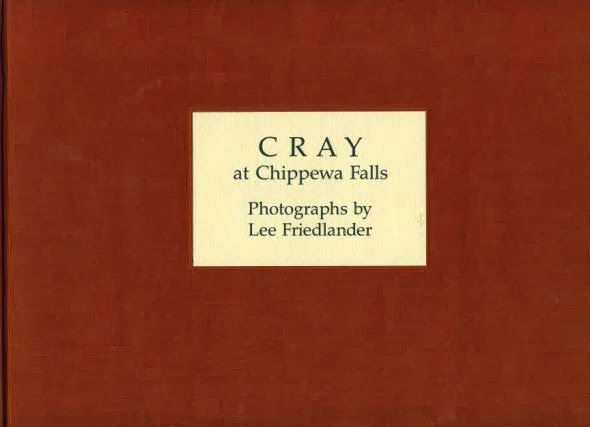
CRAY at Chippewa FallsPublisher: Cray Research, Inc., Minneapolis
Year of publication: 1987
Binding: hardcover (linen cloth; pasted label on front panel)
Size: 310 x 300 mm
Number of pages: 96
Number of illustrations: 79 black & white photographs
Type of illustrations: photo reportage; documentary photography
Printer: Franklin Graphics, Inc., Nashville
Type of reproduction: offset lithography
Print run: 5000
Photography:
Lee FriedlanderText: Stuart Klipper (afterword)
Type: commemoration book (15 year anniversary)
Collection: Bart Sorgedrager, Amsterdam
‘In 1986 Cray Research, Inc. invited American master photo grapher Lee Fried lander (1934) to create a photo-illustrated book commemorating the company’s 15th anniversary. Friedlander took these photographs at Cray Research, Inc., Chippewa Falls, Wisconsin, birthplace of the Cray-1 supercomputer—then the fastest computer in the world. The book includes a range of subjects shot in Friedlander’s characteristic style: sober images of shop fronts and empty streets, views of the landscape and underbrush surrounding Chippewa Falls and close-up shots of workers. The result was a landmark visual record documenting the assembly of this awe-inspiring supercomputer and the people who made it.’ From:
https://museum.stanford.edu/news_room/friedlander.htmlPictures of a factoryPublisher: Fretz & Wasmuth Editions, Zürich
Year of publication: 1961 (2nd edition); 1959 (1st edition)
Binding: hardcover
Size: 285 x 230 mm
Number of pages: 102
Number of illustrations: 101 black & white photographs
Type of illustrations: documentary photography
Printer: Fretz Brothers Ltd. Zürich, Switzerland
Type of reproduction: photogravure
Photography:
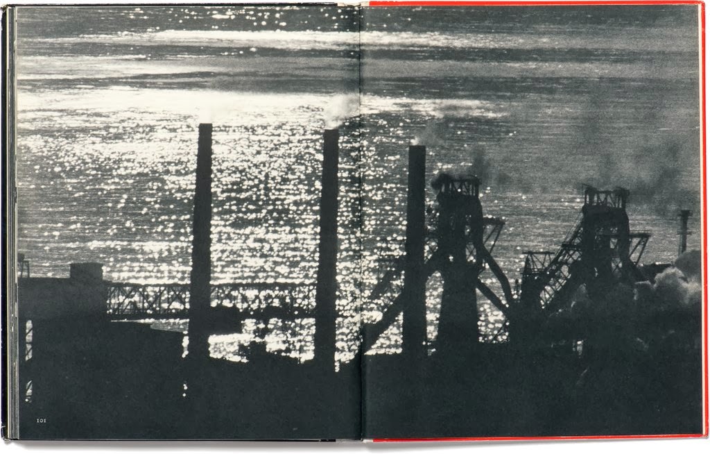
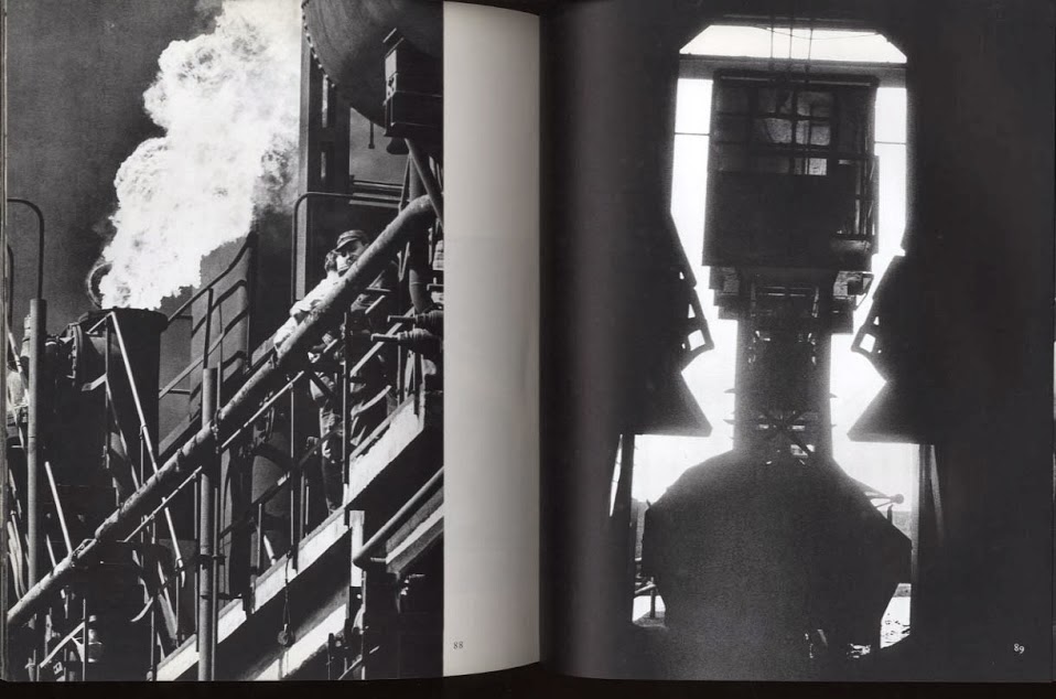
Kurt BlumText: Michele Parrella
Type: promotional book
Collection: Bart Sorgedrager, Amsterdam
‘Kurt Blum [1922-2005] worked for large industrial companies in northern Italy, leading in 1959 to the book Pictures of a factory (reprinted in German language in 1960, title: Lebendiger Stahl), in which he presented an almost infernal image of steel works, sparks flying, by means of black-and-white photographs rich in contrasts. Above and beyond the documentary aspect, he soughtsubjective expressiveness, the atmospherically dense moment, conscious composedphotographic print. Blum belonged to the avant-garde of Swiss photography, so it is notsurprising that he also played a role in the “subjective photography” circle around Otto Steinert in Germany in the early 1950s.’ From: Swiss Foundation for Photography
HenkelPublisher: Henkel & Cie GmbH, Düsseldorf
Year of publication: 1951
Binding: hardcover (linen cloth)
Size: 285 x 237 mm
Number of pages: 72
Number of illustrations: 34 color photographs
Type of illustrations: photo reportage; archival photography
Printer: A. Bagel, Düsseldorf
Type of reproduction: offset
Photography:
Henkel ArchiveText: H.C. Hugo Henkel (prologue)
Type: commemoration book (75 year anniversary)
Collection: Bart Sorgedrager, Amsterdam
![]()
This commemoration photobook celebrates the success story of a family business in chemical products that involved three generations across 75 years. The introduction tells the reader the story from Dr. Hugo Henkel’s (1881-1952) point of view. He embodies the third generation in the family business and describes how the factory began as a playground for him and later became his laboratory. His grandfather Fritz Henkel founded the company in 1876 in Aachen. Hugo Henkel became the first chemical engineer within the business. After 70 years of labor Henkel is looking back on the progression and innovation of their company. A new generation is about to take over. The layout is straightforward with on every left page a few lines of text and on the right page a bleeding image, sometimes with white bars on the bottom or on the upper side of the page. Because most of the photographs are highly retouched, everything depicted looks spotless and bright, even dark interiors like the shop floor.
Câbleries et tréfileries de Cossonay [Cables and wires of Cossonay]Publisher: Câbleries et Tréfileries De Cossonay, Cossonay
Year of publication: [1972]
Binding: hardcover
Size: 280 x 240 mm
Number of pages: 72
Number of illustrations: 53 black & white photographs
Type of illustrations: abstract and documentary photography
Printer: Jean Genoud, Lausanne
Type of reproduction: photolithography
Photography:
Marcel ImsandType: commemoration book (50 year anniversary)
Collection: Bart Sorgedrager, Amsterdam
Câbleries et tréfileries de Cossonay is the result of a cooperation between photographer Marcel Imsand (1929) and the Swiss cable and wire company. This company photobook was produced in the French-speaking section of Switzerland; the publication of company books in that area has developed slower than in the German region. Marcel Imsand received much artistic freedom from the company, reflected in some of the chapter’s titles in the book: ‘Human’, ‘Machine’ and ‘Material’. Imsand photographed wires and cables to place emphasis on repetition, lines and form and thereby created visually rhythmic sequences. The selection of large images and use of full bleed, across the bind seam and in different sizes, create a dynamic design to complement the objects depicted. Imsand’s signature is explicit: black & white, coarse grain, close ups and expressive abstract photographs.
PROGRES [PROGRESS]Publisher: Société anonyme Manufacture Belge de Lampes et de Matériel Électronique, Brussels
Year of publication: 1966
Binding: hardcover (linen cloth with pattern in relief)
Size: 325 x 237 mm
Number of pages: 226
Number of illustrations: 61 black & white photographs; 5 color
Type of illustrations: photo collages; abstract and portrait photography
Printer: l’Imprimerie Wellens-Pay, Brussels
Type of reproduction: photogravure
Print run: 5000
Photography:
Jacques RichezDesign: Jacques Richez
Text: Lucien Massart (introduction); André Maurois; Harry Melville; e.g.
Type: commemoration book
Collection: Bart Sorgedrager, Amsterdam
![]()
This book contains an historical resume, suggesting that illustrious men have been determining progress for all of mankind. The book attributes modern society to the invention of electricity. Electronic devices play a major role in everyday life. Jacques Richez (1918) was a gifted designer, draughtsman and experimental photographer. With his skills he added new dimensions to drawing and photography. PROGRES is exceptional in terms of size, color, typography and layout, tactility and shape. The book is richly illustrated with portraits, handwritten notes, line drawings and photo collages on sturdy metallic paper. Richez created subdivisions within the book by using different types of paper: matted or glossy, thick or thin. The result is a luxurious edition with a futuristic touch. The book includes texts from memorable philosophers and scientists. PROGRES was made in commemoration of Marcel Hublou and commisioned by Société anonyme Manufacture Belge de Lampes et de Matériel Électronique.
75 Jahre Brown Boveri 1891-1966Publisher: Brown Boveri & Cie., Baden
Year of publication: 1966
Binding: hardcover (faux leather; black spine on cream board)
Size: 243 x 240 mm
Number of pages: 290
Number of illustrations: 77 black & white photographs; 147 color
Type of illustrations: archival, historical, product landscape and documentary photography
Printer: Conzett & Huber, Zürich
Type of reproduction: offset
Photography:
Otto Daettwyler; WerkarchivDesign: Pit Günter
Text: Peter Rinderknecht; Otto Mittler
Type: commemoration book (75 year anniversary)
Collection: Bart Sorgedrager, Amsterdam
![]()
On the occasion of the 75th anniversary of the Swiss electrical engineering company, Brown Boveri & Cie published this comme moration book. The publication contains an historical overview from 1891 until 1966. The content focuses on expansion, development and corporate accomplishments. Both French-language and English-language editions were published. The book is divided into three sections: historical overview, company formation, and the human dimension of the industry. The book contains a wide variety of types of illustrations: from factual graphs to archival images. The cover contains a minimal line illustration. Most of the pictures taken in the factory halls were made with flashlight exposure, resulting in images appear like staged photography, comparable to the suspense tangible in the photographs by the Canadian artist Jeff Wall (1946). Text and image are evenly balanced in a mosaic layout. Brown Boveri & Cie produced a wide range of industrial products: electrical motors, generators, steam and gas turbines, and transformers.
150 Jahre Habig150 years Habig
150 ans Habig
Publisher: Busche, Dortmund
Year of publication: 1959
Binding: hardcover (satin cloth; spiral; first sheet transparent plastic; one foldout)
Size: 240 x 170 mm
Number of pages: 84
Number of illustrations: 35 black & white photographs; 22 color
Type of illustrations: company profile; aerial photographs; photo collage; documentary and
commercial photography
Type of reproduction: offset
Photography:
Eick Emsdetten; H. Harz; Aero-luxDesign: E. Zander
Text: Heinrich Haber Jr.
Type: commemoration book (150 year anniversary)
Collection: Bart Sorgedrager, Amsterdam
This little commemoration book was published on the occasion of the 150th anniversary of the German fabric company Habig. The satin cover is made with a fabric design from the Habig collection: red, yellow and white stripes on a black background. The pages are interspersed by thick matted paper every time in a different pastel color. The bright retouched color photographs reflect the fabrics made in the factory. The book contains many nearly page-filling illustrations. The accompanying texts are often witty and ironic in nature, such as: ‘The pensioner. Looking into the evening does not symbolize the end.’
Kupferhammer Grünthal Vierhundert Jahre deutscher Arbeitskultur [Kupferhammer Grünthal 400 Yearsof German Work Culture]
Publisher: C G Röder, Leipzig
Year of publication: 1937
Binding: hardcover (linen cloth; engraved emblem on cover)
Size: 305 x 230 mm
Number of pages: 140
Number of illustrations: 50 black & white photographs
Type of illustrations: landscape, portrait and documentary photography
Photography:
Albert Renger-PatzschDesign: C G Röder
Text: Ernst von Laer
Type: commemoration book (400 year anniversary)
Collection: Bart Sorgedrager, Amsterdam
This company book was made for the 400th anniversary of the sheet copper working firm of F A Lange in 1937, and according to Gerry Badger it contains some of Albert Renger-Patzsch’s (1897-1966) finest work. ‘Kupferhammer Grünthal is a sumptuously produced book, demonstrating the full range of Renger-Patzsch’s talents, and revealing an eye that was none too adventurous, but always interesting.’ (Parr; Badger, 2006: 186) The book depicts a workers community as well as landscapes and portraits. The combination of types of photography that Renger-Patzsch applied create an in depth visual documentary study. The style the photographer embraced has been considered a forerunner of the studies Paul Strand made of various European communities in the 1950s and 1960s. See also: Badger, Gerry & Martin Parr (ed.), The Photobook: A History volume 2, Phaidon Press, London: 2006
Henschel LokomotivenPublisher: Henschel & Sohn A.G., Kassel
Year of publication: 1931
Binding: hardcover (linen cloth with title and logo in relief; three foldouts)
Size: 300 x 215 mm
Number of pages: 160
Number of illustrations: numerous black & white photographs
Type of illustrations: product and landscape photography
Printer: Röderdruck, Leipzig
Type: promotional catalogue
Collection: Bart Sorgedrager, Amsterdam
Henschel Lokomotiven contains different models of locomotives and engines produced by the firm with the same name. The book provides a grand tour of the world of locomotives built by the company intended for export. The book has the appearance of a collector’s guide. Henschel’s products are sold within Germany as well as internationally; the models of locomotives are ranked by country. Every page contains multiple images: one background image and smaller-framed photographs in front. The layout has a wide variety of style interventions: double spreads, bleeding images, images with duotone color layers, and a bold upper cast typeface. On three foldouts cross sections of locomotives are displayed.
Wetzlar und die Stahlwerke Röchling-Buderus A.G. [Wetzlar and the Steel Mills Röchling-Bunderus A.G.]Publisher: Röchlingstahl, Wetzlar
Year of publication: 1965
Binding: hardcover (plastic cover; inside work glued to the cover)
Size: 150 x 220 mm
Number of pages: 40
Number of illustrations: 35 black & white photographs
Type of illustrations: company profile; (urban) landscape and documentary photography
Printer: W. Bechstein, Wetzlar
Type of reproduction: offset
Type: promotional book
Collection: Bart Sorgedrager, Amsterdam
This small publi cation, Wetzlar und die Stahl werke Röchling- Buderus A.G., places the steel mills central in the history of Wetzlar by introducing the small town and zooming in on the factory and the shop floor. The hard plastic oblong cover is illustrated with a map of Wetzlar that gives the impression of the steel mills as a tourist attraction. The first spread shows a collage of laborers leaving the factory after work; the background image is a birds-eye view on the factory printed on an olive green stripe pattern. The booklet contains illustrations in a variety of sizes most of which are overlaid with red and yellow color fields. The book concludes with a direct message to the reader: The quality of the product is its selling point; this is what the company explicitly wants to communicate.
Du, Mensch…[You, Creature…]Publisher: Huber & Co. AG., Frauenfeld
Year of publication: 1962
Binding: paperback
Size: 218 x 225 mm
Number of pages: 47
Number of illustrations: 49 black & white photographs; 1 color
Type of illustrations: product, commercial and documentary photography
Type of reproduction: offset
Photography:
Jürg Klages; Beringer & Pampaluchi; Conzett & Huber; e.g.Design: Jürg Klages, Zürich
Text: Willi Fava, Frauenfeld
Type: promotional book
Collection: Bart Sorgedrager, Amsterdam
Du, Mensch… is a nearly square and thin publi cation about the origins and the usage of different types of leather. Consis tently, images of animals and nature are juxtaposed to those of human beings and leather products. The book consists of anthropological images and product photography, mostly cut out in black & white. Photographer and designer Jürg Klages (1924) used horizontal primary colored bars intersecting with the images. Some of his photographs suggest a tactile quality referring to leather. In a poetic and moralizing manner the reader is narrated from Eskimos to Africans and from the prairie to the desert. The story concludes with the prophetic note that leather is an indispensable product worldwide and essential to human beings now and in the future.
Peugeot Fréres, berceau des entreprises Peugeot [Peugeot Brothers, a cradle of enterprises by Peugeot]Publisher: Peugeot et Cie, Valentigney
Year of publication: 1953
Binding: soft cover (with folded cardboard jacket)
Size: 280 x 215 mm
Number of pages: 71; 1 fold out
Number of illustrations: 98 black & white photographs
Type of illustrations: company profile; documentary photography
Photography:
Robert DoisneauDesign: Jean Vallée
Text: Pierre Mac Orlan (preface)
Type: yearbook
Collection: Bart Sorgedrager, Amsterdam
With the publication of this yearbook the longstanding French car company Peugeot proclaims international success. However the emphasis of the publication is not about car models. The geographical and historical roots of Peugeot Fréres are the starting point, from there the reader is introduced to the industrial manufacturing of a diversity of products, e.g., steel strips for dressmaking, saws and springs for watch making. The gold pasted label on the cover and the two golden emblems inside gives the book allure. The designer Jean Vallée integrates texts and photographs by way of blue triangle text balloons. The photographs, made by French renowned professional photographer Robert Doisneau (1912-1994), vary in size and position on the page; some overlap in a mosaic-like layout.
Unanimite [Unanimity]Publisher: Société Anonyme André Citroën, Paris
Year of publication: [1968]
Binding: soft cover (saddle stitched)
Size: 230 x 328 mm
Number of pages: 20
Number of illustrations: 27 color photographs
Type of illustrations: street photography
Printer: Delpire Publicité, Paris
Type of reproduction: offset
Photography:
William KleinType: promotional catalogue
Collection: Bart Sorgedrager, Amsterdam
Citroën - producer of among the most avant-garde car designs ever marketed on a main stream basis - collabo rated regularly with author photographers, which over the years included Henri Cartier-Bresson, Jean-Paul Goude, and Marc Riboud. Following his key publication New York 1954-1955 (1956) William Klein (1928) photographed Unanimite with a snapshot approach. For this catalogue, Klein zoomed in on the futuristic, aerodynamic design elements that made the DS [DS stands for Déesse and means Goddess in French] one of the most unique cars ever made. Klein photographed the gracious French DS model in New York City and by doing so he suggests similar characteristics between the car and the metropolis. Klein’s photographs depict movement as a metaphor of speed. Velocity is reflected in the layout: with diagonally text captions, big tilted images and repeated circles with flag patterns of the export countries. See also:
http://bintphotobooks.blogspot.nl/2008/04/william-klein-french-goddess-citron-ds.htmlNestlé, usine de Saint-Menet, Marseille [Nestlé, factory in Saint-Menet, Marseille]Publisher: Les Presses de Draeger Frères, Montrouge
Year of publication: 1959
Binding: paperback (folded cardboard with pattern in relief)
Size: 285 x 240 mm
Number of pages: 50
Number of illustrations: 22 black & white photographs; 27 color
Type of illustrations: company profile; documentary, landscape and product photography
Type of reproduction: letter press printing
Photography:
Draeger; Nestlé Collection; Roger ViolletDesign: Ferry and Barbot
Type: promotional book
Collection: Bart Sorgedrager, Amsterdam
The Swiss nutrition multinational Nestlé published a promotional book on their chocolate and Nescafé factory in Saint-Menet, near Marseille. The publication introduces the picturesque town Saint-Menet, followed by a view on the industrial complexes and concludes with a report on the fabrication of chocolate and Nescafé. The illustrations are varied: black & white exterior and interior photographs, photographs of coffee roasters, machines for rotating and equalizing the chocolate paste, and large piles of Nescafé packages. Some of the photographs are coated with a single primary color. With one exception, all color photographs are manually pasted to the inside work. In addition to the photographs, the book contains two detailed illustrations of the cacao plant and the coffee plant: the natural resource of chocolate and Nescafé.
Renault Yvon and Volkswagenwerk WolfsburgBinding: folded cassette (with front window; photographs printed as postcards inside)
Size: 70 x 94 / 70 x 94 mm
Number of pages: 20 / 16
Number of illustrations: 20 / 16
Type of illustrations: company profile; documentary photography
Type of reproduction: gelatin silver print on picture postcards
Type: promotional book
Collection: Bart Sorgedrager, Amsterdam
Renault Yvon and Volkswagenwerk Wolfsburg are two of a kind: a pack of, respectively, twenty and sixteen small souvenir postcards that nowadays can be found in large amounts at antiquarian markets. Because these peculiar objects are not photobooks they are an exception to the rule in this exhibition. These miniatures come across as merchandise meant for the tourist branch. The photographic series on the two biggest European car companies are practically the same. The postcards give insight into the operational car industry processes from raw materials to end product: an aerial overview, the machines to paint and presses to weld the body parts, labour on the shop floor, the final product Renault CV4 and VW Bug. A descriptive caption on the backside of each card explains what is depicted on front.
Le Confort au Palais et dans les Appartemens [Comfort in Palais and Appartments]Publisher: La Société Générale de Fonderie, Paris
Year of publication: 1931
Binding: paperback (hand silk paper; cover with engraved ornaments)
Size: 240 x 320 mm
Number of pages: 92
Number of illustrations: 52 black & white photographs
Type of illustrations: photomontage; documentary photography
Printer: SOC, Paris
Type of reproduction: photogravure
Print run: 1000
Photography:
[Germaine Krull]Text: Gosselin Lenotre; Paul Reboux; Marcel Provost; e.g.
Type: promotional book
Collection: Bart Sorgedrager, Amsterdam
Le Confort au Palais et dans les Appar temens is a luxurious, large-size publi cation by La Société Générale de Fonderie a company in household equipment like bold heating ovens. The first half of the book contains four fiction stories written by Gosselin Lenotre, Paul Reboux, Marcel Provost, and Pierre Mac Orlan. The first page of each short story is juxtaposed with a color drawing pasted on the left page. The stories are printed on hand silk paper. The second half of the book encloses a series of densely printed full bleed photographs with intersecting bracts in between some of the pages. The series of photographs consist of photomontages and close-ups; all photographs are shot in a dramatic modernist style. The photographs are generally ascribed to the German photographer Germaine Krull (1897-1985). Krull lived in Paris between 1926 and 1928, and is known for her seminal industrial photobook Métal (1928).
GEOPublisher: Géo Foucault & Schweitzer, Paris
Year of publication: [1930s]
Binding: paperback (bound by a cord)
Size: 175 x 112 mm
Number of pages: 210
Number of illustrations: 42 black & white photographs; 62 color
Type of illustrations: product and architecture photography
Type of reproduction: offset
Type: promotional catalogue
Collection: Bart Sorgedrager, Amsterdam
GEO appears like a no-nonsense booklet about the different types of meat the factory produces. The book consists of two parts; clearly divided by different types of paper. The first part contains detached black & white interior and exterior photographs of the factory. The second part continues with product photography and includes cut-outs in vivid colors. The chunks of meat are displayed within an ornamental frame. Not only ham and sausages are presented, but also cans with paté and pots with pickles are displayed. The book is loosely bound with a cord and two perforations; only the right pages are printed. Either a one centimetre white bar or an ornamental frame consistently formats each of the photographs on these pages throughout the booklet.
NewsprintPublisher: International Paper Sales Company Inc., Montreal, Canada
Year of publication: 1939
Binding: hardcover
Size: 345 x 268 mm
Number of pages: 74
Number of illustrations: 84 black & white photographs
Type of illustrations: documentary photography; photo collage
Type of reproduction: photogravure
Photography:
Margaret Bourke-White; H.F. Kells; Edward J. Herbert; e.g.
Type: promotional book [40 year anniversary]
Collection: Bart Sorgedrager, Amsterdam
Newsprint is a photo book pur sang, compiled of docu mentary photo graphy. This publi cation contains hardly any text. The subtitle explains precisely what the book is about: ‘A book of pictures illustrating the operations in the manufacture of paper on which to print the world’s news’. A series of photographs by famous American woman photographer Margaret Bourke-White (1904-1971) shows the reader the production process from lumbering to sawmill, from pulp to the final product: newsprint. Besides the production process Bourke-White also focuses on the employees of International Paper Sales Company. The book consists almost entirely of large-size printed photographs: some are full spread, others contain white bars on top or bottom and in some cases overlapping and bleeding images. Bourke-White used high contrast black & white photography and emphasized in her pictures both the force of the elements of nature with the force of man-made machines.
Les Nouvelles Messageries de la Presse Parisienne [The New Message from Presse Parisienne]Publisher: N.M.P.P., Paris
Year of publication: 1960
Binding: hardcover (linen cloth)
Size: 320 x 245 mm
Number of pages: 62
Number of illustrations: 51 black & white photographs; 5 color
Type of illustrations: company profile; documentary photography
Printer: Draeger Frères, Montrouge
Type of reproduction: offset
Photography:
Édouard BoubatDesign: Pierre Faucheux
Text: Antoine Blondin
Type: promotional book
Collection: Bart Sorgedrager, Amsterdam
![]()
On first impression, the publication of Presse Parisienne looks, in terms of size, cover and layout, like a children’s book: colorful and set in a large typeface. However, this is illusionary. The main part of the book is about the daily distribution of a newspaper. With a daily press run of over three million copies, it needed a large distribution network. The visual narrative in Les Nouvelles Messageries de la Presse Parisienne is chronological and shows the production of Presse Parisienne as if it were a life cycle with time as its only enemy. The book design echoes the dynamic of a venturous company, resulting in a variety of image sizes, paper and little text. Sheets of mechanical wood paper emphasize the physical aspect of the production of a newspaper. In assigning the Paris based photographer Édouard Boubat (1923-1999), Presse Parisienne choose to depict the newspaper in a humanist manner. Boubat is fitting in the tradition of postwar humanist photography. Boubat’s photos show the daily newspaper as a communication tool and how Presse Parisienne is part of daily life.
So Entsteht ein Auto [The Making of a Car]Publisher: Bücherei der Adlerwerke, Frankfurt
Year of publication: 1930
Binding: paperback (stitched; cover with relief)
Size: 355 x 265 mm
Number of pages: 109
Number of illustrations: 49 black & white photographs
Type of illustrations: photomontage; product photography
Printer: Brönner’s Druckerei, Frankfurt
Type of reproduction: photogravure
Photography:
Paul WolffDesign: Hans Breidenstein
Text: Paul G. Ehrhardt
Type: commemoration book (50 year anniversary)
Collection: Bart Sorgedrager, Amsterdam
On occasion of the 50th anniversary of automobile manufacturer Adlerwerke the company published So Entsteht ein Auto. This title is likely the first industrial company book made by photographer Paul Wolff's (1887-1951), who studied medicine and was a pioneer in 35 mm color photography and the use of the Leica camera. This paperback edition showcased Adlerwerke’s car production in a striking Art Deco design. Most of the illustrations are photomontages. The text is printed in brown on beige paper, which contrasts effectively with the cold deep black of the images. The book is divided in six chapters and depicts historical, contemporary and future production techniques.
My trip to “Caterpillar”Publisher: Tractor Co. Peoria, Illinois
Year of publication: [1940s]
Binding: hardcover (bound by a cord and two perforations; faux leather cover)
Size: 240 x 330 mm
Number of pages: 18
Number of illustrations: 2 black & white photographs; 18 color
Type of illustrations: company profile; group portrait (gelatin siver print)
Type: commemoration book
Collection: Bart Sorgedrager, Amsterdam
My trip to “Cater pillar” is a personal souvenir to B.F. Gephart whose name is in gold relief print on the cover. The cover is similar to the American high school yearbooks mentioned in The Photobook: A History volume two (2006) by Martin Parr and Gerry Badger. The book design appears as an old-fashioned family album: in size; full-padded whitewashed plastic cover with shiny yellow cord; glassine interleaving paper and text balloons accompanying each image. Groups who visited the world’s largest manufacturer of diesel engines, tractors and road machinery began their tour with a group portrait and each visitor was able to take this personal gift home at the end of the day. The final pages are left blank for personal notes, like in a diary.
The photographs are heavily retouched with bright colors and placed in pairs in a white frame on light blue paper.
L’uomo in fabbrica [Man in factory]Publisher: Gruppo Fiat, Turin
Year of publication: 1971
Binding: hardcover (with paper dust jacket)
Size: 280 x 158 mm
Number of pages: 96
Number of illustrations: 92 black & white photographs; 12 color
Type of illustrations: documentary
Type of reproduction: offset
Photography:
Aldo Moisio; Filiberto Rota; Enzo Isaia; e.g.Text: Umberto Agnelli
Type: promotional book
Collection: Bart Sorgedrager, Amsterdam
In the publication L’uomo in fabbrica the automobile manufacturer Fiat expresses its affinity with its employees working on the shop floor, its focus on the importance of human workforce in factory work. A technical drawing of the Fiat 128 model is printed on the dust jacket. After a short introduction the book contains only photographs. A compilation of thumbnails, bleeding images and large images bordered with white bars show the reader a day at work in the factory. The variety in image size and the mixture of black & white and color photographs generate a dynamic flow in the visual narrative. The story begins with the employees going to work and it ends when they leave the Fiat complex; in addition, the storyline shows the fabrication of the Fiat 128. Captain of industry of the Fiat Group, Umberto Agnelli, is portrayed on the shop floor and wrote an introductory text.
Revolution im Unsichtbaren [Invisible Revolution]Publisher: Econ-Verlag GMBH, Düsseldorf
Year of publication: 1963
Binding: hardcover (linen cloth with engraved title)
Size: 305 x 260 mm
Number of pages: 132
Number of illustrations: 26 black & white photographs; 54 color
Type of illustrations: company profile; abstract and documentary photography
Printer: H. Osterwald, Hannover
Type of reproduction: offset
Photography:
Rudi Angenendt; Horst H. Baumann; Heinz Bitter; e.g.Design: Wolf D. Zimmermann
Text: Friedrich Sieburg
Type: commemoration book (100 year anniversary)
Collection: Bart Sorgedrager, Amsterdam
The company Bayer AG was established in 1863 and originally manufactured dyestuffs, a substance for staining and coloring fabrics. In 1925 it evolved into the consolidation of Germany’s chemical industries known as IG Farben. Bayer AG first developed pharmaceuticals, dyes, acetates, fibres, insecticides, and other chemicals and, most of all, is it renowned for being the originator and first marketer of aspirin (1899). Revolution im Unsichtbaren was published on the occasion of Bayer AG’s 100th anniversary and contains full bleeding bright silver-coated images, somewhat psychedelic in nature, that display the chemical development of dyestuffs. With close-ups, little depth of field and motion blur, the visual narrative is abstract and dynamic.
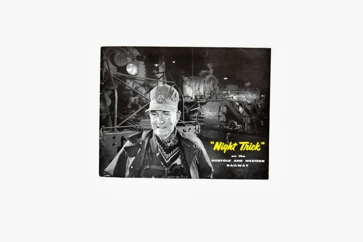
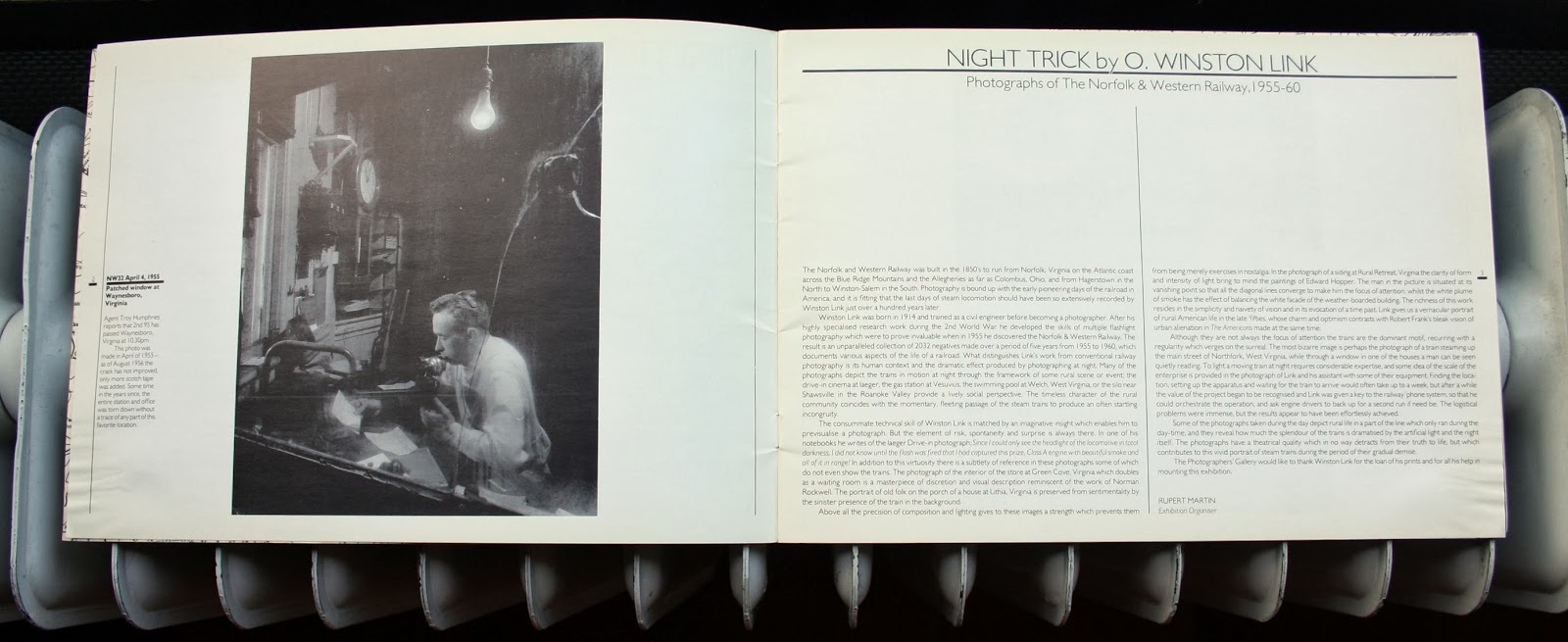
“Night Trick” on the Norfolk and Western RailwayPublisher: Norfolk and Western Railway, Roanoke, Virginia
Year of publication: 1957
Binding: paperback
Size: 215 x 278 mm
Number of pages: 16
Number of illustrations: 16 black & white photographs
Type of illustrations: landscape and documentary photography
Type of reproduction: offset
Photography:
Ogle Winston LinkText: Norfolk and Western Railway
Type: promotional book
Collection: Bart Sorgedrager, Amsterdam
‘This book, made for the Norfolk and Western Railway in Virginia, might not be large, but many of O. Winston Link’s (1914-2001) classic images are in there, and given fine reproduction. Link, who is formulating a vision of the United States as conservative and as precisely calculated as that of Norman Rockwell, generally creates a foreground tableau and has a train, steam blowing behind, rushing by in the background. [...] Link’s vision is, of course, a fabrication, a very persuasive one based on the idea of community. He shows the United States going about its business and leisure, keeping the commercial, social and cultural life of the country flowing as it should.’ From: Badger, Gerry & Martin Parr (ed.), The Photobook: A History volume 2, Phaidon Press, London: 2006, pp.188-189
IGNIS 25Publisher: Rizzoli Editore, Milan
Year of publication: 1969
Binding: hardcover (paper dust jacket; logo engraved on cover)
Size: 290 x 210 mm
Number of pages: 172
Number of illustrations: 136 black & white photographs; 61 color
Type of illustrations: landscape, architectural, reportage and product photography
Type of reproduction: offset
Photography:
Publifoto; Renato Padovan; Faoro and Tediosi archiveDesign: Enzo Avesani
Text: Giuseppe Tanzi (ed.)
Type: commemoration book (25 year anniversary)
Collection: Bart Sorgedrager, Amsterdam
The Italian company in household equip ment, Ignis, published a photo book on the occasion of its 25th anni versary. The book has a two-part division: the first part is a historical overview in text and graphs and the second part is a visual reportage on the company. The latter is again divided in three sections: photographs of the industry, of the commercial enterprise, and a section on social life. All the color images are full-bleed spreads. The photographs that are taken inside the factory are shot with flashlight. The effect is images appearing to be staged. Because all the employers wear blue overalls and work along the assembly line the repetitive mise-en-scene in the photographs has a theatrical quality.
FacomPublisher: Draeger Frères, Montrouge
Year of publication: 1960
Binding: paperback (spiral binding; sections divided by numbered cardboard tabs)
Size: 268 x 235 mm
Number of pages: 150
Number of illustrations: numerous black & white photographs; 9 color
Type of illustrations: company profile; product and documentary photography
Type of reproduction: offset
Photography:
Mazo, St-Martin; Photocrom, Buenos-AiresDesign: Service Artistique Draeger Frères, Montrouge
Text: Facom
Type: promotional catalogue
Collection: Bart Sorgedrager, Amsterdam
Facom is a company in mechanical gear; the catalogue depicts many different types of wrenches, sockets, screwdrivers, and other hand tools. Most of the product photography is printed on black & white coated with a red tone, some of the interior photography is in the same style. For example, the store is depicted in black & white with only a cupboard in red. Another notable aspect of the design is the images along the cardboard tabs are printed as spreads, in black & white on the left page and in color on the right page.
Im Kraftfeld von Rüsselsheim [In the Force Field of Rüsselsheim]Publisher: Knorr und Hirth, München
Year of publication: 1940
Binding: hardcover (printed linen cloth and faux leather spine; with dust cover)
Size: 220 x 210 mm
Number of pages: 219
Number of illustrations: 80 color photographs
Type of illustrations: documentary photography
Printer: Hauserpresse Hans Schaefer, Frankfurt
Type of reproduction: offset
Photography:
Paul WolffDesign and Idea: Carl T. Wiskott
Text: Heinrich Hauser
Type: promotional book
Collection: Bart Sorgedrager, Amsterdam
Im Kraftfeld von Rüssels heim was published during World War II. It took two years to finalize its produc tion, for which the publisher expressed pride on the jacket text. One of the reasons for this euphoria is that the text is written according to Nazi ideology. Another reason was the fact that Im Kraftfeld von Rüsselsheim is the first book with color reproductions of 35 mm negative film. Dr. Paul Wolff (1887-1951) used his preferred Leica camera in twelve different factories to record the industrialization of Rüsselsheim, among them: a rayon factory, a screw factory, and steel mills. Most of the factories manufactured products for the biggest car company of its time in Europe: Opel. The photo series depict mainly factory workers on the shop floor working with metal, from welding to polishing.
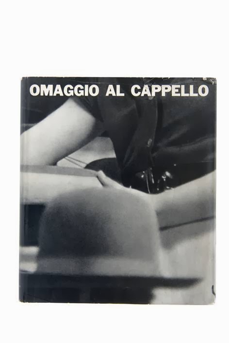
Omaggio Al Cappello [A Tribute to the Hat]Publisher: Arti Grafiche Amilcare Pizzi, Milan
Year of publication: 1957
Binding: hardcover (linen cloth with embossed title; illustrated dust jacket)
Size: 292 x 255 mm
Number of pages: 150
Number of illustrations: 79 black & white photographs; 1 color
Type of illustrations: company profile; historical and portrait photography
Printer: Arti Grafische Amilcare Pizzi, Milan
Type of reproduction: offset
Text: Mario Carrieri; Giuseppe Trevisani; Massimo Vignelli (eds.)
Type: commemoration book (100 year anniversary)
Collection: Bart Sorgedrager, Amsterdam
The 100th year anniversary of the Borsalino company resulted in a bulky tribute to headdress. The publication is composed of pictures, photography and reproductions of paintings which makes it a versatile design. The dust jacket is printed on two sides: on the outside the assemblage of a hat is depicted, and hidden on the inside flaps is a photograph of the apartments of employees. The inside work is compiled of a series of reproductions of famous paintings that show people with hats. These reproductions are pasted on black pages. The second section in the book contains various humorous and fashion illustrations, with the hat as central topic. The third section displays full-page portraits of employers with a short but quite a personal history introducing each person. Omaggio Al Cappello conveys to the reader the company’s fascination for and affection with the (making of the) Italy’s famous headdress.
Die Maggi Werke [The Maggi Works]Publisher: Maggi Gesellschaft MBH, Berlin
Year of publication: [1925]
Binding: paperback (folded binding with cord)
Size: 205 x 295 mm
Number of pages: 40
Number of illustrations: 41 black & white photographs
Type of illustrations: company profile; documentary photography
Type of reproduction: offset
Design: H. Schirmer, Berlin
Type: promotional book
Collection: Bart Sorgedrager, Amsterdam
Die Maggi Werke is a publi cation on Germany’s largest food industry business: Maggi. The straight forward Art Deco book design is similar to the design of Dutch artist magazine Wendingen [1918-1932] from the same style period. The page layout and typography in this oblong publication is more prominent than the greyish photographs about the people working in the factory and the agriculture. Depicted on the photographs are the men returning from harvest, long lines of women wearing aprons and headscarves preparing cauliflower and kettles with bouillon. Except for two pages, every page contains one medium size photograph that is always off-centre. With a large typeface and decorating strips in silver along the outer edge of the pages, black strips around the photographs and blue strips along the page seam create a firm and dated Art Deco layout.
Les Cathedrales du Vin [The Cathedrals of Wine]Publisher: Sainrapt et Brice, Paris
Year of publication: 1937
Binding: paperback
Size: 310 x 237 mm
Number of pages: 20
Number of illustrations: 11 black & white photographs
Type of illustrations: documentary photography
Printer: Jacques Bazaine, Paris
Type of reproduction: photogravure
Print run: 3100 (numbered)
Photography:
André KerteszText: Pierre Hamp
Type: promotional book
Collection: Bart Sorgedrager, Amsterdam
Les Cathedrales du Vin is a publication on the winery Sainrapt et Brice in Paris. The large format paperback contains eleven photographs made by the Hungarian master photographer André Kertesz (1894-1985). A semi-transparent glassine interleaving paper with explanatory captions covers each photograph. The black & white illustrations have a dense quality with high contrast due to the photogravure reproduction. Kertesz captured the winery with serenity as if it were a cathedral. The dimly lit chambers are empty with deep down anonymous individuals at work. From different points of view, some frontal and some from a high or low perspective, Kertesz emphasizes the height of the winery’s interior.
Práce Je Živá [Work is Living]Publisher: Ceská Grafická, Prague
Year of publication: 1945
Binding: hardcover (half brown cloth; photographic dust jacket).
Size: 340 x 255 mm
Number of pages: 180
Number of illustrations: 173 black & white photographs
Type of illustrations: documentary photography
Type of reproduction: photogravure
Photography:
Vladimir HipmanType: promotional book
Collection: Bart Sorgedrager, Amsterdam
Práce Je Živá is a tribute to the workforce of Czecho slovakia. This costly and volu minous
publi cation pays tribute to the industrial era and its heroic workers. The Czech photographer Vladimir Hipman was a prominent figure in the Neue Sachlichkeit (New Objectivity) movement in Eastern Europe. In style and propagation of work ethos Práce Je Živá is comparable to Albert Renger-Patzsch’s Eisen und Stahl (1931) and Lewis W. Hine’s Men at work (1932). The rich photogravures display a dramatic view on industrial work published in this scarce post-war classic.


.jpg)


.JPG)
.JPG)
.JPG)
.JPG)
.JPG)
.JPG)
.JPG)
.JPG)
.JPG)
.JPG)
.JPG)


.JPG)

 *
* *
* *
* *
*
 *
* *
* *
* *
*